I have students who email me saying they’ve painted in the past, but are taking a break.
They still read and enjoy the tutorials, but don’t feel like they could give them a go. They don’t feel they could start again because they’re back at ground zero.
But I want you to know that hesitancy to start painting again has nothing to do with your skills.
You know how to mix colours, and you’ve got an empty canvas ready to go!
What’s gone is your belief that it’ll be good.
This January, I’ve had tons of household stuff to catch up on and new courses I’m researching, but alongside all that, I’ve been putting time aside to paint daily.
But what happens when the day doesn’t go to plan?
You miss one or two days, and it doesn’t change much.
But when you’ve missed a week, something begins to shift.
What about a month? A decade?
What I’ve discovered through my own practice is that the barrier to returning to painting isn’t lost skill—it’s lost confidence.
The Forgetting Curve and the Confidence Gap
We’ve previously looked at the forgetting curve, which shows us that we forget new knowledge at a surprisingly quick rate.
But this is something different.
The longer you wait, the more the psychological pressure builds.
It’s irrational.
Anxiety builds to such a point that it becomes a self-fulfilling prophecy.
The Procrastinating Painter
Timothy A. Pychyl, PhD, author of ‘Solving the Procrastination Puzzle’, is a procrastination researcher.
Through his research, he’s found that putting things off isn’t really about not having the time to do them, but about avoiding the perceived negative emotions that will come with the thing you’re procrastinating on.
“Procrastination isn’t a time management problem; it’s an emotional management problem. We have negative emotions attached to some tasks….we feel frustration, boredom, resentment or anxiety. By putting off the task, we put off those emotions, and that’s the crazy self-defeating nature of it all.”
– Timothy A. Pychyl (https://maryannjacobsen.com/stop-procrastinating-with-tim-a-pychyl-podcast/
We’re avoiding the negative emotion that we’ve suddenly become terrible artists!
Miss one day and you’re a painter who took a break.
Miss a month, and you become someone who used to paint.
Build Evidence, Not Motivation
Keeping a record of your past work matters.
It can be a quick snap on your phone (Here’s how to take better iPhone shots of your paintings) or one of the pieces you’re most proud of displayed where you can see it.
When doubt creeps in after a break, you need something tangible to look back on, proof that you were once in that zone, that you did create something you were proud of.
And this leans into another strange thing that happens with creative work: when you finish a painting, you immediately see only the flaws. Every wrong mix, every misaligned feature. You’re intensely critical.
So it makes it even harder to come back to your paintings after a break, because alongside the doubt, you will see the work more harshly when you’ve first finished it.
However, come back a week later, you’ll look at the same piece and think, “Who painted that?” You’re genuinely surprised by its quality.
This happens to all artists.
How to beat procrastination with Procatalepsis
Procatalepsis comes from the Greek: pro (before) + katalepsis (seizing or grasping).
When debating a point, it’s a way of highlighting your own shortcomings before your opponent can voice them towards you.
You’re doing the same thing, except the opponent is your own resistance.
This is particularly effective against procrastination because procrastination often disguises itself as legitimate concern. Your brain says, “I should wait until I’m more prepared” or “Maybe tomorrow when I’m fresher”, and these sound reasonable.
Here’s how you might use it for returning to portrait painting:
“I know the proportions are going to feel off in the first few attempts. The eyes won’t sit right, the nose will be too long, or the mouth too small. That’s not me forgetting how to paint, that’s my eye being sharper than my hand right now, which means my eye still works. The hand will catch up.”
You’re facing the fact that, of course, this won’t be your most accurate painting ever, how could it be!
By anticipating both your artistic doubts and your delay tactics, you can move forward.
Confidence Comes From the Work Itself
If you’re in the midst of an artist block, the answer isn’t to think harder about what you’ve lost or to wait to be inspired. It’s to reduce the friction of starting again.
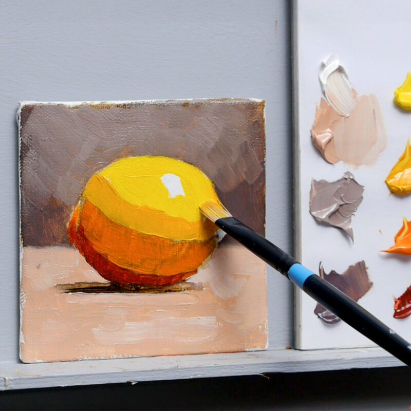
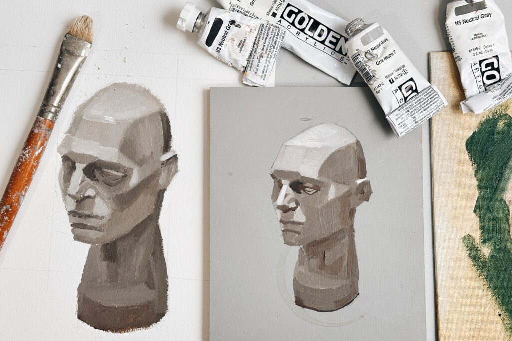
Pick up the brush.
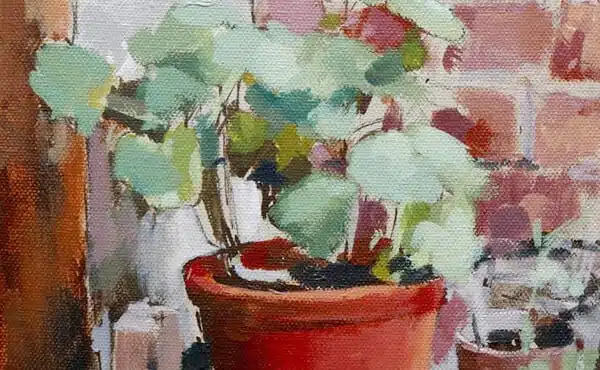
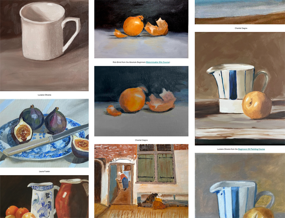
Copy something simple.
Let your hands remember what your mind has temporarily forgotten.
You’re not just practising the skill. You’re practising the courage to show up again, even when the distance to where you want to be feels insurmountable.
Your painting skills aren’t lost; you just need the evidence to believe in them again.
Will