Where to Find Epic Copyright-Free Reference Images for Your Paintings (7 top sites)
Disclaimer: I’m an artist, not a copyright attorney; everything here is shared for general educational purposes only.
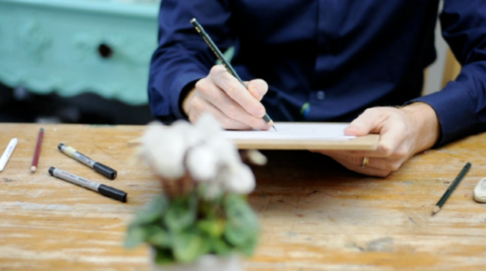
Morning class, I get lots of emails from students who want to pick up a paintbrush but find the first stumbling block is what to paint! It’s easy to find yourself at a loss when looking for a good reference image for the simple reason of copyright.
Most published photos in books, magazines, and online are copyrighted. That means you typically need permission from the photographer or rights holder to use them as a reference for your paintings, especially if you intend to sell or publicly display the artwork.
However, if you’re simply using them for practice at home and not sharing the work commercially, or if they are being used for educational purposes, it’s usually okay. You can also look for images that are under Creative Commons. This is where an image can be used, and if displayed or sold, the original creator must be credited.
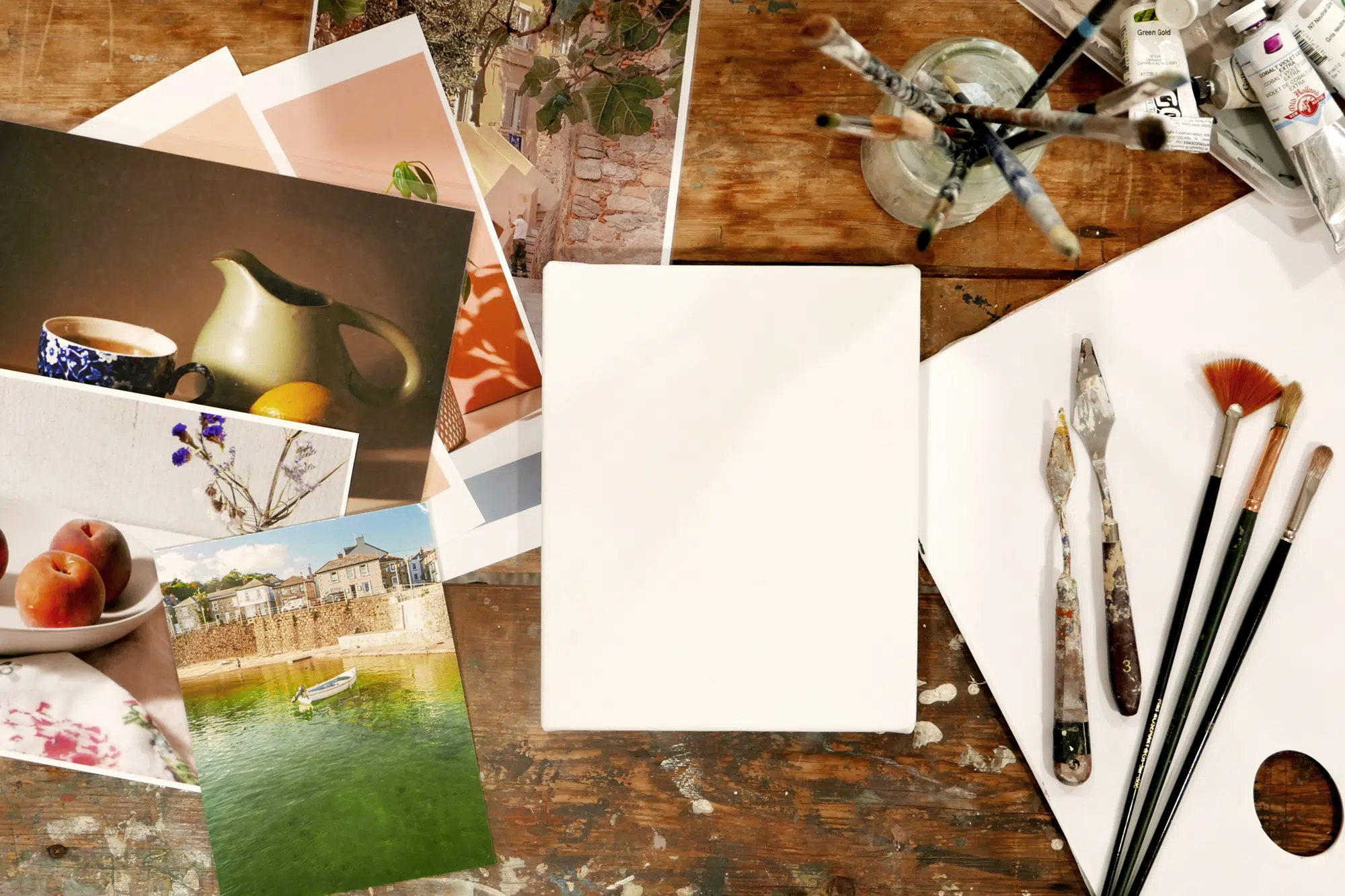
The best free reference images for artists are your own.
You can tweak, light, and design them to be unique. But when you’re starting out and want to practice different subjects, high-quality, royalty-free images can be super helpful.
When it comes to finding the perfect reference image for your artwork, not all sources are created equal. Knowing where to look and understanding the rules around usage can save you from the gut-wrenching moment of realising your beautifully finished piece is based on an image you didn’t have the right to use.
So I’ve put this article together to give you confidence in finding great resources, knowing your work is legally protected and ethically sourced.
There are three main categories of reference images that artists commonly use:
Museum and Library Archives
Museums and libraries hold vast collections of historical artworks, drawings, etchings, artefacts, and patterns. Many of these works are old enough to be in the public domain, meaning you can use them, even commercially, without restriction. This makes them super helpful for finding inspiration and creating master copies of artworks.
Free Photography Sites (Unsplash, Pexels, etc.)
These platforms offer high-quality images taken by living photographers. You’re free to reference these photos for your artwork and sell your painting or drawing based on them. However, you can’t just sell the original photo as is. Some of these sites have usage requirements like Creative Commons licensing or simple attribution to the photographer, so it’s important to double-check the terms before using them.
Artist-Curated Collections
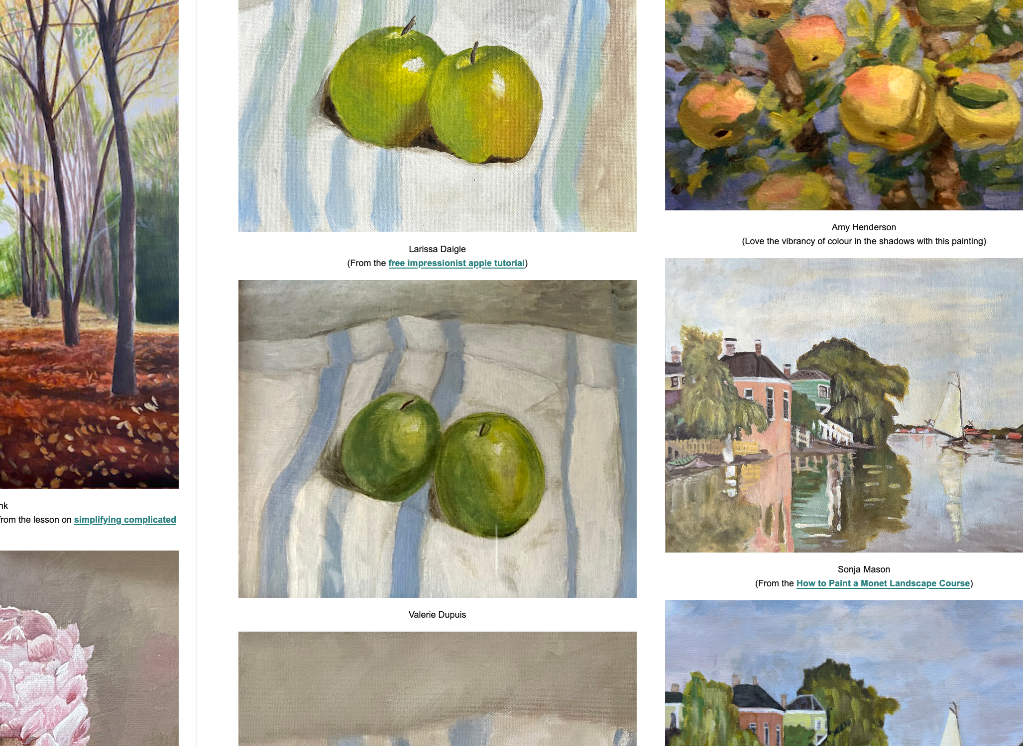
These are specially curated for painters and illustrators. Unlike typical photography, these images often focus on strong light, simple shapes, and clear values making them perfect for translating into paint. Some of these collections come with zero copyright restrictions, while others may require simple attribution. They are designed with artists in mind, making it easier to spot key elements like shadows, contrasts, and composition that work well in a painting.
What Are Royalty-Free Reference Images?
A royalty is a recurring payment made for the use of someone else’s asset, like a song, book, or artwork.
For example, if a radio station plays your song, you receive a royalty each time it’s played. If a publisher sells your book, you earn a percentage of each sale.
“A royalty payment is a payment made by one party to another that owns a particular asset, for the right to ongoing use of that asset.” https://en.wikipedia.org/wiki/Royalty_payment – Wikepidia
‘Royalty-free’ works differently. It isn’t always free, you pay once to use the image or asset, with no additional fees each time you use it.
For free reference images, we don’t necessarily want a ‘royalty-free image, we want a ‘free-free’ image!