The Materials List Is the End of the Story – To Process Behind a Painting Palette

choosing artist colour palette

In many of my paintings, I’ll often start with just a couple of colours and perhaps one brush.

Yet if you look at the materials list I ended up using, you’ll see a much larger range.

And that process of how I got there can be slightly misleading.

It can look as though I sat down before starting the painting, carefully selected the perfect palette, laid all the colours out and then simply followed the plan.

That usually isn’t what happened.

The materials list is a record of the colours I discovered I needed during the painting journey.

If I repainted the same subject again from scratch, I may take a slightly different route, based on what I learnt. I might find I don’t need one of those colours at all. I might discover that a mixture I struggled with could have been achieved much more simply.

I often finish a painting on the first attempt and think:

Why on earth did I start with that colour?

But that is part of the process.

Building without predicting

It reminds me of an article Derek Sivers wrote about when designing an off-grid house in New Zealand.

His idea was essentially building without predicting. (You can read the article here: Building Without Predicting)

Rather than designing a house around everything he imagined he and his son might possibly need, they started by living very simply in a bare cabin.

Then they added things when they discovered they actually needed them.

I love that idea.

We took a similar approach when renovating our house and studio. We lived in it for a year before making some of the bigger decisions.

That meant we could follow the seasons. We could see where the morning light came through in Winter, where we naturally sat in Summer, which rooms we actually used and where we tended to end up during the day.

Instead of trying to predict how we would live in the house, we let living in the house tell us what it needed.

A comment at the end of Sivers’ article particularly struck me. He described a neighbour visiting and being horrified by some of the choices they had made.

A neighbor came by for the first time and really hated it, getting all upset and yelling, saying I was crazy for not having his preferred comforts. I love that this home feels wrong for others, and just right for us – Derek Sivers

His conclusion was essentially that he loved the fact the house felt wrong for someone else, but exactly right for them.

And I think there’s something really useful in that when developing a colour palette.

Your palette doesn’t have to look right to somebody else.

Developing a personal palette

There’s a temptation when painting to think there must be a correct palette.

You see another artist using Burnt Umber, Ultramarine Blue, Cadmium Red and Titanium White, so you feel as though you should have those colours too.

Or you look at the reference and think:

There’s a bright red there, so I need a bright red.

There’s a pale colour there, so I need white.

There’s green in the landscape, so I need a green.

But you might not.

A palette should develop from the problems the painting actually presents.

Not from the problems you imagine it might present. And that leads to a really useful painting exercise.

Start with one colour

Find a subject you’d like to paint.

Then choose one colour.

Not five colours.

Not your normal palette.

One.

Start painting and see how long you can survive with it. Really push it, thin it, use it thickly, let the colour of the ground show through, change the pressure of the brush, scrub it in.

Use the paint opaquely in one area and almost like a stain somewhere else.

Your aim isn’t to produce a perfect finished painting with one colour; your aim is to discover the exact moment when the painting genuinely asks you for something else.

A palette developed by questions

Before adding another colour, ask another question.

Suppose you reach an area that needs to be lighter.

Your immediate reaction might be: I need white.

But do you?

Could you thin the paint and allow the lighter ground underneath to create the light?

Could you leave that area unpainted?

Could you make the surrounding shapes darker instead?

A colour doesn’t exist independently; it alters enormously depending on what surrounds it.

So sometimes the answer isn’t another tube of paint.

The answer is changing the relationship between the colours you already have.

Limitations make you notice more

This is where a limited palette becomes much more than a colour-mixing exercise.

If you have twenty colours sitting next to you, every problem can appear to have the same solution:

Reach for another tube.

Take those options away, and you have to become more inventive. You start paying much closer attention to value and notice how dark one shape really is compared with another. You become more sensitive to warm and cool relationships, and to how much paint thickness can affect colour.

You also become more aware of the surface underneath. Your brush handling improves because you’re trying to make the same paint behave in several different ways, rather than immediately reaching for another tube.

Perhaps most importantly, you start looking at the painting as a whole. Rather than asking, What colour is that object? You start asking, what does this area need in relation to everything around it?

I think that’s a much more useful question.

The finished palette is evidence, not instructions.

So when you look at one of my course materials lists and see six, eight or ten colours, try not to think of them as the recipe for the painting. Think of them as a record of the decisions I made while working through several versions of the piece.

I will have made a few small colour studies and swapped brands to get the right hue. I might have started with a couple of colours, then encountered a problem that made me introduce another. A mixture could have almost worked, but needed something slightly cooler, so another colour found its way onto the palette.

By the end, there’s a finished palette sitting there.

But the palette came out of the painting.

The painting didn’t come out of the palette.

Continue ReadingThe Materials List Is the End of the Story – To Process Behind a Painting Palette

How to Paint a Realistic Landscape (With Only 4 Colours)

Morning Class,

Last week, we explored Carlson’s theory on angles, and I received an interesting comment from a reader asking how complicated it would be to apply the principles to colour.

“I especially love black and white painting.  I’m looking forward to trying this.  How does it work then with colour?  Seems it could get quite complicated.” – Laura

Well, it’s simpler than you might think!

I thought it would be handy to demonstrate painting trees using just four colour mixes. I’m using water-mixable oils, but you can follow along with acrylics or traditional oils too.

Continue ReadingHow to Paint a Realistic Landscape (With Only 4 Colours)

Hue, Value, Chroma – The 3 Keys to Colour Mixing

I’ve found most people overcomplicate colour mixing.

Especially warm and cool colours.

So, here’s a super handy chart from Golden Paints I thought might help.

Download the chart here: https://goldenhub.goldenpaints.com/storage/uploads/cool-to-warm-order-for-golden-heavy-body-acrylics.pdf

This chart helps with ‘HUE’

One of the 3 keys to colour mixing.

1.Hue

Hue refers to the base pigment of a colour, which is what most people think of when they hear the word “colour.”

Let’s say we’re trying to mix this colour:

Step One: Make your first best guess from the tube colours you’ve already got. Select a tube to try. I’m going to try Cadmium Red Medium.

Step Two: Add white to reveal its undertone and colour bias.

Then, you can focus on whether you need to go warmer or cooler.

Step Three: Look at the colour chart and find the pigment you started with.

I need to go cooler.

I don’t have any Cadmium Medium Hue, so I’ve gone for Naphthol Red Medium.

napthol-red-medium

Step Four: Check your new mix. It’s better, but it’s still not there. Let’s go cooler.

I don’t have any Primary Magenta, so I’ve jumped to Quinacridone Red.

Getting much closer, but I’ve noticed there are some cooler tones in the shadows.

I’ve got a Quinacridone Magenta from Winsor & Newton. Let’s try that.

Too far.

It’s gone to cool and needs to be warmed up.

Step five: Combine your colours.

By mixing the Quinocridone Magenta with the Quinocridone Red, I can create a colour that better matches the range of hues in the flowers.

The key to success?

With every mix you make, think about the warmth and coolness of the colour in relation to other colours in its family. Then, you will be much closer with your mixes.

If you don’t have as many colours, you can still learn about your different pigments by making swatch scales and adding white to your pigments.

Bonus: You can check your ability to judge HUE with this Colour Challenge and Hue Test

You have to rearrange the squares as the HUE changes.

Zero is the best score you’re after.

2. Value

VALUE is sometimes also called TONE, and it refers to the lightness or darkness of a colour.

Observing value is one of the core elements in creating depth, mood, and visual interest. It gives your drawing form and solidity and plays an integral part in your paintings.

Not recognising the importance of the value structure will unintentionally create a struggle in your art. It will make colour mixing harder, your compositions won’t work, and your paintings can look amateurish.

value-scale

The great thing is you already know what you’re looking for.

When you draw, you think in value

When you draw, you’re already thinking in value. Drawing is making sense of a coloured image and turning it black and white.
The problem is, colour lures you in.

How light is this yellow? (Detail of Wheatfield by Vincent Van Gogh)

Because it’s bright, you’d think it is light.

Say whaaat? Why is it so dark?

All Colours have a Base Value

Each yellow pigment will have an inherent lightness.

In this range of yellows, Cadmium Yellow Primrose is the lightest.

Cadmium Yellow Primrose
Cadmium Yellow Light
Cadmium Yellow Medium
Cadmium Yellow Dark

In black and white, they still appear relatively close in value.

In this range of yellows, the inherent value is darker.

You can see the difference most clearly when you compare the Raw Sienna to the Cadmium Yellow Primrose.

Wheatfield, Vincent Van Gogh

Here’s the whole painting. Notice how Van Gogh has created different varieties and focus throughout the piece just by utilising the different values of the yellows, from the darker Raw Sienna yellows on the right-hand side to the lighter Primrose yellows in the centre.

When we focus on the value, it’s easier to see how the majority of the colours are within the darker end of the value scale.

All Values are Relative

Just as with one colour appearing warmer or cooler depending on what colour it is placed next to, the same is true with value.

And that’s why it can be so hard to judge.

In this Wheatfield painting by Van Gogh, the yellows appears bright and light. However, when viewed in isolation, they are a darker value.

This doesn’t seem right. Why do the central yellows appear brighter?
They appear brighter because they are surrounded by darker colours.

This is called ‘simultaneous lightness contrast.’

The two central squares above are the same colour. And the same value.

But the square surrounded by black appears lighter, just like the yellows in the Van Gogh painting.

How can you start to develop your ‘value vision’?

Closing your eyes can help.

If you look at your subject/reference and painting so they are within the same frame. Then close your eyes.
Slowly open your eyes until you identify the first lightest shape.

Does it match what you’re painting?

Does the hazy image look the same lightness and shape?

You’re trying to see the most basic value structure of your subject into tonal masses. These simple masses with hold the structure of your painting together.

Once you get accustomed to this technique you can then practice ‘squinting down’ from when your eyes are open.

You don’t always need a wide value range

When you’re composing a painting, it doesn’t always have to be high contrast (wide value range)

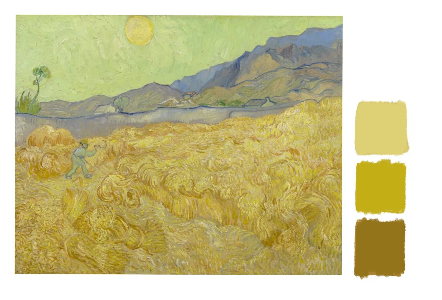
Here’s a second Wheatfield painting by Van Gogh.

Wheatfield with a Reaper, Vincent Van Gogh

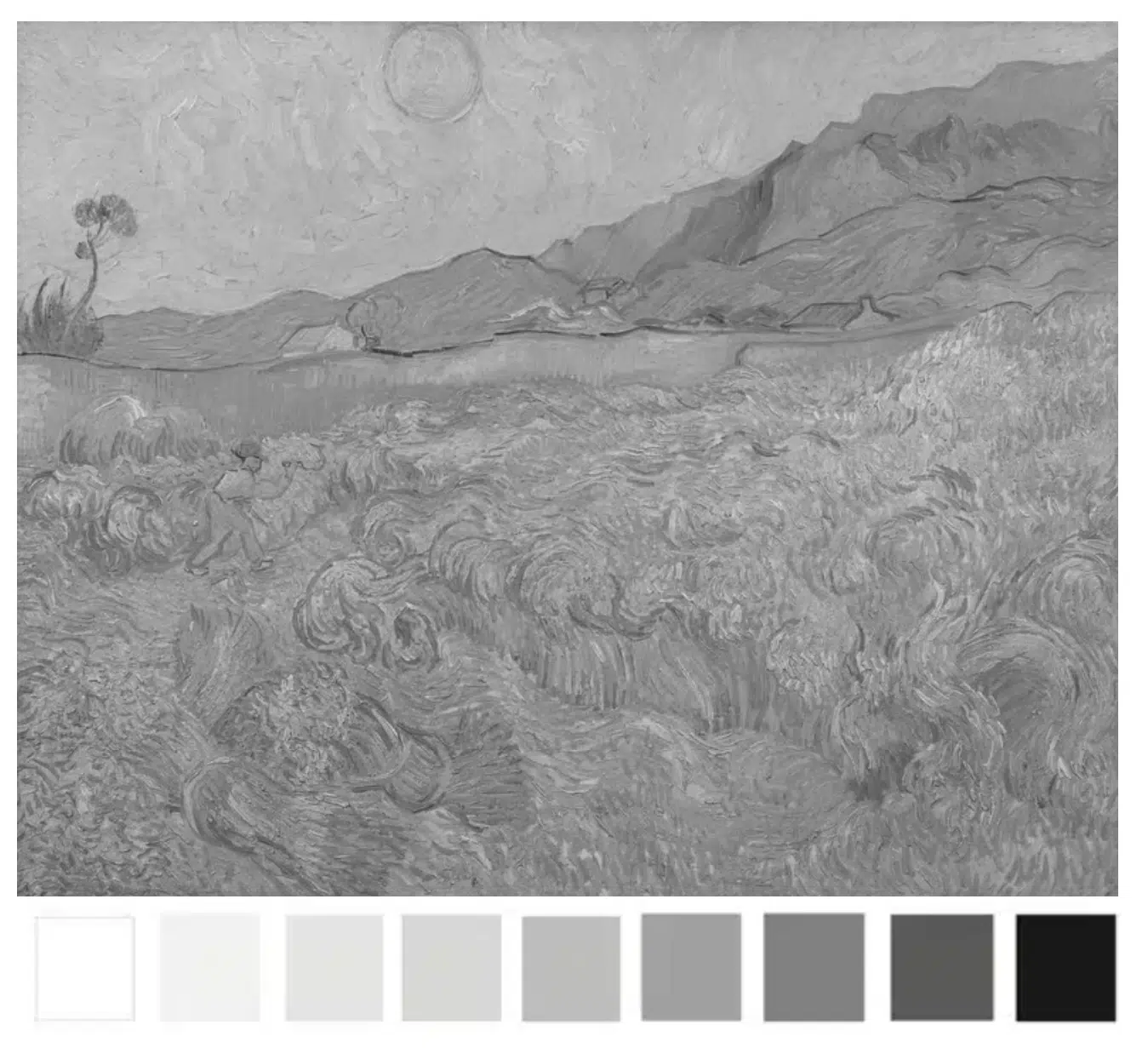
You can see the figure in the wheatfield due to the difference in colour.

Notice how the figure practically disappears when I’ve turned the painting black and white.

The values of the yellows within this painting are mostly a mid value.

Here are 3 yellow swatches.

To mix the darkest swatch, we can look for a yellow pigment with a similar value.
I’m using Yellow Ochre.

Then add a touch of Raw Umber to darken it. (If you have Raw Sienna that will be very close straight from the tube)

Then I lighten the mix by adding some Hansa Yellow Light.

For the lightest mix I add a touch of Titanium White and a little more Hansa Yellow Light.

The key to success?

With every mix you make, think about the lightness and darkness. How would you approach it if drawing in black and white?

I use a grey scale value strip also called a tonal strip, to help me.

It goes from black to white, with each ‘step’ having a number for easy reference. I print it out and make hole punches through each value square.

I can use those as a viewfinder to judge tonal values in a reference image.

When that colour just about ‘disappears’ into one of the grey values on my strip, I know that would be the closest value to check my paint mix against.

Notice how numbers 4, 5 and 7 match the swatches.

When you’re aware of HUE and VALUE, there is one missing piece to the puzzle.

3. Chroma

Chroma originates from the Greek word “khrōma,” which means “colour”.

It describes the saturation, or purity of a colour, how dull or intense it is.

In the series of swatches above, Green 1 has the highest chroma. The chroma reduces as the ratio of grey increases, with 10 being a neutral grey.

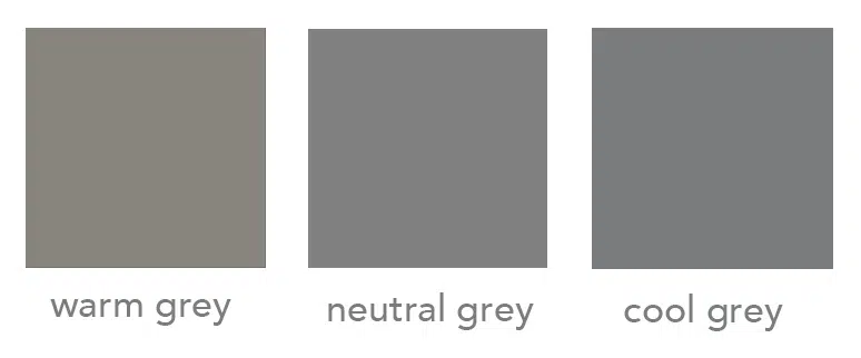
3 shades of grey

When I talk about ‘neutral grey’, I’m describing a grey that doesn’t shift towards warm or cool.

You don’t need to always add grey to lower the Chroma.

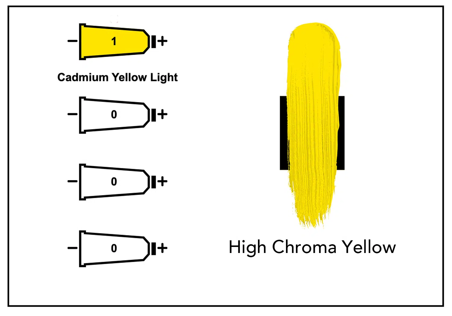
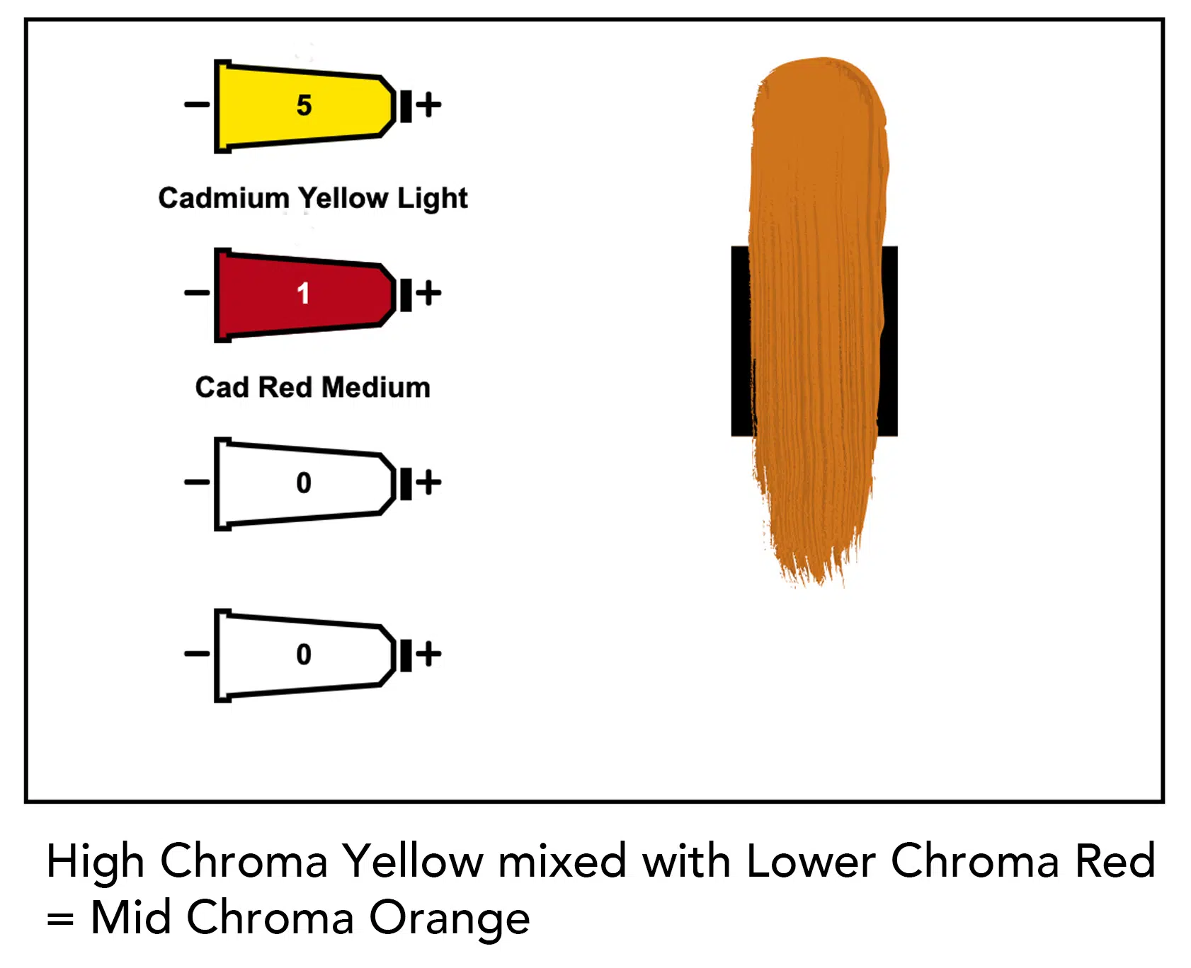
If you think of chroma as a purity of colour, Cadmium Yellow Light, straight from the tube, has a high chroma.

If you mix in any another lower chroma pigment, you will reduce the chroma.

By adding a lower chroma red (Cadmium Red Medium) to the higher Chroma Yellow (Cadmium Yellow Light) we have lowered the chroma by using colour, rather than a neutral grey.

Are you still with me? it’s a lot of Chroma’s

All pigments have a Chroma Value

Just like colours have different tonal values, they also have different chroma values.

Here’s a range of colours on a scale of light to dark.

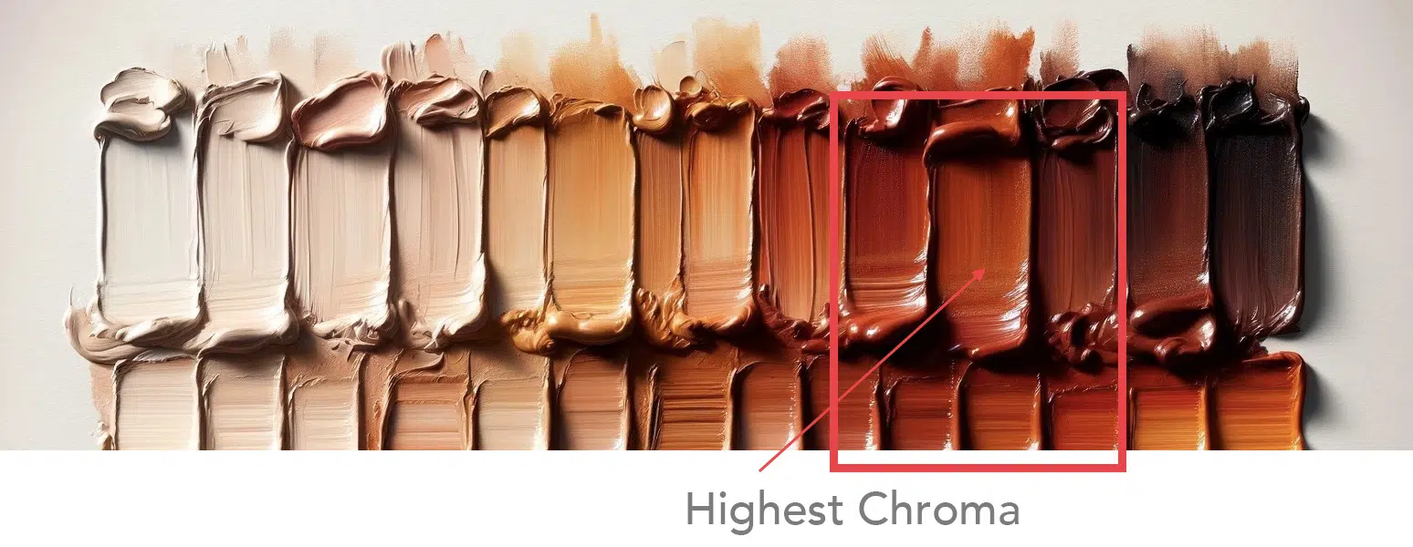
But which one has the highest chroma?


When in grayscale, it doesn’t show us the chroma intensity, just the lightness or darkness (value)

This colour has the highest chroma in the range.

How do I know? I look for which colour had the most pure intensity, the richest more purest pigment. All the white based colours or the earth colours take away the purity.

How does this help you in your painting?

If you can judge the chroma of the scene, you can select appropriate pigments that have a matching chromatic range.

Here’s a painting by Anton Mauve.

Morning Ride along the Beach, Anton Mauve, 1876

It reads as a bright morning at the beach, with clear blue skies.

That should be vivid and high chroma?

But when we take colour swatches from the painting, look how dull they are.

Actually, all low chroma colours.

What would happen if you boosted the saturation of the colours?

You can see in the swatches, all of the colours now have more saturation, but the painting has a completely different feel.

You might love, super intense, vivid colours or prefer subdued, subtle mixes. There is no right or wrong answer, it’s more of a case of looking at the style of paintings that you’re trying to create and matching the chromatic qualities.

4 methods for lowering chroma

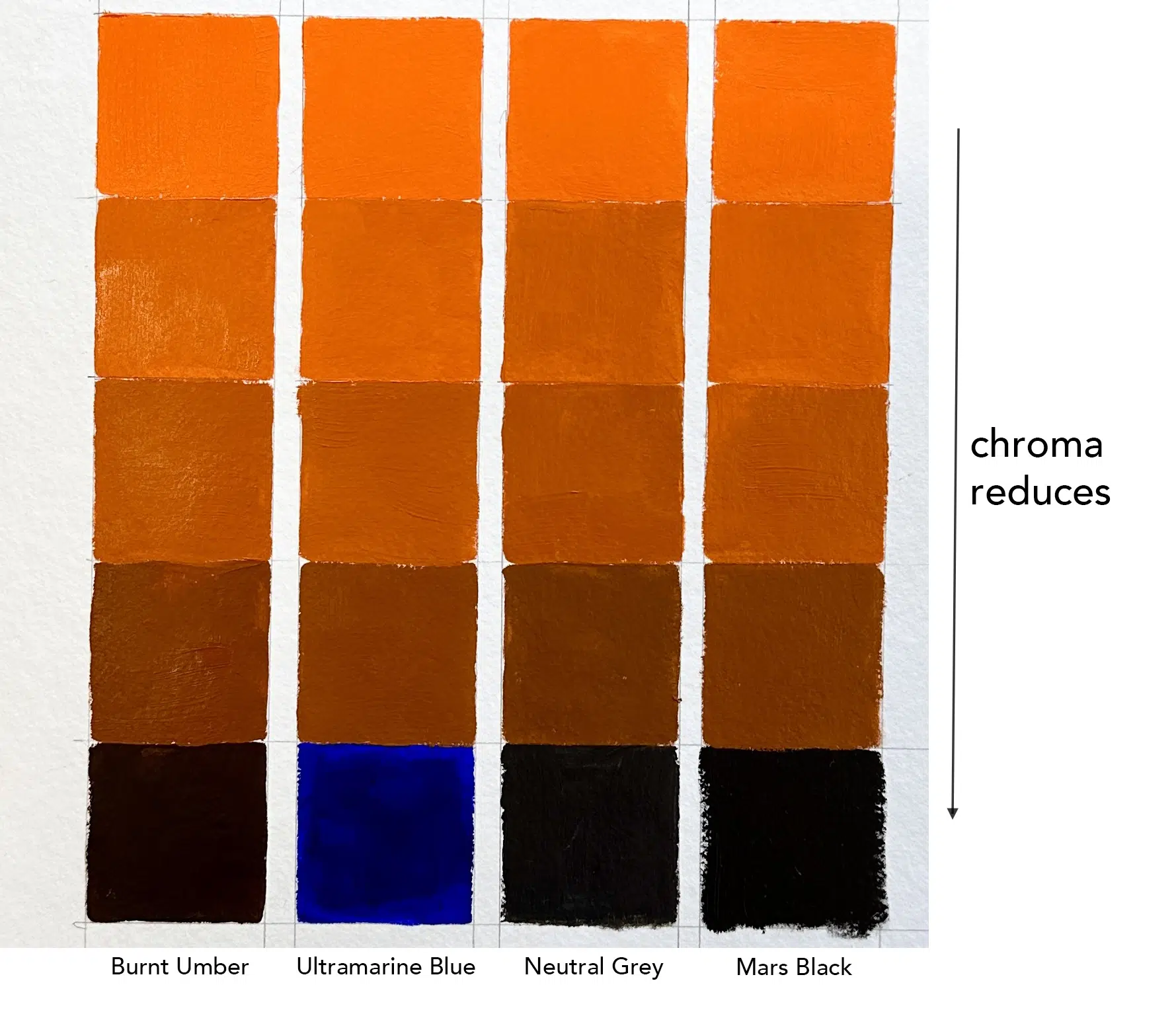
There are 4 main ways to reduce chroma (apart from adding white)

  1. Add a lower chromatic version of the colour
  2. Add a complementary colour
  3. Add a neutral grey
  4. Add a black

Each method will give you slightly different results depending on the pigments you use.

In the example above, I’ve started with high chroma Cadmium Orange on the top row, and added different ratios of colours to reduce the intensity.

I’ve added Burnt Umber as a lower chromatic version of the colour.
I’ve added Ultramarine Blue as a complementary colour
I’ve added Neutral Grey as a Grey
I’ve added Mars Black for a Black

Note how the different mixes all look very similar in the low chroma oranges, even with different pigments.

Each method has pros and cons. The main thing to be aware of is the colour bias of the particular pigment you are going to use, how it shifts, and how it affects other colours.

The key to success?

Observing and experimenting.

You won’t truly understand how a pigment behaves until you try it with paint.

Find a painting you like and experiment with choosing a colour palette.

If you only have a few colours, see how far you can push them, or try to find a subject that already fits with the colours you have.

Note how colours change under different lighting conditions and how the highest chroma isn’t always in the lights.

Start to look at objects and try to guess the highest chroma areas. When you’re aware of it you’ll start to train your eyes to notice more.

I really hope you found this helpful; if you’d like to learn more about colour mixing and how to put the theory into practice, you might enjoy the simple colour mixing course.

I demonstrate this with acrylics, but the same principles apply to oils.

Here is a PDF Download of the Hue, Value Chroma Article.

Continue ReadingHue, Value, Chroma – The 3 Keys to Colour Mixing

Van Gogh Self Portraits at The Courtauld

‘People say that it is difficult to know oneself but it’s not easy to paint oneself either’
Excerpt from a letter from Vincent van Gogh to his brother Theo, September 1889

My first introduction to the Dutch painter Vincent Willem van Gogh was at school. A tortured artist who cut off his ear and painted thick, brightly coloured swirly paintings.

He felt dramatic, passionate and extreme.

12-year-olds tend to want to produce art that looks more realistic, so I think at the time, I wanted to try and paint like Cezanne. Cezanne’s still life’s hit the dizzy heights of being recognisable yet achievable, with a nice painterly style.

But thinking back, I probably felt I was being sophisticated and different; copying Van Gogh as a young painter seemed too obvious.

It wasn’t until an art trip at 16 to the National Gallery, London that I rediscovered the Sunflowers…

Continue ReadingVan Gogh Self Portraits at The Courtauld

How to Choose a Colour for a Tonal Ground

My Top 5 Pigment Choices

Inspired by the dramatic, dark Flemish oil paintings I saw in Antwerp; I’ve just started working on a still life set up of some fab oversized pink peonies. I’m going to begin simply with acrylics then build up the piece using water-mixable oils.

Yesterday, I talked about the importance of a coloured ground and how this very simple step of preparing your canvas, can transform your working method. And I received lots of emails asking
‘How do you go about choosing a colour for your tonal ground?’

Well, the first thing I do is make a decision.

What is the most important thing or the most important problems that I can foresee within the painting I’m going to be working on?

For this still life, judging the values of the flowers and getting the drawing right are going to be the two trickiest areas –  but get them right….and they can pull the whole painting together. Choosing a sympathetic tone for the coloured ground will help me achieve this.

Continue ReadingHow to Choose a Colour for a Tonal Ground

NEW Beginners Acrylic Colour Mixing Course is Live!


Learn more about the course here: New Simple Colour Mixing Course

I’ve designed this brand new, downloadable video course to help you understand the theory behind colour mixing, discover how to mix and match colours accurately and then put theory into practice, creating a series of 4 still life paintings.

You might have been struggling to understand colour mixing for years, sometimes getting it spot on but other times when it goes wrong, have no idea why or how to fix it?

Or maybe you’ve read articles on colour theory but not had the confidence to put that new knowledge into an actual painting practice?

On this colour mixing video course, we take a really simple practical approach, over 5 hours + of tuition, you’ll gain an understanding of the properties of paint, learn the foundations of colour theory and put brush to canvas.

And we’re just going to take it one step at a time, starting with learning the language of colour, everything broken down simply so that the painting exercises and studies give you the confidence you need to develop your colour mixing skills.

I demonstrate using a traditional, 3 primary & 3 secondary colour wheel to teach you a step-by-step approach and working through these progressive tutorials; you’ll be guided by your new colour mixing intuitions, opening up the fantastic world of colour.

Continue ReadingNEW Beginners Acrylic Colour Mixing Course is Live!

How to Paint a Still Life with Acrylics – Apricots

will-kemp-apricot-still-life

Will Kemp, Still Life with Apricots (detail), acrylic on canvas

Distracted by Light…or how a bowl of apricots sent my schedule out the window

I’ve been distracted by an apricot.

It’s not the usual thing that grabs your eye but I’m deep in the midst of filming a new simple colour mixing course and the apricots have got me.

They were the perfect subject to teach colour theory for one of the studies and as I arranged them in the studio, a light, impressionistic, muted blue and orange composition began to form.

Pleased with the setup, I headed down the garden for a tea break.

Continue ReadingHow to Paint a Still Life with Acrylics – Apricots

5 Simple Steps for Painting Realistic Shadows in Sunlight

“A Painting is complete when it has a Shadow of a God”
Rembrandt van Rijn

Unlocking the Secrets to Creating Realistic Shadows in Sunlit Paintings

I remember being taught at art college that shadows weren’t really present in paintings until the Renaissance period.

And you’d be forgiven for thinking when you look at some beginners work, that they were from Ancient Greece – they didn’t use shadows either!

In live painting classes in the past, when I’ve mentioned the words ‘cast shadow’, students concentration wains or worse, a look of rising panic crosses their faces as if they’ve been duped into a technical drawing class.

I’m not quite sure why cast shadows seem so mysterious, elusive or confusing. Shadows help to ‘ground’ an object and learning to accurately observe them, is the most effective way of making your paintings look convincing.

And just by switching the name around it seems easier to digest.

Shadows cast.

I want to keep it simple without the complications of multiple light sources or atmospheric perspective that occurs in vast landscapes, today I am going to focus on shadows cast outside, by sunlight.

Shadows cast by a tree, by a building, shadows cast by a chair or plant pot. The shadow that is falling onto the ground, or against a wall, or onto a table.

Continue Reading5 Simple Steps for Painting Realistic Shadows in Sunlight

How to Paint Green Summer Trees with Acrylics

adding shadows to a landscape painting

Green.

Love it or hate it, almost all landscape artists want to paint trees, woods and grass realistically.

But mixing greens can be one of the major issues that can start to throw your landscape painting off-course.

Greens can be an Achilles heel for beginners, and the urge to grab a vivid, bright green from the paintbox can be hard to resist.

In the past, I’ve demonstrated how you can achieve some surprisingly subtle greens by using some seemingly ‘non-green’ colours such and black and brown.

And I advise beginners to throw out their pre-mixed green (usually this is Emerald Green included in starter sets) when they’re first starting, in order to practice colour mixing with acrylics and develop their own mixing skills and gain colour confidence.

Why?..

Continue ReadingHow to Paint Green Summer Trees with Acrylics

Are these 3 Black Paint Myths Holding You Back?

warm and cool black velazquez

Diego Velázquez, portrait of Juan de Pareja, 1650

Are you scared of using black in your paintings?

Or secretly feel they are the missing ingredient to your work?

If you don’t use black whilst mixing colours, you could be missing a trick.

A tale from two masters:

John Singer Sargent and Claude Monet used to go out and paint together.

One day, Sargent had left his paints behind and asked Monet to lend him his to work with. “Where’s the black?” asked Sargent.
“I don’t allow myself to use black,” replied Monet.
“It’s against the impressionist theory. In nature, all colours are made by mixing.”
Sargent refused to understand how anyone could paint without black.

It’s a matter of taste…

Continue ReadingAre these 3 Black Paint Myths Holding You Back?

Is Green Ruining Your Acrylic Paintings?

Ballet rehearsal-Degas

Edgar Degas, Ballet Rehearsal, 1834 – 1917

Green paint is like peanut butter is for dieters, dangerously addictive.

I don’t quite know why, maybe the freshness, the feeling of a landscape, the memory of nature… whatever the reason it’s a bad one.

Step 1. If you buy a starter set of beginners paints, throw away the green that is included (usually this is Emerald green)

It is usually terrible and very unforgiving when trying to create harmonious colour in painting.

“Can’t I use it  to tone down red? or use red to tone down the green? I know about complementary colours; I’ve only just bought it, I can’t throw it away!”

You must.

Still got it?…

Continue ReadingIs Green Ruining Your Acrylic Paintings?

How to Make Pink? (and Purple) Colour Mixing with Acrylics

How to make pink?

It seems straightforward.

Two colours, red and white make pink. Simple.

But why does your colour mixing look wrong? or your pink looks salmon and not hot pink?

How to make a bright pink colour?

A quick look at the undertone of a few red paints can show you how mixing the perfect pink can easily elude you.

Cadmium won’t allow you to make a hot pink; this video will show you how.

This is not due to a lack of mixing ability, just the wrong red paint colour for the desired result.

Mixing a bright purple?

The right choice of red will influence your ability to make a bright purple, and Part 2 of this video (at the end of this post) will show you how easily purple can go muted and grey rather than bright and vibrant.

This is due to the ‘muting down‘ effect of complementary colours.

It’s all to do with the colour bias of the pigment hidden in paints…

Continue ReadingHow to Make Pink? (and Purple) Colour Mixing with Acrylics

How to Layout an Acrylic Paint Palette

Acrylic painting techniques – How to set out a basic palette

In this video, I show the basic layout of 3 primary colours (plus brown and white) for a stay-wet palette.

Continue ReadingHow to Layout an Acrylic Paint Palette

3 Tricks of Complementary Colours you can Learn from Van Gogh

complementary colours Van Gogh

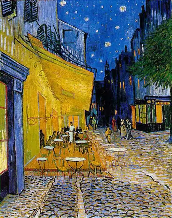
Vincent Van Gogh, Café Terrace on the Place du Forum, Arles, 1888.

Complementary colours

Two colours, placed side by side, will appear differently depending on which colours are used and what they are placed next to.

The effect of this interaction is called simultaneous contrast.

Simultaneous contrast is most intense when two complementary colours are juxtaposed directly next to each other.

For example, red placed directly next to a green, if you concentrate on the edge you will see a slight vibration.

Your eye doesn’t like resting on the edge. The two complementary colour in their purest, most saturated form don’t sit well together, however, if you want to try and focus your viewer gaze on a particular part of the painting a knowledge of the ‘attraction to the eye’ can be used to great effect…
Continue Reading3 Tricks of Complementary Colours you can Learn from Van Gogh