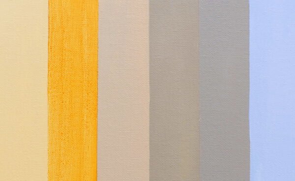
My Top 5 Pigment Choices
Inspired by the dramatic, dark Flemish oil paintings I saw in Antwerp; I’ve just started working on a still life set up of some fab oversized pink peonies. I’m going to begin simply with acrylics then build up the piece using water-mixable oils.
Yesterday, I talked about the importance of a coloured ground and how this very simple step of preparing your canvas, can transform your working method. And I received lots of emails asking
‘How do you go about choosing a colour for your tonal ground?’
Well, the first thing I do is make a decision.
What is the most important thing or the most important problems that I can foresee within the painting I’m going to be working on?
For this still life, judging the values of the flowers and getting the drawing right are going to be the two trickiest areas – but get them right….and they can pull the whole painting together. Choosing a sympathetic tone for the coloured ground will help me achieve this.

Peony reference photo detail next to Pale Umber ground colour swatch
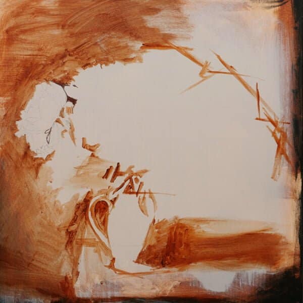
Early block-in stage, using Burnt Sienna and Burnt Umber mix, over the Pale Umber ground
Even though the finished painting will have a more solid black background, I’ve chosen a ground colour of pre-mixed Pale Umber by Winsor & Newton. Squint your eyes and flick them between the left-hand side of the central flower on the reference photo above and the paint swatch. You’ll see the Pale Umber which is a warmish light grey/brown, is already very close in value to the general shadow tone of the petals.
It’s not too dark, which means I can quickly draw out on top of it and it’s not so light that when I get to the brightest lights blocking in stage and white goes on, it will still allow my shapes to emerge.
So if the mid-tone value of the ground helps with the drawing and judging the rest of the values more easily, the colour, the actual pigment choice, will help with the mood of the painting.
I want the warm elements in this piece to shine, so the flowers heads, the wood of the table and the cream jug in the front. When the solid black of the background gets eventually blocked-in, and you can start to see below a darker colour being introduced, the warmth will sit nicely in contrast to the cool.
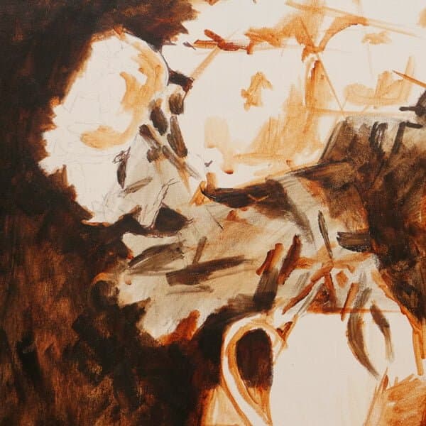
A Note on Drawing Out: Because there’s so much going on in a floral piece – the leaves, petals and jug, being a bit more fluid to start with, can take away some of the overwhelm, also a few wobbly lines won’t really matter. What I’m looking for is the silhouette shape of the whole image together. It’s amazing how much the viewer can create in their mind, once you’ve got the basic shapes in. So don’t let the feeling that you ‘can’t draw’ put you off from painting something like an organic floral piece. You can see when I’m first starting to draw this out, I’m putting in very simple, angled lines, rather than detailed round flower heads. I’m also always using the shapes around the flowers – the ‘negative spaces’, to help with my drawing and composition.
My top 5 Pigments for Coloured Grounds:
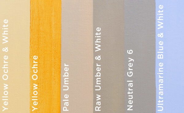
A coloured ground is always best if it’s close to a mid-tone, so not too dark or too light and it can be based on any colour that suits your work and palette. I’ve listed my top 5 favourites below:
- Yellow Ochre diluted with water – This gives a lively vibrant yellow undertone, brilliant for adding sparkles of colour into landscapes. If I were painting a Van Gogh style painting or a colourful still life, I’d go for a yellow to add a glow and give the whole picture a feeling of warmth. If I didn’t want it quite as intense, I’d add a little white to it or even mix it in with gesso to create a lovely muted yellow to work on top of.
- Burnt Umber diluted with water – This would be for a very dark painting to add a glow, or I’d mix it with white to create a Pale Umber, it would still have a warmth to it but have a more opaque coverage.
- Raw Umber and White – Which is a cooler tone and works brilliantly for portraits and judging muted skin tones.
- Golden Neutral Grey 6 – For other muted or cool paintings this an excellent choice. I’d probably use this if I were working on a series of paintings together, so everything is consistent throughout and I’d know they’d all started from the same point.
- Ultramarine Blue and White – I’ll often choose a muted blue for seascapes, perfect if I’m painting Plein Air and I want to have a canvas that that’s already got a base sky colour, blocked-in.
You might be interested in this article about how changing your studio space wall colours can alter the perception of your paintings and towards the bottom of the post, it covers different colour ground choices in more detail.
I’ll be working on the floral still life painting over Christmas; I’ll create a step-by-step of how I approached the finished piece in the New Year!





Thanks! Very helpful post; great tip about painting a series with the same ground colo/u/r as the starting point for each one. Looking forward to the step-by-step peonies post.
My pleasure Jack.
Will
Thanks again, Will, very helpful.
Cheers Kendal, hope it helps with your colour choices.
Will
Hi! Will. Thanks again.
You are the first artist who has actually helped with the
use of warm and cool background colours and having them lined up is very helpful.
Thanks again. All the best Jox
My pleasure Jo, so glad seeing the swatches together is helpful to compare and contrast. Forgot to mention in at the article, of course, all the ratios of the pigments to white can also be tweaked to better match the values in the subject you’re working on.
Will
You are a superior teacher—far more of everything learned from you than any classroom person over the years!
You explain everything in well supported detail. I also love your work‼️Thank You, RZ
Thanks very much Rozanna, very kind of you to say so.
Cheers,
Will
Thanks for the info! I’ve switched to oils and I think this can be done with washes except without the white added. I just read that oils shouldn’t be painted over acrylic bases because over the years the paint will start to slip off! But with water soluble oils that probably is not a problem.
Hi Bethany, yes you can apply a wash of oils or use a quick-drying alkyd white. As long as you dilute the acrylic slightly with water to from an absorbent layer the oil will adhere to the surface.
Cheers,
Will
Thank you for your background-favourites! I have used brunt sienna for greenery and yellowocra under skies. – What do you think? Maybe better With your lightblue behind the sky….?
Thank you also for the newsletter! I appreciate it very much!
Yours sincerely
They would work well Marie, it can be an interesting experiment to choose one scene and then paint it with multiple times with different coloured grounds. That way you can start to see the colours and style that most suits your style.
Cheers,
Will
Thank you Will, you are the only artist / teacher whe gave me the most practical and easy to follow instructions. Started to study painting only three years ago at the age of 70 when I retired. You are the best. Your advice on ground colour has helped me immensely.
That’s so great to hear Janaki, so pleased the method has been beneficial in your painting journey.
Will
Very helpful article, Will, thanks a lot! Enjoy your floral painting and I very much look forward to reading your step-by-step in the New Year :)
Cheers Jo.
Will
Hi Will, this helped heaps
Good one Annette.
Will
Thanks so much Will, this is very helpful! Can’t wait to try this technique.
Really hope it helps Giselle.
Will
You answered my prayers! Thank you so much. My project is a large one with a series of 24X36 canvases with a desert scene that travels across the canvases. Having a pigmented ground will help keep the color together. However, with my reference photos taken during the morning hours, my colors will be vibrant.. So I think I still need to play around with a couple choices I have for colored ground to help me decide. Thank you again for stearing me in the right direction!
Hey Ann, yes it will really work well for a series of paintings to keep that consistency and colours throughout.
Will
Thank you so much! Such helpful information, as always!
My pleasure Honey.
Will
Good teaching and updates, keep it up. thank you so much
Thanks Jo, much appreciated.
Will
Thankyou Wiil, for that useful info.
Hope you enjoy experimenting with the different colours Ken.
Cheers,
Will
Thank you for these invaluable tips. This explains everything so clearly
That’s great to hear Pam.
Cheers,
Will
Hi, Will, thanks so much for this post!
The pale umber looks very close to mixing burnt umber with titanium white. Would that be a suitable substitute?
Hi Sherry, yes, that’s exactly what it is, a mix of Burnt Umber and White that has been premixed by the manufacturer. You can get the same colour just by mixing Burnt Umber and White.
Cheers,
Will
Dear Will,
I have enjoyed working thgough couple of your courses very much this year, and look forward to more inspiration in 2020.
You are a very fine teacher – warm, very lucid and encouraging.
Very best New Year wishes to you and your Vanessa, from Beverly A
So pleased you enjoyed the courses Beverly, and glad you’ve been enjoying the teaching style. Have a fab festive time!
Cheers,
Will
Thanks for this. I just completed the apple still-life painting you have on YouTube with yellow ochre ground, turned out great! Totally upped my game. Thank you again!
Great stuff Wanda, so pleased you enjoyed the apple tutorial.
Cheers,
Will
Can’t wait to see the finished peonies! Hope you have a wonderful Christmas and happy New Year!
Thanks so much Monica, you too, have a wonderful time.
Will
Any chance these peonies might become one of the available courses? would love to give them a try! Can’t say how much your teaching has helped me, and given me the confidence to paint! Any chance you might set up a patreon, or some kind of ‘critique’ mentorship?
Hey Inna, this current peony painting won’t be a course, but there is this floral course with white peonies available you might enjoy. Great to hear you’ve been finding the lessons helpful, I’m not currently running any live classes or critique sessions but fab to know it would be of interest. Have a great new year!
Cheers,
Will
Hi Will – I’m an acrylic beginner and am loving your videos and tips, thank you! I’m currently working through your apple (working with light) painting video. My apple is quite dark gold in colour. I’ve had to make my raw umber with primary colours (blue, yell, red, I gave both cool and warm hues) and and have struggled to get the light green hue you have. Any advice for on mixing my colours to get the right colour? Thanks so much in advance!
Hi Fiona, pleased you’ve been enjoying the lesson, if you mix a Burnt Umber, Ultramarine Blue and Cadmium yellow and have about 70% Burnt Umber, 30% Ultramarine Blue add a speck of yellow it will give you a nice raw umber base to work from.
Hope this helps,
Cheers,
Will
Hi Will
My confidence lies in painting animals in pastel on sanded paper. However, just recently I’ve had the scary request to paint in acrylics (mainly so that no glazed frame & mount is required). I’ve already read lots of useful articles on your site and am trying to decide on which tutorial to buy PLUS – how to prepare my background. So I have 2 questions please…
1. Can you recommend the most useful tutorial/s for me?
2. having bought a large (eek) deep canvas for my current commission, I am wondering if I need to add yet more gesso and, if so, can/should I colour the gesso with my base coat colour?
I have read that even with nicely primed canvases, you still need to add another coat of gesso or primer but I havent seen a mention of this on your site – may I have your suggestions please?
Many thanks in advance
Hazel
Hi Hazel,
1. Can you recommend the most useful tutorial/s for me?
I don’t currently have any specific tutorials on painting animals with acrylics. You might find a more specific animal lesson like this would be more helpful for the commission
2. having bought a large (eek) deep canvas for my current commission, I am wondering if I need to add yet more gesso and, if so, can/should I colour the gesso with my base coat colour?
You won’t have to apply an extra coat of gesso, but if you want to you can add a colour to tint it.
Hope this helps,
Will
Hi will
I’ve not only enjoy your art but also your podcast suggestions. I hope you will suggest even more.
Question: I’m doing a large beaach scene wit pink piles of shells on the sanibel sand. Water & sky.
Can u suggest the best ground color?
Thank you
Annette
That’s great to hear Annette, pleased you enjoyed them. A ground using Naples yellow and white would work well, or mix a Naples yellow with yellow ochre mixed with white and a touch of cadmium red.
Cheers,
Will
I learn so much by your newsletter Will! I agree with past comments you are a wonderful teacher and exceptional artist. I’m wondering if I could add an isolation coat and then varnish over an “old” painting I have -probably 25 years older or just leave it as is? Thank you in advance. I’ve always used a sort of light gold under paintings. Looking forward to trying some of the other colors!
Hi Joan, pleased you’ve been enjoying the site, yes that would still be fine to do to unify the sheen of the painting. Yes, trying the same subject with a few different coloured grounds can be a very enlightening process
Will
I am planning a large acrylic painting of a window of stained glass with light showing through the many colors. What background color, or colors would you recommend that will shine through?
Your advice has given me the confidence to take on challenges that I would have otherwise not attempted. Thank you!
That’s great to hear Jeanie, what I would do is make some small thumbnail studies and try a few different colours, that way you can get a great idea of what colours would work best for the scene. Also don’t be scared to try a few really bright, or seemingly ‘off’ colours. Often deciding what won’t work can make the decision making so process so much clearer.
Will
This is SO helpful thank you!
Hello there. And, Happy New Year! I am embarking on quite a large horizontal painting for our bedroom (my husband commissioned me!) which will have at the top sky and clouds and at the bottom sea and waves and sand. In between will be impressionistic mountains and lakes and streams and rivers and fields of greens, browns, blues, purples, pinks, etc. Can I use one color for the grounding at top and bottom and a darker for all the middle? Or will this confuse me while I am painting? Can it be done or is it silly?
Sure can, yes, you can create a graduated sky and sea base and then work ontop of that.
Will
Hi Will…super helpful on color grounds which I’ve used in a course purchased from you and your free videos. I’m attempting a larger painting, landscape, with red rocks, trees, mountains and sky. My first thought is to use yellow ochre but then thought maybe I should use yellow ochre for the rocks, trees, grass and a blue color ground for the mountains and the sky. Do you ever use two tonal grounds or should I stick with one.
Hey Carol,
Do you ever use two tonal grounds or should I stick with one?
Yes, sometimes I use a mix of two if there is a clear definition between colour families and I want to keep the warm/cools cleaner. So I would paint a blue ground for the sky sections and then switch to an ochre for the foreground.
Cheers,
Will
Thank you, Will, for sharing your wisdom! I love very colorful paintings–bright pinks, magentas, yellows, cobalt, etc. What ground color should I use? Thanks!
Hi Chris, you can create a coloured ground with any colour that complements your scheme, try some smaller test pieces with super bright colours aswell as the more muted ones and see which you enjoy painting on the most.
Will