This is a simple, easy-to-follow downloadable video course with over 4 hours of tuition.
It’s a one-time payment with lifetime access to the lessons.
The course is a self-study video course for beginners exploring Van Gogh’s palette, methods and techniques. It has been designed as a step-by-step, rounded learning experience that brings together all my knowledge as a student, painter, and teacher.
What’s in the Course?
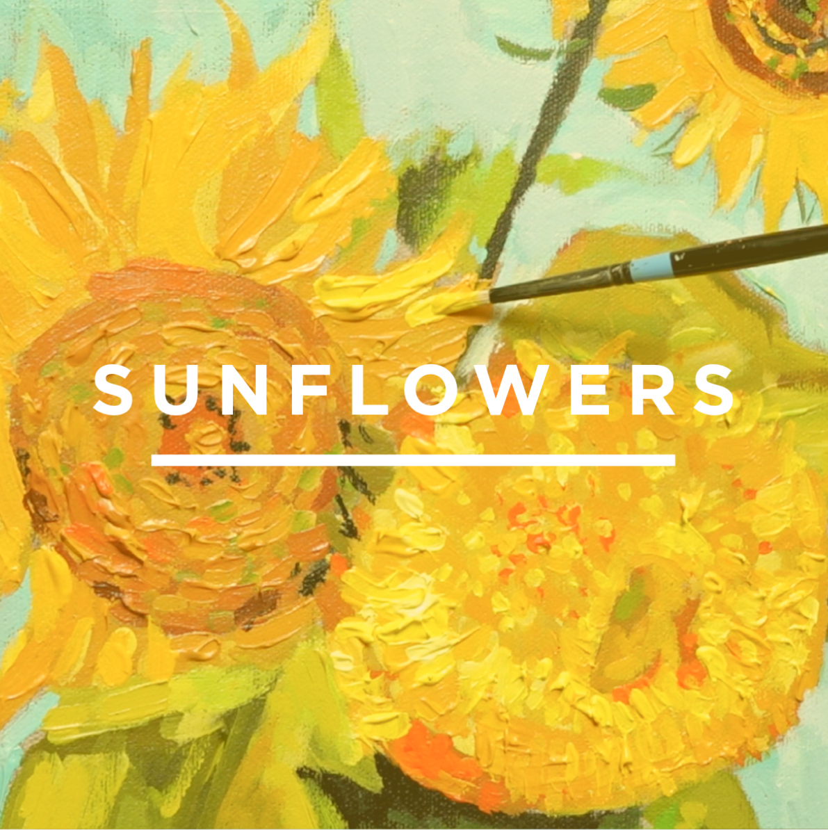
1 x Van Gogh-inspired Sunflowers painting from start to finish, based in the studio, working from a reference image.
13-lesson curriculum: Downloadable Video Lessons (with lifetime access to these recordings)
Step-by-step acrylic painting lessons that you can follow at your own pace.
A clear, easy-to-follow process for building the painting in stages.
A drawing template to help you overcome the blank canvas and get started with confidence.
LIFETIME ACCESS to video lessons, download on separate devices, keep forever.
Over 4+ hrs of detailed video instruction.
(I demonstrate the course with acrylics, using gels and thicker paint to create texture, but you could also adapt the approach to water-mixable oils or traditional oils if you prefer.)
In this course, we’ll observe one of the most expressive painters in art history: Vincent van Gogh.
Best known for his bold use of colour, thick impasto brushwork, and paintings filled with emotion and movement, Van Gogh transformed simple subjects into something unforgettable.
And few subjects capture that better than his Sunflowers.
Van Gogh painted his Sunflowers series after moving to Arles in the South of France in 1888. It was a period of hope, ambition, uncertainty, and intense creative energy. He was searching for his own voice as an artist, and in these paintings we can see his brushwork becoming looser, his colour choices bolder, and his style more personal than ever before.
I’ve chosen this particular version of the Sunflowers, ‘Three Sunflowers in a Vase‘ because it beautifully captures the warmth, optimism, and intensity of that moment.
At first glance, it looks like a simple vase of flowers.
But when you look closer, there’s so much to learn.
Thick paint. Directional marks. Broken edges. Subtle yellows. Muted greens. A background that shifts and glows. Brushstrokes that don’t just describe the subject, they become part of the experience.
You’ll learn how to build a painting in stages, starting with a simple grid drawing and moving through the background, tabletop, vase, leaves, and sunflower heads.
We’ll look at how Van Gogh used colour relationships to create impact, how small areas of contrast can bring a painting to life, and how to use thicker acrylic paint and gels to suggest the texture and energy of impasto brushwork.
If you’re unsure of your drawing, no worries. We use a simple grid method to help keep everything in proportion and make the subject feel much more approachable.
And if you’ve ever looked at Van Gogh’s paintings and thought, “I’d love to paint with that kind of freedom, but I wouldn’t know where to start,” this course will guide you through it step by step.
So grab a brew, maybe a straw hat, and let’s paint Vincent’s Sunflowers!
Is this course for me?
“I’m not good enough.”
Van Gogh often felt the same way. He compared himself to other artists, questioned his abilities, and struggled to achieve what he saw in his mind. Yet he kept painting. Every brushstroke was a step forward.
“I’ve left it too late.”
Van Gogh didn’t dedicate himself fully to art until he was 27. Art doesn’t ask when you started. It asks whether you’re willing to start.
“What if I never develop my own style?”
Your style isn’t hiding somewhere waiting to be discovered. It grows through practice. Van Gogh’s famous Sunflowers weren’t the beginning of his journey. They were the result of years of observation, experimentation, and changing. The same process is available to every artist who is willing to pick up a brush and begin.
“I don’t know if I have talent.”
Talent is overrated. Before you write yourself off, ask yourself a different question: have you actually given yourself the chance to learn? Van Gogh certainly didn’t look like a genius when he started. His early drawings were awkward, his paintings were dark and heavy. Most people decide they don’t have talent long before they’ve given themselves enough time to improve.
This course isn’t about proving you’re talented. It’s about discovering what happens when you stop judging yourself and start painting.
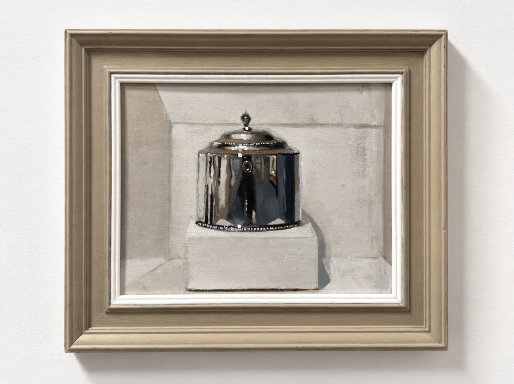
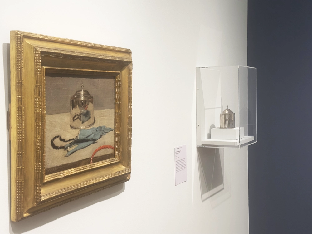
Before starting a larger painting, I almost always create a “postcard” colour study.
This small-scale version helps determine if the concept will work at a larger size and provides a roadmap for the painting process.
These simple studies allow you to plan composition, colour balance, and value structure before committing to your final piece. Solving problems at this manageable scale gives you confidence and clarity before investing time.
Think of this as a visual test lab for experimentation and discovery. Although painting the same subject twice may feel like a waste of time, the insights from a quick study help avoid frustrations that can emerge later on.
There is nothing more daunting to a beginner artist than the question, “How much do you charge?”
Putting a price on your artwork can make your stomach drop, trigger imposter syndrome, and cause you to get flustered.
The idea of selling your work can sometimes lead to giving your paintings away for free, convincing yourself that the ‘exposure’ will bring future commissions.
With this in mind, I wanted to share my experiences with the emotions that can hold you back, the factors that influence the value of your art, and how to develop a pricing strategy. Hopefully, this will give you the clarity and confidence you need so you’ll be prepared the next time someone asks about your prices!
Last week, we explored Carlson’s theory on angles, and I received an interesting comment from a reader asking how complicated it would be to apply the principles to colour.
“I especially love black and white painting. I’m looking forward to trying this. How does it work then with colour? Seems it could get quite complicated.” – Laura
Well, it’s simpler than you might think!
I thought it would be handy to demonstrate painting trees using just four colour mixes. I’m using water-mixable oils, but you can follow along with acrylics or traditional oils too.
As a beginner landscape painter, it’s easy to feel overwhelmed by the vastness of nature and the complexity of capturing it on canvas. But when you break down the scene into shapes, values and planes, you can instantly improve the sense of depth and realism.
In last week’s post, we looked at the theory of angles and how they relate to a landscape.
This week, we’re going to put the theory into practice.
By stripping away the colour, it will be easier to see how the value relationships work in our subject.
Materials you will need:
4 x 4-inch or 6 x 6-inch square canvas board or canvas paper
Often, the biggest obstacle to success is overcoming the worry you’re wasting your time learning a new medium that doesn’t ‘fit’ your style, or you don’t have the talent to be an artist or, worse, wasting your money buying loads of art materials that you end up not using!
Getting over the Frustration Barrier
“Many things aren’t fun until you’re good at them. Every skill has what I call a frustration barrier, a period of time in which you’re horribly unskilled and you’re painfully aware of that fact.” Josh Kaufman – The First 20 Hours
Even uttering the phrase “I am an artist” can stir feelings of self-doubt. But take heart – every creative feels this impostor syndrome. What matters is moving forward anyway.
The main thing to grasp is that painting is a teachable skill anyone can develop, regardless of innate talent. Some people prefer to take classes with a live instructor, while others prefer to learn independently.
There is a place in the art world for every single artist, and it’s never too late to begin painting.
The main thing to realise is that painting can be learned; it’s a skill that can be developed.
I hope this guide gives you insight into not just materials and mediums, but also a window into the possibilities.
Skill vs Talent (Talent is Overrated)
A Fan Brush used for blending
Can I learn art if I have no talent?
Sure you can.
Can you learn how to bake a cake if you have no talent?
100%.
It’s the same approach. It’s not about natural talent but learning a new skill.
Beginning painting is learning to embrace experiments and find inspiration in your mistakes.
‘Happy Accidents’ can be the beginnings of creative breakthroughs, so be open to when your painting ‘goes wrong’ and try to see what new lessons can be learnt.
Talent is overrated and can be an excuse you can rely on rather than putting in the time on the foundations. The path to success in learning any new skill is focusing more on improving the fundamentals.
“Skill is the ability to do something. Talent is the rate at which you can acquire the ability to do something.¹ If you have a talent for the guitar, that means you will learn to play the guitar faster than someone who doesn’t have a talent for the guitar. If you don’t have a talent for the guitar, that means it will take longer to learn to play the guitar than it would if you did have some talent. For most things* in life, talent doesn’t really matter. The rate at which you can acquire the ability to do something doesn’t really matter. What really matters is the length of time you can do something.” – Billy Oppenheimer
This quote is so true, “what really matters is the length of time you can do something“.
If you set yourself a goal of creating one painting, you will face problems.
If it goes well, you’ll be worried that the next one won’t be as good, so you’ll procrastinate on continuing.
If it goes badly, you’ll convince yourself you have zero talent; painting isn’t for you, and all those teachers were right.
So what’s the answer?
Start an experiment.
Let’s say you’ll try to paint 100 paintings before you decide if it’s for you.
Does 100 sound too many? It’s estimated that Picasso created 13,500 paintings and around 100,000 prints and engravings.
And don’t get put off if you’re coming to painting later in life. Your unique experiences and perspectives can inform your practice and tell your journey. (Range: Why Generalists Triumph in A Specialized World By David Epstein is a great book on this)
I teach classical painting methods in oils and acrylics that focus on fundamental painting principles.
My philosophy is less is more. A distilled approach to classical painting. A solid foundation for anything you choose to paint, regardless of subject or medium.
I help other aspiring artists not make the same mistakes I did, so if you’ve ever dreamt of picking up a paintbrush and filling a canvas with colour but don’t know where to start, let’s go on a creative journey together to discover how to ‘see’ like an artist.
Students often ask me, ‘What essential materials do I need to begin painting?’
Winsor & Newton Cotman Travel Watercolour Kit
When you are learning anything new, you want to get the best results without investing too much too soon, so before we get into materials, I found it usually helps to begin with the end in mind.
You need to decide on your medium, and each medium has its own charm.
What are you trying to emulate, or what artists are you trying to recreate?
Make a note of paintings you like the style of, what they were painted with and the effect or technique you want to achieve.
You might have tried watercolours and got buckled paper or put off using oils due to the dangers and smell of turpentine (but not realise how far modern oil materials have come.)
You might be much happier with pencils and sketchbooks than painting on canvas.
You’ll get faster results if you can match the correct medium to your personality, aspirations and experience, but knowing which medium will suit you best is impossible until you try.
When you’re dealing with any paints, there are a few things to consider:
Handling properties
Drying times
Surface that you want to work on to
Implement you want to use to apply the paints
Environment or the space you’ve got available to you
Oil Paint
Oil paints can be amazing to work with, from quick Alla-prima oil canvas sketches to photo-realistic oil portraits.
They have a lovely buttery consistency and a slow drying time, enabling you to make changes over a longer period, adjust shapes, or work wet-into-wet with thick impasto marks.
Oil paints stay workable for much longer than acrylics; the paint on the palette stays pliable.
And oils are king when it comes to blending colours.
Because of their slow-drying nature, you can enjoy the luxury of tweaking and softening your work, creating wonderful, subtle paintings. This is especially true for portrait painting when the shading of the face can need constant revisiting.
If you’re a bit wary because of all the solvents associated with traditional oil painting, you could use water-mixable oils (WMO’s) that you can dilute with water. (Watermixable Oils vs Traditional Oils)
Pro Tip: Even though you can use water with water-mixable oils, you still need to introduce a water-mixable thinner and water-mixable oil to get the best result. This will give you better paint flow and handling. Try to think of them as ‘water-cleanable’ oils.
Bear in mind that oil paint is a bit messy. I find it gets everywhere just because, well… it tends to get everywhere!
If you’ve got a house full of cats or small children running around, oil painting can make a mess; that goes for water-mixable oils, too.
With Oil Paint you can change your medium to alter paint handling qualities
Preparation is key. Due to the oil in oil paints (usually linseed oil), it’s best to work on a prepared canvas or board.
If you have plenty of time set aside for your painting, traditional oils can be fantastic, but if you want to work with thick paint, you need to consider drying times.
Each particular pigment needs a different amount of oil mixed with it, resulting in different drying times. e.g. Earth colours such as Burnt Umber are rapid drying, whereas Ivory Black takes much longer to dry.
Ensure a well-ventilated space; traditional turpentine and white spirits can be quite strong. I work with odourless mineral spirits or ‘Zest It‘ (a thinner made from citrus ) with very little odour compared to turpentine.
Many new solvent-free products, such as Gamblin’s Solvent-free Gel, are now coming to market, so there are plenty of alternatives. These offer a way of diluting the oil paint without using traditional solvents; you can also clean your brushes with walnut oil (Murphy’s soap in the US gets good reviews).
Acrylic Paint
Professional Artist Acrylics have a higher pigment load than student-grade paints
One of the key things that make acrylics a great medium to start with is you can paint on anything: paper, card, canvas board, whatever you have to hand.
Set up is quick; they are water-soluble, fast-drying and water-resistant when dry. They clean up with water, and there’s no smell!
They can be used in thin layers like watercolours or in thicker, more opaque applications like oil paint.
You can mix clean, bright colours, and the crisp edges that can be achieved with acrylics can be perfect if you want to paint with a more graphic composition. You can quickly mask out areas, work over them, and easily cover a hard shape with thicker paint.
Blending with acrylics can be a bit frustrating due to the speed of the drying time; acrylics dry by evaporation and tend to dry quite quickly.
Artists refer to this as having a short ‘working time’; however, this can vary depending on several different factors; the main ones are:
How thick or thin is your application of the paint
The absorbency of the surface you’re working on
The size of the painting
What you dilute the paint with, either water or a specialist medium
The heat and humidity of the environment you’re painting in
If you are working on a large scale, it can be practically impossible to work the canvas as a whole to bring together the same finish. But apart from working quicker or on a small scale, you can add a medium to the paint to help keep the working time open for longer. Soft gel gloss, a retarder (slows down drying time) or my preferred choice, glazing liquid gloss, make achieving smooth blends with acrylics easier.
Beautiful graded washes, translucent colours, seamless transitions, a quick drying time, and super reasonably priced to get started. You can buy a Cotman travel kit, a pad of watercolour paper, a couple of brushes and get going!
If you want to paint outdoors, watercolours are a great option because your kit is pretty compact. Quick, impromptu watercolour sketches of a little plant next to you or a study of your garden always look pretty good in my experience.
Watercolour is all about washes and contrasts over line work, so you must know your drawing skills.
You can, of course, paint abstractly to produce swirls, blocks and washes, but if you’re trying to create a scene, a landscape or a realistic still life, there will usually be a fair amount of a drawing element to it.
When you paint with acrylics or oils, although the initial sketch and drawing out are still important, you can build up the painting through the form using an opaque application, whereas, with watercolour, you’re traditionally washing over a line. (Here’s an Ink and Watercolour demo)
So, what are the essential beginning painting materials I would need?
The Winsor & Newton Artists’ Choice Professional Watercolour Set of 18 half-pan colours would be a great start for new watercolourists. Great pigmentation and these little pans last a really long time.
You could get away with one good brush, but ideally three brushes, and you could probably do 80% of the paintings with these three brushes.
a small round
a medium round
a bigger mop brush
For watercolours or gouache, brushes are usually soft, have a spring and can hold water. Most traditional brushes are made from animal hair, and the quality of the brush’s bounce and feel depends on the quality of the hair used. But you can get really good quality synthetic brushes now, too. You can read aboutA Quick Way to Understand Brushes here.
Flat & Round Synthetic Acrylic Brushes (Isabey Isacryl, Rosemary & Co Golden Synthetic, Princeton Aspen)
I think a great starter set for acrylic painters would be the Winsor & Newton Professional Acrylic Colour Set of 12 20ml tubes.
Again, a handful of brushes would be a great start.
a small round for detail
a flat brush
a Filbert brush,
and a bigger brush 1 1/2 inches for laying down the tonal ground
And Glazing Liquid Gloss as your medium.
Michael Harding Introductory Oil Painting Set
And for oil painters, I’d start with the Michael Harding Introductory Kit. The set consists of six tubes of 40ml paint: Titanium White, Yellow Lake, Ultramarine Blue, Yellow Ochre Deep, Burnt Umber and Scarlet Lake.
When it comes to the brushes, it is definitely easier to have more and, ideally, be able to hold a few brushes in your hand at the same time.
For example, if you’ve got a white brush and want to go from white to black with oils, it is really tricky.
It takes loads of washing, impeccable cleaning or a huge load of paint to transfer or change oils from light to dark. It’s very easy to end up with muddy colours on your canvas and messy everything else, so ultra-clean practice of brush handling is key here.
You’ve got to spend more time colour mixing, then make a mark and leave it to keep a clean colour, gently blending out the edges.
The other difference with oils is you need less paint, so you only need to put out a tiny bit of pigment. It will last ages, and a small paint volume will have good coverage.
When it comes to the mediums, you can use an odourless mineral spirit, like Gamsol, to cut through the paint to thin it. An oil medium to add flow and oil. Or one of the many non-toxic mediums as an alternative to using a thinner.
How do I set up a basic painting workspace at home?
Firstly, consider light and ventilation.
Essentially, the easiest thing is to have a table and a slightly angled board or a tabletop easel because then you can sit behind and paint in the right light.
You can sit next to a window, but it will vary depending on what time of day it is or how dark it is.
An LED bulb or an LED panel behind and above you is the best thing to get. Clipped on, looking down onto the easel.
This, again, will depend on if you’re using oils, which are a bit trickier because they often get a glare onto your canvas. So you have to make sure you’ve got the hang just right, or you can adjust the angle.
Have a kitchen roll or rags for cleaning up and a bin, and make sure you have a metal bin for oils because of the fumes and good practice with the rags disposal.
What are some of the fundamental basic techniques I should focus on as a beginner painter?
It sounds boring, but working with black and white to work on your tones, value, and contrast is fundamental. Paying attention to the value (lightness and darkness) of colours and learning to create contrast in your paintings is essential for depth and visual interest.
And then, after that, I would work on colour mixing because if you’ve got your tones and colour mixing right, everything else falls into place.
And also not to forget, drawing.
I always say most painting mistakes come from your drawing mistakes.
You need more brush techniques with watercolour. With this medium, mastering brush control is key for achieving textures and effects, such as variated wash, wet into wet, lifting and blooms.
You’ll be thankful for that larger brush that holds more water!
When you’re working in acrylics, my top tip would be use more paint than you think you would need.
And with oils, make sure that you don’t drag or you don’t reapply; it’s so easy to make colours dirty. Ideally, you’d lay a colour down, leave it, and then work over it to blend the edges.
How do I choose a subject to paint?
Begin with simple subjects and compositions, and you can tackle more complex scenes or ideas as you gain confidence.
If you are looking for simple projects, I’d recommend signing up for the email newsletter, if you haven’t already. There are 10 references to work from; just pick one of them and follow it.
I often find beginners want to put their own mark onto a canvas; even when they’re first beginning, they don’t want to copy something. But if you look at any of the Students Success Pages, everyone following the same image with the same colours has their own character and natural style. It’s almost like having your own handwriting but with painting!
So, when you are learning, I recommend copying the basics until you understand the language of paint.
Which of your courses would you recommend?
The Beginners Acrylic Painting Course gives a good overview of different paints, such as high-flow acrylics, heavy-body acrylics and different mediums.
There are three different projects: a still life, a seascape and a landscape.
Alternatively, if you did one of the Morning Painting sessions, like the Modern Still Life, you would just have one subject, five colours, and three brushes.
It’s super simple to get started. There’s a drawing guide that you can follow along and you get to a finished painting quicker because it’s more focused.
Remember, painting should be enjoyable!
Let your creativity flow, and don’t be overly critical of your work; it’s all part of developing your ‘talent.’
Welcome to my NEW Acrylic Painting Course, Coastal Canvas!
This impressionistic seascape is all about simplicity.
It has been designed with short 10 -20 minute ‘micro-learning’ lessons, so you’ll build your knowledge, even if you’ve never painted seascapes. The project is so simple that you’ll have a finished painting in a few short sessions.
In this course, we view the coastal path across gentle waters, where sailboats are harboured up or just coming into the dock.
Set in the early evening golden hour light, the foreground has a secluded coastal garden with pink hydrangeas in full bloom; the greens are dark, cool and olive in tone and frame the passage of the sea.
Then, in the far distance, you’ve got a warm headland of pastel yellows and greens glowing from the golden light, creating a contrast of values and tones of greens from the foreground to the background, and then just a glimpse of a white lighthouse in the far distance.
Loosen Up Your Acrylic Painting
Many beginners think that painting the sea is too hard or that getting a convincing perspective is beyond them and that they need special drawing skills. But in reality, all you need are simple shapes, scale and a framing shift when mixing your colours.
This course is designed for beginners, with a simple subject (even if you’re brand new to drawing) and a limited palette of colours.
Learn how you can keep your brushstrokes simple and the subject fresh to create an impression of a scene rather than a photorealistic rendering. (You could also follow along with Watermixable Oils or Traditional Oils.)
I’ll walk you through how to mix colours, analyse pigments and distil your subject into a compelling painting. We’ll cover the preparation of your surface & drawing out, observing the composition with sketching and scale, and keeping the boats in scale to give that sense that they’re in the distance.
Inky Depths to create realism.
Change the intensity of the greens by changing the pigments, lose the fear, and embrace black in landscapes and seascapes. You’ll discover you don’t need to go bright with your greens in order to make them feel realistic. In fact, less is more; the more darker and muted your greens are, the more realistic they will read in a landscape painting.
When capturing coastal light, sea and sky, understanding the undertone and colour bias of the different blues to achieve the glimmering reflected lights.
When it comes to the details of flora and focal points, we keep things gestural and impressionistic, looking for passion, not perfection.
By the end of this course, you’ll have that insight into the hidden under-workings of a painting, teaching you classical painting skills alongside impressionistic brushstrokes.
Gained confidence that you could create a painting from a simple subject, motivating you to tackle different, more challenging views from your own photo library.
Capture the Essence, Not Every Detail.
Learn how to paint realistic headland by controlling your colour intensity
How to create a ‘vignette’ with your foliage to frame your view
How to paint the sea by using colour strings
How to control water flow and absorption
How to select an image that will translate well to paint
How to check if a subject will make a compelling painting subject (by creating a postcard prep study)
There are some intermediate lessons where we expand the colour palette, but each step is described clearly and succinctly.
What’s in the Course?
1hr 45min Self-Paced Downloadable Video Course
1 x Seascape Painting subject from start to finish, working from a reference image.
8-step-by-step video lessons (split into ‘micro-learning’ sections.)
DRAWING TEMPLATE – line drawing to follow to help you overcome the blank canvas
TOOLS & MATERIALS: Downloadable Materials List PDF
REFERENCE IMAGES: Downloadable Line drawings.
Study at your own pace ✔
Over 1hr 45min+ hours of detailed video instruction ✔
Full Lifetime Access to the Lessons ✔
One-time Payment ✔
Who this course is for?
A beginner to acrylics who wants to gain confidence in their painting by following a step-by-step proven plan. An aspiring artist who loves the sea and the coast and has folders of photos they would love to capture in paint but are unsure of the best approach.
This week, I’ve been working on a Spritz cocktail painting inspired by one I enjoyed in St Mawes.
This subject offers an excellent opportunity to practice capturing reflections in water and exploring how coloured liquids can challenge our visual perception.
While painting the background and the surface around the glass might be relatively straightforward, the real challenge arises when we start painting the cocktail itself. Your mind will naturally begin to second-guess what you’re seeing. Thoughts like, “That’s too dark for a lemon,” or “The straw should be white, not grey,” might pop up.
You’ll be craving a cocktail yourself after tackling all these tricky reflections!
Painting large scale is not just a matter of having the right size canvas and paint. It’s also about adopting slightly different working methods and brushstrokes than when you work with a small canvas, and it’s one of the best ways to stretch your skills as a painter, even if you predominately paint small.
After months of renovation, I have recently regained the use of our new studio space. For the last 6 months, it had become the perfect place for storing multiple power tools and timber that needed acclimatising. It has been uplifting emptying the space of leftover building materials back to an empty room.
So last week with great relish, energy and anticipation, I propped up a large-scale 2m square canvas against a newly cleared wall and got to it.
I had a loose plan of the final image.
I’d sketched a pen and ink thumbnail of the view and had a palette of colours in mind but if I’m 100% honest I was super excited by the freedom of painting in a big space and seeing how the new studio felt.
Here are five things I learned.
#1. A little colour change is a big colour change.
Mixing the right colours for a large scale is not easy.
On smaller-scale pieces, your reference image is often close in size to the final piece, so you can translate the effect of the colour quite easily, but when you scale up an image everything becomes exaggerated.
As soon as you scale up the surface area that a colour covers, it has more of an intensity to it. The same colour ratio I would normally go for in a smaller piece looked more colourful once it was painted onto such a vast area.
#2. Scale up your brush to match your canvas size.
Just as you have to be aware of scaling down your colour choices and scaling up the volume of paint, you have to use larger tools to apply the paint too.
I rapidly went from a 1/2-inch brush to a 3-inch brush to a mini-roller!
Morning class, last week I was struck by this image of these beautiful colourful cast shadows.
Spring sunshine was pouring through the wrought iron railings on the balcony and casting all these amazing shapes of the plant leaves onto the studio wall. I really, really liked the way they framed the rubber plant and I also liked how flat the shadows were in contrast to all the textures that I saw on the front of the aged terracotta pot.
You can be put off by painting shadows or tackling greens because they seem too complicated.
So for this lesson, I want you to think about the drawing first—a tonal underpainting and then a minimal painting on top. Spend more time on the shadows and the lights to create a painting that captures the feeling of sunlight.
I’ve put together a detailed photo step-by-step (with a few video time-lapses as well), so you can approach painting shadows and greens with ease.
I had an email from a student recently with a great question,
I’m wondering how to start painting this picture. There are so many colours, trees and bushes so I think it gets so messy. Do I start with the sky in the background and work my way forward and finally paint the trees? – Ulrikke
The photo that accompanied the email was a scene crowded with trees. Lots of layers all on top of each other, overlapping leaves and foliage coming towards the viewer with almost no visual sky.
Will Kemp, Fishing Boat at St Michael’s Mount, 10 x 8 inches, Acrylic on Board
Acrylic Step-by-Step Tutorial
Are you looking for an easy acrylic painting tutorial for beginners?
After posting photos from my recent trip to St Michael’s Mount, the most popular request was to create an acrylic step-by-step tutorial of the little blue boat. So here it is, a new free acrylic lesson!
Grab a brew, maybe a biscuit or two (now the weather’s turning a bit more autumnal I’ve got a piece of particularly good ginger cake from the local farmers market) and let’s get painting, I really hope you enjoy it.