
A Simple Leaf Step-by-Step Tutorial
Following on from last week’s lesson, where we looked at the problem of the midday sun, I’ve put together a simple study in shaded light.
In this acrylic step-by-step, we look at creating a green ‘colour string’ and working on separating the darks and lights in a leaf-dense subject.
Downloading the reference photograph
The photo can be downloaded, and printed out, and follow the steps below.
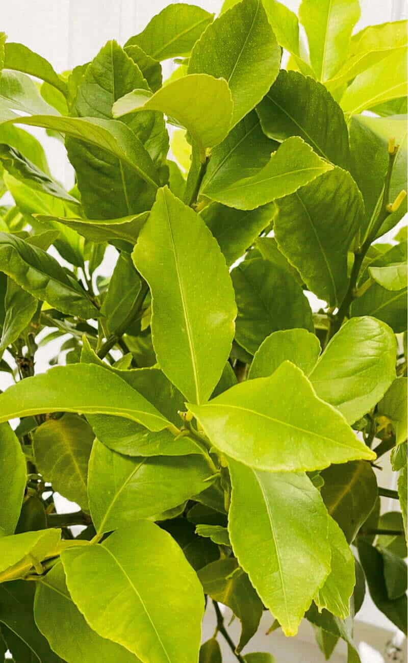
Looking at the reference image, there are two main groups of greens.
A warm yellow-green in the lights and then a darker olive green in the shadows.
There are a few sky holes in-between the leaves, creating a lovely pattern of negative spaces. We can use these to help guide our drawing, but they also add an edge that helps define the shape of the leaves in the final piece. There are lots of overlapping hues in this cluttered composition, so it’s a case of trying to simplify the visual information to create a painterly impression.
Materials you will need:
I used a piece of board I found in my studio, which was around 33 x 20cm. I’ve scaled down the reference image above so it fits onto a piece of A4 paper for ease of printing out; it’s the same ratio as my board but a slightly smaller size.
I also prepped the board with a couple of coats of acrylic gesso (I like the one from Golden Paints), but you could also use a canvas or acrylic paper.
Paints:
- Titanium White (Golden Paints)
- Cadmium Yellow Light (Golden Paints)
- Hansa Yellow Light (Golden Paints)
- Raw Umber (Golden Paints)
- Cobalt Blue (Golden Paints)
You could also use Bismuth Yellow in place of Cadmium Yellow Light and/or Burnt Umber instead of Raw Umber.
Brushes:
- Flat – Jacksons Arts Procryl, size 6.
- Round – Winsor & Newton Galeria, size 4
Ground Colour

I start by applying a tonal ground colour of Raw Umber and Titanium White mix to the board. I use a palette knife to mix the two pigments together on a tear-off palette, starting with the white and then adding a little Raw Umber at a time.
The paint I’m using is a heavy body acrylic paint, so has quite a thick consistency. I want a thinner, more fluid application, so I dilute the paint with a mix of 50/50 water and Airbrush Medium. You can just use water, but the Airbrush Medium helps to maintain paint film integrity when working in more transparent applications.
I apply the colour with a flat decorator’s brush in a thin application that creates an opaque covering. I don’t want it too thick because you still want to be able to draw on top of it. Leave that to dry, which will take around 10-15 minutes.
Drawing out

Sepia High Flow Acrylic, FW Mixed Media Marker and 1.0mm hard nib
I’m using a 1mm hard round nib with a Daler Rowney FW Mixed Media paint marker to draw out the main leaf shapes.
I love this pen because the paint marker comes empty, which you can fill with any fluid paint or ink you like. I’m using Sepia high-flow acrylic, which I’ve found is a good neutral brown and fluid consistency.
I use this pen a lot; if you hold it upright, you have the fine point, but if you hold it in an overhand grip, you can use the side edge for a wider chisel mark. It also works well out and about for urban or landscape sketches because if you want to later add a wash effect or more colour to your piece, you’ve already got an acrylic base. You can use the same hi-flow acrylic and the ink is already sympathetic to the painting.

You can judge how thin the ground colour application is but the visible texture of the wooden grain.
I hatch the areas that will be in shadow and try to keep the line work fluid and loose.
Blocking in shadow shapes

Once that’s drawn out, I use a bit of the sepia high-flow acrylic diluted with airbrush medium and a #4 round brush.
I apply it in a thin wash as if it were a watercolour painting. I’m looking at the tonal values to try and group my darks and lights, so I’ve created a first map of where things are placed within the painting.
Adding the background

With Titanium White, I paint in the negative spaces and shapes around the leaves.
Mixing a yellow

When looking at the greens in the reference, I wanted to mix a yellow base that all my greens would come from, that was halfway between a cool yellow (Hansa yellow) and a warm yellow (Cadmium yellow). If you have a Bismuth yellow, you could use that too.

Once I have my yellow base mix at the top, I can mix a range of four greens from it, creating a colour string. I’m looking for small incremental jumps in tone.
For the first green, I start by taking some of the yellow base and adding a little Raw Umber to mute it down. For the second mix, I take some of the first mix and progressively add more Raw Umber each time, and so on down the string.
At the bottom of the string, as well as the Raw Umber, I increase the intensity by introducing a tiny touch of Cobalt Blue to the last two greens.
I wash in a thin application of the lightest green over the leaves I can see in the light.

I then work down the values of the colour string to indicate the light and shadow pattern on the face of the leaves. Notice the brushmarks are definite, maintaining a flat stroke; I use painterly marks, not getting too concerned with blending.
Where the light is hitting the lightest parts, I add a little white into the lightest green in my string, for a cooler tone.

To create this deep olive green for the shadow area, I add more Raw Umber into the darkest green mix on my colour string. I’m applying this in one flat block-in throughout the entirety of the shadow shapes.
Once the darks are in, I felt the lights could have a bit more vibrancy. I can also judge the colours more clearly now, and feel more confident about going thicker with the paint, so I reinforce the saturation of the lighter greens.
At this point in a painting, knowing I’ve got a good foundation down, I can be more intuitive, looking at the painting, what looks out etc.. rather than being so focused on the reference image. I can be freer in my mixes and marks.
So I start to introduce different variations of greens within the shadows and onto the front of the leaves by working up and down the colour string and using the Raw Umber to mute down and darken the hues and the Cobalt Blue to add intensity.
I noticed the top leaves were a too sharper line, so I soften that edge to draw the focus more towards the centre of the painting. I then look for the lightest lights and mix a lighter cool green adding areas of light detail. I’m still painting using the technique of placing a brushmark down without trying to blend it too much to maintain a fresh impression.
Hope you enjoy it, and if you’d like to learn more about mixing greens, you might enjoy these demos:
How to Paint Green Summer Trees with Acrylics – Video Tutorial


Thank you, Will, for giving us another excellent opportunity to work on our painting skills…and our greens. You are a positive, inspirational, teacher.
Thanks Janice, really hope you find it helpful.
Will
Thank you Will,
Greens can be a challenge. Your mixing green tutorial is most helpful..
Hey Pat, yes, if you start with more subtle colours and then creep up on the greens, it can make a real difference in them feeling more natural.
Will
I’ve learnt such a lot from this tutorial! Thanks, Will.
Good one Sarah, so pleased to hear.
Will
Thank you Will for sharing your talent and helping to enjoy painting with beautiful greens !
I enjoyed very much !
Be well , Blessings!
Cecilia
Thanks Cecilia, pleased you found it helpful.
Will
Will,
According to Golden’s website Hansa Yellow Light and Cadmium Yellow Light are right next to each other on the scale of yellows looking at the color bias from green to red (both are green biased.) So, I don’t think you need to mix them. Check out this color bias page, it is very nice to have.
file:///C:/Users/Owner/Documents/Art/cool-to-warm-order-for-golden-heavy-body-acrylics.pdf
Hey Jay, in the demo I wanted to shift the Cadmium Yellow Light to be cooler, so mixed in the Hansa Yellow Light. Hansa Yellow Light on its own wouldn’t be opaque enough, so the Cadmium Yellow Light gives the opacity. If you had a Bismuth Yellow (listed in the materials list alternatives) it gives the best of both worlds for this image but not all students have it in their palette.
Hope this helps,
Will
Hi Will! Thank you for another great art lesson! Flowers and botanicals are some of my favorite subjects and mixing greens are always tricky. I’m sure I will use this information a lot, Your explanations are always so clear and informative. I will look for the bismuth yellow asI am trying to avoid Cadmiums. Great tip.
Good one Nancy, Bismuth is a great colour to have as a Cadmium alternative.
Thank you Will, I’m looking forward to having a go at this.
Foliage was always a difficulty for our early artists here downunder, with our excessive light, blue gums and diversity of species north in tropical climes to south in Vic and Tas which are more like the climate in Scotland.
I usually work in oil (currently trying out with your help-water mixable oils) using mainly oil because I mix all my shades and never knew how to do it, well enough and keep it for long enough, using acrylics.
Cheers, Wendy
Good one Wendy, really hope you’re finding the water-mixable oil course helpful.
Will
Hi Will! In the article you said ‘I use painterly marks, not getting too concerned with blending.’ Can you expand a little on what you mean by ‘painterly’? I find that I get wrapped up in blending, and detail in general, way too early and I’m not sure how to break the habit. Thanks for all you do Will! – Justin
Hey Justin.
Painterly, as in you can see the brushstrokes and paint bristle texture rather than super smooth to look like a photo.
Will
Your teachings are great. Much appreciated! Especially the names of paint colours. And your idea to draw in the picture content with the marker that can be refilled is also new to me. Thank you so much!
Good one Betty, pleased it helped.
Thank you so much Will, I like to follow your instruction. It’s easy to understand and very helpful !
Vivian Ho
That’s great to hear Vivian.
Thankyou Will,
As always, for the generosity of sharing your knowledge.
Despite art school decades ago, I was never a painter (photographer, printmaker, silversmith), I am finding acrylic a good medium for plein air, and studio.
Caz
Really pleased you’re enjoying working with acrylics Caz.
Cheers,
Will
Thanks, Will! I will face my greens, or the lack thereof, with new vigor!
Great to hear it Victoria!
I really enjoyed this tutorial. I have never thought of using an acrylic pen before, what a great idea! I do have a question: how do you clean the pen? And, will it dry out between uses? Thanks so much!
Hey Jauhara, you can just wash out the pen and get replacement nibs for different colours. Depending on use, if using the small tips they can dry out if left for a few weeks without using them. If you use a thicker nib (like the Liquitex chisel markers) they tend to keep workable for a longer period of time.
Hope this helps,
Will
Hi Will,
Gosh, I can’t believe how long I have been following you….I tell everyone about you! Although my landscape paintings are really limited to a leaf or maybe grass, I mostly paint animals, and they are mostly done in oil. I use acrylics for my smaller work.
I have been using fluid acrylics, have you used them? I love and hate them, and greens, omygosh grrr. blending is my biggest problem as they dry so darn fast. Adding a medium helps.
Any suggestions? Thanks for the ‘greens” and the acrylic pen idea…will try !
Hey Ellen, pleased you’ve been enjoying the lessons and thanks for the recommendations. Yes, fluid acrylics can be great in certain applications and can intermix with the heavy-body if needed. You might find this article helpful on understanding the approaches to dealing with the fat drying nature of acrylics :7 Ways to Stop Acrylic Paint Drying too Fast
Cheers,
Will
Hi Will,
Thanks for another great tutorial! I think I’ve taken all but one of your courses and have enjoyed them all! I’m not sure what your planning in the future but I’d love to see another class using the water soluble oil paints but on a landscape study.
Thanks, Catherine
Thanks so much for your support Catherine, and great to know a landscape water-mixable oil course would be of interest.
Will
Maravilloso, como siempre!
Gracias Will.
Regards.
Mi placer Tamara!
Hi Will and thanks for sharing this.
Two questions if I may; can I complete this painting in water mixable oils? As these are all I have and practise with?
Secondly are you planning any ‘intermediate’ still life and landscape courses using the medium I use?
I’ve followed a course in the past which I completed and enjoyed doing so.
Kind regards
Geoff
Hi Geoff, yes, you could complete this using WMOs. Glad you enjoyed the previous WMO course and good to know an intermediate lesson would be of interest.
Will