Green.
Love it or hate it, almost all landscape artists want to paint trees, woods and grass realistically.
But mixing greens can be one of the major issues that can start to throw your landscape painting off-course.
Greens can be an Achilles heel for beginners, and the urge to grab a vivid, bright green from the paintbox can be hard to resist.
In the past, I’ve demonstrated how you can achieve some surprisingly subtle greens by using some seemingly ‘non-green’ colours such and black and brown.
And I advise beginners to throw out their pre-mixed green (usually this is Emerald Green included in starter sets) when they’re first starting, in order to practice colour mixing with acrylics and develop their own mixing skills and gain colour confidence.
Why?..
Because greens with a high-tinting strength can easily put your colour mixes out.
Tinting strength is how much or how little paint is needed, to alter the colour of white paint.
In acrylics, this can be especially dangerous because you tend to have clean mixes on top of dry paint, so there is nothing underneath to mix in with it to help tone it down – unlike oils where you are usually applying wet-into-wet.
For this Summer Landscape study, I want to show you how to mix naturalistic green using 2 or more colours first – and then as we become more practised, we are going to live life on the edge when I introduce a high tinting pre-mixed green to your palette to speed up your painting process.
Using a pre-mixed green
There is one green that can give you a lot of bang for your buck.
Phthalo Green.
It comes in two different shades, a yellow shade and a blue shade.
The yellow shade brings out the yellows and gives a more vibrant yellow-green; the blue shade goes darker towards the bottle green-blues. I’ve found the yellow shade can work best for greens that are in the sunlight and blue shade when painting greens in the shade.
But they’re very close, so I personally tend to use a Phthalo Green yellow shade, and if I need a darker shadow tone, I add in Phthalo Blue, which I nearly always have on my palette.
Interestingly it’s also used as a key ingredient within many other pre-mixed greens.
Here is a list of paints from Winsor & Newton that contain Phthalo Green:
- Permanent Green
- Cadmium Green
- Emerald Green
- Chrome Green
- Hookers Green
- Sap Green
You can check if a green paint contains Phthalo green by looking at the Colour Index name on the paint tube and is usually only available on artist quality paints (See: The 8 key differences between Artist quality vs Student grade Acrylic paints)
- Phthalo Green (Blue Shade) Color Index Name: PG 7
- Phthalo Green (Yellow Shade) Colour Index Name: PG 36
Pro tip: Winsor & Newton sometimes refer to their Phthalo Green as Winsor Green, they also refer to a Phthalo Blue as Winsor Blue.
How to Lighten Green Paint
The two most common colours you’ll be using for lightening up green are white and yellow.
A white will always flatten the green and send the colour towards a minty green; yellow will always warm a green. You can change the intensity of the yellow you’re using depending on the subject and feel you’re after.
I want a wide bright tonal range in this painting, so I’m using a Cadmium Yellow Light.
Pro tip: An alternative to Cadmium Yellow is Hansa Yellow Medium, I do demonstrate in this demo with a Hansa Yellow Light, which is a greener, lighter, more translucent yellow. Hansa Yellow Medium has a warmer hue and more opacity.
How to Rescue an Unnatural Green Mix
If your mix goes too acidic, then the next skill to mixing green is how to tone the colour down.
From the palette we’re using there are several different ways you can darken and dull the mix. Either by using the Burnt Umber, Ultramarine Blue, Phthalo Green, Phthalo Blue or the Permanent Alizarin Crimson.
- The Burnt Umber will pull the colour towards a dark orange.
- The Permanent Alizarin Crimson will neutralise the intensity of the green.
- The Ultramarine Blue will pull the colour towards a purple-blue.
- The Phthalo Blue will pull the colour towards a green-blue.
A step-by-step Summer Landscape Painting in Acrylic
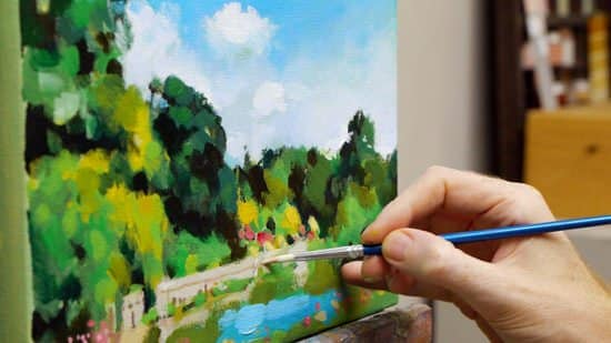
This season is perfect for getting bolder in your brush marks, technique and your colour palette. Impressionistic broken colour, vibrant green foliage and blossom, fuller tree shapes with abstract sky holes and moving cloud formations.
The atmospheric lighting has also changed from our Winter study, so now the light dapples on the surface of trees and mountains.
This changing effect can produce some lovely impressionistic style paintings and can allow you to really experiment with more painterly, impasto brushstrokes!
Video Tutorial – Part 1
Video Tutorial – Part 2
Video Tutorial – Part 3
Summer Greens
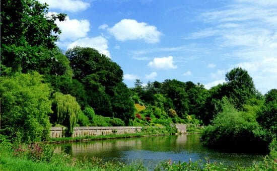
Photo Credit: “The Weir Gardens – Herefordshire” by Les Haines Licensed under CC BY 2.0. Please Note: The Original photograph has been cropped down to the Golden Ratio proportion used in the painting.
Downloading the reference photograph
The photo below can be ‘right clicked’ and ‘Save image as’, so you can use it as a reference image, print it out and follow along with the video above.
You can also download a High-Resolution Image here...
Materials you will need:
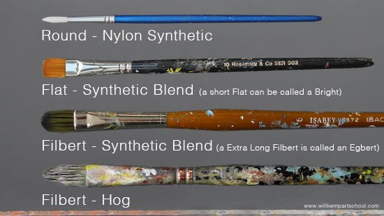
Brushes
- 2-inch Purdy decorators brush – XL Monarch Elite
- Round – Small nylon round brush – This brush didn’t have a brand name or specific size on the brush, any small round will be fine. The dimensions are approx 3-5mm in diameter and 1.5 – 2cm in length
- Flat – Rosemary & Co – Small Flat ‘Bright’ Golden Synthetic, Size 10, Series 302
- Filbert – Isabey Isacryl Acrylic Brush, Filbert shape, Size 6 – Series 6572
- Filbert – Isabey Isacryl Acrylic Brush, Filbert shape, Size 10 – Series 6572
- Filbert – Jacksons Art Black Hog Bristle Brush, Filbert shape, Size 4 – Series 335
Palette Knife
- RGM Classic Line, Medium size 45, Diamond-shaped, cranked (angled) handle. I use an RGM 45 for mixing the paint.
Support
- Jacksons Art (UK) 10 oz cotton duck canvas 20 x 32.4cm (Code: CJS2032) that has 2 coats of white acrylic gesso applied.
I demonstrate on a 10 oz cotton duck canvas, 19mm Profile, and the ratio I use for the main paintings are based on the Golden ratio.
An alternative brand in the US is Masterpiece Fibonacci Golden Rectangle Canvas.
Other Materials
- Kitchen roll/paper towel
- Clean water
- Tear-off palette or stay-wet palette (In this tutorial I demonstrate on an A3 size white tear-off palette)
Paints – The Colour Palette
Artist quality acrylic colours. I’ve used a mix of Golden Heavy Body colours & Winsor & Newton Professional Acrylic (also called Artists’ Acrylic)
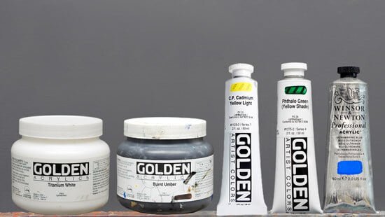
- Titanium White
- Burnt Umber
- Cadmium Yellow Light
- Phthalo Green (Yellow Shade)
- Ultramarine Blue (Winsor & Newton)
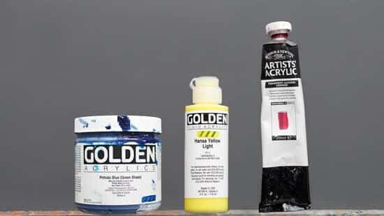
- Phthalo Blue (Green Shade)
- Hansa Yellow Light (Golden Fluid Paint)
- Permanent Alizarin Crimson (Winsor & Newton)
Mediums
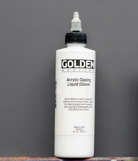
Acrylic Glazing Liquid (Gloss) Golden Paints. This will extend the paint’s working time and enable thin applications of the paint with smooth smokey blending. What I like about Glazing Liquid Gloss as a medium, is you can use it in any ratio in with your paint, and it still brushes well and remains a nice paint film integrity.
Step 1. – Choosing a coloured ground.
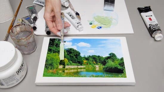
For this painting, I wanted a ground colour that would pull together the trees and the sky. The majority of the colours in the painting, apart from the sky, are green based. However, if you notice the clouds on the right-hand side, you can see a faint green hue within the whites.
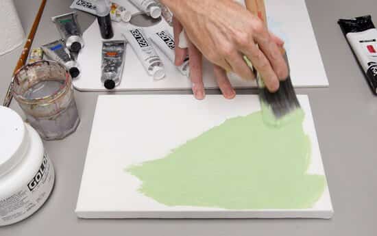
I start the mix with Titanium White, Ultramarine Blue and Cadmium Yellow Light. Once the paint is mixed to a light muted green, I then add the stronger Phthalo Green (Yellow Shade) to bring up the saturation.
It’s always easier to mix a muted base colour to start with and then add a small amount of the high-tinting Phthalo Green, rather than starting with the Phthalo Green. I’m using a 2-inch Purdy decorators brush to apply the paint thinly, so it just covers the canvas without building up any texture or thickness.
Step 2. – Drawing out
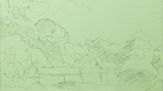
Using a 3B pencil (Staedler Mars Lumograph) I sketch out the basic tree shapes; I’m not drawing any detail – just squinting my eyes at the reference image to see the main outlines.
You’ve got all these different angular shapes that make up quite a lot of the painting, also there’s a lot of quite dark areas. The really strong light in summer creates all these lovely shadow shapes, and you see how I’ve indicated them with pencil cross-hatching, and they’re equally distributed throughout the painting.
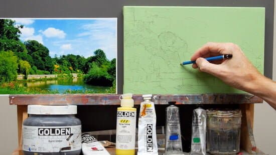
When the painting is finished, the dark areas will optically sink into the background. This wide tonal range of Summer, from the hard light of the sun, is compared to the soft light of Winter (See: How to paint an Acrylic Snowscene) where there is a compressed tonal range.
Step 3. – Blocking in the sky.
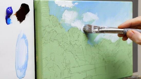
I would usually start by painting in the darkest darks of the composition, however, because the green of the coloured ground in the sky will affect our ability to judge the rest of the scene I start by blocking in the sky with a blue, making it easier for us to judge the tonal range of the greens within the trees.
Using a mix of Ultramarine Blue and Titanium White, I paint a wash over the sky. I’ve diluted the paint with water and start with the smaller size 6 Isabey Isacryl filbert brush then swap to the larger size 10 Isabey Isacryl for blending the sky colours. Adding a thicker white to indicate the clouds.
When this is painted in, it’s easier to judge the silhouette shape of the tree line and adjust your drawing at this stage if it isn’t balancing quite right.
Step 4. – Adding the darkest darks.
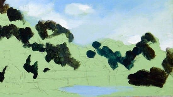
This is what you’ll often see in summer, really strong light, which gives all these lovely dark shadow shapes. Initially, I’m only concentrating on the shadow shapes and the pattern they are making.
They’re equally distributed throughout the painting, with gaps of the coloured ground in between the dark shadows. This technique is called ‘shadow mapping’.
I’m using a mix of Burnt Umber, Ultramarine Blue and a touch of Phthalo Green (Yellow Shade)
Pro tip: Shadow mapping can be handy when sketching with a pen to notice the subject’s shadow pattern before you begin the painting.
Step 5. – Adding a muted yellow-green base.
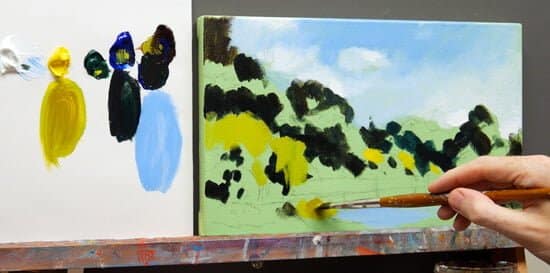
Using some Cadmium Yellow Light straight from the tube I add a couple of dashes to the painting’s centre.
It’s worth remembering if you can see an area of a scene that you’re painting, and you can match it with colour straight from a tube, it works as a handy visual anchor to judge your next mixes against.
I then mute this yellow down with a little Burnt Umber to paint in the light mid-tones pattern.
Step 5. – Painting the tree line mid-tones
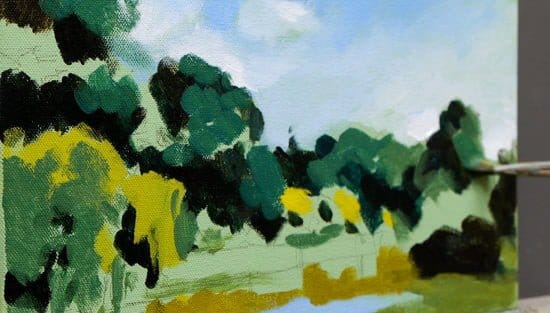
Mixing Ultramarine Blue and Cadmium Yellow Light gives a lovely deep blue-green painted as the mid-tone on the tree line, amazingly the colour is still quite close in tone to the shadow value even though the landscape is in bright sunshine.
Step 6. – Adding a dash of red to bring out the green.
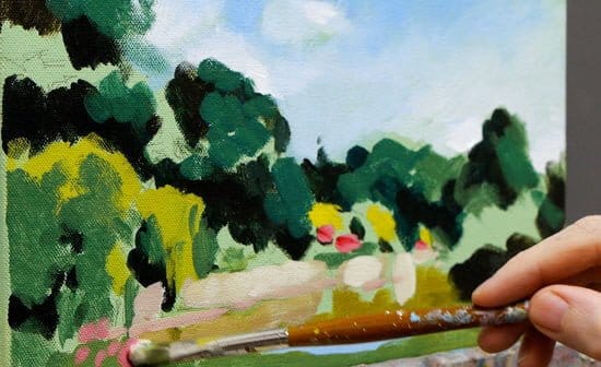
Introducing a few touches of a red/pink (mixed using Permanent Alizarin Crimson & Titanium White) will help make the green appear greener. This is due to the effects of simultaneous contrast.
Simultaneous contrast, identified by Michel Eugène Chevreul, influences our perceptions of tone and colour when two different objects affect each other. The effect is most apparent when you have subjects that are complementary colours (such as red and green)
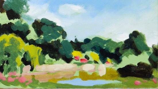
Step 7. – Mixing a vibrant green
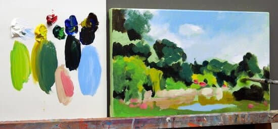
Now we’ve got a good base we can introduce a more vivid green by adding some Phthalo Green (Yellow Shade) in with the Cadmium Yellow Light.
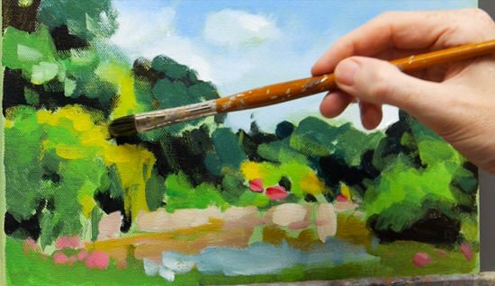
I then wash over with some Hansa Yellow Light, which is a yellow with a green bias and quite transparent. I’m using a fluid version of the paint rather than the heavy body, so I paint the colour straight from the tube. It’s got a great thin consistency and has had acrylic binder added in the factory, so the paint holds an excellent thin film.
Step 8. – Adding a more vivid blue.
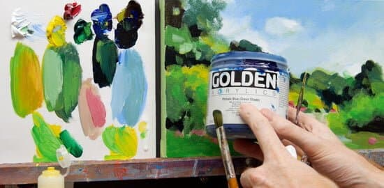
Flicking my eyes between the sky and the trees, the sky feels a little too purple to balance with the other colours, so I introduce a Phthalo Blue (Green Shade) to add a more Turquoise hue.
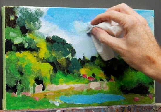
Once the blue is blushed over the sky, I blend it into the clouds using some paper towel.
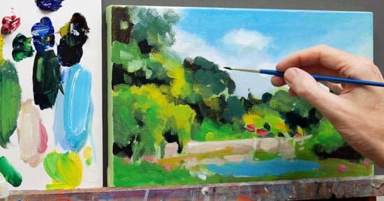
Swapping to the small round brush, I paint in some sky holes into the very edges of the tree line. This gives a subtle illusion of leaves that breaks up the mass shape of the trees.
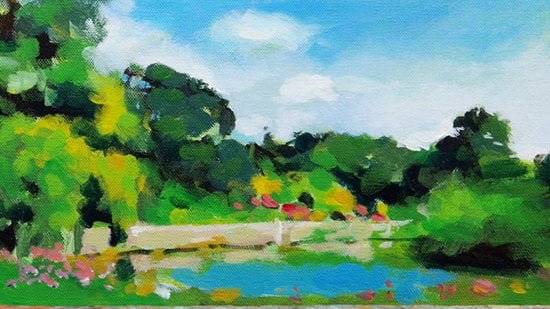
I now take a break from the painting to give my eyes a rest. When you come back fresh to your painting anything that’s ‘out’ you tend to notice straight away.
Step 9. – Adding volume to the clouds.
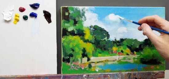
I paint on some pure Titanium White with a clean round brush into the cloud shapes in the sky to bring them forward.
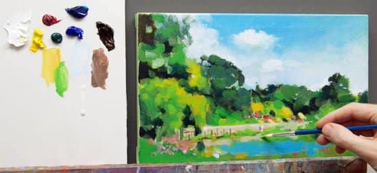
I paint in some finer lines to the foreground and establish the edge of the water.
Step 10. – Reassessing the dark shapes with a bristle brush
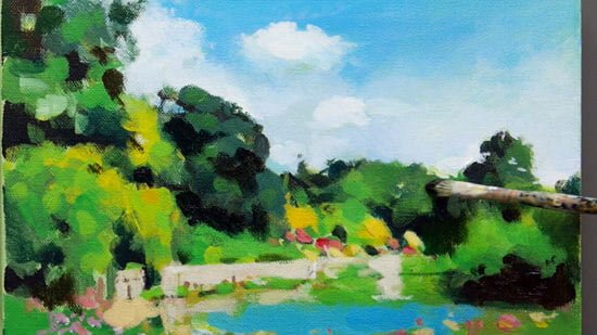
Stepping back from the painting and squinting my eyes, I now reinforce the dark shadow shapes we first painted onto the trees. For this section, I’m using a stiff hog bristle brush, this keeps the texture in the marks and gives a broken edge and adds variety to your landscape painting techniques.
Step 10. – Finishing touches

I finish the study by painting some more flashes of pink flowers in the foreground along the bottom edge of the painting and refine any finer detail on the wall.
The final painting
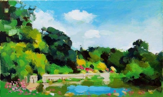
You can watch the full video tutorial below. Enjoy!
Video Tutorial – Part 1
Video Tutorial – Part 2
Video Tutorial – Part 3
You might also like:
1. How to Paint Snow in Acrylics – Video Tutorial
2. Is Green ruining your Landscape Painting?
3. Landscape Sketching Course




Thanks Will!
Another great tutorial – as always, most generous of you!
Have a great summer!
Cheers,
Yvonne Rozario, Canada
Thanks Yvonne, and you, pleased you enjoyed the tutorial.
Cheers,
Will
Wonderful tutorial! Only thing … I know it’s difficult to fit everything in for the camera, but it might have been helpful to have the photo taped above the canvas. Many thanks!
Hi Rose, pleased you enjoyed the tutorial, all of the tutorials are designed to work with a print out of the reference image so you can work ‘sight-size’ next to your painting. So if you print out the image first and then begin the tutorial you’ll be away!
Cheers,
Will
I so enjoyed this as it really showed me the concept of those darks.. I needed this, thank you so very much….. Also learning about the other colors that have green and yellow in them, I was completely in the dark about that…..
So pleased it helped with your green mixes Sandie.
Cheers,
Will
Greens are most difficult and the tips for mixing various colors are terrific as well as the development of layers from dark to light. Thanks
Thanks very much Renea.
Will
Will:
Thank you for so much kindness. This is very helpful for the landscape painter.
Best of luck,
My pleasure Mairead, hope your painting turns out well.
Will
This is a great tutorial Will, I enjoyed watching it very much. Your instruction on how to mix the various greens and their complimentary colours was very informative. I was also particularly interested in your use of glazing liquid, which I will have to try. Thank you for posting it.
Thanks Karen, yes, I really love the Glazing liquid, it can be so handy for smoking in colours in your paintings.
Cheers,
Will
I am so excited for this! I need experience with greens and this looks like so much fun! Thanks you a lot! I continually watch and hope for posts from you! Happy painting and God bless!
Cheers Naomi, enjoy experimenting with your mixes, pleased you found the tutorial of help.
Will
What a wonderful tutorial! It has all the elements I like. Focus on the canvas, gentle music, articulate commentary and detailed accompanying notes. And all for free! I can’t wait to have a go. Many thanks, Will, for sharing this. Inspirational.
,
Very kind of you to say so John, much appreciated. Looking forward to hearing how your painting turned out.
Cheers,
Will
Very well explained video. We don’t get these brands in India. I’ll make do with the closest that I get. Thank you for sharing your work
Thanks Simanti, hope you can track down some similar colours for the lesson.
Will
Thank you Will, it’s great to see how you develop this picture. Thank you for being so generous with your knowledge :)
Pleased you found it helpful Katherine.
Cheers,
Will
Thank you for your sharing and knowledge.
Pleased you found it helpful Jorge.
Will
Will,
Loved the tutorial. I learn more from you about color mixing and layering than I do anywhere else. You obviously love what you do and take great joy in sharing what you know. I look forward to the day I can take some of your classes.
Thank you so much..!!
That’s great to hear Karen, glad it helped with your colour mixing.
Cheers,
Will
Why did you specifically choose the yellow as the fluid type of paint?
Hi Brendan, so I could us it straight from the tube and get a good level of intensity with the Hansa yellow Light. If I was applying the heavy body Hansa Yellow Light with the same consistency I wanted it would have been diluted by the water too much for the effect I wanted to achieve.
Cheers,
Will
Thanks so much for the tutorial on painting summer trees. I’ve been trying to find something to give the acrylic a longer drying time and more “oil-like” blendability. Appreciate the tip on the Golden medium that will help in this area. Loved your finished landscape too! Appreciate your help!
Really pleased it helped Janie, hope you enjoy experimenting with the glazing medium.
Cheers,
Will
Been painting for many years, but acrylic greens are still a challenge and one is tempted by yet another ‘green’ in a tube. Thanks for your help in creating ones own green using unexpected colours. Come to Newfoundland for some wonderful scenery.
Thanks for the invite Betty, you’ve got some fabulous landscape for inspiration.
Cheers,
Will
Thank you for a very excellent lesson – beautifully produced and demonstrated. I am inspired to start ASAP.
Thanks very much Susan, pleased you’re feeling inspired to get creating.
Cheers,
Will
Thank you so much Will for another wonderful tutorial.
Cheers.
My pleasure Pantelis.
Will
I love reading and following along with Wil’s videos. What a gift. Wil was my first teacher (via the internet) and I keep coming back to the classes I’ve bought for great reference. Each time I learn new things. Thank you Wil. I hope you are well.
Best, Sue
Cheers Sue, I’m doing great thanks, hope you’re well.
Will
Thanks Will, very informative and helpful.
Cheers Bernie.
Thank you, Will, for your wonderful tutorials…so helpful to a novice like me!
Pleased you found it helpful Mary, hope it helped to take some of the mystery away from mixing greens.
Will
Wonderful tutorial! Thank you!
Thanks Mare, glad you enjoyed it.
Will
Thank you for the great tutorial. I love your teaching style and even though this will be a challenge for me I’m going to try it.
Do you varnish your acrylic paintings? I have been wondering about this. Is it necessary? And what do you use?
Michele
Good one Michele, pleased you’re going to face the fear of the green mixes! Yes, I varnish my acrylic paintings. I first apply an isolation coat layer and then apply a varnish coat layer. You can read more about it here:
3 Reasons why artists varnish their work (and why some artists don’t)
Adding an Isolation Coat to an Acrylic Painting
How to Apply a Varnish to an Acrylic Painting
Thanks so much for this acrylics landscape tutorial I really appreciate your clearly explained tutorials, I’m quite sure it will be helpful in my future landscape paintings.
I also mostly paint with Acrylics as it is quite efficient, faster drying,and also produces brilliant hues,tints and shades.Looking forward to more informative tutorials….
You’re more than welcome Madhukar, really hope you enjoy working through the tutorials.
Will
Thanks for all the great advices, special about mixing colors.
Pleased it helped Chris.
Will
Thank you Will, great instructions for those difficult to handle greens
Thanks again
Glad you enjoyed the tutorial Judy.
Thank you for all the effort you put into these articles and videos — they’ve helped me a lot :)
Good one Patrick, really pleased you found the lesson helpful in your paintings.
Cheers,
Will
Thank you so much for this lesson Will, I really appreciate your tutorials. This is exactly the tutorial I was looking for. I was just wondering if you are planning on making more of this type of landscape tutorial? I would gladly pay, might as well donate for this one!
So pleased to hear it Jen, yes, I’m looking at developing a new landscape/sunset acrylic course in the future. Hope your green mixes turn out well.
Cheers,
Will
Hi Will,
Just returned home after a few days in Devon and found your excellent tutorial.
Many thanks for all your advice and encouragement. Once the garden is back
in shape I will put brush to canvas!
All the best,
Peter B.
Hey Peter, hope you had a nice trip to Devon, I’m rather jealous of the cream teas you’ve (hopefully) been sampling! enjoy the tutorial.
Cheers,
Will
Hey Will – thanks soooo much for this great tutorial. Great material; great teacher, and much appreciated! Very helpful for me to see your brushwork process up close – thanks for the up close views! Mary
That’s very kind of you to say so Mary, pleased you’ve been finding the close-up shots of brushstrokes helpful.
Cheers,
Will
I have just started painting using acrylic after many years doing watercolour.
Your video is so, so helpful. Thank you for sharing your knowledge, skill and time with us.
Pleased you’ve been finding it helpful Siti,
Cheers,
Will
Artists are the most generous people in the universe! Thanks so much for sharing your talent with us…
Hope you find it useful for your colour mixing Debbie.
Cheers,
Will
I got married in July! My husband loves that I am an artist. I explained that I started instructions with your art school and he and are grateful. Thank you!!!!! I have a small income, a natural talent and with your. Help I am improving!
My pleasure Janice, really pleased you’ve found the lessons helpful. Hope your green mixes turned out well.
Cheers,
Will
Hello Will – I am long overdue in sending you a thanks for all your latest tutorials and Instragram pictures – you are so generous with your knowledge and talent! I am very taken with the copper pot and will give that a go – it’s so hard to find photos that inspire and that one I really like. I’m also going to dive in to the Greens of Summer and I look forward to hopefully sharing some good results with you.
Best regards,
Helle
That’s very kind of you to take the time Helle, really pleased you’ve been enjoying them. Good luck with your copper pot painting.
Cheers,
Will
Dear Will,
Thank you so much for this great tutorial. I admire your generosity with the huge amount of information you provide on this website for free. When I started to read your website, I had that feeling that I wanted to paint, but I didn’t know how to start. Now I am more confident, and I have some beautiful paintings to hang on my walls. :)
The only difficulty I have normally that I use a tiny bit different palette, which contains Raw umber and Burnt sienna, and as I see you use Burnt umber and Raw sienna. I always try to mix the hues you show, for example by putting some Burnt sienna to the Raw umber, and it looks like Burnt umber for me. Could you give some reasons why to change them, or is it OK like this? How does this affect the color mixing?
Best regards,
Cris
Hi Cris, so pleased you’ve been gaining confidence in your paintings. I tend to use either a raw umber if its greener/grey brown, or a burnt umber of it’s a warmer brown. Adding a touch of Burnt Sienna to you Raw Umber will give you a similar hue, it’s just if you have a Burnt Umber its easier to keep a consistent tone every time you work and the orange base of the Burnt Umber can work very well when neutralizing other colours, such as Ultramarine Blue.
Hope this helps,
Cheers,
Will
Great tutorial, Will! Just want to thank you for the amazing free content that you put out there and say that your paid courses are well worth the cost as well. I have many courses from many artists, all good in their own right, but you have a way of teaching that makes this information very accessible.
Thanks!
Cheers Joe, glad you enjoyed the lesson and thanks for your kind words on the courses, really pleased you’re finding the structure and steps of the courses easy to follow.
Will
Thanks Will. You sent this tutorial just when I was struggling with mixing different shades of green.
Perfect timing Hannah! so pleased it helped your colour mixing.
Will
Thanks for another wonderful tutorial Will! I had fun with it and have now leaned about mixing greens . I just LOVE your teaching style :)
Blessings,
Debbie
Pleased you found it helpful Debbie and are enjoying mixing new greens!
Cheers,
Will
Will, thank you for another great tutorial. You are my best teacher and I learn so much from you. The greens are tricky but you have explained it and presented very well and easy to understand. I am going to paint again the summer photo I like and I am sure it will be much better when I use your tips.
Hope we will see a tutorial of the fall colors soon.
Thanks again for your generosity.
Krystyna
So pleased you found it helpful Krystyna and glad your green mixes are going well.
Will
I love your tutorials and am interested in your book “Simple Color Mixing” but… Do you know if there are any used editions. My budget does not permit the expense.
Thank you
Hi Adrienne, the colour mixing course if a downloadable video course and isn’t currently available in a book format.
Cheers,
Will
Delightful set of videos, as always. I love how you can take a few steps back and all those colorful strokes just pop into focus. Great tutorial, had a ball.
https://conniehurley.wordpress.com/2018/02/04/02-04-2018-summer-scene/
(Here is my progression through the videos.)
Great work Connie, brilliant colours, really pleased you enjoyed it!
Will
Thank you Will.Lovely colour blocking concepts.I am already struck in popping out trees in the wilds and got so much of helpful tips.I have downloaded the ref pic and shall do it
to just crystallize the various colour and hue usage in my mind.would like to share my efforts with you and get your feedback .
Thanks
Hi Lonee, really hope you enjoy the lessons!
Cheers,
Will
Hi Will, I have just completed this painting following you on Youtube. I have been painting for 4 months and find your tutorials most helpful. I did not have all the colours listed so my bridge came out a bit pink, but I don’t mind. I will try it again with the green underpainting (mine was already primed in a peach) and will download the photo. Thanks you again for taking the time to share your expertise.
My pleasure Charmain, so pleased you enjoyed the series.
Will
Dear Will. I am 93 years old and have just. Started painting again after many years and I have found your video most delightful an d the appreciation of colour most stimulating, I used to exhibit in. Sydney but only ever used oil paints. Now I am in full care acrylics suit the residence better . Great fun and pleasure meeting your work and and a great help in every way .congratulations. Please keep it up for everyone thanks again Patricia Browning
That’s great to hear Patricia, so pleased you’ve been enjoying the lessons and working with the acrylics.
Cheers,
Will
Hi Will, The Phthalo Green I have is the (blue shade) – can this be substituted instead of the (yellow shade)?
I think your website is amazing BTW. I have so far done the fish painting with the glazes, which looks really good. I also dis the impressionist lavender scene, too. Will you be adding any additional content in the future? Many Thanks, JB
Hi John, yes that would work, you might just need a little extra yellow on your mix to balance it. Glad you’ve been enjoying the lessons.
Cheers,
Will