
I had an email from a student recently with a great question,
I’m wondering how to start painting this picture. There are so many colours, trees and bushes so I think it gets so messy. Do I start with the sky in the background and work my way forward and finally paint the trees? – Ulrikke
The photo that accompanied the email was a scene crowded with trees. Lots of layers all on top of each other, overlapping leaves and foliage coming towards the viewer with almost no visual sky.
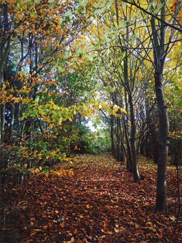
Scenes like this, or the one above, are challenging subjects to paint.
Because there are no clear silhouettes or variety in sizes of the shapes, if you were to create a shadow map, it wouldn’t be instantly recognisable as a landscape. There is a motif of a tree on the right-hand side but in general, there isn’t a good arrangement of elements within the composition.
But.
There will be occasions when you have a view that is less than ideal, but you still want to paint it. Maybe you’ve taken just one photo of a memorable trip, or a customer gives you a photo for a commission.
In our example, the woodland scene was taken from the garden of my childhood home. My Dad planted the trees when they were just saplings. It has memories of nostalgia and time passing.
So where would you start?
If you were to approach painting this classically, you’d creep up on the colours, apply thin layers and build up the colour palette slowly.
But because the detail is almost overwhelming, you’d have to rely heavily on your drawing skills to keep checking your shapes. After applying an Umber block-in, it would be difficult to differentiate between all the objects and on top of that, the values between the colours are all so very similar.
Creating clarity
I want to show you a method where you can quickly make sense of a complicated or messy scene, using a poster study. We’ll create an impression, rather than drawing too much detail. Grouping and concentrating on blocks of colours together, using 2 values from each colour family.
In our image we have piles of leaves on the woodland floor, but with colour variations between every single leaf. All the branches are very thin, with lots of them, everything is tiny and detailed. There’s no clear path to where you begin and where you stop.
The first thing I do is colour group. Identify the main colours within the scene, keeping them to three or four. So now I’ve got categories of oranges, greens, yellows and blues.
Then I say if I had to only use two variations of green to paint all of the greens, what would I use?
Well, for this scene, I’d pick out the dark green of the undergrowth and that will do my shadow area as well, and I’d use a lighter yellow-green, for the leaves. But remember I’ve only got one light value to use, so I squint my eyes and choose a general leaf hue.
You do that with all the colours It forces you to make a decision. One’s got to be shadow one’s got to be light.
Approaching a quick study in this way will help to give clarity. Simple but recognisable, so your study will still ‘read’ across a room, with the lowest risk of getting muddled and the highest success rate.
Poster study
A poster study is a small, simplified painting; the colour placement is applied flatly, almost like a screen print. The purpose is to map out the tone, illustrate harmony and establish the mood of a scene quickly.
If you’re a beginner, this is a great way to work with stronger colours quicker, practice colour mixing, and get to think about colours as values. It is efficient, and you are much less likely to get lost, and it develops a practice that you can use for any subject.
The great thing about a poster study is you can leave it as a painting in its own right. Use it as a preparatory study or sketch to make a larger piece from. Or work on top of it, use this poster study as a colour block-in for a more refined, detailed painting.
Downloading the reference photograph
The photo can be downloaded, so you can use it as a reference image, print it out, and follow the steps below. (The size of the image is 1:1 to the size I painted)
You can download the image here.
Materials you will need:
- 10 x 8 inch (25.4 x 20.32cm) canvas, board or acrylic paper
I’ve used a board with a couple of coats of acrylic gesso, but you could use canvas, or acrylic paper because this is a study rather than a finished painting.
Paints:
Darks & Lights
- Mars Black (Winsor & Newton)
- Neutral Gray N4 (Golden Paints)
- Titanium White (Golden Paints)
Oranges
- Burnt Umber (Golden Paints)
- Cadmium Orange (Golden Paints)
Greens
- Permanent Green Light (Golden Paints)
- Cadmium Yellow Light (Golden Paints)
Yellows
- Yellow Ochre (Winsor & Newton)
- Raw Umber (Golden Paints)
Blues
- Cobalt Blue (Golden Paints)
Brushes:
- Jacksons Arts Procryl, size 6, Flat

Pens
- Liquitex Acrylic Marker, 2-4mm chisel nib: Neutral Grey 5

Drawing out


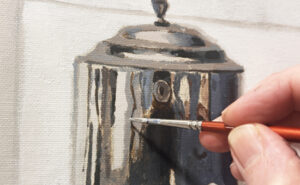
I start by working directly onto the white gessoed board without applying a tonal ground. The initial sketch is with a Neutral Grey acrylic marker and I can establish the motif of the tree and branches on the right-hand side.
Mixing the Greys

I then use Mars Black (Ivory Black or Carbon Black would also work fine) and a Neutral Grey N4. I paint both of these with the flat synthetic brush straight from the tube, just diluted slightly with water using the edge of the brush and lifting the pressure off as I get towards the end of the branches.


The black is placed at the bottom of the trunk and the base of the foliage near the woodland floor. The grey indicates a sense of light hitting the top of the trees as they get closer to the sky.
Mixing the Oranges


Working between Cadmium Orange and Burnt Umber with a palette knife, (size 45 from RGM) I create two distinct colour tones. A slightly muted down orange and a more saturated warm brown.


They get painted on in solid, flat blocks, trying not to blend them together. I tend to work on the darker hue of the pair first and then build up the lighter tone on top.
Mixing the greens


Using a little of the Mars Black, Cadmium Yellow Light, Titanium White and Permanent Green Light, I want a dark muted green for the undergrowth and a brighter lighter green for the leaves.
A tiny touch of black helps to darken and desaturate the green and a touch of white in the mixes helps to cool.


As I place in the darker green, I’m trying to combine a mass of leaves together in one colour. The main dense shapes behind the lighter leaves, keeping space for the sky holes and the warmer yellows to come.


The brighter greens help the painting to start to ‘read’ more as a landscape. I tend to paint the leaves at a 45-degree angle. It’s not a conscious decision, but I’ve found it can give a subtle indication of movement, blowing in the wind.
Mixing the warm Yellows


I add a Raw Umber to the palette for the two yellow mixes alongside Yellow Ochre and Cadmium Yellow Light. The Raw Umber helps to darken the yellow without it shifting too warm.


These are layered on top of the greens and I start to add a few dashes to the woodland floor.
Once I’ve applied the lighter yellow next to the crown of the tree, I feel like I’m losing the distinction between the trunk and the leaves so I’ll darken the trunk down some more.
Mixing the Blues


This is a mix of Titanium White and Cobalt Blue. They are quite close in tone as there isn’t much variation in the sky.


Here I’ve reinforced the dark of the tree trunk and painted in the sky holes. There are also a couple of dashes of white on the edge of the tree trunks, to indicate where the light was hitting them.
Finishing touches
Then using the edge of the flat brush, I paint in a couple of extra thin branches over the leaves to help give a greater sense of depth.
The leaves and the sky holes have come together better than I thought! The woodland floor could have more variation of colour added, but for the purpose of this exercise, it’s created an impression of the scene without any details, that’s still recognisable as a landscape.
You don’t have to use the exact colours, it’s more of a process of getting used to grouping colour families together and then grouping tonal values.
Thanks to Ulrikke for the inspirational question, let me know how your poster studies turn out!


Thank you Will that demo is really helpful.
My pleasure Ernie.
Thanks Will. This is almost always an on-going issue with wooded landscapes, and this instruction is very helpful!
Great stuff Gail.
Thank you Will. I love this idea, it works as practice, warm up, and as a study. I can’t wait to try it out. I have been using oils but I’m guessing the same thing can be achieved either painting alla prima ( my first choice) or letting each stage dry. Your study is a lovely stand alone abstract, but i see it as a great base for more detail as well.
Hey Cynthia, yes for sure, using oils with the method is a great way to practice making strong brushstrokes and keeping your colours clean. Resisting the temptation to blend will also help to think through the layers of which colour to apply first.
Will
Very nice and clear lesson. Thank you Will.
My pleasure Jivko, hope you’re doing well.
Will
Hi Will, you’ve answered so many of my questions in one article! Thank you. I’m delighted. Here’s hoping I don’t revert to my muddy habits when I have a go. I’ll have no excuse! Cheers Gaynor
That’s great to hear Gaynor.
Wonderful Thank you.
Thanks Char.
Will, your landscape tutorial is perfect to make painterly sense of Virginia’s forests, which often have tangled undergrowth, saplings, stone outcroppings and older trees in front of distant blue mountains (hence, their name, the Blue Ridge Mountains). Many thanks and happy new year!
Good one Betty, really hope it helps when deciphering your next Blue Ridge Mountain scene.
Will
Hi Will,
Today’s session is very helpful. Your initial steps in black and white provide foundational order to help with “where & how do I begin?” The simplification of limiting, limiting the use of colors takes so many decisions manageable.
Thank you.
Aledra in Virginia, USA
So pleased you found it helpful Aledra.
Will
This was very helpful! Thank you!
Cheers Nancy
Beautiful Will! I’m anxious to see your next online course. I’m currently working on the Still Life Masterclass and really enjoying it.
Glad the Still Life course is going well Catherine, yes a new course should be coming in a few weeks time.
Will
Thanks Will for helping my understanding of simplifying a complicated scene
Glad it helped Michael.
Your tutorials are so helpful, and so are your responses; nuggets of gold you leave for us throughout. Thank you!
That’s great to hear Mary.
Will, I have learned so much from your painting examples and instruction! Your advice on color choices has really been helpful especially on mixing greens. I am basically a landscape painter and understanding greens and understanding the atmospheric changes in a landscape have helped me create more depth in my paintings. Thanks so much for all of your help!
Good one Jean, yes greens can be a tricky one, so pleased the lessons have been helpful.
Will
Thanks Will. You’ve inspired me to get going again! I had to relocate due to pandemic with everything in storage… but now I’m ready!
So pleased Lila!
You always break things down so that I can understand! Thanks for the inspiration!
Good one Ann, hope it helps when faced with your next subject.
I will definitely try this!! Thank you
Hope it turns out well Karen
thank you Will. with your methodical & detailed explanation, there’s a glimmer of hope I might be able to have a go at this someday! meanwhile I’m determined to steadily work through your beginners’ courses first
For sure Yuen, pleased you’re enjoying the course.
As always, Will, so clear and helpful. Just in time for me to try on a painting in queue of my friend’s favorite photo of his mountainous “yard.”
Great stuff Jennifer, hope the painting goes well.
Hi Will. What a wonderful lesson! I have recently become much more interested in abstract art, but have no idea how to go about creating it. This step by step shows exactly that. I have never heart of poster painting, so that opens up a whole new area for me. The color grouping does indeed make me think of color as value, an area that I struggle with. I am mainly a watercolor artist and am not as comfortable or confident using acrylics. Colorado, USA, is a high dry desert with extremely low humidity, so the drying time is very short and I struggle to keep mixes fresh and workable. I took up acrylics several years ago so that I could follow your lessons and now have a beautiful gallery of work on my home from your lessons. So much of what you teach is applicable to any media! This lesson looks wonderful and simple enough that I am confident I could do it. I must get my acrylics out now and start this painting! Thanks for this inspiring post! Hope you and Vanessa are keeping well.
Hey Nancy, yes, this can be a great technique towards abstraction as well. Create a poster study of a subject…then create a poster study of your poster study.
Will
Hi Will, I will practice this over and over, I love it. I have to admit I’ve never heard of poster study before. Very interesting, thank you.
Glad the method has piqued your interest Rose.
Will – this looks like fun! Can’t wait to give it a try.
Thanks Gordon
very good tutorial, thank you
Cheers Patty
Great tutorial Will. Look forward to trying this technique on a seascape with beach. Thanks.
Sounds like a great subject to try it on Donna
I’ve learnt so much about how to simplify colour tones and build a study with a step by step approach. Really inspirational. Thanks Will.
So pleased you enjoyed it Lola
Really nice, Will!! As always, inspiration is abounding!! Thank you,so very much.
Cheers and God bless, C-Marie
Thanks C-Marie
This is brilliant, Will! And timely, as I’m about to start a commission and I’ve been looking for a way to get a color study with less detail and more emphasis on value. Also, I’ve been seeing a lot of references to poster studies and I wasn’t sure what they are and how I can use them. Thank you very much!
Perfect timing Colleen! really hope it helps with your commission.
Thanks so much Will! I truly appreciate the extra details and step by step process – I am going to give this a try!!
That’s lovely to hear Melanie, thanks.
Hi Will,
It’s starting to sink in. Keep it simple. This applies to both the elements to draw and the color. It’s far more interesting this way than to try to replicate the details of the photo. It implies loose brush strokes and not to over mentalize the steps. It’s a process. Thanks for the information.
Laura
You got it Laura.
Excellent lesson. I used to get so confused when there are many trees of different hues. Now I know how to separate them. Thank you so much.
Well that’s brilliant to hear Janaki
Happy 2022, Will. Thanks for that lesson, exactly what I need right now.
Thanks Syl, and to you!
Hi Will,
Brilliant! This is really a big help and i can’t wait to start. You have given a very practical and wonderful explanation, thanks. Beautiful colors. I’ll post you my versjon. I wonder what kind of brush are you using? Is it synthetic or squirrel hair brush?
That’s great to hear Ulrikke, it’s a synthetic brush.
Thank you so much for the step by step process, Will! Your lessons and explanations are always so clear and you are always so generous with sharing your knowledge – I am so immensely grateful.
My pleasure Natalie, hope you find it helpful in your next painting.
Thanks Will,
This will help me not to get to detailed and frustrated when I want to do a scene similar. Can’t wait to get started .
That’s great to hear Karen, so pleased you’ll be able to implement the technique in your next piece.
Will
Using the 2 light & shadow of each color, and just putting in blocks of them was the best idea of approaching a complicated scene that I have not heard in this way. I’ve been thinking about painting a hills of grape vines in Sonoma, CA —mentally trying to figure out how to “paint all the leaves, without painting all the leaves” conundrum, and this will help me get started!
So pleased you’ve found the method helpful Sherrie. Really hope your grape vines painting goes well.
Will
Will, this is one of the best tutorials I have seen to help sort through a busy landscape scene. Picking 2 of each basic color is so helpful! In a previous post or lesson you demonstrated a color string and that has helped so much too. I have only been painting a year and had the goal of producing one painting per week so that I would keep practicing no matter what. Discovering your site and your classes has added excitement and clarity to the learning process. Thanks!
Hey Inez, thanks for the kind words, so pleased you found the technique helpful and have been enjoying the lessons.
Cheers,
Will
Will, your lessons are always helping and inspiring. Thanks so much!
My pleasure Linda.
Thank you for the tutorial. I have been try to loosen up my painting. This was invaluable in seeing step by step the process and how you simplified, shapes and color palette. Looking forward to experimenting, painting this study, then applying it further. Might you consider doing an expanded class with the same focus?
So pleased you found it helpful Camille, and good to know an expanded class on the method would be on interest.
Thanks Will,
Very helpful as allways.After the post study , how should we finish the painting?Should we start a new one?
Thanks a lot.
Hi Carolina, You can leave it as a painting in its own right. Use it as a preparatory study or sketch to make a larger piece from. Or work on top of it, use this poster study as a colour block-in for a more refined, detailed painting.
Cheers,
Will
Great tutorial Will. In one study you approach 2 difficult topics. A scene too complicated and the colors. Thank you for this.
So pleased it helped Katerina.
Thanks for this! As someone who can’t seem to break out of a realistic, detailed approach, this helps me get out of my own head.
Do you suggest this technique as a launching pad for someone who wants to shift from detailed & literal into a more impressionistic style? (If not, where should I begin?) Thanks again.
Yes, for sure, the method would work well.
As always, your direction is so helpful and motivating, Will. You’ve broken the steps down so clearly! I wasn’t familiar with the poster study concept but I can see how this could be a regular part of my painting practice. I am particularly pleased to learn about it as it doesn’t require full completion. I recently read about “premier coup”. Can you explain how this compares to a poster study?
Hey Terri, so pleased you enjoyed it, Au Premier Coup, (the first shot/stroke)is similar to Alla Prima or Direct Painting, where you paint in one sitting rather than building up in layers, with the aim of trying to get the expression or mark with one brustroke. Working in this method of pre-mixing for a poster study is great practice to paint in that style.
Hi Will,
I was recently in the national gallery and your poster study is making me think of a Cezanne I was gazing at, his use of blocks of colour to create a really interesting abstract painting.
So pleased you’re been inspired Helena and seeing how the poster studies can be a great starting point for abstraction.
Will
Beautiful actually.
This tutorial was so helpful! I am only nine years old and I haven’t had any experience painting but it looked really good when I was done, that’s how amazing this tutorial was! thank you so much will!
So pleased you enjoyed the lesson Peilah!
Will