
Will Kemp, A Mediterranean Washing Line, Detail, Acrylic on Board
A Mediterranean Washing Line
For this week’s free step-by-step acrylic lesson, we’re returning to the gorgeous faded paintwork and quiet cobblestone streets of Corsica.
After the challenging perspective in our first Starter Set Challenge ‘Warm Shadows in Corsica’ the simpler shapes and clear blue sky of ‘A Mediterranean Washing Line‘ should be plain sailing.
I particularly love the multiple wires threading your eye towards the sea in this scene and the washing strung up between the buildings brings a human presence of day-to-day life, breathing real energy into the composition.
Downloading the reference photograph
The photo below can be downloaded to use as a reference image; print it out, and follow the steps below.

Click here to download a full size image – The size of the image is 1:1 to the size I painted, 8 x 10 inch
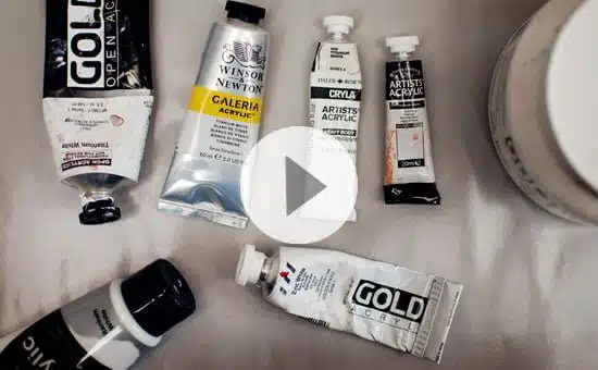
Materials you will need:

I’m using the same materials as the previous Corsica Street Scene painting.
8 x 10 inch (20 x 25.4 cm) canvas or board
Paints:
- Titanium White (Golden Paints)
Colours in the Winsor & Newton Professional Acrylic Colour Set of 12 x 20 ml tubes:
- Azo Yellow Medium
- Lemon Yellow
- Naphthol Red Light
- Permanent Alizarin Crimson
- Phthalo Blue Red Shade
- Ultramarine Blue
- Phthalo Green Blue Shade
- Olive Green
- Yellow Ochre
- Raw Umber
- Mars Black
- Titanium White
Brushes
- Winsor & Newton Foundation set.
Mediums/extra tools
- Kuru Toga 0.5 mm Mechanical pencil, HB
- Tear-off palette
- Palette Knife
Step #1. Mixing a coloured ground

You can download a larger version of my drawing here.
For this painting, I could have either taken inspiration from the sky and worked on a graduated blue coloured ground or chosen a warmer tone indictive of the buildings. Because the sky section is so narrow, I opted for a warm base mixed with Yellow Ochre & Titanium White.
Diluted down with water and then using the number 14 Winsor & Newton foundation brush, I paint a very thin layer onto the 8 x 10-inch canvas board.

I then sketch in the drawing with a 0.5mm HB mechanical pencil. Kuru Toga Roulette Pencil.
Step #2. Raw umber block-in

Using Raw Umber, diluted with water, I block in the darkest areas of the painting. I’m scanning where the dark areas are and how they jump your eye around the whole piece. The first pass is quite diluted to indicate the two tonal masses on either side of the frame. This first stage helped to get your eye in and used to how dark these buildings actually are.

I paint over the first wash-in with a thicker Raw Umber to emphasis the darker areas. There’s some foliage on the right-hand side, and I also try and place where the main shutters will be on the painting.
All values are relative to what they are next to.
This can feel a bit dirty and dark, and you may be thinking at this point, “I wanted to paint a bright, airy painting with some dappled light”.
But to make something appear brighter, you need to have something darker next to it and having that contrast early on will help the buildings appear as if in the shade.
Step #3. Painting in the sky

Next, I mix a sky colour that I can paint down the centre of the piece.
Because I’m just using the starter set, it’s a little limited, and I’ve only got Phthalo Blue – Red shade and Ultramarine Blue to choose between. This is one of the areas that I found most frustrating because, for this particular piece, I really wanted to use a Phthalo Blue, Green Shade.
Phthalo Blue (Green Shade) enables you to get much, much stronger turquoise. This version gets close, but not quite. Also, be aware when using any Phthalo Blue, it has a high tinting strength compared to most other pigments. A little goes a long, long way with this blue! Start with white and then add a tiny touch of the Phthalo Blue Red shade into your mix.
(You can watch a video here, looking at colour bias of blues and compare a Phthalo Blue Green Shade and an Ultramarine Blue.)

I add more white into this next band of the sky and slowly move down the painting, lightening the blue. At the very bottom, I paint in an indication of the sea in the distance. This whole band is just the two colours Phthalo Blue – Red shade and Titanium White.
I’ve used the Golden Titanium White for the thicker impasto parts of the clouds as the heavy body holds the brushstrokes that little bit better.
Step #4. A warm and cool base

Because my eyes have now tuned into those blues, I’m scanning around the reference image to look for any other similar tones. I mute down the blue with a little Raw Umber to vary the saturation and paint in the slants of the wooden shutters using a ‘dabbing’ motion with the end of the brush.
Step #5. Introducing pinks

I now introduce a small amount of Permanent Alizarin Crimson to the palette to get some of these lovely pink colours. I’m using the smaller filbert size brush for this. To get the warmer, orangey-pink, I mix in some Azo Yellow Medium.
Step #6. Bringing warmth to the buildings

From here, I’m just really concentrating on the warm colours on the right-hand side to start pushing those lovely orangey-yellow tones.
Even with those in, it was about this stage where it all started to feel a bit dreary, the buildings felt very blocky, and it still looked pretty dark.
But before you start to make too many judgments about your own painting, wait until you’ve brought in all the other colours and got the whole piece blocked in. Keep strong and keep going.
Step #7. Adding an olive green

I paint a thinner application of the warm colours over the Raw Umber base, and because I’ve got some of that showing through, it helps to give a dusty feel to that side of the buildings.
I’m also refining more of the colours on the washing line. I’ve got a really nice Olive Green in the kit, so I’m using some of that mixed in with Raw Umber and White to indicate some of the foliage and washing,
Step #8. Painting warmth in the shadows

Now I’m adding slightly thicker paint to bring warmth into the foreground. I want a bit more contrast in the lower areas of the painting to suggest they’re more in shadow.
Step #9. Blocking in the shutters

I’m now starting to indicate some of the finer darker line work on the buildings. Some of the shutters’ angles and some of the metal pieces sticking out of the walls. These little details are actually really helpful to break up the side of the wall and give us a different break in our viewpoint.
Step #10. Finishing touches

Will Kemp, A Mediterranean Washing Line, 10 x 8, Acrylic on Board
I’ve put in some stronger red using Naphthol Red Light for the little No Entry sign at the very bottom of the painting. Then I’ve jumped that red across to the right-hand side to add some warmth to the building’s higher shutters.
From here, I mix a tiny bit of Ivory Black in with the Raw Umber, so it’s not completely pure black, and using the fine round brush, I paint the electrical wires that go across the building at the bottom.
These really are key to bring the whole painting together. Not only do they link the buildings, but they help to give you that sense of movement. Notice how there’s a curve to the washing line as it sags in the middle, and then you’ve got the lines of the other cables that really take your eye into the far distance and also echo that curve.
What did I miss using?
So reflecting back, the thing I missed most was a little bit of Phtahlo Blue (Green Shade). I wanted to add that punch of intensity into the sky to make it ‘pop’ a bit more. Also, trying to keep a super consistent width line with a brush compared to an acrylic marker was much more difficult.
I really hope you enjoy meandering down the lanes with your paintbrush! If you want to learn more about sketching outdoors and building your confidence when drawing street scenes, you might enjoy the Urban Sketching Course.


Hi Will
many thanks for all your newsletters and tips for paintings including the recent washing line step by step.
My mental health( bipolar ) deteriorated significantly before the first lockdown. I am now on the road to some form of recovery and as well as my medication I have taken up painting at last after encouragement from my partner and she does various arts and crafts plus watercolours.
I undertake mainly abstract work in acrylic and I just love all the colours.
I will be attempting the washing line picture soon as I feel sure I can start to focus enough although when my mind is manic my abstracts flow out of me!!
Thanks again
Chris Eves
p.s I will be soon helping, in a volunteer role, the NHS in their development of a new national framework. They are keen to hear about lived experiences and art will be one of many subjects I can say have really helped me keep sane!!
That’s great to hear Chris, so pleased you’ve been finding your painting practice therapeutic. Really hope you enjoy the lesson.
Cheers,
Will
Hi Will,
In the near future will you be offering a figure painting course in oil? I have your portrait course and it has proven to be extrldenaraly helpful for my work. I received accolades from the instructors at the American Portrait Society.
Hey Rick, so pleased you found the portrait course helpful and have been receiving some good accolades with your work. I haven’t got a figurative painting course planned, but good to know it would be of interest.
Cheers,
Will
This is wonderful, Will. Thank you so much for your time and generosity.. I love your teaching style.
Thanks very much Sharon, my pleasure.
Will
Thank you very much, Will, for the time and expertise you give us! Art has really been a huge factor in getting through this last year and your teaching methods and style always lift my spirits and improve my knowledge and skills. I have learned more from you than any other teacher and you always make me smile! Although I prefer to do still life and not architecture, this simplified scene seems within my capabilities and I love the hanging laundry! So I will give it a try! Thanks again. Love your school! Nancy
Thanks for your kind words Nancy, and hope you enjoy experimenting with the architectural subject matter.
Cheers,
Will
Will I recently found you as I wanted someone who works with acrylics specifically. Love the newsletters and these challenges. I have 4 large containers of green, blue, yellow and red heavy body Golden paint so I mixed my own colors to get as close to yours as I could. I find heavy body too thick and fluid too liquids. Perhaps the Open line is the way to go. Anyways this was a great exercise. Thanks from New York City.
Glad you’ve been enjoying them Andrew, the OPEN line is a bit more fluid than the heavybody but doesn’t have the same covering power. You can also mix the fluid and the heavy body together, might be the perfect consistency for you!
Will
Will, I absolutely love your painting tutorials. I’m a very hesitant beginner in art and nervous of the mechanics. Your videos however dispel a lot of the anxiety I feel about “not doing it right” or “using the wrong materials”. Therefore I really want to thank you for giving me the courage to push ahead and just try it all out. Kindest regards. Diane
That’s brilliant to hear Diane, so pleased you’ve been encouraged and inspired with your paintings, thanks for sharing.
Will
Thank you so much for sharing indepth painting lessons. I really learn a lot from your paintings.
So pleased you found it helpful.
Will
Thank you so much Will.It´s a joy to receive your lessons.I´m using watercolor,using the paper the size of a post card,taking care of waiting it dry step by step.
The result is not so bright as yours,but is OK.
I´ll try acrilics.
Thanks again.Stay safe.
Pleased the watercolour study went well Carolina.
Will
this is wonderful Will and I am going to try it :) Thanks from Canada
Cheers Tamara, really pleased you liked it.
Will
Many thanks Will. You are very kind. Sorry for the delay in replying.
My pleasure Bernie, hope you enjoy it.
Will
Hi will, Thanks for the Mediterranean washing line challenge. It‘s a lovely picture and I have given it a try. Looking at it now I can see my picture needs more warmth so I will go back and adjust. I enjoyed doing this picture – I like the style. Am looking forward to trying more.
So pleased you enjoyed it Alison.
Will
Hullo, Will, I was wondering, what is the difference between burnt umber, and raw burnt umber?
because they look the same to me.
Burnt Umber is warmer and Raw umber Goes more towards green. They appear the same in a masstone, but are more noticeable when you add white.
Cheers,
Will
Thought I would let you know I did the ‘Mediterranean Washing Line’ and it came out pretty good. I really like the colors in it. Thanks, Will!
Great stuff Liz, so pleased it turned out well.
Will
Thank you so so much for your help. I’ve just discovered your website, it is a gem.
So pleased you’ve been enjoying it Selomé.
Cheers,
Will
I’ve been struggling with this one, which surprised me after doing the cherry, apple, brass pot, etc, which satisfying results. I thought, since there was little modeling, and it would be mostly shapes of relatively solid color it would be simpler, but it wasn’t. The first try, it was way too loose, the colors were fine, but the shapes were all distorted, and it was missing the interesting lines created by the hard-angled shapes. On the second try, it was better, but still missing something. I got to the step of warming up the shadows, but at that point it had fallen apart again.
Hi Jonathan, this piece tends to comes together at the end when the finer lines are drawn in to bring the shapes together.
Will