How to Paint a Still Life with Acrylics
Time lapse preview for New painting course The Art of Acrylics with Will Kemp
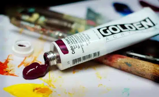
“The Art of Acrylics” Painting Course
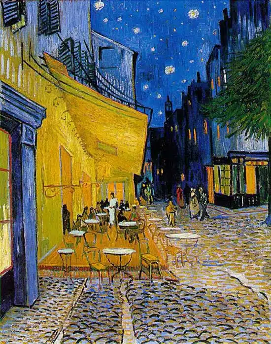
Developing your artists eye
When I was first learning to paint my results were often disheartening, the apple looked too flat, the greens looked garish and harsh and I was generally getting more and more frustrated.
I often took a large palette knife to the canvas and smeared the entire painting.
The result?
My new abstract period!!!
The problem with learning to paint is that you have an inbuilt ‘taste’ meter. You know a good painting when you see one. You don’t have to be art educated or have studied the classics, you just need to trust your own judgments.
So when you attempt your first painting and it goes wrong, you know it is wrong.
You just might not know why…