The moment you tell yourself, “I need to draw more,” the process can suddenly feel pressured, important, loaded with expectations… and strangely less enjoyable.
Drawing becomes “Art.”
The sketchbook becomes a test.
Every blank page starts quietly asking: “Is this good enough?”
And often, that pressure arrives before the pencil has even touched the paper.
Recently, Kathy emailed me describing something very similar. She explained that once she actually begins drawing, she quickly loses herself in the process and enjoys it enormously. The challenge wasn’t really drawing itself; it was getting started.
The search for the “perfect” subject or composition had become so overwhelming that it was preventing the simple act of drawing in the first place.
So I’d like to suggest an alternative approach: stop thinking of it as drawing and start thinking of it as observing.
The moment you shift into observation, a lot of the pressure disappears. There’s no longer the expectation that something has to become a finished piece of art. You’re simply noticing things.
You might observe the colour shift within a shadow.
The way fabric folds across the arm of a chair.
The shape of a reflected highlight on a mug.
Or you might simply experiment with a new material or pencil without any expectation of producing something “good.”
There’s a freedom in that mindset because the work no longer feels as though it needs to be framed, judged, or critiqued. The sketchbook becomes a place for curiosity rather than performance.
And really, that’s what drawing has always been: observation made visible.
By reframing it this way, you quietly remove the weight of the capital “D” in Drawing.
Instead of thinking: “I’m going to make a good drawing.” Try thinking: “I’m just going to fill one page with observations.”
And then you get to unlock a sense of frictionless creating; some of the most valuable sketchbooks are visually messy but mentally free.
The best thing I’ve done for my studio practice this year happens the night before I paint.
I call it the Midnight Sketch Club.
What separates a painting that ‘works’ from one that doesn’t is usually decided long before the first brushstroke goes down.
You need to recognise what to look out for, where your natural tendencies can lead to mistakes and how the values will work.
And the best way to figure all that out?
A sketch and a value study.
But most beginners don’t do them. Because they think they are boring.
Now, I know what you’re thinking because I do this too.
You see a subject, you get excited, and you think, “Right, I’m just going to dive straight in. I don’t need to do a sketch first—I’ll figure it out as I go.”
And then three hours in, you’re wrestling with a painting that’s fighting you every step of the way because you didn’t take twenty minutes to work out the problems beforehand.
On the How to Paint a Peony Course, we paint a simplified ‘poster study’ of the peony before committing to the main painting.
It’s like running through a dress rehearsal before the main performance.
But here’s what I’ve started doing instead.
The night before I paint, usually around midnight, because I’m a bit of a night owl, I’ll spend 15-30 minutes sketching out the subject.
Nothing fancy.
Just getting the composition down, mapping out the value structure, seeing where the darks and lights fall, and figuring out where the problems are going to crop up. It might be colour notes, or things I noticed.
You can do this with actual physical sketches, or on an iPad if you prefer digital. Doesn’t matter. What matters is you’re thinking about the painting before you’re in the painting.
And here’s the magic part: you sleep on it.
You give your brain a whole night to process what you learned. You step back from the subject. And when you wake up the next morning, something interesting happens: you’re actually more excited to paint it, not less. Because now, you’re not walking into the unknown.
You know what you’re doing.
You know what to look out for.
You’ve already solved half the problems while you were asleep.
The preparation is the work
It’s a bit like how film directors don’t just show up on set and wing it. They spend months in pre-production, storyboarding every shot (essentially a hand-drawn version of the final movie), working out every angle, so that when it’s time to actually film, they’re not figuring things out; they’re executing a plan.
Pixar spent over 2.5 years storyboarding Toystory before they animated a single frame.
That preparation is the work. The final painting, the final film, the final animation is the execution of all that thinking.
Why you need tea & biscuits
My brothers and sisters think I spend my days lounging around in some sort of artistic reverie, wafting a paintbrush toward a canvas in a state of internal bliss.
What we’re actually doing when we paint is solving hundreds of tiny problems, one after another, making decision after decision after decision. Which edge to soften? Where does that value shift? Is this colour too warm? Should that brushstroke follow the form or cut across it? It’s exhausting.
That’s why we need all the tea and biscuits afterwards, we’re recovering from genuine mental effort!
And this is exactly why my Midnight Sketch Club works so well. By sketching the night before, you’re solving a huge chunk of those problems in advance.
Now you can actually focus on the painting itself, rather than burning through your decision-making energy just trying to figure out where things go.
I was listening to a podcast, and Darren Cahill, co-coach of the current world No. 1 tennis player, Jannik Sinner, discussed Roger Federer’s work ethic.
“I did a week with Roger Federer and was stunned how hard he worked on the practice court. Four and five-hour blocks on the practice court. I never knew this about Roger because if you go and watch Roger warming up for a match, it looks like he’s going out to play with a country club, or he’s just slapping the ball around, barely out of his feet.”
He said:
“Darren, all the hard work is done in the lead-up. I just have to feel the ball and feel good about my game. Everything is done away from the public’s eyes. The actual match court is just for show. It’s when you are practising inside a stadium with zero people watching, that’s what really matters, and that’s where you’re putting in all that hard work. If you can accomplish that, then you can accomplish some great things.” – Roger Federer
So sketch at midnight
Map the values. Find the problems. Then sleep on it.
I think you’ll be surprised at how much better your paintings turn out when you’ve given yourself that gift of preparation.
“The pictures they created convinced me that anyone and everyone could use a few clear principles to build powerful visual statements: emotionally charged arrangements of shapes on a page.” – Molly Bang, Picture This: How Pictures Work
When you’re surrounded by hundreds of reference photos or standing in a beautiful location, it’s easy to feel overwhelmed.
Every scene seems to have potential for a painting, but nothing quite clicks. You find yourself thinking, “Would this work?Will that look good?” without ever feeling confident in your choices.
This is where ‘compositional categories’ can really help organise your imagery and give you a starting point to check your compositions against.
Not by limiting your creativity, but by giving you a clear lens through which to view your options.
Your pencil flows across the paper, and suddenly, it all makes sense. The proportions look right, the shading actually resembles the model, and you feel like you’re ‘getting it!’
You pack up your supplies with quiet confidence, already daydreaming about the drawings you’ll make at home next week.
Then life gets busy. A week later, you finally sit down to draw again, excited to pick up where you left off. You sharpen your pencil, study your subject, and… nothing.
The connection is gone. The techniques that seemed so natural have vanished. You’re not just rusty, you feel like you’re starting entirely from scratch.
It’s as if everything you learned has slipped away.
You’re not alone.
You’ve just run into one of the most common experiences in learning: the forgetting curve.
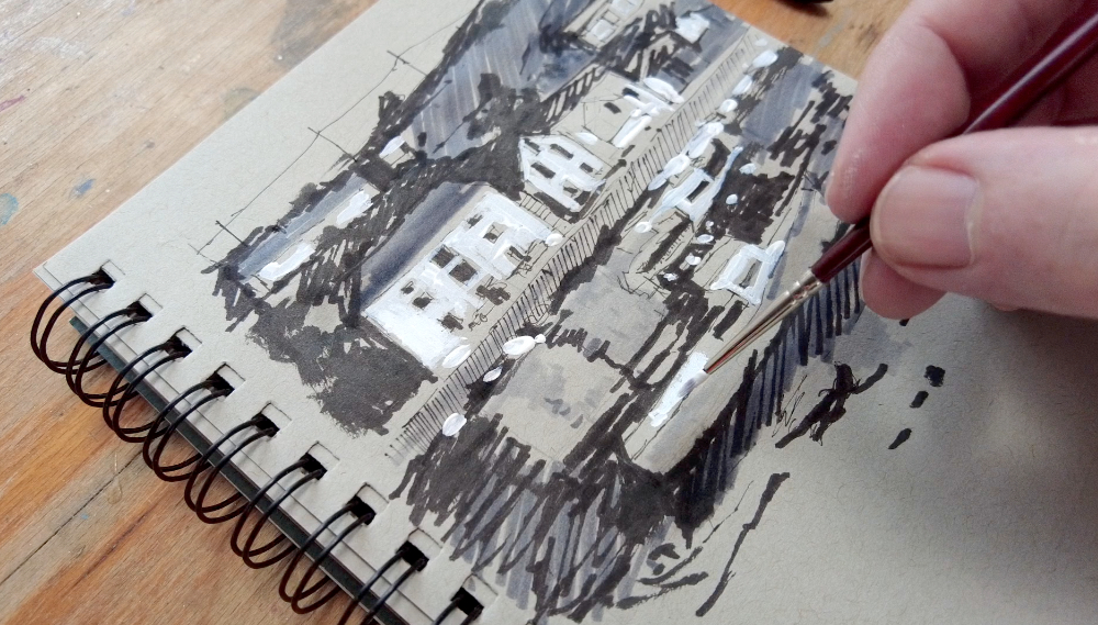
After a recent day out to Porthleven, I put together a video of a harbour scene sketch I did back in the studio.
I used Strathmore toned paper, started with a Sailor Fude Pen and then added layers of tone using Tombow Markers. The final highlights are white dashed Gouache.
The colours bounce off the water like a painting. I kept thinking how many artists must have stood here, brush in hand, trying to catch that perfect line where ochre meets cobalt.
It was a fresh, clear morning, and I was exploring one of Copenhagen’s most picturesque 17th-century districts.
I read an article that said a pencil can write 35 miles.
35 miles! I’m sure that can’t be true.
But the idea got me thinking about how keen we are to judge our drawing efforts before we’ve had time to develop our skills.
Many people give up on drawing after just a few attempts, declaring, “I can’t draw” or “I have no natural talent.” way too early on in the actual drawing practice.
That’s like judging your fitness level after a week of walking around the block, so it’d be easy to do a couple of drawings that don’t quite work out.
Drawing, like any skill, takes time and practice to develop.
A method that can help is to look at a non-emotional record of progress. It can help you keep calm and not critically self-assess your work until you’ve done a much larger body of work.
In the beginner’s drawing course, I recommend hiding your first attempts in an envelope to look back on in the future.
When progress in developing any skill is incremental, it can be helpful to have clear times to have a check-in on how things are going and to look back and see what has improved.
35 miles is a lot of shading; that’s 1,000s of contours and a bucket load of erasers!
I’ve been focusing on portrait structure, and anatomy with pencil on paper.
Morning Sketches from Jan 2025
Morning Sketches from Jan 2025
Morning Sketches from Jan 2025
There’s a whole story and a whole journey that would have come out of one pencil.
Not only do I remember the sketches that went well, but lots of smudging, erasing and relooking. I also remember how the sun was streaming in through the studio window when I sat down to do the third sketch and the croissant I was going to buy after my practice.
If you’re drawing with pen and ink, put a little pot on the side for empty ink cartridges.
Keep a bin for used-up paint tubes – not to judge the work but to celebrate a dedication to practice. I think it’s a nice idea just to think in terms of evidence; every artist’s journey is made up of these small records.
Ready to start your own artistic journey? My Absolute Beginners Drawing Course is designed specifically for people who think they “can’t draw.” Through proven techniques, you’ll discover that anyone can learn to draw – including you.
I thought I’d share with you a little seascape sketch that I did the other day.
It’s filmed in real-time, so you can actually see how long I take and how my decision process works when drawing.
You’ll see moments when I pause and reconsider what pens to start with and what pens I end up finishing with. You also see me having a cup of tea throughout the sketch because sometimes, just having a brew will give you that little bit of contemplation time to decide what to focus on next.
If you haven’t got 10 minutes to watch it all, I’ve also made a shorter 60 seconds edited version on YouTube shorts (and a 90-second one on Instagram)
Watch along in real-time as I sketch the shoreline of Porthminster beach, St Ives, Cornwall
60-second version below:
Sketching Pens, from Left to Right: Pentel Aquash Pen, Lamy Safari Fountain Pen, Liquitex paint marker, Pentel brush pen, Muji 0.5mm gel pen.
Exploring the narrow cobbled streets of St Mawes, every turn uncovers a charming cottage or an absolutely stunning view. This small historic fishing village is nestled at the end of the Roseland peninsula on the south coast of Cornwall and is magical.
Natural stone, slate, and white lime-washed simplicity, so with pen in hand, I set about capturing some of St. Mawes architectural coastal doorways.
‘The combination of lights and darks especially as used in Japanese art : the design or pattern of a work of art as seen in flat areas of dark and light values only.’- Webster Dictionary
Out for a beach stroll early this morning, as the sun was coming up behind the boats in the harbour, it was an idyllic image.
I had sunlight, a beach and a view, so I took a photo on my phone, and you would think this would make a brilliant painting—a reflection in the water, the pier in the distance and the boat in the foreground.
However, I know if I painted this back at my studio, it wouldn’t work out as well as it promised.
It would be just okay.
It might still translate if I wanted to create a piece that focused on the colours of the water and sky, but the basic graphical design of the piece just isn’t strong enough to create a great painting. The boats aren’t instantly recognisable as boat shapes, and the harbour is obscured by other unidentifiable shapes.
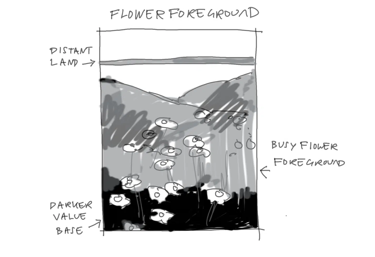
I find three value studies or Japanese Notan studies can be surprisingly helpful in guiding your choices for creating a compelling composition in your paintings. If you were just to look at a scene in simple values or Notan, it becomes glaringly obvious what really works as a successful image.
Every few weeks, I share my top art inspirations that I’ve read, experimented with or listened to. Here’s this weeks edition of things I enjoyed when I should have been at the easel, with the hope they might inspire your own work too…
Morning class, this week I’ve been in Corsica exploring the North Coast of the Island.
Sketching your surroundings can be such a fantastic way to create a visual diary of your travel experiences, so when I’m walking around the streets of any new town or city, I always carry a small sketchbook in my backpack.
A couple of tonal sketching pens and a brush pen is usually all I need, always trying to keep my kit as simple and minimal as possible.
This week I’ve been working on the last stages of my new beginner’s acrylic project book and wanted to add some pen and ink illustrations of materials & still life setups.
For all the sketches I used the following pens on 220gsm cartridge paper.
Lamy Safari Fountain Pen – filled with Lamy water-soluble black ink
Pentel Aquash Waterbrush Pen – this bad boy just holds the perfect about of water in the brush filament tip to wash-in water-soluble ink
Muji 0.5mm Black Fine Liner – so smooth and works well at any angle under a rapid speed
Pentel Brush Pen – if you’re struggling to create broken line effects, treat yourself to this pen, you can block in deep blacks really quickly
A number of the illustrations below are based on famous still life paintings. I always think looking at the pieces in black and white is interesting as you see how much the composition reveals an artists style. If you compare the shapes in Cézanne’s work to Morandi’s, there is a different set of compositional interests.