
Venice Light & the Landscape Course
(Scroll down ↓ to Add to Cart)
It was time to break out with the big canvas.
As a student visiting the Musée de l’Orangerie in Paris, I’d just seen Monet’s monumental Water Lily paintings, and I was in awe.
The sheer scale of the pieces with thick, painterly brush strokes inspired me to get back to my little studio space at home. I wanted to create impressionistic landscapes and seascapes that still held the qualities of light-fall and realism that I’d seen, but maybe a little bit smaller than 40ft!
And this immersive large-scale painting experience is what many beginner artists want, it feels exciting and well….arty to create something big and expressive.
Grabbing a large decorator’s brush, making gestural marks on your canvas – feels invigorating, almost like a breakthrough and then…. you start to hear your inner artist voice getting overwhelmed.
You haven’t got a plan; you don’t know what the next step is, so you lose your nerve.
You don’t know how to finish the painting, and more often than not, you revert back to a small canvas because it feels safe.
In this course, you’ll learn the key techniques for moving from small-scale to large-scale paintings with acrylics whilst still achieving a painterly style.
Over 4 hours of tuition, you’ll observe fabulous lighting conditions and colour harmony of a beautifully lit skyline by completing a large, impressionistic studio painting of Venice, Italy.
You’ll be guided through the basics of working with acrylic paint, review different brushes and materials, add texture to the surface of your canvas, mix pastel base colours, loosen your brushstrokes, and accurately capture architecture in your drawings.
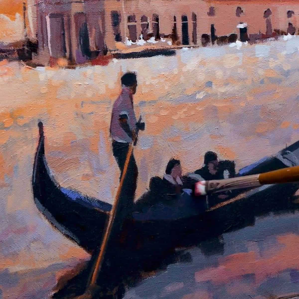
The silhouette of the gondola, the warmth of the sun setting behind the Basilica and the dappled light reflecting off the water allow us to capture the colour and light of a Venetian scene.
£57.00
- Description
- Lesson Breakdown
- Course Delivery
- Course Requirements
- What Students Say
- Student Success
- Gift Card
- FAQs
Description
What pitfalls does an artist face when painting big?
When I first started painting large-scale canvases, I had the luxury of free expression, a paint-splattered studio and no-one to please but myself – I had a ball!
But the experience of this much-anticipated freedom when working larger scale actually started to have a negative effect on my creations. I couldn’t seem to get what I wanted on the canvas quick enough.
As the size of the canvas increased, areas I was used to changing with one brushstroke, seemed to take ages. I’d run out of paint, then have to mix some more and spend hours fighting against the quick drying times of acrylics.
I’d press on the easel too strongly and the whole thing would lurch forward and my paint would go flying (note to self – an H-Easel is an excellent investment!)
The paintings either looked great up close to the canvas or great from right across the studio, but getting that balance between the two was hard.
So, what was the key to going from small-scale to large-scale and achieving a landscape that captures the atmosphere of the scene in a painterly style?
Vision? Confidence? Talent?
It came down to something far less exciting.
Planning.
To find the ‘big picture’ you need to go small first
I found that the same 3 key things kept on cropping up in my work:
1. If the paintings tonal values (black, whites and greys) on a small scale didn’t work, the bigger scale painting didn’t work.
2. If I planned a colour harmony before I began, I could be more expressive with my mark making knowing there was an underlying backbone that worked.
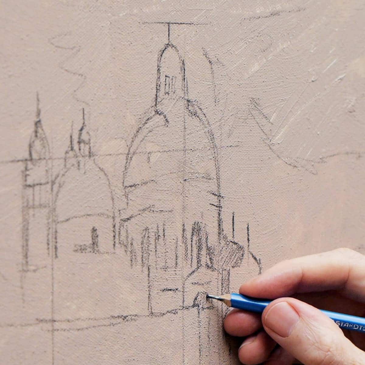
3. Spending time getting the drawing laid out was always worth it – even though I was aiming for an impressionistic painting style.
How to create a large-scale Impressionistic painting in Acrylics
I’ve developed this painting course inspired by a Venetian Sunset to help guide you through the process of moving from small-scale to large-scale acrylic paintings.
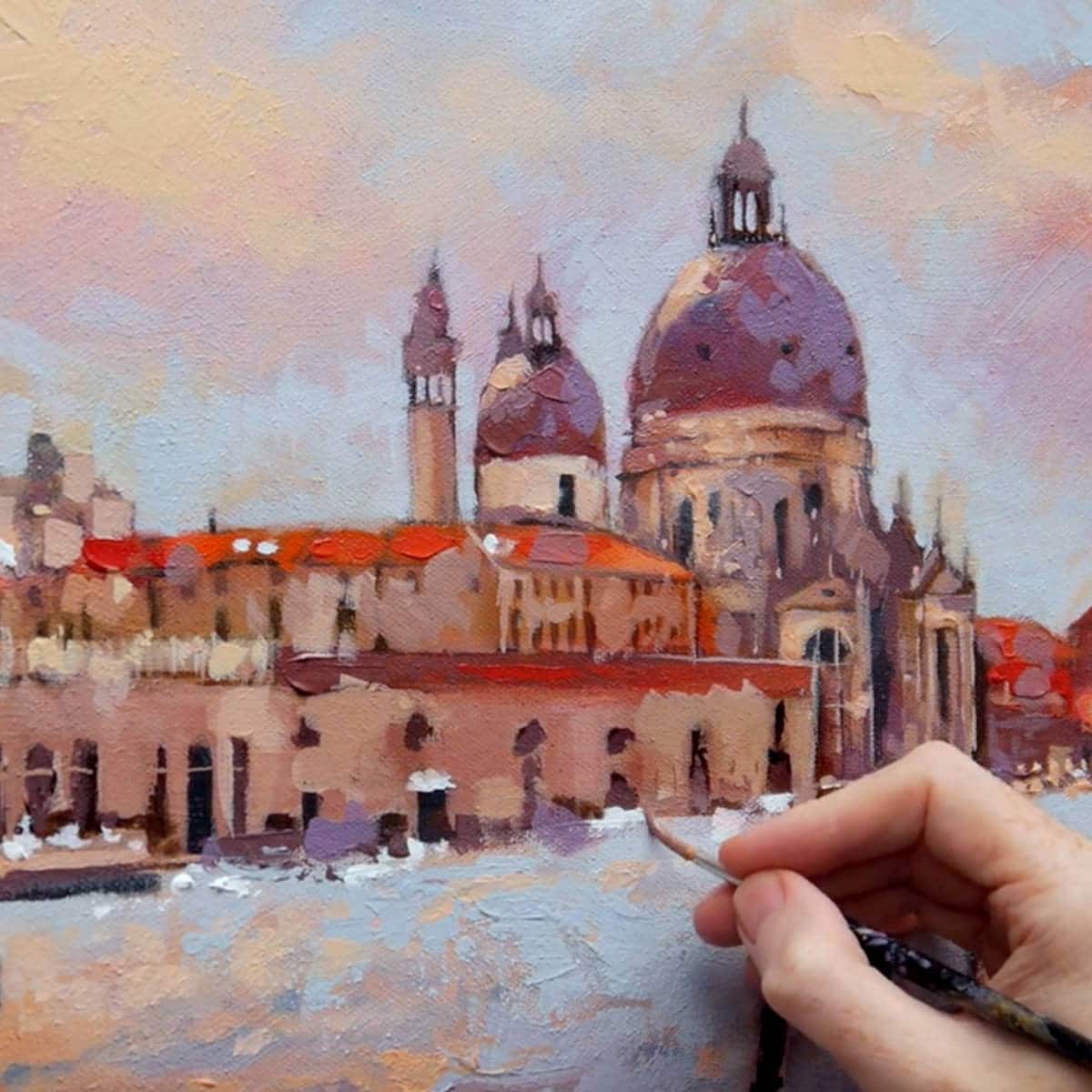
For me as a painter, there is nothing more exciting than the fabulous lighting conditions, amazing architecture and the warm pastel shades of the Venetian skyline. Observing the hidden tones, colour in the shadows and the vibrant reflected colours in the water lends itself to a broken colour Impressionistic style.
“No one is an artist unless he carries his picture in his head before painting it, and is sure of his method and composition.”
Claude Monet, Artist
What’s in the Course?
- 1 x large-scale finished painting of a Venice Sunset, taking you step-by-step from drawing, right through to the final glazes.
- 3 x small supporting studies to practice your techniques and refine your vision.
- 8-downloadable video lessons, split into separate chapters that follow on sequentially.
- Step-by-step instructional videos so that you can follow along at your own pace.
- Downloadable JPEG reference images and drawing worksheets to work alongside, including a mapped out grid for scaling up your drawing, black and white printouts and a full materials list.
- Over 4 hours of detailed video instruction.
- Lifetime access, downloadable on separate devices.
Lesson Breakdown

Lesson One
Painting with Colour & Light
An introduction to the materials, paints, surfaces, brush-strokes and mark-making. Observe how different lighting within a landscape affects the colour temperature of a scene.

Lesson Two
Edges & Brushstrokes
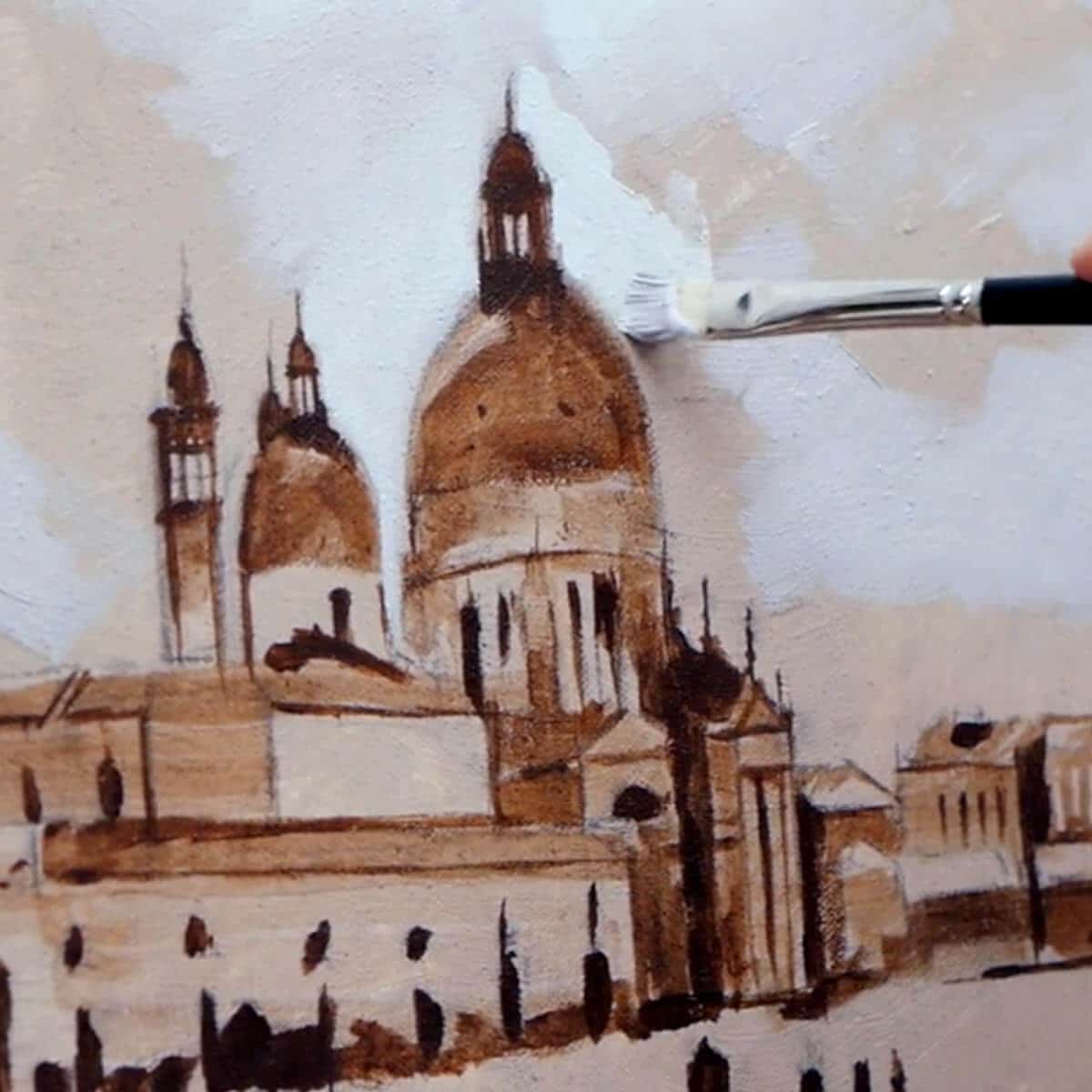
Adding surface texture onto the canvas enables looser brush handling and broken edges. Understanding the importance of accurate drawing and scale when handling architecture, even when painting in an impressionistic style.

Lesson Three
Tones of the Landscape
Practicing new techniques on small tonal posters studies before committing to the larger scale piece to build confidence. Increasing perception using the power of the ‘planes of the landscape’ and how they help avoid distraction.

Lesson Four
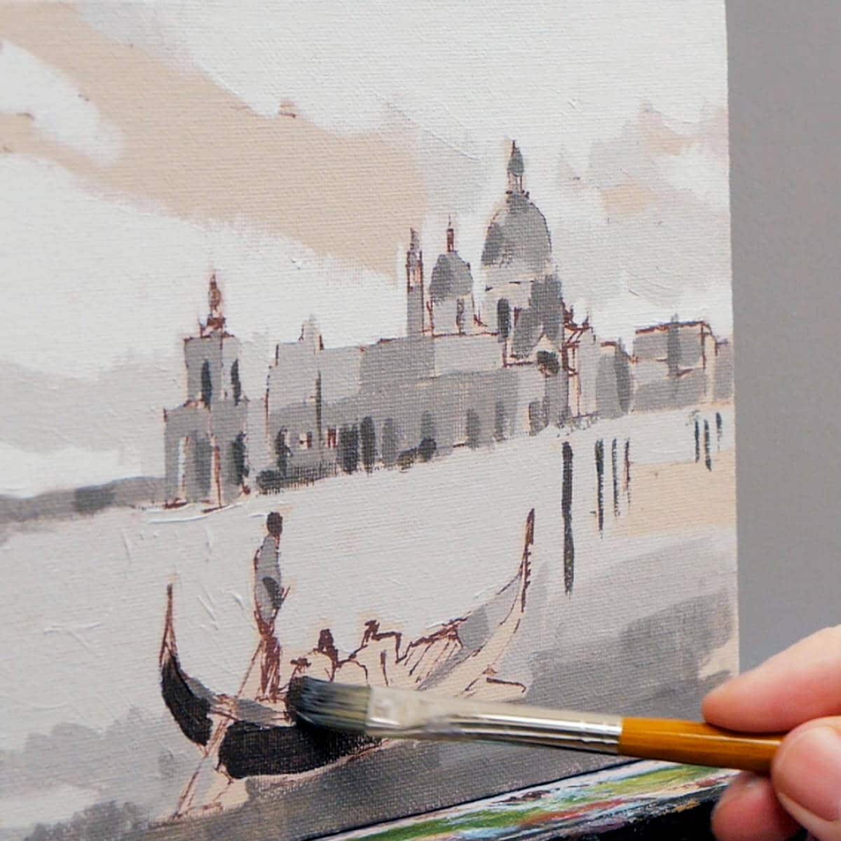
Shadow Blocking
Transforming complicated views into a simple design by shadow blocking. Learn how using a limited palette saves you endless amounts of painting time.

Lesson Five
Blending & Glazing
Using large flat brushes and a soft pastel palette to block in your base colours to the sky and sea. How to overcome the rapid drying time of acrylics when painting big by using specialist acrylic mediums that ‘open-time’, smoothing edges and the importance of blending acrylics.

Lesson Six
First Painting
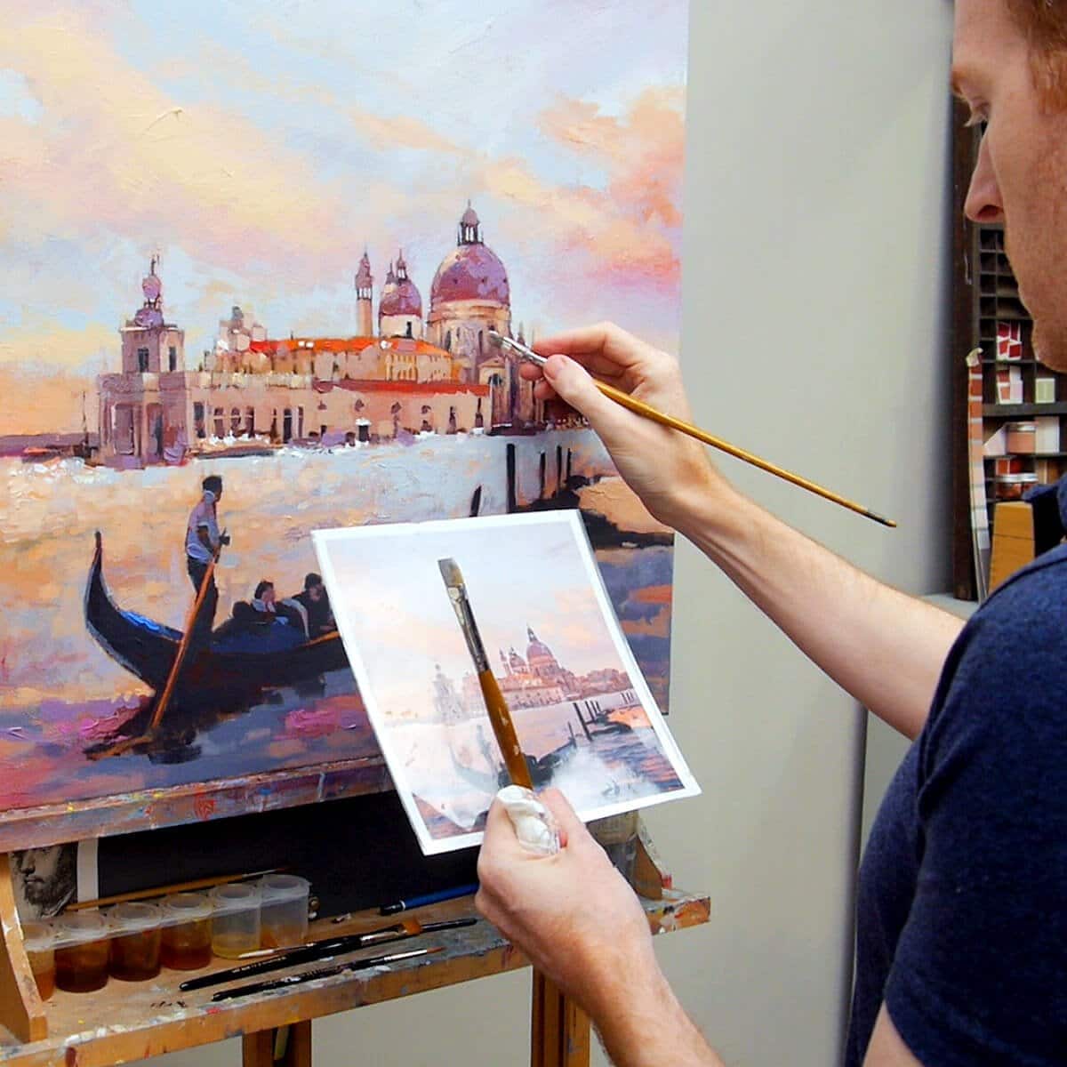
Introducing the rigger brush to add super smooth fine lines for architectural detail. Extending the colour palette with brighter pigments to increase the saturation and push the hues in the rooftops. Thinking abstractly to create impressionistic brush-marks in the water, bringing together the sky and sea.

Lesson Seven
Glazing & Details
How glazing can add atmosphere, mood and inject a warmth and glow. Adding further details to the architectural elements in the painting using finer brushes. Looking at the smaller shapes on the gondola, architecture & clouds.

Lesson Eight
Finishing Touches
Using a palette knife to add texture and an impressionistic flair. Refining our colour mixes, checking our drawing and seeing how the painting works together as a whole. Adding clean dashes of colour to create the ‘silhouette effect’ bringing the viewers attention to certain parts of the painting.
Course Delivery
I’ve taken care to film everything from my perspective so you can see exactly what I’m doing as we go through the entire painting process in real-time. With over 4 hours of video instruction, full-color photographs and drawing guides.
How is the course delivered?
When you purchase the course, you will receive an email with all the downloadable video links to the course. You then have to download and save the Video Lessons onto your home computer/iPad. Go through each lesson in your own time and in the way you prefer, with smaller studies and challenges throughout the course to keep your larger painting fresh.
- 8 Downloadable Step-by-Step Video Lessons – over 4 hours + of video instruction that once downloaded – you have any time, anywhere, lifetime access.
- A ‘Getting Started & Materials List PDF’ – which includes your materials list.
- JPEG reference images used throughout the course, including the photo reference I demo with and copies of my line drawings.
- The video files are large (3.5GB) so you need a broadband internet connection and enough space on your computer hard drive.
Please note: You will not receive a DVD.
Cut by the Artist
I filmed, edited, and coloured the course myself (with a little help from Vanessa!) rather than working with a production company. Artists have different needs than editors so I wanted to cut the course like an artist, showing you exactly what I wanted to see when I was learning.
I show all the real-time brushstrokes for the paintings so you don’t miss a step.
There are 3 main camera views I cover:
An over-the-shoulder view of the work – so you can see how I build up the painting as if you were standing behind me in the studio.
A close-up of the brush contacting the canvas – with extreme close-ups, so you can see the grain of the canvas and the bristles in the brush.
Stable shot of the palette for when I pick up paint – see exactly how I mix colours. There is nothing worse than when the brush disappears from view, only to reappear with some fantastic new colour. Where did that colour come from?! How did it get mixed?
The palette view is very important, and not just at the beginning of the video. I want to show you every single mix I make, so I film with the palette directly next to the painting, then you can see shots of the palette throughout the course and gain a sense of my approach to colour mixing.
Colour Corrected Footage
Filmed under constant colour balanced conditions, so the paint colours are as accurate as can be. (Computer monitor screens and print-outs can vary)
Real-time filming – No long jumps in progress
I don’t like long jumps in progress when the paintbrush goes off camera, the shot changes and suddenly the picture has seemed to drastically improve. I include all the stages so you can clearly see the progress of a work.
Course Requirements
Requirements for the Course
A broadband internet connection – the files sizes for the video lessons are quite large (3.5GB in total) so can take a while to initially download (depending on your internet speed.) Once downloaded, they are yours to keep forever, watch without buffering or take to the garden and watch away from an internet connection!
Enough free space on your Computer or iPad – You can download the files to a separate USB stick if you need extra storage space.
A Colour Printer – to print out the reference images or access to a Print Shop.
Glossy Photo Printer Paper – I use Epson Photo Glossy.
A love of espresso! – optional but you might need a biscotti or two!
What Students Say
Thank you, Will!
I’ve downloaded the videos … now off the grab a brew and start painting! I have to let you know that you are simply the best teacher when it comes to your art classes. I can’t find another source of online instruction that gives as much clear, step by step information as you do. Plus you have SO MANY FREE videos!
Thank you thank you thank you! This aspiring artist is so grateful for your generosity. I am sure I’m in over my head with this new class but I’m gonna just go for it.
Kristin, Venice Light & The Landscape Course
This is a great course. I especially like how in-depth this course is and all of the exercises that you include.
I’ve completed the first three videos and just finished spraying fixative on the canvas. I’ve done all my art study on the internet and your courses are by far the best I’ve taken. All the best.
Jack, Venice Light & The Landscape Course
Aloha, Will! Mahalo (Thank you) for your wonderful course. I studied the photos and lessons over and over, watched how you did your paint mixes, used the grid method and transferred my drawings to an 11×14 and 16×20 canvas for the main painting.
Except for the W&N pale umber which I purchased, I mixed all of my base colors, substituting for red oxide and violet oxide ( I had yellow oxide) and value mixes. You packed a lot in this art adventure and from your excellent demonstrations and teaching tips, I would recommend your fine course to any serious art student.
Thanks to your patient and painstaking teaching, I now have my Italian experience with two beautiful pieces of art! Let me know when we can travel together again!
Liz from Blue Hawaii, Venice Light & The Landscape Course
Will,
I have taken many of your free acrylic painting courses over the last year. Today I just finished the Venice Sunset painting course that you are selling. It was a great experience for me. It is probably my best painting ever. My wife gave me the course as a Christmas present, now she wants to frame the picture, she loves it. I learned a great deal starting with the stay wet palette that kept the premixed colors wet for three weeks (I’m slow). The exercises before the main painting were very instructional and fun. I learned a great deal on the color mixing and color tone instruction. The use of the glazing gloss to smoke the edges of colors is something I will use in the future. I have only been painting for about a year and a half but have learned the most from your instruction. My first painting ever was the acrylic painting of an apple that you offer. You are very talented as both a painter and instructor, the lessons were well thought out and detailed. After finishing this painting I had to write and say THANK YOU! Now whats next!
Steven, Venice, Light and the Landscape Course
Student Success

Venice Seascape

Venice Seascape

Venice Seascape

Venice Seascape

Venice Seascape

Venice Seascape

Venice Seascape

Venice Seascape
FAQs
Venice Light & the Landscape Course
No, there is no time limit, you can watch them as many times as you like.
The course is a series of downloadable video lessons, once they are downloaded they are yours to keep forever. If you change computer in the future just drop me an email and I’ll send you through some fresh links.
You can watch the lessons and courses as many times as you like and have lifetime access. If you change computer in the future just drop me an email and I’ll send you some fresh links through.
Yes, you can download to an iPad using Files App, or the free app called ‘Documents’. Without either of these apps, you will not be able to download directly to an iPad.
You can also download the video lessons to multiple devices (home PC, laptop etc) and if your storage space is running low on your laptop, you can download to a separate USB stick.
No, not at the moment.
The courses are available as a download only, there is not a streamable option.
If you only have an iPad you need to use either the Files App or the free Documents App to download and have enough space on your device
But there is one exception.
If you open the download links in the Safari browser on an iPad, Safari will give you an option to View or Download, if you click View, you can watch the videos without downloading.
Not hugely, I’ve kept the material list as small as possible.
For the painting courses, I try to keep the colour palette small and use the same base colours for many of the other courses. I demonstrate with artist quality paints which have a higher pigment ratio so a little goes a long way.
Yes, there are jpeg reference images and line drawings to work from.
I’m a big fan of drawing, and if you have a good understanding of how drawing works, it can make the biggest jump forward in your paintings. But if you’re super keen to get started with painting and engrossed in colour, then I’ve added a few downloads to help you out.
All of the images can be printed out A4 size allowing you to work 1:1 with your reference image (a classical technique called sight-size)
I’m a big fan of drawing and if you have a good understanding of how drawing works, it can make the biggest jump forward in your paintings (it seems counter-intuitive but it can make dramatic changes).
But if you’re super keen to get started with painting and engrossed in colour, then I’ve added a few downloads to help you out. These are line drawings that you can work from.
All of the images can be printed out A4 size so you can work 1:1 with your reference image (another classical technique called ‘sight-size’). You can then draw out freehand or trace the lines to get you started, this course is all about getting you painting.
Beginner to intermediate.
No, all the painting demonstrations are studio based.
Yes, it’s not all tea and biscuits when painting a larger scale for the first time! and there will be some parts during the process that seem to be taking longer than you may have experienced before when painting small.
That’s absolutely normal, for every artist.
Michelangelo spent four years perched on scaffolding when painting the Sistine Chapel, so a few more hours for this larger scale is to be expected.
Ideally, yes, or a very high table top to place your canvas onto. One of the most common mistakes when starting to paint on a larger scale in keeping yourself too close to the painting surface. Physical distance (stepping back and forth) is much easier when standing at an easel.
If you have difficulty standing for long periods, you can still work seated and even tweak the size from 24-inch x 24-inch to 16-inch x 16-inch to make it more comfortable.
Yes, when trying anything for the first time there are going to be areas that are frustrating. Just don’t be too hard on yourself, it happens to the greats.
Even Monet had his moments.
Just before 15 of his Water Lilies went to an exhibition in Paris, he was so unhappy with his work, rather than have them on public display, he destroyed them!
In theory, yes, although the first ground preparation stages are easier with acrylics and you would have to wait longer in between sections when working on the glazing parts of the piece. Many of the pigments I use are also available in oil colours but I don’t reference any mediums or list oil alternatives in the course.
You could follow along with OPEN acrylics by swapping the first under-painting with standard acrylics and then working with the OPEN paints. Again, when we get to the glazing stages you’d have to wait much longer in-between paint applications and the thicker impasto sections would also take much longer to dry.
For the initial ground, I’d use acrylics. You could then use water-mixable oils but would have to wait longer in-between sections when working on the glazing parts of the piece.
- Beginners Acrylic Painting Course – The fundamentals of a classical approach to working with acrylics
- Beginners Urban Sketching Course – Gaining confidence sketching outside
The shopping cart will convert to your local currency. You can use a currency converter to get an idea of the current exchange rate: https://www.xe.com/currencyconverter/
Yes, you can from another screen, such as an iPad or a desktop. That will let you keep the reference image visible while you follow the lesson.
However, in some of the lessons, I physically test colours directly on the printouts. This can be very helpful when you are first learning, because it makes colour matching clearer and easier to judge.

