A Beginners Guide to Colour Strings

…and How to Paint Quicker
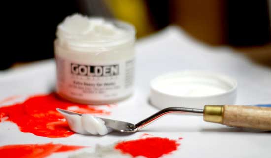
When you first start painting, the vision is to squeeze out bright, vivid paint colours, a handful of paintbrushes, or maybe a beret?
But often, this approach is an illusion, an artist myth.
To get professional results, you need a professional approach.
If you want freedom and expression on the canvas, a bit of premixing can help you achieve more pleasing results, especially if you try to achieve a more realistic effect.
If you spend a little extra time preparing, your actual time at the easel will be more efficient, quicker and rewarding.
Let’s enter the world of colour strings…