When you first start painting, the vision is to squeeze out bright, vivid paint colours, a handful of paintbrushes, or maybe a beret?
But often, this approach is an illusion, an artist myth.
To get professional results, you need a professional approach.
If you want freedom and expression on the canvas, a bit of premixing can help you achieve more pleasing results, especially if you try to achieve a more realistic effect.
If you spend a little extra time preparing, your actual time at the easel will be more efficient, quicker and rewarding.
Let’s enter the world of colour strings…
What are the colour strings?
When painting, you can either mix your colours as you need them using the raw pigment colour straight from the tube or premix your most useful tones.
Some artists prepare batches of colours in advance, others only prepare a few, and others don’t premix at all, preferring to mix on the fly – and this is the approach that beginners usually favour.
It really is a personal preference, but premixing is definitely worth practising.
When trying to create subtleties in portraits, it can be practically essential.
Traditionally, colour strings are used with oil paint because you have the luxury of slow-drying paint, so you can premix all your colours and tones one day, and the paints will stay wet for weeks (depending on the size of the blobs of paint and pigments used)
However, you can also use the same approach with acrylics.
You have to work a bit quicker, but I often premix colours I regularly use and either:
1. Keep them in small resealable plastic tubs or empty paint tubes.
2. Premix paints with a palette knife on a tear-off palette, then transfer these piles of paint to a stay wet palette. This acts as the loading bay, and you can keep them on here for about a week.
Then use a fresh tear-off palette to layout the colours you need for each part of your painting. Although the second method sounds a bit laborious, it can become quite therapeutic and mean the actual painting time will be quicker and easier.
Pro tip: make sure the stay-wet palette isn’t too wet, or the paints aren’t all student grade paints. They will be too thin, so they will soak up the water and mix into each other on the stay-wet palette.
How to mix a colour string?
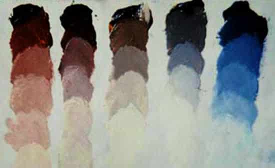
A colour string is a group of premixed piles of paints with different tonal values.
You usually start with the darkest colour in the string (say a pure ultramarine blue) and slowly add progressively lighter ‘steps’ to the mixture.
The lighter steps can be added with any lighter colour but are usually made by adding white as it is easiest to keep the tones as a clean tonal shift.
What does premixed colour mean?
Premixed: Sometimes you can buy a colour that has been ‘premixed’ by the manufacturer, say a ‘mid-tone grey’ or a ‘flesh tone pink’, but I favour staying away from these and using the basic 5 colour palette we’ve used before.
This will teach you both about each pigment’s tinting strength and show you how very subtle earth colours can be mixed from bright hues, using the principles of colour theory and complementary colours to help to dull and mute colours down.
Split colours into zones
You can premix strings for certain areas of a painting; spend a few minutes looking at the subject and trying to split a painting into different zones.
So for example, in a simple landscape, the sky can be a string of three to five colours, say start with an Ultramarine Blue with a touch of white, make a pile, then add a touch more white to create the next tonal step, make a pile, then add a touch more white for the colour nearest the horizon line.
The mix above starts with a dark blue of Phthalo blue (green shade) with a touch of Ultramarine blue – then gets progressively lighter. This will help to create a soft, blended finish due to the ability to quickly intermix the mixtures with confidence, knowing that the mixes are already very close in tone to the finished scene.
Using colour strings in black & white paintings
Even though they are usually called colour strings, essentially, the process stems from working with black and white tonal values. Often called a value scale or tonal range. For black and white paintings, a value scale of 9 or 10 mixtures is used. I prefer to use 9 mixes as it becomes easier to split lights, mid-tones and darks.
Each ‘step’ in the colour string has the same jump in tone when you flick your eyes between them.
You can download the above value scale and practice matching the tones with paint or pencil.
The power of 3
Using nine values can be useful when first modelling form because you can use the darkest 3 tones for the darks, the lightest three for the highlights and the middle 3 as the halftones.
The trick is having the willpower to only use those three premixed colours for that area of the painting! It will be very tempting to try and use other tones.
If you keep them separate, it will really improve the realism in your work.
I worked on the basic 3 tone underpainting; it was on a raw umber and white ground, value 3 or 4.
The dark shadow tone is pure burnt umber; this lies in the darkest 3 tones. In this second stage, I use Raw umber and Ivory black for the neutral dark grey, and I also use flake white for the lights.
I then work up the painting using the full 9 tones I’ve premixed (painting 3 above). This stage in a painting can sometimes be called a grisaille – a monochrome tonal underpainting.
I have found it saves me a lot of time in the later stages of colour if I take the time to make a complete value painting in grisaille first.
The painting is still rough at this stage, but I am now ready to start modelling the form knowing my tones are in the right ballpark. Adjustments will be made, but this gives a great starting point.
Below is the palette I used. The darkest grey is a mix of Ivory black and Raw umber to create a neutral dark. I then added Flake white progressively.
Using colour strings and experimenting with tonal shifts can give your paintings a variety in contrast while creating a harmonious painting.
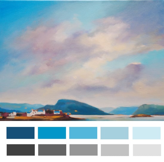
The below video shows how to apply the colour strings to a blended sky using acrylics.
Will, once again you have read my mind. Every time I think “how do I go about doing that?” you post the perfect solution!
I am about to embark on some monochrome paintings and wondered if the colours you list (ivory black, raw umber & flake white) are the obvious choices for black and white images, or if there are others that are commonly (or uncommonly) used? In the past I’ve used a little yellow ochre to warm things up, but you may disagree …
Hey Dave, Those mystic skills of mine are working again!
There are a variety of other colours you could use, the simplest being just black (mars black could be a better choice as it is slightly warmer than ivory black and a quicker dryer in oils) & White (flake white or titanium white) However, it might be a bit too cool, depending on the subject matter.
You can add the yellow ochre to the black, and have more of a green underpainting. This was used in renaissance painting, especially on portraits because you could then add subtle glazes of warmer red flesh tints over the top and the figures would ‘pop’ in contrast to cool green background.
Using a green/gray underpainting is known as the ‘Verdaccio technique’. Traditionally it was created from a mixture of Mars Black and Yellow Ochre. Again, it was used to establish tonal values in the underpainting. Due to the green colour of the flesh at this stage of the painting it is sometimes called the ‘dead colouring’ stage of a painting.
Other mixes include Chromium Oxide Green & Mars Black & titanium white, or
yellow ochre, raw umber and mars black. However, I’ve also found Green Umber (from Old Holland) can be used on it’s own to create a nice effect.
It really is personal preference. What’s nice about the black & raw umber is you can create a neutral, so if you where painting a white plaster cast you can achieve a close resemblance.
Hope this helps and doesn’t confuse matters further!
A very thorough reply and much appreciated, I’m learning a lot!
A while ago I did a few little paintings based on black and white images and I soon realised that there was no such thing as ‘black and white’ – every photo had a slightly warm or cool colouring, even if very subtle, and I wanted to try and capture those hues if I could. What initially seemed like a simple idea quickly became a bit of a puzzle … but that’s painting, I suppose! :O)
The colour options you have listed above are a good starting point and I will definitely try them out. Cheers Will !
Thanks Dave,
The slight colour shift between warm and cool always seems to appear more and more – the more you look at the subject. When you’re first starting in monochrome I would try to ignore these shifts on the first pass, as in the first lay in. Any slight change in colour temperature can put your eye out. Try and painting it with one string all coming from the same base colour. You can then alter and tweak the hues in the next thinner layers of paint. It will be tempting to try and change them as you notice a new subtle shift but you have to put faith in the technique. Start slow so you can finish fast.
Will
Hi Will, me again. I have been studying your piece on black and white portraits and I just wondered about a few details;
When doing the underpainting (grisaille) stage you are only using three values. Does the ground form one of these three values? If so, does it form the dark, medium or light value?
When mixing your three values for the grisaille stage, do you aim for values 2, 5 and 8? This seems logical as each are in the middle of their respective groups of three on the value scale. In other words; the midtones on the value scale are 4, 5 and 6 so would value 5 be best for the midtone at the grisaille stage?
Also, is number 1 on the scale light and number 9 dark?
When doing the underpainting (grisaille) stage you are only using three values. Does the ground form one of these three values? If so, does it form the dark, medium or light value?
This stage is called a Basic 3 Tone Underpainting, not the grisaille stage.I was referring to the last painting of the 3 in my post as the grisaille stage, which is a term for a painting created entirely in monochrome – I’ll tweak it in the post to make it clearer.
On this particular 3 tone underpainting, the ground colour is quite light, so acts as a midtone, the dark shadow tone is pure burnt umber and then white can be added as the lightest light.
On the whole, the ground is always a midtone so you can have the flexibility of going lighter or darker. The midtone ground colour would not necessarily be always a value 5, for this painting it would be about a 4 but for a more Caravaggio style painting it might be as dark as a 6. Often you can aim for your ground colour to be quite close to the general tone of the face in the light.
So when I am painting the grisaille stage, I’m using the full 9 tonal range, this is when it is useful when first modelling form because you can use the darkest 3 tones for the darks, the lightest three for the highlights and the middle 3 as the halftones and yes, number 1 on the scale is light and number 9 dark.
Some value ranges go the other way, such as the Munsell system, however as long as you stick to one of them it doesn’t really matter.
hello will … you very kindly pointed me towards some very helpful art sites the last time i left a comment and they have been fab!! I have added about 2,000 views since you answered my question!! Thank you so much!! Moyra
Great to hear from you.
Very pleased to hear that marketing art sites were useful and what a result you got!! 2000 extra views is a real achievement.
Thanks for letting me know,
I just found your site. I’m neither a professional artist nor a struggling artist. I just love to learn and get better at drawing and painting while teaching science to support my art habit.
I will explore the rest of your site. But first, I wonder, will you be posting the finished portrait from the above Grisaille?
I’m curious to see the final and subsequent steps.
Painting and drawing can be a bit of a science so sounds like the perfect combination! I haven’t posted the finished version of this painting as I decided to do a more indepth look at the process. Just follow the links to the ‘How to paint a portrait in oil‘ and it demonstrates the entire process.
Thanks! The link you provided is an excellent tutorial!! I learned a couple things. I’d love to see how you add glazes for coloring effects to the portrait.
You’re welcome Jeremy, pleased to hear you found some useful information for your portraits. For this particular painting I’m leaving it black and white bit will look at glazing in future posts.
Thanks,
Will
sean mulligan March 9, 2016
Hi Will
I have just viewed your tutorial on the black & white oil as I have been doing some pencil portraits using asimilar 9 tonal range and was searching for help on getting into oil painting. So thank you this is perfect.
However I was a little confused on the final section for varnish and Glaze. Did you mix the varnish and linseed and apply over the finished painting or did you mix a black glaze with this medium and apply over the complete portrait? sorry as I couldn’t quite understand this final section.
Hi Sean, I mix a black glaze and then just apply to the shadow sections of the painting I want to darken down a bit more to push the value range in the painting.
Cheers,
Will
Hi Will,
I discovered your website recently and enjoyed your still life Acrylics course, it was extremely educational as I am a beginner in acrylics coming from a watercolors media background, I just wanted to thank you for your great work that you are sharing with us.
And If you could do a step by step course for portraits in Acrylics it will be extremely nice :)
Thanks so much for your kind comments, so pleased to hear that the Acrylic still life course has helped in that leap from Watercolours. For beginners in portraits I usually recommend working with oils as the extra working time available makes for more subtle blends, and to get as good a portrait in Acrylics takes a lot more skill and a more methodical approach.
Yes, to lighten use either white or yellow, to darken either black or brown. Blue will darken the red but with create a purple rather than a more muted red. It depends on the type of red you are aiming for.
Thanks,
Will
when I’m painting, for example when I get to the part that I want to do the pinks, I make every shade of pink I think Im going to need, because first it distracts me when I have to stop and remake the color, second it sometimes is hard for me to make the same exact color.
what I do is also pre-mixing right? my teacher tells me it’s unprofessional and I have to mix as I go, is she right?
“I make every shade of pink I think I’m going to need, because first it distracts me when I have to stop and remake the color, second it sometimes is hard for me to make the same exact color. What I do is also pre-mixing right? “
Yes that’s right, you’re premixing the colours you’re going to use for your painting.
“My teacher tells me it’s unprofessional and I have to mix as I go, is she right?”
I’d have to disagree with your teacher. It’s not unprofessional, its just a different way of painting than direct painting.
Will, pls help with this question: how do u lighten a color with white in a color string with out the color graying out. For example,
If u wish to paint a red box and you use white in making the color string for the painting what do you do to avoid making the painting look chalky
Hi Sunday, If you want to introduce a warmer colour to the string you would have to apply a glaze over the top of that colour. Adding white to a colour will always coolit down, so it’s more noticeable in a red colour string than a blue one.
Hi will
i really learned alot here that i didn’t know before, so thank you.
when you are painting landscape, where in the landscape do you start with, i really want to Paint a landscape but i don’t know where to beginning, Do you start with the sky or the other Things?
Pleased you found the article helpful, I usually start with looking at the tones of the scene as a whole and then building the painting up in layers. Have a look at this landscape painting demonstration that goes through the process I use.
This is from my Oil Glossary as traditionally glazing originates in oil painting.
Glazes – the term used for a thin, transparent layer of paint. Glazes are used on top of one another to build up depth and modify colors in a painting. A glaze must be completely dry before another is applied on top. Traditionally glazes were used on top of a black and white under-painting called a Grisaille, thin layers of colours where then applied once the initial form had been established.
The best paints to use for glazes are pigments that have a translucent quality.
When using glazes in Acrylics I always use an Acrylic Glazing Medium to give an even finish.
Hello will you have to bear with me at 77 im trying to paint like the old masters and if thats not bad enough I have to try to understand this new technology called a tablet so battleling to get the tonal values plus this modern communication is taking its toll , however I thank you for all the information im picking up regards lionel
Like many visitors to this site, I’m deeply impressed with your generosity of time and experience. Thank you! And, thanks for offering an attelier/classical angle on acrylic technique!
Two questions for you:
Do the Stay-Wet palettes really extend the workable life of the paint even when the lid’s off, ie., while working? If so, how long will undiluted paint stay workable on one of these palettes (approximately)? I should add that I’m using Golden Heavy Body acrylics, RE the above question.
Regarding supports; 1/4″ oak plywood panel, sealed with matte medium–should it be sealed on both sides? Is warping an issue as it might be with oils?
Hi Anne, thanks for your kind words, pleased you’ve been finding the site helpful.
To answer your questions:
Do the Stay-Wet palettes really extend the workable life of the paint even when the lid’s off, ie., while working? If so, how long will undiluted paint stay workable on one of these palettes (approximately)?
Yes they do, if you have a large blob of paint on the palette, that would stay wet all day with a open top, you can mist over with a plant sprayer to prevent any skinning on the top of the paint. With the lid on the paint would last a good few days.
1/4″ oak plywood panel, sealed with matte medium–should it be sealed on both sides? Is warping an issue as it might be with oils?
It should be fine on smaller pieces, but if the board starts to get above 2ft x 2ft I would apply a coat on either side just to be on the safe side.
Hi Will, I found your website and have found it extremely helpful. I watched the video on doing a “Monet-style” painting and had fantastic results. I then downloaded your colour-mixing course and again this enlightened my knowledge. I was about to switch from acrylic to oil paints and was looking at your tips. Can i ask what a wet-palette is made from (i realise this is for acrylic)? By the way i have been self-taught 15 years ago, keeping up-to-date with regular courses over the years and i am finally part of an Art Club. I find your website very useful supplementing this and while at home.
Thoroughly enjoying your teachings. Thanks Fiona
A stay-wet palette is made from a shallow tray, then a membrane that holds water is placed in the bottom. Depending on brand this can either be a piece of sponge or a piece of absorbent paper. Then a layer of shiny paper (such as greaseproof paper) is laid ontop and as the water evaporates from the acrylics, water is soaked up from the absorbent sponge/paper underneath.
In a few weeks I will be teaching a class of 12 year olds how to paint a tonal portrait. I have found your site very informative and extremely helpful. However, I can’t decide whether to use oils or acrylics with them even after looking at your tutorial vids. Acrylics would suit, as the prep time and cleaning up time would be minimal and we wouldn’t have to worry about storing large numbers of canvas boards around the classroom whilst waiting for them to dry, but I am concerned that the quality of the acrylic portraits wouldn’t be as good as if we used oils. I was wondering if there is such as thing as quick drying acrylic paints which give a similar finished look to oils? Also, do you know if you can buy acrylic paints in set which are already mixed on a tonal scale – I think you referred to it as the munsell scale (or something similar :). I do aim to get the children to mix their own paints, but would like to give them something compare their mixing too rather than just printing off a tonal strip on paper.
The options depend on what the main teaching objectives are, either to learn about the layered process of in-direct painting with oil, to understand tone, to create a realistic portrait?
The oils are much easier to blend, but I’ve found students often apply the paint way too thickly, so using the acrylics might be a safer bet for your drying time.
The other alternatives are to use Quick drying oils (which still use oil and solvents as a thinner) or water-mixable oil which can be thinned with water.
They will both give you more working time than the acrylics, but dry quicker than the traditional oils.
You can by pre-mixed tonal paints, they are usually in artist quality acrylics and oil, or just make a monochromatic study just using black and white, or raw umber and white.
I’ve decided to go with the oils and will work through your self-portrait tutorial using raw umber and white. The learning objective will hopefully be to get the pupils to gain a better understanding of tone and of working with oils as this will be a new experience for them. Of course, I want them to paint a realistic portrait, so will probably use a scaling grid when working from a photo.
I’m working on canvas board, do you think I should prime this with gesso or can I just use brown acrylic paint for a base for the oils?
Good one Shelley, you won’t need to gesso the canvas boards as 99% come with a couple of coats of gessoed already applied. You can then start the painting using an acrylic coloured ground as detailed in part 1 of the tutorial.
I have (finally) made the foray into oils, and bought some supplies yesterday. Unfortuantely, I forgot the colours I needed, so came home with: Titanium White, Raw Umber, Burnt Umber, and Raw Sienna (Windsor & Newton Artist Series).
Can I still use just these to get used to the medium, and the actual process of painting, yet still create some tonal paintings?
Hi Franco, yes these are all great colour to have, you’ll still be able to create some great tonal paintings with these colours, next time you’re at the art store just add a ultramarine blue so you can start to experiment with warm and cool painting studies.
Cheers,
Will
Thanks Will,
Honestly I wish you could have been our teacher. My professor tried to teach us a lot of the same principles and it was a good class but I left the class not really knowing how to break the process down and do it all over again. The same material explained by you is easier to absorb. Seriously – thank you!!
my instructor will not allow us to use black to darken colors.
ie. use compliment colors.
he says mars black always gives a “black hole” look.
the dutch painters didn’t know better.at
what is your take?
what do you use to lighten color.?
ie.crimson with little yellow and little white.
what is your recommendation to shade and lighten in acrylic?
First of all, I just want to say, I’ve taken a couple of your full length classes (acrylic and drawing) and absolutely loved them!! My question for you today is regarding the sky you painted in the video: How to paint landscapes: colour mixing acrylics using colour strings. In particular, I’m interested in how you painted those beautiful clouds. Do you have a tutorial on this? I am working on a large scale painting that will have a big sky, so I’ve been practicing skies on a smaller scale. Any advice you have is much appreciated!
That’s great to hear Andrea! I haven’t got a specific video on painting clouds, the main thing that can help is to pre-mix three base tones for your clouds – a dark, mid and light. And then only use these tones for 90% of the clouds. It will be really tempting to try and add more contrast of more colours early on, but stick with your bases and then add the final tweaks at the end.
Hope this helps,
Dear Will,
I am currently thoroughly enjoying your impressionist painting class. I’ve continued practicing my small scale cloudscapes and your advice has been very helpful. I was wondering if you could tell me what colors you used in your clouds in the “How to paint landscapes: colour mixing acrylics using colour strings” video (as seen above) You had mentioned sticking to three base tones and then adding final tweaks at the end. Do you happen to remember what you used in both cases?
Thank you so much for your help. Your tutorials are a treat I look forward to every time I get a chance to take out my brushes and paints.
Cheers,
Andrea
Hey Andrea, pleased you’ve been enjoying the lessons, for the demo above it would have been a Phthalo blue (green shade) with a touch of Ultramarine blue – then gets progressively lighter with the Titanium White.
Cheers,
Will
Thank you for your prompt response Will! Final question: How do you achieve the beautiful gray, violet and yellow hues that appear to glow in the clouds?
Hi, I was wondering if using grey to tone down the chroma in landscape paintings is better than using the compliment. I have studied Frank Covino’s teachings on the subject and was wondering your opinion on his layer method. I believe the underpainting was made in order for the overpainting to be wiped in the shadow areas, most painters just paint over the underpainting today from what I have seen in numerous artist videos save for Covino…
Hi Will,
I just love this landscape painting with beautiful sky and clouds. Will you making or do you have the step by step tutorial video available, please?


Will, once again you have read my mind. Every time I think “how do I go about doing that?” you post the perfect solution!
I am about to embark on some monochrome paintings and wondered if the colours you list (ivory black, raw umber & flake white) are the obvious choices for black and white images, or if there are others that are commonly (or uncommonly) used? In the past I’ve used a little yellow ochre to warm things up, but you may disagree …
Thanks and keep up the excellent work !
Dave.
Hey Dave, Those mystic skills of mine are working again!
There are a variety of other colours you could use, the simplest being just black (mars black could be a better choice as it is slightly warmer than ivory black and a quicker dryer in oils) & White (flake white or titanium white) However, it might be a bit too cool, depending on the subject matter.
You can add the yellow ochre to the black, and have more of a green underpainting. This was used in renaissance painting, especially on portraits because you could then add subtle glazes of warmer red flesh tints over the top and the figures would ‘pop’ in contrast to cool green background.
Using a green/gray underpainting is known as the ‘Verdaccio technique’. Traditionally it was created from a mixture of Mars Black and Yellow Ochre. Again, it was used to establish tonal values in the underpainting. Due to the green colour of the flesh at this stage of the painting it is sometimes called the ‘dead colouring’ stage of a painting.
Other mixes include Chromium Oxide Green & Mars Black & titanium white, or
yellow ochre, raw umber and mars black. However, I’ve also found Green Umber (from Old Holland) can be used on it’s own to create a nice effect.
It really is personal preference. What’s nice about the black & raw umber is you can create a neutral, so if you where painting a white plaster cast you can achieve a close resemblance.
Hope this helps and doesn’t confuse matters further!
Will
A very thorough reply and much appreciated, I’m learning a lot!
A while ago I did a few little paintings based on black and white images and I soon realised that there was no such thing as ‘black and white’ – every photo had a slightly warm or cool colouring, even if very subtle, and I wanted to try and capture those hues if I could. What initially seemed like a simple idea quickly became a bit of a puzzle … but that’s painting, I suppose! :O)
The colour options you have listed above are a good starting point and I will definitely try them out. Cheers Will !
Thanks Dave,
The slight colour shift between warm and cool always seems to appear more and more – the more you look at the subject. When you’re first starting in monochrome I would try to ignore these shifts on the first pass, as in the first lay in. Any slight change in colour temperature can put your eye out. Try and painting it with one string all coming from the same base colour. You can then alter and tweak the hues in the next thinner layers of paint. It will be tempting to try and change them as you notice a new subtle shift but you have to put faith in the technique. Start slow so you can finish fast.
Will
Hi Will, me again. I have been studying your piece on black and white portraits and I just wondered about a few details;
When doing the underpainting (grisaille) stage you are only using three values. Does the ground form one of these three values? If so, does it form the dark, medium or light value?
When mixing your three values for the grisaille stage, do you aim for values 2, 5 and 8? This seems logical as each are in the middle of their respective groups of three on the value scale. In other words; the midtones on the value scale are 4, 5 and 6 so would value 5 be best for the midtone at the grisaille stage?
Also, is number 1 on the scale light and number 9 dark?
Thanks :O)
Dave.
Hi Dave,
When doing the underpainting (grisaille) stage you are only using three values. Does the ground form one of these three values? If so, does it form the dark, medium or light value?
This stage is called a Basic 3 Tone Underpainting, not the grisaille stage.I was referring to the last painting of the 3 in my post as the grisaille stage, which is a term for a painting created entirely in monochrome – I’ll tweak it in the post to make it clearer.
On this particular 3 tone underpainting, the ground colour is quite light, so acts as a midtone, the dark shadow tone is pure burnt umber and then white can be added as the lightest light.
On the whole, the ground is always a midtone so you can have the flexibility of going lighter or darker. The midtone ground colour would not necessarily be always a value 5, for this painting it would be about a 4 but for a more Caravaggio style painting it might be as dark as a 6. Often you can aim for your ground colour to be quite close to the general tone of the face in the light.
So when I am painting the grisaille stage, I’m using the full 9 tonal range, this is when it is useful when first modelling form because you can use the darkest 3 tones for the darks, the lightest three for the highlights and the middle 3 as the halftones and yes, number 1 on the scale is light and number 9 dark.
Some value ranges go the other way, such as the Munsell system, however as long as you stick to one of them it doesn’t really matter.
Hope this helps,
Will
Thanks Will, you’ve hit the nail on the proverbial head.
Dave.
Good one Dave,
Will
hello will … you very kindly pointed me towards some very helpful art sites the last time i left a comment and they have been fab!! I have added about 2,000 views since you answered my question!! Thank you so much!! Moyra
Hi Moyra,
Great to hear from you.
Very pleased to hear that marketing art sites were useful and what a result you got!! 2000 extra views is a real achievement.
Thanks for letting me know,
Will
Hello Will,
I just found your site. I’m neither a professional artist nor a struggling artist. I just love to learn and get better at drawing and painting while teaching science to support my art habit.
I will explore the rest of your site. But first, I wonder, will you be posting the finished portrait from the above Grisaille?
I’m curious to see the final and subsequent steps.
Thank you,
Jeremy
Hi Jeremy,
Painting and drawing can be a bit of a science so sounds like the perfect combination! I haven’t posted the finished version of this painting as I decided to do a more indepth look at the process. Just follow the links to the ‘How to paint a portrait in oil‘ and it demonstrates the entire process.
Hope this helps,
Will
Thanks! The link you provided is an excellent tutorial!! I learned a couple things. I’d love to see how you add glazes for coloring effects to the portrait.
Cheers,
Jeremy
You’re welcome Jeremy, pleased to hear you found some useful information for your portraits. For this particular painting I’m leaving it black and white bit will look at glazing in future posts.
Thanks,
Will
Hi Will
I have just viewed your tutorial on the black & white oil as I have been doing some pencil portraits using asimilar 9 tonal range and was searching for help on getting into oil painting. So thank you this is perfect.
However I was a little confused on the final section for varnish and Glaze. Did you mix the varnish and linseed and apply over the finished painting or did you mix a black glaze with this medium and apply over the complete portrait? sorry as I couldn’t quite understand this final section.
Many thanks
Sean
Hi Sean, I mix a black glaze and then just apply to the shadow sections of the painting I want to darken down a bit more to push the value range in the painting.
Cheers,
Will
Hi Will,
I discovered your website recently and enjoyed your still life Acrylics course, it was extremely educational as I am a beginner in acrylics coming from a watercolors media background, I just wanted to thank you for your great work that you are sharing with us.
And If you could do a step by step course for portraits in Acrylics it will be extremely nice :)
Thanks
Nader
Hi Nader,
Thanks so much for your kind comments, so pleased to hear that the Acrylic still life course has helped in that leap from Watercolours. For beginners in portraits I usually recommend working with oils as the extra working time available makes for more subtle blends, and to get as good a portrait in Acrylics takes a lot more skill and a more methodical approach.
Cheers,
Will
Quick question about mixing strings. To lighten a red add white or yellow? To darken add black or blue? I understand color bias.
Hey Sharon,
Yes, to lighten use either white or yellow, to darken either black or brown. Blue will darken the red but with create a purple rather than a more muted red. It depends on the type of red you are aiming for.
Thanks,
Will
Me gustaria saber si tienen libros o en PDF en Español son exelentes sus publicaciones
Hola Abel, desafortunadamente no tengo actualmente ninguna de PDF Español
Hi Will,
when I’m painting, for example when I get to the part that I want to do the pinks, I make every shade of pink I think Im going to need, because first it distracts me when I have to stop and remake the color, second it sometimes is hard for me to make the same exact color.
what I do is also pre-mixing right? my teacher tells me it’s unprofessional and I have to mix as I go, is she right?
thanks,
Soode
Hi Soode,
Thanks for dropping by, to answer your questions:
“I make every shade of pink I think I’m going to need, because first it distracts me when I have to stop and remake the color, second it sometimes is hard for me to make the same exact color. What I do is also pre-mixing right? “
Yes that’s right, you’re premixing the colours you’re going to use for your painting.
“My teacher tells me it’s unprofessional and I have to mix as I go, is she right?”
I’d have to disagree with your teacher. It’s not unprofessional, its just a different way of painting than direct painting.
Hope this helps,
Will
Will, pls help with this question: how do u lighten a color with white in a color string with out the color graying out. For example,
If u wish to paint a red box and you use white in making the color string for the painting what do you do to avoid making the painting look chalky
Hi Sunday, If you want to introduce a warmer colour to the string you would have to apply a glaze over the top of that colour. Adding white to a colour will always coolit down, so it’s more noticeable in a red colour string than a blue one.
Hope this helps,
Will
Hi Will,
In the landscape video, what colors did you use to paint the warmer part of the sky?
Thanks.
Hi Sam, for the purple tones in the sky it was Permanent Alizarin crimson mixed with Ultramarine blue.
Cheers,
Will
Hi Will,
For the middle part of the sky, did you use some kind of yellow?
Thanks.
Hi Sam,
That part is a Yellow ochre coloured ground, see this tutorial for how it fits into a landscape painting.
Cheers,
Will
Hi will
i really learned alot here that i didn’t know before, so thank you.
when you are painting landscape, where in the landscape do you start with, i really want to Paint a landscape but i don’t know where to beginning, Do you start with the sky or the other Things?
Regards Lise from Norway.
Hi Lise,
Pleased you found the article helpful, I usually start with looking at the tones of the scene as a whole and then building the painting up in layers. Have a look at this landscape painting demonstration that goes through the process I use.
Cheers,
Will
Please explain glazing and do we have to use glazing medium for acrylics or is there another technique
Hi Tina,
This is from my Oil Glossary as traditionally glazing originates in oil painting.
Glazes – the term used for a thin, transparent layer of paint. Glazes are used on top of one another to build up depth and modify colors in a painting. A glaze must be completely dry before another is applied on top. Traditionally glazes were used on top of a black and white under-painting called a Grisaille, thin layers of colours where then applied once the initial form had been established.
The best paints to use for glazes are pigments that have a translucent quality.
When using glazes in Acrylics I always use an Acrylic Glazing Medium to give an even finish.
Cheers,
Will
Hi Will,
First of all thank you so much! I have learnt so much here….. ! Thank you from the bottom of my heart.
I have just started to paint….i always wanted to but dint knew where to start from and how.
:) Best Regards.
Hi Indu, thanks very much for your kind comments, so pleased you’ve been learning where to start with your painting.
Cheers,
Will
Hello will you have to bear with me at 77 im trying to paint like the old masters and if thats not bad enough I have to try to understand this new technology called a tablet so battleling to get the tonal values plus this modern communication is taking its toll , however I thank you for all the information im picking up regards lionel
Good one Lionel, hope you’re finding the info helpful in getting to grips with the Old Masters!
Cheers,
Will
Will,
Like many visitors to this site, I’m deeply impressed with your generosity of time and experience. Thank you! And, thanks for offering an attelier/classical angle on acrylic technique!
Two questions for you:
Do the Stay-Wet palettes really extend the workable life of the paint even when the lid’s off, ie., while working? If so, how long will undiluted paint stay workable on one of these palettes (approximately)? I should add that I’m using Golden Heavy Body acrylics, RE the above question.
Regarding supports; 1/4″ oak plywood panel, sealed with matte medium–should it be sealed on both sides? Is warping an issue as it might be with oils?
Thanks,
Anne
Hi Anne, thanks for your kind words, pleased you’ve been finding the site helpful.
To answer your questions:
Do the Stay-Wet palettes really extend the workable life of the paint even when the lid’s off, ie., while working? If so, how long will undiluted paint stay workable on one of these palettes (approximately)?
Yes they do, if you have a large blob of paint on the palette, that would stay wet all day with a open top, you can mist over with a plant sprayer to prevent any skinning on the top of the paint. With the lid on the paint would last a good few days.
1/4″ oak plywood panel, sealed with matte medium–should it be sealed on both sides? Is warping an issue as it might be with oils?
It should be fine on smaller pieces, but if the board starts to get above 2ft x 2ft I would apply a coat on either side just to be on the safe side.
Hope this helps,
Will
Hello Kim !
i am just curious as to know what sort of pallete do you use ? Plastik ? Wood?Paper?
And another ( silly) question : after your painting , you normally clean the pallete and scub off all the paint ,even if there is some left on it ?…
would be very helpfull to know ! and i really enjoy watching all your Video lessons -especially the Acrylic paints…Thanks !
Mara
Hi Mara, I demonstrate with a tear-off disposable palette, and also use a stay-wet palette for larger acrylic paintings.
Cheers,
Will
Hi Will, I found your website and have found it extremely helpful. I watched the video on doing a “Monet-style” painting and had fantastic results. I then downloaded your colour-mixing course and again this enlightened my knowledge. I was about to switch from acrylic to oil paints and was looking at your tips. Can i ask what a wet-palette is made from (i realise this is for acrylic)? By the way i have been self-taught 15 years ago, keeping up-to-date with regular courses over the years and i am finally part of an Art Club. I find your website very useful supplementing this and while at home.
Thoroughly enjoying your teachings. Thanks Fiona
Hi Fiona,
A stay-wet palette is made from a shallow tray, then a membrane that holds water is placed in the bottom. Depending on brand this can either be a piece of sponge or a piece of absorbent paper. Then a layer of shiny paper (such as greaseproof paper) is laid ontop and as the water evaporates from the acrylics, water is soaked up from the absorbent sponge/paper underneath.
Here’s a video that goes through how to make a home made stay wet palette.
Hope this helps,
Will
Very helpful article, great pictures, thank you!
Thanks Judith, pleased you enjoyed it.
Will
Hi Will,
In a few weeks I will be teaching a class of 12 year olds how to paint a tonal portrait. I have found your site very informative and extremely helpful. However, I can’t decide whether to use oils or acrylics with them even after looking at your tutorial vids. Acrylics would suit, as the prep time and cleaning up time would be minimal and we wouldn’t have to worry about storing large numbers of canvas boards around the classroom whilst waiting for them to dry, but I am concerned that the quality of the acrylic portraits wouldn’t be as good as if we used oils. I was wondering if there is such as thing as quick drying acrylic paints which give a similar finished look to oils? Also, do you know if you can buy acrylic paints in set which are already mixed on a tonal scale – I think you referred to it as the munsell scale (or something similar :). I do aim to get the children to mix their own paints, but would like to give them something compare their mixing too rather than just printing off a tonal strip on paper.
Hi Shelly,
The options depend on what the main teaching objectives are, either to learn about the layered process of in-direct painting with oil, to understand tone, to create a realistic portrait?
The oils are much easier to blend, but I’ve found students often apply the paint way too thickly, so using the acrylics might be a safer bet for your drying time.
The other alternatives are to use Quick drying oils (which still use oil and solvents as a thinner) or water-mixable oil which can be thinned with water.
They will both give you more working time than the acrylics, but dry quicker than the traditional oils.
You can by pre-mixed tonal paints, they are usually in artist quality acrylics and oil, or just make a monochromatic study just using black and white, or raw umber and white.
Hope this helps,
Will
Thanks Will,
I’ve decided to go with the oils and will work through your self-portrait tutorial using raw umber and white. The learning objective will hopefully be to get the pupils to gain a better understanding of tone and of working with oils as this will be a new experience for them. Of course, I want them to paint a realistic portrait, so will probably use a scaling grid when working from a photo.
I’m working on canvas board, do you think I should prime this with gesso or can I just use brown acrylic paint for a base for the oils?
Shelley :)
Good one Shelley, you won’t need to gesso the canvas boards as 99% come with a couple of coats of gessoed already applied. You can then start the painting using an acrylic coloured ground as detailed in part 1 of the tutorial.
Hope your students create some fab portraits!
Cheers,
Will
Hi Will,
I have (finally) made the foray into oils, and bought some supplies yesterday. Unfortuantely, I forgot the colours I needed, so came home with: Titanium White, Raw Umber, Burnt Umber, and Raw Sienna (Windsor & Newton Artist Series).
Can I still use just these to get used to the medium, and the actual process of painting, yet still create some tonal paintings?
Thanks
Hi Franco, yes these are all great colour to have, you’ll still be able to create some great tonal paintings with these colours, next time you’re at the art store just add a ultramarine blue so you can start to experiment with warm and cool painting studies.
Cheers,
Will
Great stuff! Many thanks.
Thanks Will,
Honestly I wish you could have been our teacher. My professor tried to teach us a lot of the same principles and it was a good class but I left the class not really knowing how to break the process down and do it all over again. The same material explained by you is easier to absorb. Seriously – thank you!!
Pleased to hear it Maya, glad that you’ve been able to see the process behind the paintings more clearly.
Cheers,
Will
my instructor will not allow us to use black to darken colors.
ie. use compliment colors.
he says mars black always gives a “black hole” look.
the dutch painters didn’t know better.at
what is your take?
what do you use to lighten color.?
ie.crimson with little yellow and little white.
what is your recommendation to shade and lighten in acrylic?
‘
Hi Raquel, you might find this article of interest about using black: Are the 3 Black Painting Myths Holding you Back?
Cheers,
Will
Thank you for this article, Will. It’s very helpful!
You’re more than welcome Jo, glad it helped, colour strings can be super handy.
Cheers,
Will
This idea has changed my painting. Made everything easy for me after that.
Good one Zahra, pleased it helped.
Will
Hi Will,
First of all, I just want to say, I’ve taken a couple of your full length classes (acrylic and drawing) and absolutely loved them!! My question for you today is regarding the sky you painted in the video: How to paint landscapes: colour mixing acrylics using colour strings. In particular, I’m interested in how you painted those beautiful clouds. Do you have a tutorial on this? I am working on a large scale painting that will have a big sky, so I’ve been practicing skies on a smaller scale. Any advice you have is much appreciated!
Thanks so much!
~Andrea
That’s great to hear Andrea! I haven’t got a specific video on painting clouds, the main thing that can help is to pre-mix three base tones for your clouds – a dark, mid and light. And then only use these tones for 90% of the clouds. It will be really tempting to try and add more contrast of more colours early on, but stick with your bases and then add the final tweaks at the end.
Hope this helps,
Cheers,
Will
Wonderful! Thank you so much for the tips Will!
My pleasure Andrea.
Will
Dear Will,
If you get a chance, I would really love a tutorial on how you paint your clouds.
Thank you for your excellent classes!
Sincerely,
Andrea
Pleased you’ve been enjoying the classes Andrea, and good to know a cloud tutorial would be of interest.
Cheers,
Will
Dear Will,
I am currently thoroughly enjoying your impressionist painting class. I’ve continued practicing my small scale cloudscapes and your advice has been very helpful. I was wondering if you could tell me what colors you used in your clouds in the “How to paint landscapes: colour mixing acrylics using colour strings” video (as seen above) You had mentioned sticking to three base tones and then adding final tweaks at the end. Do you happen to remember what you used in both cases?
Thank you so much for your help. Your tutorials are a treat I look forward to every time I get a chance to take out my brushes and paints.
Cheers,
Andrea
Hey Andrea, pleased you’ve been enjoying the lessons, for the demo above it would have been a Phthalo blue (green shade) with a touch of Ultramarine blue – then gets progressively lighter with the Titanium White.
Cheers,
Will
Thank you for your prompt response Will! Final question: How do you achieve the beautiful gray, violet and yellow hues that appear to glow in the clouds?
Thank you!
Andrea
Hi Andrea, that was using Yellow Ochre and a touch of Alizarin Crimson.
Cheers,
Will
Hi, I was wondering if using grey to tone down the chroma in landscape paintings is better than using the compliment. I have studied Frank Covino’s teachings on the subject and was wondering your opinion on his layer method. I believe the underpainting was made in order for the overpainting to be wiped in the shadow areas, most painters just paint over the underpainting today from what I have seen in numerous artist videos save for Covino…
Hi Kenneth, yes muting down with a neutral can work well, it will depend on the hue and the effect you’re after.
Will
Hi Will,
I just love this landscape painting with beautiful sky and clouds. Will you making or do you have the step by step tutorial video available, please?
Hi Silvia, pleased you enjoyed it. I haven’t got plans to make this into a step-by-step, but good to know it would be of interest.
Cheers,
Will