Your colour choices can make or break a painting.
Understanding warm and cool colours can instantly give your paintings a sense of harmony.
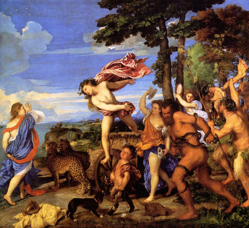
In the above Titian painting ‘ Bacchus and Ariadne’ Titan has almost split the colour wheel in half in his composition. If you were to put a diagonal line straight through the painting, the cool tones of the blues, greens and purples would be dominant on the left and the warm tones of reds, oranges and yellows on the right.
If you squint your eyes at the picture, the general colour scheme is based on blue and orange, which are opposite each other in the colour wheel so are known as complementary colours…
Titian balances the scene by placing areas of these two complementary colours, blue and orange, throughout the composition, creating not just harmony but also vibrancy.
In this video below, I talk you through how Titian has used warm & cool complementary colours to move the viewer’s eye around the painting.
The more you look for warm and cool colours in paintings the more you will see them.
Warm and Cool
The key principles of balance when learning how to mix colours is between warm and cool colours. If you divide the solar spectrum roughly into half, you will have the reds, oranges, and yellows on one side and the purples, blues, and greens on the other. The former being roughly the warm and the latter the cool colours.

Less is more
When you start to learn how to paint in acrylics, it is best to start.
It is better to have 5 colours you use consistently and learn to understand their individual properties and behaviours rather than keep on hoping a new premixed exotically named colour will save the day!
One brush is better than ten.
By just limiting yourself with a few key colours Ultramarine Blue, Burnt Sienna and Titanium White your paintings will have unity and balance.
This ultra-limited palette is very efficient and very effective.
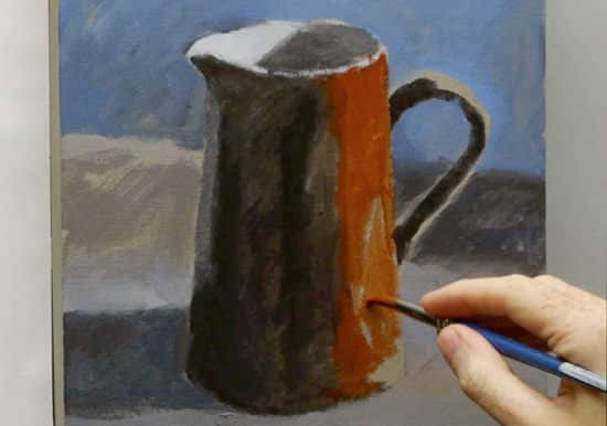
You can follow a simple step-by-step jug painting using these colours.

Warm & cool colour simple Jug painting video tutorial – Part 1 (40 min total Lesson time)
Perfect if you’re still learning about colour and want to understand the principles of warm & cool colour in painting.
Benefits of an ultra-limited palette
In her book Classical Painting Atelier Juliet Aristides commented:
Pliny the Elder wrote in C.E.30 that the most renowned painters of ancient Greece often limited themselves to only four colours – even when more were available. Pliny said that work was better when resources were limited because ample resources tempt artists and patrons to value materials above genius.
By varying the intensity levels throughout the painting, e.g., a muted blue next to a brighter orange or a bright blue next to bright orange, it will control where the viewer looks in the painting. The trick is to be able to control your viewers gaze without them even realizing it.
Below are 7 benefits of learning how to paint using a limited palette.
- A greater balance in your painting
- Easy colour harmony
- Professional looking results, think Old masters.
- Quicker to paint
- Can translate to acrylics or oil paints
- Forces you to think about tone and composition
- Have to adapt to use warm and cool colours to achieve contrast rather than adding a brighter colour.
A limited palette is efficient. If you had three colours on your palette and used those colours consistently, you would get to know them very well.
The better you know your pigments, the better able you will be able to control your mixtures.
Resources
Google Arts project, explore the painting close up
National Gallery, London Baccus and Ariande


I like how he paints and looks as he real a great master of arts
Thanks Mathew,
Will
Hi Will. I am totally confused by dioxazine purple. If I look at you linear example of warm and cool colours violet is on the cool side of indigo whereas many manufacturers label it as warm. Is this because when we go around the colour wheel it all joins up and violet is then placed next to red? To my eye it is a cooler version of red and a warmer version of blue, however I am very confused about labelling it ‘warm’ or ‘cool’ and how to use it while maintaining cool backgrounds and warm foregrounds.
Any help would be much appreciated, thanks:-)
Hi Coralie,
Different manufactures do have different pigments used for similar name paint. For example, Liquitex produce a Ultramarine blue with both a red shade and a green shade, whereas most other manufacters just produce Ultramarine blue that has a red shade.
It can be confusing as colours in general are labelled as warm or cool: red /warm, blue /cool and purple is a mix of them both so can be either warm or cool, depending on which way it leans.
So then you are left with how warm or cool the purple is in comparison to the other colours surrounding it. So next to red, it will look cool. Next to blue it will look warm.
You’ll often see purple used in skies as they go into the distance due to the effect of aerial perspective, so the purple acts as a ‘between the two’ of warm and cool depending on what else is in the scene.
Plus, in the sky/ landscape example (in the post above) white has been added to purple which will always make a colour cooler.
Hope this helps,
Will
P.s. Dioxazine purple is a cool purple, Cobalt violet is slightly warmer, Ultramarine violet is cool. These are based on Golden Acrylics, as manufacturers colours do vary, and this is from viewing the colours in isolation.
Hi Will
Thanks for you very informative reply. You’ve simplified the use of Dioxazine for me beautifully and that is generally the way I use it (diluted and in comparison to the colour it is next to).
We can’t buy Golden paints here and importing them is prohibitive. My Dioxazine is Atelier interactive by Chroma and the pigment is written as PV23RS so I’m assuming this is a single violet but cannot guess what other pigments may be contained in that number. I wanted to be clear in my own mind about its temperature because I routinely mix warm or cool chromatic blacks for darkening another colour. I tend to stick with mixing warm/warm and cool/cool within the palette I’m using to keep the colours clean and want to find a good recipe for a clean purpled-undertone chromatic black. I also tend to use a relatively limited palette of 6 colours. Sorry I didn’t compose my initial question accurately
Thank you for your many wonderful videos. They are always rich in information and very much appreciated
Thanks Coralie, pleased it helped.
Hello Will. This is my first time with you and I’m very interested in your information so interesting. thank to share.
Pleased you’re finding it helpful Mercedes.
Cheers,
Will
This is a very convenient and useful site. I’m very interested on exploring more of these great links I this marvelous site. I’m a first time painter from the drawing side of things and I’m hoping to get all the skills and mental tools to get me started. Thank u!
Pleased you’re finding it helpful Nhlanhla
Hi Will
I have really enjoyed and learn’t how to mix colours from your videos.
But, how do I darken white acrylic, when depicting a plate or dish, without it looking
‘dirty’ or lifeless ?
Any suggestions ?
Thanks.
Linda
Hi Linda, pleased you’ve been finding the tutorials helpful in your colour mixing.
If you mix together ultramarine blue & burnt umber ( a tiny amount of each) & titanium white you can mix a range of greys that will help in toning down the white but still keeping it neutral.
You’ll then be able to adjust the hue by increasing or decreasing the blue/brown to the mix.
Also, depending on the colour surrounding the white plate or dish will drastically change the percieved colour of the white object. For example, a bright red next to the white will give the white a pinkish glow, even if the white is pure white.
Hope this helps,
Will
Dear Will, appreciate your instruction.Re warm cool color: how do you use in a watercolor painting? Do you use a warm red and next to it put a cool red or just as beneficial do you use any temperature red and put any temperature of green next to it?
In other words can you give guidelines on using warm and cool temperature colors together in a single painting.
Hi Max, have a look at this tutorial, that uses a cool blue and warm brown. Also. the final stages of the cherry painting. Notice the cool red on the underside of the cherry compared with the warm red around the white highlight.
Hope this helps,
Will
Dear Will, Your free tutorials are just fantastic. I am a long time painter in acrylics but without any formal training and your lessons tie up many loose ends that have plagued my paintings for years.You also have a very nice way of teaching.Thank you and God Bless. Sara
Hi Sara, so pleased to hear you’ve been finding the tutorials helpful and they are giving you a more rounded approach to your paintings.
Cheers,
Will
Hi Will, u r a constant inspiration and a very good artist…I am just a beginner n I have been practising art through your videos. My question to you is I am trying to paint white Daisy with a backdrop of warm colours like lemon green, pink, lemon yellow and lavender, so which colour do I prep my canvas with to best bring out these warm shades?
Hi Shobhana, a warm yellow such as naples yellow oy yellow ochre mixed with some titanium white would be a good base coloured ground colour.
Cheers,
Will
Hi Will What colors foo you use for clouds? Is it different for oil and watercolor.
Thanks, Laurie
Hi Laurie, yes you would approach it differently with each different medium, just starting with a white, ultramarine blue and burnt umber you can achieve some lovely skies.
Cheers,
Will
I am glad I found your site. Though not formally trained, I have been painting over 30 years. Your explanations are clear, to the point and not too technical for us artists without the degrees. Thank you very very much.
You’re welcome Mary, so pleased you’ve been enjoying the articles and tutorials.
Cheers,
Will
Enjoyed the tutorials ! I painted the pitcher and really enjoyed it. Do you have others? Thanks
Cindy
Pleased your painting turned out well Cindy, you can see more free videos here.
Cheers,
Will
Hi Will. Very informative and neat. I’m trying to learn about that. I’m painting a figure and i mixed all my cools and warms everywhere and now I’m at a point to look for more understanding because what i want in my is not showing in my paintings. Thank you for the article.
But now.. i have a set of blue red and yellow in cool and warm tones. How to mix them when painting in general and when painting a figure?
Would you for example mix a warm blue with a cool red (mangeta)? If so to achieve what? That’s what i am most confused about.
Hi Viviane, it all depends on what colours you’re trying to achieve, a warm and a cool blue and red can be intermixed as long as you have an understanding of what can or can’t be achieved with the specific colour.
Have a look at this video on mixing pinks & purples to see the differences in intensity of purple when using different reds and blues.
Hope this helps,
Cheers,
Will
Hi dear master. How to make cool and warm orange❓
Hi Reza, you might find this tutorial helpful.
Cheers,
Will
Hi Will
So much great info that I want to get everything in my head ASAP this is my major issue ‘Quick gratification’ I started painting way back in 1994 and did not start with a small canvas but a really HUGE one that I got framed before I started the painting ( long story) I felt if I did not do that then I would procrastinate but a blank canvas sitting in a gorgeous Italian frame would nag me in starting up!-It took 4 months to do that painting a Huge bowl filled with flowers of different kind! After that I went on and continued to do as many as I could, landscapes, flowers, etc. anything that takes my fancy- I love mountains trees and seascapes-Trees seem to elude me though- and though they are all what an amateur artist does they gave me pleasure, I have in many painting ( abstract ones) experimented with different mediums! including water color pencils markers etc.! and they turned out well!
Anyways I have joined a class in my town and enjoying it However I refer to some real great guys like you- I like Clive5art-So far the two of you really keep me awake till the wee hours trying to absorb so much stuff!
Thanks a bunch
Cheers, really pleased you’ve been finding all the lessons helpful.
Will
Hi Will, really enjoy reading your articles. Particularly interested in the concept of painting with just burnt sienna and blue to create the form, tone and atmosphere of the painting. I was just wondering if one could then push it further and add more colour in areas without knocking the balance out? Ie. Adding alizarin or cadmium to heighten intensity? Similarly, introducing the yellows etc? The result being a painting with the full spectrum but the process being one that is less confusing for the artist?! Similar to the glazing process, but without the glazing…
Hi Adele, yes that would work fine. Get the initial painting laid out and then start to introduce stronger more pigmented colours.
Hi Will, I just read questions and your answers and find you fascinating because you are helping so passionately! I started to go paid classes to learn the acrylic painting after having stroke and lost my peripherial vision.. Unfortunately found many teachers don’t teach much! For example I am still not satisfied
about sand colours ! What basic colour combination should I use to create many tones of the sand colours ? Thank you so much by now!
Nesrin
Hi Nesrin, pleased you’ve been enjoying the website, for a sand colour a yellow ochre and white can get you very close for a base sand colour and then you can tweak the tones from that mix.
Hope this helps,
Cheers,
Will
A great great website and videos for beginners. Had been postponing painting for too long. Finding Will’s website really pushed me to finally start. Yesterday walked through your video on how to paint a jug with just three colours. Love the result and love the way you teach. THANK YOU!
Cheers,
Gunita
Thanks very much Gunita, really pleased you’ve been enjoying the tutorials.
Cheers,
Will
Will
Just magic! Can’t get enough of your advice and videos. A bit like eating too many cream cakes and feeling as though your head will explode…
Thank you SO much
Sarah Orchard
Ha, ha, really pleased you’ve been enjoying them Sarah.
Cheers,
Will
I’ve been working on a landscape for months but recently noticed that it’s pulling much warmer than I intended, can I fix the tone by doing a blue glaze over the problem areas?
Hi Jenni, yes, using a blue glaze will shift the colour cooler. It will also slightly darken the area.
Cheers,
Will
Hi Will, other combinations exist such as ultramarine blue and burned siena to create interesting limited palettes.
Cheers
Eloisa
They sure do Eloisa, you can see a tutorial using those two colours here: How to Paint a Warm & Cool Still Life Painting (Using only 2 Colours) Part 1 of 3
Cheers,
Will
Hi Will, I enjoyed the limited palette tutorial, but I’m curious… obviously in life we see more than just two colors, so how would I apply this technique to a full color scene or still life that doesn’t necessarily include the colors of the palette? Thank you!
Hi Robert, glad you enjoyed it. You would start to build out the palette and colours in the composition but still being aware of the warm and cool shifts in the colours. Here’s an article on a wider palette
Hope this helps,
Cheers,
Will
Thank you soo much. I have been following you from Germany and. now in United states.
I am 92 years old . and started to learn how to paint with Oil . do you suggest some more simple objects such as the pitcher to practice with. God bless you. Will, you are so good and generous to help others. It makes me cry for your kindness.
Duh chuen priessnitz
Hey Duh Chuen, so pleased to hear that you’ve been enjoying the lessons and finding them helpful. Yes, simple subject like the pitcher can work really well for beginner subjects with oil. You could adapt many of the acrylic lessons to use those as the reference for your oil studies.
Will