
Morning Class,
This week, I’ve been working on a Spritz cocktail painting inspired by one I enjoyed in St Mawes.
This subject offers an excellent opportunity to practice capturing reflections in water and exploring how coloured liquids can challenge our visual perception.
While painting the background and the surface around the glass might be relatively straightforward, the real challenge arises when we start painting the cocktail itself. Your mind will naturally begin to second-guess what you’re seeing. Thoughts like, “That’s too dark for a lemon,” or “The straw should be white, not grey,” might pop up.
You’ll be craving a cocktail yourself after tackling all these tricky reflections!
Part One: How to Paint a Spritz
Part Two: How to Paint a Spritz
You can see a Student Success page from the lesson here: Aperol Spritz Student Success
Without the straw, the image falls apart.

I painted a 15 min colour sketch before beginning the actual piece, and this taught me a lot about the subject.
Without the straw, the image falls apart.
This small test painting, more like a thumbnail impression, plans out the composition. I found that without drawing the stem and straw, the painting looked unclear and abstract.
Arranging the Composition
I’m using an 8 x 10 inch (20 x 30cm) canvas and wanted to see how it would work best on this ratio.
Using my iPhone, I zoomed in or out to find the right crop. However, I noticed that the top of the straw was too long, and it interfered with the balance of the composition.

The straw is key to the composition, but interferes with the balance of the 3:4 ratio
I wanted to keep the straw in, as it connects the viewer to the idea of being a drink with ice; it went off the end when cropped closely, ruining the overall look. To address this, I used a little artistic license and shortened the straw in the painting. With a shorter straw, I could then zoom in, making the drink more central to the canvas.
Preparing the Canvas

The Galeria paint range has a nice paintable consistency straight from the tube, but I’m going to add a little water to achieve a mix with a slightly thinner consistency.

Pale Umber. A pre-mixed light umber created from Titanium White and Burnt Umber
For the ground colour, I’m using Pale Umber from Winsor & Newton; this is part of their student-grade paint collection Galeria. It’s basically a mix of Burnt Umber with Titanium White, so you can easily create your own mix if you haven’t got his particular one. It gives a nice neutral base for the woody colours in the background and provides a warm starting point for the rest of the painting.

To apply the paint, I’m using a 25 mm decorator’s brush. Before I start, I dip the brush in water to moisten the bristles slightly, making the paint flow better on the canvas. This paint is a bit more fluid compared to standard heavy body paint, so it goes on smoothly straight out of the tube.
Reference Image
You can download the reference image below to follow along with the lesson.

The photo can be downloaded and printed out (opens in a new tab).
Painting Materials you will need:
- 10 x 8 inch (25 x 20cm) cotton duck canvas
You could create the painting with a more limited palette, but these were the colours I used.
All the paints below are from Golden Heavy Body Acrylics, unless otherwise noted.
Paints:
- Titanium White
- Cadmium Yellow Light
- Cadmium Orange
- Pale Umber (Winsor & Newton – only available in the Galeria Range)
- Burnt Sienna (Winsor & Newton)
- Burnt Umber
- Raw Umber
- Cobalt Violet Hue
- Cobalt Blue Hue
- Phthalo Blue – Green Shade
- Ultramarine Blue
- Permanent Alizarin Crimson (Winsor & Newton)
- Cadmium Red
- Naphthol Red Light (a tiny touch)
Brushes:
- Isabey Isacryl, Size 6 – 6562 Flat
- Isabey Isacryl, Size 6 – 6572 Filbert
- Rosemary & Co, Series 302 Golden Synthetic Flat
- Small Round for details
Palette Knife
- Size 45 – RGM Palette Knife
Acrylic Medium
- Glazing Liquid Gloss (Golden Paints)
Step #1. Drawing Out

I use a 0.5mm HB mechanical pencil to draw the initial outlines and a straight edge for creating the gaps between the boards on the tabletop.

I’ve drawn the abstract shapes within the reflections and shaded where the darkest tones will be.

Then I added more details using a fine-tip paint marker filled with fluid high-flow acrylic paint in sepia from Golden Paints.
Step #2. Underpainting with Burnt Umber

Underpainting is essentially a base layer for your painting.
I used Burnt Umber on top of the initial Pale Umber ground. By adding these dark tones first, I can gain an understanding of the construct of the subject without the distractions of colour.

Once I’ve got the darks down, I use Titanium White to block in the lights. I change the opacity by adding a little water (noticeable in the larger brushstrokes at the top of the painting) and then go thicker for the brightest highlights.
Step #3. Painting the impressionist background

Once I’ve blocked in the dark and light areas, I introduce Burnt Sienna, Ultramarine Blue, Cobalt Violet Hue, and Cadmium Yellow Light onto my palette, in addition to Burnt Umber and Titanium White I already have. I focus on the outer edges of the painting, capturing the purplish and bluish shades on the left and right sides to indicate the shadows of a person and the curtains.
I’m using the flat Isabey Isacryl paintbrush and standing at arm’s length from the canvas. This helps to be more gestural. Using your whole body rather than being up too close to the surface.
I’m following the dark values of the Burnt Umber and matching those values, but now adding colour. So constantly observing the different shades and how they change around the composition.
Bounced light on the centre of the table
Coming through the door frame is a cool evening light hitting the back of the glass. (Daylight will cool in colour temperature as the day gets later) When this light hits the wooden table, notice how the colours around the glass turn to warmer greens and muted blues.
Once I’ve blocked those in, I look again at the colours in the background.
Into the grey mix I used on the figure, I added a touch of Cobalt Violet Hue to paint the more saturated fabric in the top left. This was then lightened with white to capture the folds in the light.
Lastly, I painted a mix of Burnt Umber and Burnt Sienna for some of the warmer hues on the right side of the tabletop. I vary the consistency by adding water to create a wash and give a glow.
Step #4. A String for a straw
For the blues in the doorway, I use a Cobalt Blue Hue, Titanium White and a touch of Cadmium Yellow Light to shift towards a more turquoise note.
I begin by mixing a lovely inky blue as the darkest blue. You can see the darkest blue on the edge of the door frame. I slowly add more white into the mix as I move across the doorway to give that sense of the light transition into the bright outside.
For the straw, I add a tiny bit of Phthalo Blue (Green Shade) and then mix that with Ultramarine Blue and Cobalt Blue to create a colour string for the range of blues on the straw.
When you’re painting the ‘white’ of the straw to give that sense of it being backlit – it’s darker than you think!
I mixed a yellow with some Cadmium Yellow Light, White and Burnt Umber. Once you have the darker notes down, I paint along the edge with white to give three-dimensional volume.
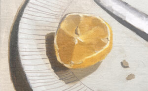
Step #5. Mixing Oranges for the Spritz

I’ve got Cadmium Yellow Light, Cadmium Orange, Cadmium Red, Burnt Sienna, Permanent Alizarin Crimson (from Winsor & Newton) and Burnt Umber.
Using these colours, I mix a range of values, creating a warm colour string, and I start with the darkest value.

Painting in the deep red, I use a smaller square brush, a Golden Synthetic from Rosemary & Co. I then jump up the value of the colour string to the next orange hue. I work between the muted yellow colours in the lemon that’s floating in the drink and the rich oranges.

The darker area of the white straw submerged in the drink can be a little harder to judge.
Because you know that it is white, but it looks dark, and then it’s also got the colour of the drink!
Block some colours as close to it as you can to start with. Take for first best guess. Then creep up on the colours.
The ice on the top of the glass has a soft pink/purple hue. It balances nicely with the stronger purple in the top left of the curtain that we first painted.
Make sure you’re happy with the values and saturation before you start to refine any of the colours.
Step #6. Reinforcing the Lightest Lights
Painting in thicker Titanium White around the top of the glass emphasises that sense of reflected water. Also, a few dashes of white within the drink.

Step #7. Glazing
The final step is to get the drink to ‘sink’ into the canvas.
I’m using a Naphthol Red Light with some glazing liquid and just blushing it lightly over the surface before reinforcing the stronger colours to give more of that illusion that we’re looking through a veil of colour.
Then a couple of final tweaks on the highlights, and we’re done!

Summer Spritz in St Mawes, Will Kemp, Acrylic on Canvas, 10 x 8 inches.
I really hope you enjoy the lesson!


Thank you Will. The spritzer glass is brilliant and I will certainly have a try. You are very generous in your help for us beginners.
Carole
Ahh, my pleasure Carole, hope you enjoy painting it.
Will
Planning on this one after a holiday. Many thanks.
Hope you enjoy it Jude!
Thanks for the spritzer glass tutorial Will. Like Carole I will certainly have a go. I watched your masterclass course, took some notes, and had a go at a still life of my own design. I used glazing liquid for the first time, but put it on too thickly! I also had a go at adding reflections (that proved a laugh) but I will keep re-watching the video in the hope of getting better some day. Have only been painting for a year but I’m really enjoying it.
Glad you enjoyed the course Patricia, yes the glazing liquid can be a but tricky to get the right ratio, but can be so helpful in your paintings. Hope you enjoy this step-by-step.
Will
I cannot wait to give this a go. Thank you for sharing your talent so freely. I had my first Aperol Spritz on a hot, summer evening in Venice. A spritz will forever remind me of that dreamy vacation. Cin, cin!
Sounds bliss Debi, hope it brings back some great memories when painting it.
I love your spritz painting. Actually I love all of your paintings. I am on my third lesson with you, you are an excellent teacher. I will definitely give this one a try. Thanks for sharing.
Thanks so much Patty, so glad you’ve been enjoying the lessons.
Will
Hi Will, many thanks for this beautiful painting lesson. Just what I needed this morning. It has been freezing cold here in Melbourne Aust. I could not get warm yesterday even with heaters on. This cheered up my morning just looking at it. So thank you once again for this lesson Will. Hope this finds you and your family in good health and enjoy what you have left of your warm weather. So sad what is happening in Hawaii at present and all the other places around the world that are having terrible times due to the climate changes around the globe.. My thoughts go out to you all. Thanks again Will.
Isabel
Thanks Isabel, hope those oranges in the painting help to bring a glow!
Thank you, Will.Painting glass is very dificult but you made it more simple,It seems that is a matter of light and dark values.I love to paint flowers /glass vases,but it is not easy.
let´try.
Thanks a lot
That’s it Carolina, looking for the dark values to establish how the light is falling or being distorted through the glass.
Will
Hi Will and everyone ! Super comp and colors Will, I most certainly be giving this a try this week I hope.
Have an amazing week and many thanks again for your super hard work and great posting Wll !
Thanks Louise, hope you enjoy giving it a try.
Will
Thanks a lot Will – looking forward to giving it a go!
Cheers Teresa, hope you enjoy it.
Will
Hi Will,
Well I did it. I gave it a go. I would like to send it to you but I dont know how to do that. Can you assist with that? One of these days I will take one of your classes. I have done most of the free classes. Cherry, pear, apple etc, not the fish.
Thank you for your instruction. I get caught in too much detail.
Barb
Great one Barb! virtual high-five! glad you’ve been enjoying the lessons.
Will
Thanks Will. This is interesting to view. I can’t wait to try it! Thanks for sharing your talents.
Good one Gail, really pleased you found it helpful.
Will
Hi Will. How can I submit my Aperol Spritz attempt? Is that still possible to do? Literally been obsessed with this for days now and I have to admit I’ve digressed re : the figure has become a dramatic curtain effect. And I spent ages trying to make ice look like ice but they are now lemon slices
I would love to add to the gallery
Hey Julia, so pleased you enjoyed the tutorial, if you send it to my direct email (it’s on the contact page of the blog) and I can add it to the success page.
Cheers,
Will
Thanks so much Will. I bought some acrylic paints after attending Patchings art fair in 2024 and never used them. Your tutorial encouraged me to have a go and I was really pleased with the result. I really enjoyed following your lesson.
So pleased you’re feeling inspired Paul