
Morning class, last week I was struck by this image of these beautiful colourful cast shadows.
Spring sunshine was pouring through the wrought iron railings on the balcony and casting all these amazing shapes of the plant leaves onto the studio wall. I really, really liked the way they framed the rubber plant and I also liked how flat the shadows were in contrast to all the textures that I saw on the front of the aged terracotta pot.
You can be put off by painting shadows or tackling greens because they seem too complicated.
So for this lesson, I want you to think about the drawing first—a tonal underpainting and then a minimal painting on top. Spend more time on the shadows and the lights to create a painting that captures the feeling of sunlight.
I’ve put together a detailed photo step-by-step (with a few video time-lapses as well), so you can approach painting shadows and greens with ease.
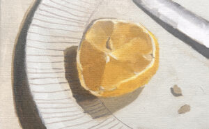
Downloading the Reference Photo

The photo above can be ‘clicked’ and ‘Save image as’, so you can use it as a reference image, print it out and follow along with the video.
You can also download a High-Resolution Image here.
Materials you will need:
Brushes
- Round – Princeton Aspen size 4, series 6500
- Flat – Rosemary & Co – Small Flat ‘Bright’ Golden Synthetic, Size 12, Series 302
(I use a 2-inch decorator brush to apply a flat coloured ground before drawing the painting out)
Support
- Canvas Board 20.32 x 25.4 cm (8 x 10 inch)
Palette Knife
- RGM Classic Line, Medium size 45, Diamond-shaped, cranked (angled) handle. I use an RGM 45 for mixing the paint.
Drawing
- Uni Kuru Toga Roulette Mechanical Pencil 0.5mm HB pencil
- Faber Castell Putty Eraser
- F&W Mixed Media Paint marker, Daler Rowney, 1mm tip.
Other Materials
- Kitchen roll/paper towel
- Clean water
- Metal double dipper (you could use two small pots)
- Tear-off palette or stay-wet palette (A4 size White tear-off palette from Daler Rowney)
- Ruler or straight edge.
Paints – The Colour Palette
I’ve used a mix of Golden Heavy Body colours, Winsor & Newton Professional Acrylic (also called Artists’ Acrylic) and Old Holland artist quality acrylic colours.
- Titanium White (Golden)
- Raw Umber (Golden)
- Neutral Gray 5,6,7 (Golden)
- Cadmium Yellow Light (Golden)
- Venetian Red (Old Holland)
- Cobalt Violet Hue (Golden)
- Cobalt Blue Hue (Golden)
- Green Gold (Golden)
- (Raw Umber High Flow Acrylic for the Mixed Media Marker)
Medium
- Acrylic Glazing Liquid Gloss (Golden Paints)
Getting a feel for the subject
Check out what power tools you can hear in the timelapse background!
I started with a sketch to see how the values worked together. I really liked the busyness of the leaves but felt I could keep the cast shadow and pattern on the wall as a simple flat value.
You can read more about the sketching materials I used here (and there is an Urban Sketching Course that goes into more depth about plein air sketching with pens)
Step 1. – Preparing the Ground

I dilute a little N7 Neutral Grey with water and Airbrush Medium. The Airbrush Medium helps retain paint film integrity when working in thin watery layers. I apply the paint in a thin even coat using a 2-inch decorator’s brush.
The neutral pre-mixed colours by Golden are a combination of Burnt Umber, Bone Black and Titanium White if you’d like to mix your own.
Pro tip: You can read more about thinning acrylics in this article on painting surface absorption
Step 2. – Drawing Out

Kuru Toga Mechanical Pencil and Midori Ruler
For this painting, the majority of your time will be spent on the drawing and the value underpainting.
When I started this sketch, I didn’t quite realise how many angles and lines there are! The repeated pattern in the shadows is worth spending time on and will take a bit of time to get right in comparison to the central subject of the plants.
I’m using a 15cm Midori Black Aluminium Ruler to draw the angles and straight lines. Also, I’m always looking for the shape of the cast shadows of the leaves cast onto the wall on the left-hand side.
Once the drawing is complete, I lightly rub a kneadable putty eraser over the surface to remove any excess graphite before painting on top.
Step 3. – Tonal map with an Acrylic Marker

Golden High Flow Raw Umber in a F & W Mixed Media pen with a 1mm tip
I use a mixed media marker to establish a tonal map in the drawing. This is a 1mm tip marker filled with a High Flow Acrylic paint. It enables me to draw the sharp edges on the leaves quickly and start to see how the shapes are working together.


Step 4. – Painting the Darkest Darks.

Raw Umber Heavy Body Paint, Golden Acrylics
I use a heavy body Raw Umber and a round synthetic brush from Princeton to paint in the darkest areas of the pot. This brush has a nice stiffness and allows you to paint detailed areas and block in larger passages quickly.

I’m altering the dilution by adding a touch of water to increase the flow. On areas of the reference that are warmer, I wash in the Raw Umber with a watery wash. This is an indication to remind me that those areas will have warmer colours painted on top in the later stages.

Notice how the thinner application of the Raw Umber appears warmer in comparision to the tone mass of Raw Umber when painted thickly.
I’ve also noticed in the reference image, a solid vertical shadow in the background competing with the plants, so I’m going to use artistic license and leave that out of the painting.
Step 5. – Painting the Architectural Shadows
I switch to Neutral 5 and 6 and work between these to add in the shadow pattern on the buildings. I paint most of the lines freehand and use a straight edge to paint odd ones.

I use a straight(ish) piece of foam board to draw the architectural shadow lines.

So at the end of this stage, we have a warm base from the Raw Umber and cooler shadows from the Neutral Grays.
Step 6. – Adding the Lightest Lights
I mix a touch of Raw Umber with Titanium White to paint in the lightest areas, this mix will do most of the light block in, apart from a very small pure white area on the bottom right

Step 7. – Adding Purple Shadows

Now we can add some colour to create those fab shadows. I’m using Cobalt Violet Hue from Golden Paints. Cobalt Violet Hue can be hard to track down, so you could also use Ultramarine mixed with Quinacridone Red.


I mix some of the Cobalt Violet Hue and a touch of Cobalt Blue. This is then muted down with Titanium White and Raw Umber. Still using the round brush, I paint it over the cast shadows. I lighten the colour as it gets closer to the top of the painting.
This allows me to better judge the warmth of the terracotta pot.
Step 8. – Adding Warmth to the Pot

I’m using some Venetian Red and white, just to introduce the warm areas to the pot, and also reinforce the warmer leaves. I lighten the mix to indicate where the sunlight hits the side of the pot.
Once this was painted in, it felt a little too cool as a red and feel it needs more yellow mixed in. (A Light Red would have been a closer match than the Venetian Red)
Step 9. – Introducing Yellow

To move the colour towards orange I’ve introduced some Cadmium Yellow Light. This will do two things:
1. I’ll be able to warm up the red on the pot
2. Mixed in with the Raw Umber will create muted greens for the leaves.
You can start to see in the video above, how the yellow enables a more harmonious orange hue and a muted green onto the leaves.
Step 10. – Judging & Refining the Greens
Building on our muted greens, I add a touch of the Cobalt Blue to make a more intense green. This is layered onto the previous colour. I’ve swapped to the flat brush and am diluting the paint with a little Glazing Liquid.

I layer up more intensity to the greens by using a little Green Gold. This is lovely transparent green, which is great for capturing that lichen feel on the front of the weathered pot. I’ve also added a warm glaze to the shadow but instantly felt it was competing too much with the pot.
The final piece

I cleaned up the cast shadow and reintroduced the purple hue, I’ve also added a few fineline highlights in the centre of the leaves. A little Green Gold glaze using glazing liquid gloss finishes off the painting.


Thanks, Will, for a fresh tutorial to nudge inspiration. I’m currently working through your two courses, Beginners Acrylic and Modern Still Life. GREAT challenges and I’m happy with several end paintings. I plan on doing a second version of each, to incorporate things I’ve learned during the first. I’m somewhat stalled out at the moment and this nudge keeps me moving.
My pleasure Jennifer, really hope you find it’s the creative nudge you’re after.
Will
Excellent lesson as always, Will! With your permission I’d like to share it online. Wanted to ask first though~ It was interesting to note your mix for shadows. Lovely painting~
For sure Peach, so pleased you enjoyed it.
Will
This is a great springtime project, Will; thanks so much. (Earlier I purchased and really enjoyed doing your Floral Still Life course. Actually did it in water miscible oils and loved the result.)
My pleasure Helene, and so pleased you enjoyed the Floral Still Life Course and could adapt it to the WMOs.
Will
Lovely as always!! Thank you so much Will! I always enjoy your explanation, so detailed. I have done manny of the paintings following you.
Thanks for your support Nicoleta, glad you’ve been enjoying them.
Will
So generous of you, Will, thank you!!
My pleasure Ani!
Thanks so much for creating this “happy” Springtime lesson, Will! Loved the addition of your time-lapse videos! Question: is there a difference between canvas board and canvas panel? And do you prefer a particular brand to work with? As always, thanks for sharing your talent!
So pleased you enjoyed the time-lapse Terri. Canvas Board and canvas panel mostly describe the same substrate. There can be slight differences if the canvas board, is a cardboard backing, wheras a panel usually describes a wooden panel.
Will
Thank you Will Kemp. As always, top quality content. I really enjoyed this lesson and learning each time I watch your tutorials.
Thanks so much Tina, pleased you enjoyed the lesson.
Will
another great lesson! …you often use 8 x10 inch canvases for your lessons, which are fine but not quite easy to get in Germany. For presenting your paintings you have those nice little frames in grey or blue … where do you get those? … or are they custom-made?
Hey Svend, glad you’ve been enjoying the lessons.
you often use 8 x 10 inch canvases for your lessons, which are fine but not quite easy to get in Germany.
Oh really, I though this was a standard size 20cm x 30cm, what sort of ratio is more common?
For presenting your paintings you have those nice little frames in grey or blue … where do you get those? … or are they custom-made?
These are custom made frames I’ve had for a while.
Thanks Will
Would you be interested in having a plein air tutorial class in real life?
Hey Abbey, I’m not planning any plein air in-person classes at the moment, but great to know they would be know interest.
Will
I have tested 20cm x 30cm canvases for your lessons but the format is not so appealing, the ratio you use (8×10 inches) is much more lovely and is about 20cm x 25cm – I have to order those canvases in England but they are worth it.
Thank you for all the useful advice regarding materials and technique:
The idea of using Alizarin Crimson from Winsor&Newton or Venetian Red from Old Holland is fantastic.
So pleased you enjoyed it Svend.
All your courses are so helpful. I’d love to have more landscape subjects, plein air or from photo. Thank you for your generosity in sharing.
Thanks Lydia, good to know.
Will