
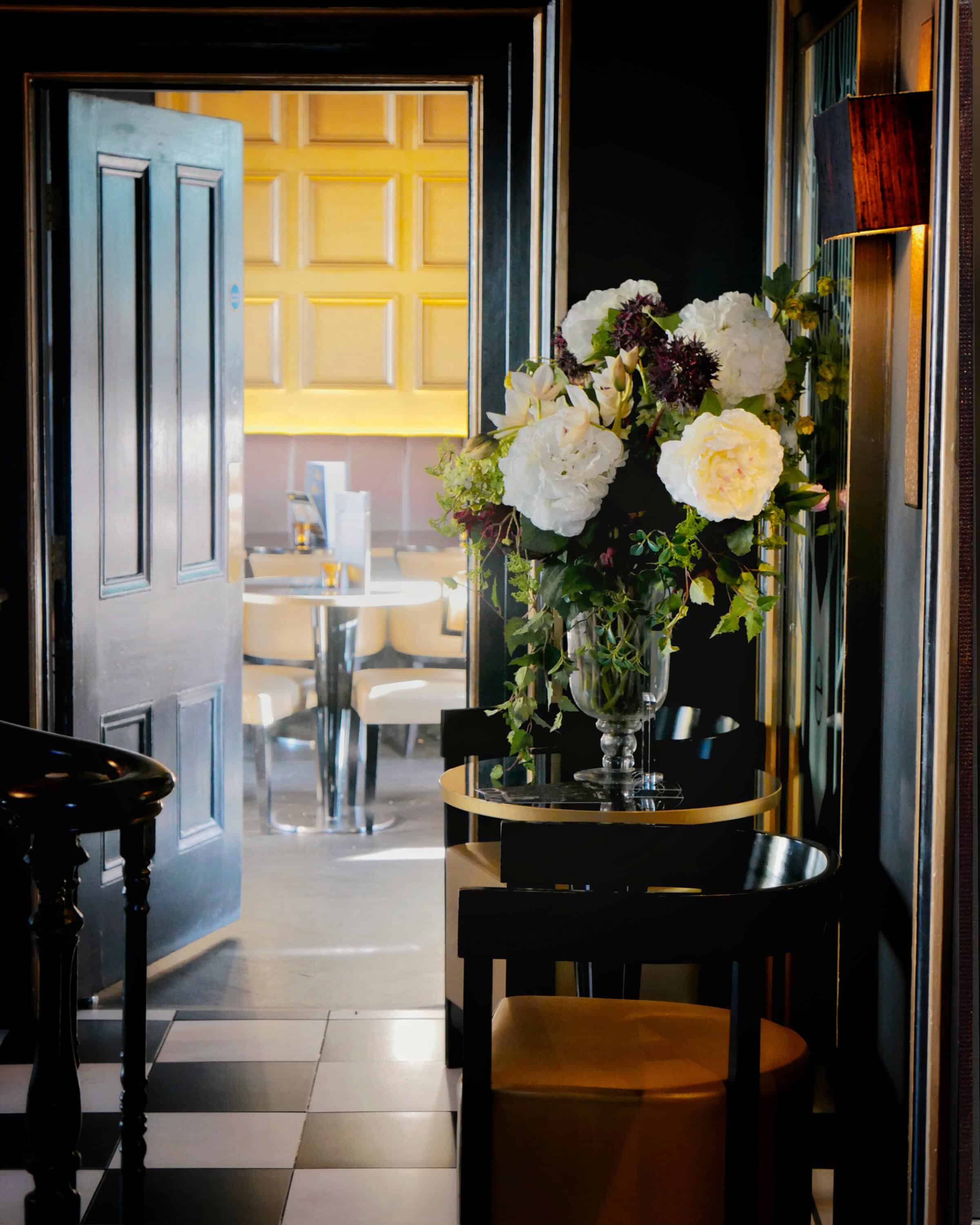
Morning class! This week we’re in a Victorian townhouse.
I’d been visiting for afternoon tea when the play of light in the hallway caught my eye. The warm sunlight coming in from garden doors to the right cast a real glow onto the yellow wooden wall. The floral arrangement reminded me of the peonies in the Floral Still Life Painting Course, and you can start to see how compositions can be built out from one point of reference.
There was a natural blue light coming from a window in the hallway out of shot to the left, and an orange incandescent wall lamp, higher up on the right, both contributing to the warm and cool tones in the flowerheads.
This step-by-step acrylic tutorial looks at balancing different areas of light and shadow (chiaroscuro) when working on a sunlit room interior scene.
Downloading the reference photograph
The photo below can be ‘Right-clicked’ and ‘Save Image As’, so you can print it out and follow along with the steps below, or you can download a larger 8 x 10-inch version here

Materials you will need:
Brushes
- Princeton Catalyst Polytip Bristle Brush: Bright – Size 4 (9.75mm width x 13mm length)
- Small round nylon brush about 3mm diameter (any brand will be fine) this is for the very last highlights
Acrylic Paints
I use a mix of Golden Heavy Body Acrylics and Winsor & Newton Professional Acrylics
For the coloured ground:
- Titanium White (Golden Paints)
- Cadmium Yellow Light (Golden Paints) – Bismuth Yellow or Hansa Yellow Opaque are Cadmium free alternatives
- Permanent Alizarin Crimson (Winsor & Newton)
For the main painting:
- Titanium White (Golden Paints)
- Cadmium Yellow Light (or Bismuth Yellow) (Golden Paints)
- Permanent Alizarin Crimson (Winsor & Newton)
- Phthalo Blue – Red Shade (Golden Paints)
- Burnt Sienna (Winsor & Newton)
- Burnt Umber (Golden Paints)
Mediums
- Acrylic Glazing Liquid Gloss (Golden Paints)
I use this medium for applying thin layers of paint (glazes) to the surface. The paint will flow nicely and stay in a stable paint film on the canvas surface when working in very thin layers, using water for this method won’t work as well.
Palette Knife
- RGM Classic Line, Medium size 45, Diamond shaped, cranked (angled) handle. I use an RGM 45 for mixing the paint on the palette
Support
- I demonstrate on a 10 oz cotton duck canvas board, 4mm thick, 8 x 10 inch (20.32cm x 25.40cm). It’s had two coats of white Acrylic Gesso applied by the manufacturer. (If your board or canvas is white, then it has been pre-prepared with Gesso, and you’re good to go)
Other Materials
- Kitchen roll/paper towel
- Clean water in a little jar, I use a clean jam jar
- Mini jam jar, for putting Acrylic Glazing Liquid into
- Tear-off palette
- 2-4mm Burnt Sienna Acrylic marker from Liquitex
- 3B Faber Castell 9000 pencil (if sketching out first)
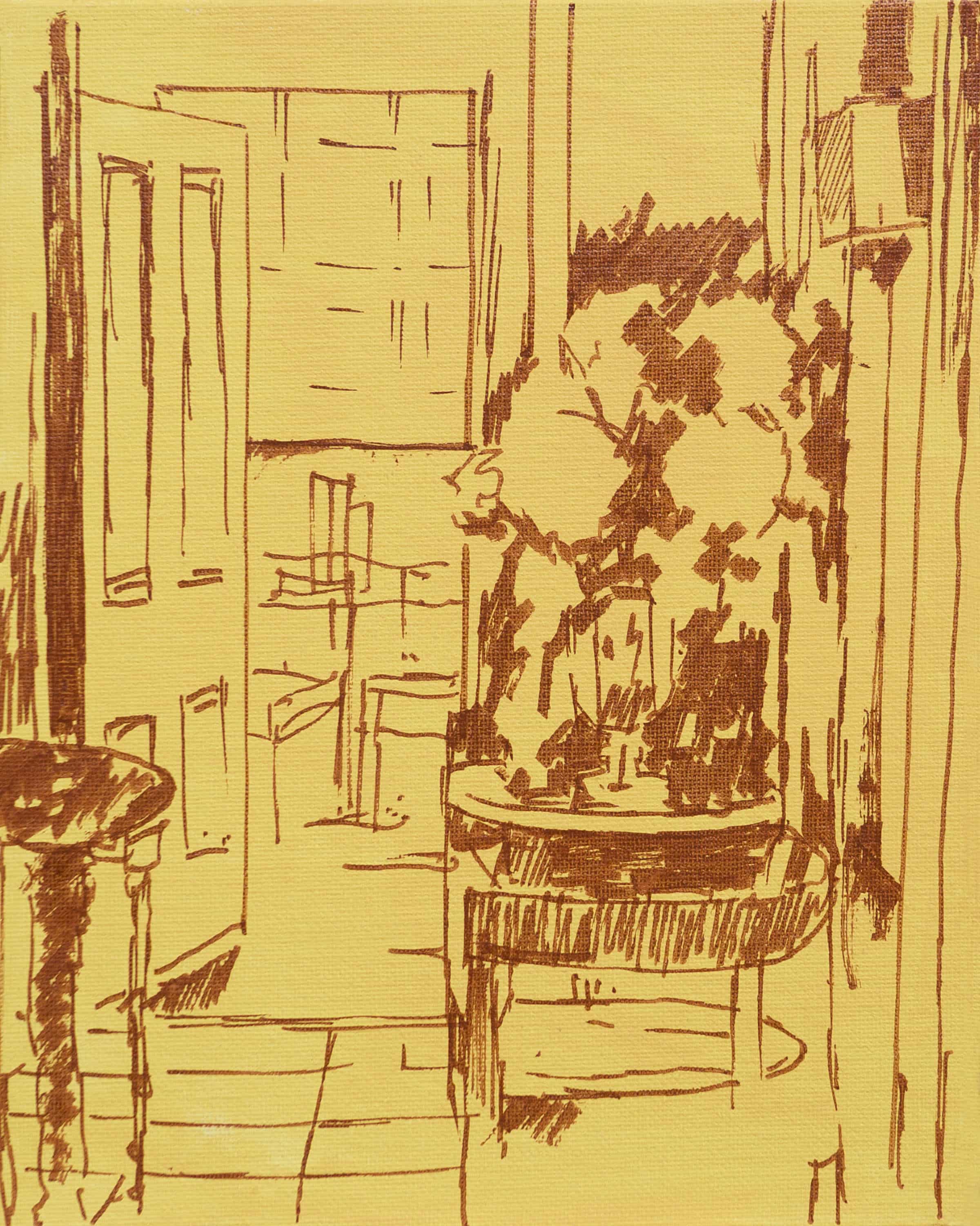
Step #1 – Preparing the ground & drawing out

Coloured ground swatch
To give the sense of a sun-drenched interior, I wanted a rich, vivid yellow underpainting. Take some Titanium White and add a little Cadmium Yellow Light, then add a speck or two of Permanent Alizarin Crimson to warm the yellow mix.
Pro tip: If you have Cadmium Yellow, just adding Titanium White will work well as it’s a warmer yellow than Cadmium Yellow Light.
Using a synthetic brush (any flat brush will be fine) dilute the heavy body of the paint with a little water, you’re looking for a thick cream consistency. (see: How to paint a coloured ground)
Paint this onto the white gesso board, so you have a solid (yet thin) covering.
After the acrylic ground has dried (about 10 to 15 minutes), I draw out the structure of the interior.
Step #2 – Drawing in the main shapes

Initially, I use a right angle set square to make sure the inner edge of the door and the inner frame are vertical.
Once I know these central areas are aligned, I can then freehand the rest of the drawing. I’m drawing out using a Burnt Sienna acrylic marker from Liquitex; you could also use a Burnt Umber marker or pencil. I’m working with the marker because I know I’ll be keeping some of the more delicate dark lines still showing through in the finished painting.
I then swap to the wider chisel side of the marker to block in the shapes around the flowers and the chair in shadow.
The perspective of the door

When drawing the perspective of the door, I’m looking at the negative spaces above and below. These shapes create triangles that help judge the perspective angle.
When faced with an open door, you’ll initially be fighting against the instinct to draw such an acute angle. Your brain will be telling you ‘this must be wrong, the bottom of a door is flat’ but thinking in ‘triangles’, can be amazingly effective.
Step #3 – Wash-in with Burnt Umber

I want to establish the tonal values in monochrome first, this helps to check your drawing and tonal hierarchy before committing to colour. By diluting the Burnt Umber with varying amounts of water you can change the perceived tonal value, the more water used, the more the paint has a transparent watercolour feel.
As I’m working upright at an easel, it’s a nice way to judge if I’ve added too much because the mix would begin to drip down the surface, so you’re aiming for quite a dry brush and a stain effect for the tones.
The image can roughly be split down the centre into lights and darks. Your eye will always be drawn to the lightest section within a composition first, so the room in the distance being flooded with sunlight, adds to the illusion of depth by directing the line of sight into it.
By utilising the yellow ground, I can get these super fine areas of bright yellow that help to give space and form around the arms of the chair.
For this painting, I tried out a new brush by Princeton, it has a bright shape, which is similar to a flat but with a slight curve at the edge. Princeton uses a Polytip feature, below you can see an example of the bristle in a filbert shape.

“For the first time, the tip of each individual hair has been split to replicate the natural flags on the finest natural bristle. By giving each individual hair 2 to 3 distinct tips, Catalyst™ is able to hold a higher volume of paint while providing a smoother application. Designed for use with medium to heavy-bodied acrylics and oil paints”
Princeton Artist Brush Company

It’s got a lovely spring to the bristle and was very effective at giving a smooth stain.
Step #4 – Adding the tile pattern with Burnt Umber

What I always find fascinating about patterned tiles in a painting is how much they can evoke a sense of grandeur. They remind me of the museum marble floors in Florence, seen in the Dutch interiors of Vermeer and Hooch (Incidentally, it’s thought that Vermeer used imported Florentine Marble tiles for his interior scenes).

Pieter de Hooch, 1658, A Woman Drinking with Two Men, © National Gallery, London
Step #5 – Adding a Burnt Sienna glaze

Because of the warmer incandescent bulb, I wanted to give the sense of a glow of orange light on the right-hand side of the painting. Using Burnt Sienna diluted with Acrylic Glazing Liquid Gloss, I paint a glaze over the wall underneath the light source and then onto the seat of the leather chair in the foreground.

The Winsor & Newton Burnt Sienna, in particular, has a lovely rich glow to it.
Step #6 – Adding blue to the door

Once the underpainting has been established, I introduce Phthalo Blue (Red Shade) onto the palette.
Mixing it with the Burnt Umber produces a muted neutral blue/grey, and I’ve chosen this blue because it enables me to get a wide range, from the inky blues in the shadows to some crisper clean greens on the flowers.

It’s quite amazing how light and colourful the reflections are on the surface of the door. You can see in the reference image how there are three bands of colours:
- a pale blue at the top of the door (reflecting the sky from a window out of frame)
- a muted purple band in the centre (coming from the interior of the room)
- a darker inky blue towards the bottom of the door as the light becomes softer.
Step #7 – Adding purple lights to the room

For the central purple band in the door, I added some Permanent Alizarin Crimson to my blue mix and lighted with Titanium White. Then, using a dry brush, I scumbled over the floor and the tiles using a muted yellow, also working it over the dark tiles to try and create that illusion of soft diffused light.
Step #8 – Adding inky turquoise to the shadows

With a darker turquoise mix of Phthalo Blue & Burnt Umber, I begin to bring some of the blue shades from the door, through into the shadow side of the frame. I darken around the chair and paint in the marble tiles to increase the contrast in the foreground. Then with some pure Titanium White, I paint in the brightest highlights and reflections.
Step #9 – Painting the shadow pattern around the flowers

Using Cadmium Yellow Light and Phthalo Blue, I mix an intense green which I then tone down by adding a speck or two of Permanent Alizarin Crimson. With this dark green, I paint in around the shapes of the flower heads. By painting the darks first, I can start to assess my drawing and the balance between the tones in the shadows.
Step #10 – Adding green to the flora

With some more Cadmium Yellow Light added to my green mix, I lighten the value (lightness or darkness) and the intensity of the green. This is painted with quick, spontaneous brushstrokes around the flower heads. I balance this green by painting a dull maroon colour, created from the Phthalo Blue and Permanent Alizarin Crimson around the leaves.
I’ve also painted a brighter deep red onto the side of the wall lamp to give a sense of light radiating out from behind the shade.
Step #11 – Increasing intensity to the greens

With a little Titanium White, I cool my green mix and then add a touch more Cadmium Yellow Light, these lightest areas of the leaves are then painted impressionistically on top of the darker tones underneath. Once the brighter leaves are in, I mix a cool lilac and block in the shape of the glass vase holding the flowers.
Step #12 – Painting the flower heads


Using the lilac within the vase as a visual guide, I mix some pinky greys for the flower heads furthest from us. I then add a little Cadmium Yellow Light and Titanium White to warm and lift the value of the flower heads for the flowers closest to us.
Most of these brushstrokes are painted at an angle; helping to bring movement and focus into that area of the painting.
Step #13 – The finishing touches

I now step back from the painting and look for areas of my drawing that could be sharpened or corrected. I use a small round synthetic brush for a few lines under the lamp and add refinement to the drawing of the vase and some white highlights on the panelled wall.
I also add a thicker impasto highlight on the tiles in the foreground and a few specks of highlights onto the wooden bannister to add a sense of light hitting the surface.
When viewing the painting from a distance, I found the purple band within the far room coming out towards me too much, so I painted over with a lighter, more muted tone.
I wanted to bring a little more colour into the shadows and move the viewer’s eye from left to right of the frame, so I mixed a brighter turquoise blue and painted a few dashes around the piece. By having that extra colour intensity, it helps to bring the flowers and the hallway forward in the scene and shift the muted, light values of the far room into the distance.
Taking an extra step back from your painting will often help you to simplify the overall impression.
I really hope you enjoy it!


What a wonderful step by step set of instructions! Thank you so much!!
My pleasure Joyce, really hope you find it helpful.
Will
Gorgeous painting! Thank you for showing us how to do this – I can’t wait to try it!
Good one Helen, hope it goes well.
Will
I surprised myself – it did! Even though I didn’t quite have all the right colours. So thanks again Will. Next stop is one of your acrylic courses…
Fantastic one Helen!
Cheers Will. You are so generous with your free lessons. And of course the paid ones are fantastic. Thank you for this new one and I can’t wait to give it a go.
Thanks Kristin, very kind of you to say so.
Will
Nice work Will!
Thanks Sandy.
I wish you did more in oils. The Madrid painter’s Museum was fantastic
Here is a question esp for oils. I can draw somewhat but painting fine detail is a mess. Yes I can do buildings with cheats.
But what paint brush with short bristles gives total control when painting facial features. Help!
Hi Tom, you could still follow along with oils, the same colours are also available in oil paint. A sable hair or synthetic mix brush will give you excellent control with fine soft details with oils.
Cheers,
Will
Really good step by step instructions. Thanks for the reference photo too. It’s always helpful to be able to see why certain colours and tones are chosen. I love the impressionistic look too. Looking forward to trying this out. Thanks Will!
Thanks Sarah, really hope you enjoy working with the colour palette.
Cheers,
Will
Hello Will, it’s always a great pleasure to receive your painting guides and videos and it’s very generous of you to provide free demos. Thanks a million for this video, I’m looking forward to trying my hand at it! I love the scene and the colours and, of course, your painterly interpretation! Best wishes, Annne
Thanks so much Anne!
Will you’ve done it again I had a look through the lesson and found it to be superb as always you have such a wonderful way of getting a cross a difficult subject and breaking in down in easy to follow steps will thank you for sending this lesson
Kind regards Steve
My pleasure Steve, glad you enjoyed it.
Will
Another great tutorial. So beautiful palette of colours. Thanks so much Will.
Thanks Katerina, you’re very kind, pleased you liked the colours.
Cheers,
Will
Thanks so much for this, Will. I’ve been thinking of painting interiors for a while now and this is the push I needed. Great reference photo and great step by step guidance! Looking forward to seeing what I can make of it!
Thanks Colette, really hope it goes well
Cheers,
Will
There’s a lot of information in this demo.
Thanks Will
My pleasure Will
Thank you will. Inspiring, as always.
Cheers Norbert.
Thanks for uploading a great painting tutorial Will. A very atmospheric scene, demonstrating a tremendous impressionistic painting. The dashes of supersaturated colours really help you dart your eye around the piece. The complimentary influence between the orange lamp and blue door provides such a strong effect. I really learned a lot from it too. Thanks again Will.
Glad you enjoyed the lesson Andrew.
Will
HI Will, thank you so much for this lovely tutorial. I love the scene , the dark and light areas and the colours, look forward to giving it my best shot. Hope this finds you well. Isabel
Thanks Isabel, pleased you’re feeling inspired!
Will
Absolutely beautiful in every respect. A person can imagine a bit of a story to go along with the scene. Thank you for sharing your knowledge and step by step instruction.
Glad you enjoyed it Susan.
Cheers,
Will
Thank you Will . I am really enjoying working with Acrylics and this tutorial is very informative , love the impressionist feel. This is definitely the route I want to explore more so thank you for this free lesson.
. The Golden range of paints are a joy to use and after following your lessons on colour mixing that I purchased I have a better understanding of the use of colour and have found a new balance to my work.
Cheers Jan
That’s great to hear Jan, pleased you found the colour mixing course helpful.
Cheers,
Will
Thank you for this new lesson! You are an amazing artist and teacher!
Thanks Karina, my pleasure.
Will
Thank You Will! I love your story behind this painting and the painting its self. Thank You for your generosity in sharing your process. I look forward to trying it out with a biscuit and a cup O brew of course! ;)
Of course Lela, the perfect accompaniment! so glad you enjoyed it.
Will
What a great tutorial, I can’t wait to try it. Thank you so much for your generosity in sharing your knowledge and expertise.
Cheers Karen, really hope it goes well.
Will
Thank you so much, Will. Very greatly appreciated!
My pleasure Susan.
Will
Wow! this looks great Will.
Can’t wait to get started on this lesson. This is something I have I have hoped to gain the skills for.
That’s great to hear Alan, hope you enjoy it.
Cheers,
Will
Great Demo My sister and I go to the tea cafes in S. Pasadena… I sure will take a photo and sketch next time… Thx. Char Cee
Sounds a fab idea Char
Will
Thank you Will. I appreciate the detailed instruction on this painting. Beautiful job.
Pleased you found it helpful Jane,
Will
Thank you so much for all your inspiration, help and advice! I will try this sunlit room!
Really hope you enjoy it Teresa.
Cheers,
Will
Thanks for another excellent tutorial.
I just wanted to add that I really like your new web site format as it is really easy to navigate and find topics whenever an issue arises .
Thanks for all your help for us amateur artists and happy holidays to you and yours.
Mike (Ottawa, Canada)
Cheers Mike, so glad you’ve been finding the new layout easy to navigate, great to hear. Hope you enjoy painting the townhouse.
Will
I already had the pleasure of seeing many works in museums here in Brazil and other countries such as the Louvre and even in the National Gallery there in England. Since I am not an art student, my great frustration is not to have known your teachings before visiting these muses to better appreciate the depth of each work, of each painter. What a pity! I remember well when I spent just one day astonished inside the main museums of Florence. Certainly if at the time I had your teachings I would have spent a week!
Very kind of you to say so Ademir.
Will
beautifully painted and nice demo
Thanks Muhammad.
Will
Hi Will
I think this is just a beautiful painting and the step-by-step instructions are so illuminating – thank you!
One of the ‘truisms’ that I’ve always read is that warm colours advance and cool colours recede – and yet here you have the lovely warm yellow as the furthest element, and it works so well!
So glad you found it helpful Katherine.
Will
Hi will! thanks for the amazing demonstration-and thanks for your generosity. A really beautiful interior scene- i can’t wait to start on this one.Have a wonderful christmas and new year
Nina
Cheers Nina, and to you! really hope you enjoy the lesson.
Will
Thanks Will. Another great tutorial and my apologies for the late reply. All the best for Christmas & New Year.
Cheers Peter, and to you, have a lovely time
Will
Thanks Will I love your painting style , I think you are an amazing teacher I have enjoyed trying your lessons I got some great feedback on the one I recently completed the vase of flowers, Thank you for sharing this one cant wait to give it a go have a merry xmas and all the best for the new year
Cheers Gail
You’re very kind Gail, really pleased the floral painting turned out well. Have a lovely Christmas.
Will
Will, you inspire me. It seems so difficult at times to paint very loose in a more impressionistic way. Any tips? Also, do you offer in person classes?
Hi Sheila, glad you’ve been enjoying the classes. I don’t currently run any live classes, but the best way to loosen up your paintings is to practice limiting your brushstrokes. This will help you to simplify the image and try to capture the essence of the scene without overworking.
Will
Will, thanks for the excellent tutorial. One question. You use phthalo blue paint with a red bias. Since I only phthalo blue with a green bias, would that w work here?
Lora
Hi Lora, yes that would work nicely as well.
Will
Well, I but on my brave and gave this one a whirl! I enjoyed following your most excellent step by step instructions but mine doesn’t quite seem as alive as yours. I am grateful for the photos you include as they really help visually to explain the process. Thanks for taking the time to share this tutorial with us.
My pleasure Lisa, really glad you found the photos helpful and your painting turned out well.
Cheers,
Will
You are the GREATest teacher
Pleased you enjoyed the lesson Akifumi.
Will
I really enjoyed this lesson. I only wish that I knew when to STOP fussing with it, and just put the brush down.
Glad you enjoyed the lesson Sheryl, yes knowing when to stop is half the battle!
Cheers,
Will
Hello Will
A quick question – where did you buy your Princeton Catalyst brush from? They seem very difficult to get hold of in the UK. Is there an online store you recommend?
Thank you for being so generous with your help and support.
Regards
Fiona
Hi Fiona, I think I got them from Jackson’s Art: Princeton Brushes
Cheers,
Will
Hi Will
Is it OK to use this site with my Year 10 art class? We are painting interiors and this is a good base study. Much appreciated!
Kind regards
Louise
Sure thing Louise, hope the class enjoys it.
Will
You are an excellent excellent artist and art instructor. I really mean the
best! You are so clear, precise. You are such a natural. I am so happy
after one of your lessons because I deeply “feel” your approaches and reasoning and understand.
Thank you Thank you Thank you, Will, for all you give others of your talents and skills and make us happy that we are learning!
Hey Rozana, thanks so much for your kind comments, so pleased the lesson resonated with you.
Will