


Sunlight & Shadows – Terracotta Pot
(Scroll down ↓ to Add to Cart
Vibrant hues and the mesmerising play of colourful shadows can add so much more variety and intrigue to a composition; imagine capturing the essence of these elements and bringing them to life on your canvas!
Shadows can totally transform a scene. We sometimes think of them as dark, but they don’t have to be dull.
Our subjects in this acrylic painting course, Sunlight and Shadows, are a couple of sunlit terracotta plant pots against a lovely pink wall. This Still-life step-by-step course will teach you the skills and techniques to create a stunning painting.
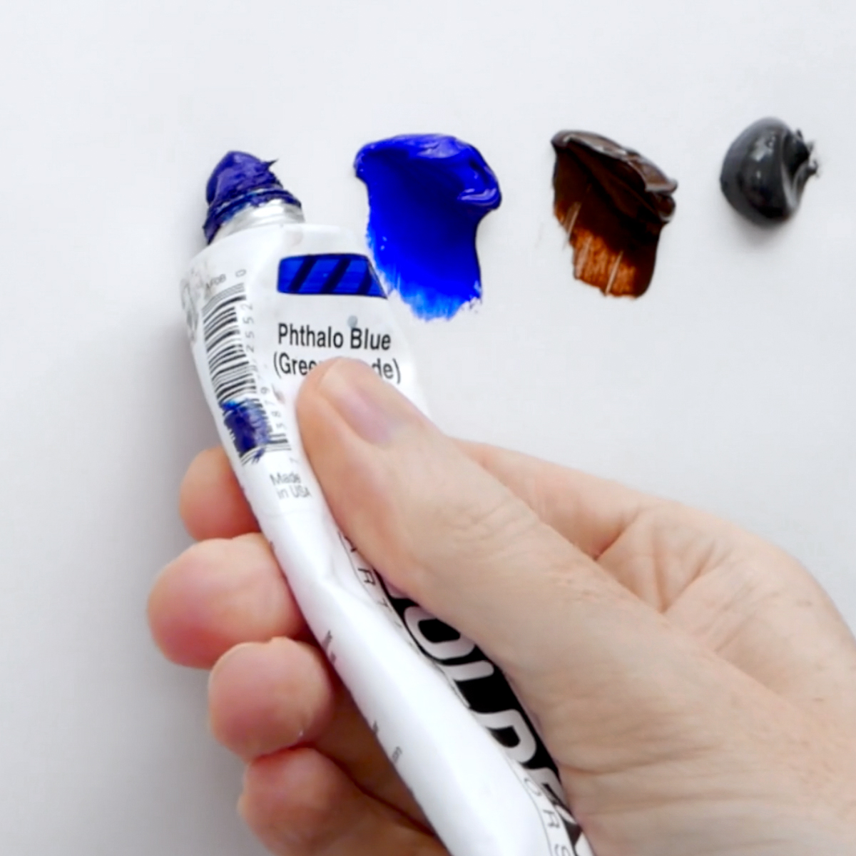
We’ll cover the preparation of your surface, drawing out, exploring colour groupings and blocking-in. Discover the secrets of a split primary palette, enabling you to achieve the widest range of hues. Experiment with slow-drying acrylic mediums to manipulate and blend colours with ease, enhancing the realism of your painting.
In the bonus lesson, learn how to expertly wield a palette knife, adding texture, expression and dimension to your artwork.
You’ll learn about underpainting, using warm and cool colours to create captivating contrasts and evoke a sense of natural light. When painting the greenery, we mix colour strings and observe value and colour shifts.
- Discover the secrets of utilizing a split primary palette and expand your colour knowledge.
The warm shadows are key. We want the shadows in the background to be as important as the main subject. - Learn how to use a palette knife for impressionistic marks, The Palette Knife Edition is an introduction to how you can take a scene in front of you and start to simplify it even more once you’ve got those blocks of colours down.
- Experiment with slow-drying acrylic mediums.
- Harmonize naturalistic greens. In the Floral Still Life course, we had soft white tones on the flowerheads and subtle greens. In this course, we start to introduce brighter colours in the background and more patterns.
- Observe colours and light in the sunshine, and discover the nuances of capturing colourful shadows.
With over 3+ hours of comprehensive tuition, you will master the art of simplifying complex tonal values, separating areas of light and shadow, and infusing your artwork with a realistic sense of light and shade.
6-Lesson Course Study at your own pace (with lifetime access to these recordings)
LIFETIME ACCESS to downloadable video lessons
BONUS Free Palette Knife Edition Lesson
DRAWING TEMPLATES Line drawings to work from
MATERIALS LIST Tools and materials list to help match colours and tonal value
So, let’s unlock your artistic potential and bring your terracotta-inspired masterpiece to life together!
£57.00
Description
I’ve developed this painting course to show you how to create an illusion of reality, turning a form following the way that light falls.
Most importantly, looking at the concept of how the shadows are key, actually as important as our main subject.
Working through this acrylic still-life course, you’ll learn the skills and techniques needed to create stunning, realistic still-life paintings that capture depth, richness, and texture while still learning classical painting techniques.
By the end of this course, you’ll have expanded your colour knowledge with a split primary palette that can create the widest range of a colour gamut and introduced a slow-drying medium.
What’s in the Course?
- 1 x Terracotta Pot Still Life subject from start to finish, based in the studio working from a reference image.
- 1 x BONUS palette knife edition.
- 6-lesson curriculum, study at your own pace (with lifetime access to these recordings)
- Step-by-step instructional videos so that you can follow along at your own pace.
- Each stage is a detailed yet easy-to-follow process.
- DRAWING TEMPLATE – line drawing to follow to help you overcome the blank page
- LIFETIME ACCESS to video lessons, download on separate devices, keep forever.
- Downloadable Tools and Materials List
- Downloadable JPEG reference images and reference line drawings.
- Printable Class materials list, over 3+ hrs of detailed video instruction.
LESSON BREAKDOWN

Welcome
Preparation
A visual introduction to all the materials, paints, mediums, palettes and canvas and how to use and apply an archival ground to your painting.
We learn how to choose a colour for our coloured ground, giving us a great base to work colours on top of and prepare the surface for painting.

Lesson One
Drawing Out
We’re going to draw out our pots using the envelope drawing method, which is just a way of checking the scale of your subject and keeping it all in proportion.
First, we’ll put in the confines of the tallest point and the lowest point, this can be helpful because we’re looking at plants, shadows and pots, so the pot sits in scale within the composition.

Lesson Two
Underpainting
So really what we’re doing here is approaching everything in reverse, rather than having a solid background and then painting the positive form of the leaves on top, we’re starting with the colour and looking for the negative outer shapes of the leaves. This creates a positive form and we’ll do the same thing with the colours within the cast shadow.

Lesson Three
Introducing Blue
So before the terracotta pot goes in, I’ll introduce the blues, to give us balance of where all the cools are in the painting.
When we turn the form of the pot, we’ll only use 2 colours to give us a basic sense of volume, again, following the way that the light falls away. Once we’ve got this established, we can then add more details and pattern on top.

Lesson Four
Introducing Green
Now we’re going to look at the neutrals and the cools, seeing how the light falls across the scene.
Mixing the colour strings to give us a range of greens in different value. Then we can introduce the slow dry medium, which will help us to complete all of the leaves in one sitting without the paintings drying off.

Lesson Five
Glazing & Refining
Refining our colour mixes, checking our drawing and seeing how the painting works together as a whole. Sometimes you have to repaint! This is your chance to see if everything sits together and what areas need to be tweaked.

Bonus Lesson
The Palette Knife Edition
Once you have all your pre-mixed colours, you can use those to create another version of the painting in a more impressionistic veering towards abstraction.
You can be a bit freer with your expression, and if you constrain yourself to use a palette knife and the colours, it can help you to really loosen up and see your painting in blocks instead of getting wrapped up in the detail.
COURSE DELIVERY
Course Delivery
I’ve taken care to film everything from my perspective so you can see exactly what I’m doing as we go through the entire painting process in real time.
- Downloadable Full-colour reference photograph
- Downloadable Line Drawing
- Downloadable Value Scale
- Downloadable Video files
This course has been developed with a beginner in mind, carefully going through the steps at a pace that introduces new colours and techniques slowly.
How is the course delivered?
When you purchase the course, you will receive an email with all the downloadable video links to the course. You then have to download and save the Video Lessons onto your home computer/iPad.
5 Downloadable Step-by-Step Video Lessons.
With 3.5 hours of detailed video instruction, once downloaded – you have any time, anywhere access.
- A downloadable materials list.
- JPEG reference image, a copy of my pencil sketch for the line drawing.
The video files are large (3.5GB) so you need a broadband internet connection and enough space on your computer hard drive.
Please note: You will not receive a DVD.
Cut by the Artist
I filmed, edited, and coloured the course myself (with a little help from Vanessa!) rather than working with a production company. Artists have different needs than editors, so I wanted to cut the course like an artist, showing you exactly what I wanted to see when I was learning. I show all the real-time brushstrokes for the paintings, so you don’t miss a step.
There are 3 main camera views I cover:
An over-the-shoulder view of the work – so you can see how I build up the painting as if you were standing behind me in the studio.
A close-up of the brush contacting the canvas – with extreme close-ups, so you can see the grain of the canvas and the bristles in the brush.
Stable shot of the palette for when I pick up paint – see exactly how I mix colours. There is nothing worse than when the brush disappears from view, only to reappear with some fantastic new colour. Where did that colour come from?! How did it get mixed?
The palette view is very important, not just at the beginning of the video. I want to show you every single mix I make, so I film with the palette directly next to the painting; then, you can see shots of the palette throughout the course and gain a sense of my approach to colour mixing.
Colour Corrected Footage
Filmed under constant colour-balanced conditions, so the paint colours are as accurate as can be. (Computer monitor screens and print-outs can vary)
Real-time filming – No long jumps in progress
I don’t like long jumps in progress when the paintbrush goes off-camera, the shot changes, and suddenly the picture seems to improve drastically.
I include all the stages so you can clearly see the progress of the piece.
COURSE REQUIREMENTS
Requirements for the Course
A broadband internet connection – the file sizes for the video lessons are quite large (3.5GB in total) so can take a while to initially download (depending on your internet speed.) Once downloaded, they are yours to keep forever, watch without buffering or take to the garden and watch away from an internet connection!
Enough free space on your Computer or iPad – You can download the files to a separate USB stick if you need extra storage.
A Colour Printer – to print out the reference images or access to a Print Shop. If you have a separate device you could have the reference image onto that, but it can be harder judging colours from a backlit computer screen vs a paper printout.
Photo Printer Paper – I use Epson Photo Glossy.
A love of Tea & Biscuits – Optional, but some might say essential tools!
Related products
 40% Off
-
-40%
- Beginners Art Courses, Still Life Acrylic Painting Courses
Vincent’s Sunflowers in Acrylics
- Original price was: £57.00.£34.20Current price is: £34.20.
- Add to cart
-
-40%
