How to Paint a Portrait in Oil – Part 5 of 5

How to paint a portrait series. This is part 5 of a 5 part series of tutorials for beginners making the transition from drawing to oil painting.
We look at how importance value and tone are in creating a realistic black and white portrait using classical oil painting techniques.
Here is a quick review of what we have covered so far if you’d like to join in…![]()
Part 1 – Establishing the drawing, including the shadow line.
Part 5 – Finishing & Glazing

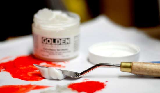
The next medium to use is a simple mix of 1 part Dammar varnish: 1 part Linseed oil.
If you don’t have dammar varnish just add a bit more linseed oil to the previous mix. The varnish is fatter than the odourless mineral spirit but leaner than pure linseed oil.
Oil paint medium recipes
I have tried to keep the mediums in this demonstration as simple as possible because when I was first starting, I became obsessed with trying down track down the ‘medium of the old masters’ as I was convinced this would be the missing ingredient in my paintings.
It wasn’t.
I’ll go into more detail on the different recipes you can use in mediums for oils in a future post.
The greatest advancements in your own paintings, especially if you’re making the transition from drawing, will come from simple principles.
These aren’t glamorous, or shiny and new, but waiting for the ‘right’ brush, or the perfect medium will slow down your progress due to time and energy wasted searching for an answer rather than actually painting. Start simply with solid colour and flat tones and progress from there.

Reusing Old Oil Paint
The first thing I do is put pressure onto the old blobs of paint on my palette, this bursts the paint skin and gives me access to the paint underneath. As I mentioned in the steps last week there are a variety of ways of keeping your oils fresh between painting sessions, and the paint can go slightly thicker using the method above, but as it’s at the final stage of the painting I’m happy to use it. Just use your own judgement if the mix feels okay.
At this stage of the painting, we are going to redefine some of the edges and check our drawing. Painting is a process of constant refinement and our fresh eyes are often our best judge.

I then start to readdress some of the shapes using a round sable, as before when the paint goes on, it will feel like it sits on-top of the paint underneath rather than blending in, so I apply the paint knowing that I will be using a soft dry sable to blend and fuse the edges.
I work around all of the features redefining the shapes and subtly altering the tones.

I also add dark accents to the darkest points in the portrait, these can look a bit ‘stuck on’ but I will be softening them shortly.

What is a Glaze?
A glaze is a method of altering the colour and tone of an underpainting by applying a thin translucent layer of paint. The best pigments for a clear glaze are the translucent pigments, as with all colours, the glaze will appear warmer when painted thinly, so classically painters like Vermeer used to start with a highly finished grisaille (a monochromeunderpainting) and then apply layers of colour in the form of glazes.
So, I then mix a thin consistency of paint using the blackest mix, to use as a glaze. This will be the most translucent as it contains none of the Titanium white (which is an opaque white)
If you were painting with the Flake white, you can make a more semi-opaque veil of colour to adjust areas in tone. This is called a ‘Velatura’ in Italian.


Focus in portraits
You have control of the viewers gaze, well a certain amount of control. We are always drawn towards eyes and contrasting colours. James Gurney has done some interesting eye tracking studies on some of his own paintings. Notice how the viewer focuses on the face.
For this painting, I keep the eyes sharper and more detailed and the lips and chin softer.
You then need to look to check the edges, are they too soft or too hard. I purposely leave the eyes and nose sharper in focus than the mouth.

Adding dark accents
Now I squeeze out some of the Ivory blacks and use this diluted with a tiny amount of medium to the very darkest areas of the portrait

Adding catchlights
With the fine sable round, I dot in highlights around the eye, this can really add a punch to the eye and make them stand out from the rest of the features.

A Word of Warning…
This doesn’t just happen with one quick swift movement of the brush. As we get into more details of the face there is more room for mistakes and the drawing to go out. It’s amazing how a little change in movement or shape can change the sitter’s look, feel and emotion.
Sometimes you’ll be so close to finishing the painting, then go for one final brushstroke – only for it to go out and you are back to square 1, or so it feels.
This is where the Filbert sables become your best friends, they’re soft and you can subtlety blend edges and not make too drastic changes.

Darkening the background
After looking at the portrait, I felt I could go darker onto the background. I quite like the Raw umber on its own but wanted to show you how much the background can affect your subject.
I use a thin mix of Raw umber and Ivory black and apply it to the background, much like the initial stage when we were just using the Raw umber. I use the number 4 Ivory Filbert to scrub the paint in, I don’t mind if the mix goes over the edge of the hair as it helps to blend it in and bring the face forward.
Notice how the lights suddenly look lighter due to the change in contrast we have created by adding a darker background to the portrait.


Reviewing the Process of Light and Shadow.
- The power of a single light source – The old masters used the effectiveness of a single light source to great effect. It is one of the best ways to create depth and form in your paintings, especially in portraits. You’ll find the more light you have on the face the harder it will be to create the illusion of depth.
- Flat shadow area – These can be broadly split initially into two area, lights and darks. By simplifying the shadow line shape you can quickly establish a form. Just using simple, flat tones
- Leaving the details for later – When you are first beginning you will notice areas of reflected light and details in the shadows. If you learn to resist painting these in, it will help so much in your progress as a painter. You can create a really powerful portrait really simply without having a photorealist finish.
- Keeping your edges soft – I keep the edges soft and only sharpen the areas I want the viewer to focus on. This is a Classical technique to create the illusion of realism.
- Work from Large forms to Small forms – It will be tempting to paint the eyes as soon as you begin, but getting the general shapes and modelling the form will pay dividends later in the painting. Adding the white highlights should be left until the end.
- Glazing for subtlety – When you first start using glazes they can be addictive and if you’re not careful, you can end up with the ‘Tom Jones’ effect ( see – How to choose a basic portrait palette for oils) so tread carefully and they can give some amazing results.
So now we have the finished painting, I could, of course, carry on refining with glazes to get a more realist finish.
However, as an impressionist starting point when working with Oils, I am happy to leave it at this stage and sometimes with paintings, it’s knowing when to stop that’s the hardest bit.
If you have any questions about painting a black and white portrait, let me know in the comments below. Students have been achieving some fantastic results, I’d love to hear how anybody else has got on.
If you want to learn about how to add colour glazes to a grisaille you might enjoy the colour portrait oil glazing video course.
Happy painting!
You might also like:
1. How to Paint a Portrait in Oil – Part 1
2. How to Paint a Portrait in Oil – Part 2
3. How to Paint a Portrait in Oil – Part 3
4. How to Paint a Portrait in Oil – Part 4