In Part 1 we looked at how to master the basic features of your digital camera, so you can emulate how your eyes see things in nature to give you fantastic reference photographs for your still life painting.
In Part 2we saw how small incremental changes in your composition and lighting can instantly create a more dramatic and pleasing image for a painting.
Creating a great still life painting often occurs before you’ve even picked up the brush.
In this part of Setting up a Still Life series, we’re going to look at using natural light, whilst also considering the incremental changes in the actual composition of the piece.
In Part 1 we looked at how to master the basic features of your digital camera so you can emulate how your eyes see things in nature, to give you fantastic reference photographs for your still life painting.
Once you understand how to get the depth of field and exposure that you are after, the next thing to consider is the lighting.
I happened to be chatting with my sister about my new Still Life Painting Course on Reflections, when she asked: “Are you going to paint a really hard subject like a glass of water?”
Interestingly, I had overlooked how the ability to paint transparent liquid and glass can seem very impressive – when in fact, with the right image – it’s very simple.
And if you’ve got the right set up, it can be really easy to achieve.
So inspired by this, we’re going to arrange a simple glass of water and next week…paint it…
Have you ever got out your digital camera to take a shot of your still life set up and been sorely disappointed with the results?
Your photo looks washed out, or too dark or the flash had popped up and flattened the whole scene.
You’re not alone in the quest for a simple formula to create great reference photographs for your paintings.
You might have tried turning the dial to the ‘manual’ mode, fired off a few shots, got disheartened, only to return to the safe haven of the ‘flower setting’ or ‘Auto’ on the dial.
Understanding the manual functions of your digital camera can be a liberating experience and can greatly improve the framing of your paintings.
Or maybe you’ve never used your camera to help with your paintings but you’d like to learn how…
One of the most common colour questions I get asked on the Art School is “How do I choose the right colour to paint my coloured ground?”
But before I tackle that subject in more detail, I wanted to look at an often overlooked subject, studio wall colour.
To answer the previous question completely, you should be thinking of your studio space as a whole.
The colours that surround you in your studio space influence the perceptions of the colour on your canvas and are often the secret source to effective classical painting.
It isn’t as glamorous as the actual painting, however, getting it wrong can throw your eye out without you even realizing it…
In these tutorials I will be posting a series of videos on my YouTube channel that you can follow along at home. It’s free to subscribe to the website so you can keep updated with the painting progress.
In this series I will be posting a weekly video on my YouTube channel that you can follow along at home. It’s free to subscribe to the website so you can keep updated with the painting progress.
This tutorial takes us through a simple cafe scene, where we follow through the underlying structure of a painting.
We look at an easy way to check your perspective, the importance of ‘negative spaces’ when composing your image and how to mix the perfect consistency of paint…
Have you ever been half-way through a painting and suddenly the art studio light changes?
You carry on painting, hoping for a break in the weather, trying to remember the colour you’ve just mixed, and then the lighting changes.. again.
You think it won’t matter, it’s not that important, but the way you light your art studio can be one of the most cost effective ways of improving your painting and your colour mixing without buying another tube of paint.
One of the easiest methods of designing better lighting, is to simply change your light bulb.
But not all studio lamps are created equal.
From a £5 hardware store fluorescent tube to a £1,500 bespoke solution, the choices you make affect your ability to match colours accurately, judge skin tones effectively, and even feel a little happier by the quality of light you paint within.
With different options available you can have studio lighting the Old Masters would have been proud of…. without turning to shots of Absinthe.
Emergency chocolate biscuits needed
Trying to understand all the considerations when choosing my own studio lighting nearly led me to a lighting melt down! But bear in mind, I’m trying to design a bespoke studio where I’ll be painting 12 hours a day some days, through gloomy British weather and many a midnight painting session. So I need a space that has both natural light and the best quality artificial light.
There are so many variables and it’s such a specialist request that many Electrician’s will roll their eyes at you. With this tricky subject in mind, I have tried to created a summary of what you really need to know, and it can get a bit technical in places.
Do I really need to know this? I hear you cry!
Maybe, maybe not.
It depends on how much painting you do and your current lighting situation…
In the final stages of any painting, it’s a case of viewing your piece as a whole and adjusting details or adding more saturated colour to create a harmony and balance.
You’ll be painting more instinctively, rather than methodically and putting a stamp of your own personal style within it.
Students often ask, ‘How do I develop my own style?’
And the answer is quite simple.
You already have it – even though you might not think it…
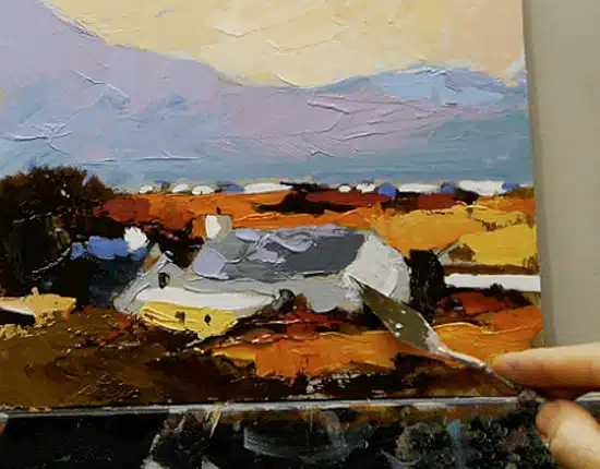
A step-by-step Palette Knife Acrylic Painting – Video Course Part 3
In this painterly, impressionistic palette knife study, I am posting a weekly video on my YouTube channel so that you can follow along at home.
It’s free to subscribe to the blog to receive updates so you can keep up with the painting progress.
Developing a Painterly Approach
When painting with a palette knife, one of the most valuable techniques you can apply is to loosen up and try and see shapes, rather than details.
If you’re coming to painting from drawing, comparing the control you can achieve with a sharp pencil with the ‘clumsiness’ of a palette knife, can be become your Achilles heel…
Palette knives are seen as a sign of confidence in a painter; you can wield them with gusto, paint impasto, and when no-ones looking, you feel like Van Gogh or maybe Bob Ross!
They can have a reputation of being good for certain ‘effects’ or ‘tricks’, for example, painting a snow-capped mountain (and it’s true – they are!).
But often, they are left in your paint box, and you’re not sure where else they fit into your paint practice.
The humble palette knife is used to mix nearly all the paint for my paintings, from getting paints out of tubs, mixing tints and shades on the palette, to scraping off any mistakes.
I often favour a medium size, diamond-shaped blade with a cranked handle – RGM 45 is my favourite tipple (sometimes referred to as a painting knife due to the angle of the cranked handle – see picture below)
It’s a good size for most mixes, and I also paint with it, helping to keep my tools down to a minimum.
I’m overly attached to mine, but what can a good painting knife do for you?…
I was standing at the front of a queue in a packed art shop in London. There were 15+ people behind me, and I felt more embarrassed than I could remember.
I had been researching new art materials and product releases, and I’d spotted something new out, and I was convinced the store stocked it.
After waiting for what seemed like days, I was at the end of the queue and overconfidently asked: “Umm…do you stock alkalid paint?”
In the spirit of Thanksgiving, I’ve been reflecting on all the positivity and creativity that has come through the Art School blog.
So I’d like to thank you all for your support & encouragement this year. The most rewarding thing for me is seeing students progress in their drawing and painting where they’d previously been struggling.
I’ve also broken through the 500,000 views on YouTube, Woohoo! so thanks for watching and more videos will be coming soon.