


@willkempartschool Collection #2 & #3

This second Instagram collection comes from my studio and painting practice, you can read more about the story behind each photo on Instagram @willkempartschool
Cheers,
Will

This second Instagram collection comes from my studio and painting practice, you can read more about the story behind each photo on Instagram @willkempartschool
Cheers,
Will

After following along with painting tutorials, learning new skills and getting excited to develop your own painting practice, it can feel like a step into the unknown when trying to choose what subjects to paint next.
Should you paint landscapes, still lifes or work towards portraits? With so many choices, it can quickly lead to indecision and procrastination.
I’d like to share with you some of the photos I use as my own visual diary that inspire my sketches, paintings and palette choices. It could be from museum trips or travels to new cities, new paint experimentation in my studio or simply a fall of light through a window that has a great quality to it.
Just as a painter’s palette can give you a glimpse into the painter’s approach, your camera roll can reveal what really interests you. The compositions you naturally create, the repeated colours that keep on cropping up and the patterns of the negative spaces you’ve observed all contribute to your own personal style.
Below are a selection of photos with a brief description of what inspired me at the time, and this first collection comes from my trips around National Trust properties, focusing on historical kitchens. Hopefully, they’ll inspire you to start your own visual diary. Then you’ll have a camera roll full of painting ideas!
Also, I’ll be regularly posting the photo collections to my new Instagram account, really hope you enjoy them.
Cheers,
Will

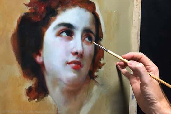
When I was trying to find my way in portraiture, I’d spend hours studying Old Master paintings thinking “Wow, how did they do that?”
I was flummoxed.
Not only did the skin look realistic, but they’d managed to capture those bluish grey tones that lie just beneath the skin’s surface. In my naivety, I just couldn’t work out how you could paint one colour next to another colour yet create such a smoky transition.
I’d repetitively ask Vanessa, “When will I be able to paint the melt of the cheek you see on the Mona Lisa?”
Unhelpfully she used to say “Isn’t it just old?”
Inwardly I’d sigh.
And then I discovered oil glazing…

When Vanessa suggested a spot of Winter sun, if I’m honest, I dragged my feet.
Locations where being proposed and I politely nodded.
When she casually mentioned a possible trip to Seville, my interest was piqued.
Why?
Seville was the birthplace and hometown of Spanish artist Diego Velázquez, and one of my favourite paintings is the ‘Waterseller of Seville’ by Velázquez, but I had never seen it in the flesh, was it even in Seville?
Caught up in the fever of ‘my’ trip, I got researching and discovered the painting was actually hanging much closer to home, in Apsley House, London.
Apsley House? Where’s that?
Well as it turns out, it’s known as Number One London and sits at Hyde Park Corner.
How had I missed it on all my gallery trips and what else was there?
Holy Moly! There’s a study for Pope Innocent X by Velázquez, there’s a Goya, in fact, there’s another portrait by Velázquez and some cracking portraits by Sir Thomas Lawrence.
I shouted through to Vanessa ‘Do you fancy a trip to Knightsbridge?‘
Who knew train tickets could be booked so quickly?…

Snow.
It can seem a tricky subject to capture.
Is it white? Is it blue? How do you paint it to look soft, or darken it without it looking dull?
Having a ‘less is more’ approach to your palette can reflect the colours of Winter absolutely perfectly – without getting complicated.
And the first clue to a convincing Winter snowscape, is the sky…
There was a small sign that hung below an empty black space, it read ‘In Prestito‘.
On loan.
Last Summer I was back in Florence, Italy, to visit one of my favourite paintings that had enticed me to the city over 10 years ago.
The only problem was, when I got to the gallery, the painting wasn’t there.
It was at the Kunsthistorisches Museum in Vienna and I had missed it.
The painting?
Caravaggio’s sleeping Cupid.

This new Urban Sketching for Beginners Course, reveals how observing everyday life can give an eye-opening appreciation for the towns and cities that we live in.
You don’t need to drive out to the country to draw from life, from an artistic point of view, urban settings have just as much appeal!
The lessons follow a logical progression, from sketching static buildings and monuments to capturing the movement of individual figures and bustling crowds, enabling you to practice your drawing skills and create fast, bold urban sketches with pencils, pens, or watercolors—whatever tools you have on hand.
This online drawing course shows you how to draw from life, learn how to draw buildings, street scenes, cafés, and people and you can read more here.

Hi, my name is Will and I am an art material addict.
When the new season art catalogue arrives, I prepare a large cafetiere of coffee, find a comfy chair and indulge in a little bit of window shopping.
If I spot a new ‘innovative ink system’, it’s hard to imagine how my drawings can exist without it.
And if a magazine states ‘Free Pen (RRP £30) when you spend £50 or more on drawing products’ I’d be a fool to miss out!
But the reality is, when I take my sketches out of the studio into the city or countryside, there is a recurring theme.
Most of the new materials I buy are left behind in my growing number of art supply boxes and I find myself grabbing the same few trusted pens that work well together – again and again.
In fact, to create a huge variety of styles, it’s probably less than 10 materials and that includes different ink colours.
So this week I want to introduce you to my Top #4 Minimalist City Slicker combination sets that I actually use when I’m out sketching on location…

This week we’re going to bring our pen sketching skills into the urban environment.
Sketching your surroundings can be such a fantastic way to create a visual diary of your daily experiences and I’m always a sucker for a sketch of a bike.
This video tutorial looks at how you can use different thicknesses of pens to create variety in your sketches, and how thinking about the surrounding shapes outside your main subject can add context to your drawings.
How do you start a sketch?…

Earlier in the Summer, I took an impromptu trip to see ‘Late Rembrandt‘.
It was the first time that an exhibition had been solely dedicated to Rembrandt’s late works. Many of the most famous paintings that he produced in the last 15 years of his life had been brought together from museums and private collections across the globe.
This period is often the most celebrated due to Rembrandt’s development of a more gestural, impressionistic style and this was some 200 years before the popularity of the Impressionists.
He was out there!
I’d missed the exhibition when it was on show in London at the National Gallery but for the final leg of the tour it was going home to the Rijksmuseum in Amsterdam.
Heavy dark shadows, hidden brooding eyes, thick scratchy textured marks, lots of Brown umbers and a dirty yellow varnish glow are all the things that excite me about Rembrandt’s self-portrait style.
With the allure of Nutella Waffles, the opportunity to visit Rembrandt’s Studio and the once in a lifetime chance of seeing so many Rembrandt’s up close together, how could I resist…

I’ve just finished creating a new sketching course taking some of my drawing techniques out of the studio into the countryside.
In ‘The Essential Guide to Sketching the Landscape’ we look at new materials, techniques but most importantly what ‘works’ in a landscape sketch, from composition and simple perspective to changing your viewpoint to achieve maximum results.
Developing the habit of thumbnail sketches can build your confidence when gathering reference information out on location and you’ll become used to using your sketchbook to its full advantage, without feeling pressured to make every piece a finished work of art.
If you want to learn more about discovering the simple pleasure of sketching outdoors, soaking up the sounds and atmosphere click here to watch an intro video to the course
Cheers,
Will
The photo below can be ‘right clicked’ and ‘Save image as’, so you can use it as a reference image, print it out and follow along with the video above.
You can also download a High-Resolution Image here...

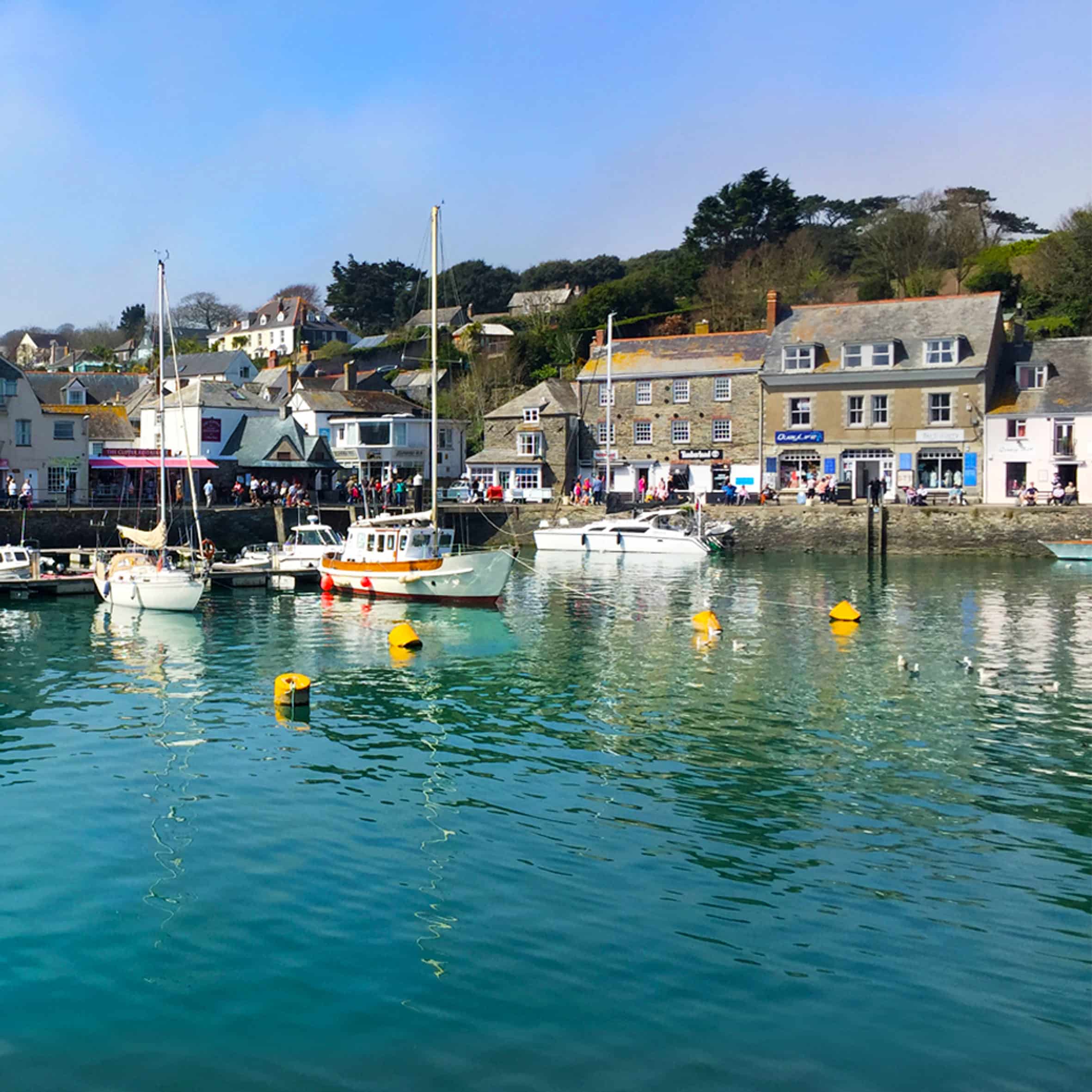
Considering it was mid-April in England, we were treated to some truly amazing weather.
We’d travelled down the coast to an area of South East Cornwall called ‘The Forgotten Corner’. Often overlooked due to its remote location but we found some cracking little-secluded coves and practically empty sandy beaches.
Artist’s have always been drawn to Cornwall due to the quality of light and mild climate, but the trip for me was all about getting to the sea.
The ever changing tide, the allure of cliff edges, the great expanse of sky and the unpredictable power of the waves.
We wanted to get to the edge, be battered by the elements and this was the closest we could find.

View from our cottage window – Rame Peninsula, Cornwall

An Artist in His Studio, John Singer Sargent, 1904
Last month saw the opening of a new exhibition at the National Portrait Gallery in London.
The show highlights the work of one of my favourite portrait painters, John Singer Sargent (1856 – 1925)
I’ve been a fan of Singer Sargent’s paintings ever since visiting the Tate in London as 15 year old student, blown away by Carnation, Lily, Lily, Rose, the most compelling scene with its magical sense of glowing light.

Carnation, Lily, Lily, Rose, John Singer Sargent, Oil on canvas, 1885
I’d always thought it was quite a small painting having only seen it in books, but in reality it’s nearly 2 meters tall by 1.5 meters wide, the sheer scale of it being life-size really draws you into the piece. The golden hour light is fading and the glow from the lanterns illuminates the girls faces so beautifully.
And that’s often the most fantastic thing about visiting an exhibition, the experience of sitting in front of the painting and seeing it through the artist’s eyes…

“For of all sad word of tongue or pen, the saddest are these. “It might have been.”
John Greenleaf Whittier
I always feel so sad when I read this quote, “It might have been…”
What a waste.
So many aspiring artists come to me with a real passion for learning how to paint and ask me where they should start?
Not knowing where to begin or muddling along on your own can be really slow progress and eventually the paints can spend more time in your box than on your canvas.
Your dreams of becoming a painter get lost.
But you were so close!
If you came to my studio with the question ‘I have a week to learn how to paint, what do I need to know?’
I’d strip the learning process down to basics, the fewest brushes, a few key colours and an essential introduction to the wide properties of acrylics.
Materials and set up, colour mixing and pigment choice, brush handling and palette knife techniques and gels and mediums.
Then we’d get painting using methods that achieve great results even if you’ve got no artistic training.
Why Acrylics?
Acrylics can be used in thin transparent washes like water colours or in a thicker more opaque form like oil paint.
They dry quickly and can be diluted and cleaned with water making them simple to use, odourless and accessible for the beginner.
So when are you coming round, right?
If you’ve never even picked up a pencil I’d always usually recommend learning how to draw. Which I know sounds a little deflating … you want to learn how to paint!
However, learning to draw sets you so far ahead, so quickly, it really is the most ‘bang for your buck’ for a set of principles that don’t change.
But what if the allure of colour is too much to resist and you want to get straight into painting?
Well, I’ve been working on a new course just for you…