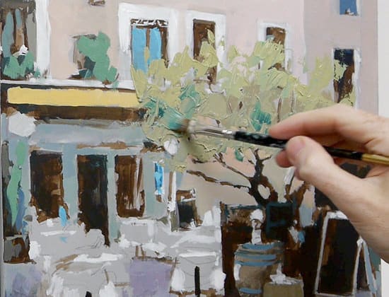
A step-by-step French Café Scene acrylic painting
In these tutorials I will be posting a series of videos on my YouTube channel that you can follow along at home. It’s free to subscribe to the website so you can keep updated with the painting progress.
You can watch Part 1 & 2 of the painting demonstration and Part 3 French cafe
This week we start to introduce a red and a yellow…
Materials you will need for this stage of the painting:
- 12mm Acrylic brush – Pro Arte Prolene – flat
- Size 4 Kolinsky sable from Rosemary & co – round – (any small round will be fine)
Paints
- Artist quality Titanium white
- Burnt Umber
- Phthalo Blue (Red shade) or (Green shade) – I demonstrate using Phthalo blue green shade
- Permanent Alizarin Crimson (Winsor & Newton Artists’ Acrylic)
- Naples Yellow (Winsor & Newton Artists’ Acrylic)
Other materials used
- Kitchen roll
- Jam jar for cleaning brush.
- Small dipper for diluting paint
- Stay-wet or tear off palette
- Palette knife – 45 RGM
Step 1. Introducing a Red
Having success with this method of painting, building it up slowly, is often a battle to resist the urge to go brighter and brighter too early on!
We’re going to creep up on our colours.
To wash in some of the purple/bluish tones to the left foreground, we’re going to need to introduce a red.
For this stage, I’m using a cool red – Permanent Alizarin Crimson.
The aim of colour mixing in a painting is to create the largest number of options from the minimum number of colours (whilst being able to mix the colour you want!).
Permanent Alizarin Crimson is a very handy colour to have in your paintbox (and one of the 5 I recommend for a basic beginners painting palette) as it can produce some lovely purples when mixed with Ultramarine blue and when mixed with Cadmium yellow light can make a nice warm red.
It has quite a dark masstone to it, and thus is often left on the artshop shelves, deemed ‘too dull’.
But Permanent Alizarin Crimson is a sleeping giant!
Wonders are hidden in this dark mass, just add white.
It has a nice translucent quality to it, so is very handy for thin glazing applications.
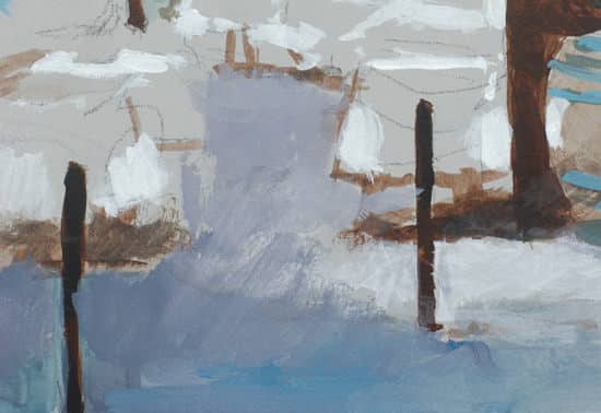
Notice how the purple colour can be blushed it quite watery at this stage. Having the toned ground gives us the luxury of painting thinly, yet the visual effect still being solid.
Consistency & Feel of the Paint
When you first start using Permanent Alizarin Crimson, it can feel quite ‘oily’ in comparison to other colours. This is because it can take quite a lot of milling in the manufacturing process to disperse the pigment evenly in the acrylic emulsion.
So what’s the difference between Permanent alizarin crimson vs traditional Alizarin crimson?
Permanent Alizarin Crimson vs Alizarin Crimson
- Alizarin crimson (colour index name either PR83, based on natural Madder pigment or colour index PR83:1 -synthetic laked pigment)
Traditional Alizarin Crimson has a notorious reputation for being a ‘fugitive’ pigment.
This is when the pigment loses its intensity and colour when exposed to light. Traditional Alizarin is one of the least lightfast colour’s still being produced.
You will find it mostly in watercolours as the acrylic version is called Alizarin crimson hue. The ‘hue’ denotes it is a modern replacement for traditional Alizarin crimson.
(Lightfast just means how quickly the colour would fade if exposed to light. This varies depending on what the colour is mixed with and the level of light exposure for the final piece. If the painting has been finished with an isolation coat it will have better UV protection than if left unprotected).
Paint manufacturers still produce it and it has a nice romance back to painters of old but it practical terms its just not that great. Even the American Society for Testing and Materials (ASTM) have commented:
“not sufficiently lightfast to be used in paints”
The pigments in the traditional Alizarin are a mix between Purpurin and Alizarin which is the natural dye found in the Madder plant.
Permanent Alizarin Crimson
Permanent Alizarin Crimson is a modern equivalent to the traditional Madder colour used in traditional Alizarin crimson. It’s a more stable synthetic man-made pigment that has similar colour properties, however, it can also mix brighter more intense colours than traditional Alizarin crimson or Alizarin crimson hue.
One of the most used modern pigments to create this crimson is the synthetic organic pigment Quinacridone (Colour Index Name: PV 19)
If you can’t get hold of Permanent Alizarin Crimson and want a close substitute, then add Quinacridone red to an Alizarin Crimson Hue.
The closest modern pigment to traditional Alizarin crimson is a colour such as Perylene Maroon, which is quite dark and excellent choice for making subtle shifts in skin tones.
Confused? In simple terms:
- Quinacridone Red is the most vibrant but most transparent
- Alizarin Crimson Hue is darker and more subtle (close to Perylene maroon)
- Permanent Alizarin Crimson is somewhere between the two
The Permanent Alizarin Crimson is a cross between Perylene maroon and a Quinacridone Red, so you can mix nice dark purples and brighter pinks.
If you have a look at this colour mixing comparison video below you can see the differences in intensity between the colours.
The video below shows the ranges of purples that can be made with a range of reds
Step 2. Introducing a Yellow
I’m using a Naples yellow at this stage. This is a lovely creamy, warm yellow that isn’t too bright. When mixing with the Phthalo Blue it will produce a muted green. If the greens go in too bright at this stage, they can put the balance of the painting out as we’ve used such subtle tones we’ve created.
Step 3. Using a Palette Knife
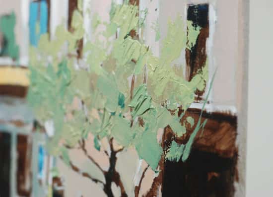
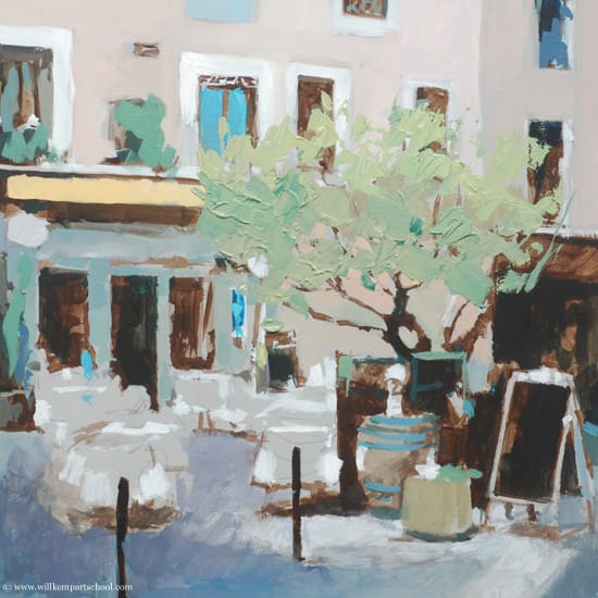
I use an angled palette knife to apply the green paint thickly onto the board. I draw into the paint with the palette knife as well as using the square ended brush for tweaking any area of the tree.
Pro tip: For more indepth palette knife painting techniques have a look at this tutorial.
French Café scene Acrylic painting – Free video Course |Part 4
Click the video below to watch the tutorial.
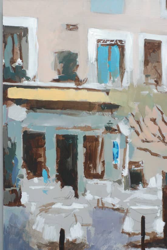
Here’s what the painting looks like at the end of Part 4
Tune in next week for the final part 5 when we introduce some brighter yellows & reds into the painting.
You might also like:
1. French Café Scene with Acrylics Tutorial – Part 1 & 2
2. French Café Scene with Acrylics Tutorial – Part 3
3. French Cafe Scene with Acrylics Tutorial – Part 5



I am enjoying your instructive videos and learning so much. Especially helpful are your instructions and examples of color mixing. Thank you so much.
Thanks Anne, pleased you’re enjoying the colour mixing tutorials.
Cheers,
Will
Excellent stuff Will :)
Top man
Regards
Duncan
Thanks Duncan, pleased you’re finding it helpful in your painting.
Will
Hi Will,
I might give it a try.. I have a 60X60cm canvas laying at the side, would you think it would look suite this painting? it’s twice the size you have used..
Thanks,
Ben
Hi Ben, yes that would still work that size. You might just need to use a slightly larger round and flat brush. You should be okay using a standard palette knife.
Cheers,
Will
Hi Will, Just learning myself how important grays are. Your video is great!
Thanks Susan, pleased you’re finding them helpful.
Cheers,
Will
Good Morning Will,
I have been following your posts with great interest as I am in between a rock and hard place at the moment with my paintings. I attended a 4-day workshop by renowned Canadian artist David Langevin recently and I learned a great deal unfortunately acrylics are new to me and his techniques are very different from what everyone else teaches so I’m looking for some rules of thumb if you will for how to decide on when to use glazes, when to use opaques and how to know which colors to use. Now I know that a huge subject in itself but David teaches to use transparent, single pigment colors only in glazes and veils and the rest only for specific end of painting kind of uses – the way the masters painted. This is all good but since most acrylic artists do not paint this way and I want to develop my own style I’m looking for the very best in instruction so that when I begin a painting I at least have an idea of the direction I need to go in to get the results I want. I have the creative talent, just not the knowledge and most of the books I see out there don’t cover enough of how to understand how to get started and get a good solid foundation that you can build on.
Morning Terry,
Thanks for dropping by, sounds like you’ve had a great introduction to acrylic with David Langevin.
Thin, transparent colours are best for glazes as they allow the colour underneath to shine through, just like a stained glass window.
This Cherry tutorial builds up the painting with a combination of opaque and transparent glazes using a classical painting technique.
Hope it helps,
Cheers,
Will
Hi will. Great instructions ! Thank you so much , very helpful, glad I found your tutorials take care , diane
Thanks Diane, pleased you’re finding the tutorials helpful.
Cheers,
Will
Hi Will,
I recently finished the still life course, which was wonderful. This course is also terrific. It is all about the process and building up the colors slowly!
Though I can buy Naples Yellow, is there a way to mix something close to it with maybe yellow ochre or cadmium yellow medium or light?
Thank you!
Linda
Hi Linda,
Nice to hear from you, so pleased to hear you enjoyed the still life course. Yes, you’ll be able to mix a Naples yellow by adding a touch of cadmium yellow light to your yellow ochre and then adding white.
Cheers,
Will
Hey will , remember me ?
I had said that I was going to write youre review on my website!
Well, now it’s ready ! CHECK IT OUT at http://www.funtooz.webs.com/ home page
It’s not exactly a review , but a small post about yous , or we can say , an article.
Oh hey Divyanshu, yes I do remember you, thanks for the article.
Cheers,
Will
Dear sir,
Usually,I will use acrylic when there is some urgent work after seeing your demonstaration (French cafe)I am very much inspired to work in depth.
E.rabindranath.
Pleased to hear you’ve been inspired to paint with acrylics.
Cheers,
Will
Simply wonderful demo..I have been wondering what I should start with– now that I have retired. and have time to channelise my creative urges…watercolor or oil painting or anything else…you have convinced me that I should take up acrylics as my hobby.
Thanks very much Prasad, so pleased you enjoyed it, and great to hear you’ll be starting to learn with acrylics. Really hope you find the site beneficial.
Cheers,
Will
Hi will,
Thank you so much for your kind help, since i discovered you i try to follow your explications – and it works! Even if I don’t understand everything you say, I’m french, you show it so exactly, it makes it easy!
Merci beaucoup,
Ingrid
So pleased to hear you’ve been enjoying the tutorial Ingrid,
Cheers,
Will
I can’t seem to find the last video! I can find only 1-4 :(
I’m new to painting (ish, always was a crative child and young adult) I really enjoy your tutorials thanks!!
Hi Neon, you can find part 5 here: https://willkempartschool.com/french-cafe-scene-with-acrylics-tutorial-free-video-course-part-5/ pleased you’ve been enjoying the lessons.
Cheers,
Will