Longing for the sea during lockdown, I decided to have a look through some of my old travel photos from trips around the coast.
I did a few thumbnail sketches looking at different images; I liked the diagonal composition in the first sketch. I used an Acrylic Marker by Daler Rowney (FW Marker) filled with Sepia High flow acrylic (Golden Paints).
I settled on an image looking down on some fishing boats, moored in the harbour of St Ives, Cornwall.
You can download a reference image below to follow along with this acrylic lesson, hope you enjoy it!
Have you ever fancied trying Traditional Oil paints but the thought of using strong-smelling solvents in a small room put you off?
Then you might find that Water-Mixable Oils are a perfect balance – the blending time of oils with the super easy clean up of water.
Water-mixable oils are real oils, they are water mixable, not water-based. They can be mixed and applied using the same techniques as traditional oils but whilst wet they can be removed from brushes and palettes with soap and water rather than using a solvent.
Don’t water and oil repel each other?
Well, yes they do. But water-mixable oils have an added ingredient that acts as an emulsifier, so the oil droplets are suspended within the water.
Water-mixable oils are relatively new to the market so I wanted to create this new Absolute Beginners Water-Mixable Oil Painting Course, to address some of the most commonly asked questions and help aspiring oil painters understand the theory and practice of painting in this medium.
Water-mixable oil paints can be mixed with water, low odour mediums or natural drying oils so if you paint in an enclosed space without good ventilation or you’ve developed a sensitivity to turpentine, working in a fume-free painting environment makes them really appealing.
They have a lovely buttery consistency, a long working time which enables you to make changes over a longer period of time, blending colours, adjusting shapes, or working wet-into-wet with thick impasto marks.
What does the Water-Mixable Oil Course Cover?
On this course, we’ll cover the best oil techniques to use, the different mediums and levels of sensitivity of some products that have been specially developed, so you can take a safe approach for you.
With over 5+ hours of tuition, you’ll slowly and methodically be introduced to the theory and practice of painting in water-mixable oils.
The course covers materials and setup, absolute beginner basics, moving on to more advanced classical oil painting methods from underpainting to impasto. I want you to fully understand fat over lean, know when to work alla prima or indirect – practice palette knife techniques and introduce classical oil mediums.
And also oils can get messy! So throughout this course, you’ll see me demonstrating clean working methods.
You’ll complete 3 paintings tutorials, with downloadable reference images for you to work along from and each look at different techniques and methods. I show every stage from drawing out, colour mixing, brush handling and edge control, always being aware of the handling of the paint, drying times and toxicity.
The first is an impressionistic alla prima cloud study where we compare and contrast acrylics and water-mixable oils.
The second is a master copy of a section of a Vermeer painting ‘The Little Street’ where we build it up in layers with an indirect approach so I can demonstrate the fat-over-lean principle.
Our final study is a classical still life painting bringing all the principles together, working through the underpainting, colour mixing to creating form and edge control.
Designed with the Acrylic Painter in Mind
If you’ve ever painted in acrylics and have struggled to achieve lovely smokey blends because the paints dry too quickly – then using water-mixable oils will make the blending process so much easier. And this course has also been designed with the acrylic painter in mind.
We look at how water-mixable oils compare to acrylics, the pros and cons of handling and opacity and how the speed of acrylics drying can be used to your advantage in underpainting, blocking in and canvas preparation. Utilising the best of both worlds.
Sensitivity to Solvents
Because there are varying degrees of sensitivity to consider from painters with multiple allergies and asthma – to painters who can tolerate low odour solvent or others that work in a well-ventilated studio space, I’ve designed this course bearing 3 different levels of sensitivity in mind.
Hypersensitive with allergies – We create a completely solvent-free painting, just diluting with water and oil
Less sensitive and can tolerate low odour solvents – We mix our own mediums using a low odour water-mixable thinner
Low sensitivity/paint in a well-ventilated room – Discover advanced pre-mixed mediums you can use to manipulate the drying time of the paints
Over 5+ hours of tuition
This is a simple, easy-to-follow downloadable video course with over 5 hours of tuition where you will discover the essentials of how to create an oil painting aimed at the absolute beginner.
It has been designed as a step-by-step rounded learning experience bringing together all my knowledge as a student, painter and teacher.
What’s in the Course?
3 x water-mixable oil paintings demonstrations taking you step-by-step from drawing, mixing and matching colours through to the final brush strokes.
9-downloadable video lessons, split into separate chapters that follow on sequentially.
Over 5 hours of detailed video instruction so that you can follow along at your own pace.
Downloadable reference jpeg images, line drawings, and a full materials list.
Lifetime access, downloadable on separate devices.
So why don’t you grab a brew, maybe a couple of biscuits and join me on this New Absolute Beginners Water-Mixable Oils Course and discover your inner oil painter!
Every few weeks, I share my top art inspirations that I’ve read, experimented with or listened to. Here’s this weeks edition of things I’ve enjoyed, with the hope they might inspire your own work too…
In August 2020 Sir Ken Robinson sadly died. His TED talk was one of the first I enjoyed when I stumbled across TED nearly 10 year ago. It was a funny, heartfelt and poignant message on the way that schools can kill creativity in children who don’t quite fit the standard academic mould.
‘For most of us the problem isn’t that we aim too high and fail – it’s just the opposite – we aim too low and succeed.’ – Sir Ken Robinson
Over the past few months, I’ve been experimenting with various mediums, recording drying times and noting the handling of water-mixable oils – all in the process of creating a new course.
Amongst the copious footage, I wanted to share this introductory lesson where I compare the dilution of acrylics to water-mixable oils.
Simple but fundamental observations.
You may find there are times when acrylics dry off too quickly or are difficult to blend especially when you’re painting in thin layers. Using water-mixable oils can be fantastic because they give you that extra working time. Painting wet-into-wet is one of the significant advantages you’ll notice because you gain a lot more time for smoking together colours.
But how do they both compare when diluting with water?
Morning class, this week I’ve been enjoying taking my breakfast outside onto the terrace which gets great mid-morning sunshine. Because the angle of the sun is lower at this time of the day, it can create a lovely backlight for translucent subjects.
I really liked how the sunlight coming from behind the orange segments gave them this wonderful backlit glow and thought it would work well as a little weekend acrylic study.
You can download a reference image below to follow along with the lesson, hope you enjoy it!
Every few weeks, I share my top art inspirations that I’ve read, experimented with or listened to. Here’s this weeks edition of things I enjoyed when I should have been at the easel, with the hope they might inspire your own work too…
“No one is an artist unless he carries his picture in his head before painting it, and is sure of his method and composition.” Claude Monet
Free 1 hr video tutorial
Morning class! This week we’re taking inspiration from around your home.
You might have always wanted to capture the corner of your sunlit living room or an interesting collection of books stacked up on your coffee table or a section of your garden or patio with all the vibrant greens and spring colours.
But when faced with a new painting subject, where do you begin?
How do you decide on the pigments to use or what’s important to focus on?
The tendency can be just to get started and work it out as you go along.
But without adopting a systematic approach to your painting, you can be faced with frustration with your colour mixing, wasted time on your drawing and an unsatisfying result; I want to show you an easier way.
In this acrylic still life tutorial, I go through the steps of how I think through my colour composition, from choosing the coloured ground to introducing the pigments and then slowly building up the piece before putting the brush to canvas.
So let’s grab a brew and any remaining biscuits you may have left, and let’s get painting!
If I’m listening to something that has piqued my curiosity, it can send me down a rabbit hole of research….usually halfway through a painting.
And then the copious note-taking follows.
It got so bad at one stage, Vanessa had to prevent me from buying new notebooks because after furiously filling them with fascinating insights, I’d annoyingly lose where I’d put them or worse couldn’t decipher what my own scribbling all meant.
On a positive, my last birthday present was The Remarkable Tablet (an e-ink notebook that feels amazingly close to writing on paper) which has helped add order to the chaos and made the kitchen table decidedly neater.
Some of my research notes do come back to inspire my practice and if they bring me a new understanding or appreciation, I figured they are worth sharing.
So here are my top 5 art inspirations that I’ve read, experimented with or listened to this week, when I should have been at the easel, with the hope they might inspire your own work too…
Will Kemp, Peonies (Detail) Acrylic & Water-mixable Oils on Canvas, 60.96 cm x 60.96 cm (24 inch x 24 inch)
How do they compare to Acrylics?
Over the New Year, I’ve been in the studio working up a large scale floral still life painting, from a series of sketches I did over the summer. The original composition had been inspired by the dramatic oil paintings of the Dutch Golden Age (you can see the progress of my painting further down the article).
To achieve the soft blends between the petals, delicate smoked edges and the ability to work across subtle shifts in hues, oils would allow me a longer working time. Then I could build up the painting as a whole piece, adjusting tones, working wet-into-wet.
But being in the middle of a British winter and the studio doors firmly shut with little ventilation, the thought of having a pot of thinners or strong solvents in an enclosed space was discouraging me from getting started.
After a prolonged period of procrastination, it occurred to me, maybe it was time to break out the water-mixable oils.
Inspired by the dramatic, dark Flemish oil paintings I saw in Antwerp; I’ve just started working on a still life set up of some fab oversized pink peonies. I’m going to begin simply with acrylics then build up the piece using water-mixable oils.
Yesterday, I talked about the importance of a coloured ground and how this very simple step of preparing your canvas, can transform your working method. And I received lots of emails asking ‘How do you go about choosing a colour for your tonal ground?’
Well, the first thing I do is make a decision.
What is the most important thing or the most important problems that I can foresee within the painting I’m going to be working on?
For this still life, judging the values of the flowers and getting the drawing right are going to be the two trickiest areas – but get them right….and they can pull the whole painting together. Choosing a sympathetic tone for the coloured ground will help me achieve this.
In the spirit of Thanksgiving, I’d like to thank all the students and well-wishers for the positivity that has come through the Art School blog this year.
Peter Paul Rubens, Detail from The Assumption of the Virgin, Oil on Panel, 1626
Ruben’s House & the Art of Antwerp
The rhythmic sound of African drums echoed through the vast interior of the Cathedral.
It was an unexpected acoustic experience, and the historical tour we’d seen advertised was looking increasingly unlikely.
There was just Vanessa and me waiting patiently at the back of the Cathedral when the tour guide arrived; she was getting extremely agitated. She hadn’t known the performance was on, the volume was too loud, a new musical set had just started, and her tension was building.
She was miffed.
But then our saviour came, a gentleman from Romania. Our tour of two had become three. We were off to the races.
I was in Antwerp (just last month) exploring Ruben’s home and studio, but nothing had prepared me for the pure brilliance of his works that lay only a few steps from our hotel lobby, hidden behind the doors of the Cathedral of Our Lady.
Morning class, this week I’ve been in Corsica exploring the North Coast of the Island.
Sketching your surroundings can be such a fantastic way to create a visual diary of your travel experiences, so when I’m walking around the streets of any new town or city, I always carry a small sketchbook in my backpack.
A couple of tonal sketching pens and a brush pen is usually all I need, always trying to keep my kit as simple and minimal as possible.
I’ve designed this brand new, downloadable video course to help you understand the theory behind colour mixing, discover how to mix and match colours accurately and then put theory into practice, creating a series of 4 still life paintings.
You might have been struggling to understand colour mixing for years, sometimes getting it spot on but other times when it goes wrong, have no idea why or how to fix it?
Or maybe you’ve read articles on colour theory but not had the confidence to put that new knowledge into an actual painting practice?
On this colour mixing video course, we take a really simple practical approach, over 5 hours + of tuition, you’ll gain an understanding of the properties of paint, learn the foundations of colour theory and put brush to canvas.
And we’re just going to take it one step at a time, starting with learning the language of colour, everything broken down simply so that the painting exercises and studies give you the confidence you need to develop your colour mixing skills.
I demonstrate using a traditional, 3 primary & 3 secondary colour wheel to teach you a step-by-step approach and working through these progressive tutorials; you’ll be guided by your new colour mixing intuitions, opening up the fantastic world of colour.
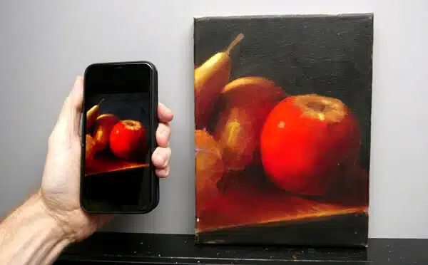
I see a lot of fantastic success stories from the tutorials on the blog and one of the most common footnotes is,“‘my painting looks better in real life than it does in the photo.”
90% of them are taken on a phone or iPad and over the last couple of years, I’ve found smartphone cameras are getting better and better, as long as you bear in mind their sensor size.
A traditional camera has got a much larger sensor, in comparison to a smartphone.
The larger the sensor, the bigger the surface area available to capture light on, so to get the best out of your phone and get great exposure on your shots, you need to follow a few easy steps.
I’ve put together a guide below which addresses some of the most common issues and the simplest way to fix them. There are two main approaches, natural light or artificial light, depending on what lighting conditions you have available to take your photos in.