Thanksgiving Thanks for 2019!
In the spirit of Thanksgiving, I’d like to thank all the students and well-wishers for the positivity that has come through the Art School blog this year.
Peter Paul Rubens, Detail from The Assumption of the Virgin, Oil on Panel, 1626
The rhythmic sound of African drums echoed through the vast interior of the Cathedral.
It was an unexpected acoustic experience, and the historical tour we’d seen advertised was looking increasingly unlikely.
There was just Vanessa and me waiting patiently at the back of the Cathedral when the tour guide arrived; she was getting extremely agitated. She hadn’t known the performance was on, the volume was too loud, a new musical set had just started, and her tension was building.
She was miffed.
But then our saviour came, a gentleman from Romania. Our tour of two had become three. We were off to the races.
I was in Antwerp (just last month) exploring Ruben’s home and studio, but nothing had prepared me for the pure brilliance of his works that lay only a few steps from our hotel lobby, hidden behind the doors of the Cathedral of Our Lady.
Morning class, this week I’ve been in Corsica exploring the North Coast of the Island.
Sketching your surroundings can be such a fantastic way to create a visual diary of your travel experiences, so when I’m walking around the streets of any new town or city, I always carry a small sketchbook in my backpack.
A couple of tonal sketching pens and a brush pen is usually all I need, always trying to keep my kit as simple and minimal as possible.
I’ve designed this brand new, downloadable video course to help you understand the theory behind colour mixing, discover how to mix and match colours accurately and then put theory into practice, creating a series of 4 still life paintings.
You might have been struggling to understand colour mixing for years, sometimes getting it spot on but other times when it goes wrong, have no idea why or how to fix it?
Or maybe you’ve read articles on colour theory but not had the confidence to put that new knowledge into an actual painting practice?
On this colour mixing video course, we take a really simple practical approach, over 5 hours + of tuition, you’ll gain an understanding of the properties of paint, learn the foundations of colour theory and put brush to canvas.
And we’re just going to take it one step at a time, starting with learning the language of colour, everything broken down simply so that the painting exercises and studies give you the confidence you need to develop your colour mixing skills.
I demonstrate using a traditional, 3 primary & 3 secondary colour wheel to teach you a step-by-step approach and working through these progressive tutorials; you’ll be guided by your new colour mixing intuitions, opening up the fantastic world of colour.
I see a lot of fantastic success stories from the tutorials on the blog and one of the most common footnotes is,“‘my painting looks better in real life than it does in the photo.”
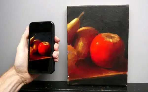
90% of them are taken on a phone or iPad and over the last couple of years, I’ve found smartphone cameras are getting better and better, as long as you bear in mind their sensor size.
A traditional camera has got a much larger sensor, in comparison to a smartphone.
The larger the sensor, the bigger the surface area available to capture light on, so to get the best out of your phone and get great exposure on your shots, you need to follow a few easy steps.
I’ve put together a guide below which addresses some of the most common issues and the simplest way to fix them. There are two main approaches, natural light or artificial light, depending on what lighting conditions you have available to take your photos in.
Will Kemp, Still Life with Apricots (detail), acrylic on canvas
I’ve been distracted by an apricot.
It’s not the usual thing that grabs your eye but I’m deep in the midst of filming a new simple colour mixing course and the apricots have got me.
They were the perfect subject to teach colour theory for one of the studies and as I arranged them in the studio, a light, impressionistic, muted blue and orange composition began to form.
Pleased with the setup, I headed down the garden for a tea break.
On a brisk winter’s morning in the coastal town of St Ives, we negotiated our way down the steep lanes, past whitewashed slate-roofed cottages to Trewyn Studio.
Home to one of Britain’s most important twentieth-century artists, Dame Jocelyn Barbara Hepworth (1903 – 1975), who lived and worked here for more than 25 years.
Trewyn Studio – now the Barbara Hepworth Museum & Sculpture Garden, St Ives, Cornwall
Her secluded garden studio lies behind the white arched doorway and protective stone walls to the right of the house. The property is now owned by Tate gallery but has been left as close as possible to when she worked in the gardens under the Cornish light and amongst the seagulls.
Will Kemp, Cornish Fishing Boat, Acrylic on Canvas (detail)
Last week I was lucky enough to spend a few days in South Cornwall and caught the most fantastic weather. I’d visited this stretch of coastline before and enjoyed fabulous Summer sunrises & sunsets, fresh seafood and sparkling Mediterranean colours.
Seasons can often show you new sides of a landscape and experiencing it all again in Winter was totally invigorating.
Atmospheric mist enveloped harbours, it was wilder with more dramatic changes in light, and the sombre Winter palette reminded of James Abbott McNeill Whistler’s landscape paintings.
Morning class! This week we’re in a Victorian townhouse.
I’d been visiting for afternoon tea when the play of light in the hallway caught my eye. The warm sunlight coming in from garden doors to the right cast a real glow onto the yellow wooden wall. The floral arrangement reminded me of the peonies in the Floral Still Life Painting Course, and you can start to see how compositions can be built out from one point of reference.
There was a natural blue light coming from a window in the hallway out of shot to the left, and an orange incandescent wall lamp, higher up on the right, both contributing to the warm and cool tones in the flowerheads.
This step-by-step acrylic tutorial looks at balancing different areas of light and shadow (chiaroscuro) when working on a sunlit room interior scene.
This Still Life Acrylic Project Book is a brand new, downloadable PDF E-Book designed to help you understand light and shadow and create better acrylic still life paintings.
An absolute beginner to acrylics who wants to complete a simple still life painting but would like help with colour mixing recipes and drawing guides.
If you have trouble creating a realistic form within your still life’s, then you would see instant improvements through the lessons. Why? Because when you will understand how changes in light influence change in value, it can transform your paintings.
Throughout the e-book, I’ll guide you through 3 full-colour acrylic paintings from start to finish. I’ve broken each lesson into bite-size pieces, so you can complete each stage of the painting within a 2-hour window, something you can easily follow, even if you’ve never painted before.
By the end of the book, you’ll learn how to filter your objects, look for relationships in stories, scale, size and the importance of planning a colour scheme, knowing all the same principles will apply to future more complicated arrangements.
You can read more about it here: Still Life Acrylic Project E-Book
Cheers,
Will
p.s You can also read a review of the e-book by the lovely Professor and Author Mary Tabor here: New Book by Will Kemp, Artist and Teacher Extraordinaire
Joaquín Sorolla, Strolling along the Seashore, Detail, Valencia, 1909
In the heart of bustling Madrid, behind a protective brick wall, sits the elegant former home and studio of Spanish painter Joaquín Sorolla (1863 -1923)
Huge decorative iron gates lead you through a lush Andalusian courtyard garden to one of the best-preserved artist houses in Europe, an absolutely priceless experience.

“A Painting is complete when it has a Shadow of a God”
Rembrandt van Rijn
I remember being taught at art college that shadows weren’t really present in paintings until the Renaissance period.
And you’d be forgiven for thinking when you look at some beginners work, that they were from Ancient Greece – they didn’t use shadows either!
In live painting classes in the past, when I’ve mentioned the words ‘cast shadow’, students concentration wains or worse, a look of rising panic crosses their faces as if they’ve been duped into a technical drawing class.
I’m not quite sure why cast shadows seem so mysterious, elusive or confusing. Shadows help to ‘ground’ an object and learning to accurately observe them, is the most effective way of making your paintings look convincing.
And just by switching the name around it seems easier to digest.
Shadows cast.
I want to keep it simple without the complications of multiple light sources or atmospheric perspective that occurs in vast landscapes, today I am going to focus on shadows cast outside, by sunlight.
Shadows cast by a tree, by a building, shadows cast by a chair or plant pot. The shadow that is falling onto the ground, or against a wall, or onto a table.
Morning Class!
If you’re new to the website I’ve put together a Free PDF ‘Beginners Guide to Acrylics’ which includes a brief overview about acrylic paint, colour palettes, tools & materials as well as showing you how the different areas of the Will Kemp Art School fit together.
I introduce the principles behind my teaching, a catalogue of all the free video painting tutorials on the website and a section on how to find the perfect course for you.
If you click the link Free PDF ‘Beginners Guide to Acrylics’ you can download it and have a read-through with a brew!
NEW for 2023 – I’ve also just added 10 free images (with links to free tutorials) just sign up for the free newsletter to get the reference images.
Hope you enjoy them,
Cheers,
Will
The video tutorial looks at how to glaze with acrylics using a monochrome underpainting with coloured acrylic glazes. We’ll keep the piece’s freshness by building up layers of clear transparent glazes, and all we will use are five paints and a couple of brushes to create depth and dimension in your acrylic paintings.
Acrylics are fantastic paints for teaching you glazing techniques because they dry so quickly. This week we’ll be painting a simple study of a fish, taking inspiration from objects you might see every day and transforming them into paint using acrylic glazing techniques.
I’ll be using a stay-wet palette to hold my tonal colour string mixes in, and then any leftover colours from the painting can go back in there, ready for my next piece.
Glazing is a technique where you add a transparent layer of paint over an existing layer. It’s a great way to add depth and dimension to your paintings and bring out the colours or form underneath.
To glaze, you’ll need a glazing medium and a brush. Mix the glazing medium with your paint to create a transparent layer. Then, apply the glaze over your base layer, using smooth brushstrokes to spread the paint evenly. You can build up multiple layers of glaze for even more depth and richness.
Remember to let each layer dry completely before applying the next.
You can download the reference image below to work along from, so grab a brew (maybe a couple of biscuits) and let’s get painting!!…
We arrived in Paris to catch the last few days of a retrospective exhibition of the Swedish painter Anders Zorn (1860-1920)
After a snowy week in England, we woke to blue skies, warm croissants and this amazing rooftop view from our hotel room. I couldn’t resist a quick pen sketch of the row of chimney pots in the distance before we hit the show, check out those windows!
Sketch from Hotel, Rotring Art Pen (F), Pentel Brush Pen and Pentel Aquash Water Pen in A6 size (10 x 15cm) Seawhites of Brighton Sketchpad (140gsm All-Media Cartridge Paper)