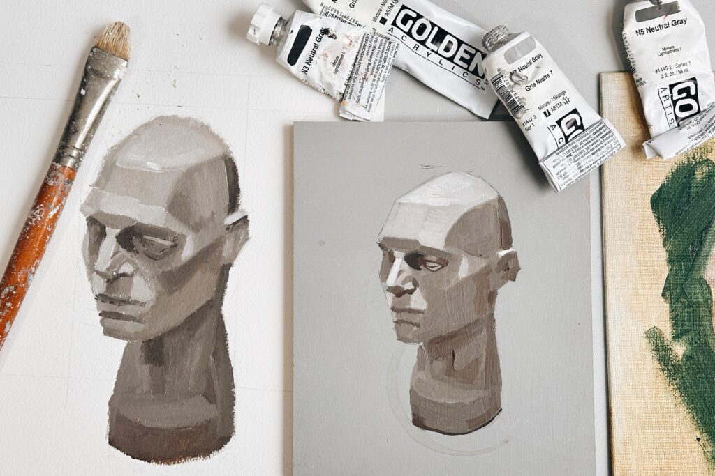
And in that moment, before any colour hits the canvas, the painting is perfect.
Not because it’s complete but because it’s got potential.
Nothing has gone wrong. There are no mistakes to fix. The best work you’ve ever made might be a few brushstrokes away.
Then you start to add the first touches of colour.
It’s genuinely exciting; you’re making decisions. Things are beginning to take shape, and as the painting progresses, you’re feeling confident.
And then, somewhere in the middle, it happens.
The ugly stage arrives.
A Series of Stages
A painting is not created all at once. It develops through a series of stages, and almost every stage temporarily sacrifices one quality, in order to build another.
You lose simplicity to gain structure.
You lose freshness to gain form.
But this stage, this stage feels like everything has hit you at once.
“During Lesson 2, my son was saying how ugly his work looked, but as we later sat on the couch and looked at his painting… it looked so good! Haha.”
I love this so much. Not just because it’s a lovely image, the three of them on the sofa, looking at the painting with fresh eyes, but because it captures something I genuinely believe is one of the most important things to understand about making art.
The Obstacle is the Way
There’s a coding school in Paris called 42, founded by French entrepreneur Xavier Niel.
Applicants spend weeks working through problems they’ve never encountered before. They’re given challenges that leave them stuck. The school isn’t testing whether someone can code. It’s testing what happens when they hit a wall.
Do they keep going?
Do they break the problem into smaller pieces?
Do they ask for help?
Do they come back the next day and try again?
If a student gets stuck, they’ll often seek out someone who struggled with the exact same problem a week earlier. The solution isn’t always finding the answer immediately. It’s learning how to work through uncertainty.
What struck me when I first heard about this is how familiar it sounded. Because painting works exactly the same way.
Every painter encounters walls. A colour mixture that won’t work. A drawing that looks wrong. A painting that suddenly loses all sense of form halfway through. The difference is that when you’re painting alone, it’s easy to assume that getting stuck means you’re failing.
It doesn’t.
It means you’ve reached the next problem to solve.
This is one reason following a structured course can be so powerful. The path has already been laid out.
You know the painting has an ending because someone else has already walked the route before you. You know that the awkward middle stage eventually leads somewhere.
The challenge isn’t completing the entire painting in one leap. It’s identifying the next problem.
What often discourages painters isn’t the difficulty of the task itself. It’s imagining all the future problems they haven’t solved yet.
The ugly stage isn’t a sign you’ve taken a wrong turn.
It’s often proof that you’re exactly where you’re supposed to be.
And what happened to Sam’s children and their paintings?
They finished them.
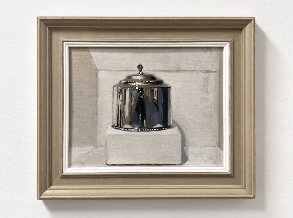
Gessa – Age 9
Joseph – Age 13
With some encouragement and a reminder that the goal wasn’t perfection, it was the experience of working through the process.
“This project was one of our favourites this past school year.”
Paintings rarely reveal themselves all at once.
They unfold gradually, layer by layer, decision by decision.
Experienced painters have learned not to panic when the middle gets dark.
They recognise the ugly stage for what it is: not failure, but evidence that the painting is still in progress.
If you’re judging something that isn’t finished yet. It’s like reading half a novel and deciding whether the story was worth telling before you’ve reached the final chapter.
So keep going. Add the next brushstroke. Solve the next problem. Give the painting a chance.
Because until you’ve reached the end, you don’t know what you might create.
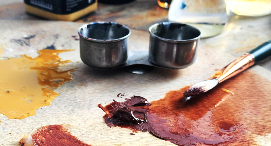
If you’ve been searching for less toxic mediums to use with traditional oil paints, you may have come across a mysterious product by Schmincke, ‘Medium-W’.
It sounds more like a character from a Bond film than an artist’s medium, but it’s actually quite an ingenious solution for turning traditional oil paints into water-mixable ones.
Seems like magic?
In this guide, we’ll look at what Medium-W actually is, what it does to the handling of your paint, how much to add, the difference between the fluid and gel versions, and if it’s the right medium for you.
It’s a modified alkyd resin that’s been developed to transform traditional oil paints into water-mixable oils. It has been chemically adjusted to accept water into its structure, so instead of repelling water as conventional oils would, it can combine with and work alongside them.
The “W” stands for water, and at the moment I haven’t come across another manufacturer producing a product quite like this (if you have, let me know in the comments)
With traditional oils, you would typically use Turpentine or Odourless Mineral Spirits (OMS) to thin the paint. Medium-W offers an alternative approach for artists looking to reduce their reliance on more traditional solvents. By mixing the medium in with your oil paint, you can then use water as a way to dilute it further.
The Control
Here is some Old Holland traditional Oil paint. Old Holland is often thicker than other oil paints straight from the tube, so it will be a good paint to use when you’re adding another medium to dilute it.
Here, the Old Holland traditional oil paint is diluted with a small amount of Odourless Mineral Spirits. In this example, I’m using Gamsol from Gamblin.
Notice how the paint thins very easily and has smooth brushstrokes while still retaining a bit of texture. This is only with a small amount of OMS.
For experimental purposes only, I’ve also shown diluting the traditional oil paint with a small amount of water, and you can see how it’s kind of separating and not really holding a fluid film.
Mixing 2 Parts Oil Paint: 1 Part Medium-W Fluid – (Recommended amount by Schmincke)
I’ve mixed the recommended 2 parts oil paint to 1 part Medium W. I found the easiest way to do this was to put out 2 blobs of oil paint, then a third blob of Medium W (roughly 50%)
Then mixed well together with a palette knife.
The photo above shows it further diluted with water.
Adding Medium-W to your paint changes several properties at once, which is why it can feel quite different from simply thinning paint with a mineral spirit.
Medium-W loosens the paint’s consistency and improves its flow across the surface. It will also add a bit of body to the paint compared to diluting it with OMS alone.
The only drawback was that when I came to clean the brush with water, it still diluted it, but a lot of the oil paint was left in the bristles.
On the Schmincke website, it says, ‘if necessary, add more medium W,’ and I’ve found from experience that using it at a slightly higher ratio makes it easier to clean brushes and adds a nice flow to the paint.
Paint Film Integrity
I must point out at this stage that increasing the amount of Medium W works if you’re working alla prima.
If you’re working in layers, it adds a bit more complexity. The higher dilution is only recommended for the thin underpainting, always respecting the fat-over-lean approach.
If you are painting in thicker layers, keep your added medium W to the recommended ratio to preserve the structural integrity of the paint film.
Mixing 1 Part Fluid Medium-W: 1 Part Oil Paint
I’m now mixing 1 part Fluid Medium-W to 1 part oil paint, so they’re equal in volume.
I’m using a pipette to slowly add the medium to the paint, then thoroughly mixing everything together with a palette knife.
Here you can see the fluidity when fully mixed at a 1:1 ratio. Once mixed, the paint can be thinned further with water, and your brushes and palette can be cleaned with water as well.
Which brings us on to colour shift.
The Colour Shift Issue With Water
When traditional oils are mixed with Medium-W and then further thinned with water, you’ll often notice a visible colour shift between the wet and dry paint films. This shift is much more noticeable than when using a dedicated thinner or painting medium.
Colours dry lighter, flatter, and less saturated than they initially appear when first applied.
While wet, the paint can sometimes appear slightly milky or cloudy before drying back clear. The darker the pigment colour and the higher the water ratio, the more noticeable this shift becomes.
So, although Medium-W can seem like a perfect solution for making your existing oils water-mixable, it also introduces another variable you need to learn to compensate for while painting.
Can you clean your brushes with water?
Kind of.
You can see above that I’m now cleaning out the brush, using the dilution of a 1:1 ratio. I’m then rinsing the brush in clean water to see how effectively the paint releases from the bristles.
At this ratio, it’s removed most of the pigment quite well.
This pink is quite a staining colour, so it’s giving me a bit more of a challenge.
What I’m going to do now is place the brush into some odourless mineral spirits to see if there’s any remaining pigment still trapped in the bristles that can be lifted out.
So on the right, you can see there was still some additional pigment left in the brush that I couldn’t fully remove with water alone. The odourless mineral spirits cut through the remaining oil residue a little more effectively.
Schmincke Medium-W Gel
Schmincke Medium-W comes in two forms: Gel and Fluid. They both do similar things in terms of the chemistry, but have different handling properties. The gel medium offers greater viscosity and a thicker starting point for diluting the paints, so you don’t get as fluid or runny a consistency.
Medium-W Fluid
This is the standard version, a pourable, liquid medium. It has the consistency of oil, and it integrates smoothly and quickly into paint on the palette. It’s best to give the bottle a shake (with the lid on!) before using it.
When to use it: Use Schmincke ‘Medium-W’ Fluid to improve the flow of your paint while reducing its body. Use for any passage where you’re painting in thin-to-mid layers.
Medium-W Gel
The gel version has the consistency of a soft, translucent gel. It doesn’t pour; you squeeze it out from the tube.
The gel form does everything the fluid form does but has more body. When you mix it into paint, it increases the paint’s viscosity while simultaneously making it more workable.
When to use it: Use Medium-W Gel when you’re after thicker marks, more textural, impasto-style effects.
If you’re trying to decide between the two, ask yourself what your paint needs to do:
If you want paint to flow more easily and move smoothly, use the Fluid.
If you want paint to hold its shape while becoming more responsive, use the Gel
2 parts paint: 1 part Gel
Here is the consistency of the paint when mixed: 2 parts traditional oil paint to 1 part Medium-W gel, mixed with a palette knife.
So the gel is probably the version I tend to lean towards, unless you’re going to be using very sketchy, loose painting. Personally, it gives me better consistency for the type of paintings I’d be working with.
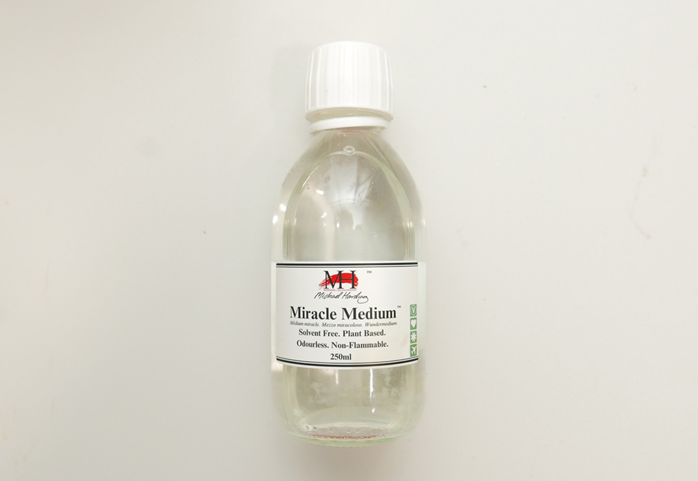
“Derived from renewable vegetable sources, the Miracle Medium™ range is odourless, solvent-free, and designed to provide a safer, cleaner studio environment”
An alternative to working solvent-free and non-toxic with traditional oils is to use Michael Harding’s Miracle Medium.
I often use this in the studio, and you only need to add a small amount to increase flow and dilute the paint. You don’t get the same dramatic colour shift from wet to dry as you do when thinning heavily with water.
The drawback of this medium is that the recommended ratio for adding to your traditional oil paints is only 5 to 10%. This means you can’t really achieve a thin consistency for underpainting as you could with Odourless Mineral Spirit.
Also, it takes longer to dry than using Odourless Mineral Spirit.
A solvent-free alternative to the medium W gel is solvent-free gel from Gamblin
You can also get solvent-free alternatives for traditional oil gels, like this one from Gamblin.
Can you use linseed oil with the Medium-W
No. The linseed oil will work against the water-mixability you’ve added with the gel/fluid.
Can I use water-mixable Linseed Oil with Medium-W
Yes, you can; the water-mixable linseed oil will mix well and is easier to clean when washed with water.
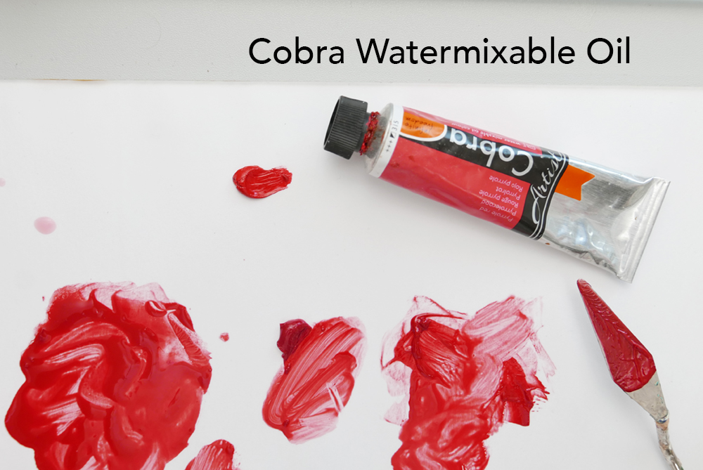
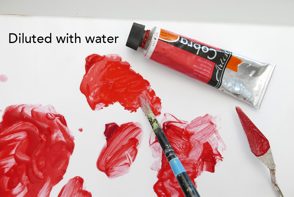
How do Water-mixable Oils compare?
Here I’ve poured out a small amount of Pyrrole Red from Cobra water-mixable oils, and then I’m going to dilute it with a touch of water (about the same amount of OMS that I put in the first control dilution)
You can see the flowing paint, just diluted with a dash of water, and it’s got a nice even consistency. Personally, I much prefer using a water-mixable thinner or medium instead of water.
Thinning heavily with water can still introduce some of the wet-to-dry colour shift issues discussed earlier, so there are always a few technical variables to learn and work around.
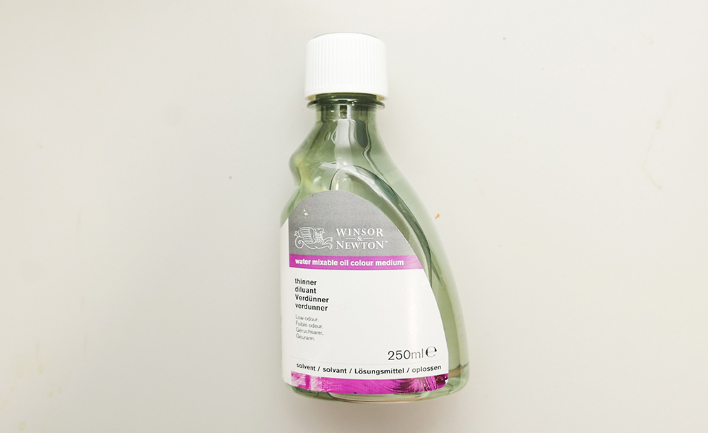
Winsor & Newton water mixable oils thinner. I often use this when working with water-mixable oils. Water is used for cleaning your brushes, but the thinner gives better flow control and feel when painting.
Would I Recommend Schmincke ‘Medium-W’ ?
Yes, in the right circumstances.
For certain situations, Medium-W can be super useful.
If you have an oil colour you love but can’t find in a water-mixable range, Medium-W can be a clever way to integrate that colour into your palette.
Also, if you’ve already got a studio full of expensive traditional oil paints, it might be worth experimenting with.
If you’re painting away from the studio and want a water-based cleanup, it can be great.
For fluid sketching and cleanup with water, Medium-W fluid provides flow without excessive solvent use. However, if your goal is to work with water as cleanup, I would recommend building your palette around water-mixable oil paints.
Cost Comparison: Medium W to Water-mixable Oils.
If you mix in the Medium W, this means that for every small squeeze of paint, you need to add half f as much fluid or gel medium.
When you scale that up across six or eight colours on your palette, you can end up using quite a lot of medium, which quickly adds to the cost.
40ml of the Medium W gel works out at around £9.49
40ml of Cobra Yellow Ochre water-mixable oil paint (an earth colour and one of the more affordable pigments) is around £6.70
40ml of Cobra Cadmium Yellow Deep is around £13.50.
If you’d like to explore these differences further, I have several free YouTube videos that compare water-mixable oils, traditional oils, mediums, and solvent-free approaches in greater depth.
One of the fastest ways to improve as an artist is to get into the habit of checking your own work as you make it.
That might sound obvious, but it is one of the biggest differences between a beginner and a more experienced painter.
A beginner often keeps painting, hoping the piece will somehow come together. If anything, desperately picking up the pace when things start to go ‘out’.
A more experienced artist stops. Then checks, then adjusts.
That practice changes everything.
Progress in painting is not about learning new techniques. It is about learning to see. The more accurately you can judge your own work, the less dependent you are on guesswork or hoping for the best.
You start to spot small problems before they become big ones. You notice when a drawing is leaning, when a value is too light, when a shape is too wide.
And once you can see the problem, you can usually fix it.
That is why artists have always used simple checking tools to sharpen their eyes. Not because they lacked skill, but because they understood something important:
Your brain gets used to what it is looking at.
After staring at a painting for too long, mistakes can begin to disappear. The wonky ellipse looks normal. The portrait that is slightly ‘off’ starts to feel convincing. The unbalanced landscape composition seems ok, because you’ve looked at it for an hour.
A mirror breaks that familiarity.
It reflects the painting back to you in a way your brain has not yet memorised.
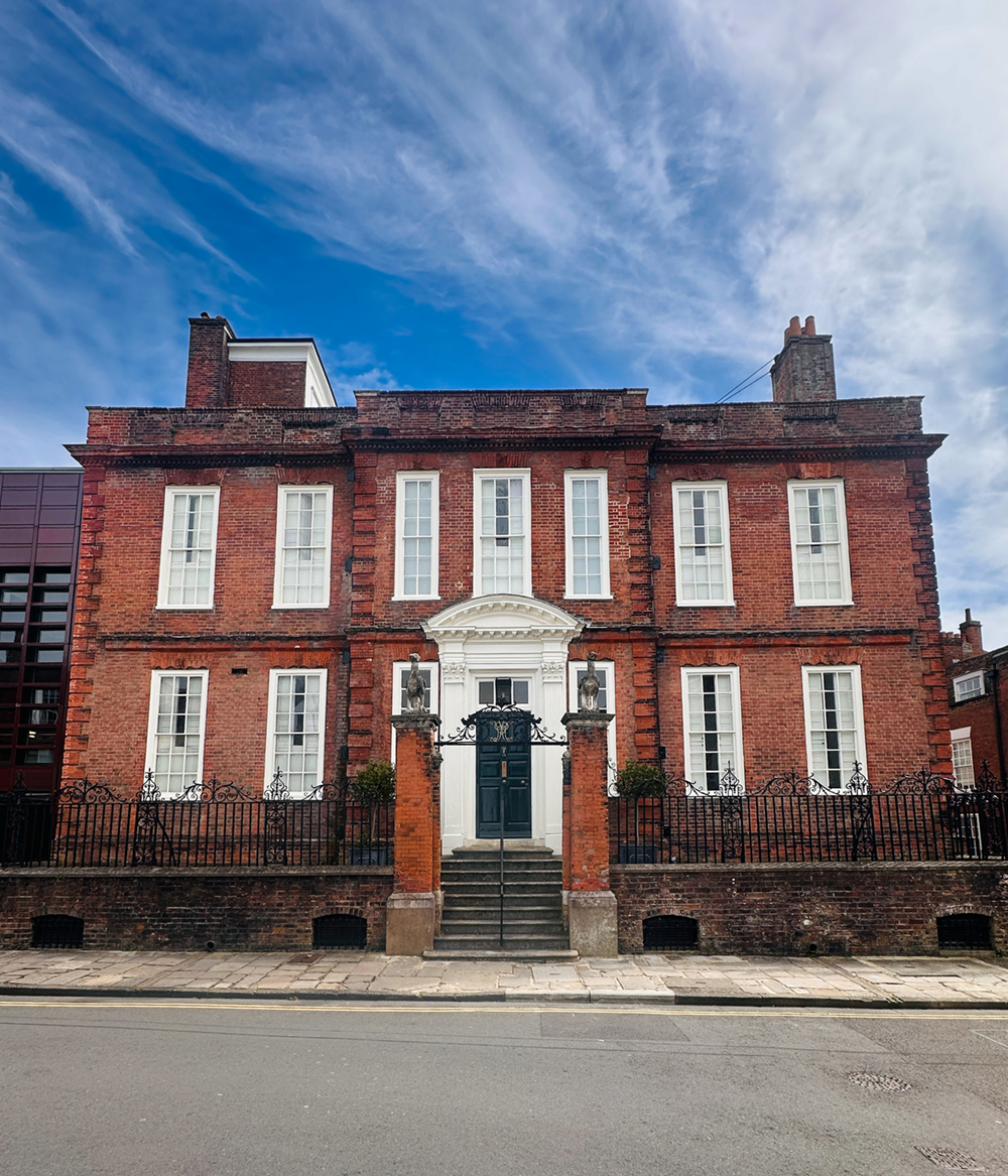
It’s always a pleasure to visit a gallery that feels so naturally in tune with the kind of paintings you already enjoy, and Pallant House in Chichester feels exactly like that.
The gallery is situated within a Grade I-listed Queen Anne townhouse, with an impressive modern extension. It creates a comfortable mix of the period beauty of a townhouse, built in 1712 for Henry Lisbon Peckham and his wife, Elizabeth Albery, and the contemporary galleries of the new wing.
This week, I’ve been focusing on the simplicity of set-up and essential techniques.
Sometimes you want to get painting quickly, so I’ve propped a blank canvas or board behind my subject on the kitchen countertop, where the light was streaming in.
I used Oil Paper from a pad, just a handful of water-mixable oils, one water-mixable thinner for dilution, and a couple of brushes.
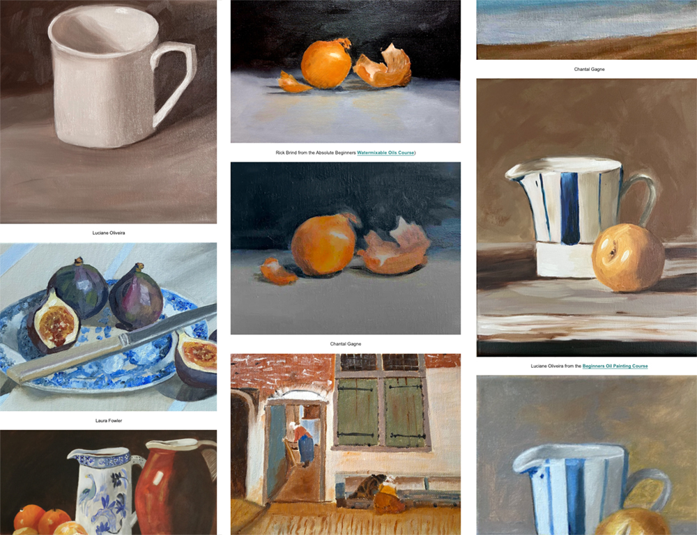
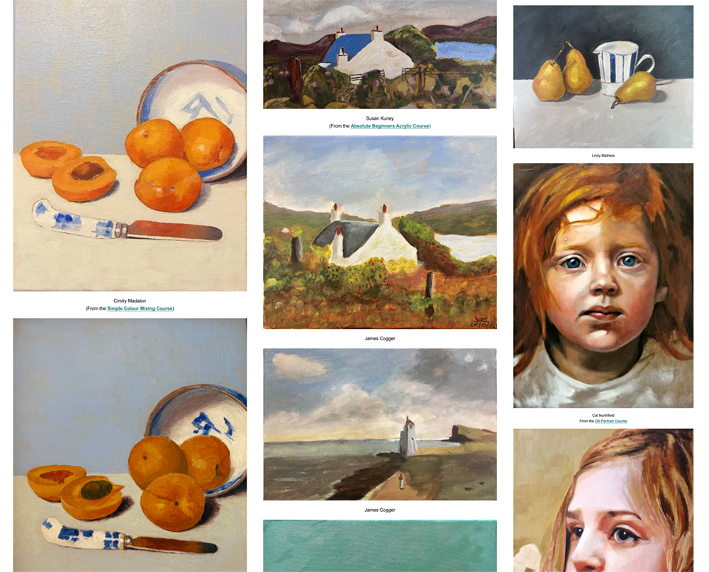
What an incredibly creative few months it’s been for students working through the courses and lessons. From the first-ever paintings taking shape on the canvas, to one student revisiting the same lesson ten years later! And others are going on to win awards at exhibitions. Many of these successes are linked to free tutorials, so you can follow along yourself.
Even if you’re returning to something you’ve tried before, you’ll often spot something new the second time around.
I was looking for the replacement leads for my mechanical pencil.
Just leads.
I knew I had put them somewhere sensible. Somewhere memorable. Somewhere safe. I just had no idea where that somewhere was.
I asked Vanessa.
“Have you seen my 0.5mm Uni leads? Little plastic case. White top?”
Vanessa has an almost supernatural ability to locate the things I misplace. She seems to carry an internal map of my chaos, but even she looked doubtful this time.
I checked the drawers. Lifted sketchbooks. Opened tins.
I briefly wondered whether they had migrated to the kitchen, victims of one of my “I’ll just put this here for a moment” decisions.
Nothing.
Amazon offered hope. £4.19 for 24. One click, and the problem would disappear.
But I didn’t want tomorrow’s leads. I wanted the ones I already owned.
A small stick of lost graphite was the moment it caught up with me. The moment I had to admit that my art materials storage “system” was not a system at all. It was more like a leaning tower of creative good intentions, a stack of brushes and a precariously balanced tear-off palette.
It’s hard to be creative when you can’t find a pencil.
One of the most common questions students ask me is: “How can I paint looser?” Many students want to know how to loosen up their painting, especially if they tend to get stuck in careful details.
But loose painting is rarely the starting point.
In my experience, what often looks loose on the surface is actually controlled simplification underneath. Learning to paint with control first makes a far stronger ‘loose’ painting later on.
Messy and loose can look similar at a glance.
Structurally, they are completely different.
Loose painting is confident editing.
Messy painting is an undecided execution.
That difference in how they are constructed changes everything.
The hidden structure
If you look at painters like Sargent or Sorolla, their work, on the surface, feels fresh and spontaneous. The brushstrokes seem almost casual.
But slow it down.
The drawing is solid.
The values are clear.
The edges are intentional.
And also, let’s not forget the scale. When you’re first starting out and most probably painting small, 20 x 25cm, or in sketchbooks, you can flick through images online and think, ” Wow, how do those paintings look so luscious and painterly, yet still hold that accuracy?”
I have students who email me saying they’ve painted in the past, but are taking a break.
They still read and enjoy the tutorials, but don’t feel like they could give them a go. They don’t feel they could start again because they’re back at ground zero.
But I want you to know that hesitancy to start painting again has nothing to do with your skills.
You know how to mix colours, and you’ve got an empty canvas ready to go!
What’s gone is your belief that it’ll be good.
This January, I’ve had tons of household stuff to catch up on and new courses I’m researching, but alongside all that, I’ve been putting time aside to paint daily.
But what happens when the day doesn’t go to plan?
You miss one or two days, and it doesn’t change much.
But when you’ve missed a week, something begins to shift.
What about a month? A decade?
What I’ve discovered through my own practice is that the barrier to returning to painting isn’t lost skill—it’s lost confidence.
The Forgetting Curve and the Confidence Gap
We’ve previously looked at the forgetting curve, which shows us that we forget new knowledge at a surprisingly quick rate.
But this is something different.
The longer you wait, the more the psychological pressure builds.
It’s irrational.
Anxiety builds to such a point that it becomes a self-fulfilling prophecy.
The Procrastinating Painter
Timothy A. Pychyl, PhD, author of ‘Solving the Procrastination Puzzle’, is a procrastination researcher.
Through his research, he’s found that putting things off isn’t really about not having the time to do them, but about avoiding the perceived negative emotions that will come with the thing you’re procrastinating on.
“Procrastination isn’t a time management problem; it’s an emotional management problem. We have negative emotions attached to some tasks….we feel frustration, boredom, resentment or anxiety. By putting off the task, we put off those emotions, and that’s the crazy self-defeating nature of it all.”
We’re avoiding the negative emotion that we’ve suddenly become terrible artists!
Miss one day and you’re a painter who took a break.
Miss a month, and you become someone who used to paint.
Build Evidence, Not Motivation
Keeping a record of your past work matters.
It can be a quick snap on your phone (Here’s how to take better iPhone shots of your paintings) or one of the pieces you’re most proud of displayed where you can see it.
When doubt creeps in after a break, you need something tangible to look back on, proof that you were once in that zone, that you did create something you were proud of.
And this leans into another strange thing that happens with creative work: when you finish a painting, you immediately see only the flaws. Every wrong mix, every misaligned feature. You’re intensely critical.
So it makes it even harder to come back to your paintings after a break, because alongside the doubt, you will see the work more harshly when you’ve first finished it.
However, come back a week later, you’ll look at the same piece and think, “Who painted that?” You’re genuinely surprised by its quality.
This happens to all artists.
How to beat procrastination with Procatalepsis
Procatalepsis comes from the Greek: pro (before) + katalepsis (seizing or grasping).
When debating a point, it’s a way of highlighting your own shortcomings before your opponent can voice them towards you.
You’re doing the same thing, except the opponent is your own resistance.
This is particularly effective against procrastination because procrastination often disguises itself as legitimate concern. Your brain says, “I should wait until I’m more prepared” or “Maybe tomorrow when I’m fresher”, and these sound reasonable.
Here’s how you might use it for returning to portrait painting:
“I know the proportions are going to feel off in the first few attempts. The eyes won’t sit right, the nose will be too long, or the mouth too small. That’s not me forgetting how to paint, that’s my eye being sharper than my hand right now, which means my eye still works. The hand will catch up.”
You’re facing the fact that, of course, this won’t be your most accurate painting ever, how could it be!
By anticipating both your artistic doubts and your delay tactics, you can move forward.
Confidence Comes From the Work Itself
If you’re in the midst of an artist block, the answer isn’t to think harder about what you’ve lost or to wait to be inspired. It’s to reduce the friction of starting again.
Pick up the brush.
Copy something simple.
Let your hands remember what your mind has temporarily forgotten.
You’re not just practising the skill. You’re practising the courage to show up again, even when the distance to where you want to be feels insurmountable.
Your painting skills aren’t lost; you just need the evidence to believe in them again.
Left: The Jester Don John of Austria, Diego Velázquez. 1632–1633.
Right: Buffoon Don Juan of Austria, John Singer Sargent. 1879.
You’re six months into painting, with a couple of decent Monet studies under your belt, and you’re starting to experiment with Van Gogh’s impasto brush strokes.
A friend walks by your easel: “Oh, you’re copying again?”
That word, copying, lands like an accusation.
It doesn’t feel like “real painting,” does it? Real painters have an original vision. Real painters have their own unique style. Real painters don’t spend Tuesday afternoons recreating someone else’s portrait from 1885.
Last week, I sat down to write new goals for the year ahead.
Eating healthier, moving more (that came up a lot!), and I noticed myself saying something I’ve said many times before. “This year I’m going to paint more plein air.”
It sounds reasonable. But I’ve learnt that with painting and drawing, more isn’t the thing that moves you forward. Focus is.
Alignment over Inspiration
If you want to reach your art goals in 2026, you need better art alignment.
But when you have a specific goal, it helps to be specific with your practice too.
If portraits are your goal, you don’t need to “earn” your way there by painting still lives first. Even a small, focused study, like an ear, can move you closer to where you want to be.
I made the mistake of telling my sister about my resolutions, and she phoned yesterday to check up on me! I made a fumbled excuse about it being too cold to go outside to paint (I know some readers will laugh who are in -25 degrees, so appreciate my excuse is unfounded!)
So today I’ve propped an easel in the kitchen warmth, looking out the window. Heating on and tea by my side.
It’s a small move towards plein air.
Reading an article, watching a video, or reading a book counts as research, but it isn’t the same as actually practising drawing or painting.
Time under Tension
Instead of asking whether you’ll paint more portraits this year, try planning the kind of day that, repeated often enough, would make improvement inevitable.
It’s usually not a matter of finding the time, but of doing the thing you said you wanted to do in the time you set aside for it, without letting yourself drift into something else.
As the year unfolds, check for alignment. Treat new methods as learning, not success or failure. Create in ways that energise you. And be kinder to your artistic self.
Like drawing a portrait, a slight adjustment in direction can change everything.
As the pace softens and the new year comes into view, there’s often a quiet sense of possibility in the air.
It’s like a mirror has been held up to what you’d promise yourself you’d do – if only you had the time.
This is when expectations and comparison creeps in.
Goals grow too big too fast, and before you know it, the idea of making this your “best art year ever” quietly freezes you in place.
So what do you do next?
Experiment without expectation.
Painting a wall is better than waiting for your next masterpiece. One colour on the page is better than agonising over the perfect nineteenth-century palette.
Doodle, draw, paint, make. If you are putting a mark to a page, you are creating.
Confidence does not arrive first. It follows the work.
Small, regular creative acts keep the wheels turning. Most breakthroughs happen while you are simply showing up, not forcing results.
A rough value study counts.
A colour swatch counts.
An unfinished sketch counts.
Four words that help
“I’ll try it anyway.”
I can’t draw an accurate portrait. “I’ll try it anyway.”
I don’t have all the colours for the lesson. “I’ll try it anyway.”
I feel uneasy sketching outside. “I’ll try it anyway.”
The tries become marks, and the marks become evidence.
Every sketch, every mix, every imperfect attempt quietly proves you are becoming the artist you want to be.
Picture yourself a year from now with a thousand small pieces of ‘artistic evidence’ behind you. Growth becomes unavoidable.
So step into that uneasy space before the new year. This is where artistic confidence is made.
It has been a brilliant couple of months across October and November. I’ve loved seeing all the paintings, sketches and studies that have been shared recently.
Thank you to everyone who has taken the time to post their pieces. The creativity and progress on show over these weeks has been a real highlight.