On the Wisdom of Colour Schemes

colour-palette-acrylic-exercises

A student emailed me last week (hey, Vicki!) with a problem I think most painters face.

She was stuck in that difficult space between wanting to paint and overthinking every decision about what to actually paint.

That uncertainty can easily stop your enthusiasm to get back to the easel.

To break the cycle, she decided on a simple idea…

blue-jug-painting

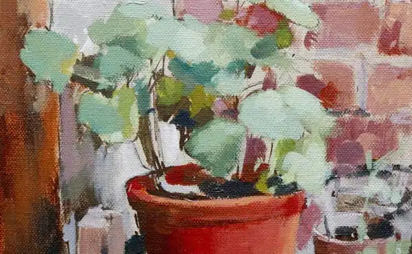
Return to the same object and paint it in different colour ways, using the blue coffee jug from the Still Life E-book as a familiar starting point.

This is actually a brilliant way to learn.

When you remove the anxiety of constantly searching for new subjects, your attention can move onto the real foundations of painting.

If you’re in a similar situation, here are some colour palettes you can use to develop your painting skills without constantly having to find a new subject to paint.

A simple object becomes familiar territory

When you’re painting the same jug over and over again, you can practise ellipses and shadow mapping. You begin to instinctively understand the proportions of the object. Your hand becomes steadier because you are solving the same visual problems repeatedly rather than looking for new ones every session.

Then the colour schemes themselves become the lesson.

Burnt Umber + White

Warm and very traditional, this is an excellent palette for learning form and understanding value relationships.

Similar to the first shadow-mapping exercise in the e-book, adding white to the Burnt Umber gives you a full range of tonal values to work with.

Earth colours have long been used for oil painting underpaintings because they tend to dry relatively quickly compared with many other pigments. That makes this simple monochrome setup an ideal palette for practice studies.

You could also use Winsor & Newton Galeria Pale Umber, which is a mixture of Burnt Umber and White, as a ground colour. Combined with the monochrome palette, it creates a really strong traditional starting point to experiment with.

pale-umber-winsor-newton

Pale Umber, in the student Galeria Range

Raw Umber + White

Softer and slightly cooler.

Great for subtle value shifts, especially with yellows. If you think of Raw Umber as a dark yellow, it can be a very effective colour for darkening yellows without causing colour drift. On the ‘How to paint light and shade‘ tutorial, you can see how effective Raw Umber can be as a colour neutraliser. In this tutorial, I use Cadmium Yellow Light, muted with Raw Umber, for the apple’s form.

Ultramarine Blue + White

Working with just Ultramarine Blue and White can be surprisingly difficult compared to the softer, more subdued character of Raw Umber or Burnt Umber palettes.

Ultramarine has a much stronger colour personality. Even when mixed with white, it tends to retain an intensity that can feel sharp or emotionally charged on the canvas.

Earth colours naturally sit in a quieter, more neutral range. They are forgiving, understated, and often easier to organise into harmonious value relationships. Ultramarine, by contrast, demands more control.

Self Portrait, 1901 by Picasso

Blue also carries a particularly strong emotional association. We instinctively read it both psychologically and visually. If you think of Pablo Picasso and his famous Blue Period, which followed the death of a close friend, you can see how an entire emotional atmosphere can emerge from the dominance of a single pigment family.

Historically, intense blues were precious and symbolic. Ultramarine itself was once made from Lapis Lazuli and was more expensive than gold. Often reserved for the most important passages in paintings.

Some artists became fascinated not just with blue as a colour, but with its psychological and sensory effect. Yves Klein was obsessed with the immersive intensity of blue and wanted blue itself to become the subject.

Klein worked with a chemist to develop a special synthetic resin binder that preserved the raw brilliance of the pigment particles.

This became known as International Klein Blue, or IKB.

Ultramarine Blue + Burnt Sienna + White

Adding Burnt Sienna introduces a warm orange earth colour that beautifully balances the coolness of Ultramarine Blue. Suddenly, you can begin moving between warm and cool mixes, and an entirely new world of colour relationships opens up. It’s a wonderful way to discover just how far a painting can be pushed using only a handful of pigments.

In the still-life jug demo, ‘How to Paint Warm and Cool‘, the entire painting is created using just these two colours plus white, making it an excellent practice exercise.

When working with a single pigment, your decisions are mostly tonal. You are essentially thinking: “Do I add white to lighten the value, or more pigment to darken it?” But once you introduce a complementary pair, such as Ultramarine Blue and Burnt Sienna, you add another layer of subtlety to the process.

Now, as you move up and down the value scale, you are also controlling temperature.

One mixture will lean cooler, another warmer. This naturally develops your sensitivity to colour balance without becoming overly complicated.

The beauty of the palette is its simplicity. If a mixture becomes too cool, you can gently warm it with Burnt Sienna. If it starts to feel too warm or heavy, Ultramarine Blue will cool and neutralise it again. There is a lovely balannce between the two pigments, which is why complementary colour schemes can feel so harmonious and satisfying to paint with.

Ultramarine Blue + Burnt Sienna + Yellow Ochre + White

Building on the Ultramarine Blue and Burnt Sienna palette, introducing a muted yellow such as Yellow Ochre opens up an even broader range of colour possibilities while still keeping the palette controlled.

Yellow Ochre is a warm earth yellow, so rather than creating highly saturated colour mixes, it gently expands the upper warm range of the palette.

When you lighten Burnt Sienna with white alone, the mixtures naturally tend to move towards pinks and warm reds. By introducing Yellow Ochre, you can shift those lighter passages towards warmer golden tones instead, creating a much stronger sense of sunlight, warmth, and atmospheric light across a painting.

This becomes especially useful in illuminated areas of a still life or landscape, where you want the light to feel warm rather than chalky or cool. Even a small touch of Yellow Ochre can beautifully soften and enrich lighter mixtures.

Another advantage is how it affects your greens.

When mixed with Ultramarine Blue, Yellow Ochre creates muted, natural greens rather than vivid, overpowering ones. Strong greens can easily dominate a limited palette and draw attention away from the painting’s structure, but these softer earth greens remain subtle and harmonious.

So rather than expanding the palette into lots of bright colours, Yellow Ochre gently widens the range while still keeping everything connected and restrained. It is also excellent for warming toned grounds and coloured backgrounds, adding a soft glow beneath the painting surface.

Yellow Ochre + Ivory Black  + White

If you’d like to take the idea of muted yellows and greens further, then the simple combination of Yellow Ochre and Ivory Black can be really effective. What makes the palette so interesting is that the Ivory Black begins to act like a muted blue, allowing you to mix very subtle, restrained green hues when combined with the Yellow Ochre. Also, it gets you used to using black in a palette without being scared it will ruin the painting!

As you introduce white into the mixtures, you’ll notice how the black naturally cools the colour range, while the Yellow Ochre gently warms it back again. The overall effect remains soft and subdued. You won’t achieve highly saturated colour with this palette, but that is precisely its strength.

It’s an excellent way to study how desaturated colour often appears in distant landscapes, shadow passages, and atmospheric effects, which can also be a very useful approach for initially mapping out a painting before introducing stronger colour accents.

Venetian Red + White

Using a colour like Venetian Red, or another muted warm earth red, can create a beautiful old-master tonal quality. These pigments feel particularly natural for subjects such as pottery, terracotta, brickwork, roof tiles, and warm architectural studies because the colour family already sits close to the subject matter.

But the real lesson lies in the tonal value of the pigment.

Unlike Ultramarine Blue, which has a naturally deep dark value range, Venetian Red isn’t as dark. It simply cannot reach the same depth of darkness. At first, this can feel limiting, but it actually teaches an incredibly important skill: value compression.

When working with a compressed-value pigment, you begin to realise that painting is not about copying every value literally. Instead, you are organising relationships between values.

If you observe an area that appears extremely dark in your subject, but your pigment physically cannot reach that darkness, you have to reinterpret the entire value structure around it. You begin asking:

“If this is the darkest my pigment can go, how do I adjust the surrounding lights and mid-tones so the painting still reads convincingly?”

That process develops a sensitivity to tonal relationships. You start to understand that a convincing sense of light and shadow comes less from absolute darkness and more from the relative contrast between values.

In this landscape painting lesson on tonal value compression, you can see how values become closer and closer together as they recede into the distance.

This is one of the reasons limited palettes and compressed tonal studies can be so valuable. They force you to simplify, organise, and truly understand the structure of light rather than relying on strong contrasts or highly saturated colour.

How do you bring the palettes together?

Terracotta-pots-acrylic-tutorial.jpg

What I love about the terracotta plant pot tutorial is that it shows how these simplified colour ideas can move beyond exercises and become part of a more developed, finished painting.

Before the painting starts, the composition is reduced to a few key shapes and value relationships. This is exactly the same mindset as working with a single object repeatedly. You are reducing visual noise so you can concentrate on the key parts of the composition.

The next stage is the drawing.

In the tutorial, there is an emphasis on getting the ellipses accurate because plant pots can quickly feel awkward if the curves become uneven or overly sharp. Again, this connects directly back to the idea of repetition and familiar forms. When you paint pots, mugs or bowls repeatedly, you begin to train your eye to recognise subtle shape shifts instinctively.

But perhaps the most useful lesson in the tutorial is the colour structure itself.

Here is the palette:

  • Titanium White
  • Burnt Umber
  • Cadmium Yellow Light
  • Venetian Red
  • Violet Iron Oxide
  • Burnt Sienna
  • Raw Umber
  • Ultramarine Blue

Although the finished painting appears colourful, the palette is actually very restrained.
The painting starts with:

Burnt Sienna + Ultramarine Blue + Burnt Umber + White

Then the terracotta oranges are balanced against muted violets in the brickwork.

Violet Iron Oxide + Venetian Red + White

The foreground is painted with

Violet Iron Oxide + Ultramarine Blue + White

Terracotta-pots-brickwork

So you can start to see how the different areas of the painting are built up using these mini compressed colour palettes.

That is why exercises with monochrome palettes, complementary pairs and muted colour families are so valuable. They are not separate from “real painting.” They are the training ground that allows more developed paintings like the terracotta pots to feel cohesive and controlled rather than chaotic.

The painting may look complex at first glance, but underneath it is built on very simple decisions:

  • Simplified composition
  • Controlled values
  • Muted colour relationships
  • Limited palette harmony
  • Warm versus cool contrast
  • Selective saturation

In many ways, this is what mature colour handling really is.

Not adding more and more colour, but understanding which colours to leave out.

This Post Has 27 Comments

  1. Chacha

    Thank you, Will! Your articles are always so educational! I’ve learned most of my color theory and painting techniques from you! Even your articles on your musuem trips have expanded my knowledge of art and art history! Though there’s still a lot to learn, I’ve become a more skilled painter and confident artist because you are able to break down the lessons into manageable, easy to follow chunks. Appreciate you!!

    You are a blessing!
    Chacha

    1. Will Kemp

      Thanks so much Chacha, that’s very kind of you to say so, so pleased you’ve been enjoying the teachings.
      Will

  2. Lynn

    Thank you, Will! Your posts are so inspiring. The level of detail that is so “on point” has excited beginners over again, to try the methods you describe. Thank you for sharing your knowledge as beginners try to tackle color and value. It is very helpful!

    1. Will Kemp

      So pleased that you’re feeling inspired Lynn, I really hope you find it helpful when building palettes for your paintings.
      Will

  3. Kathleen Ferno

    I completely agree with Chacha and could not have put it better. I’m always investigating other artists who teach but no non-measure up to your excellence, Will.

    1. Will Kemp

      Hey Kathleen, That’s very kind of you to say. So glad you enjoy them.
      Will

  4. Kim

    As I read I became lost , not at my easel at all , not at my paper and graphite
    I’m thinking on the pallet, I have no violet iron oxide no venetian red , yet I still have a very strong urge to make those colours and do this study , I remember reading this tutorial when you 1st added to your posts , it looked impressive to me and yet simplistic enough for a try,…. The value in repeating and excluding is key , what a fab read , thanks so much for you endless talent and sharing always speaks to me

    1. Will Kemp

      Hey Kim, It can be a great exercise to see how you can mix those pigments you haven’t got from the ones you’ve already got. For the violet iron oxide, you’re trying to get a muted purple, so you could use an ultramarine blue and a crimson or a bit of cad red that would work. And for the Venetian red again try mixing a richer red, so if you’ve got a cadmium red and then add in some burnt umber into it to mute it down.
      Will

      1. Kim

        Will , it is like you knew I only had those to mix from(old faithful pallet )
        thank you for formulae’s ,they shall be perfect now …

  5. Karen Sorensen

    This is an excellent article. Thank you for sharing this. I hope I can be disciplined with my time to do all of the exercises!

  6. Bonnie Yuill

    Thanks Will – one of your best emails – lots of excellent points – have printed it out to keep! Bonnie

  7. John Kackloudis

    Thank you, Will! So concisely informative and helpful.

    1. Will Kemp

      Cheers John, hope you’re keeping well.
      Will

  8. Debbie A

    Oh Will your articles are always so timely and informative! I’ve been really trying to compress my values lately and working with limited palettes. Basically trying to make my paintings look a bit more sophisticated! My favourite oil combo is Gamblin Transparent orange and phthalo blue – it makes a stunning range of muted greens. Honestly, your tuition is next level and so generous. I recommend you to anyone new to painting.

    1. Will Kemp

      Thanks so much Debbie, and that sounds like a great pairing, phthalo blue can be so nice.
      Will

  9. Sonja Mason

    Hi Will,
    I really like your articles on colour mixing. I find that it involves both hemispheres of my brain. Your critical analysis combined with your ability to bring a subject to life on a two dimensional canvas are unparalleled. I also like the museum visits. Art history is one of my favourite subjects, and I look forward to posts on that subject.
    Cheers.

    1. Will Kemp

      Thanks so much Sonja, that’s lovely to hear.
      Will

  10. Laura

    I’m so glad to come across this article, Will. I was just recently feeling unmotivated on painting, but this is quite inspiring. Would this be something that I could apply to landscape painting?

    1. Will Kemp

      Hey Laura, yes it would work really well for landscapes. What would be handy is to stick with the ones that are a bit cooler or more towards green, so the raw umber and white, and then the yellow ochre, ivory black, and titanium white. They’ll be good basics for landscapes to establish a muted colour structure.
      Will

  11. Elizabeth Egan

    Hi Will,

    My first time posting since following you and joining your newsletter. I have just finished my third read of this article. It’s great- an excellent breakdown. I’m going to give the Jug a shot.
    Thank you.
    Elizabeth

    1. Will Kemp

      Hey Elizabeth, great to have you along and really pleased you enjoyed it. The jug is a great demo to practice these techniques. Really hope you enjoy it.

      Cheers,
      Will

  12. Teresa

    Hi Will – thanks so much for sharing your knowledge and inspirational articles.
    Love your work.
    Teresa

    1. Will Kemp

      Cheers Teresa, pleased you enjoyed it.
      Will

  13. Lawrence

    Will, always when I think…O I can’t do it….you open up the door…yet again..and it all becomes possible…I enjoy your lessons and informative posts so much…thanks for providing a creative springboard into summer painting…
    Cheers
    Lawrence

    1. Will Kemp

      Thanks Lawrence, so pleased it helped.
      Will

Leave a Reply