The secret to realistic depth in a landscape isn’t just simplifying forms and loosening brushwork; it’s knowing what to hold back on.
In fact, the real magic happens when you begin to reduce something most artists overlook.
Contrast.
Value Grouping: How Light and Dark Shapes Create Depth.
But isn’t contrast good?
Yes, contrast is important. But in landscapes, too much of it destroys the illusion of distance.
Creating depth means understanding how values shift as they recede. More specifically, how the light-and-dark relationships change from near to far.
Understanding Value Compression
‘Values’ describe how light or dark an object, or subject, is.
A value scale shows a range of tones, from the darkest dark to the lightest light.

A value scale – One ‘value step’ is the difference between two values next to each other.
Objects nearest to you have the strongest contrast. As they recede, the contrast gradually fades. The key is to notice the subtle value steps at the furthest point in your painting. Getting this right adds real sophistication.
Value compression becomes more pronounced as you move farther from your viewing position.
Squinting reduces the light entering your eyes, softening edges and hiding detail. This helps you judge the big shapes and value relationships more easily.. This makes it easier to judge the big shapes and value relationships in a scene.
Pro tip: If you’re unsure how much to squint, close your eyes completely, then open them slowly until only the main shapes come into view.
You might have come across aerial perspective, overlapping and objects getting cooler in the distance.
(The reference Image for this demonstration is by Annie Spratt ” A Grassy Field with Trees and Fence‘ )
How to Use Value Steps to Create Depth in a Landscape Painting
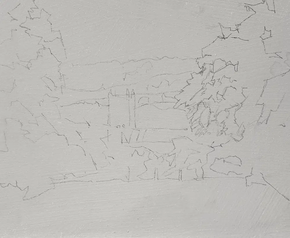
I’ve applied a neutral mid value grey colour to a board and drawn out with a HB Pencil
You hear about landscapes having a foreground, a midground, and a background, but most landscapes don’t fall neatly into these three layers. There are subtle transition zones where colour, value, and edge quality shift gradually.
Below is a basic structure to look out for, and I find it easiest to imagine the scene like a pop-up theatre made out of multiple layers of paper. At each stage, I’m looking at one isolated layer at a time.
1. Near Foreground Vertical Layer (closest to you)
Four to Five Value Steps between the lightest area and the darkest area, in this example, in the tree on the right.
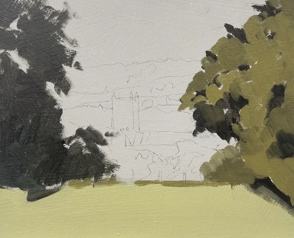
I’ve painted the lights on the trees. Notice the difference in value between the shadow and the light.
The strongest contrast appears in the foreground. Objects closest to you have the most significant jump between light and dark. I’ve painted in the closest darks with a colour close to black (using Raw Umber, Ultramarine Blue and a dash of Viridian Green). For the lighter tones, I added some Cadmium Yellow Light.
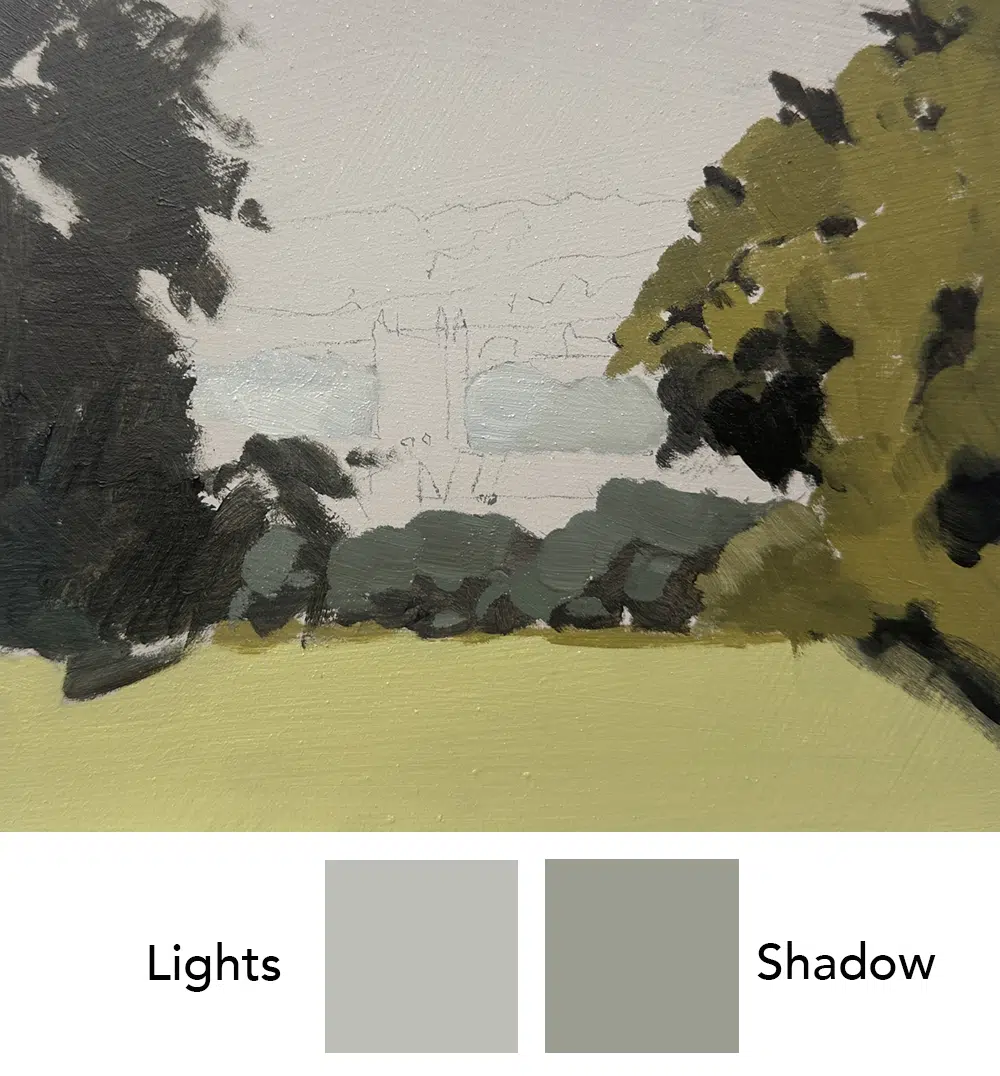
2. Foreground Next Vertical Layer Back
Three Value Steps between the lightest area and the darkest area, the bushes in the centre.

At this stage, I’ve added more Raw Umber and Ultramarine blue to the mix to make a cooler and less saturated green.
Move a little further back and you’ll notice two or three distinct steps between light and dark. The contrast softens, but there’s still enough difference to describe form. Also notice how the colour has slightly less saturation, and is now cooler.
3. Middle Ground Next Vertical Layer Back
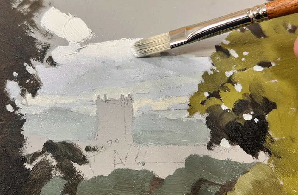
Two Value Steps between the lightest area and the darkest area, I’m looking at the row of trees behind the church.
As you look deeper into the scene, the value range narrows into only a couple of steps between light and shadow.
4. Far Background Next Vertical Layer Back and the Furthest.
One to one and a half value Steps. I’m looking at the far hillside.
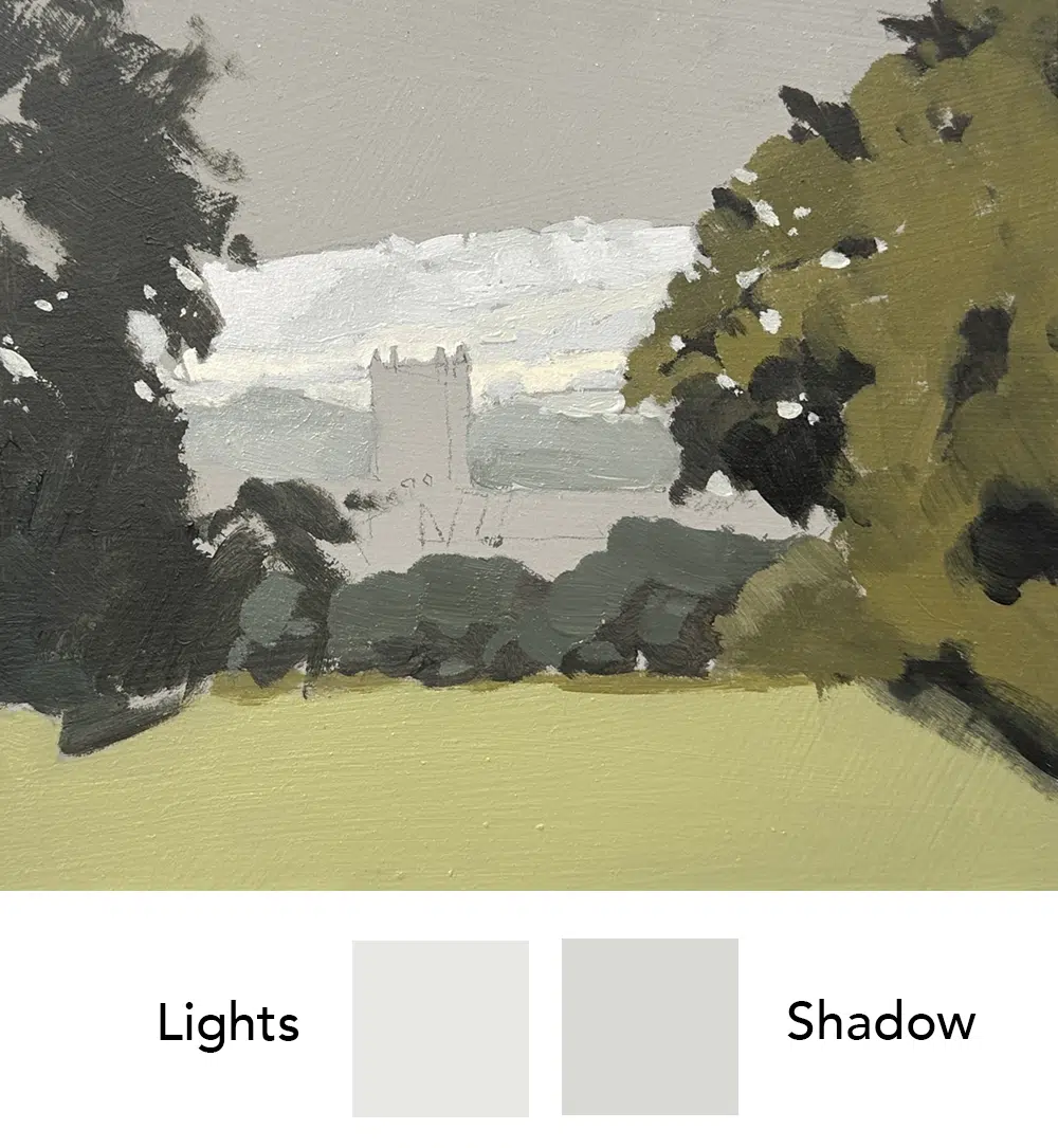
Optically, this looks the strangest because the lightest value of the sky hasn’t been added yet, but the far distance is very close in value. In many instances, in the far distance, all those hills, trees, and textures merge into a single value. Up close, you’d see detail and variation, but from far away, it compresses into one tone.
Adding the Sky
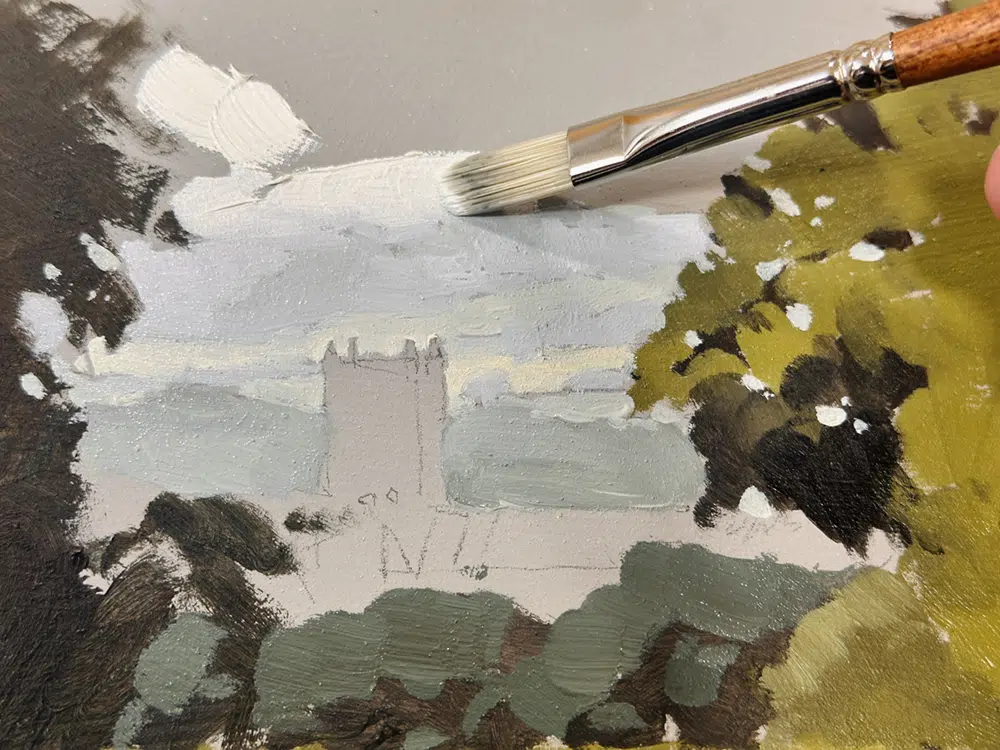
Adding the sky allows you to judge its value accurately against your foreground tones.

Aerial Perspective
As the landscape fades into the distance, it isn’t just the values that change, the colour does too. This is known as aerial perspective (or atmospheric perspective).
When light travels through air, tiny particles of dust and moisture scatter it. The further that light travels, the more muted and bluish the colours appear. That’s why distant hills often look cooler and paler than the foreground.
- Foreground: Colours are warmer, richer, and more saturated.
- Middle distance: Colours begin to soften, losing intensity.
- Background: Colours become cooler and lighter, often shifting towards blue or purple.
This subtle temperature shift enhances the illusion of depth and helps you separate the planes of your painting without over-relying on detail.
If your landscapes look flat, try reducing background contrast and colour saturation, then gently increase warmth and contrast as you move forward.
Pro Tip: Mix a touch of the sky colour into your distant landforms. This helps them feel bathed in the same atmosphere and instantly pushes them back in space.
You might also enjoy:
Landscape painting composition using ‘composition categories’
Plein air painting techniques with Acrylics demo


Will your instructions are so clear and understandable and helpful! Thank you so much for sharing with us all.
My pleasure Linda, so pleased you found it clear.
Zeer veel dank Will!
Will, value compression is a very important tool and you explained it so well that I actually got it
So pleased Abbey
Thank you Will, for the amazing in depth tutorial.
Thanks very much for curating and sharing with us.
Your earlier post on the importance of practice is so true.
Glad you enjoyed it Tanusree
Super clear and helpful Will! Thankyou!
Cheers Toni, so pleased it was clear to understand.
Thank you for your instructions. Very very helpful. Cheers Paula J
Good to hear it Paula
Thank you, Will.
This was extremely helpful for my landscape painting.
Many blessings,
Mary Ann
So pleased Mary Ann
Thank you so much for your generosity in sharing such valuable information .
My pleasure Mimi
Thank you Will.
I have found getting the colour value right for aerial perspective in a landscape quite tricky especially with acrylics which darken on drying. I have used the grayscale value chart as a guide but its not easy to translate the perceived grey scale value from the subject matter to its equivalent colour value. I find I always seem to bias towards a lower value!
Hey Jon, yes, it’s a tricky thing to get right as it only ever reads correctly when all the values including the sky are in. With the darkening on drying, you might try the Winsor and newton professional acrylic range, they use a clear acrylic binder rather than opaque so the darkening when drying is much, much less pronounced.
Aloha, Will
This post is very timely. It truly explained how I am working on a seascape that follows what you are explaining to a great extent. I wracked my brains doing this work and intuitively it is as you’ve shared it.
I can now proceed on the final touches on my painting! Your friend in Blue Hawaii- Liz
Ahhh, so pleased it helped to shed some light on your seascape Liz.
Wonderful teacher! Thanks so much for this tutorial! Did this intuitively before; hits and misses; now will have much more control. Again, many thanks!
Good one Roberta, hope it helps.
Thank you, Will… Your tutorials are always very helpful…
You are very generous with sharing information.
My pleasure Julie, glad you enjoyed it.
Will