
“I am a simple man, and I use simple materials: Ivory black, Vermilion (red), Prussian blue, Yellow ochre, Flake white and no medium. That’s all I’ve ever used in my paintings.
L.S.Lowry
A great deal of things in nature are actually very muted, it is often the difference between light and dark and warm and cool colours, rather than the use of a bright colour.
If you want to paint subtle still life paintings, choose muted earth colours.
If you want very bright, vivid abstracts, you might need some more man-made pigments that have a higher colour saturation.
My suggested basic acrylic colour palette is somewhere in-between. It allows bright colour mixtures as well as subtle. The pigments are all light-fast (will not fade over time) and are a mixture of series (the price labelling system of paints) so the cost will be kept down….
In his book “Blue and Yellow don’t make Green”, Michael Wilcox talks extensively about the colour bias of paint.
Colour bias happens due to the trace colours found in paint pigments. They can cause trouble when trying to mix bright clean colours when you use the wrong paint pigments.
One way to overcome this problem is to have a palette that consists of two of each of the primary colours, red, yellow and blue.
He recommends a palette of 6 colours, two primaries each.
A red with an orange bias for mixing orange – Cadmium Red
A red with a violet bias for mixing violet – Quinacridone Red
A yellow with orange bias – Cadmium Yellow
A yellow with green bias – Hansa Yellow
A blue with green bias – Cerulean Blue
A blue with a purple bias – Ultramarine Blue
However, I find in practice, especially if you are just starting acrylic painting, this can be a tad overwhelming.
How to start with 3 tubes of paint
Now I know you are going to think this is a misprint but I would usually recommend starting with 3 tubes of paint consisting of a warm and a cool colour.
- Burnt Umber (muted orange based brown) or Burnt sienna (brighter orange based brown)
- Ultramarine blue
- Titanium white
But what happened to the primary colours?
A great lesson you need to learn when trying to create professional looking paintings is the importance of value (how dark or light a subject is)
It is so much more important than colour. Try to learn about value, learn about complementary colours (opposites) and you will start to understand the different qualities of paint.
Moving from drawing to painting is hard enough without the distraction of trying to mix lots of colours if you force yourself to have less you will learn more about mass tone and undertone.
Masstone & Undertone
- Colour – has both a masstone and an undertone
- Masstone – refers both to the tone if it was black and white (value) and its colour tone (hue).
- Undertone – the colour produced when you scrape a small amount of paint over a white surface
eg: Phthalo blue has a dark blue masstone and a yellow/green colour bias in undertone
So if I say, “look at the tonal range in this painting,” this is exactly the same as saying “look at the value range in this painting.”
You’d be amazed at the great paintings you can achieve with just a few colours. The painting below by Larine Chung uses just ultramarine blue, burnt sienna and titanium white.


Okay, I understand this but it sounds serious.. I want bright colours!
If you really want to get started with colour, below I’ve listed a basic acrylic colour palette that will help you achieve the next level in your painting.
What acrylic colours should I buy to start with?
To create 90% of the colours you will need for realistic painting use the following:
- Burnt Umber
- Ultramarine Blue
- Cadmium Yellow Light
- Alizarin Crimson Permanent
- Titanium White
Other useful colours:
- Yellow Ochre
- Raw Umber
- Ivory Black
- Cadmium Red
- Phthalo Blue (Green Shade)
Why do I need these particular colours?
Burnt Umber – although this looks very dark and dull it is really handy to have, both for blocking in the darks on portraits and for toning down colours. It is also invaluable in oil painting due to its quick drying time so it is a great pigment to get to know.
Ultramarine Blue – sometimes beginners steer away from this blue because it is mentioned so often in art books and seems, well a bit boring, but it has good opacity, great for subtle skies and mixed with Burnt Umber will make a dark very close to black.
Cadmium Yellow Light – good opacity for a yellow and just generally great!
Alizarin Crimson Permanent – this will look too dark when you buy it and you’ll feel a bit disappointed, it also feels different than the other pigments because it has a gloss sheen to it and it very translucent. But a little goes a long way. Add some white to make a killer bright pink.
Titanium White – good opacity, good coverage, goooood.
Pro tip: make sure it is the permanent as other Alizarin Crimsons can be ‘fugitive’ colours and not have great lightfastness. Look at some of Gainsboroughs portraits to see what happens if you use fugitive colours.
Now with these four colours and white you can mix 90% of the colours you need. You might not believe me and still feel the urge to search for another palette. But for general landscapes, still life’s you won’t need anything else.
Occasionally you will need 3 other colours, they are:
Phthalo Blue (green shade) very high tinting strength, great for making very bright blues.
Cadmium Red Light – if you want a really red red. Cadmium Yellow light and Alizarin crimson permanent can make a colour very close to cadmium red.
Yellow Ochre – So here we have yellow ochre great for a coloured ground in acrylics and good to start to mix more subtle greens, if you unleash Hansa yellow and Phthalo blue we will have luminous green disasters.
These are pigments that will work well both with acrylic and oil paint. It makes it very transferable when you are learning to paint. For a watercolour palette you may choose some more subtle tints that have a different undertone.
For a portrait palette I would use a more subtle palette please see:
How to choose a basic portrait palette for Oils
You might also like:
1.Titian’s use of warm and cool colours
2.The hidden hues of colour mixing


Hi Will,
Stumbled across your YouTube channel while searching how to mix purple. Thanks a lot for explaining, purple was giving me a world of pain!
Hi Nazish, purple can be really tricky! pleased to hear that it helped you out
Thank you for this post, I’ve been to the store today to get some supplies for acrylics and this post has been especially helpful on knowing which brand \ palette colours would be good to start off with.
Looking back I see I’ve made a few slips with what colours I’ve bought… I’ve bought Golden Open | Burnt Umber – Titanium White – Ultramarine blue – Yellow Ochre – C.P. Cadmum Red Medium. I’ll atleast be able to try a hand at that 3 tube painting :).
There were a few things that confused me while being in the store, one of the things was that Golden Open didn’t have “Alizarin Crimson Permanent”, only “Alizarin Crimson Hue” (Which can be a fugitive colour as you’ve said), so I was wondering about that.
My main objective for the future will probably be trying out other primary colours with a different bias, but while looking at the tubes for information I realised that some colours have less or more opacity than eachother. Wouln’t that mean you’d have to get 4 of each primary? (1 biasA transparant – 1 biasB transparant – 1 biasA opaque – 1 biasB opaque)
Thank you in advanced for your reply :),
Michael
Hi Michael,
It doesn’t sound like you’ve made any slip up on colour choice, they will all be useful.
1. Alizarin Crimson Permanent is made by Winsor & Newton.
Historically Alizarin crimson used to be a fugitive colour, the Golden version of Alizarin crimson Hue however, is not.
This is because it is a man-made alternative (that is what the ‘hue’ stands for, it means imitation’) that will stand the test of time so will not fade.
2. You can extend your primaries by usually having two of each primary colours, for example cadmium yellow (high opacity, red bias) and Hansa Yellow (low opacity, green bias)
However, you definitely don’t need 4 of each.
I use 1 x Cadmium Yellow light for 90% of my paintings and might use a tiny amount of Hansa Yellow for subtle glazing as the nature of the pigment of Hansa Yellow is transparent.
If you’ve bought Alizarin crimson Hue and added it to the paints you’ve already bought you can do loads with these, the only nice thing about Alizarin Crimson Permanent is you can go a lot brighter in your pinks.
The Alizarin crimson Hue is what I use in portraits for glazing lips, cheeks etc, a very handy paint to have on your box because it is muted, and transparent. perfect for the subtle nature of portraits.
The tip about Alizarin crimson hue for portrait glazing is a golden one, I’ll probably get both Alizarin’s and give them both a go for various subjects.
Thank you for your help :) (and so fast too!)
Michael
Your welcome Michael, good luck experimenting
Hi again Will, in response to this thread I was just wondering, a) when it says ‘hue’ on Golden paint colours is it ok to buy then? And b) can you mix Golden and Winsor & Newton acrylics successfully?
a.) When it says ‘hue’ on a paint tube it indicates that the paint has been made from imitation pigments, in lesser quality paints ie: not artist quality, that can lead to an inferior product.
In Golden paints however, the quality of their imitation pigment is extremely high, in fact in any artist quality paints it would be fine to use a colour that says ‘hue’.
In some examples like Alizarin crimson the ‘hue’ version is a lot more stable and permanent than the original pigment source.
b.) yes, you can intermix brands there will be extremely subtle differences in drying times and colour shift but so minimal it will not effect your painting.
Hope this helps
Will
Thanks so much for this page. I’m sure I shall return to it more than once as I progress. It is very useful to a beginner like myself. You are very generous in sharing your knowledge with the world.
Hi Martin,
Pleased to hear you’re finding the site useful.
You can always leave me a comment if you’ve got any questions.
Will
Thanks for such an informative website and taking the time to share your knowledge and experience. I am a beginner and about to purchase my first Acrylic paints but I am having difficulty deciding which quality as I have had conflicting advice to date. I have just read your “8 key differences between Artist quality vs Student grade acrylic paints” and conclude from this that I am better off getting Artist quality paints as I would have less coverage and a greater colour shift with the lesser quality paint. However, would it be possible to mix the two, i.e., using Artist quality, but where necessary Student quality for under painting and for covering larger areas? I note that some do not have Alizarin Crimson so can I use, say this colour from W & N while my other colours are from AV Vallejo or Old Holland?
Jay
Hi Jay,
Glad you’re finding the website useful.
In answer to your questions:
However, would it be possible to mix the two, i.e., using Artist quality, but where necessary Student quality for under painting and for covering larger areas?
Yes, definitely. All student and artist quality paints are inter-mixable. You can also intermix different brands of paint, you’ll just find, for example, a Yellow ochre from Old Holland might have a slightly different hue than one from Winsor and Newton. This is due to where each manufacturer source their raw ingredients.
I always recommend an artist quality white as the opacity makes such a big difference, you’ll also find artist quality yellows have a lot higher tinting strength but the student quality paints are brilliant for the underpainting.
I note that some do not have Alizarin Crimson so can I use, say this colour from W & N while my other colours are from AV Vallejo or Old Holland?
Yes, I use Golden paints in the majority but use Permanent Alizarin crimson from Winsor and Newton. I haven’t found another red that can make good purples and warm oranges from just one pigment. (Make sure it is the Permanent Alizarin Crimson and not Alizarin Crimson, they are different colours)
If you do invest in artist quality it will make the painting easier and if you watch my video on Gels part 1 you’ll see how you can buy a clear acrylic gel that you can mix with artist quality paints to effectively create your own ‘Student’ range and makes everything more cost effective.
‘Regular Gel’ thins the paint down without losing consistency thus mimicking student paint (as opposed to watering it down with water and changing the consistency of the paint)
Good luck and if you’ve got anymore questions just leave a comment.
Will
As a result of your detailed answers to my questions, I have now sourced most of the colours you recommend above with the exception of ‘Cadmium Red’ in that there appear to be three different variations ‘Light’ ‘Medium’ and ‘Dark’ / ‘Deep’ / ‘Intense’. Any suggestion?
Your notes on the use of gels and mediums has really helped. It also has saved me money as I now know exactly which ones to get. Thanks!
Jay
Hi Jay,
Glad I’ve helped.
Regarding Cadmium Red, personally I use Cad red light as it’s the brightest you can get and it’s always easier to tone down a colour, rather than inject more of a punch.
However, most of my students prefer using Cad red medium when they’re just beginning because they can use it straight from the tube and is more of a balanced red (cad red light veers towards orange)
A note on cost, if you intend using this in large areas of your paintings it is worth buying a student quality version as Cadmium’s are the most expensive pigments.
In Student grade paints they call it Cadmium red hue (hue denotes an imitation pigment rather than pure Cad red pigment)
Let me know how you get on,
Will
Mr. Kemp,
Have you used the Artist’s Acrylic line by Pip Seymour? If so, any opinions? It is suggested that these do not have the same amount of filler as other Studio / Student quality paints, actually have high quality pigments, and is manufactured in England.
I found your advice on mixing invaluable but it is tricky especially when mixing paints from different manufacturers (in my case the Alzarine Crimson Perm. by W & N and the other from ARA). Like you state, knowing the bias of each colour is important but surely I can find this information online or in books, can’t I?
Thanks
Jay
Hi Jay,
Have you used the Artist’s Acrylic line by Pip Seymour?
No, I haven’t used these before, it is unlikely they will have the same amount of filler as they are artist quality, not student quality, therefore should be very good. Any artist quality paint will be extremely similar.
I found your advice on mixing invaluable but it is tricky especially when mixing paints from different manufacturers (in my case the Alizarin Crimson Perm. by W & N and the other from ARA).
I think the more experienced you get mixing and painting the less this will become of an issue, but whatever you feel comfortable with. Over the years I have inter-mixed brands and the difference between them is really very minimal.
Like you state, knowing the bias of each colour is important but surely I can find this information online or in books, can’t I?
‘Blue and yellow don’t make green’ by Micheal Wilcox has extensive colour swatches and is great to read for a more scientific approach, but alone without going through colour mixing yourself is like reading a book on how to drive and jumping in and thinking it’ll be o.k.
I personally think it is an invaluable process you go through as an artist to find the pigments and the paints that suit you best, experience their tinting strengths, coverage etc.. this way you really learn about colour mixing.
Remember, in classical painting, students paint in black and white for 12 months before introducing colour, so don’t feel you have to rush the learning experience.
Hope this helps,
Will
I could not find the Wilcox book you mentioned but instead found ‘Colour Mixing Bible’ by Ian Sidaway. If anyone is interested, from an quick perusal, the book is useful but lacks emphasis on the 3 primary colours. However, Mr. Kemp, your advice in your reply is sound and I should learn the process through experience and personal preference rather than just reading instructions. I guess I am finding there is a lot to think about, from the quality of supports and surfaces, priming, through to using the correct brushes and how to mix colours, mediums and gels. I just thought trying to remember colour biases might be a bit of a stretch at this time but I experience will make it easier.
Thanks
Jay
Hi Jay, there is a lot to take in when you first get started painting. I’ve got a link to the Wilcox book at the end of The hidden hues of colour mixing post.
Will
Hi Will! I was wondering, you have mentioned using Yellow Ochre for ground color in landscapes, would you also use this color in seascapes or would another ground color be more appropriate?
This was a great section, the basic classes that I took in school never went into detail about different color bias and now I know the answer to my many questions of why my colors turn to mud, thank you.
Hi Michelle,
I usually always use an earth tone as a ground, so it doesn’t put your eye out too much when judging colours against it.
I usually select the most appropriate colour, depending on the mood and scene I’m after.
For example a traditional seascape with a lot of blues would suit a cooler base of Raw umber and white, but for a warm beach scene I might use Burnt sienna or Yellow ochre.
Hope this helps,
Will
p.s on my latest youtube still life video right at the beginning, I show an example of why I chose a specific ground colour.
Hi Will, i contacted you a few weeks ago and showed you my motor sport drawings and now im looking to get started with acrylics, im just wondering what colours to start with as i will be going for strong/bright colours that racing cars have on them so im definitely not looking for a subtle selection.
best regards and bravo on all your videos!
James
Hi James,
Having looked at your work I’d start with a Cadmium yellow light, Cadmium Red, Ultramarine blue, Phthalo Blue (green shade) Titanium White & Ivory black.
You would able to get 95% of the colour mixes you’d need, if not 100%.
You might find introduction of Cadmium yellow medium and Cadmium red light would also help but the difference is quite subtle and you would be able to mix them.
Hope you enjoy using the acrylics,
Will
Hi Will,
I’m a beginner in mixing colors and stuff, especially in acrylics. I am 12 years old and I’m from Philippines. I’ve been watching recently your Youtube Channels and read topics in you websites and I found it very helpful. I am only watching your free videos because we can’t afford your courses. I wish that you keep on posting free videos which I can watch and study. Thank you very Much!
Carl
Hey Carl,
Thanks for stopping by! So pleased to hear you have been enjoying the painting videos and they have been helping you get to grips with acrylics. There will be more free articles and videos coming soon,
Thanks for the support,
Will
Hello Will,
Thanks a lot.I’ll be expecting that.
Carl
Hi Will, this is Daniel from Colombia. I’ve been watching your videos and reading some of your stuff. I’m 19 years old and I really appreciate your work, you’ve done such and amazing job. I wanted to thank you for your help, it’s useful. I’ve been painting for about 4 years and I’d love to go to another country, because it’s almost impossible to get a job as an artist here in Colombia, so I was wondering if you could send me information about scholarhips in the US or Europe, I’d love to apply for some of them so I can continue painting and doing what I really love. Sorry if i’m, bothering you
and about my english. Thanks for your time. Daniel
Hi Daniel,
Thanks for your kind comments, great to hear the website is helping your progress as a painter. I don’t have a specific list of scholarships available in the US, I think it might be a case of a few Google searches!
You can have a look at the Art Renewal Center, who do have a scholarship scheme, bit this is linked to studying at one of there recommended Ateliers. Also, in the UK go on the Mall Galleries website, they have a list of scholarship opportunities. Making a Mark also does a run down of yearly art competitions, although this is mainly UK based. If you do find any scholarships in your searches ( or if any readers know of any) then I’d be happy to put together a resource for other artists.
You’ve also given me an idea to start my own scholarship scheme here on the site. Who knows, you might be the founding scholar!
Thanks for the inspiration.
Will
Hi Will. Found your website yesterday. Really enjoyed everything I read/watched. Very informative for a newbie like myself. A lot of terms and technical items have been made clearer for me thanks to you. I have one question though regarding paint. At the moment I have all if the colours you recommend but they are a mixture of different manufacturers. I have Daler Rowney System 3, daler rowney graduate and a couple of Hobbycraft own. Would you recommend I bin them and start from scratch? Wholey System 3 or W&N Galeria? Or other?
Thanks
Gary
Hi Gary,
pleased to hear the website has been helping your painting! Regarding the paints you have I wouldn’t throw them away because you can still use them in your work. Some artists prefer to work with one brand but I often intermix between them. I always stress the importance of investing in an artist quality white, so the winsor and newton artist acrylic is a good choice in your next paint purchase.
Then, when you’ve used your old paints up, based on budget invest in all artist quality. It really will make a big difference in the ease of painting and judging the colour shift that you get with acrylics. ( the cheaper the paints the more noticable a colour shift than artist quality)
Hope this helps,
Will
Hi Will
Thanks so much for the quick reply. I will take your advice and invest in some good quality white and replace the other colours as and when they run out. I look forward to looking at the website more closely and trying some of your ideas.
Thanks again.
Gary
Hi Gary, you’re welcome. Enjoy having a look around the site. Some of the step by step classes, like the cherry still life or landscape painting can be a great start to understand a lot of the fundamentals of how to paint with acrylics.
Looking forward to seeing how you get on.
Thanks,
Will
Hi Will just found your site. I’ve been out of the painting practice for quite some time. My daughter and her husband just contracted to build a new home and want me to supply all the artwork for it. I really need to practice painting techniques before attempting to help them. Do you have any suggestions as to where to start? They intend to make their home a showcase for my artwork so I would like any tips you may have as to how to make my paintings look more professional as well as adding more value to their collection. :)
Hi Brenda,
Sounds like a really exciting venture (for the whole family!) I think the easiest thing to do would be to show me a couple of examples of your work (even if it’s been a long time since you’ve done them) so I can get a feel of the sort of work you do, and the painting techniques that would help you best. Or a piece of work that you aspire to do, then I can point you in the right direction.
Thanks,
Will
Hi Will
I was just wondering if the colours that you recommend follow the “2 Primary Colours” idea?
I’m trying to mix a rusty, reddish, orangey colour for a painting of Uluru and so far they are all turning out a beigey colour. I’ve tried various combinations of Yellow Ochre, Cad Yellow, Cad red and Alizarin crimson.
I’m reluctant to mix more than 2 colours together because I’ve heard that that way lies disaster!
Hi Gary,
The starter palette I recommend follows the 2 primary colours idea but leaves out a couple of colours as it has been simplified even further.
So you only have a single yellow, red, brown, blue & white. The other colours can be added as you become more practiced but this offers a wide range of tones with only a few colours.
With the colours you are using you will be able to create a reddish orangey colour perfect for an Ulura sunset. You will have to mix more than 2 colours together to be able to tone the mix down, for example a yellow, red and then add a brown (such as burnt umber) to tone the orange down.
Thanks,
Will
Thanks so much Will.
The uluru painting looks OK, not perfect by any means but better with the tips I’ve picked up from your site. I will try and mix another reddish colour tomorrow with the advice you’ve just given me and see if I can get a more vibrant colour than I have at the moment.
Im going to try the landscape exercise this week. Your site has given me a bit more confidence. And I now better understand hue and tone etc as well as tips on mixing.
One thing I have discovered this weekend is how to blend using the right brush. In the past I had mostly harsh edges. And even though my Uluru painting isn’t perfect colour wise, I’m really happy with the blending.
So thanks again.
Have a great week.
Hi Gary,
To get the brightest orange, you need a yellow with a red bias (cad yellow) and a red with a yellow bias (cad red).
Good luck with the landscape painting,
Thanks,
Will
Hi Will
Thanks again for all your help. I think what you are doing for newbie artists is amazing.
I have just one more question (I promise lol).
I know that the same colour paint can vary from brand to brand, but I have also noticed that sometimes the same colour can be transparent, semi or opaque from brand to brand also.
Is there a rule of thumb regarding this? Does the more opaque a brand mean a better pigment content? Or is it just down to a personal choice,in the same way that free flow or heavy body is?
Thanks
Gary
Hi Gary,
Which particular pigments have you noticed this with?
There usually isn’t much of a difference in the transparent/ opaqueness of a colour between artist quality brands. Differences in transparency occur depending on the raw ingredients of the paint mixture.
A student quality brand may appear thinner as the paint tube contains a larger amount of binder & filler than with an artist quality paint.
The pigment is the most expensive part of the paint, hence why artist quality cadmiums are expensive.
You can check out this article on the The 8 key differences between student grade & artist quality paint.
Thanks,
Will
Hi Will
Thanks for getting back to me.
The following are a sample of info I have found in the SAA catalogue:
Cad Red Deep
cryla – opaque
system 3 – semi
w&n Artist – opaque
Sap Green
galeria – semi
system 3 – trans
w&n artist – trans
Cobalt
galeria – semi
system 3 – opaque
w&n artist – semi
Taking the Cobalt colour as an example, the system 3 paint is opaque, but the more expensive Windsor & Newton Artist paint is semi.
Thanks
Gary
Hi Gary,
I can see the confusion, artist quality always has a better saturation of colour and is often more opaque, but not always as in the case below.
Cobalt Blue
The Cobalt from system 3 is called cobalt blue (hue), now the hue is the important bit.
In this case it denotes when a colour has been made from a substitute pigment – in this case, Ultramarine blue + titanium dioxide = cobalt blue (hue) which results in a different opacity to the pure pigment, cobalt aluminate.
Winsor & Newton Galleria & artist quality cobalt blue, just uses cobalt aluminate pigment, which is semi opaque.
Better saturation of colour gives you a truer, stronger pigment even if it is semi opaque.
So to sum up, the more expensive the paint, the more pure pigment you get and the changes in opacity from brand to brand will depend on what raw materials they use to create the paint.
Thanks,
Will
Hi Will
That’s great, thanks. It makes sense now. Since using some slightly more expensive colours recently I have noticed a richer texture to them. Guess this is the way to go. My original bargain hunting was a false economy. So I think the really cheap one’s will be relegated to base covering duty!
Cheers
You’re welcome Gary,
Thanks,
Will
Will,
I’ve watched enough of your videos after stumbling across one on youtube I feel like I know you! I’m a young self taught artist, and one of my favourite ways build on my talent is watching others.
Your videos are awesome, very helpful and have helped me in leaps of progress. I started off in graphite and am now slowly shifting into color mediums, specifically Acrylic painting.
Your explanation of color and theory have been a wonderful aid in my understanding and confidence to move forward in creating some new and color-vibrant pieces. Thank you again and may God bless you for sharing all your knowledge and skill.
I look forward to continually reading and learning from your posted materials.
Respectfully, CJ
Hey CJ,
It was really nice to receive your comment, so pleased that the colour mixing videos are helping in your transition from graphite to paint. It can be a tricky jump as mixing and matching colours can be a bit frustrating when you’re first starting!
Your background in drawing will put you in a great position with your acrylics, and with a bit of colour mixing knowledge you will progress really quickly in your painting.
Thanks again, looking forward to helping you on your painting journey!
Will
Hi Will, as a newbie painter I am interested in mixing my own skin tones, but there are are so many recipes, I do not know where to start.
I recently purchased a number of colours in acrylic, and was wondering if I could scale it down and keep it simple.
My colours are cad red, crimson, yellow ochre, cad yellow, ultramarine blue, colbalt blue.
I’m not sure if this is a good choice but feel free to add or substitute colours as you see fit.
I’m looking for basic mixes for light, medium and dark caucasian . any advice or recipes would be gratefully recieved. Many thanks
Hi Daniel,
The colours you’ve got sound pretty good, I wouldn’t use the cadmium yellow to start with as it can be a bit harsh, also I would add a burnt umber to your selection. This way you can mix a nice neutral for toning down colours when mixed with the ultramarine blue. You don’t really need the cobalt blue to start with as this can also be too bright.
Have a look at this post on choosing a basic portrait palette, at the end of the article I demonstrate how to match your own skin tone with acrylics, sounds like it might be the perfect fit.
Thanks,
Will
thank you will
Hey Will,
I really appreciate the wealth of information you provide on this site, however I do have one question. I’ve decided to go with Liquitex Heavy Body Acrylic Paints due to the great price:performance ratio. When purchasing the Ultramarine Blue, I noticed I grabbed the Ultramarine Blue (Green Shade). I noticed that they also produce a Ultramarine Blue (Red Shade). Which exactly were you referencing in your lesson?
Hi Alex,
So pleased you’re finding the site useful, the Ultramarine Blue I use has a red bias, so red shade in Liquitex would be the closest match to the one I refer to in the article.
Cheers,
Will
I love your website! I’ve wanted to paint for a long time, but never knew where to start with materials and what not. Your website has been wonderfully helpful for my start in painting. All the questions I have had or have not thought to have, are answered on your website. I just wanted to thank you for making your information available and very clear to understand.
Hi Sarah,
Thanks very much for your kind words, really glad you are finding the site helpful on your journey into painting.
Thanks again,
Will
HI Will, can i ask you if i can use cad yellow mixed with white to make cad yellow light i ask because i have no light but have shed loads of cad yellow. I should mention i am useing system 3 acrylic I have had fun painting for many years but now i need to learn more so i can still enjoy it , its important to make progress Thank you so much for this help.
Hi Sue,
To answer your question,
if i can use cad yellow mixed with white to make cad yellow light?
Mmmm, technically no as they are different pigments and when you add the white in, it will take the colour cooler towards blue, albeit on a very subtle level.
The trouble starts when you then mix the ‘new Cad yellow light mix’ in with other pigments.
I would say as it is Student grade paint anyway,and you have a lot of it! the Cad yellow medium pigment won’t be as strong so use it as it is, and you’ll get cleaner results.The mixes will just be a little bit more orange rather than a very bright yellow.
I hope this helps,
Will
Hi again Will. Thanks for your reply yes I understand. I have just seen your acrylic mixing course,I will be getting this,Thank you I can’t wait for the next stage in my progress .
Hi Sue, you’re welcome. Enjoy the course!
Will
Hi Will,
First of all, love the website. I am a beginner is every sense of the word. I have got all the colors you listed above with a few exceptions. I couldn’t get Alizarin Crimson Permanent so I got the Hue one, which I read in a comment above is ok, just wouldn’t create the bright pinks the other would.
Also, I couldn’t find an ivory black? So I got the General Bone Black. Hope thats ok.
I’ve been browsing the internet and that’s how I came to your website, but I must say – I am still 100% stumped on what brushes to buy. Obviously cheap is fabulous to the budget, but I don’t want to get something I am going to have to replace in a month or don’t give me the results I want. Help?
Hi Kristen, those colours will be fine to start with. If you are finding you still can’t get the bright pinks you’re after just add a touch of Quinacridone red light to the mix. The Permanent alizarin crimson is from Windsor & Newton.
Your choice of brushes depends on the effect you are after. The stiffer the brush the more impasto your paintings will be.
Have a look at this article for an overview: A quick way to understand brushes
I recommend Rosemary & co brushes, they are handmade in the UK and are very high quality for very good value.
Isabey Isacryl are also a nice all-round acrylic brush.
Hope this helps,
Will
Hi Will,
First of all, I love your website, it’s pretty much the only website I go to now to get tips and advice. I am new to painting and it can be so overwhelming and at times does my head in but you are just amazing with all your information.
I am starting now acrylic painting and I have just a quick question, forgive me if I sound daft…
These combinations:
A red with an orange bias for mixing orange – Cadmium Red
A red with a violet bias for mixing violet – Quinacridone Red
A yellow with orange bias – Cadmium Yellow
A yellow with green bias – Hansa Yellow
A blue with green bias – Cerulean Blue
A blue with a purple bias – Ultramarine Blue
Are they all I would need? Or should I go ahead and get those and then the other list you put as well? The paintings I am going to do are from pictures, and they are motorbikes, there’s the bike and then lots of green in the back ground and then grey road.
I don’t know then if I should go ahead and get all the colours you mention.
Any advice?
Cheers!
Elena
Hi Elena,
Thanks for your kind words, and dropping by.
For the most basic palette I usually suggest:
Titanium white
Cadmium yellow light
Permanent alizarin crimson ( from winsor & newton)
Burnt umber
Ultramarine blue
The colours you listed above will give a wider range of hues but aren’t crucial when you’re first beginning. If you have a lot of bright greens ( or orangey reds) you could extend the palette to include either a phthalo blue ( green shade) and a cadmium red.
Hope this helps,
Cheers,
Will
Hi Will!
PerfectO! Thank you so much. This is very exciting, I’m sure I will make a complete mess but I’m just gonna go with it.
You’re the coolest!
Kind regards,
Elena
Hey Elena, Good one. i think you’ll suprise yourself, just take the painting a step at a time.
Cheers,
Will
Hi Will
I randomly stumbled across your YouTube channel and your website and I have to say it’s really fantastic. Your amazing at explaining and you’ve cleared up many problems for me like why when I mix my colours they came out so crappy. I didn’t understand the importance of artist quality (I’m a huge cheapskate!) and colour biases. You’re sight was like a light bulb moment for me and I’d like to really say thank-you and to keep helping us aspiring artist (we need you!). I’ll be sure to direct my newbie friends to your website :)
Hi Kay, thanks for dropping by and your kind comments. Really pleased you’re finding the tutorials easy to follow and are making some discoveries about your own paintings. Thanks for spreading the word.
Cheers,
Will
Hello Will,
just starting out in acrylics after a lifetime in water colour! Thanks for your really helpful advice. Have just retired and want to try new things. Most of my pictures up to now look a bit disturbed!!!!! I never realised that before. So I am going to change direction and spend the rest of my life painting happiness. Your advice is really appreciated.
Hello Jen, nice to hear from you.
Pleased you’re enjoying the articles and have made the excellent decision to spend your life painting happiness!
Cheers,
Will
Dear Will. Firstly I would like to say how much I enjoyed your simple Acrylic mixing course, very good value indeed.
I would just like to ask a question if I may regarding the colours you recommend, cad yellow light, crimson, ultramarine blue and titanium white.
I am very interested in portrait palettes and I was wondering if you would add any colours that would cover most ethnic groups or will the colours above suffice? Many thanks
Hi Dan,
Nice to hear from you, really pleased you enjoyed the simple colour mixing course. To answer your question:
I am very interested in portrait palettes and I was wondering if you would add any colours that would cover most ethnic groups or will the colours above suffice? Many thanks
You could achieve a wide range of ethnic groups with those colours, however, it can make it harder to mix subtle shifts when you start with the stronger mixes. In this article on a beginners portrait palette I have a list of other more subtle paints, such as Yellow ochre & Light red, rather than a Cadmium yellow light & permanent Alizarin crimson.
You’re still working with a yellow and a red albeit a more subtle tone.
Hope this helps,
Will
Thank you will
Will,
I’m getting on in years and never tried painting before because I’m such a dreadful drawer. I’ve never gotten beyond stick figures. Maybe that’s why I’m so intrigued by abstracts.
Anyway, I love combining colors and moving them around the canvas, seeing what develops “by accident.” My problem is that sometimes the colors fade or become weak as they dry. I apply them straight, without using water on the brush, figuring that the color would be stronger, or hold together better, but not always.
Maybe I’m just using cheap paint, but what about the canvas. I’ve been using a medium texture surface. Does that make the paint break apart, so to speak? Would a fine surface canvas hold the paint together better?
Thank you so much for your advice. You’re a very talented artist (I’ve seen several of your videos — excellent) and a saint from heaven for sharing what you’ve learned. Even though I lack the talent to paint, I enjoy doing it anyway.
Be well.
Hi Rich,
Thanks for dropping by and your kind comments, to answer your questions:
My problem is that sometimes the colors fade or become weak as they dry
This usually happens with watercolours – they can lighten by up to 50% when they dry. Acrylics dry darker (called colour shift)
Does that make the paint break apart, so to speak? Would a fine surface canvas hold the paint together better?
Acrylic paints shouldn’t ‘break apart’ as they are held together by an acrylic emulsion, which acts as the vehicle binder for the paint (see Glossary of acrylic paint terms)
Try investing in a tube of artist quality acrylic paints and giving it a try, your paintings will be instantly transformed!
Hope this helps,
Will
Thank you.
Hi,
I went to buy Cadmium Red but the shopkeeper sold me Vermilion Hue by mistake and I also did not notice it until I came home. So after that I was just reading articles about the shade difference of Cadmium red bad Vermilion red. But I came to know that Vermilion is highly toxic because of mercury. Cadmium is also toxic and can be absorbed in blood through skin, but cadmium pigments are not much toxic to be warned. So I shouldn’t use that Vermilion Hue? I saw also artists prefer cad red more than vermilion…
Right now, apart from that vermilion hue, I have scarlet lake, crimson , and permanent rose in reds. Neither of them are bright pure red…
p.s. However the manufacturer says on the tube that it’s non toxic and ACMI certified…. But still..if it’s vermilion, why it is not supposed to be toxic?!
In the labelling of paint tubes the word ‘hue’ is used to denote an imitation pigment that has been used in the manufacturing process, often to replicate a traditional toxic, or unavaliable pigment.
So the ‘Vermillion hue’ has been developed to mimic the original colour Vermillion, but without the mercury.
Cheers,
Will
Oh I see. Thanks for helping :)
Namaste Will!
Your site is a treasure! I have had few informal drawing and painting classes as a kid but reading your articles have brought a new understanding to me. Thanks for putting this out on the web.
I had a query about whether it is advisable to mix and use acrylics of different brands in my paintings. The stores in my town have very limited colours and supply. So I have to make do with whatever I can lay my hands on.
Hi Saurav,
Pleased you’ve been enjoying the articles, intermixing acrylics brands is usually absolutely fine, there might be slight differences in colour shift or drying time depending on the brands you’re using but for the chemical structure of the painting you’re good to go.
Cheers,
Will
Hi again, Will, Another question: The first paint I bought was a set of Antelier Interactives due to a video I saw on youtube. Can I substitute the Antelier Crimson (series 1) and Atelier Arylamide Yellow Light (series 3) for the Alizarin Crimson Permanent and Cadium Yellow Light? Thanks! Deborah
Hi Deborah, they should be quite close, you’ll just find you won’t be able to get as bright pinks with the Atelier Crimson, and the Arylamide Yellow light will be stronger tinting but less opaque than the cadmium yellow light, but if you have the tubes a great substitute.
Cheers,
Will
Thanks Will, I only wish I had found you before I started buying supplies! My plan is to go in order and do all your free lessons. For now, due to expense, I will make a stay-wet pallete with parchment paper and paper towels in a plastic container. The Atelier Interactive paints I have can have water added any time for blending, I think :)
Thanks so much for providing so much guidance to beginners like me. Deborah
You’re welcome Deborah, enjoy working through the tutorials.
Cheers,
Will
Hi I want to know if I can buy the paint n keep them for years to come until I want to use it. Does the paint has an expiry date on it please!
Hi Shalini, you can keep your paints for years and use them when you need them. Oil paints dry by oxidation so as long as the lid is on tight and there isn’t any air in the tube they will last for years and years. Sometimes the oil will separate from the pigment, but you can just squueze out the whole tube, remix together with the separated oil and put into an empty tube and it will be good to go.
Cheers,
Will
Hi,
I have been advised by many artists friends to mix all the necessary colours directly from red, blue yellow… to have the most control on each colour… Is it necessary? working with pre-made shades cause any big difference?
Hi Swapniel, yes, this is good advice to learn about the properties of paint pigments and what is possible with each colour. As you get more advanced you can add pre-mixed colours to your palette.
Cheers,
Will
Having been using winsor n Newton recently. I want to try out the golden fluid range you’ve mentioned. But am having difficulty choosing the correct named paints . As you say to use the alizarin crimson permanent from w& but from the list what are the equivalent golden names you would recommend.
Winsor & Newton names
Burnt Umber
Ultramarine Blue
Cadmium Yellow Light
Alizarin Crimson Permanent
Titanium White
Other useful colours:
Yellow Ochre
Raw Umber
Ivory Black
Cadmium Red light
Phthalo Blue green shade
Golden fluid names?
Hi Jon,
Golden don’t always make an exact equivalent colour in the fluid paints to the Heavy body acrylics, or the paints I suggest for a starter set up, so you have to make a judgement on the closest colour to your requirements. For example, are you after semi-opaque Old master type tones or vivid man-made glazes?
I’ve found the fluid paints are best for thin glazing techniques so I would usually use some of the more modern, man-made paints these give a clear, vibrant glaze.
The palette I recommend above is mainly for working with opaque/semi opaque applications of paint, but the fluid yellow ochre can be very handy for coloured grounds.
Cheers,
Will
Thanks for the reply Will
I’m basically painting Abstract/impressionistic paintings and either monochromatic or big bold colours.
I’ve tried many different paint makes and colours (kid in sweetshop syndrome ) and as I replace empty tubes want to adopt one maker and a limited pallette. Winsor & Newton or Golden seem best.
With my subject matter and style do you think I should go for the Winsor & Newton listing already mentioned or could you recommend a Golden Primary/warm/cool pallette?
Hi Jon,
The recommended palette above are all Heavy body Golden Acrylics, apart from the Permanent Alizarin crimson, which is from Winsor & Newton.
I’ve found for opacity the Titanium white and Cadmium yellow light from Golden have the edge, but if you want to stick with one brand the Winsor & Newton are a great choice, with slightly more working time and very little colour shift when drying.
Hope this helps,
Cheers,
Will
Hi again Will! I have a question, since you don’t include raw or burnt sienna (which is so often included in basic sets) how do you make burnt sienna from the pigments you’ve chosen? Thanks!!
Hi Kate,
If you’ve got a burnt sienna, then I would use it if the scene you’re working on is close to those warm, orange tones. If not you can mix a burnt sienna colour with the burnt umber, alizarin crimson amd cadmium yellow light.
Cheers,
Will
Thank you Will! I’ll try your recipe for burnt sienna. Much appreciated!
You’re welcome Kate.
Will, thanks so much for your helpful tips. I am about to start painting a street scene. Its just of NYC in the middle of the day, Chinatown. You obviously can’t see this photograph, but do you have any tips on how to choose what color to paint my “toned ground”?
Hi Sarah, you might find this article helpful, its about choosing art studio wall colours, but the same principles apply.
Cheers,
Will
Thank you Will. I appreciate all the time you take to help us aspiring artists.
My best to you.
You’re welcome Sarah, pleased you’ve found the article helpful in choosing your paint colours.
Cheers,
Will
I’m pretty sure I read it above but just to confirm, the basic palette (and extended palette) suggestions above work equally as well for oils as for acrylics, correct?
Yes, that’s right John, the palette is designed to work with oils or acrylics.
Cheers,
Will
Hi Will
10 days from the himalayan painting trip and about to purchase acrylics. However, one small but probably silly notion has been planted by one art shop assistant. Paints in tubes on air flights. Now I do plan to have them in under carriage baggage but is there any history of paints in tubes not handling airplane pressure.
Owner of another art shop was a bit incredulous offering examples of importing or sending of paints to customers by air.
Any experience or insights appreciated.
regards
john c
Hi John,
You’re probably under the 7 day mark until your trip, so hope this isn’t too late!
I have had oil paints taken out of carry on bags before, but if the tubes are kept within your under carriage baggage it should be fine. Any thinners or solvents is a definite no-no, but acrylics should be fine.
Here are a few articles that go more in-depth:
Empty Easel – How to Pack Your Painting Supplies and Artwork for an Airplane Flight
Making a Mark-Top tips for travelling artists – oil painters
Fine art tips – tips for the traveler travelling by Airplane
Have a great trip.
Will
thanks Will,
timely, fly out Tuesday!
Acrylic palette to match my oil palette but paired back a little. Cad med red, Alizarin, cad med yellow, cerlulean blue. ultra marine, titanium white.
Left out lemon yellow, cad yellow light, burnt umber….tossing up mars black.
Painting 4 canvas boards yellow ochere before i go. 2 @12x 16 2@ 9 x12
Matisse Pro artist acrylics, Ozz company that has suprised international market!
thanks for links, seems like leakage is possible, so wrap up tubes in plastic. I will have to mention that to shop asistant…not silly after all!
jc
Hi John,
Pleased the articles helped, and I caught you before you trip! Have a great time,
Cheers,
Will
I understand the colors now that I should focus on, too many options are distracting. Any guidance on Heavy Body vs Fluid vs Open …again so many choices not sure what to inv est in for a good foundation of products.
Good one Michelle, have a look at this article on the differences between Golden Heavy body & OPEN paints.
Cheers,
Will
good evening sir i keep watching your videos i really found them inspiring what i would like to know about colours , how can i give depth to my painting by choosing different colours and specificaly how should i choose colour for my painting sir help me
thanks
Hi Sonu, nice to hear from you, blues always recede into the distance and reds and warm colours come forward. But often the effect of depth is due to the drawing and tonal range in your painting.
You might find this article helpful
Cheers,
Will
I love that with only 3 colors you created very different pictures of color. Keeping it simple is a beautiful thing. Earthy.
Good one Theresa, pleased you found it interesting to see what can be achieve with just a few simple colours.
Cheers,
Will
Hi Will. I am loving every moment spent learning from your website. Thank you very much for helping me find the courage to pick up a paint brush.
I am picking out paint colors using your guidelines. The Golden thick body paints don’t list a “cadium red”….there is cadmium red light or cadmium red medium hue ……
Would you, please, clarify which would be best??
Thanks again. I plan to be a long term patron.
Anne
Hi Anne,
Great to hear from you and pleased the website is helping you find the courage to get creating!
Regarding the choice of cadmiums it varies depending on the other reds you already have and the particular subject your painting. But in general the cadmium red medium gives you the most flexibility as you can get some nice muted purples with it and when a little cadmium yellow light is mixed in you can achieve a colour close to cadmium red light.
However, if you’ve painting lots of bright orange/red sunsets the cadmium red light appears a ‘brighter red’.
Hope this helps.
Will
Hi Will,
I just found your website in the last few days and just cannot express how valuable your posts and videos are for me. I have just started painting with acrylics and your generous sharing of information as just been amazing. I am so grateful for your clear explanations presented in such a fresh vibrant manner. I watched your color mixing videos several times.
I have a couple quick questions please about reds. Presently I have the Modern Theory Set from Golden- which came with the Quinacridone Magenta, and I also have a tube of Napthol red light. 1) In the posts above I see mentioned that Alizarin crimson mixed with titanium white makes a brilliant pink, and also has possibilities for purples and warm oranges. How do these pinks compare to the pinks created by the Quinacridone magenta (mixed with the white)? 2) I am wondering how the Napthol red light compares to cadmium red (light)? In order to have the most versatility for mixing, if I buy another red should I buy the cadmium or alizarin crimson?
Thank you so much
Dustin
Hi Dustin,
Nice to hear from you, and pleased you’ve been enjoying the site.
The Quinacridone Magenta is very close to the Permanent Alizarin crimson, its a little bit more transparent and a bit more towards purple. If you mix in some of the Napthol red light you’ll get a very similar colour.
The Quinacridone Magenta will give you nice bright pink/purple colours.
Napthol red is a slightly cooler than cadmium red and slightly less opaque.
The cadmium red light is warmer and more opaque, but slightly more expensive
(£17.50 – £11.50rrp)
I would say if you wanted to expand the colours at all the next purchase would be a cadmium red light as the two you have are quite cool reds.
Cheers,
Will
Thank you so much for taking the time to reply Will. This is so helpful. I truly appreciate it and look forward to studying more of your valuable information.
One last quick question please if you have time- I was considering the cad red light per your suggestion– (I love reds) and noticed that it can be expensive, and then also noticed the hue version option. I have read on your site that the paints with “hue” after the color name are made from synthetic elements, but if it is artist quality paint (golden brand in particular) it seems the “hue” colors should be just fine, especially for a beginner, and are less expensive.
However, Golden does not seem to offer a Cadmium Red Light Hue, only a Cadmium Red Medium Hue. I imagine that the Cadmium Red Medium Hue would be even warmer and more opaque right? So maybe this would be a fun option for me and provide more variation with the Quinacridone Magenta and Napthol Red I already have?
Best wishes
Dustin
Hi Dustin,
You will be able to get a pretty close colour to a Cadmium red medium hue if you mix some cadmium yellow light in with the Napthol Red light you already have.
The Cadmium Red Hue is darker in tone so it quite close to your reds you have already have due to the face that the inorganic pigment used to create this version of a cadmium red is a mix of Naphthol AS-D & Napthol ITR pigments.
Cadmium Red medium Hue has an opacity rating of ‘Opacity/Transparency: 3
(1 – most opaque to 8 – most transparent)
CP Cadmium Red light has an Opacity/Transparency : 2
So the Cadmium red Medium Hue is cooler and less opaque than the CP Cadmium Red light.
Hope this helps,
Will
Thanks again Will! This is so helpful. Again, I truly really appreciate your time. Love your videos and look forward to exploring the site more.
Cheers,
Dustin
You’re welcome Dustin, hope it helped.
Very informative. Thank you for sharing your knowledge. I have been painting for a few years, but am still a beginner. What brands of paint would you recommend I use? I just purchased a ‘bunch’ of Talen Amsterdam (?) That’s already a done deal and they sure made it sound good in their description. But for future purchases, would you recommend a few brands? Thanks, Linda
Hi Linda,
Any artist quality paint is going to to give you great results, I use Golden, Winsor & Newton, Old Holland, Liquitex, M Graham.
Hope this helps, it’s on my list to do an artist quality paint shootout!
Cheers,
Will
Hello Will
I am a total novice and got your drawing class for your class for Christmas, which was great. But why are you not doing any watercolours? And since you recommend colours for acrylics: for Christmas I got a box with white, medium yellow, brilliant red, scarlet, violet, ultramarine, medium green, dark green, yellow ochre, light brown, brown and black. So only two of them are on your list – am I stuffed?
Regards
Christiane
Hi Christiane,
Nice to hear from you and pleased you enjoyed the drawing class. I focus on Acrylics and oils as this is the medium I paint with most, you can find some great watercolour tutorials at http://www.arttutor.com
The colours you’ve got sound fine, the medium yellow is close to cadmium yellow, the brilliant red – cadmium red, the brown – burnt umber, the scarlet – alizarin crimson.
The pack has a white and a ultramarine blue so you’re all set!
Cheers,
Will
Hi Will!
Thank you so much for this information! Question, when working with an ultramarine blue, that purple base, is there any way to really get it to make a bright, blue-green? The color I’m trying to create is a Pantone 360 C. Thank you!
Cass
Hi Cass, no, it’s impossible to get a bright blue green with a red blue base.
You need a green-blue. Have a look at this how to mix green video to see the differences.
Cheers,
Will
Cant find at our shop Phthalo Blue, thei have only Coelin blue which seems similar in color, maybe a different name?
Hi Michal, yes that’s a green blue so will give you similar mixes to the Phthalo blue green shade.
Cheers,
Will
Thanks for the reply Will!
You’re welcome Michal,
Will
Hi Will. I noticed some of your videos on you tube a few months back while looking for some general painting tips. I’ve been painting for about two years and am in the art magnet area at my high school. At my school i am required to take at least two but up to four art classes a year! I have learned so much the past few years about acrylic painting but your website has been one of the best sources of my knowledge. My art is improving daily and I’m quite proud of some of my work. I owe some of my accomplishments as an artist to you! Thanks so much.
Hi Karlena, thanks for your kind comments, brilliant to hear you’ve found the videos have been helpful in improving your art. Thanks for taking the time to let me know, much appreciated.
Will
Hello Will,
I discovered your videos on YouTube, then your site, and am thrilled you are giving all this information.
One question: I live in the Rockies, and many artists here seem to use Payne’s Gray as an added color to their palette, as I think it helps paint the many grays we have in the mountains. So I bought some, both watercolor and acrylic, but is it really necessary or just a “shortcut” color? I assume it’s better to learn with mixing burnt umber and ultramarine blue according to what you write?
Otherwise, I am French but live in the US. This year, I have decided to really push my drawing and painting skills and your site is perfect for that.
Merci !
Aude
Bonjour Aude,
Payne’s Gray is a lovely colour and can be a very handy mixing shortcut for neutralising tones in your painting. Once you’ve learnt about the warm and cool differences with the Burnt umber and Ultramarine blue then other premixed colours can be very helpful to your paintings.
Cheers,
Will
I recently started painting self portrait to learn more about mixing skin colour and shading in paint.
I have tried some of the typical classics recommended pallettes, like Y.Ochre, Alizarine, R.Sienna, B.Umber, U.Blue and so on, but I have found that for me at least, skipping all those pre-made shades and sticking with this pallette does the job just as good. And I have more control over my mixing:
Primary Magenta
Cadmium Red
Cadmium Yellow Medium
Primary Cyan
(Ultramarine Blue and Alizarine for an extra punch if I want that. I also fall in love with Raw Umber and Burnt Sienna easily, and mix those into black when I want a black with more debth)…
BUT, I want a smaller pallette.
+ A set of neutral greys, or my own mixes of Carbon Black and Titanium White makes me more efficient when I want to mute colors.
I really want to limit my pallette even more.
My question for you is, if you were going to limit a palette to just TWO colors (not counting titanium white and neutral greys/grey-blacks), what colors would you limit them to in, say, a portrait of a girl sitting on a chair in a room?
I see that a limited palette can give you a lot more to play with in values, and it really pushes the painting, almost like a drawing.
So; 2 colors, which ones? One warm and one cold? One darker, one lighter and warmer? I am looking for the real minimum here, I am experimenting and trying to figure it out by myself, I just want to know if you have some good advice from your own experience.
I loved the painting by __ that was painted only in mars violet and blue black that you mentioned in your post about black. My goal is to limit it so much that I can make a lot from very, very little.
Hi Ingrid,
You can learn a lot about warm and cool colour mixes for skin tones using a limited palette of Ultramarine blue and Burnt sienna.
Hope this helps,
Will
Hi will I have read somewhere that you can make burnt sienna from the four acrylic colors you have recommended . Is this true ? Also can a yellow ochre be made as well or very close to it . ,? Using your recommended colors I have made some lovely greens oranges and muted colours using burnt umber so I thank you for that . After all this time of buying all the reds yellows and browns under the sun I finally thought , just go with what you have been advised . No more scrambled brains . ,! Also thank you for all the free advice you give to everyone you truly are an inspiration . I thank you …
Hi Dan, yes you will be to mix a burnt sienna colour, closest to how burnt sienna is in a ‘Masstone’. However, what’s nice about Burnt Sienna is using it for glazing applications, because it has a nice translucent quality to it when it is painted on thinly. And yes a yellow ochre tone can also be mixed. Pleased you’ve been mixing some nice colours from the palette, thanks for your kind comments.
Cheers,
Will
Thank you will
You’re welcome Dan
Hi Will, you’re website/videos are sooooo useful I can’t emphasize that enough, it has given me understanding and appreciation, thank you for the good work.
Great to hear it Menchie, thanks for your kind words.
Cheers,
Will
Hey will if we wanted to use the limited pallete but avoid the cadmiums due to price etc what could we use? I’m using brands golden heavy acrylic and cobra water mixable oil
Ive been using pyrole red and really like its colour
Hi James Pyrolle red is a good alternative, if you’re using oils Scarlet Lake can also work well.
Cheers,
Will
Hi Will,
Just finishing the tutorial on painting a jug, really happy!
You know, I went through A-level, foundation and 1st year art degree, and nobody even mentioned colour temperature! I actually read Michael Wilcox’s book about 25 years ago, and used his six colour system, but there has been so much good advice on this site (like don’t look into the shadows).
I shunned acrylic up till now, (newfangled paints!) but now I’m really learning the benefits and also so much stuff we really should have been taught in our formal art education. (I left my art degree and studied Chinese, to my eternal regret!) But now your site and your lessons has made painting accessible to me once again.
I think I’m going to stick to the 6 colour system, because I know the colours well, but I am going to add burnt sienna, raw umber, raw sienna, etc to this, and follow your lessons and advice.
Thanks so much!
Hi Peter, great to hear from you and so pleased you’ve been finding the article helpful in your journey back to painting! the earth colours can be so handy in establishing those tonal undertones to a painting.
Cheers,
Will
Hi Will,
Thanks for providing this great resource of information in regards to painting. A few weeks back I purchased my first course on your site. I’m back to acrylics from water based oil as thanks to you I’ve discovered the pasty heavy body Golden paints. I’m still a beginner / amateur though.
Just wondering why no greens are part of the standard palette that you advise? Are they that easy to mix? All the different shades of green are really luring at me in the art supply store. My starter kit came with phthalo green (blue shade).
Also wondering when to choose between hanse yellow medium and cadmium yellow medium hue. They look very very similar. It looks like hansa is more glossy though.
My current colours consist of:
titanium white
quinacridone magenta, cadmium red medium hue, quinacridone red
phthalo blue (green shade), ultramarine blue
phthalo green (blue shade)
hanse yellow medium, cadmium yellow medium hue
burnt umber, burnt sienna
carbon black
Thanks,
Jeroen
Hi Jeroen, if you have a read of this article: Is green ruining your paintings? and a watch of this video: How to mix green You’ll see my preference for teaching with a muted green palette.
Cadmium yellow medium an hansa yellow medium are quite close, cadmium is slightly more opaque and warmer, the hansa will give you even more vivid greens.
Hope this helps,
Will
Thanks Will! I missed that article, but it is an exact answer to my question. :-)
You’re welcome Jeroen, hope it helps.
Will
Hi Will,
sorry to trouble you…I am working on my first acrylic painting. I think I have a decent
fix on my sky and 4 mountains. Now I am faced with an inland lake. I have looked at
various videos, but nothing is clicking with me. No idea how to approach it. I had a
navy-purple base, quite dark. Then went over it with a duller version of my sky. I haven’t got a clue of how to produce the gentle ripples I see. The central areas are
quite reflective of the sky, bright, while some areas have navy, green, and almost
black reflection. I don’t have a plan of attack. I can try anything, as I know I can go over it if it fails to work. Wish you could see the original and my current work. Any
direction on this matter would be most welcome. Thank you sir.
Hi Denis, its tricky to say without seeing what you’re trying to achieve but I’ve found less can often be more with water. If the tone is right, a few dashes of bright white can really add movement to the surface, here is a technique used with watercolour that might get you inspired for creating that reflected surface.
Will
Thank you for your thoughts Will. The video showing the application of masking fluid
was very interesting. I have a better sense of how to approach the water portion of the painting, and it is much as you described. Getting the varous tones in place, overlap of white and dark ripples. I keep a practice canvas of the same painting off to the side,
and work on that until the right approach comes to me. Without formal training, it’s all
about experimentation and ridding myself of the fear of messing up. This is my first painting, and I think I expect too much, or pressure myself too much to go from a to z from the getgo. Deep down, I do have a belief that I can find my way at anything. It’s a mindset, achieving a state of flow, shutting down the left brain, and working intuitively.
I bought myself a gorgeous easel, and built up an arsenal of brushes. Previously was working on the flat surface of a table, without a filbert or fan brush. Once I get myself a credit card, I will be subscribing to one or more of your courses. I really enjoy what I am doing, and should have taken this up years ago.
Best of holidays, stay well…
Denis
Thanks Denis, really pleased you found the lessons of interest, yes an easel can really help improve your painting.
Cheers,
Will
Hi Will,
I’m going to sit at the back of the class and not say much after this starter.
I was directed to your website thrice when searching for acrylic matters so I decided this must be the place to be. Together with Wendon Blake’s classic Complete Guide, which I picked up for £4 from World of Books, I now have the old and the new to refer to, both of you saying clearly how it is.
The web-page here where you discuss choosing a palette, solved a niggling problem already. I wanted to keep mine small but I feared snobby local artists sneering if they saw phthalo blue for a Provence sky (I live in the Côtes du Rhône). But your Lowry quote and the impressively simple but effective jug by Larine Chung sorted that out: the skills of the artist trump the palette. In fact I now know that the best artists would show genius with a palette of mud, blood and guano.
I have chosen acrylic because, living in a serious wine region, I don’t like the taste of turpentine and sooner or later, I am going to absent mindedly pick up the wrong beaker.
I thought about asking you about a colour string for flesh tones, but just as I would be disappointed with physics students who couldn’t think for themselves, I shall first of all try to produce one myself. It should then be distinctively mine and neither correct nor incorrect; since there are no laws in art.
Finally, before shutting up, I applaud your generosity in sharing your knowledge.
Robin
Hi Robin, nice to hear from you, and you’re right, using a limited palette really can be the best way to learn how much can be achieved in painting when you know how to handle a pigment.
Yes, colour strings for portraits is a great approach and one I go into detail within a new acrylic portrait course I’ve recently released, however, I wouldn’t recommend the course straight off before getting to grips with some of the fundamentals. The simple jug tutorial is a good starting point to explore some of the principles of warm/cool and what can be achieved with a limited palette, and here’s a short video on matching skin tones to get you started.
Cheers,
Will
I said I would shut up, but I can’t resist.
Barely an hour after I posted the above, I settled to watch University Challenge & up came the Lowry quote as a starter for 10. Mrs was the director of the show for 8 yrs when it returned with Jeremy P & I learnt the structure of questions, starting at the difficult end and then finally when he said “Lancashire painter” someone buzzed in with Lowry. I had long since yelled out the answer, after only 3 words of the quote, thoroughly impressing ‘er indoors.
Very impressive Robin, sounds like a starter palette for 10!
What could be an equivalent to the tube paint “vermillion” color in acrylics?
Hi Ingrid, in varies from vermillion, but for a Chinese vermillion, cadmium red deep or Napthol red are quite close.
Will
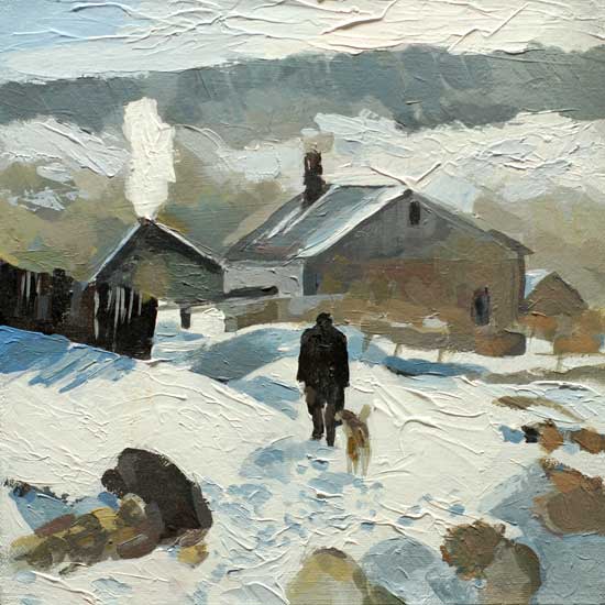
Hi Will,
Regarding your snow scene painting, which I like very much, was there definitely no yellow involved? I have been unsuccessful at creating the orange and green tones that you have there with only the white, ultramarine blue and burnt umber.
Cheers
Hi Jackson, different blues and burnt umbers can give slightly different colours depending on brand. I can’t remember which brands I painted with for that painting, but its more about learning about how far you can push each colour on your palette.
Cheers,
Will
Ok I will add a yellow tube because those three tubes didn’t come close to producing greens or oranges.
Hey Jackson, yes you could try introducing a yellow to start to push the colours more. The actual painting is very muted, sometimes the photos and different monitors can give a slightly different colour slant.
Cheers,
Will
Hi Sir,
i’ve just started learning to paint using acrylic and this website has helped me alot.
i’ve got my new acrylic paint set and i’m very confused about 1 thing, there are two types of series that’s permanent and absolute permanent and i really don’t know what is the difference between them.
Hi Pragati, pleased you’ve been finding the site helpful, different paints have different permanence ratings when exposed to light. It can be useful to be aware of the different permanent values if you’ve painting will be hung in a very sunny environment or a mural. You might find this article of interest about the differences between student grade and artist grade paint.
Cheers,
Will
thank you very much sir.
Hi Will,
I have recently discovered your site and it is amazing. I have seen that you use Golden Acrylics (apart from Alizarin Crimson) but those are not easy to find in my country. funnilly I can order Golden but just big pots, not tubes. Liquitex and Vallejo are widelly spread and also Titan. I can also Winsor and Newton and most European brands online. Which one would you recommend me? If I go for Liquitex or Vallejo, do you have any suggestions about what colors (names) I should get for a basic palette?
Thank you,
Robin
I mean that “I can also buy Winsor and Newton and most European brands online”
Hi Robin, they are all good brands, the Alizarin Crimson Permanent I use is by Winsor and Newton and the artist range they make are really nice, but colours names I suggest above are common in most brands.
Hope this helps,
Cheers,
Will
Hi Will, i came across this post while searching for basic colour palette to have and it’s most helpful. you mentioned for bright, vivid abstracts, one might need some more man-made pigments that have a higher colour saturation. what would be your pick of primary colors for abstracts? is there a system to know which colour has higher colour saturation by reading the label or the maker’s chart (i.e. W & N)? thank you!! :)
Hi Steve, you might be interested in this article that looks at different paint colour palettes for different styles, and this palette from Golden paints.
Hope this helps,
Cheers,
Will
wonderful info! many thanks!! :)
Hey Will, Thanks for all your videos and great info on the web.
Cheers from Miami, FL USA.
You’re welcome Christopher, really pleased you’ve been finding them helpful in your work.
Cheers,
Will
Hello, Will;
I found you on youtube searching for some help as a beginning acrylic artist, and you have helped me gain some semblance of preparedness that I had thought was just a blip on the horizon. I’ve just gotten some luquitex paints, and I know you mention Golden as well as Windsor & Newton quite often–I’m wondering if you have any experience with Liquitex paints, and, if you do, if you could share some tips with me?
Yours,
Angela
Hi Angela, nice to hear from you, Liquitex paints are really nice, they are slightly softer than the Golden heavy body so you won’t need as much water to dilute them for thinner applications, they’re a good brand of acrylics.
Cheers,
Will
Hey Will,
Thanks so much for this information. I’m teaching a little class and this was exactly what I was looking for.
Amanda
Good one Amanda, pleased it helped.
Will
Hello Will Kemp right back at you first of all I would like to say you blew me out of the water what you have done and accomplished in your life for looking as young as you do in your picture blew me out of the water and if you’re not that young well then please call your parents and thank them for the wonderful DNA you have thank you so much for this section on acrylic painting colour theory I went out and bought all the colors you mentioned on that pic on this page
everything you said and then put them in the same category but I can’t find the color quinacridone red or hands yellow this might be the wrong question to ask you but is there another color red that I can substitute or yellow that I can substitute the two for please don’t give me an F for the question the only way I can learn I saw this one color for the first time when I was out buying all my paints I never even heard of it or artist ever spoke of ihis unbleached titanium I had to get a tube of it what do you think of that color? I know sorry I don’t use I don’t use any!. It’s all just one big sentence one great big long sentence I apologize to everybody forI followed your instructions on your website if you’re new start here and I went straight across and I never said Wow so many times in my life and I’m 62 I’ve been paying for over 30 years and I have learned so much and I can’t wait to learn more you have a beautiful website thank you for all your input and insight I can’t wait to get into your drawing Section part and most of all I want to think Google for turning me on to your site when I went and asked that question about mixing paint you came up and I punched in so take care have a good day you paint brush mastercleaner you bye bye Cinn
Hi Cinn, nice to hear from you and thanks for your kind comments, really pleased you’ve been enjoying the site.
‘Quinacridone Red’ can sometimes be called’Permanent Rose’, you can also use Permanent Alizarin Crimson to get a pink that is close.
‘Hansa Yellow Medium’ is close to Cadmium yellow, if you have a Cadmium Yellow Light it will allow you to mix most of the colours you would need and gives you more opacity than the Hansa yellow pale. It’s always best to start with a more limited palette until you find the colour palette you like working within and then you can expand your colours from there. You might also find this article on interest.
Cheers,
Will
Will :)
I’m in Australia and struggling to find some of the colours you’ve mentioned…
What’s another name/option for yellow ochre and alizarin crimson permanent?
Other yellows too bright for tonal grounds I’m finding. Not sure what other yellow/brown to substitute.
I’m looking at Matisse flow series… There’s quinacridone red or brilliant allizarine? Slightly different names not sure if either has same qualities you describe for alizarin crimson.
Thanks
Coralie
Hi Coralie, yellow ochre is usually just yellow ochre, sometimes it can be yellow ochre pale, but most brands caryy it. The Permanent alizarin crimson is only available from winsor and newton. Here’s a link to an online Australian site that stocks it. Quinacridone red it quite close, just not as opaque but it you mix in a little cadmium red it will be a very close colour.
Hope this helps,
Cheers,
Will
I am going to go out and buy all these colours today, thank you for all the great info and for sharing your knowledge and talent with us! I’ve only been painting ( well, trying to ) for a couple years now and I still have ALOT to learn, I bless people like you who share your knowledge so people like me can maybe turn a fun hobby into a business one day ( I’m hoping to retire at 50 and just paint LOL )
Thank you!
Allie
You’re welcome Allie, really pleased you’ve been enjoying the lessons.
Cheers,
Will
Hi Will,
I’m so glad I found your website! I hope you can help me. When I signed up for a local intro to acrylic painting class, they sent me a Materials List. It says “NO HEAVY BODY or OPEN PAINTS”. Any thoughts on what I should buy? If they want soft body paints, why ask for a set of palette knives? Is it possible that an intro class would be all in soft body paints? I don’t know what to make of this. Do these people know what they’re doing? Please help!!! Maybe I should just take your on-line course instead :)
Thank You,
Helen
Hi Helen, I can see why they might not want OPEN paints due to the drying times, but not sure they wouldn’t want to use a heavy bodypaint, Liquitex soft body acrylic would be a good choice for these requirements, hope you enjoy the course.
Cheers,
Will
Hi Will,
I was wondering could you suggest a basic colour pallette for vivid bright abstracts. I create dreamy abstracts merging colours into each other and want to avoid anything remotely muddy or greyish and dont want to keep buying colours that I don’t use.
Hi Andrew, you might find this article helpful which shows a more abstract colour palette choice, the modern theory golden palette has very good colours for brighter staining effects.
Cheers,
Will
Hi Will,
quite curious to know what color palette for still life is used in angel academy usually or are there any guest colors added based on the subject ?
please clarify
Thanks in advance
Liya
Hi Liya, it will often vary depending on subject, but you could mix most colours needed in a still life with the 5 colour palette above, the only extra inclusion might be a cadmium red for painting very red objects, such as in this still life be Ben Patterson.
Cheers,
Will
Hi Will,
I’ve found your videos hugely helpful. It’s rare to find an artist who’s brilliant but also makes the craft accessible to others. I’ve been getting back into painting recently, and realised that while I have some talent and have produced some paintings I’m pleased with before, my approach was basically instinctive. So I’m trying to learn some process for more reliable, consistent results.
My basic question is about underpainting. Is it best just to use a single colour (e.g. burnt umber) to establish the tones before applying a wider range of colours on the upper layer? Or to create an underpainting using multiple colours that provide some variety e.g. white, burnt umber and ultramarine blue?
Thanks very much,
Jack
Hi Jack,
Nice to hear from you, I always find working with a single colour underpainting first to establish the basic tonal pattern works best when you’re first starting. The more practiced you become you can experiment with adding more colours, personally, I tend to still stick to a single colour underpainting.
Cheers,
Will
Thanks very much, Will. I’ll stick to one. I think that’s worked best for me, too!
Good one Jack, pleased your paintings are going well.
Cheers,
Will
Hi Will,
Your site is a goldmine of resources – I look forward to working through them! I’m a bit overwhelmed when it comes to choosing colours for my palette. I love the look of abstract colours but unsure how to decide on a green, or blue or perhaps purple as a highlight or shade where in reality, that colour is nowhere to be seen. Which of your tutorials or courses might explain this in further detail? Thank you.
Hi Sarah, pleased you’ve been enjoying the articles, the simple colour mixing course is the best for understanding how paint colours work building from warm and cool colours to understanding classical and contemporary palettes.
Cheers,
Will
Hello Will had a question regarding cadmium red and cadmium yellow I see many artists recommend cad medium and I see you noted above light versions of the colors I just want to have a general palette to practice my colors and techniques the the cad red and yellow light make less saturated colors?
thank you for your feedback :)
Hi Beatriz, the cadmium lights are just lighter in tonal value, I like the cadmium yellow light as it gives you a bit more tonal range when intermixing with other colours.
Cheers,
Will
Will,
I’ve been around here for a while, whenever I can get time. I’m self taught, growing up with an artist mom. But, I’m much more familiar with oils and I’ve been trying to teach myself acrylics for a while. I am so frustrated because I have purchased some of the traditional colors you have mentioned here, with the labeling indicating “opaque” – and they are *NOT*. Tried to play around with creating a black… my Ivory black lied and isn’t opaque, but I also tried to mix Burnt Umber + Ultramarine blue and it came out so transparent. I am a mom of 3 and get so little time to paint, I am sobbing like a child because I keep thinking I have the paints I need, but the transparency stuff keeps throwing me off. Can you suggest what brand of paint and which colors to get opaque v. transparent? I *often* find myself frustrated over transparency, when I’m wanting to layer or have dark or bright places and don’t want to dull with white. Any suggestions for what to buy and how to not have a nervous break down over this again? Ha!
Hi Melissa, Ivory black is usually transparent, but most artist quality paints have a very accurate description on the level of opacity of the pigments that they use. The biggest difference in opacity will come from the amount of pigment used in the paint, so artist quality paint has a higher binder to pigment ratio. You might find this article of interest: student vs artist grade paint. And this article looking at different whites, from hobby white to artist quality white. I use mainly Golden Brand, Winsor & Newton and Old Holland.
Cheers,
Will
Will,
Woke up here in D.C. to your message. Thank you so much! After I wrote, I did see your blog on artist paint and i think what I thought was artist, may have been a grade lower (also, they were the more fluid ones instead of heavy body – when i go buy the basic palette, should I stay with heavy body?). Im going to purchase a few more artist levels and then am going to work my way through your beginner arcylic videos. Just purchased Venice workshop- ekk! So excited! But im going to work through other paintings first to make sure Im comfortable with the paints before starting Venice. Thank you so much again – truly.
Hi Melissa, the heavy body can give you more options (you can work thick or thin) but it’s again a personal choice depending on the style of painting you’re after. Enjoy the new course.
Cheers,
Will
Will this is a very informative article. Thank you.
Would it be possible to give me a combo which makes up glauconite green?
Hi Lynette, you’ll often find glauconite green called Terre Verte in oil painting. It has a low tinting strength and transparency making it excellent for subtle glazing of portraits.
Will
Thanks
Hi Will,
I love to get a texturized effect using salt on wet acrylic, but I live in a high humidity area so the art never dries properly! Can you suggest an alternative to salt so that I can get a similar effect?
Thanks :)
Annalise
Hi Annalise, it’s hard to get the same effect with salt, Golden make Clear Granular Gel that is an acrylic solid so will give a textural effect and be archival with the paint but it won’t react at all with the acrylic and would become part of the paint texture. A humidity monitor can be handy to have in the studio to give you a guide to when it might take a lot longer for the paints to cure.
Hope this helps,
Cheers,
Will
Hi Will
How i Appreciate this site! I am lost and need help. Painting a piece of red Cocker Spaniel dog I dont seem to get the colours right. Like I am missing something, he lacks brightness and contrast
I would love to enclose a picture of the dog, but I need an email address then
Have a nice day
Cheers Lisbet
Hi Lisbet, really pleased you’ve been enjoying the site, I’m afraid I don’t offer critiques on students personal projects. To check if your colours are on the right track, cut out a 1cm square viewfinder from two pieces of white card and lay one over the reference image and one on your painting. That way you’re judging the colour in isolation without the effects of simultaneous contrast altering your perception. Hope it helps,
Will
Hi Will
A question on toned ground: I am inspired by Larine Chung’s picture of a ceramic jug, using only white, blue and umber. What color/wash would you recommend, if I wanted to work with a toned ground, using these clors for the motive? I do not have such a beautiful jug, but I have an ultramarine blue glass jug, which will do perfectly, I think.
I do enjoy your website, I am newly retired with lots of time on my hands, and I have started to paint acrylics. I want to keep it simple as a start, so I thought I might give it a try with only few colors to explore.
Best Regards
Marianne
Hi Marianne, a ground of burnt umber and white mixed to a mid tone would work well. Good luck with your vase painting.
Cheers,
Will
Hi Will,
I have a few online lessons that I recently purchased from you, and I have questions regarding two colours you referred to:
“Hansa Yellow”: Is it Light, Medium or Opaque?
“Cerulean Blue”: Deep or Chromium?
Thanks so much for your valuable lessons!!
Warm regard,
M.
Hi Michelle, I usually use Hansa Yellow Light as it’s a green bias yellow and can also be very handy for translucent glazes. Hansa yellow medium goes more towards a warm cadmium. And usually a Cerulean Chromium.
Cheers,
Will
Hi Will!
I’m just starting to paint and I’m ever so thankful I stumbled across your site! So much inspiration and information! Thank you for being my Mentor (I don’t reckon you knew you were!).
As I’m sure many beginners are, I’m finding the successful mixing of colours rather overwhelming and confusing. I’ve had some hits, and lots of misses. But, I’m learning from both.
My question today is: Why is there no green in your list of basic paints for beginners?
Thank you SO much for sharing your wisdom and experience!
Hi Susen, really pleased you’ve been enjoying the lessons. For most of the beginner lessons I teach there isn’t much of a green base and I find to the absolute beginner greens can be very addictive and easily put out lots of paint mixes. So learning how to mix and manipulate muted greens first is the best way to learn colour mixing and then you can add stronger greens to your palette when you’re more experienced or want to focus on landscapes.
You might find these articles and tutorials of interest:
Is Green Ruining your Painting?
Includes a How to Mix Green Video (check out the very muted greens)
How to Mix Greens of Summer with Acrylics (introducing a brighter green)
Cheers,
Will
Hi Will,
Thank you for the explanation, and for the excellent articles/tutorial. I appreciate your taking the time to reply!
Why do you suggest Ultramarine Blue over Pthalo Blue?
Painting along with you on your YouTube videos is also most helpful. I hope that eventually my attempts will look more like yours, although I’m into abstractism / expressionism / romanticism. I’m learning so much about mixing and shading especially.
THANK YOU!!!
Hi Susen,
Lovely to hear from you and so pleased you’ve been finding the website helpful in your paintings. Ultramarine blue is more forgiving when you’re first starting because the Phthalo Blue is a very strong pigment so it can easily push your mixes out. However, if you’re painting lots of turquoise colours then using a blue green like phthalo blue would be essential to get that punch of colour.
Cheers,
Will
I have found your articles are very usefull and educational. I have been interested in colours and had many questions how to mix colours. I am so glad that I have found this website. I am going to take a colour mix course soon!!!
Good one Hyunjeong, so pleased you’ve been finding them helpful.
Will
I have created pencil and Prisma Color portrait for many years; however, I want to see work completed sooner than weeks and weeks. I love acrylic and have used it in the craft realm, but am looking at professional acrylics to create portraits and still life. Should I start with tubes or jars?
Hi Dawnette, the paint will be the same in either the tubes or jars, I mostly use tubes but then might have a jar for white which will be used much more than other colours.
Cheers,
Will
Thanks! You made my life more simple with the starting colors, videos, and now knowing which form to purchase the paint. Seriously, thank you! I look forward to learning a lot from you!
Dawnette
Really pleased you’ve been finding the lessons helpful Dawnette.
Cheers,
Will
Hi Will, love the ‘coming home’ painting! Is that in one of the Courses? I’d like to give it a go.
Thanks
Hi Dave, pleased you like the painting, it isn’t in any of the courses, the winter scene looks at similar colours.
Hope this helps,
Cheers,
Will
Hi Will
I’m so grateful I came across your site I was browsing.
I’m a self taught artist ,your teaching has been a blessing to me ,easily explained,it’s so exiting to learn new skills about colours etc .
Thanks so much !
Pleased you’ve been finding it helpful Fatima.
Will
Hi Will,
I really appreciate your advice for starting colors when shopping. I wanted to ask you if there is a certain beginners set that you recommend? As far as a pre-packaged set of acrylics goes. I’m looking at Golden Heavy Body and Liquitex Heavy body as well as Newton but it seems that there isn’t a set that exactly replicates your recommendations, and it’s pricey to buy each color individually. Just wanted to see if you had suggestions.
Thank you,
Sarah
Hi Sarah, the Winsor & Newton artist acrylics 6 tubes have:
Titanium White
Azo Yellow Medium
Permanent Alizarin Crimson
Ultramarine Blue
Phthalo Green (Blue Shade)
Burnt Sienna
so you could just add a Burnt Umber and start with the Azo yellow Medium instead of a Cadmium and you’d get some great results. The Burnt Sienna included is also handy to use for this tutorial
Hope this helps,
Cheers,
Will
Thank you for your thoughtful and thorough explanations. I had not pained in a few decades, but your color suggestions really helped.
Great to hear it Mike.
Cheers,
Will
Hello, I’d like to know what beginner acrylic colours you would suggest for someone who wants to do open impressionist paintings?
Hi Fia, the colour palette for this tutorial is a good start: How to paint like monet
Cheers,
Will
Hi Will, my name is Fred Foster, if you’re not already tired of answering questions I have one more for you. I’m a learner and want to paint larger than smaller paintings. Two square metres plus is my desired size. How much paint would I be likely to use per square metre? I’ve bought linen canvas. primed.
Hi Fred, It’s hard to give a precise amount as it would vary on the thickness of application using on the painting.
A 1 mil coating of Golden brand paints would would have a coverage of 39.3701 sq. meters per litre. You can see a more detailed table of different paint thickness here.
Hope this helps,
Will