What if confidence, not skill, is the key to your painting progress?
Most beginners struggle with acrylics because they’ve never been shown a simple, structured approach with progressive techniques.
My YouTube channel has helped over 300,000 artists get started, with more than 25 million views.
My speciality?
Helping students who believe they “can’t even draw a stick man” finish paintings they’re genuinely proud of.
The Secret: Progress Is a State of Confidence, Not Skill
If progress comes from building confidence rather than technical skill alone, how would that change your approach to learning?
I came across this idea recently when reading “Suddenly Talented’ by Sean D’Souza, and it struck a chord.
“When we talk about talent, we rush madly towards skill.Yet, there is no skill without confidence. Confidence makes the reluctant student realise that they’re not so bad after all.” Sean D’Souza – Suddenly Talented
I’ve found many beginners try to learn painting or drawing by osmosis, by watching an experienced artist work.
Before starting a larger painting, I almost always create a “postcard” colour study.
This small-scale version helps determine if the concept will work at a larger size and provides a roadmap for the painting process.
These simple studies allow you to plan composition, colour balance, and value structure before committing to your final piece. Solving problems at this manageable scale gives you confidence and clarity before investing time.
Think of this as a visual test lab for experimentation and discovery. Although painting the same subject twice may feel like a waste of time, the insights from a quick study help avoid frustrations that can emerge later on.
This week, I’ve been painting a small postcard study of a street scene in Mousehole on the Cornish Coast. It was a really grey day, full of a mizzle sky and lots of rain reflected on the road.
I liked how this view had dashes of yellow from the double yellow lines that had faded out. These matched the same colours as the hedge on the right-hand side.
There is some warmer orange yellow in the roof, and in the very far distance, just above the chimney, you can see the little cottages that go around the harbour. (You can see a sketch of the harbour towards the end of this article)
I read an article that said a pencil can write 35 miles.
35 miles! I’m sure that can’t be true.
But the idea got me thinking about how keen we are to judge our drawing efforts before we’ve had time to develop our skills.
Many people give up on drawing after just a few attempts, declaring, “I can’t draw” or “I have no natural talent.” way too early on in the actual drawing practice.
That’s like judging your fitness level after a week of walking around the block, so it’d be easy to do a couple of drawings that don’t quite work out.
Drawing, like any skill, takes time and practice to develop.
A method that can help is to look at a non-emotional record of progress. It can help you keep calm and not critically self-assess your work until you’ve done a much larger body of work.
In the beginner’s drawing course, I recommend hiding your first attempts in an envelope to look back on in the future.
When progress in developing any skill is incremental, it can be helpful to have clear times to have a check-in on how things are going and to look back and see what has improved.
35 miles is a lot of shading; that’s 1,000s of contours and a bucket load of erasers!
I’ve been focusing on portrait structure, and anatomy with pencil on paper.
Morning Sketches from Jan 2025
Morning Sketches from Jan 2025
Morning Sketches from Jan 2025
There’s a whole story and a whole journey that would have come out of one pencil.
Not only do I remember the sketches that went well, but lots of smudging, erasing and relooking. I also remember how the sun was streaming in through the studio window when I sat down to do the third sketch and the croissant I was going to buy after my practice.
If you’re drawing with pen and ink, put a little pot on the side for empty ink cartridges.
Keep a bin for used-up paint tubes – not to judge the work but to celebrate a dedication to practice. I think it’s a nice idea just to think in terms of evidence; every artist’s journey is made up of these small records.
Ready to start your own artistic journey? My Absolute Beginners Drawing Course is designed specifically for people who think they “can’t draw.” Through proven techniques, you’ll discover that anyone can learn to draw – including you.
True freedom lies in consciously choosing what matters most and letting go of the rest. For overthinkers, this can feel impossible.
The Reality Check
Eight days into the new year, my paints and sketchpad are still on the shelf.
Things have been “busy.”
You know how it goes: catching up on YouTube videos, checking my macros, meeting friends. But in the back of my mind, I’ve been thinking about what I want to make next… a lot.
Some would call it overthinking.
The list of things I want to do grows endless: Sargent-inspired portraits, still life studies with just a biro, square landscape paintings of Cornwall, epic wide-angle views of Scotland, and a new watercolour course.
I procrastinate, and before I’ve even begun, I have lost some momentum in executing these ‘amazing’ ideas.
Understanding Resistance
In Steven Pressfield’s “The War of Art,” he talks about ‘resistance’ – that mysterious force that stops us from doing what we should be doing. Every creative experiences it. As Pressfield writes:
“Fear tells us what we have to do. Remember our rule of thumb: The more scared we are of a work or calling, the more sure we can be that we have to do it. Resistance is experienced as fear; the degree of fear equates to the strength of Resistance.” – Steven Pressfield, the War of Art
Understanding that happiness, contentment, and calm come from overcoming resistance helps you take steps to work through it.
The Overthinking Trap
I tend to get stuck in the weeds – I analyse framing options before drawing the first line, think about international shipping fees before getting my first order, and research every camera and printer option on the market before deciding which painting to turn into a print.
These tendencies can be fantastic for idea generation or interdisciplinary thinking, but what they’re not so good at is a focus.
The (self-inflicted) pressure to ‘specialize’ can mean it’s easier not to paint anything for fear of painting the wrong thing.
A Solution: Pick One
Here’s my proposal for a personal New Year creative experiment, and I invite you to try it yourself:
Pick one.
Just one format, one medium, one subject.
The key is knowing that you’re not abandoning all other ideas – they’re just waiting their turn. This might feel a little uncomfortable as your ego jumps in to say, ‘You could do more’.
When you’re painting, the goal is an appreciation for those fleeting moments of pure creation.
Sometimes, the bravest thing we can do is to simply begin.
If you’re looking for a course that has one image, one path, you might enjoy the following single project courses:
One of the most common messages I receive, is from beginners, asking if they ‘need to loosen up.’
Sometimes they do, sometimes they don’t.
Painting in a loose, impressionistic style has the allure of freedom and artistic and personal expression. But when you’re thinking about your drawing, composition, and colour mixing, achieving fluid and expressive brushwork feels elusive.
So, what can you do to practice? How can you keep a balance between realism and looseness?
The key to looser brushwork lies in mastering the subtleties of your tools and learning how to let go of unnecessary precision.
There is nothing more daunting to a beginner artist than the question, “How much do you charge?”
Putting a price on your artwork can make your stomach drop, trigger imposter syndrome, and cause you to get flustered.
The idea of selling your work can sometimes lead to giving your paintings away for free, convincing yourself that the ‘exposure’ will bring future commissions.
With this in mind, I wanted to share my experiences with the emotions that can hold you back, the factors that influence the value of your art, and how to develop a pricing strategy. Hopefully, this will give you the clarity and confidence you need so you’ll be prepared the next time someone asks about your prices!
(The Wetting Agent was previously called ‘Acrylic Flow Release’)
I find using a stay-wet palette really helpful when my acrylics dry too quickly in the studio.
I’ll often premix colours on a tear-off palette and transfer the paint piles into a stay-wet palette. It acts as a loading bay where I can keep my acrylic mixes workable for a few days.
I’ve just finished making my NEW acrylic still life painting course, whoo hoo!
This time, the subject is a single-stem peony inspired by its layers of ruffled petals and delicate colour palette. I’m running a launch-week offer!
You might feel intimidated by the complexity of painting peonies, struggle with basic drawing techniques, lack confidence in your colour-mixing skills, or are unsure of how to start.
Don’t worry; I’ve got you covered!
This is a self-paced, downloadable video course. I’m excited to guide you through creating the delicate details of a peony in an impressionist style.
I demonstrate this with acrylics, but you can easily follow along with water-mixable oils or traditional oils.
Last week, we explored Carlson’s theory on angles, and I received an interesting comment from a reader asking how complicated it would be to apply the principles to colour.
“I especially love black and white painting. I’m looking forward to trying this. How does it work then with colour? Seems it could get quite complicated.” – Laura
Well, it’s simpler than you might think!
I thought it would be handy to demonstrate painting trees using just four colour mixes. I’m using water-mixable oils, but you can follow along with acrylics or traditional oils too.
As a beginner landscape painter, it’s easy to feel overwhelmed by the vastness of nature and the complexity of capturing it on canvas. But when you break down the scene into shapes, values and planes, you can instantly improve the sense of depth and realism.
In last week’s post, we looked at the theory of angles and how they relate to a landscape.
This week, we’re going to put the theory into practice.
By stripping away the colour, it will be easier to see how the value relationships work in our subject.
Materials you will need:
4 x 4-inch or 6 x 6-inch square canvas board or canvas paper
Hue refers to the base pigment of a colour, which is what most people think of when they hear the word “colour.”
Let’s say we’re trying to mix this colour:
Step One: Make your first best guess from the tube colours you’ve already got. Select a tube to try. I’m going to try Cadmium Red Medium.
Step Two: Add white to reveal its undertone and colour bias.
Then, you can focus on whether you need to go warmer or cooler.
Step Three: Look at the colour chart and find the pigment you started with.
I need to go cooler.
I don’t have any Cadmium Medium Hue, so I’ve gone for Naphthol Red Medium.
Step Four: Check your new mix. It’s better, but it’s still not there. Let’s go cooler.
I don’t have any Primary Magenta, so I’ve jumped to Quinacridone Red.
Getting much closer, but I’ve noticed there are some cooler tones in the shadows.
I’ve got a Quinacridone Magenta from Winsor & Newton. Let’s try that.
Too far.
It’s gone to cool and needs to be warmed up.
Step five: Combine your colours.
By mixing the Quinocridone Magenta with the Quinocridone Red, I can create a colour that better matches the range of hues in the flowers.
The key to success?
With every mix you make, think about the warmth and coolness of the colour in relation to other colours in its family. Then, you will be much closer with your mixes.
If you don’t have as many colours, you can still learn about your different pigments by making swatch scales and adding white to your pigments.
You have to rearrange the squares as the HUE changes.
Zero is the best score you’re after.
2. Value
VALUE is sometimes also called TONE, and it refers to the lightness or darkness of a colour.
Observing value is one of the core elements in creating depth, mood, and visual interest. It gives your drawing form and solidity and plays an integral part in your paintings.
Not recognising the importance of the value structure will unintentionally create a struggle in your art. It will make colour mixing harder, your compositions won’t work, and your paintings can look amateurish.
The great thing is you already know what you’re looking for.
When you draw, you think in value
When you draw, you’re already thinking in value. Drawing is making sense of a coloured image and turning it black and white.
The problem is, colour lures you in.
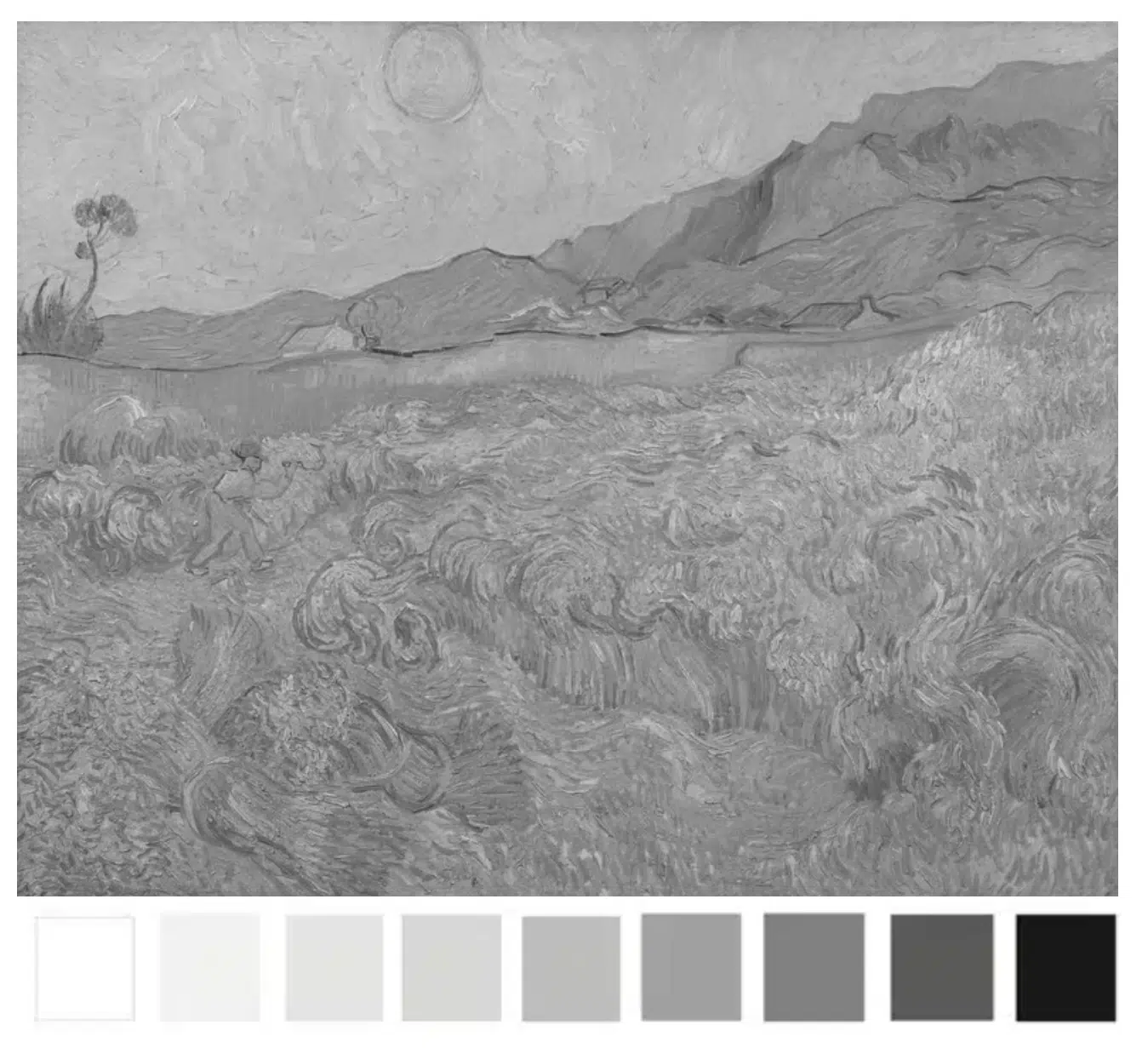
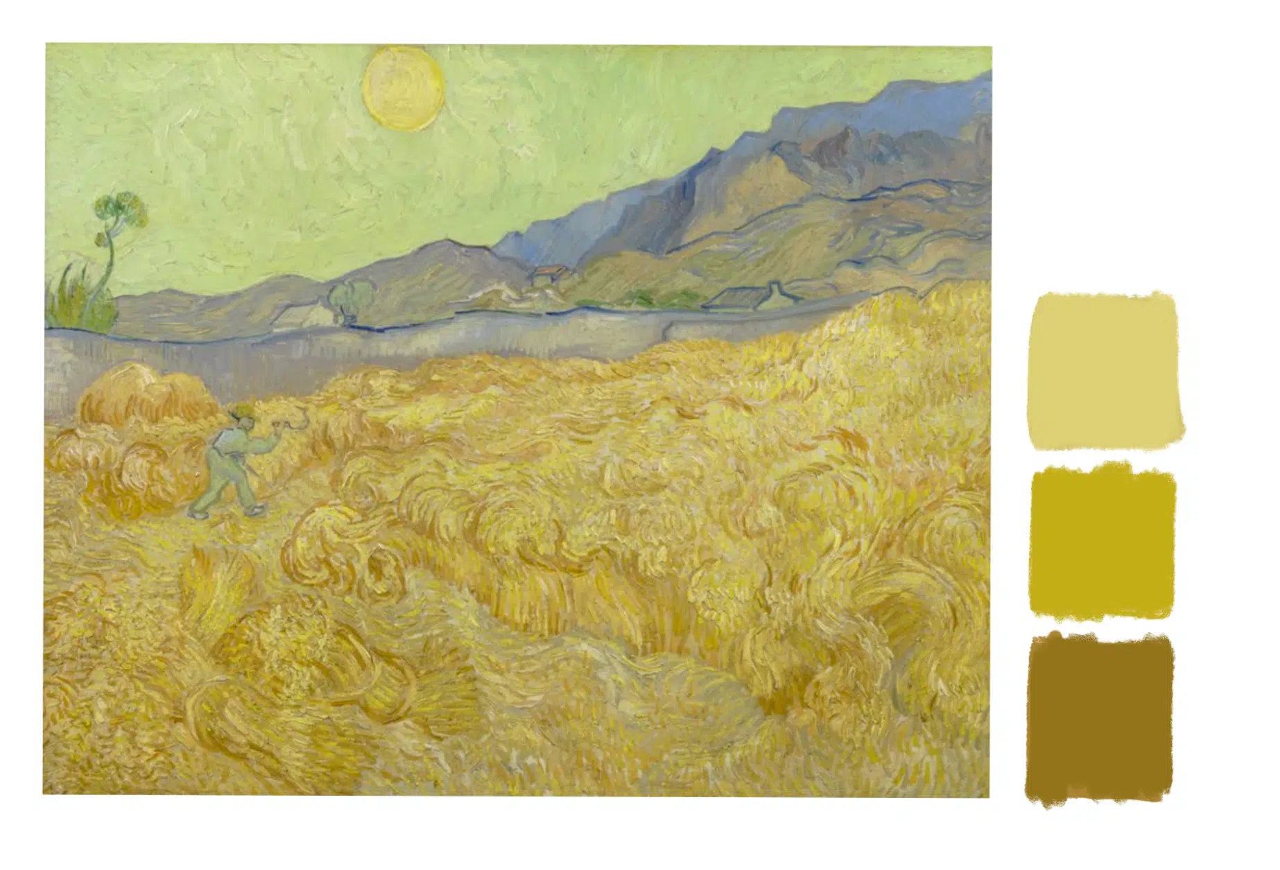
How light is this yellow? (Detail of Wheatfield by Vincent Van Gogh)
Because it’s bright, you’d think it is light.
Say whaaat? Why is it so dark?
All Colours have a Base Value
Each yellow pigment will have an inherent lightness.
In this range of yellows, Cadmium Yellow Primrose is the lightest.
Cadmium Yellow Primrose
Cadmium Yellow Light
Cadmium Yellow Medium
Cadmium Yellow Dark
In black and white, they still appear relatively close in value.
In this range of yellows, the inherent value is darker.
You can see the difference most clearly when you compare the Raw Sienna to the Cadmium Yellow Primrose.
Wheatfield, Vincent Van Gogh
Here’s the whole painting. Notice how Van Gogh has created different varieties and focus throughout the piece just by utilising the different values of the yellows, from the darker Raw Sienna yellows on the right-hand side to the lighter Primrose yellows in the centre.
When we focus on the value, it’s easier to see how the majority of the colours are within the darker end of the value scale.
All Values are Relative
Just as with one colour appearing warmer or cooler depending on what colour it is placed next to, the same is true with value.
And that’s why it can be so hard to judge.
In this Wheatfield painting by Van Gogh, the yellows appears bright and light. However, when viewed in isolation, they are a darker value.
This doesn’t seem right. Why do the central yellows appear brighter?
They appear brighter because they are surrounded by darker colours.
This is called ‘simultaneous lightness contrast.’
The two central squares above are the same colour. And the same value.
But the square surrounded by black appears lighter, just like the yellows in the Van Gogh painting.
How can you start to develop your ‘value vision’?
Closing your eyes can help.
If you look at your subject/reference and painting so they are within the same frame. Then close your eyes.
Slowly open your eyes until you identify the first lightest shape.
Does it match what you’re painting?
Does the hazy image look the same lightness and shape?
You’re trying to see the most basic value structure of your subject into tonal masses. These simple masses with hold the structure of your painting together.
Once you get accustomed to this technique you can then practice ‘squinting down’ from when your eyes are open.
You don’t always need a wide value range
When you’re composing a painting, it doesn’t always have to be high contrast (wide value range)
Here’s a second Wheatfield painting by Van Gogh.
Wheatfield with a Reaper, Vincent Van Gogh
You can see the figure in the wheatfield due to the difference in colour.
Notice how the figure practically disappears when I’ve turned the painting black and white.
The values of the yellows within this painting are mostly a mid value.
Here are 3 yellow swatches.
To mix the darkest swatch, we can look for a yellow pigment with a similar value.
I’m using Yellow Ochre.
Then add a touch of Raw Umber to darken it. (If you have Raw Sienna that will be very close straight from the tube)
Then I lighten the mix by adding some Hansa Yellow Light.
For the lightest mix I add a touch of Titanium White and a little more Hansa Yellow Light.
The key to success?
With every mix you make, think about the lightness and darkness. How would you approach it if drawing in black and white?
I use a grey scale value strip also called a tonal strip, to help me.
It goes from black to white, with each ‘step’ having a number for easy reference. I print it out and make hole punches through each value square.
I can use those as a viewfinder to judge tonal values in a reference image.
When that colour just about ‘disappears’ into one of the grey values on my strip, I know that would be the closest value to check my paint mix against.
Notice how numbers 4, 5 and 7 match the swatches.
When you’re aware of HUE and VALUE, there is one missing piece to the puzzle.
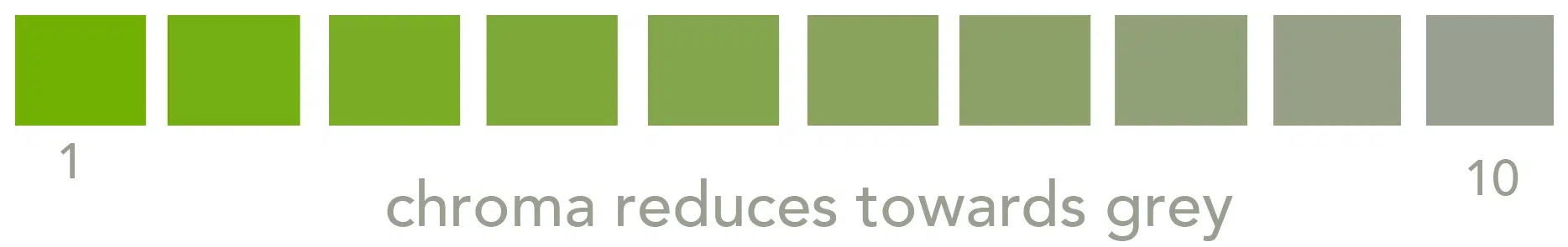
3. Chroma
Chroma originates from the Greek word “khrōma,” which means “colour”.
It describes the saturation, or purity of a colour, how dull or intense it is.
In the series of swatches above, Green 1 has the highest chroma. The chroma reduces as the ratio of grey increases, with 10 being a neutral grey.
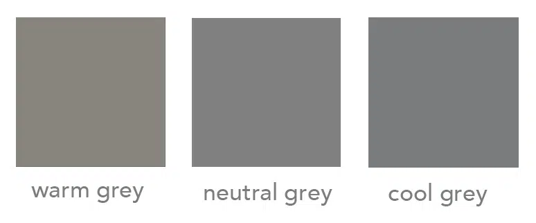
3 shades of grey
When I talk about ‘neutral grey’, I’m describing a grey that doesn’t shift towards warm or cool.
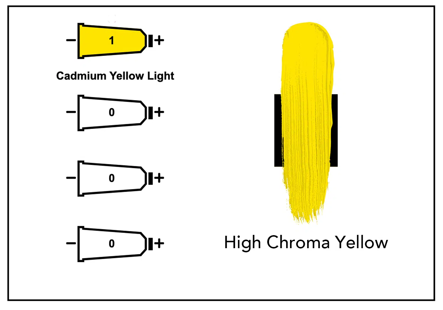
You don’t need to always add grey to lower the Chroma.
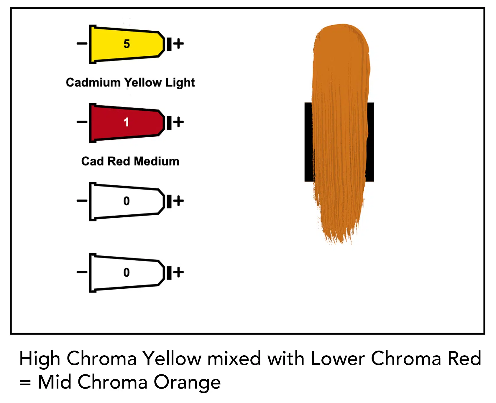
If you think of chroma as a purity of colour, Cadmium Yellow Light, straight from the tube, has a high chroma.
If you mix in any another lower chroma pigment, you will reduce the chroma.
By adding a lower chroma red (Cadmium Red Medium) to the higher Chroma Yellow (Cadmium Yellow Light) we have lowered the chroma by using colour, rather than a neutral grey.
Are you still with me? it’s a lot of Chroma’s
All pigments have a Chroma Value
Just like colours have different tonal values, they also have different chroma values.
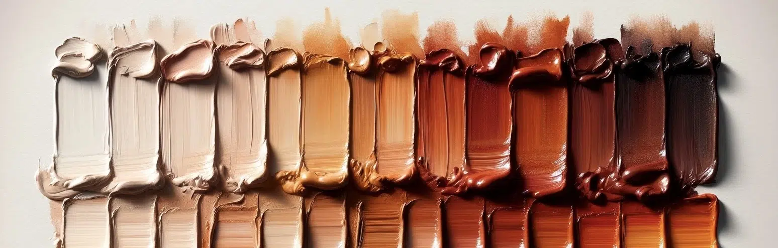
Here’s a range of colours on a scale of light to dark.
But which one has the highest chroma?
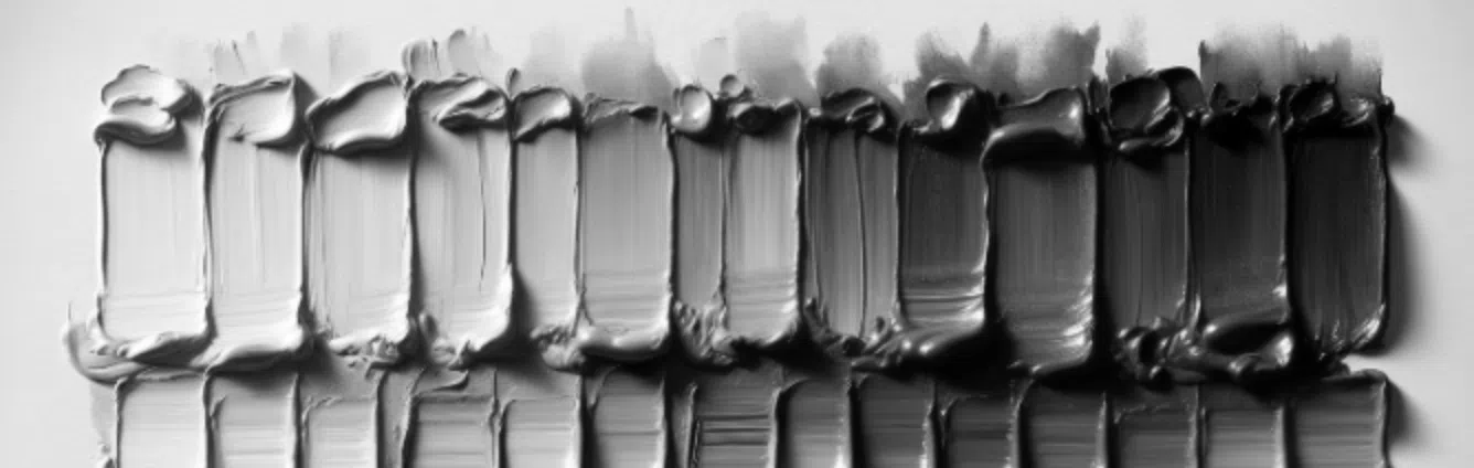
When in grayscale, it doesn’t show us the chroma intensity, just the lightness or darkness (value)
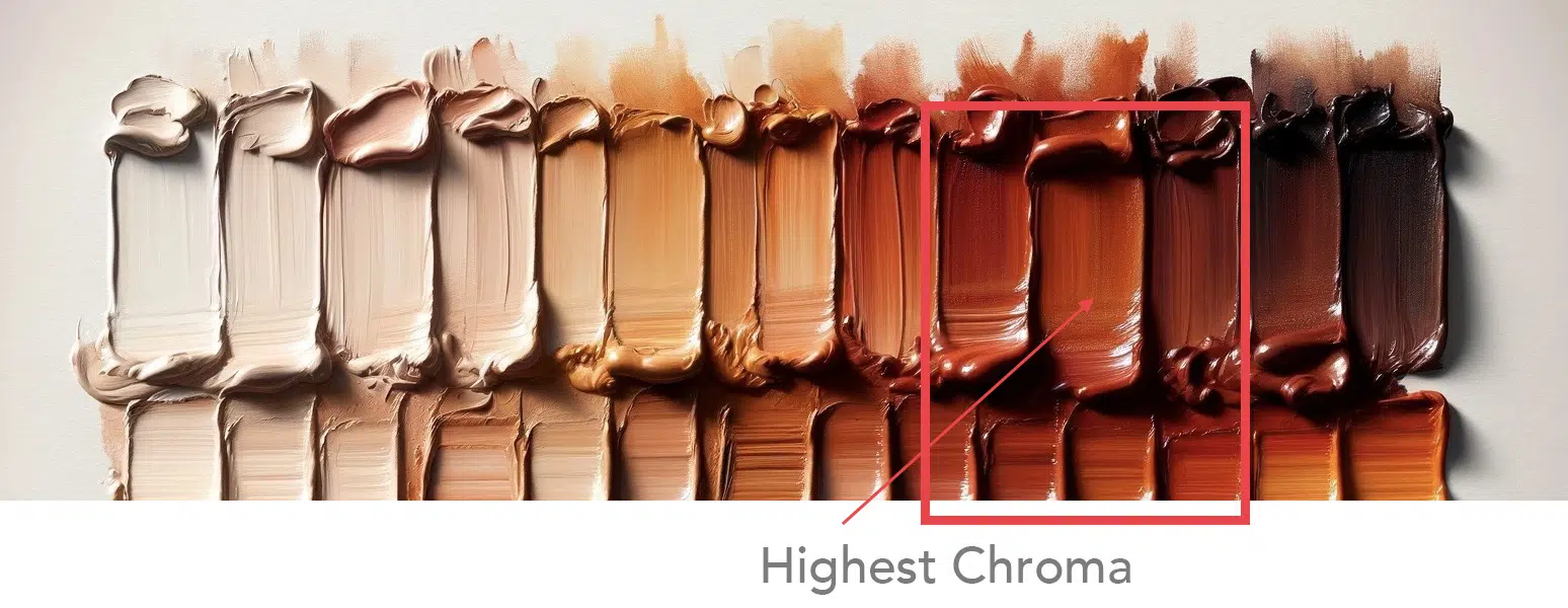
This colour has the highest chroma in the range.
How do I know? I look for which colour had the most pure intensity, the richest more purest pigment. All the white based colours or the earth colours take away the purity.
How does this help you in your painting?
If you can judge the chroma of the scene, you can select appropriate pigments that have a matching chromatic range.
Here’s a painting by Anton Mauve.
Morning Ride along the Beach, Anton Mauve, 1876
It reads as a bright morning at the beach, with clear blue skies.
That should be vivid and high chroma?
But when we take colour swatches from the painting, look how dull they are.
Actually, all low chroma colours.
What would happen if you boosted the saturation of the colours?
You can see in the swatches, all of the colours now have more saturation, but the painting has a completely different feel.
You might love, super intense, vivid colours or prefer subdued, subtle mixes. There is no right or wrong answer, it’s more of a case of looking at the style of paintings that you’re trying to create and matching the chromatic qualities.
4 methods for lowering chroma
There are 4 main ways to reduce chroma (apart from adding white)
Add a lower chromatic version of the colour
Add a complementary colour
Add a neutral grey
Add a black
Each method will give you slightly different results depending on the pigments you use.
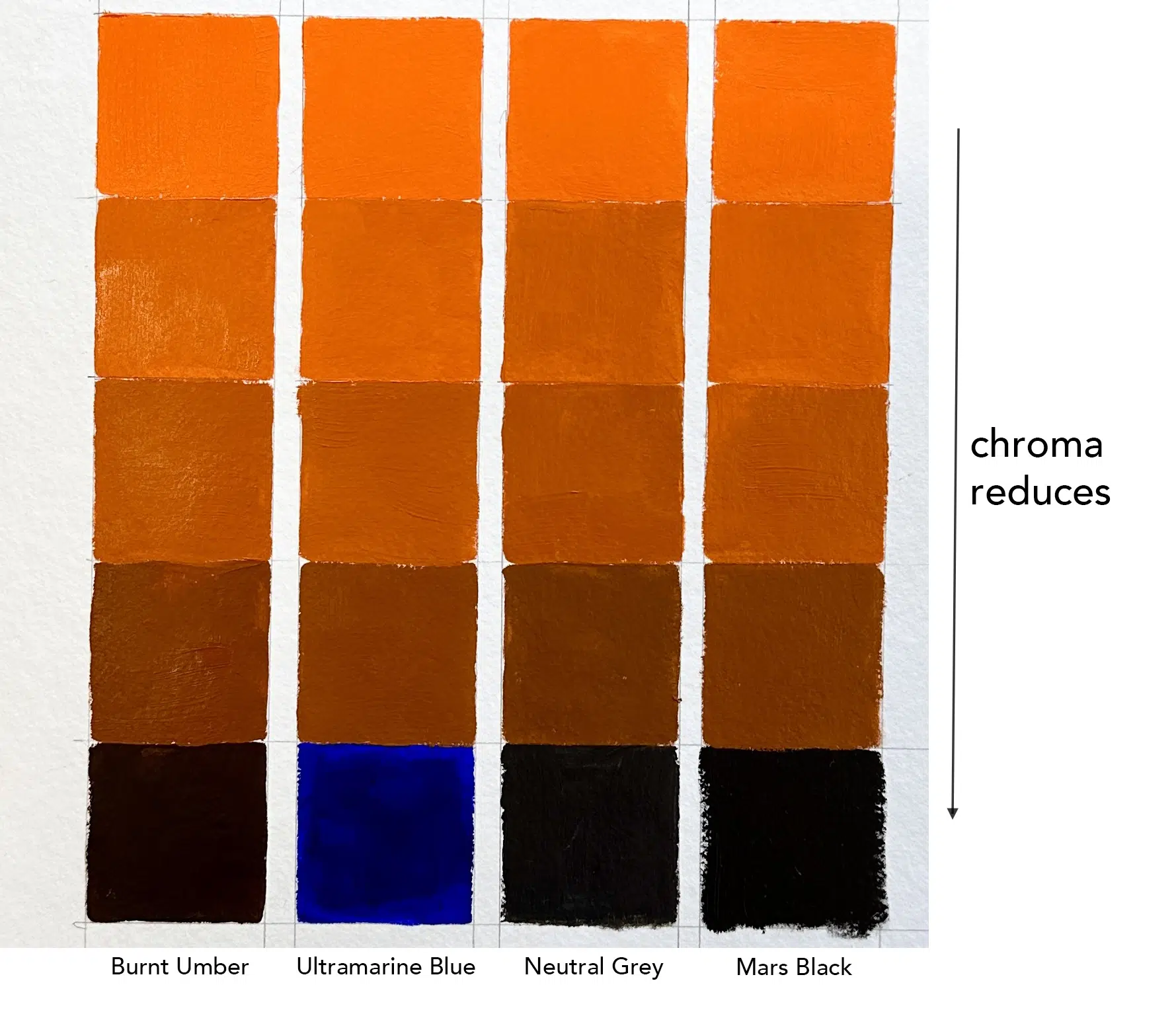
In the example above, I’ve started with high chroma Cadmium Orange on the top row, and added different ratios of colours to reduce the intensity.
I’ve added Burnt Umber as a lower chromatic version of the colour.
I’ve added Ultramarine Blue as a complementary colour
I’ve added Neutral Grey as a Grey
I’ve added Mars Black for a Black
Note how the different mixes all look very similar in the low chroma oranges, even with different pigments.
Each method has pros and cons. The main thing to be aware of is the colour bias of the particular pigment you are going to use, how it shifts, and how it affects other colours.
The key to success?
Observing and experimenting.
You won’t truly understand how a pigment behaves until you try it with paint.
Find a painting you like and experiment with choosing a colour palette.
If you only have a few colours, see how far you can push them, or try to find a subject that already fits with the colours you have.
Note how colours change under different lighting conditions and how the highest chroma isn’t always in the lights.
Start to look at objects and try to guess the highest chroma areas. When you’re aware of it you’ll start to train your eyes to notice more.
I really hope you found this helpful; if you’d like to learn more about colour mixing and how to put the theory into practice, you might enjoy the simple colour mixing course.
I demonstrate this with acrylics, but the same principles apply to oils.