
How to Paint a Monet Landscape Course
(Scroll down ↓ to Add to Cart)
Welcome to the How to Paint Monet Landscape Course.
In this course, we’ll observe the master of green, the French Impressionist painter Claude Monet.
Best known for his brilliant paintings of landscapes, coastlines, and water lilies, we’ll study some of his palette and brushstrokes to create a single copy of this picturesque Dutch port masterpiece.
Monet painted this scene while travelling to the Netherlands in 1871.
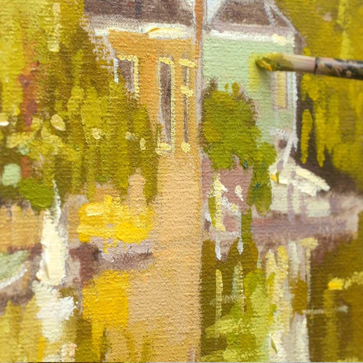
I’ve chosen this particular painting of the Houses on the Achterzaan because it is not only the 150th anniversary of the first Impressionist show in Paris, but in this piece, he captures the hazy atmosphere and light-dappled water along the bank of the Zaan River using a palette of varying greens, from subtle and muted to vibrant and light.
Greens can be a real Achilles heel for beginners! The urge to grab a vivid, bright green from the paintbox can be hard to resist.
The most common mistake I see in students’ landscape paintings is a general mid-tone green that is way too bright and blocked in, with no variety. This can often make the scene flat and unrealistic.
In this course, we tackle both.
I’m excited to guide you through creating a landscape painting using Monet’s colour palette, brushes, and methods.
You’ll learn about modern and classical palettes for mixing greens and then use the pigments Monet used to mix muted greens using bright, chromatic colours.
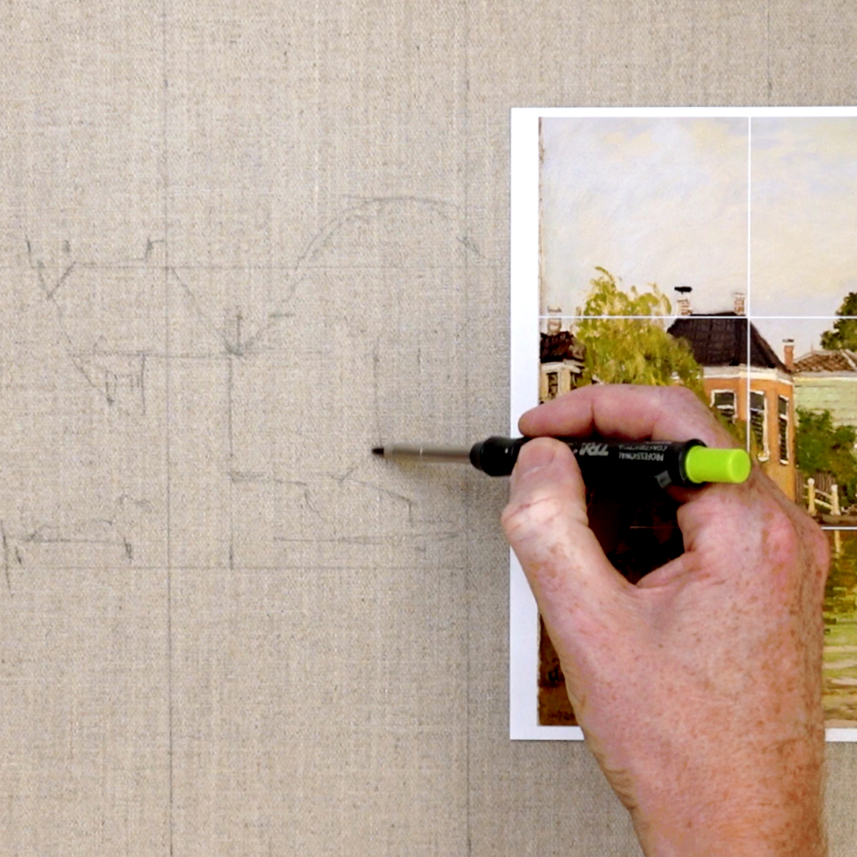
If you’re unsure of your drawing, no worries. We use a grid method for simplifying shapes and keeping everything in proportion.
So grab a brew, a beret and maybe a biscuit and let’s get painting a Monet!
“When you go out to paint, try to forget what objects you have before you,” he said. “Merely think, here is a little square of blue, here an oblong of pink, here a streak of yellow, and paint it just as it looks to you.” Claude Monet
What’s in the Course?
1 x Monet Landscape Painting from start to finish, based in the studio, working from a reference image.
7-lesson curriculum: study at your own pace (with lifetime access to these recordings)
Step-by-step instructional videos so that you can follow along at your own pace.
Each stage is a detailed yet easy-to-follow process.
DRAWING TEMPLATE – line drawing to follow to help you overcome the blank page
LIFETIME ACCESS to video lessons, download on separate devices, keep forever.
Downloadable Materials List
Downloadable JPEG reference image and reference line drawings.
Over 2+ hrs of detailed video instruction.
(I demonstrate the course with acrylics, but you could also follow the lessons with water-mixable oils or traditional oils.)
£47.00
Description
Welcome to the How to Paint Monet Landscape Course.
In this course, we’ll observe the master of green, the French Impressionist painter Claude Monet.
Best known for his brilliant paintings of landscapes, coastlines, and water lilies, we’ll study some of his palette and brushstrokes to create a single copy of this picturesque Dutch port masterpiece.
Monet painted this scene while travelling to the Netherlands in 1871.
I’ve chosen this particular painting of the Houses on the Achterzaan because it is not only the 150th anniversary of the first Impressionist show in Paris, but in this piece, he captures the hazy atmosphere and light-dappled water along the bank of the Zaan River using a palette of varying greens, from subtle and muted to vibrant and light.
Greens can be a real Achilles heel for beginners! The urge to grab a vivid, bright green from the paintbox can be hard to resist.
The most common mistake I see in students’ landscape paintings is a general mid-tone green that is way too bright and blocked in, with no variety. This can often make the scene flat and unrealistic.
In this course, we tackle both.
I’m excited to guide you through creating a landscape painting using Monet’s colour palette, brushes, and methods.
You’ll learn about modern and classical palettes for mixing greens and then use the pigments Monet used to mix muted greens using bright, chromatic colours.
If you’re unsure of your drawing, no worries. We use a grid method for simplifying shapes and keeping everything in proportion.
Mixing a very vivid green is easy. What’s more difficult is controlling the subtleties between the greens.
Understanding how colour balance in painting works gives you the knowledge to observe the intensity of the colours in an image and then select your pigments to mix those colours more accurately before you begin; the most powerful thing you can learn is confident colour mixing.
Then, if your mixes are too saturated, you can make them more muted. If they’re too warm, you can make them cooler.
Monet and the Impressionists avoided black and Umbers, using more intense, vibrant colours, so, in this painting, we’ll introduce Monet’s more vibrant palette to show you how to mute the mixes.
But as black and Earth colours are an integral part of the work for many contemporary painters, I’ll also demonstrate how you can achieve some surprisingly subtle greens by using some seemingly ‘non-green’ colours such as black and brown so that you can see both approaches.
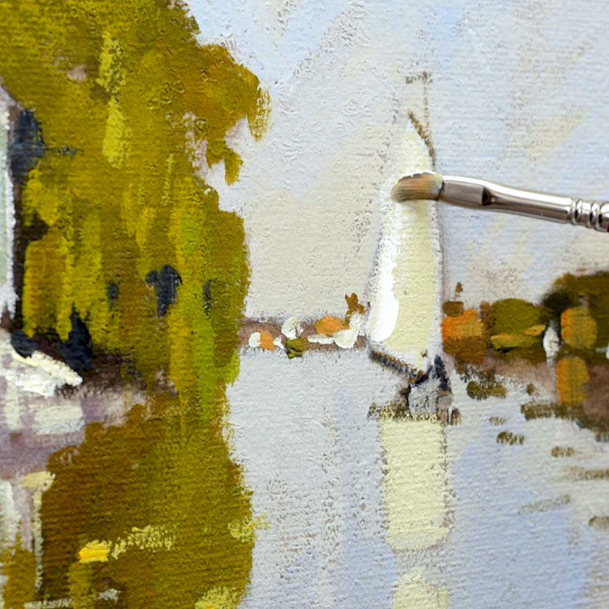
We’ll cover all the materials, drawing out, and the power of the pre-mix colour. We’ll capture fleeting light, moving clouds, serene cool, muted colours over dappled water, and Water reflections in the open sky stretching over the land with little dotted windmills.
I’ll introduce the Cat’s Tongue brush, and how Monet used it perfectly for getting those loose marks painterly brushstrokes, and where it is best to hold a brush for the results you want.
So grab a brew, a beret and maybe a biscuit and let’s get painting a Monet!
Course Outline
Welcome from Will
Learn about the history of impressionism, Monet’s approach and even a video of him painting!
Introduction to Mixing Greens
Blue and Yellow Don’t Make Green.
This is the title of a colour-mixing book by Michale Wilcox,
But it’s super handy to remember when trying to capture the colours in a landscape. Could you use black, brown, or red?
We’ll use all of these in the course.
Drawing Out
Using a simple grid on our reference image and canvas, you can scale up your drawing. I use a pencil straight onto the canvas, no prep or coloured ground (the secret is the canvas we use)
Blocking In
Impressionism is all about colour. We want everything bright, light and vivid…don’t we?
To make a colour ‘pop’, something needs to pop against it. Getting our value map down at the start will create the structure for our colours to sit on top of.
Painting the sky
Discover how to mix a harmonious sky and keep it simple: painting with broad strokes.
Mixing Greens
Now, we introduce more pigments to expand the palette, building up those lovely greens associated with Monet and the watery reflections with impressionistic brushstrokes.
Introducing a full Palette
I’ll introduce the Cat’s Tongue brush we saw in the first video. Monet used it perfectly to get those loose marks, and we start adding warmth to the architecture to contrast against the greens of the river bank.
Finishing Touches
When you get to this stage of a painting, it’s all about refining, using your intuition and looking at the painting as a whole. What draws your eye? Check your focal point, highest chromatic colour, and values.
Add blushes of colour and dappled light on the water to bring the painting together.
Course Overview
Throughout this acrylic landscape course, you’ll develop essential skills and techniques to create a loose, impressionistic master copy of Claude Monet’s painting of the Houses on the Achterzaan.
This is a real beginner’s course, and we will cover everything from drawing out, teaching you how to scale up the image using a grid, how to keep loose painterly brushstrokes, and how to mix and colour match muted colours and contrast to create lovely impressionistic effects.
After taking this course, you’ll feel confident in your ability to observe the intensity of the colours of the piece you want to paint and then select your pigments to mix those colours more accurately, painting landscapes with depth, variety and beautiful harmonious greens.
With impressionist-style paintings, you don’t have to capture every single detail. You’ve just got to create the sense of depth, light or movement using simple brushstrokes and contrast in tone.
“When you go out to paint, try to forget what objects you have before you,” he said. “Merely think, here is a little square of blue, here an oblong of pink, here a streak of yellow, and paint it just as it looks to you.” Claude Monet
What’s in the Course?
- 1 x Monet Landscape Painting from start to finish, based in the studio, working from a reference image.
- 7-lesson curriculum: study at your own pace (with lifetime access to these recordings)
- Step-by-step instructional videos so that you can follow along at your own pace.
- Each stage is a detailed yet easy-to-follow process.
- DRAWING TEMPLATE – line drawing to follow to help you overcome the blank page
- LIFETIME ACCESS to video lessons, download on separate devices, keep forever.
- Downloadable Materials List
- Downloadable JPEG reference image and reference line drawings.
- Over 2+ hrs of detailed video instruction.
COURSE DELIVERY
I’ve taken care to film everything from my perspective so you can see exactly what I’m doing as we go through the entire painting process in real-time.
The courses are delivered by a series of downloadable video links that you need to download to your computer.
There is also a downloadable zip file that contains all of your reference images.
- Downloadable Video files
- Downloadable Full-colour reference photograph
- Downloadable Line Drawing
- Downloadable Materials List
This course has been developed with a beginner in mind, carefully going through the steps at a pace that introduces new methods and techniques slowly.
How is the course delivered?
When you purchase the course, you will receive an email with all the downloadable video links to the course. You then have to download and save the Video Lessons onto your home computer/iPad.
8 Downloadable Step-by-Step Video Lessons.
With over 2hrs+ hours of detailed video instruction, once downloaded, you can access the lessons anytime, anywhere.
- A downloadable materials list.
- JPEG reference image, a copy of my pencil sketch for the line drawing.
The video files are large (3GB), so you need a broadband internet connection and enough space on your computer’s hard drive.
Please note: You will not receive a DVD.
Cut by the Artist
I filmed, edited, and coloured the course myself (with a little help from Vanessa!) rather than working with a production company. Artists have different needs than editors, so I wanted to cut the course like an artist, showing you exactly what I wanted to see when I was learning. I show all the real-time brushstrokes for the paintings so you don’t miss a step.
There are 3 main camera views I cover:
An over-the-shoulder view of the work – so you can see how I build up the painting as if you were standing behind me in the studio.
A close-up of the brush contacting the canvas – with extreme close-ups, so you can see the grain of the canvas and the bristles in the brush.
Stable shot of the palette for when I pick up paint – see exactly how I mix colours. There is nothing worse than when the brush disappears from view, only to reappear with some fantastic new colour. Where did that colour come from?! How did it get mixed?
The palette view is very important, not just at the beginning of the video. I want to show you every single mix I make, so I film with the palette directly next to the painting; then, you can see shots of the palette throughout the course and gain a sense of my approach to colour mixing.
Colour Corrected Footage
Filmed under constant colour-balanced conditions, the paint colours are as accurate as possible. (Computer monitor screens and print-outs can vary)
Real-time filming – No long jumps in progress
I don’t like long jumps in progress when the paintbrush goes off-camera, the shot changes, and suddenly the picture seems to improve drastically.
I include all the stages so you can clearly see the piece’s progress.
COURSE REQUIREMENTS
Requirements for the Course
A broadband internet connection – the file sizes for the video lessons are quite large (3GB in total) so can take a while to initially download (depending on your internet speed.)
Once downloaded, they are yours to keep forever, watch without buffering or take to the garden and watch away from an internet connection!
Enough free space on your Computer or iPad – You can download the files to a separate USB stick if you need extra storage.
A Colour Printer—to print out the reference images or access a Print Shop. If you have a separate device, you could have the reference image on that.
Photo Printer Paper – I use Epson Photo Glossy.
A love of Tea & Biscuits – Optional, but some might say essential tools!