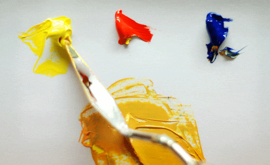
“All colours will agree in the dark.”
Francis Bacon
How to Mix Colour: The Basics
Learning how to mix colour can be daunting, colour theory can be off-putting, but understanding the basics is key when starting to paint.
A knowledge of colour theory is helpful, but in practice nothing beats actually mixing colours, however, you need to start somewhere so let’s start with some basic theory. I’ll be going into some advanced techniques in later posts.
Please note: New Colour mixing course for beginners is now live!
How your hairdresser can teach you to mix paint colour
I’ll be honest, a few years ago I knew nothing about the hairdressing business until my wife opened her hair salon above my gallery, I can now tell you the difference between a champagne blonde and a beige blonde..(0.4 if you were wondering) but the main thing I hadn’t realized was the similarities between hair colourists and painters.
If you want to learn a fast track to understanding your paintings next time your at the salon have a chat to your hair colourist…
They are amazing. They could pick up painting in no time and here’s why.
When hair colour goes wrong our old friend colour theory can save the day. Have you ever seen really yellow bleach hi-lights and wondered how to save them? Well, a colourist will immediately put on a violet toner to neutralize the colour.
Why?
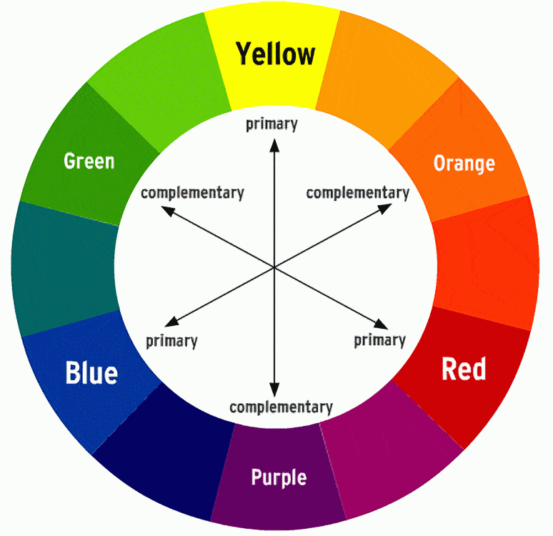
This is an example of when colours that are opposite each other on the colour wheel (complementary colours) are used to tone down a colour e.g: If the yellow in your painting is too bright add a touch of violet to achieve a much more muted subtle colour.
This video below shows how a blue can tone down the orange. And how orange can make blue appear darker.
These are both opposite each other on the colour wheel so are complementary colours.
ARVE Error: Invalid URL https://www.youtube.com/embed/eVXBjajLkcI in urlEver seen someone try and cover blond with brown home dye and end up with khaki green undertones? The hair colourist will put on a red based rich colour to counteract the green.
So if your trees are unnaturally bright green add a little red to the mix to make a more subtle shade.
Complementary colours help tone each other down and are the simplest colours to start to understand colour theory. (3 tricks of complementary colour you can learn from Van Gogh)
Yellow & Purple, Red & Green, Blue & Orange
The problems with the colour wheel
- It puts you off
- It reminds you of school
- It appears more complicated than it is
- It’s ugly to look at
- It seems too academic
- It is a tool and not a list of paints to go and buy and paint all your paintings with.
The irony is, when learning about colour mixing, it is the most important thing to understand.
Having a basic knowledge of the colour wheel is really important so you can always find your way out of a colour mixing corner.
The 3 primary colours
Blue, Red and Yellow.
These are the colours that are impossible to mix from a combination of other colours.
The 3 secondary colours
Orange, Violet, and Green
These are a mix of two primary colours.
For example, mix primary yellow and primary red to make secondary colour orange.
These 3 primary colours and 3 secondary colours make up the basics of the colour wheel.
This is where theory hits reality and the colour wheel should be used only as a tool to learn about colour rather than a guide for choosing paint as all paint colours have a colour bias.
For example, Cadmium Red is an orange-red and will have a bias towards yellow. Alizarin Crimson is a blue-red and will have a bias towards purple. So it is not just as easy as buying a ‘pure red’ and a ‘pure yellow’ they don’t exist.
As a beginner, learn the theory and start simply.
The 6 Tertiary colours
No, I don’t know how to pronounce it either! These are the mixtures between the previous 6 colours mentioned above. To start with don’t worry about them.
Analysing the 3 properties of colour
To accurately mix or match a colour you need to analyze the colour properties. This takes years to master so don’t feel overwhelmed if you don’t get it straight away, the more we talk about it the more practiced you’ll become.
The 3 things to remember are Hue, Value & Saturation
Hue – In the land of colour mixing ‘Hue’ simply translates as the colour e.g: ‘that vase has a red hue‘ literally means if you had to mix that colour in paint what is the closest pure colour you can think of, as in red, orange, yellow etc…but not necessarily bright red.
Pro tip: Not to be confused with the labeling of pigments on paint tubes such as Cadmium red ‘Hue’. In this example ‘hue’ means imitation. So Cadmium Red Hue isn’t a pure pigment, it has been replaced with an alternative – you can read more about labelling on a paint tube here.
Confusing isn’t it.
Value – how dark or light the colour is if you took a black and white photo of it.
This is one of the most important factors in mixing accurate colours but one of the hardest to master.

Pro tip: We easily understand value when we look at a range of greys, or a black and white photograph. When it is transferred into colour it is sooooo much harder to judge. Try squinting while looking at colours to determine their value. Squinting helps the eyes black and white receptors to make value judgments
Saturation – how bright, or intense the colour is. It is sometimes called Chroma or Intensity
How to match a colour
ARVE Error: Invalid URL https://www.youtube.com/embed/bNnlz_4xJD0 in urlColour Mixing Basics – Matching a Muted Yellow Video
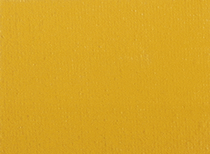
Once you know this information you can match any colour, although the steps below seem a bit mechanical they actually all intermingle together when you look at a colour. When you first start it’s advisable to take your time to understand each step.
Step 1: Analyse the Hue – what colour is it closest to on the colour wheel?
I’m going to go with yellow. And in this example, I’m going to use Cadmium Yellow Light as the closest tube colour to the target colour.
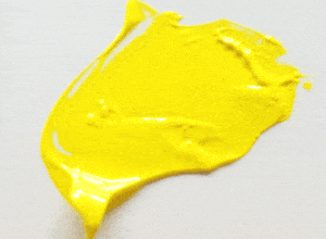
Cadmium Yellow Light has an orange/red bias.
When I look at Cadmium Yellow next to the target colour I can see it’s too Yellow and the target has a much more Orange hue to it. So I’ll add a bit of Cadmium Red (remember this has a bias towards yellow) to achieve a Yellow-Orange
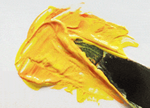
Step 2: Analyse the Value – How light or dark is it?
For this it is easiest to paint a swatch onto a bit of scrap paper, let it dry and compare it.
If it’s too dark we can add white, if it’s too light we can add the complementary colour.
In this case, I’d look at the colour wheel and see what is opposite the yellow-orange we have mixed which is a dark blue-purple.
Step 3: Analyse the Saturation – How bright or dull is it?
Mines too bright, so I’ll need to add a touch of blue-purple to tone it down. For this example, I’m using Ultramarine Blue (which has a purple bias)
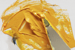
Be careful though as darker colours usually have a lot higher tinting strength than yellows so you only need a tiny amount. A little at a time and keep checking it.
Developing your Artist’s Eye
The process of developing your Artists eye can take a while. So be patient. Your brain is very good at playing tricks on you, telling you it knows what colour you need to paint. Often when a colour first goes on the canvas it will look wrong. It is only when it is surrounded with colours it balances together.
I’m a keen believer that starting Acrylic painting with muted pigments such as Burnt Umber and Ultramarine Blue is more beneficial to your work than starting with Cadmium Orange and Phthalo Blue, same ballpark but very different results.
Acrylics can get a bad press as being too garish and childlike but it is not the paints but an Artists choice of pigments.
If you’d like to learn more about colour mixing with Acrylics you should have a look at the Simple Colour Mixing Course.
You might also like:
The hidden hues of colour mixing
How to balance Warm and cool colours
The 3 tricks of complementary colour you can learn from Van Gogh



Thank you for this article. It has a ton of helpful information packed into it in an easy to understand format. I will be coming back to this page often till I get it :)
Hi Dave, glad you found the information helpful, it can be a lot to take in to start with but keep with it!
Thanks Will, you are great.
Hi Zheila,
What can I say, I totally agree with your comment 100%!
Good to hear you’re finding the site helpful in your paintings,
Will
Great website!
Have you got any tips for choosing a good palette knife for mixing colours?
Rachel
Hi Rachel,
I usually use a number 45 palette knife from RGM, you can watch a video here on basic palette knife techniques,
Hope it helps,
Will
Hi Will,
Really enjoyed this article – I’m learning a lot, but I do have a few questions…
Having read about the difference between value, tinting, saturation / intensity etc. I’m a little confused. Surely ‘saturation / intensity’ is the same thing as ‘value’? The way I see it you’re simply talking about the brightness or darkness of the colour….am I missing something here?
Also with regards to ‘tinting’ am I right in thinking that tinting strength relates to its value, i.e. the darker the colour the higher the tinting strength? However I have also read in other books that a ‘tint’ is lighter than the hue and is made by adding white, so I’m a bit confused here?
Add to this the concepts of ‘shade’ and ‘tone’ and I wonder if these terms sometimes have different meanings in different contexts? For instance I’ve also read that a tone is made lighter by adding its complementary colour, but this seems to be the opposite of what I have read in this article.
Any help would be much appreciated!
Thanks
Hi Tony,
Colour mixing can be tricky at times and different artists use different expressions and approaches to colour mixing.
To answer your questions:
1. I’m a little confused. Surely ‘saturation / intensity’ is the same thing as ‘value’? The way I see it you’re simply talking about the brightness or darkness of the colour….am I missing something here?
Saturation / intensity’ is not the same thing as ‘value’. You can have a bright red that has a high saturation of colour, but if you took a black and white picture of it it would have a mid-tone value.
Its not a simple case of brightness or darkness, more looking at the intensity of pigment and then where the colour falls on the value scale, ie: lightness or darkness.
2.Also with regards to ‘tinting’ am I right in thinking that tinting strength relates to its value, i.e. the darker the colour the higher the tinting strength? However I have also read in other books that a ‘tint’ is lighter than the hue and is made by adding white, so I’m a bit confused here?
You’re right, ‘a tint’ is a colour that has had white added to it so as result is lighter in value than the colours hue. (Its original colour)
‘Tinting strength’ describes how little or how much of a pigment is needed to change the colour, for example, generally the darker the colour the higher the tinting strength but there are exceptions to the rule.
A good example is Phthalo blue as indicated in the table in the article.
3.For instance I’ve also read that a tone is made lighter by adding its complementary colour, but this seems to be the opposite of what I have read in this article.
A colours intensity is reduced when adding a complementary colour, you wouldn’t normally use it to lighten the tone.
It can be confusing as there are works such as shade and tone that mean different things in drawing and painting.
Hope this has helped to clarify some points,
Thanks,
Will
This helps a lot, thanks for the reply
Let’s see if I understand this……out of two different reds, say ‘alizarin crimson’ and ‘cadmium red’, my guess would be that ‘cadmium’ red would have the greatest colour saturation because it appears to have more ‘red’ pigment….is that correct?
Hey Tony,
Yes, you’ve got it!
Will
P.S I’m currently working on an ‘Essential guide to colourmixing course’ keep an eye on the blog for updates.
Hello Will,
I am very happy to have joined you.
I’ve read a bit about colour mixing but found differing opinions from different sources, so gave up for a while…too hard.
I happened on your website by accident and decided to try again since it looked a lot more friendly.
From what I’ve understood so far…and you seem to subscribe to this…is that two primary colours make a secondary colour – red and yellow make orange ..like 1+1=2?
You mentioned tertiary colours…so does it work like math, i.e. a primary colour and another primary colour generate a secondary colour, therefore a primary colour and a secondary colour generate a tertiary colour? (1+2=3)?
If, for example, primary red and secondary purple mixed together make a tertiary colour….what is the name of that colour? ( and the others?)
I bought a tube of each colour on your colour wheel…as close to the colours as possible, and, in my search for tertiary colours on the basis of 1+2=3, much to my disgust, I mixed some really awful colours!
Where did I go wrong ? ..(set aside impatience, curiosity and excitement about making paintings.) This is such a buzz! R
Hi Robin,
Great to have you onboard, to answer your questions about the perils of colour mixing!
Two primary colours make a secondary colour – red and yellow make orange ..like 1+1=2?
Correct, two primary colours make a secondary colour.
A primary colour and a secondary colour generate a tertiary colour? (1+2=3)?
Correct, a tertiary colour is a mix of a primary colour and a secondary colour.
If, for example, primary red and secondary purple mixed together make a tertiary colour – what is the name of that colour? ( and the others?)
In this example it would be: red-purple (red is the primary colour, purple is the secondary colour made from red + blue) The colours would be named by using a hyphenated name that indicate the source of the colour, yello-green, yellow-orange, blue-purple etc
Where did I go wrong ?
Usually due to the hidden colour bias of a pigment.
Have a look at these videos to see how using the ‘wrong’ red or blue can make a vivid bright purple or a muted purple.
Hope this helps,
Thanks,
Will
Yes! My art teacher can be confusing but after watching the clip i understand! I even sent a link to my classmates to help with their homework!! Very helpful! ^-^
Good one Esther! Glad you’ve found it useful.
Cheers,
Will
Hi Will,
Great blog! The way you explained things made it a lot easier to understand. In my art class, the assignment was to do a painting, and now I am stuck! How do I mix colors to make skin color? Which colors do I mix?
Hi Sara,
If you have a look at How to choose a basic palette for portraitsi there is a video lesson at the bittom of the article showing you how to mix and match your own skin colour.
Cheers,
Will
Thanks for this article.
I’m a 22 yr old boy from Durban(KZN, South Africa) and draw portraits but i can only draw in pencil and I have mastered my medium after drawing for years now since I was 8 and without any art lessons but now I feel that I also want to do coloured paintings but i’ve been finding it hard to mix colours, but from reading this article i now have the basics of mixing colours. So as i’ve learned over the years of drawing in pencil, practice makes perfect so with this start on paintings I’ll have to apply the same principle.
Thank you so much and God bless.
You’re welcome Kevin, mixing colours is a step-by-step approach, but with your drawing skills you’ll be able to pick up painting very quickly.
Cheers,
Will
Hi Will, Thank you so much about the colour wheel, whenever I see one my eyes just glaze over it and nothing else, I also quite often end up with a lot of muddy colours on my pallet and waste so much paint. After reading what you wrote about the colour wheel, I gave it a go and I am converted. Thank you for your free tips, by the way, you have another talent other than being artistic, you possess and display an exceptional talent in conveying ideas and concepts effectively.
Thanks again
Suzie
Hi Suzie, thanks very much for your kind comments. Really pleased you gave it a go with the colour wheel. Just taking the colour mixing a step at a time can really make a big difference in your success rate!
Thanks again,
Will
Hello Will, you have written a really wonderful and approachable article on color mixing, that being said, if you are able to receive my comment I would like to ask you how you go about mixing a purple out of napthol crimson and ultramarine blue? I most often arrive at a result which is more similar to a dark maroon mud than anything which actually resembles brilliant purple. If you were able to answer this question I can imagine myself as well as other internet users may find it helpful.
Thank you for your time,
Zach
Hi Zach, pleased you’ve found the article helpful.
You might be interested in these two videos:
How to mix bright pink paint & a bright purple
Cheers,
Will
Hey Will,
Just a question I’ve been curious about during the time reading your articles.
It has to do with toning down.
I understand that the complementary color is used to tone down, but if I were to use a pure black (such as the Mars) in very small amounts, would this achieve the same result? (Toning down).
Also is toning down the same thing as desaturation?
Hey Jordon,
Nice to hear from you, yes, you would achieve a similar result on certain colours.
If you added black to red it will mute it down nicely, as with blue. However, if you add it to yellow you’ll produce a green due to the underlying blue bias of the black.
Have a look at the green mixes here:
And an article on the use of black in your paintings here.
Hope this helps,
Will
Hi Will, my wife has just started to paint a German shepherd dog for a friend, but she can’t seem to get the colours right for the light coloured fur.
Could you please tell me the exact colours she needs to make the fur?
It looks a sandy colour to me. thank you
Deane
Hi Deane,
When painting there isn’t usually an exact formula for a particular subject.
Different light conditions and surroundings of a subject will effect how we perceive the actual colour.
A grey circle will appear differently on a white background, black background or coloured background.
This is called colour constancy and is why in painting each colour needs to be judged individually.
She might me interested in my simple colour mixing course which goes through the entire process of mixing and matching colours.
Cheers,
Will
Hi Will
Have found your website amazing thank you. I am painting a horse portrait in oils. It’s a ginger/warm brown colour. Have made the under painting in raw umber and oms as per your lessons. I’m not sure whether to complete a full black to white value under painting using the measured mediums because I think the paint might be too thick by the time I get to use colour. I am intending to buy the portrait lessons but in the meantime want to get this done as it’s for a friend. Please could you advise as I’ve made three attempts already n can’t keep buying more canvases! Also too impatient to wait for the lessons!
Kindest regards
Vanessa
Hi Vanesssa,
Nice to hear from you, and so pleased you’ve been finding the website helpful in your painting.
Regarding the layers on your painting i t depends how you are going to add the colour to the painting, either by glazes or by painting thicker, more impasto paste.
If more impasto, then once you’ve had some practice turning forms and building tones with the black and white portrait you can start to build up the first layers using more tonal colours for the portrait.
For glazing, you’ll be able to apply colour ontop of the completed grisaille.
Hope this helps, enjoy the portrait course.
Cheers,
Will
I am an artist and part time Art teacher and stumbled on your site today. Great. Learned a few things and I went to art school. Great site.
Hi Michael, thanks for dropping by, so pleased you’re finding the site of interest, thanks for your kind comments,
Cheers,
Will
Thank uuuuuuuuuuuuuuuuuuuuuu
Your articles and videos show that you have pedagogy which is rare. (particularly among teachers) You bring in concrete ideas, simple presentation, packed with an abundance of the real meat of painting. All one need do is become playful and diligent for the abstractions so hard to grasp to come to one seemingly out of the blue. Play to the muse and she will reward you, so to speak. Thank you very much and I just bought a box-load of paint and brushes. With the valor of St. George I will now destroy some blank white dragons.
Hi Tim,
Thanks for your kind words, may the valor of St. George be with you with your creative endeavours with paint!
Cheers,
Will
it was great
Your tips on colors and the blends that we can use to create those colors on our palette helped me a lot. I have even bought Magic Palette Color Matching from Jerry’s Artarama, it simplifies my color search and gives me ideas to get perfect color.
Good one Jacob, pleased you found it helpful.
Cheers,
Will
Hello! I really don’t have anything to do with colours but my son is having “visual arts” at school and I’ve heard that the teacher finds very important the knowledge of colours.
Your site like me very nice and easy to understand -I can also find also difficult things that I don’t understand of course!- .
Thank you very much!
You’re welcome Ivette, pleased you’re finding the lessons helpful.
Cheers,
Will
HI!
I left brush and paint in 1999. Since then no colors no canvas no paint …. Nothing.
Last month I went back my mum’s house and found a canvas in the store room. Pulled it out and realised i was blank. Forgot about brushes, charcoal, colors, primer, medium, canvas everything related to painting.
Googled! your website popped up and went through it page by page. Saw every picture, followed videos and subscribed your youtubr channel.
Result – Now i have confidence and i strongly feel that i can start painting. Maybe this week i’ll buy colors and brushes. Acrylic to start with!
Will, Kindly suggest what else do i need n how to proceed and Believe me i’ll paint the Base first as suggested by you.
Thanks dear.
Rgds
Hi Yuvraj, sounds like you’re all ready to go! The next step is just starting with the paint onto canvas.
Cheers,
Will
Will,
Why when I’m painting does the paint seem to dry while I’m working with it on the canvas? What can I do to make it more fluid?
Hi Robert, you can either add water or a fluid medium to increase the flow of the paint.
Cheers,
Will
Hi Will
Thanks for a great site full of very useful advice, which I’ve recommended to a seniors painting group I attend. I’ve followed your pieces on color with great interest, but a project I’m attempting now has me stumped. It’s a landscape of stooked hay in a field, but I just can’t get the color of the hay. I’ve tried Cad Yellow+Cad Red+Ultra Blue+White and some like Burnt Umber+Cad or Azo Mid Yellow+White. I have a limited range of paint: Cad Yellow, Azo Mid Yellow, Cad Red, Magenta, Ultra Blue, Phthalo Blue, Burnt Umber, Paynes Grey, a Light Skin Tone and plenty of White. The mixtures I’ve tried all look too brown or pink, just can’t seem to get that golden color of newly harvested hay. Can you please suggest a combination I could try? Many thanks again for some very helpful articles.
Hi Andrew, thanks for passing on the site to your art group, much appreciated. A raw sienna is often a good colour base for a warm hay colour, you can add a touch of cad yellow to it to brighten if need be, but it will have a nice tone on its own or with a touch of white added.
Hope this helps,
Will
Thanks, Will. I’ll invest in a tube of raw sienna and give that a go.
Hey. I am a student working in an art program. we are doing a 9 week long project and i decided to do painting as the main form of art. what i will be painting is landscapes and the picture i decided on has hay in it. i originally found this site by searching about how to get the hay color. I found that Andrew also had the same problem as me but i do not have all the different colors, such as sienna. Do you know what i can do with the normal primary colors to make the hay color??
Hi Isaiah, just start with a muted yellow tone such as yellow ochre, mute down with a burnt umber and then add white.
Hope this helps,
Cheers,
Will
Ok I will get to that eventually and I will post later when i get to the hay part. Thanks a bunch!
Hi Will
Thanks once again for your colour mixing videos. I was in awwe of how many greens you can produce without using… errr… green! Just quick tips on creating my own colour wheel like the one that you used in your video for bardic colour matching.
Pleased you found the lessons helpful in mixing greens Salma,
Cheers,
Will
Hello, great tutorials!
Two questions, when mixing colours half way the colour wheel, theoretically don’t you need 50% of one colour and 50% of the other one? ie. to make orange why wouldn’t one use 50% red and 50% yellow but rather 95%-5% ?
Secondly when changing the value or saturation of any particular hue, aren’t you actually changing one colour (hue) into another hue?
Hi Alec, theoretically, yes, but in practice different pigments have a huge variety in ‘tinting strength’ so you would only need a small amount of blue to tone down a large amount of orange.
It terms of changing the hue’s saturation or value you’re trying to change an orange into a dull orange, without it starting to drift too much into another colour hue, so you want to try and keep it so it appears that you’ve just dulled it.
Cheers,
Will
Hiya Will, I love what you’ve done on your page, it’s been very helpful to me!
I have a slight problem though and was wondering if you could help me with it please??
I am a huge game of thrones fan and have bought three little metal dragons, representing the Wueen Danearys Dragons, Drogon, Viserion, & Rhaegal.
What I am wanting to do is paint them in their correct colours which are as follows………
‘Drogon” is reddish/ black with red scale wings ,……..” Viserion” is cream and gold in colour with reddish/ orange wings, & “Rhaegal” is……greenish/ bronze in colour , with yellowy orange wings.! It would be much appreciated if you could help me get the right colour-tones please??… cheers for now Marcus
Hi Marcus, if you had a black, a cadmium yellow (or yellow ochre) and a cadmium red of alizarin crimson and white you would be able to mix the tones needed. They are quite dull in saturation but have a warmth to the colour underneath, so for Drogon, for example, paint the entire figure in a dark warm red and then mix the red with a small amount of black and then layer up the colours. Here is a video demonstration layering up colours on another dragon figure you might find of interest.
Cheers,
Will
Hello Will,
I’m trying to get the right hue to paint landscapes with red sandstone rocks( Grand Canyon). I was trying to mix the right color using red cad, but wasn’t successful. Can I use other primary color to get the right shades? Or I rather should keep red cad.
Hi Aleksei,
You can get pretty close with the cad red, add a touch of cad yellow and white, then a tiny amount of ultramarine blue to cool the tone. If you still find this too strong use an alizarin crimson as there are often cool purple/red tones in the shadows.
Hope this helps,
Cheers,
Will
oh my God thanks for your kindness and your merciful to this site.am done and happy to follow this simple formelar.am 20years boy from Ghana love to draw and paint,but seems i still have much problem in my color mixing.but i found i huge to perform but as today all my gratitude to the one who posted this great post.may God bless you.and do more for the seekers
Thanks Seth, pleased you found it helpful.
Cheers,
Will
I want to say thanks! This entry blog has been very helpful to me! I have two questions though. Now that I know about color bias, how do you identify it’s bias? Sometimes I get a dull orange by mixing red with yellow. So I know that I’m either: (a) mixing the wrong red with the wrong yellow (b) the right red and the wrong yellow, or (c) the right yellow and the wrong red. If I mix like (b) and (c), is it not totally wrong because I get a not so dull color? I find that sometimes I have to search a color’s bias on internet because I don’t know exactly where it leans to.
Hi Hodan, if you keep your palette simple and say if you have a warm yellow (cadmium) and a cool yellow (hansa yellow) and then just label them on your palette warm and cool you’ll soon get used to choosing which yellow would be best for the colour you’re trying to mix.
Hope this helps,
Cheers,
Will
Thanks for the instruction.
Your information is easy to understand.
I am mostly self taught, and first started painting without using black, as I had heard that was the way to go. A sort of bumbling around, trying to get the colours right. Hence a painting took an awful long time to complete to my satisfaction.
Hi Jen, pleased you found it helpful, one of the best ways to learn is to follow a tutorial and then learn the basic skills from that. You can then adapt and alter subject matter to your own interests and inspiration.
Cheers,
Will
which colours do I mix to get tobacco colour?
Start with a burnt umber and add a little yellow ochre and white.
Cheers,
Will
Hey,
I’m incredibly new to your website (less than an hour) and I found this article most interesting on a personal level.
I am currently in between jobs as hair colour technician and looking to reestablish an old passion to occupy my mind and maintain dexterity.
Throughout my school days drawing and painting was always my favourite, and like the discipline of colouring hair it’s esoteric.
As an educator in my field, I teach a range of levels from apprentices to qualified staff, and I’m always shocked at lack of basic colour theory people have been given previously. I was first introduced to the colour wheel when I was in year 3 at primary school and have been fascinated ever since. It is one of the most important foundation tools across a number of creative industries.
Further from that the more delicate principles of colour and how our eyes perceive it work exactly the same when creating a composition for a clients hair:
Darker and ashen colours to flatten and condense a shape
Lighter and warmer colours to open it.
A common misnomer I deal with is clients with round faces asking for lighter colour around the front to soften their face when, in fact, it will only serve to make their face look larger.
I’m looking forward to reading more on your website, and hope to start practically too, just thought I’d share.
Tommy
Hi Tommy, great to hear from you and so pleased the article struck a chord, hope you find the lessons helpful in renewing your passion for painting.
Cheers,
Will
do you have a tip as to how we can darken a finished acrylic painting. we just want an overall darker look to the whole painting. it’s a distressed union jack, it is a little darker than the actual Union Jack but we need it darker.
Hi Lisette, you can apply a thin glaze of a darker transparent colour over the whole of the painting that will darken it all down.
Will
ah yes of course that makes sense thank you. :)
I used this article to understand colour better in my photography.
Very clear and fundamental. Thank you!
Pleased you found it helpful Wieland.
Will
Hi Will!
Thank you so much for your tutorials, I have learned so much!
I am wondering, how do you identify the colour bias? I can’t seem to find any websites which has lists identifying the colour bias. Do you recommend any books? Like that lists the pigments of paints and what colour they are leaned towards? Or can it be identified by someway? I’m a beginner :)
Thanks!
Hi Jess, the best way is to add white to the paint to see which way the colour shifts. If you have a look at this watercolour leaflet there is a section on page 10 that lists warm and cool colours in the Winsor & Newton range.
Cheers,
Will
Hi Will,
thank you so much for the quick response! I will take a look.
Thank you so much for making so much of your information free. I’m a high schooler and I can’t afford expensive art books and such, so I really appreciate it.
Looking forward to your future articles!
Good one Jess, pleased you’ve been finding the site helpful.
Will
This really helps a lot for my painting project. Thanks.
I saw this video on YouTube, and it looked like a green yellow and a blue red. I was completely off. And I thought ultramarine blue was supposed to have a red bias (although I know red and blue made purple). What would happen if you used a green biased blue?
I’ve been doing an online course on mixing colors, and I never understood the difference in mixing an orange yellow with a orange red vs a green yellow with a blue red. I often wondered why my orange wasn’t bright. Do you get more into this in your class?
Hi Anne, nice to hear from you. Yes, in the simple colour mixing course I go into more details on the theory of colour bias and mixing colours using a complementary colour palette.
Yes, ultramarine blue does have a red bias, you can see the differences in this colour bias video
Cheers,
Will
I keep watching your YouTube videos, and I know I want to sign up for one of your courses, to start. I keep going back and forth between color mixing and the beginning acrylic course. Some of my paintings are actually pretty good, but I know I’m lacking in the basics. I watched one on underpainting (or is it using tonal valuations?), and I think that’s where I’m really lacking.
I don’t care if I ever sell anything; this is for my own fun and accomplishment. But, I want to do a good job. I can’t share any of my paintings with you, but I truly understand the things you’re trying to get across. And, thank you for your generosity in providing a link to another instructor who did a wonderful job of explaining color mixing. I remember that she used French ultramarine blue, primary yellow, primary magenta, ultramarine or cerulean blue and titanium white for a limited mixing palette.
Also, I’m quickly catching onto the green and red bias, which you do a good job of demonstrating.
So, what do you recommend? My temptation is beginning acrylics because I remember you saying that understanding values and learning to paint with something like raw umber, ultramarine blue and titanium white is where we should start. Forgive me if I don’t have that exactly right, but I’m pretty sure you understand me. Thanks!
Hi Anne, nice to hear from you and pleased you’ve been enjoying the lessons. I’ve just released a free pdf guide to starting with acrylics and a suggested guide to the lessons and courses. You can download it here: Beginner’s Guide to Acrylics & the Will Kemp Art School. It sounds like you could start with the beginners acrylic course and then move onto the colour mixing course and with your previous experience, the paintings should all come together nicely.
Hope this helps,
Cheers,
Will
Thank you! How generous!! I keep coming back here, and watching your YouTube videos. I really want to get some good foundation skills, and that’s what I’m seeing from you.
Glad you’ve been finding them helpful Anne.
Will
Hi Will,
The “standard” colors seem very dark to me. I’m trying to make lighter colors, but when I add titanium white they come out “milky” as opposed to having a “pop”. How do I get colors that pop? I’m looking for kind of a “psychedellic” effect.
Sage
Hi Sage, you can get fluorescent paint colours like these although they won’t be as opaque as more muted colours because colour used are derived from dyes rather than pigments.
Cheers,
Will
I just got into painting as a coloring technique for cartoon/caricature style illustration line art and before i even get into it ive been trying to find how to get exact mixes of color. I guess up to this point it hasn’t been very important for getting consistent colors as most artist just mix color as they go. To me that’s leaving to much to chance and since my background is more design instead of regular old school painting that’s probablly why I’m so picky over it as everything needs a plan and a sensible explanation. Even so I’ve found a bit on it, more for printing process and automotive painting or like this article hair colorist might need to change color just a bit one way or another. To keep myself from rambling…are there any other sure fire ways to get exact mixes of color, as far as measuring goes??? The thing i’ve seen and have been thinking about using is length of paint put out on a ruler to mix in parts, but even that has variances as u can still have more paint on either area. Seems to me this is something that needs to be developed as we are how long into art learning and we shouldn’t be mixing color the same way artist did a hundred years ago. Any thoughts on this??? sorry for the long winded question remark.
Hi Gino, yes, you can work with ratios to get mixes consistent, and some books have colour mixing guides that you can measure out from to have more control.
Cheers,
Will
Thanks will, this really helped me with my school homework
Good one!