
Snow.
It can seem a tricky subject to capture.
Is it white? Is it blue? How do you paint it to look soft, or darken it without it looking dull?
Having a ‘less is more’ approach to your palette can reflect the colours of Winter absolutely perfectly – without getting complicated.
And the first clue to a convincing Winter snowscape, is the sky…
Observing the light quality of the sky
Successful landscape painting in any season requires observation of the light.
Is it strong and bright or soft and diffused?
Different light will alter the colour saturation, shadows and mood of a scene, so assessing the lighting qualities of the sky is important to guide your choice of pigments and brushstrokes.
So what are you looking for in your subject?
- What Season is it?
- How high or low is the sun in the sky?
- What time of day is it?
- Is there cloud cover or a clear blue sky?
- Is there fog or mist creating a haze?
A step-by-step Winter Landscape Painting in Acrylic
Video Tutorial – Part 1
Video Tutorial – Part 2
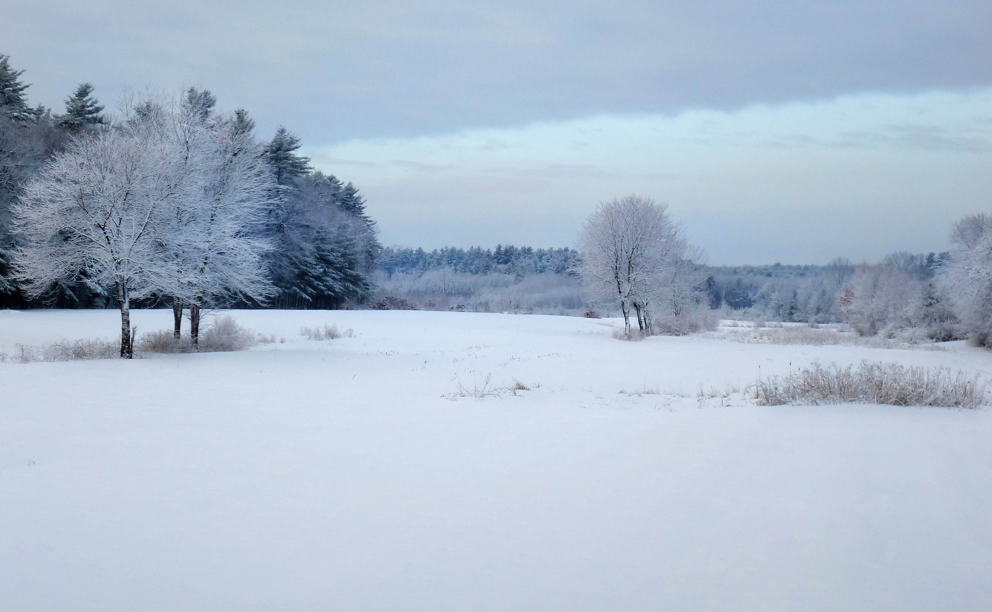
Winter Morning

Photo Credit: “Winter Morning” by Liz West Licensed under CC BY 2.0.
In our Winter scene above, the main light coming from the sky is diffused behind thick clouds with a low-level glow of the sun peaking through, giving us a compressed tonal range, muted colours and shadows on the ground or in the snow that are soft, with diffused blended edges.
The softer the light source, the softer the edges, these are all key elements that make a Winter scene appear magical.
- Dull and soft light – muted colours, narrow or compressed tonal range, less contrast.
- Bright and hard light – saturated colours, wider tonal range, more contrast usually Summer which has a wide tonal range with high saturation.
Tonal value & range in a winter scene

When I’m painting landscapes, I’m essentially looking for ranges of light and dark and assessing the values in the scene by eye.
The easiest way to see this when you’re first starting is to turn your image into black and white.
This creates what can be called a ‘tonal map’, ‘value map’ or ‘tonal range’ but the main thing to remember is how wide or compressed that range is, as it will influence how light or how dark you can go with your pigments.

Tones of black and white appear on a ‘tonal value scale’ that goes from light to dark

In our reference image above, you can see how close in value the sky is to the value of the snow.


I’ll be using a very limited palette to produce beautiful pastel colours and mixing colour strings for subtle shifts in tone for the painting.
Using a limited palette & colour strings
So for this study, we’ll begin with a warm and cool palette from the blue and orange family, alongside pre-mixed grey neutrals.
I wanted to keep this tutorial simple and impressionistic, working within the discipline of Burnt umber and Ultramarine blue to capture the essence of the scene.
If you get into the practice of pre-mixing colour (or tonal) strings and then only use those colours, it will give you a much more compelling picture. Now you have to realise that this will all come together when the picture is complete – the urge to add darker or lighter paint to the compressed range or brighter saturated new colours to the mix will be hard to resist!
Downloading the reference photograph
The photo below can be ‘right clicked’ and ‘Save image as’, so you can use it as a reference image, print it out and follow along with the video above.
Photo Credit: “Winter Morning” by Liz West Licensed under CC BY 2.0. Please Note: The Original photograph has been cropped down to the Golden Ratio proportion used in the painting.
You can also download a High-Resolution Image here...
Materials you will need:

Brushes
- 2-inch Purdy decorators brush – XL Monarch Elite
- Small nylon round brush – This brush didn’t have a brand name or specific size on the brush, any small round will be fine. The dimensions are approx 3-5mm in diameter and 1.5 – 2cm in length
- Jacksons Art Black Hog Bristle Brush, Size 4 – Series 335
- Isabey Isacryl Acrylic Brush, Filbert shape, Size 6 – Series 6572
- Isabey Isacryl Acrylic Brush, Filbert shape, Size 10 – Series 6572
Palette knife
- RGM Classic Line, Medium size 45, Diamond shaped, cranked (angled) handle. I use an RGM 45 for mixing the paint on the painting and a larger sized square palette knife (RGM 81) for mixing the coloured ground. You don’t need the RGM 81 but the larger the palette knife the quicker you can mix larger amounts of colours.
Support
- Jacksons Art (UK) 10 oz cotton duck canvas 20 x 32.4cm (Code: CJS2032) that has 2 coats of white acrylic gesso applied.
I demonstrate on a 10 oz cotton duck canvas, 19mm Profile and the ratio I use for the main paintings are based on the Golden ratio
An alternative brand in the US is Masterpiece Fibonacci Golden Rectangle Canvas
Other materials
- Kitchen roll/paper towel
- Clean water
- Tear-off palette or stay-wet palette (I demonstrate on an A3 size tear-off palette)
Paints – The colour palette
Artist quality acrylic colours. I’ve used a mix of Golden Heavy Body colours & Winsor & Newton Professional Acrylic (also called Artist Acrylic)
The first colours are a selection of Neutral Grey (Gray) tones.

- Neutral Gray N8
- Neutral Gray N6
- Neutral Gray N4
Pro tip: If you don’t have access to these neutrals you can mix your own neutral with a Burnt umber, Ultramarine blue and Titanium white.

- Titanium white
- Ultramarine blue
- Burnt Umber
Mediums

Acrylic Glazing Liquid ( Gloss) Golden Paints. This will extend the working time of the paint and enable thin applications of the paint with smooth smokey blending. What I like about Glazing Liquid Gloss as a medium, is you can use it in any ratio in with your paint and it still brushes well and remains a nice paint film integrity.
Step 1. – Choosing a coloured ground

For the ground colour, I wanted to knock back the white of the canvas but not add too much variety in colour so I went for the Neutral 8 Gray.
Step 2. – Mix a fluid consistency

To prepare the paint consistency for the ground colour, squeeze out some of the paint and then split the mass of the paint in half.

Then add equal amounts of water to 1 part of the split half.
So you will have 2 parts paints: 1 part water, diluting the paint by 50%.
Pro tip: You can dilute heavy body paints with water and still remain good paint film integrity. This is from Sarah Sands, Technical Services Supervisor for Golden Artist Color.
“Heavy Body acrylics can easily be thinned up to one part paint to one part water, or a 1:1 ratio, and maintain excellent adhesion onto absorbent surfaces. In fact, even when testing this on a non-absorbent material like Plexiglas, the paints still formed good films with no adhesion failures after being allowed to fully cure.
To add even a little more comfort beyond that, we can share that the adhesion onto Plexiglas remained solid even when thinning with one part paint to two parts water, or a 1:2 ratio. Which would feel like a fairly fluid wash for most people.”
You can read more about preparing a support and dilution levels here

Then mix the first half together well with the water.

Once the water has been incorporated into a smooth mix, combine the rest of the paint so you have a fluid mix.
Step 3. – Paint the coloured ground

Using a 2-inch decorators brush, push the paint into the canvas weave.

Then use light strokes over the surface to create a smooth, even tone.
Step 4. – Drawing Out

I draw out the basic shapes of the composition using a 3B pencil (Staedler Mars Lumograph). The main shapes I’m looking for are the circular shapes of the trees on the left and then the shape of the tree in the middle that breaks through the horizontal.

The middle tree shape is about half the size of the main tree on the left.

Then check the angle of the tree that brings your eye into the centre of the picture as this will help to guide the viewers eye into the far distance. I’ve also indicated where the dark areas of the painting will be by hatching with the pencil.
Step 5. – Setting out the paints

I set out the paints in a tonal range from white, lightest grey, middle, grey, dark grey through to the darkest tone.
Step 6. – Painting in the darkest tones

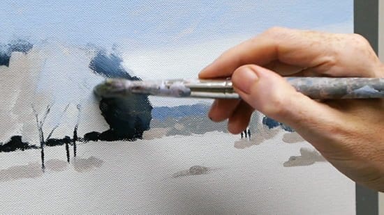
I mix a dark blue/black from the Burnt Umber and Ultramarine Blue. Using the small nylon round brush I paint in the darkest areas of the painting. You can vary the intensity slightly by adding a touch of water to the mix.

When painting in the darks of the tree trunks, start from the bottom and then taper up your brushstroke from the bottom up. As the brush strokes reach the top lift off the pressure to create a feathered edge.

Then mix in a little Neutral 4 with the first dark mix so it slightly lifts the tonal value. Don’t add too much of the N4 at this stage.
Step 7. – Blocking in tones with a filbert brush

I now swap to the Size 6 Filbert Isabey Isacryl brush and paint on a slightly lighter blue mix on top of the dark tree shape, I’m working in wider blocks of colour with gestural marks.

Now grab a little of the Neutral 6 (N6) and add a touch of the pure Ultramarine blue.

Paint this mix onto the far horizon line, I then alter the darkness of the mix to paint in variations of darker shapes on the far right side. You can already start to see the shapes of the trees emerging and the balance between the cool blue and the neutral grey ground colour.

Working with the N6 & N8 I paint in the central tree, still working with the size 6 filbert brush.
Step 8. – Adding warmth with Burnt Umber

We can now introduce some warmer colours to the composition by mixing some Burnt umber with Neutral 6.
I paint this on the left-hand side of the tree and then use the same colour to paint the shadow tone under the tree
Step 9. – Mix muted blues for the sky

In preparation for the sky, I mix a colour string of two muted light blue colours. The colour is a mix of Titanium white, Neutral 6 and Ultramarine blue. I also add some Acrylic Glazing Liquid (gloss) to the palette.

Swapping to the larger size 10 Isabey Isacryl filbert, I paint on the darkest of the two blue mixes to the top of the painting. The application is quite thin as I want some of the Neutral ground colour to show through to ‘warm’ the sky from behind.

Then paint on the lighter blue mix to the bottom half of the sky. When the top and bottom of the sky are still wet add a touch of Acrylic Glazing Liquid to the end of the brush and gently work over the join between the two colours so they softly blend together.
Still using the size 10 filbert, I paint a few more gestural strokes onto the tree edge. Loosening up your landscape paintings with gesture to capture the rhythm of the subject, bold brushwork and having a broken edge can give an illusion of branches from a distance, so keep it scratchy.
Step 10. – Mix muted white for the snow

I now mix another colour string with the Titanium white, N8 and a tiny amount of Ultramarine blue. Then apply the darker of the ‘white mixes’ to the bottom of the canvas.

Paint the darker tone in a semi-circle at the bottom of the canvas.

Then add the lighter mix to the rest of the canvas working quite quickly with the brushstrokes.

Step 11. – Add texture with a bristle brush

I now swap to the size 4 Black hog hair brush. This is a stiffer bristle brush and will give more visible brushmarks and texture.

I then mix a cleaner, brighter blue for the mountains in the far distance.
Step 12. – Add a subtle warm white to the sky

With a little Burnt umber and white I can warm up and lighter the area where the sun is illuminating the clouds.
Step 13. – Refine the shapes and darks

Working around the edge of the tree on the left I tweak the shapes so they have a nice balanced pattern.
Step 14. – Add thicker white to the center

Still using the bristle brush, build up a thicker impasto area of white in the centre of the painting to subtlety guide the viewers eye into the middle of the picture and maintain a loose, painterly quality.

I then reinforce the dark tree trunks using the side edge of the bristle brush.
The final painting

You can watch the full video tutorial (30min) below. Enjoy!
Video Tutorial – Part 1
Video Tutorial – Part 2


I LOVE this and can’t wait to try it. I am working on the new ‘small glass study’ but this one is next! Thanks Will.
Brilliant one Pat, hope you enjoy it.
Cheers,
Will
Nice Will, I learned a lot keep up the good work.
Pleased you enjoyed it Rinus.
Cheers,
Will
I really enjoy watching your videos. I looking forward to try and paint a scene. Thanks
Thanks Medcam, hope the painting turns out well.
Cheers,
Will
Hi Will,
Great stuff, I will email you for advise.
Many thanks,
Bob.
Cheers Bob, pleased you found it helpful.
Will
Thank you, I am so grateful to you for helping me with painting!
You’re more than welcome Sandie, hope your landscape turns out well.
Will
Hi Will,
This is awesome ! I am a beginner and can’t wait to try this out ! amazing work Will !
Good one Sabby, really hope you enjoy the tutorial.
Cheers,
Will
Thank you so much for this. I love your videos with your clear instructions and would like to paint this. I am Canadian though, and would like to have some guidance for the equivalent size of paint brushes. Could you tell me or direct me somewhere I could please. Thank you.
Hi Sharon,
For the Filbert size 6 it’s 11 mm wide, for the Filbert size 10 it’s 20mm wide.
Hope this helps,
Cheers,
Will
Can’t wait to start
Hope you enjoy it Ruth.
Will
My heart leaps every time I see an email from you in my inbox. I do have a BFA, but in all my years of study never did I receive the level or quality of instruction, in drawing or painting, that I receive from you. Thank you, Will. A thousand times, thank you.
That’s so nice to hear Lorrie, very kind of you to say so, hope you enjoy the tutorial.
Cheers,
Will
Dear Will,
I have taken many of your courses. And I will begin this one tomorrow for sure! Imagine: we got 30 cm of snow here during the last 24 hours, it’ s inspiring and quite a coincidence! Now, a question: Every time I followed one of your courses, I preferred to paint on a canvas quite larger than the one you suggested. I find it easier. Am I ok doing so? Are there inconvenients from the teacher’s point of view?
Marcelle
Hey Marcelle, wow 30cm of snow! In terms of canvas size, yes of course you can work on a larger canvas. The only differences would be speed of drying time over a larger area but it would still work great. Hope you enjoy the snow.
Cheers,
Will
Looks great ! I to am looking forwards to trying it out.
Thanks for putting it up.
Gladwen
My pleasure Gladwen, hope you enjoy painting the scene.
Cheers,
Will
Dear Will,
Looking forward to trying this tomorrow afternoon, thank you, I learn just by watching your videos,
Feeling more confident,
From Kathy
Hi Kathleen, so pleased you’re feeling more confident in your work, have a great afternoon painting.
Will
Terrific scene, Will. That’ll take some sorting out. Good exercise for the eyes and the brain. Must give it a try !!
Cheers Pete, hope you enjoy it.
Will
Hi Will, Thank you so much for another video to watch on Winter landscapes.
I aspire to be a landscape artist, so any input on how to do landscape painting is much appreciated. Such attention to detail and very useful points. It will be a very good one to do after finishing up the landscape sketching course.
Thank you again!!
Hi Aya, you’re welcome, yes it would work well after the landscape sketching course, the sketches we do with the Grey Faber Castell pens is a great way of practicing the techniques in this tutorial before committing to paint.
Cheers,
Will
Can i do this in oil as well? :)
Hi Liana, yes, if you use an acrylic for the coloured ground (or use a quick drying oil white) then you can follow the same steps with oils, hope it turns out well.
Cheers,
Will
Many thanks Will for another great tutorial. Wonderful timing, as I am just planning a painting of Emperor penguins in the Arctic. I was wondering about the choice of greys and blue. Thanks again.
All the best,
Pete
Hi Peter, well that it good timing, the Emperor penguins will add a nice contrast to the muted tones of winter, hope the grey mixes help out.
Cheers,
Will
Another great learning experience. I love your tutorials..you are so kind to offer these free. I am a Florida artist of Tropical scenes…hmmm, no snow around. Am going to try your snow scene, it is so lovely and inviting. No time like the present. Thank you.
Thanks Annie, hope you enjoy working through the lesson, looking forward to seeing your results.
Cheers,
Will
Hi Will! Thank you for this snow scene, Gives me ideas for my christmas cards this year.
Cheer’s
John
That’s very forward planning John! but yes, a great idea.
Will
Have been wanting to paint a winter scene. Love it! I’m trying to train my brain to paint like an impressionist, but the orderly side of my brain just won’t let my hands do it. LOL! Getting better at it though and still having fun!
Cheers!
Laundrea :-)
p.s. I need to send you the seascape I did from your beginner’s course.
Ha ha, yes Laundrea, it’s a balance between being orderly enough, and then just letting the brush flow! Would love to see your painting from the seascape course, hope it turned out well.
Will
Hi Will, Thank you so much,this is really nice and very helpful
Thanks again..
Namir
My pleasure Namir, so pleased you found it helpful in your paintings.
Will
Hi will, thank you so much for this beautiful scene! I will try it for sure. I love so much your tutorials.
Thanks very much Sophia, looking forward to hearing how your winter painting turns out.
Cheers,
Will
Just getting started with acrylics and have already run into many of the stumbling blocks you mention. What a find you are! Agree that your calm easy going approach is wonderful. All the (free) info on your site is a wealth in itself. But I want to try a class … Color mixing or acrylics for beginners. Keep teaching, Will. Your art is great and you’ve got a natural talent for conveying what you know! Cheers from Rose
Thanks very much Rose, very kind of you to say so, great that you’re learning lots from the lessons. Enjoy the tutorial.
Cheers,
Will
Hi, how can you stop your paint from drying up on the pallete? How long to you get to work before it dries?
Thanks,
Purple.
Hi Purple, you can mist it with water to extend the drying time (acrylics dry by evaporation), the drying time varies depending on the mass of paint you squeeze out onto the palette. You can also us a stay-wet palette for larger pieces to keep the paints wetter for longer.
Cheers,
Will
Hi Will,love this tutorial.I like your teaching style and method of demonstration,it’s so easy to follow,and has nothing left out.Could you tell me,would it work in water mix able oils to get similar results?
Regards Jean
Hey Jean, really pleased you’ve been enjoying the lessons. With water mixable oils you can follow along pretty close to the steps. You might want to work onto an acrylic ground for speed of getting started but apart from that it would work great.
Cheers,
Will
Hello Will,
I love how you explain your lessons – very simple and informative! I also find it so great that you use Golden Acrylic Paints! I love every thing about their product! It is the only acrylic paint I will use!
Thank you for sending these inspirational videos! I’m always happy when I see your name in my inbox!!
Enjoy what is left of winter and the excitement of what’s to come with the color of spring close at hand!
Always, Agnes
Thanks very much Agnes, yes I find Golden paints to have a good pigment load and opacity to them, really pleased you enjoyed the tutorial.
Cheers,
Will
Grazie Grazie per i tuoi tutoria e video e complimenti perché non tutti gli Artisti trasmettono la loro arte. Bravo
Thank you, thank you for your tutorial and video and congratulations because not all artists transmit their art. Bravo
Non c’è di che Giuseppe, così contento che hai trovato il tutorial di aiuto.
Saluti, Will
You’re welcome Guiseppe, so glad you found the tutorial of help.
Cheers,
Will
Dear Will, I’m delighted with your “Winter landscape in acrylic, step-by-step video”.
First I had lots of difficulties in understanding what you were explaining, but reading, it was much easier to me.
As a matter of fact, I hardly can’t wait to try this experience, I need to buy some materials, and then , follow your precious instructions, we’ll see the result!
The vídeo is perfect, very well structured
Thanks a lot Will, you are Great!!!!
Thanks to remembre me among all your friends and fellows, I’m very greatful.
Hugs
Milu, Portugal.
So pleased you enjoyed it Milu and found the photo steps helpful, good luck with the painting and have a ‘Super Bock’ to celebrate your finished piece!
Cheers,
Will
I’ve been dabbling for a few months … so glad I’ve found you and your site/courses. You’re An artist and born teacher! As someone else mentioned … Golden paints. I bought lower end paints and a few Goldens. No comparison! And I think that it’s almost more important for a beginner to have good quality materials. It’s challenging enough to become comfortable with painting skills … I don’t want to also have to make concessions for how the paint is behaving. Looking forward to trying the snow scene and taking your Color Mixing (and other) courses. Thank you, Will.
Hi Rose, yes, the difference in student quality vs artist quality in acrylics can be quite pronounced, a good artist quality titanium white is always a worthy beginners investment. Really hope you enjoy the tutorial.
Cheers,
Will
Hi Will,
great tutorial video again. Your kind of teaching is so engaging. All the people interested in painting love you for that. Since I don’t paint in acrylics would you recommend the Jackson’s premium cotton canvas also for oil paint or do you prefer linen or anything else. By now I like more the canvas boards, because on streched canvas, the paint will more absorb, but it’s hard to find boards having good quality of canvas on top.
Cheers
Stef
Hi Stefan, yes, the Jackon’s premium cotton has been primed to be used for acrylic and oil paint. You can read more about canvas preparation for oils here.
And absorbency here.
Yes, it can be hard to find a good mix of board and canvas, canvas panels in the US manufacture a board using Claessens Belgian linen, I haven’t personally used the boards but I do paint on Claessens Belgian linen for some portraits, It’s a really nice (albeit more expensive) linen to work onto.
Hope this helps,
Cheers,
Will
Love your work will, looking forward to trying this painting.
thank you
Teresa
Thanks Teresa, really hope you enjoy the painting.
Will
What a pleasure!! Thanks a lot.
Tamara.
Cheers Tamara, hope you’re doing well.
Will
Enjoyed the video. Never thought to use grays from the tube. I love the simplicity of the palette, and the painting itself. Great tips on the use of acrylics.
Thanks Samara, hope you find it helpful in your paintings.
Cheers,
Will
Hi Will – I really find your videos excellent. I sent you a photo of my effort. I used some Golden Paints and Liquitex – I like both. Unfortunately I did not have the same paints colours as you, so I substituted what I had. Somehow my design strayed a bit from your design. Any comments would be appreciated. Thanks.
Thanks for sending your painting through Linley, it looked great!
Cheers,
Will
Will, Thank you so much. I ve learned so much from you in just this painting alone. I also enjoyed and learned a lot in your color mixing piece.
Claudia
You’re more than welcome Claudia, so pleased you learnt lots from it.
Cheers,
Will
I’M back to painting after 7 years in the wilderness. My beloved teacher died and I just couldn’t touch a brush without crying.I am so happy to be back and delighted to have found this site. Cherry done and now to the jug!!
Thank you Will. Mary in Dublin
Hi Mary, so sorry to hear about your teacher, really pleased you’ve been finding the lessons helpful, enjoy the jug painting.
Cheers,
Will
Awesome Will !!!!!
Thanks so much for sharing your talent with others.
You’re welcome Debra, hope you enjoy the tutorial.
Cheers,
Will
Greetings from Post, Texas! I’m not a beginner but I find your tutorials help me in areas where I struggle. I love all your tutorials and it’s very generous of you to offer these complimentary studies. All of your tutorials are beautifully done and easy to follow. Thanks for all you do!
Angeline
Thanks very much Angeline, so pleased you’ve been finding the tutorials easy to follow and you’ve found the lessons helpful in your own painting practice.
Cheers,
Will
Thanks so much. The colour mixing is what I particularly enjoyed. I live in South Africa on the coast so never see snow, nonetheless I found the snow scene very informative.
You’re welcome Denise, really pleased you enjoyed mixing the colours for the snow scene.
Cheers,
Will
Dear Will,
I’m looking forward to painting the Winter Scene in oils.In your tutorials you use a glazing medium for acrylics.Please tell me if there is an equivalent for oils.
Thank you very much
Inge
Hi Inge, you can purchase a specific glaze medium for oils, or mix your own.
A traditional mix is:
Damar Varnish – 1 part
Stand Oil – 1 part
Turpentine – 5 parts
Cheers,
Will
Hi Will,
I am ready to begin but am having a hard time finding the darkest N4 neutral grey. I have the N6 and N8 and also Payne’s grey. How can I mix something close to N4 from what I may already have?
Thx
Hi Pat, just start with the N^ and then add some black or ultramarine blue and burnt umber to get a balanced neutral.
Cheers,
Will
I notice when you paint the darkest darks in the first step, they go on rather opaque. When I tried it, my paints ended up being much more translucent than yours, so I wasn’t sure whether I should add it on thicker or build it in layers. Both approaches kind of negate the looser feel of your brushstrokes.
Do you have any recommendations? Thanks again for your tutorials, I loved the urban sketching course.
For reference, I used Golden’s paints (I used Raw Umber instead of Burnt).
Hey Scott, nice to hear from you, and really pleased you enjoyed the urban sketching course. I also used Golden paints for the demo so the opacity issue would just be a case of using a slightly thicker mix with the paint. There can be a really fine line when diluting from the paint covering or becoming a translucent glaze. If building up opacity I would always favour multiple thin layers rather than one super thick layer.
Hope this helps,
Cheers,
Will
Thanks Will!
Hi there,
What low cost alternatives would you recommend instead of stretched canvas (that are still good quality surfaces to paint on)?
Thanks,
Kate
Hi Kate, you can use a board coated with acrylic gesso, or canvas board. You won’t have the same level of absorbency as canvas but you can still practice many of the techniques.
Cheers,
Will
Thank you for sharing your knowledge with us. I just absolutely love it and will hold on to your teachings!
Dinah Anaya
Thanks Dinah, pleased you found it helpful in your paintings.
Cheers,
Will
Hi Will,
thanks for sharing. I like your videos and the instructions are v helpful. I finally muster enough courage to try this. I am however stuck on – how do we decide how much details to add in for impressionistic paintings?
I am also keen to take your online courses. Could you clarify- for the course on absolute beginners acrylic, is it fairly similarly to the free videos?
Regards
Adeline
Hi Adeline, pleased you’ve been enjoying the lessons, when judging details for impressionistic paintings I usually would go for less is more, the longer you use a bigger brush the more it will force you to work in blocks of tone rather that details. The absolute beginners course is similar in the teaching style, but goes into more details and a more in-depth (we cover 4 different separate tutorials).
Hope this helps,
Cheers,
Will
Dear Will,
I have tried your snow painting and I’m very glad to draw that. I have done some minute changes
Your video was very helpful for me and I would like to thanks you for the video
Thanks Mansi, really pleased you found the snow tutorial helpful and hope you created a brilliant painting.
Cheers,
Will
Will, many thanks for a great video tutorial. I like the style and your method of teaching is easy to follow. I am new to the world of acrylics but already I have picked up some excellent tips on tone and composition from you.
That’s great to hear Mike, really pleased you’ve been finding the site helpful with your journey into acrylics!
Cheers,
Will
Dear Will,
I enjoy this well-designed, impressionistic style project very much. Here is my trial (https://goo.gl/photos/SLnP2gXKwuhQy1Pq8). It’s done with student grade Ultramarine, B.Sienna, and Tatanium White on acrylic paper. Some problems occurred during painting:
• When I painted the tree trunk, the paint didn’t cover the support on the first application and I had to do it couple of times more, then the line became too thick and solid. I assume it’s partly due to the student grade paint, and partly my brush skill. I also feel that my newly-acquried brushes (http://www.dickblick.com/products/princeton-catalyst-polytip-bristle-brushes/) are too soft.
• Overall my color seems to be duller than your demo, the bluish hues are not blue enough. I understand if it’s due to the quality of the paint, however, I also wonder if it’s because I have painted the snow too light.
• I feel I didn’t quite achieve the volume of the trees, bushes. I know they can be treated as spheres, but it’s still difficult for me to tell the light/dark sides from the reference photo.
• I like the idea of the subtle balance between cool and warm. However, I don’t feel it yet. I wouldn’t feel uneasy when it’s unbalanced.
• I chose B.Sienna instead of B. umber, because my B.umber seems to be very dull. Is it a reason that you prefer B.umber for this project?
Thanks a million!
Pleased you enjoyed the tutorial Ping, yes, I use Burnt Umber precisely for it’s muted tones as having the Burnt Sienna makes it easier to push the colour too warm. It looks likes you’ve balanced it well though and the overall mood has this lovely cool wintery feel. Also, working on paper will often be very absorbent and can make the pigments appear duller as they soak in more so more paint is needed to create the same effect if you were painting on a canvas or board.
Cheers,
Will
Thanks for your valuable feedback. I didn’t thank you every time when you responded to my comments so as not to cost you extra time to moderate it, but I did in my heart.
Pleased it helped Ping.
Will
I find lessons from Will very helpful AND one of the best teaching programs around.
Thanks very much John, very kind of you to say so.
Will
Dear Will,
I’ve been very interested in paintings for many many years and did some drawing and painting earlier. My problem has always been that I did not know how to paint. My last painting (i tried to do)i did in 2001, but about a year ago i decided to give it a try again (i missed the relaxed feeling of painting). I even attended an evening cource, which gave me nothing.
And one day (3 month ago) i found your website and watched your tutorials and what hapened? Well suddenly something fell in my lap, painting has never been more fun and relaxing. Thank you very much for that.
Merry christmas
/Peter
Well, that’s fantastic to hear Peter! so pleased you’ve found the tutorials have helped in your painting journey, have a fab Christmas.
Will
love your tutorials. always so explicit and informative. wish you’d come to ft. Lauderdale, Fla & conduct a workshop for intermediate to advanced skill set painters.
You’re very kind Ann, so pleased you’ve been finding them helpful.
Will
Thank You Will!
I enjoy your tutorials and always learn so much!
Michael Holmquist
Cheers Michael, really glad you enjoyed it.
Will
It is terrific to come across such a brilliantly talented artist and superb teacher. I am very happy to discover your website where you have kindly posted such well-designed video tutorials with the artist-learner in mind. Thank you Will for your kindred, passionate and creative spirit and wonderful dedication that is infused into all of the content. I am an artist with an inherited gift of artistic creativity and drawing from my father, but have not turned to doing hardly any drawing and painting for a long while since studying visual art in university a number of years back, because I have devoted my time to writing and other work instead. Now in this most devastatingly difficult of times I have picked up my pencils and brushes again and discovered your amazing instructional resources. It would be my pleasure to take several of your courses to gain new insight and deepend knowledge.
A warm hello from Toronto, Canada
~ Jana
Well that’s so great to hear Jana, glad you’ve been enjoying the site and really hope you find the lessons helpful. Keep well.
Will
I have just started with acrylics and your lessons were a huge inspiration and help with basics. Many thanks!
I’ve relady appreciated that brushes indeed make a huge difference and wanted to buy Isabey filbert brushes 6572. I found it in jacksonart online store, but the shape of the hair of size 10 looks different from yours, longer, like a larger copy of the size 6 brush. Your brush hair seems to have a lower length to width ratio. I wonder why is that.
So glad they have been helpful Svetla, It might just be that mine is a older brush so the bristles have worn down overtime.
Will
Thank you for creating these tutorials! I am just beginning to paint and your lessons are helping it to be rewarding and enjoyable. You share not only what to do, but how to see the right opportunities for harmony in painting. You are a talented artist and a natural teacher!
That’s great to hear Meg, so pleased you’ve been finding them helpful.
Will
Hi Will
Just to wish you and yours a very Happy Christmas and New Year, and to say how much I have enjoyed reading all your hints and tips for better painting! I’m going to try a snow scene in the New Year. Do have a lovely holiday. All best wishes, Alison.
Thanks so much Alison, really hope you enjoy it.
Will
Will … I love your tutorials. One recurring problem I have is when I’m painting a street or path. The path tends to go uphill rather than down. Suggestions?
Thank you.
Judy Berman
Hey Judy, one way to counter the uphill effect is to ensure that the lines and edges of the path gradually converge to a vanishing point. Having a vanishing point in your painting will enable that the path has the look that it’s going downhill.
Will
Hi Will. Just love this snow tutorial. Do you have any tips for painting acrylic snow scenes of the Alps. Big mountain scenes with brilliant blue skies, vibrant white snow, craggy rocky areas etc. Lots of contrast. I am finding it really difficult to know where to start.
Thanks Cathy
Hey Cathy, so pleased you enjoyed it. A pen drawing, or black and white study can be super helpful to try and figure out the composition of the scene. Because there are often so many elements to the landscape simplifying the shapes can really help.
Will