




3 Tricks of Complementary Colours you can Learn from Van Gogh
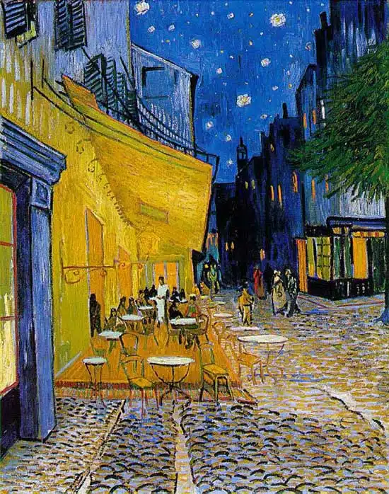
Vincent Van Gogh, Café Terrace on the Place du Forum, Arles, 1888.
Complementary colours
Two colours, placed side by side, will appear differently depending on which colours are used and what they are placed next to.
The effect of this interaction is called simultaneous contrast.
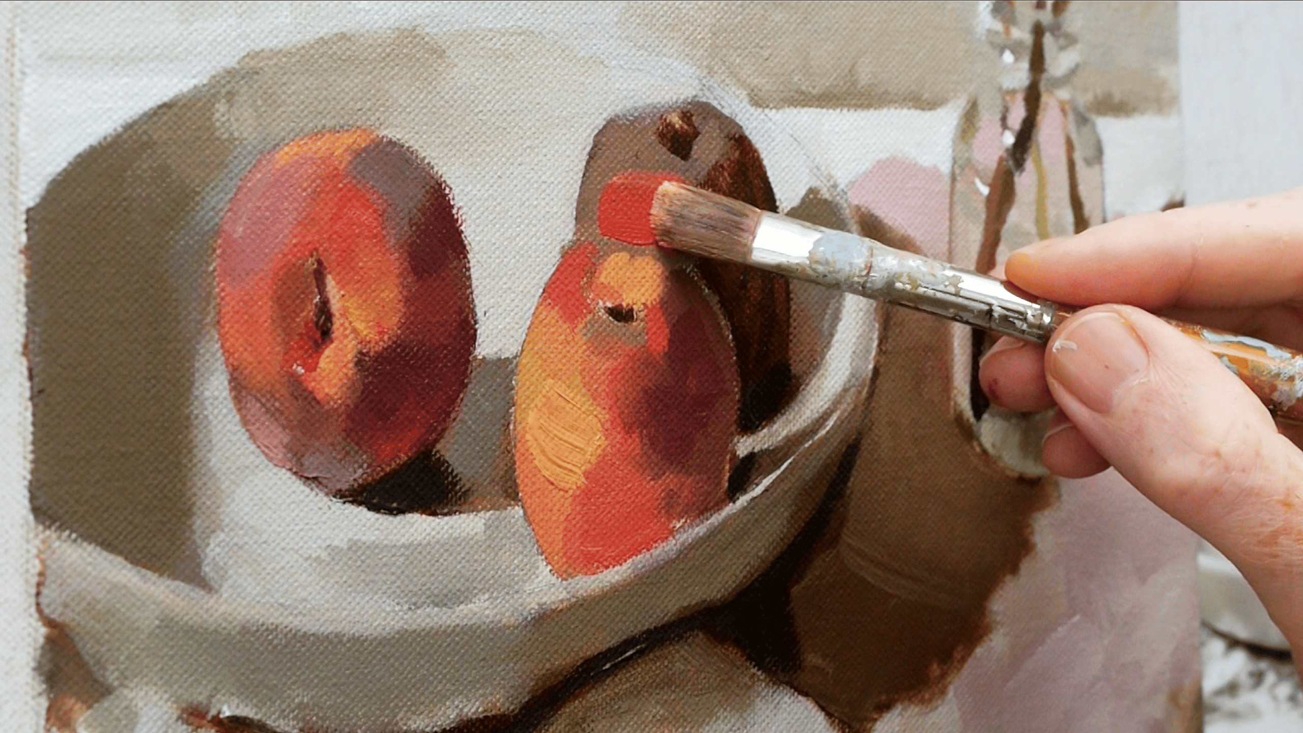
Simultaneous contrast is most intense when two complementary colours are juxtaposed directly next to each other.
For example, red placed directly next to a green, if you concentrate on the edge you will see a slight vibration.
Your eye doesn’t like resting on the edge. The two complementary colour in their purest, most saturated form don’t sit well together, however, if you want to try and focus your viewer gaze on a particular part of the painting a knowledge of the ‘attraction to the eye’ can be used to great effect…