
A Step-by-Step Video Tutorial
Morning class! This week we’re going to learn how to capture the brilliant qualities of reflections in copper, using acrylic paint.
I absolutely love how vibrant this copper pan is surrounded by the dark range. Notice how, even though the background is a dark subject, there is still a lighter tone on either side of the pan to bring it forward.
Copper makes a great subject, allowing us to work with a complementary colour palette of orange and inky blue, deep blacks and vibrant colour glazes.
So let’s get started…
Downloading the reference photograph
There’s a downloadable reference image and drawing guide that you can work along from at home.
The photo below can be ‘right clicked’ and ‘Save image as’, so you can print it out and use it as a reference image alongside the video.

You can also download a High Resolution 20 x 25cm Reference Image here (opens in new tab)
Downloading the Drawing Guidelines Reference

You can also download a High-Resolution Guideline for Printing here (opens in new tab)
Materials you will need:
Brushes
- 1.5-inch Purdy decorators brush – XL Monarch Elite
- Filbert – Isabey Isacryl Acrylic Brush, Filbert shape, Size 6 – Series 6572
- Round – Rosemary & Co – Small Round Golden Synthetic Brush , Size 4 – Series 344
- Long Flat – Rosemary & Co – Evergreen Long Flat, Size 4
Palette Knife
- RGM Classic Line, Medium size 45, Diamond-shaped, cranked (angled) handle. I use an RGM 45 for mixing the paint.
Support
- I demonstrate on a 10 oz cotton duck canvas, 19mm Profile, 20 x 25 cm (about 8 x 10 inch) that’s had 2 coats of white acrylic gesso applied by the manufacturer.
Other Materials
- Kitchen roll/paper towel
- Clean water
- Tear-off palette or stay-wet palette (In this tutorial I demonstrate on an A3 size white tear-off palette)
Paints – The Colour Palette
I use a mix of Golden Heavy Body colours & Winsor & Newton Professional Acrylic (also called Artists’ Acrylic). I use student grade paint for the coloured ground.
Coloured Ground
- Pale Umber (Winsor & Newton – Galeria)
Main Painting
- Titanium White (Golden)
- Carbon Black (Golden)
- Burnt Umber (Golden)
- Cadmium Yellow Light (Golden)
- Cadmium Orange (Golden)
- Burnt Sienna (Winsor & Newton)
- Phthalo Blue (Red Shade)
Glazing
- Permanent Alizarin Crimson (Winsor & Newton)
Mediums
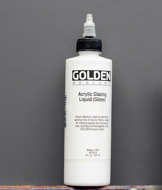
Acrylic Glazing Liquid (Gloss) Golden Paints. This will extend the working time of the paint and enable thin applications of the paint with smooth smokey blending. What I like about Glazing Liquid Gloss as a medium, is you can use it in any ratio with your paint and it still brushes well and remains a nice paint film integrity.
Step 1. – Choosing a Coloured Ground

Using a warm neutral ground colour gives a good base for the oranges of the copper pan and also acts as a highlight colour for the reflected light on the front of the range.
I’m using a pre-mixed student grade acrylic from Winsor & Newton Galeria range, called Pale Umber.

It doesn’t need much water to dilute it as the paint comes in a softer body straight from the tube.
If you haven’t got a Pale Umber, you can mix a similar colour using the same pigments found in the Galeria pre-mixed tube:
- Titanium White – PW6
- Yellow Iron Oxide – PY42
- Red Iron Oxide – PR101
- Mars Black – PBk11

Decanting the Galeria paint due to the paint having a softer, more liquid consistency than the heavy body.
I then transfer the paint to the canvas using a size 45 angled palette knife from RGM. Using a palette knife can be a good way to initially move the paint around the canvas before swapping to a brush for smoothing out.
Pro tip: I would usually paint coloured grounds on a flat table surface, but to illustrate the technique during the tutorial, I demonstrate working on a vertical.
Step 2. Painting the Coloured Ground

Smoothing out the paint texture using a 1.5 inch Purdy Monarch XL Elite brush.
I’ve dipped the brush into a touch of water and work over the canvas in both directions. I take off most of the paint using the edge of the palette knife so it only just covers the surface. I’m taking care not to build up this layer too thickly as I want the next layer to ‘grab on’.
Step 3. Drawing out Guidelines

Having a guide for your drawings can really help to create space around the main subject and keep your composition in check.
One of the most common mistakes when drawing out a still life subject is to make the main subject too big. The guidelines give you an outside edge to work to. (See: Are You Making Any of These 7 Compositional Mistakes with Your Still life Paintings?)
Measuring the ratios around the metal pan gives us breathing room for the object to sit into.
Step 4. Drawing Freehand


When you’re drawing out the copper pan it will feel small – too small, even when you’ve measured it out from the guidelines, but stick with it. Once the pan has got colour and form everything will feel in scale.
When you’ve got the guidelines down, you can finish the rest of the drawing freehand. I’m using a 3B Mars Lumograph pencil and sketching in the shadow shapes, indicating the slight curve at the edge of the pan.
Step 5. Painting the Negative

I start the painting using Carbon Black heavy body paint, diluted with water. Ivory Black or Mars Black would also work fine. I use the paint straight from the tube in the very darkest areas of the painting and then lift the pressure off the brush and dilute with water to give a charcoal-like-grey for the mid-tones.

I’m thinking in black and white at this stage, looking for the shape of the pan to appear by painting the negative space around it. You can see a similar drawing technique used in this urban sketch tutorial of a bike, where the background goes in first to establish the drawing position of the main object.
Scrubbing in the tones in the background, thinking how the tones would work in a charcoal drawing first.
Step 6. Adding Dark Accents

I then swap to a small round brush to paint in a fine line at the base of the pan and refine the corners.

Tonal block-in of the background using Carbon Black on a Pale Umber ground
Step 7. Blocking in the Copper Pan

I want to establish the contrast between the warm colours in the pan and the cool colours in the background so I swap to a Burnt Umber and block-in a thin layer to give a warm base for the subsequent layers.
Step 8. Adding Blue

I now introduce a Phthalo Blue (Red Shade) and mix a little with the Carbon Black to create a blue-black. By mixing in Titanium White I create a 4 step tonal colour string to use in the blue areas of the background.

I work down the colour string, going progressively lighter towards the base of the copper pan.
Step 9. Introducing an Orange Glaze
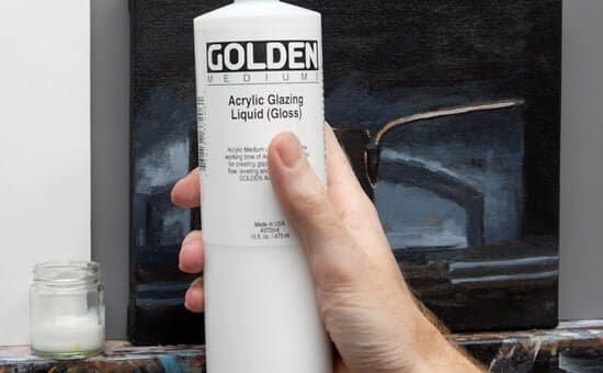
Using a glazing medium allows you to work longer with the paints in thinner layers, especially when working upright at the easel. I’m using Acrylic Glazing Liquid (Gloss) from Golden paints.
I add a flat orange glaze using a Burnt Sienna from Winsor & Newton, this has a lovely vibrant undertone to build a warm base for the copper pan. I’m now using a synthetic long flat brush, a Size 4 Evergreen from Rosemary & Co.

The first glaze is thin and even, using Acrylic Glazing Liquid

Step 10. Adding our Lightest Light

Adding white to the Burnt Sienna pigment mix gives us a more opaque application of colour.
I can then paint some pure Titanium White at the top of the reflection to push the tonal range in the painting and give us the brightest tones to judge our next mixes against.
Step 11. Looking for a Dark Pattern

I mix a muted brown using the Burnt Umber and Burnt Sienna to paint in the darker shapes of the reflective surface. Emphasising the dark lines within the reflection makes the lighter areas appear to shine brighter.
Step 12. Introducing Brighter Pigments

For the final stages, I really want to push the chroma (saturation) of the colours, so lay out Cadmium Yellow Light and Cadmium Orange onto the palette.

A touch of Cadmium Orange to bring a vibrancy to the reflections
Step 13. A Warming Glaze

Working with some Permanent Alizarin Crimson I can reinforce the warm red colours on the shadow side of the copper pan
Step 14. Final Blue Glaze

To finish the background I add a thin blue glaze to bring up the intensity of the colour next to the copper.
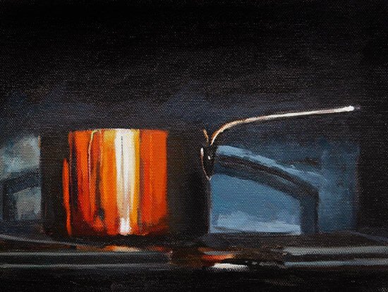
The finished painting.
I really hope you enjoy the tutorial and have a look at some previous student success stories with this lesson.


Hi Will
This is an amazing piece!
Oh my God…thanks for sharing !!!
You are absolutely a great Artist!!!
Cynthia R. Costa Rica
Hi Cynthia, nice to hear from you and thanks for your kind words, really hope you enjoy the painting.
Cheers,
Will
Once again, as always you prove to be the best most amazing tutorial master I have ever come across.
The latest Copperpot tutorial is absolutely stunning, amazing and all the other adjectives you can utter.
I can’t wait to have a go!!
You’re too kind Charles, looking forward to seeing your results.
Cheers,
Will
I Totally agree Charles….Just absolutely stunning..
We are learning from the BEST
Can’t wait to start and see the end-results!!
Thanks very much!
Will
Oooooo. Can’t wait to have a go! (Off to the shop for more supplies first!)
Good one Ali, really hope you enjoy it. Cheers, Will
cheers another great lesson thank you it was truly superb
kind regards steve
Thanks Steve, really pleased you enjoyed it.
Cheers,
Will
Even though my work is more expressionistic, I always enjoy your tutorials. You are a great teacher. It was fun watching the pot come ‘alive’ with paint and having the photo image to keep referring back to.
Hi Connie, hope you’re doing well, I’m really pleased you enjoyed seeing the development of the painting.
Cheers,
Will
Hi Will, a very detailed and instructive demonstration, I throughly enjoyed it. Is your Acrylic portrait course similarly demonstrated ?
Hi Roger, thanks for your kind words. Yes, the acrylic portrait course follows similar teaching practices and close-up’s of the brushstroke techniques, using classical teaching methods with the contemporary medium of acrylics.
Cheers,
Will
great teaching lesson, I have been painting fall leaves and colour, my problem was to get a bright copper hue for the falling leaves, this is just what I was looking for Thanks a million Will keep in touch Andy
Brilliant one Andy, great to hear you can use the colour mixing techniques in your landscape painting, that Burnt Sienna can be so handy!
Cheers,
Will
I absolutely love your style Will! Thank you for your artistry! I’ll do my best so I can share my painting with you.
Hugs from Nicaragua!
Good luck with the tutorial Karina, really looking forward to seeing how your pot turns out.
Will
Hi Will!
thanks a lot for this tutorial. It was exactly what I needed today and I am happy with my result.
regards Roy
Cheers Roy, so pleased the tutorial was a timely one for you.
Will
Will, I just love the details you give, and I can’t wait to do this painting. The metallic reflections can be very challenging!
Thank you for your help!
Pleased you find all the details helpful Joan, yes, reflections can appear a bit daunting to start with, but just take it one step at a time and I think you’ll be super pleased with the results!
Will
Will,
Thanks so much for this new tutorial. You are the shining light for people like us who are still feeling their way through…
You are too good!
Noreen
Hi Noreen, thanks for your very kind comment and great to hear that you’ve been finding the tutorials helpful in your painting journey.
Cheers,
Will
This is awesome. really wonderful to have this tutorial. I cant wait to try it this weekend !
Good one Kim, had a great time painting it at the weekend.
Cheers,
Will
Hello Will,
A big thank you for this new course from your french fan :))
I don’t unfortunately have time to paint (we were seriously flooded) but I download all the course (like the glazing portrait) for later
It will be as usual a real delight to make them… even without your talent Maestro ;)
Big kisses on your cheeks as we make it here and to Vanessa too
christel
On no Christel, so sorry to hear about the flooding, hope you’re all safe and the damage isn’t too bad. Wishing you a dry spell.
Will
Thank you for sharing this amazing tutorial. The warmth and the highlights in the piece just make me want to keep looking at it. I can’t wait to give this a go!
Great to hear it Janet, so pleased you enjoyed it.
Will
Once again, you’ve ticked another box. Thank you so much. Can’t wait to try this out.
Thanks Yeside, hope your painting goes well.
Will
This is great! Thanks a lot Will, you are an inspiration to me!
Tom
Thanks Tom.
Hi, neat. I suppose this could be done with oils in much the same way.
Stewart
Hi Stewart, yes you could use the same colour palette just adjusting for drying times.
Will
What a hero you are to me. Thank you again and again.
Very kind of you to say so Carol, hope your painting turns out well.
Will
Hi Will veeeery good ! The same with brass?
Hug
Jose
Hi Jose, yes, the same method, just adjusting to more of a yellow ochre base pigment.
Will
I’m wanting to try this in oil. Any tips?
Hi Cynthia, is you are using an acrylic ground base, just add a little more water so you have a good surface for the oil to adhere onto.
Cheers,
Will
Hi Will,
Thank you! What’s so wonderful about your video is that it’s making people just want to paint!
How do we determine what background colour to choose for a painting?
Regards
Adeline
Hi Adeline, it often depends on the type of mood and feel that you’re after in your paintings, this article on choosing a colour for studio walls looks at the same principles of how the colour can affect the style of painting the working on.
Hope this helps,
Cheers,
Will
Thanks Will, just what I needed for my current still life painting. I’m using oils, but I hope with a bit of adjustment this will work for me too. Penny
Good one Penny, really hope you enjoy the lesson.
Will
I started painting about an year ago after I found your tutorial on the apple. I was so encouraged by your words and the way you teach. Thank you so much!!!
I’ ve done all the paintings that I found on your site and I will definitely try this one. So once again many thanks!!
So pleased to hear it Lily, really glad you’ve found the tutorials helpful in your painting journey.
Cheers,
Will
This is the high standard of online tutorial we have come to expect from you, Will. Calm, articulate, measured, with the focus always on the canvas and brushwork. Most of us would have recoiled in horror at this copper pot challenge but your inspirational guidance makes it accessible to all. Like many others I can’t wait to try it. Thank you so much. John.
Thanks very much John, yes, there can be an initial sense of anxiety when faced with a reflective subject, you’ll find when painting the copper pan there is quite a lot of the painting when it appears that it doesn’t look at all like copper and then suddenly it will turn, it’s having faith to paint beyond the tipping point!
Hope you enjoy it.
Will
Hi Will. I was looking for inspiration and I always turn to your tutorials when my artistic mind gets a bit muddied. This was just what I needed for my Thanksgiving vacation. I might add some fall fruits and veggies somehow for a holiday themed painting. Gratitude abounds for your wonderful tutorials.
With thanks,
Maria
My pleasure Maria, hope it helps with your composition.
Will
I’m going to get my acrylics out again and give it a go!
Thanks so much for providing me the incentive.
Ellen
Good one Ellen, here’s to a creative painting weekend!
Will
Aloha,Will, beautiful painting! What is the shadow behind the pot? Is it O.K. To just tint gesso with a little acrylic paint and a little water for colored ground? I’ve been doing this ‘short cut’ and wonder what you think about it. Thanks! -Liz
Hi Liz, on the left of the image I think it’s a wooden spoon, I don’t include it in the final painting. Yes, if you’re painting the gesso onto a raw canvas tinting it can work well.
Cheers,
Will
Hello Will,
Thank you for yet another great informative tutorial.
Can I ask how to keep Acrylics wet on the palette, after maybe mixing colours
that can be difficlut to re- mix again, I know of the wet box for longer storage.
But when working the paint over some time obviously drying on the Palette
can be a problem. Thanks again for your Tutorials.—–Alex.
Hi Alex, you can use a stay-wet palette that will keep the paint wetter for much longer. They work best when the palette is on the flat.
Cheers,
Will
You had me at “morning class!” (That greeting always makes me so happy) This looks like another terrific tutorial, I can’t wait to have a go at this! Thanks Will!!!
Ha, ha, morning Maria! really hope you enjoy the lesson.
Will
Hi
great, thanks for sharing
Sima
GORGEOUS! LOVE THE COPPERY REFLECTION, COPPERY? IS THAT A WORD, SOUNDED GOOD TO ME. HA HA. THIS STEP BY STEP HELPS ME A LOT AND INSPIRES ME.
THANK YOU WILL!
Hi Cheryl, pleased you’re feeling inspired, good luck with the tutorial!
Will
This is marvelous — thank you so much for being such a generous (and effective) teacher.
Thanks Julie, pleased you found it of help.
Will
Hi Will,
I love your videos, seeing how the painting develops. Gives me the goosebumps.
The copper pot looks so metal! I can almost hear the sound of it.
Fascinated how you can actually see so much colour and tones in it and add the right colours. I would have stopped very early on and have been satisfied with it, but not really knowing how to make it look better! How do you do that?
Thank you so much for such a great tutorial!!
You are a great teacher and artist, no flattery intended.
Really pleased you enjoyed it Aya, and thank you for your kind comments. Yes, it’s a common issue to stop the painting process just before it all begins to make sense on the canvas, the more colours and tones are on the painting, the more references you have for your eyes to judge the relative intensities and hues of the object you’re observing. Hope you get that ‘a-ha’ moment when working through the tutorial!
Will
Thank you for sharing your talent!
Cheers from Utah in the US
Ps. My grandfather was a Kemp. We must be cousins
Ha, ha good one Teresa, really pleased you enjoyed it!
Cheers,
Will
Thanks Will.
Excellent tutorial and video as usual, and good reference photo. Finding the right subject’s often hard and I often struggle. I think I’ll have a go at this in the next week or two, although I’ll probably use oils. If I do, and it’s presentable, I’ll post a link.
Cheers, Alastair
P.S. Your “light and dark” comment was apt because I’d just been to the Beyond Caravaggio exhibition on at the National Gallery.
Hey Alastair, nice to hear from you, thanks, really pleased you enjoyed the tutorial and hope the inspiration from the Caravaggio show helps with the piece!
Will
Dear Will,
this is a really nice tutorial, which was definately a lot of work to prepare!
The result painting is beautiful!
Thank you for sharing, Galina
Hi Galina, thanks very much for your kind comments, so pleased you enjoyed it.
Will
Absolutely fascinating. Very many thanks for sharing with us.
My pleasure Bernie,
Cheers,
Will
Hello Will,
I love you’re painting video’s!! You are such an amazing teacher. This was a great practice demo. So glad you’re back to posting your video’s and so kind of you to do this for us beginning artists!
Really pleased you enjoyed it Sherrie.
Cheers,
Will
I am a professional photographer & an artist.
Many thanks for the wonderful acrylic painting lessons.
Best wishes.
Really pleased you enjoyed it Harbans.
Will
Thank you for another great tutorial! Really enjoyed painting this. Thank you. How about one for painting something silver? And where can we post our finished efforts?
Hey Gail, you can see some finished paintings here, just sent me an email with the attached painting.
Will
Hello Will,
Here’s my version of the pot :
http://www.sherringham.net/blog/2016/11/24#copper-pot
Cheers, Alastair
Great work Alastair! you’ve got the darks and lights judged really well and love the impasto touches on the white reflections. It’s also nice how you’ve got the broken edges of the pale blue next to the smooth transitions within the reflections of the copper.
Cheers,
Will
Hello Will,
As always, you do not disappoint. I love this tutorial and will be creating this one tonight! I would like to thank you again for sharing your knowledge. There are many tutorials out there, but I find your classical background and your artistry the quality that I would love to learn and present in my work.
Best wishes,
Linda from AZ
Thanks very much Linda, really pleased you’ve been enjoying the tutorials, good luck with the copper pot!
Cheers,
Will
Hi Will, I tried this one in oils and I was satisfied with the result, but my orange made with azo yellow and alizarin crimson was way less intense than yours. Do I need cadmiums for a better result?
Cheers,
Matthijs from the Netherlands
Hi Matthijs, yes, azo yellow is a semi-transparent pigment, so it can take a higher ratio of yellow to get the same amount of coverage that can be achieved with a cadmium yellow which is an opaque pigment.
Cheers,
Will
Bonjour Will !
Je vous écris en français afin de vous le faire travailler comme vous me faites travailler mon anglais à chaque toile que je réalise grâce à vous !!!! ;)
Merci énormément pour vos vidéos gratuites, je me régale à chaque fois que je commence une toile.
Thank you very much for you free vidéo it’s always a great plaisir to paint your models.
the first paint, I have do, was “the apple” and now it’s in my parents kitchen and they are very pround of me !(thank’s to you)
Sorry for my english I look for my words sometimes and perhaps that my sentances were not really easy to understand.
thanks you so much and have a good day
Merci énormément de me permettre de m’épanouir en peinture, c’est avec vous que j’ai débuté l’acrylique !
xxx
Sophie
Merci beaucoup Sophie! so pleased you enjoyed the tutorials and your painting turned out well.
Cheers,
Will
Fabulous tutorial! I have always wanted to paint but never had time or instruction. Your instruction is clear and so helpful. With your tutorials, when I find the time, I feel like I can really make progress. I so enjoy watching these beautiful paintings take shape. Thanks so much for your generous and kind nature in helping so many people realize their dreams of creating beautiful art. You’re the best!
Thanks very much Lisa, hope you enjoy the tutorial.
Will
Hello Will,
Thank you for this nice tutorial. I had some colours in my mind, but you have surprised me with the crimson glazing. :)
Well, I also would like to tell you a short story. Today I had to fill in a questionnaire, and when they surprised me with the “What is your favourite sound?” question, the first thing came in to my mind was: “When Will Kemp says ‘Moring Class!’ ” :D Of course, I could not write it down, but yes, this is my favourite sound, no doubt. :D
Thank you for this art school, I think I cannot find words how I like it.
Morning Cris! really pleased you enjoyed the tutorial and thanks for your kind words on the lessons, very much appreciated. Enjoy exploring the site and experimenting with some new painting techniques.
Cheers,
Will
Wow, it was cute. :)
I have already explored many of your tutorials, the last one was the acrylic palette knife technique, which finally was not really mine. How is it possible that I can paint easily with a brush, but not with the palette knife?
Anyway, the colours you used there (https://willkempartschool.com/acrylic-palette-knife-techniques-part-1/) were amazing, did you follow some rules when choosing them, or just simply used your imagination? I always wanted to change my colours on my paintings, but I never had enough valor to do it. Why do you paint yellow skies and violet mountains? I mean it is nice, really, but I am afraid if I do that people will not accept it. :(
Hi Cris, for this painting I exaggerated colours in the reference and then used the complementary colours yellow and purple. In this colour scheme the colour choices act to bring out the colours of the environment (the purple heather from Scotland) and harmonise into a painting.
Hope this helps,
Cheers,
Will
Wow thank you for sharing, it is so good to watch this work step by step, what a brilliant finished work.
Regards, Linda.
My pleasure Linda, really pleased you enjoyed the lesson.
Will
Loved having a bash at this. The way you break down the techniques is incredibly helpful.
Good one Ali, really pleased you enjoyed the tutorial.
Will
Looks awesome. Going to try it for sure. Thanks!
Will,
I just moved to the desert southwest in the US. I decided that I was going to look for an instructor to up my painting game. I cannot find anyone with your teaching skill. I truly appreciate your methods and your manner of sharing your talent. Any skills I have currently, I have obtained from you. I may ramp up my online learning and forgo the instructor here. Thanks and cheers!
Thanks very much Micki, really pleased you’ve been finding the teaching style suits you, good luck with the copper pot study, hope it goes well.
Will
Dear Will,
Thanks for sharing this project. What a great opportunity to enjoy not only the creation of vibrant colors, but also the art of mark-making. Here is my first trial of it using student paints of similar colors and acrylic paper (https://goo.gl/photos/LutjsZ7tJYiQHx9N6) . There are many things to learn in this project, and for sure, I will come back to it again and again. Thanks again!
ping
Hey Ping, it’s worked really well! really like how you’ve got the darker copper colours in clear blocks going into the centre of the pan, it shows the viewer that quality of the reflective surface and shape of the pot without losing the lovely painterly feel. The drawing has worked well and the placement within the composition is spot on.
Cheers,
Will
Hi will! What are the measurements of the canvas you used to paint this painting?
Hi Rob, details are under the material list :
‘I demonstrate on a 10 oz cotton duck canvas, 19mm Profile, 20 x 25 cm (about 8 x 10 inch) that’s had 2 coats of white acrylic gesso applied by the manufacturer.’
Really hope you enjoy the painting!
Cheers,
Will
where can I see other people’s attempts at the copper pot?
Hi Ina, you can see the student success page here with a familiar looking painting at the top! great work.
Will
Hi Will!! You make me think that I can paint, I’m so happy about that!! All your tutorials are amazing and I really enjoy them…not only a great artist, you are such a great teacher… just passing by to say. thank you so much! I will be buying the acrylic course as soon as possible.
Cheers!! :*
So pleased to hear it Vanessa, hope you find the acrylic course helpful.
Cheers,
Will
Hi again, great lesson, thanks again, cheers.
http://www.ckaramihos.com/illustrationgallery/2018/3/27/copper-pot
Great video! It actually inspired me to pick up my brush and follow along! I must say, it was amazing how easy to follow your instructions. I have one question: When you change brushes, what do you do with the brush you are not using? Doesn’t the acrylic start drying into the bristles? Thanks.
Glad you enjoyed it Randy, when changing brushes I rinse the brushes and dry the bristles with paper towel in-between swapping them.
Cheers,
Will
The very first video i every watch to learn how to paint, amazing tutorial.
So pleased you enjoyed it Glorisha.
Cheers,
Will
Thanks so much. I really enjoyed doing this and your instructions were so clear and helpful.
That’s great to hear Fiona.
Cheers,
Will
Hi Will,
How do you think this would work out using the limited palette of cad’ yellow, perm’ alizarine crimson, burnt umber, & ultra’ blue?
Would pre-mixing a black and orange on the palette be helpful?
Hi Kurt, yes the would work, and premixing both the black and orange would also help.
Cheers,
Will
Hi Will,
My usual art class is now socially distanced so I looked around for some on line help and inspiration ( too much staring at blank canvas !) for the winter months. Finally found what I need in your classes. Started with this one and found the way you took me through the painting to be really clear and helpful. On to the next one !
So pleased you found it helpful Bob.
Cheers,
Will
HI Will.
First of all thanks for your generosity on this. I’m about to start the copper saucepan. Can you suggest a mix as a substitute for Phthalo blue/ red shade? I’ve looked at the PB content and can’t find anything similar. Thanks
Hi Ted, you could use a Phthalo Blue and add a touch of Ultramrine Blue to warm it up.
Cheers,
Will