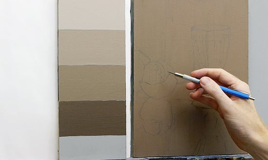
And why does it matter?
One of the most common colour questions I get asked on the Art School is “How do I choose the right colour to paint my coloured ground?”
But before I tackle that subject in more detail, I wanted to look at an often overlooked subject, studio wall colour.
To answer the previous question completely, you should be thinking of your studio space as a whole.
The colours that surround you in your studio space influence the perceptions of the colour on your canvas and are often the secret source to effective classical painting.
It isn’t as glamorous as the actual painting, however, getting it wrong can throw your eye out without you even realizing it…
So what colour do you paint your artist studio walls?
The first thing to consider is the type and style of paintings that you’re going to be creating in your space and then decide which colour will be most sympathetic to that.
What’s that I hear you say?
You’re on a journey of artistic discovery. How do you know what style you’re going to be painting tomorrow, let alone next month!!
Mmm, good point.
Ever developing styles, techniques & interests in your artistic career are to be expected.
So what I’m going to look at are general guidelines for developing artists, specific colour walls for the very focused amongst us and “Studio Shortcuts” for artists who occasionally want to try a new style without committing to a whole new colour scheme.
A simple rule of thumb
The darker the paintings you want to create, the darker the wall colour.
Let’s start with black.
Classical still life paintings
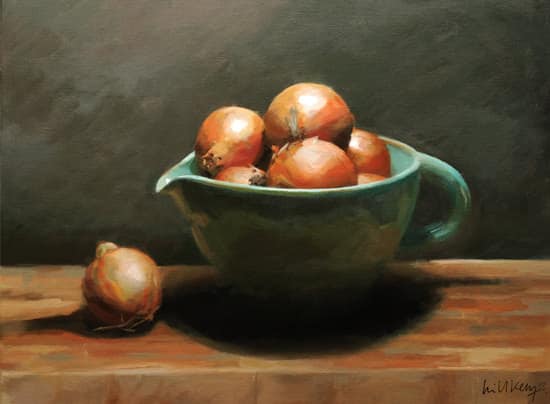
Onions, Acrylic on Canvas, Will Kemp, 2012
Why paint in a black studio?
Black studio walls are great because they stop reflected light from bouncing around your studio space.
If you are setting up a classical still life painting with a single, strong directional light source, black is the way to go.
If your aim is to work mainly from life it’s easy to create a simple, single light source without the walls bouncing light into your shadows and ruining the dramatic chiaroscuro effect.
Studio Shortcut: A workaround if you don’t like the idea of having a permanently black studio is to create your still life set ups within a shadow box.
This is simply a black box where you can control the light, without having to paint within a black space. You can make shadow boxes from black foam core and gaffer tape or hang black fabric on either side of your still life setup. You can vary the size of the box depending on subject size and available studio space.
Pro tip: Even the colour of the clothes you wear will influence the perception of the colour you’re painting.
By painting in a black shirt or t-shirt you stop any colour casts appearing unknowingly on your canvas, making it harder to judge subtle shifts in the dark tones.
You can easily test the effect of your clothes on your canvas by placing a white canvas on your easel and moving closer and closer to the canvas whilst wearing different bright colours, observing when you start to see any hue of that colour appear of your canvas.
Portraits
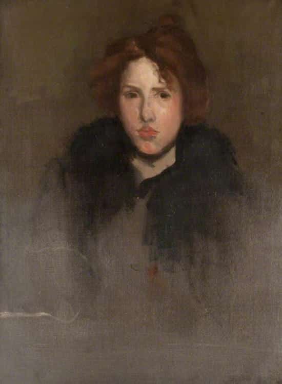
Unfinished study of a French girl, Oil on canvas, James Abbott McNeill Whistler, 1895-1896
Greys, greens, and grounds.
For portrait painters, a colour that goes towards a green/grey can be advantageous and skin tones will look fab against it.
A favourite of classical realist portrait painters (more readily available more in the US) is Mohegan Sage by Benjamin Moore.
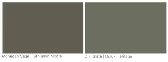
If you have a lot of natural light this will give you a nice tone, however en masse it can be a touch too dark for some studios. At the Angel Academy in Florence, the walls were also a dull olive green, and a good equivalent in the U.K is DH Slate by Dulux Heritage
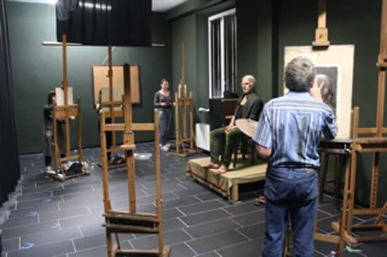
Figure painting studio, Angel Academy Florence, Italy
For a more neutral-cool grey, Benjamin Moore Sparrow is great and a good equivalent in the U.K would be Lead colour or Silt from Little Greene Paint and Paper Company.
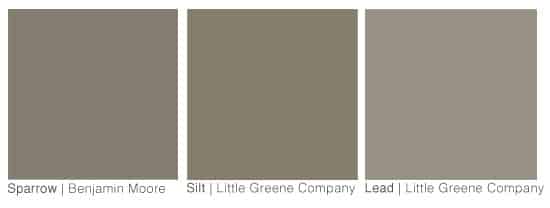
It’s a cool neutral grey but tends slightly more towards green than other greys which can look blue.
Having a slightly greener looking hue, looks better with skin-tones.
Having a neutral colour, or one that isn’t too highly saturated will also help prevent colour casts from the walls influencing the way you perceive your canvas on the easel. It helps you to keep anything from taking your eye in your painting.
When you look at the colour swatches above they are still quite dark in tone, but what sits very harmoniously against them are the ground colours I very often demonstrate with – Burnt umber/Raw umber and Titanium white mixed, in fact these ground colours are a good starting point for your wall colour.
Depending on the light in your studio, the colour when painted on your wall can look warmer or cooler and can vary drastically. More than you think, so I have always ended up customizing my paint so it’s just right for me and my studio space.
So what did I choose as my neutral coloured wall?
From past experience I knew I wanted a slightly lighter, more neutral tone that wasn’t as green, so customized French Gray by Farrow and Ball to be a little bit warmer and this works really well for me in my U.K studio space dominated by natural North light which is cool.

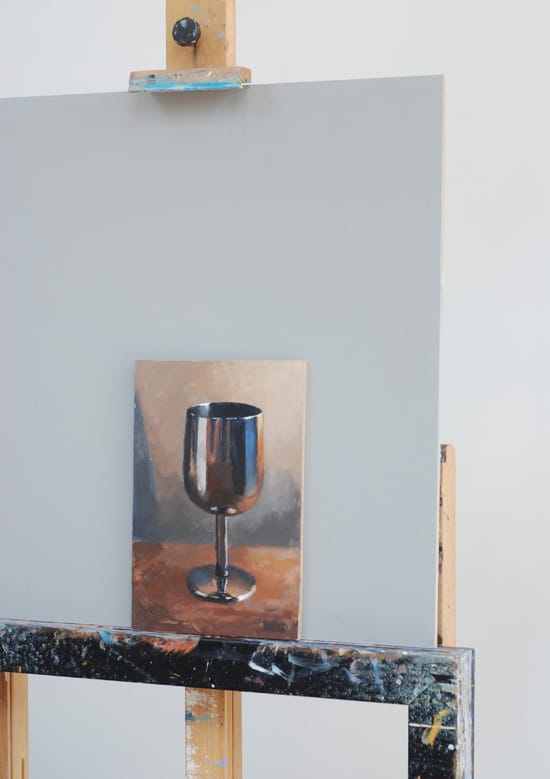
Studio Shortcut: The quick fix is to paint a large sheet of MDF board or Masonite with a neutral tone and then prop it on your easel, behind your canvas so you can get an idea of which colour you prefer.
Working from photographs, or contemporary paintings
White studio walls.
White gallery walls are an invention of the 20th century, in the National Gallery in London there isn’t a single white wall displaying the paintings.
Having white walls and ceilings will produce the most illuminated space, with light bouncing around the room surface and surrounding surfaces creating ambient, reflected illumination.
So if you mainly work from photographs, or abstract paintings this can be a lovely space to work within because it will feel light and airy.
You can also consider an off-white if you paint in sunny climates and have direct sunlight coming into your studio, as brilliant white can feel, just too white.
For a warm white with a hint of yellow try Benjamin Moore’s White Dove or James White Farrow & Ball

Pro tip: Often you’ll find yourself getting picky with the colours, as each environment is slightly different and the colour of the internal studio lighting can drastically change the perceived colour of a paint.
So often you need to tweak the colour yourself, I usually add in fluid acrylics from Golden as they mix into the paint easier.
On a personal note, if you do get direct sunlight into your studio and you have white walls, controlling the light that is bounced around can be problematic. It can cause background glare making the space too illuminated so your eyes adjust to this brighter light and seeing more subtle tones in the darks becomes difficult and tiring.
I initially painted 2 of my 3 walls brilliant white as I live in the U.K and wanted to have an illuminated space on either side of me with a more neutral colour facing me, as I not only paint realistic portraits but contemporary abstracts and the flexibility of being able to turn my easel to either backdrop has been fantastic… or so I thought.
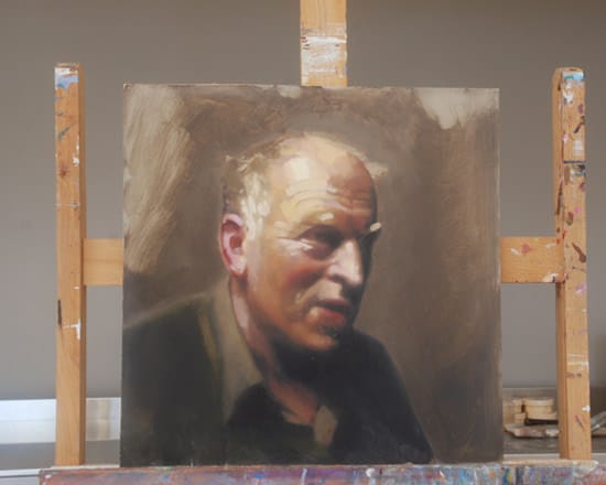
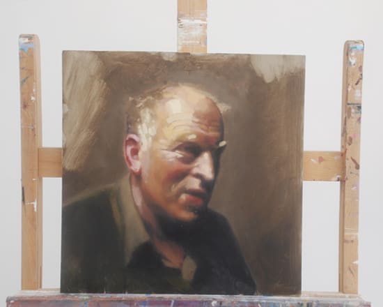
Through the winter this has worked well, however, during the summer I’ve noticed around 3pm the sun comes around to the glass front creating a glaring space for a couple of hours or so. On top of this, I’m finding I’m enjoying painting with the skylights behind me and facing the white wall more frequently than I first thought.
The solution would be to control the light coming in with diffuser blinds, soften down the brilliant white wall that I now find myself facing to a more neutral colour or to recline with a glass of Pimms and reflect on your mornings paintings rather than the thought of redecorating, it is the summer after all!
Impressionist
Earth colours
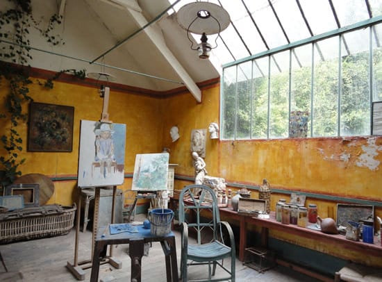
Monet’s studio at Hotel Baudy
Fear not colour lovers, you don’t always have to have neutrals as a backdrop. I suggest them because they make it easier for a beginner to judge colour mixing and subtle shifts in hue and tone. If you’re more of a colourful, impressionistic painter and your studio space is large enough that you won’t get any direct colour bouncing on your paintings then the more vibrant earth tones such as Yellow ochre can work equally well.
Which brings us neatly to our initial question:
“How do I choose the right colour to paint my coloured ground?”
The concept of painting your clean pristine white canvas a bright yellow before you begin to paint a blue seascape, can be a hard one for beginners to get their head around. But the same principles apply to your coloured grounds as your studio walls.
So here are a few of the most common questions I receive:
Do I always need a coloured ground?
The majority of the time, yes.
By preparing the canvas and removing the glare of pure white, you create a surface to paint on that is easier to judge tones and colours whilst quickly adding a mood to the underpainting.
However, there may be specific occasions when a white canvas is the best choice.
If you decide to use thin transparent glazes to build up a painting, in much the same way you would build up a watercolour painting, then having the white canvas underneath keeps the luminosity of transparent pigments (As a result of the light going through the transparent pigment and reflected off the white primer) it also makes use of the transparent nature of the paints.
N.B. Not all acrylic paints are transparent, check the paint label to see it’s opacity level as they vary greatly.
For example, the Pre-Raphaelites sometimes painted onto a white ground for applying thin transparent glazes to the face, however, if they made a mistake they did not paint over the area but scraped back to the primer and started again.
So yes, if you have a specific painting that you want a maximum brightest from a transparent pigment then go with a white.
A note for portrait painters
If you’re using the Grisaille technique to paint a portrait, the process can be a combination of a coloured ground and a white ground, albeit on a subtle level:
- 1. Coloured or toned ground
- 2. Tonal grisaille underpainting – here the whites that are added act as a mini area of white canvas, where you want the most luminous effect (so mimicking the white canvas example above)
- 3. Coloured semi-opaque glazes to build the painting up.
Why would you paint the canvas yellow, if the main subject is blue?
The coloured ground colour can change depending on the scene you are painting and the mood you are after.
If you wanted to paint a lighter, warmer more impressionistic feel landscape, a light Naples yellow coloured ground would be lovely because it would give the clouds a glow and the whole picture a feeling of warmth.
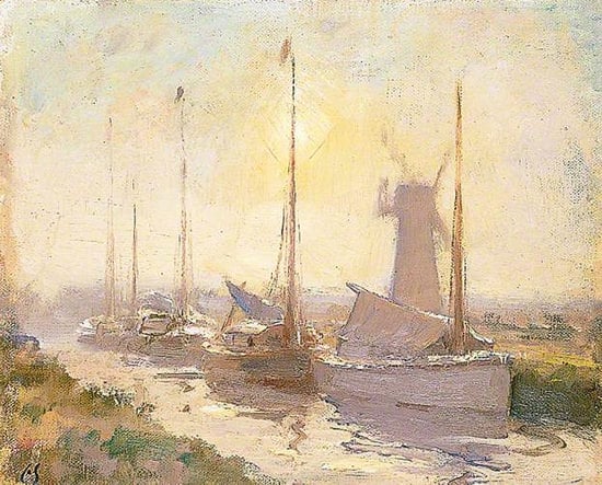
© Seago Estate, courtesy of Portland Gallery, London photo credit: Norfolk Museums & Archaeology Service (Norwich Castle Museum & Art Gallery)
The Yellow ochre is great for sunsets/beach scenes/ scenes with a glow of sunlight on them as the coloured ground shines through from underneath, if you’re after a cooler effect you can use a neutral grey colour (Raw umber & white) or a soft blue (Ultramarine blue & white).
The ground helps you to judge tonal values in your painting, pull the colours in your painting together and stop any accidentally left white canvas, so think about the general feel and mood you want to achieve from your painting and work from that starting point.
Why are some ground colours dull and muted and others bright and vivid?
It all depends on your subject, colour palette and mood you want to create.
If you’re painting a portrait you can use a muted ground such as Burnt umber / Raw umber and Titanium white mixed, so it is easier for you to judge skin tones.
Or you can use a dull green under painting technique called Verdaccio, this is similar to painting a Grisaille portrait but instead of using tones of black and white, you use tones of green.
Traditionally it was created from a mixture of Mars Black and Yellow Ochre. This was used in Renaissance painting, especially on portraits because you could then add subtle glazes of warmer red flesh tints over the top and the figures would ‘pop’ in contrast to cool green background.
Due to the green colour of the flesh at this stage of the painting it is sometimes called the ‘dead colouring’ stage of a painting.
Other mixes include Chromium Oxide Green & Mars Black & Titanium white, or Yellow ochre, Raw umber and Mars black. However, I’ve also found Green Umber (from Old Holland) can be used on its own to create a nice effect.
A coloured ground is always best if it’s a mid tone, so not too dark or not too light, however, it can be based on any colour that suits your work and palette.
Now your canvas is all prepared the only thing to think about is your colour mixing!



Thanks, Will, for this fantastic information! I’ve learned a lot but have a question that’s often concerned me:
What if your perfect painting hangs (in a gallery or its new home) on a different wall colour and with different light sources than those it was created among?
It may look perfect in the studio, but may not appeal to buyers in a gallery due to a change in surroundings, or people may dislike it once they get it home.
Just curious.
Congratulations on your Art School being two years old!
Hi Jennie,
Yes, it can be tricky as customers homes or gallery spaces are a very different environment.
Here’s a brief overview from the art studio lighting article:
So if you know of the specific wall colour where the commission will hang, paint a board with a colour close to that and place that behind your canvas as you paint (as shown in the silver goblet painting in the article)
Also, some artists who sell direct from their own studio have a display wall that is painted another (often brighter) colour so it can give clients a better vision of how the painting will look in their home
Hope this helps,
Cheers,
Will
Thank you for your very informative emails. I look forward to getting them
I have a very small apartment and paint in my bedroom with white walls. Seems to work okay although I do get a greenish glow from the foliage outside my window.
Enid
Hi Enid, pleased you enjoyed the article, interesting about the green hue from the foliage, just shows you how colour can bounce into a room.
Cheers,
Will
Would it make sense to paint the walls a warmer shade of white (pinkish even) to counteract the greenish tint coming in from the foliage?
Hi Leslie, personally I wouldn’t as I find a pinkish tone harder for judging skin tones against.
Cheers,
Will
Thank you for your generosity
Carenza
You’re welcome Carenza,
Will
Fascinating!
I have a gallery specializing in traditional Nepali & Tibetan Buddhist paintings.
My gallery’s walls are painted the same yellow ochre in Monet’s studio, it really makes the brilliant jewel tones used in the traditional paintings really pop!
On the other hand I have my home’s walls painted similar to Benjamin Moore’s Sparrow – hides the ‘grubbies’ (I have 2 toddlers) & flatters all skin tones.
Hi Beatrix, pleased you enjoyed the article, sounds like a fab colour for your gallery walls.
Cheers,
Will
Hi Will, Congratulations on your second birthday! Thanks for the great information. I love the idea of colour boards and “night” box. :-P I’ll have to do something like that because I painted my craft room a light, warm beige, which seems to be great for crafts, but I’ve noticed a yellow hue in photos taken in the room. :shrug: I don’t know where the yellow comes from, but think the boards and box will be a great help. I was so excited to see another email from you, I couldn’t wait to read it and wasn’t disappointed. Have a great day! :-)
Hi Heather, what a lovely comment, pleased you enjoyed the article. It’s amazing how even the slightest tint can influence the space. Have you tried taking photos with the lights off? As if you have any incandescent bulbs they can produce warm yellow and orange hues, and these might be the culprits to your yellow hue in the photos.
Cheers,
Will
My thoughts exactly Will. I discovered the “yellowish” hue in my photos even more dramatically when I got a much better camera for Christmas a few years back. I do exactly what you suggested, turn off the lights and rely on the natural light when taking a photo indoors. Thank you for all your knowledge. I too am delighted when I see your name in my inbox :-)
Thanks Will!
Maria.
Thanks Maria, oh good to hear just working with the natural light helped your photographs, and pleased you enjoy the email updates!
Cheers,
Will
How about talking on mat colors for your painting some time? Susan
That’s really interesting Will —maybe something we don’t give enough thought to.
Cheers Sonia,
Will
Hello Will,
Once again an informative e-mail. Thank you. I’m going to try your studio shortcut using a large coloured board behind the painting. I often paint outside on my airy back verandah and am easily distracted by areas surrounding my easel. Your hint should help keep me more focussed.
Best wishes
Helen
Hi Helen, you’re welcome, a toned board can be amazingly effective just to stop any colour distractions behind you and to focus on the painting, looking forward to hearing how you find it.
Cheers,
Will
Hola Amigos
Les escribo desde venezuela deseandoles lo mejor Como me gustaria que estos tutoriales de pintura fueran en Español les digo esto por que no se Ingles
Hola Abel,
lo siento, sólo tiene cursos de Inglés, pero voy a poner en mi lista de tareas!
Will
I’m writing from Venezuela wishing you the best as I would like these tutorials in Spanish.
Hi Abel, sorry I only have courses in English but I shall put it on my list to do! Will
Hi Will first i must thank you for the color course it has helped me so much i paint landscapes with a lot of trees mostly ” a lot of greens ” in summer what ground color would you say to use thanks Sue D ps please more on landscapes trees please.
Hi Sue, pleased you’ve enjoyed the colour course, maybe we need a ‘mixing green masterclass course!’ a dull brown or muted green will be a perfect ground to start from (you can also experiment using a muted pink, as this can work really well to make the greens pop)
Cheers,
Will
Thanks Will, If my landscapes ‘trees fields’ include sky would a muted pink be better than a muted green or brown. i’m thinking brown or green in a sky wouldnt look to good with blue sky although it would be ok with stormy sky am i on the right track or have i LOST IT or is it all personal choice. Hope you are getting lots of ice cream in this hot weather, Thanks Sue D
Hi Sue,
The muted pink would work the best because you often see subtle pink and purple tones in skies so it would really help to bring the painting together. You’ll be glad to hear my ice cream to food ratio has increased in the last couple of weeks!
Cheers,
Will
Hi Will
Thank you for writing this article, it is very informative and I am sure it has helped many others thinking the same thing as I.
Tony
You’re welcome Tony,
Pleased you found it informative.
Cheers,
Will
Hullo Will
Congratulations on your Art school 2nd Birthday. Thank you for your article it is very informative . I am in the process of setting up a studio in my garden . I paint abstracts mostly . I guess I have to see the amount of light that comes in and go from there .
Leen
Thanks Leen, pleased you’ve found the article informative, yes, judging the amount of light in the space first is the way to go.
Cheers,
Will
Many Congratulations on 2nd anniversary of your studio!
Always learned something new from your your articles, thanks for sharing.
Cheers!
Thanks Armaan, kind of you to say so and great that you’re learning from the articles,
Cheers,
Will
Congratulations for second birthday of your art school!
From your article, my most doubts were cleared about studio and back ground color set-up. I am looking forward to read interesting articles like these.
Thanks
Madri
Thanks Madri, pleased you found the article helpful.
Cheers,
Will
This is a subject I’ve always wondered about as in my first and only acrylic class, the instructor painted the whole canvas a greenish shade much like your midtone samples above for wall color and then he drew his nude with white chalk and continued to paint in the subject. I never did get the chance to ask him why he used the green. As time went on I’ve seen other artists paint their canvas and wondered why and why they chose the color they did. This information is extremely helpful in answering those questions. I do wonder though what difference it makes if you paint the canvas first whatever color, if you continue on and use a number of opaques? Don’t they negate the underpainting?
Thanks Will
Terry
Hi Terry,
The ground colour is used to establish a colour tone and midtone to the canvas.
The underpainting is used as as a guide to judge your eye when assessing tones and hues, and was traditionally used for thinner applications of paint to be applied on top so you use the underpainting to your advantage and parts of the underpainting are visible in the finished painting.
If you applied thick opaque paint over the entire piece, then you could argue that you wouldn’t need a coloured ground, but it can still be very helpful when starting the painting to judge the tones and colours you’re working with.
The best way to experiment is to make up some small postcard size boards with a variety of coloured grounds, one white, a grey, a dull green, a black.
And then paint the same image on each board. It can be very imformative to find your own personal preference and to see how the ground colour can affect your colour perceptions of an object.
Hope this helps,
Cheers,
Will
Hi Will,
Your website is really fantastic..esp. for info. on lighting in the studio…and light in general. Thank You!
Thanks Judy, pleased you’ve found the articles helpful.
Cheers,
Will
Dear Will. Am starting a gothic style picture in oils – the idea is it should be in greenish grays And silver (Church yard, cyprus trees etc). I have been reading through your ground suggestions. Good idea for postcard size experiments. But am I perhaps being conservative thinking the ground should be greenish?
No Pimms to assist inspiration here in SW France. But a nice fresh white wine at 5€/bottle! Thanx for all your excellent teaching. Vicky
Hi Vicky, I think the greenish ground should work really well for our Gothic style picture. It’s got a nice coolness that will work well with the silver tones.
A fresh white wine sounds perfect to me, enjoy your painting!
Cheers,
Will
What colour is the floor of your studio?
In my new studio, I was thinking of having terra cotta tiles. Would this impact on say portrait painting? If I do decide on terra cotta tiles what colour should the walls be?
Your tutorials are very thorough and informative. I am an experienced painter but I am not a natural colourist and have to work hard on this.
Hi Anna,
Lovely to hear from you, my studio floors are a neutral grey/brown colour. Your terracotta tiles won’t really alter the painting on the canvas because any bounced colour cast from the floor would be around the bottom on the room, and not canvas height. And this would only really be apparent in bright sunlight. Personally I would go for a grey neutral with terracotta.
Hope this helps,
Will
Hi Will
i just discovered your fantastic website while doing google searches for redesigning my basement art studio/sewing room/storage area. (One room…so many uses.) Your article on lighting is now saved as a favorite and i am signing up to recieve updates. Thank you for your generosity. The sheer amount of information you are sharing with total strangers is incredible. Thank you!!!!
Hi Mary,
Thanks for the lovely comment, really pleased you’re finding the articles helpful, good luck with your studio.
Cheers,
Will
I have been painting still life setups recently and love the dramatic light. Would I paint the inside of the box setup black or could I use the color for portraits?
Hi Debbie, you could use either, the black will just give you darker shadows. You can always paint the inside edges of the box black and then paint separate ‘sheets’ of cardboard different colours that can slot into the box and act as backdrops to your still life setups.
Hope this helps,
Will
I just found your website, and as a novice, I find your info VERY helpful. I am starting an acrylic form a photo of my 7 yr. old granddaughter at her easel working, so am using lots of green grass and flowers surrounding her. Need help with ground color and flesh tones. What do you suggest?
Hi Sharin,
Pleased you’re finding the website helpful in your paintings. For your portrait painting a muted green (similar in saturation to the greens shown in tne article above) will work well, as it will give a good background base for the grass, and compliment the flesh tones.
Cheers,
Will
Hello Will
The pic of Monet’s studio is an eye opening boon!
A planned european winter gallery tour has been postponed due to the mrs not wanting to leave the island until her doc thesis is in, sooooo to facilitate this (her study) I’m packing up the kids for 14 days and going to sit on a hill (1800m above sea level) outside of Kathmandu and paint/draw himalayan sunrises and still life from an organic kitchen garden.
(Namo Buddha Resort for your students who may be looking for a himalayan painters retreat in rustic comfort….do not be fooled by the word ‘Resort’!)
Anyway, the Yellow ochre and blue trim of Monet’s studio is reminiscent of the inside of a Tibetan Gompa so it would set the scene on return home for my ongoing himalayan inspired lanscapes and general bright still life work.
You never seem to fail to you finger on the pulse!
regards from Oz
john
ps: any info on frames choice,colour etc and frame making lurking in the vault?
Hi John,
Nice to hear from you, sounds like a fascinating painting trip with some amazing Gompa colours as inspiration!
I’ll add a ‘how to frame a painting’ to the list of articles, I don’t currently have any on the blog.
Cheers,
Will
I have been doing some small still life paintings in oil on black gesso ground. I love painting on the black gesso, but I read somewhere that one should not paint on black ground as the painting will eventually turn very dark, because oil paint is transparent, and the ground will become more apparent as the painting cures. Do you know if this is true?
Hi Peggy,
Oil paint does become more transparent with age, so it depends on how thick the application of the oil paint is to how much of the black gesso will show through in the future. If you’re painting quite thick opaque colours you’ll be fine, it’s only really becomes apparent if the painting was constructed using thin glazes of colour only.
Hope this helps,
Cheers,
Will
So enjoyed your article. It created a new awareness!
I am leading a small committee for a nonprofit gallery with about 55 different artists displaying work. We are in a beach community and much of the art reflects that and other tropical subject matter with the majority being watercolor media with some acrylics, pastels and photography.
In our remodeling process, about to begin, we have opposing ideas for walls and ceiling color. Currently, in old irregular dropped ceiling, we have a red- violet color, cream walls and a dark nondescript indoor outdoor carpet. ( The RV was picking up a color in the carpet when it was fresh.
A big discussion going on regarding choices: make the ceiling a charcoal, mid tone grey blue, or white? An architect suggested painting one wall a dark neutral…greyed green…. and the other white… the dark colors will break up the long commercial tunnel feel and the dark ceiling will also open up the space.
What are your thoughts about dark colors opening the space?
The anticipated carpet is again the indoor outdoor and a grey with blueish tones and charcoal or dark this time.
Ceilings dark or light, walls dark or white, or one of both?
Would appreciate your comments and reaction.
Hi Joan, so pleased you enjoyed the article, and really great to hear your space is getting a revamp.
I can imagine selection by committee is tough when deciding wall colours! It’s hard for me to offer any specific advice on tones that would work best for the space as the lighting conditions place such a huge role on which colours will be the most effective.
For displaying work though you can afford t
o go with stronger colours on some spaces. You might find this article interesting on the diifferent wall colours that a hanging space can handle.
Hope it helps and good luck with the gallery space.
Cheers,
Will
Hi Will,
Thanks so much for yet another enlightening article! I have recently taken a few photos of city scenes at dusk. I love the effect when the sky is still a rich blue but the lights have come on and are shimmering yellow and gold – as in Van Gogh’s cafe scene. I like working with transparent glazes as this seems to be the best way to get the sky to “glow” and the lights to “shine”. But what colour ground would be best to use in this case? Is it better to paint the ground with transparent colours? Also, where should the ground colour come on the value scale? Any guidance would be really appreciated!
Alles Gute aus Stuttgart und frohes Malen!
Judy
Hi Judy,
I would go for a yellow glow of a coloured ground such as a yellow ochre, or a naples yellow. The tone of the ground depends on the tones within your painting, but yellow ochre applied thinly on the white canvas is a nice base for glowing effects. Have a look at this demo to see an example of the shade.
Cheers,
Will
Thanks Will!
I’ll give it a go. By the way, I’m working through your Colour Mixing course and love it. The colour combinations you suggest there are super.
Have a great rest of week and lots of fun painting!
Judy
You’re welcome Judy, really pleased you’re enjoying the colour mixing course.
Cheers,
Will
Thanks for your detailed explanation for camera operation, at the moment I have a Canon A4000 general purpose digital, I think I need to upgrade to an SLR now that I have some understanding, fot the first time!, of the different settings, and how to use them.
Could you posibly do a piece on taking photographs of our own artwork, have difficulty with setting the pieces up, getting the right focus, then cropping the image to make it look good (in my case that would take some doing). I am sure that I am not the only one of your students having these problems.
Thanks
Chris
Hi Chris, pleased you found the article helpful and now have a better understanding of how a digital SLR camera works. I’ll add an article about photographing your own artwork to the list!
Cheers,
Will
Dear Willy
Nice to contact you again.By the way,I was watching some old emails and saw one of your paintings, Onions by acrylic.
I am persian and we usually eat lots of pomegranate,and may not be as usual in England,as Iran.
these fruits red color in your above acrylic painting ,are not onions,rather there are pomegranate.If it has been an mistaken,I only wanted to adjust it for your later references.
wish you best happy marry christmass
ardeshir
Hey Ardeshir!
Great to hear from you. Thanks for your kind Christmas wishes, they do look a bit Pomegranates but where defiantly onions, as after I painted the still life Vanessa made a lovely soup!
Cheers,
Will
Your on-line articles are extremely helpful and will be very helpful when I move later this year and set-up my studio art space.
Thank you!
Kathryn Appice
Pleased to hear you’ve been finding them helpful Kathryn, good luck with your new studio setup.
Cheers,
Will
So glad I stumbled onto your post. I do a summer show in Laguna and am trying to decide the color for my wall which is basically outdoors, so your article was very helpful.
Pleased you found it helpful Lori,
Cheers,
Will
Will – choosing the colour for the studio walls really set a cat amongst the pidgins on a number of levels. Research led me as far as an Alan Lawson interview which discussed painting from life against from photos. Excellent interview but confronting for the non academically trained
This led me back to Vincent and Gauguin’s discussions regarding working from imagination or from life/observation which led to Emile Bernard’s idea to paint with the palette of the impressionists and draw like the Old Masters. This is an important idea when teaching children… classic drawing skills but colour to engage!
It all ended with a studio painted with a mid tone grey green wall to paint against and near white but with a touch of blue on the other walls, thus in a way following your idea of a multi purpose space in terms of subject.
I am of the opinion now that whilst I’m not at this point up to dramatic light and dark work, (the studio is also not big enough for a human model) a painting looks better against a mid tone wall regardless if from a photo, imagination or life! I will make a black box for small Still Life though!
your interest in the Old Masters and abstract art does provide a nice balance for students to note.
cheers
Good one John, sounds like a good decision on the colours and yes a black box is very handy for those darker compositions.
Cheers,
Will
Hello Will thanks so much for your site and information. I’m into pop art with really bright colors such as Teal , Reds and Portait pinks as my go to. I like my paintings opaque for the most part. What would recommend as a ground for that? For the most part i have just been using a white canvas with gesso amounting to two layers. Cheers
Hi Randy, if you’re doing opaque pop art you don’t really need a coloured ground because you would be completely painting over the ground colour, so I would just work onto the white canvas.
Cheers,
Will
Hey, very interesting article. I am a self taught realism portrait artist from New Zealand. I started painting full time when I was 17 and 4 years later I am finally renovating my art room to help with colour mixing and lighting. It is a little north facing room (like south in the northern hemisphere) about 6 square meters. I work mainly from photos (on my monitor) as it’s hard to get people to sit for 50+ hours for me! What sort of colour would you recommend I paint/wallpaper my walls?
Thanks for your help!
Rebekah
Hi Rebekah, I would go through the different colours recommended in the article, but it’s an entirely personal choice which colour would suit your space.
Cheers,
Will
Hi Will
It’s great learning from you. You are a great teacher. I am just a kid but very excited to paint.
Arnav
Thanks Arnav, pleased you’ve been finding the lessons helpful.
Cheers,
Will
Hi Will,
i am about to paint the studio and and fell on your article. I have a question regarding the wall paint finishes: Do you think it matters? between flat,eggshell, satin, and semi-gloss and high gloss?
Thank you!
Celine
Hi Celine, I’d tend to go for a matte finish to prevent any reflective glare from the walls onto your canvas.
Cheers,
Will
Hi Will,
Love your classes! I am in the process of starting my own studio. There is one wall of windows at the end of the long part where the door is. The room is long and narrow like a rectangle. I was thinking I might paint the wall at the end at the other side of the rectangle from the windows a dark grey/black with the blue undertones. The ceiling would be white? The long sides of the rectangle walls I was thinking a lighter blue grey. What do you think?
Hi Denise, nice to hear from you, it depends on if you’re using different areas for different setups (dark background for old master still lifes) I’d usually go for a neutral grey or a muted green-grey towards putty, clay which works well against skin tones.
Cheers,
Will
I may have missed it in the comments, but do you have the paint values at the ready for tweak you did to the Farrow and Ball French Gray? I like your custom color.
Hi Deb, no, I just added a little bit of warmth to neutralise the green.
Cheers,
Will
I think this is extraordinary detailed information on how surrounding color directs your sense of color, how light is absorbed and reflected, even the color of your clothes influencing color casts. Amazing information that you share so brilliantly. Glad I stumbled on to this site kvetching about Farrow and Ball’s French Gray for my office.
Really pleased you found it helpful Deb, it’s a lovely colour to work in.
Will
Very helpful. Thanks Will.
I have a periwinkle blue room in my studio at present. It’s a bit dark at times but I do find it keeps the shadows down.
Feels a bit as if I am outside too which is always nice.
Thanks Debs, pleased you enjoyed it.
Will
Hi Will, Thank you for this informative article. I’m currently going a bit crazy trying to figure out a color to repaint my small in-home studio walls. I definitely want to go a dark neutral (currently have mid-value gray green/blue), but I am not liking the grays with green undertones (or green grays) I’m finding. Although I do a lot of portraits, I work mostly in b&w (charcoal) and when I do use color is often quite muted. My question is: would blue gray (or gray with blue undertones) walls work? I am gravitating to those colors but I don’t know if that’s a sensible or appropriate choice. The floor in my studio is blue gray tile so the green grays look too disparate. Thank you for your help. ~Dawn
Hey Dawn,
“My question is: would blue gray (or gray with blue undertones) walls work? I am gravitating to those colors but I don’t know if that’s a sensible or appropriate choice.”
Yes, that would work, it gets down to a personal preference really. If you’re working with charcoal, the subtle grey with an undertone of blue would still work well. Benjamin Moore have a great range of greys that you can look at the subtle shifts between them.
Also, often a slightly lighter grey than you think will work as when you paint the colour at scale (in comparison to a small swatch) it will tend to feel darker.
You can also look at the Light Reflective Value (LRV) that they list. A LRV measures the amount of light that reflects from a painted surface. (Here is an image to give you an idea of the differences on the scale)
This can give you a measure that you can judge how light or dark the colours are against each other.
Will