

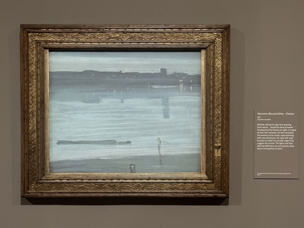
James McNeil Whistler, Nocturne Blue and Silver – Chelsea, 1871, Oil paint on wood
After visiting the Whistler exhibition at Tate Britan, the Nocturne series really captivated my attention, and I thought it would be an interesting subject for looking at compressed tonal ranges.
This painting demo is based on Whistler’s Nocturne Blue and Silver – Chelsea, 1871, Oil paint on wood.
For this study, I’m going to use a grey tear-off palette rather than white. This will give us a more neutral reference when mixing our colours, making it much easier to judge how light or dark each mixture really is.

I’m also going to prepare the wooden painting surface with a dark grey-toned ground. Whistler worked on a wooden panel, so this will be a similar smooth surface.
I want the ground to sit somewhere in the middle-to-dark range of the finished painting. Starting on a toned surface immediately removes the glare of bare white canvas or wood tone and makes it much easier to judge the subtle lights and darks so important in Whistler’s Nocturnes.
You can use canvas instead of plywood, but a smooth panel is particularly useful because it encourages thin, fluid paint applications.

For the dark grey ground colour, I’m mixing Raw Umber with Ivory Black.
- 2 parts Raw Umber
- 1 part Ivory Black
I’m using Winsor and Newton student grade paint for this because it’s got a smoother consistency than the golden heavy bodied acrylic or oil paint, so you don’t need to dilute it as much with water for applying it on.
The exact colour isn’t critical; what matters more is getting it dark enough.
I then lighten the mix slightly with a white acrylic gesso and paint this on the board in a couple of thin layers.
Drawing Out

I want the board to be dark enough that I can still see my drawing, but it’s more of a stain-thin application than a solid covering.
You can see some of the board showing through.
Once the ground is dry, I lightly indicate the basic structure of the composition using a FW Refillable paint marker, from Daler-Rowney.
I’ve filled it with high flow Raw Umber from Golden paints. (High Flow paint is a similar consistency to an ink) This gives me a fine, controllable line without introducing a heavy dark drawing underneath the painting.

What I really like about the FW paint markers is that they have interchangeable nibs, and you can put different inks or acrylics into them.
Whistler would not necessarily have approached the painting with this kind of clearly drawn construction. His working method was often much more fluid and painterly. I’m introducing the drawing stage because it makes the progression easier to follow in a tutorial.
Keep the drawing extremely simple.
Look for the main horizontal divisions, the shoreline, the distant architecture, the larger masses.
At this stage, you are creating a framework for the tonal arrangement, so I’m avoiding drawing every detail.

Oil Paints

I found this article listing the pigments identified in the Nocturne paintings, which was a brilliant reference point.
Lead white and bone black are found everywhere, with traces of vermilion, madder and a dull red ochre. Synthetic ultramarine, Prussian blue and madder were added to make the imprimatura that forms the cool blue foreground, but there is Prussian blue alone in the paint of the sky. The water includes cobalt blue and a distinct red lake from the madder, this blue giving it a greener tone.
The lights on the farther shore were applied with a pale cream paint made from lead white and yellow ochre, with added red lake, possibly that used for the water, a transparent red ochre, and possibly gamboge, a transparent yellow pigment use in oil paints at this time, but previously more used for watercolour painting.
- Lead white
- Yellow Ochre
- Gamboge
- Vermilion
- Madder Lake
- Red Ochre
- Cobalt Blue
- Ultramarine Blue
- Cobalt Blue
- Bone black
These are the equivalent colours I already had in the studio:

From L to R: Titanium White, Yellow Ochre, Indian Yellow Red Shade, Permanent Alizarin Crimson, Cobalt Blue, Prussian Blue, Ultramarine Blue, Ivory Black
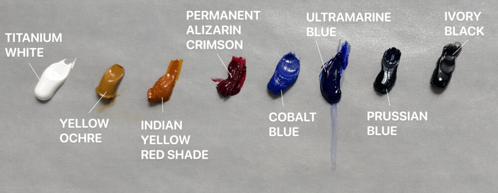
Some are quick-drying oils, but at this scale, it won’t really matter if I intermix them.
Brushes
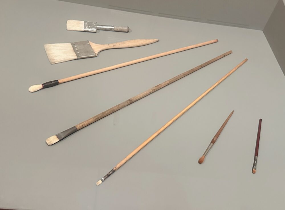
Here are a collection of some of Whistler’s actual brushes in the exhibition

I used a hog brush from Cornelissen, series 44 size 6. A softer synthetic from Rosemary & Co, Evergreen Filbert Size 6. And a super small 2/0 studio synthetic from Jacksons.

I also have a wider goat hair brush, usually used for watercolour, but any larger flat brush would work.
Establish the large tonal masses

From L to R: Titanium White, Indian Yellow Red Shade, Prussian Blue, Ivory Black
Before thinking about individual objects, I’m going to simplify the scene into a few broad areas of light and dark.
I start with a limited palette, just using 4 of the colours.
- Titanium White
- Indian Yellow Red Shade
- Prussian Blue
- Ivory Black
I use Ivory black, a touch of Prussian Blue and White to mix a cool, muted blue-grey and begin laying in the sky and water with thin paint. It’s surprising how differently the colours read when you paint onto a darker ground than when you work on white or even a lighter grey surface.

I’m using the hog brush to paint in a scrubby, thin layer.

You can start to see, in the reflection in the paint on the bottom half of the painting, how I’ve now introduced more medium to thin out the paint. I’m using a odourless mineral spirit (OMS) called Gamsol from Gamblin to dilute the paint.

Gamsol Odourless Mineral Spirit (OMS)

Try squinting at the reference. You should begin to see the subject less as buildings and water, and more as connected abstract shapes. I bring the fluid wash down to the main areas of the water.


Here’s a quick shot of how my palette looks.
Working from the dark values on the right to this brighter turquoise colour on the left, which is going to be more for the water area where there’s a lighter value, and here it shifts slightly more towards a turquoise. For this, I add a small amount of the Indian Yellow Red Shade, which is a really highly tinting transparent pigment, so you only need a small amount for it to shift the colour quite a lot.

You can see this thicker paint building up on top of the more fluid paint underneath.

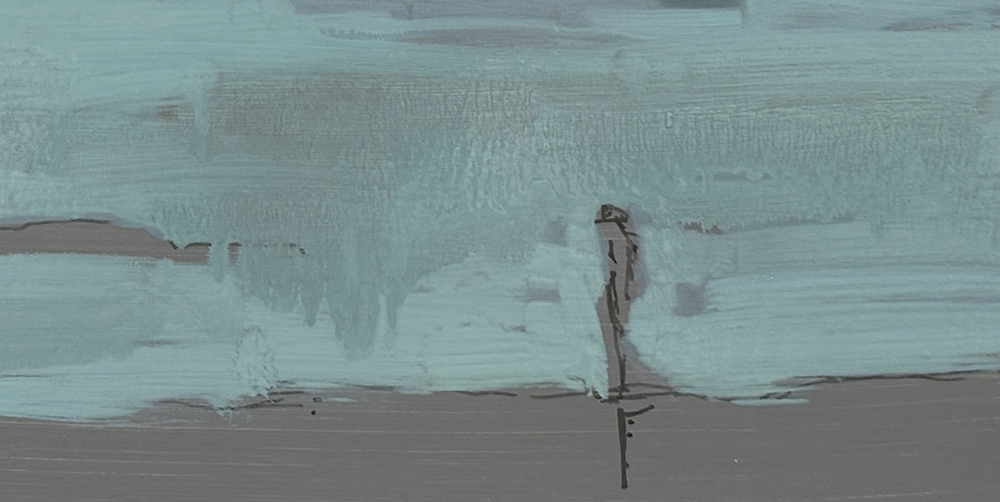
I then decided to push the paint’s fluidity a little further. Whistler often used his own medium recipes that became known as his “sauce”, It was a mixture of turpentine, linseed oil and varnish, a medium that helped him create those very thin, translucent paint surfaces.
So I added plenty of Gamsol to the mixture and brushed it on quite freely. If you were concerned about the strength of the paint film, you could add a couple of drops of oil as well. Here, though, I was really just experimenting to see what effect that extra fluidity would give.
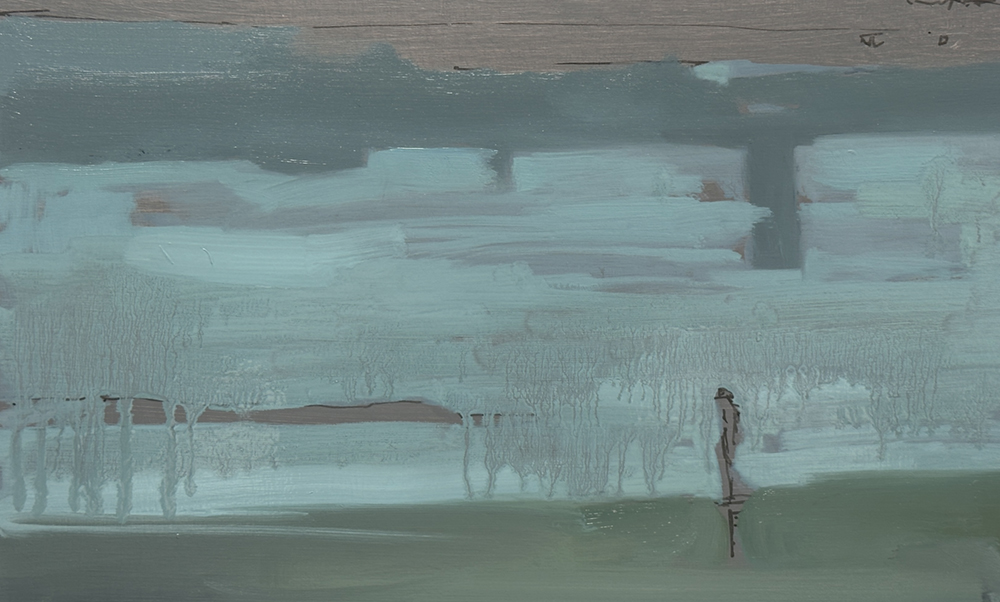
You can now start to see the paint running down the surface. I’ve probably pushed the mixture a little too far, but sometimes that’s useful. By taking it beyond the ideal consistency, you get a much clearer sense of where that balance actually is.
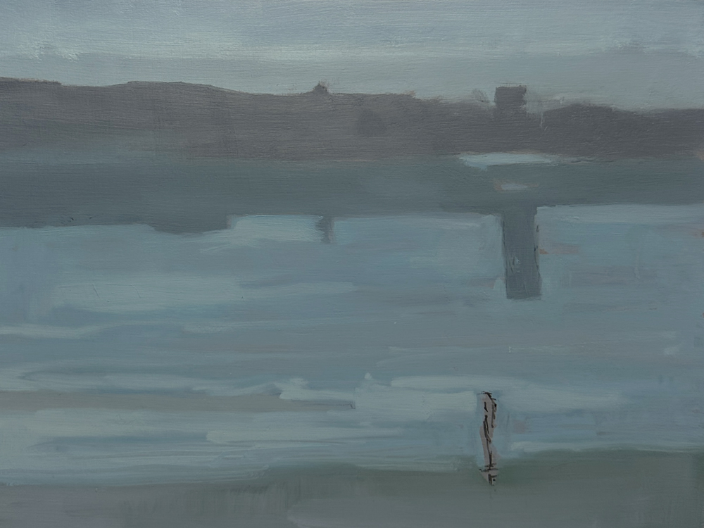
I’ve now worked over the surface a little more and blended some of those colours together. I stepped away for a while to let some of the odourless mineral spirits evaporate from the surface, then came back in with the softer Eclipse brush to soften a few of the edges.
I still want to retain that sense of translucency, with glimpses of the grey ground showing through in the water, but I’m getting a much clearer idea of how the value structure sits within the painting.
At this stage, I’m going to leave it to dry and come back tomorrow to continue working on it.
Day two
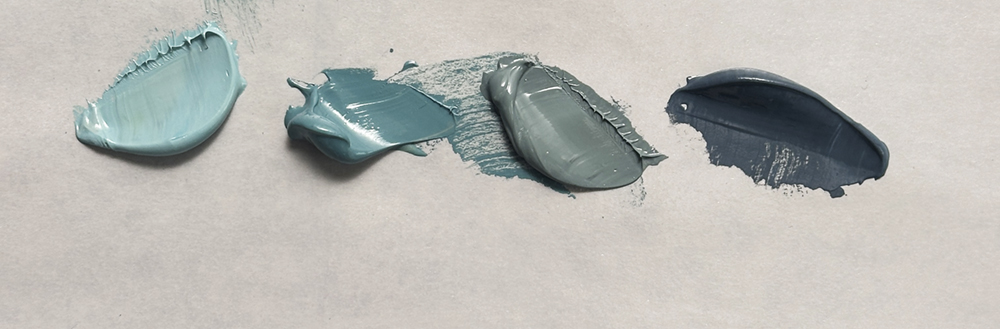
For today’s session, I’m continuing with this limited palette because I’m really enjoying working with it.
I’ve pre-mixed a few values to make things a little easier. Starting on the left is the lightest colour for the water, and over on the far right is the darker shadow colour for the buildings in the distance.
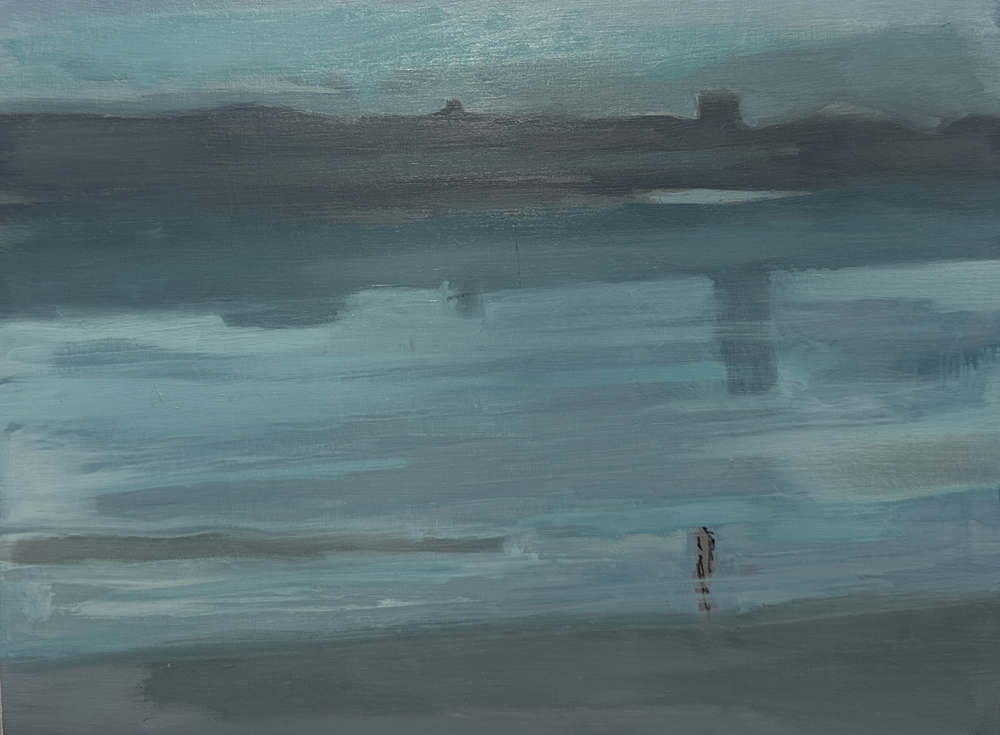
As I start to build the surface, it feels a bit blocky; it has too many individual marks rather than that lovely translucent quality Whistler’s painting surface has got.
I swap to the wider brush and start to blend that over, with quite a light application, to blend some of those surfaces together.
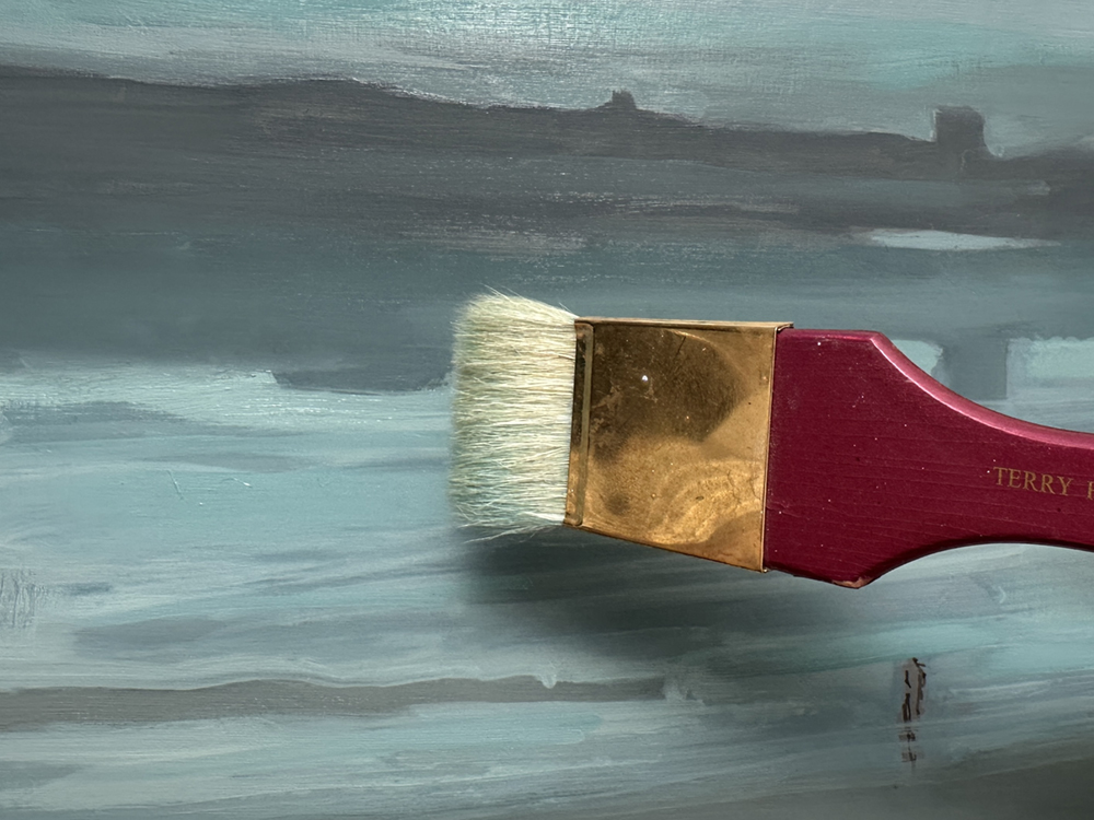
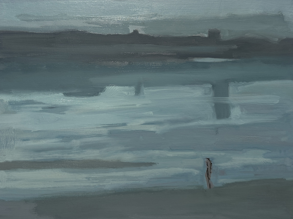
This feels so much better, the colours are working together so I can now go in with some of the details. I start with the figure in the foreground, then build up the reflected lights in the water.
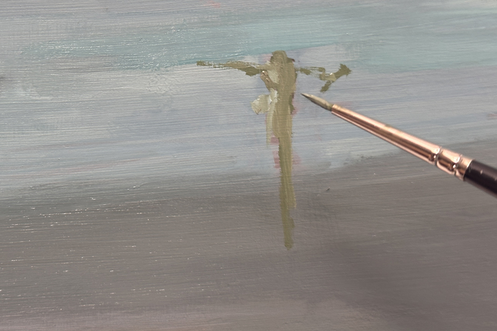
Here I’m using the small round. I’ve added more Indian Yellow to the mix and introduced Yellow Ochre as the fifth colour to the palette.
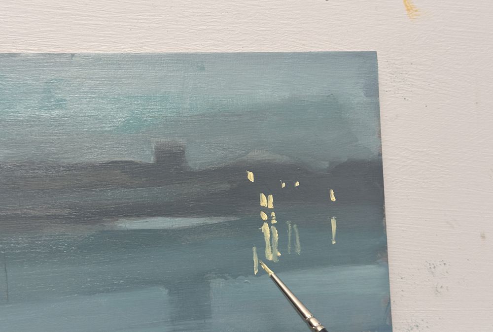
With the same small brush, I’m now painting in the highlights. I’ve added more white to the mix, along with Indian Yellow and just a tiny touch of Yellow Ochre, which creates this lovely warm colour.
The key here is to vary the paint handling. I want a slightly thicker, more solid mark for the lights on the buildings, then a softer, more translucent mark directly underneath to suggest the reflections in the water.
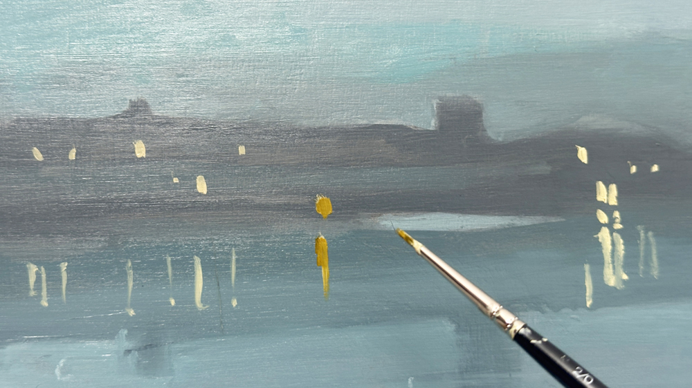
The reflection of the sun is a mix of Indian yellow-Red Shade with white, and it has become such a great colour for this painting. I didn’t think I’d be able to get the highlights and a lot of the other green shifts, just with this one yellow, but it’s got this nice golden glow to it.
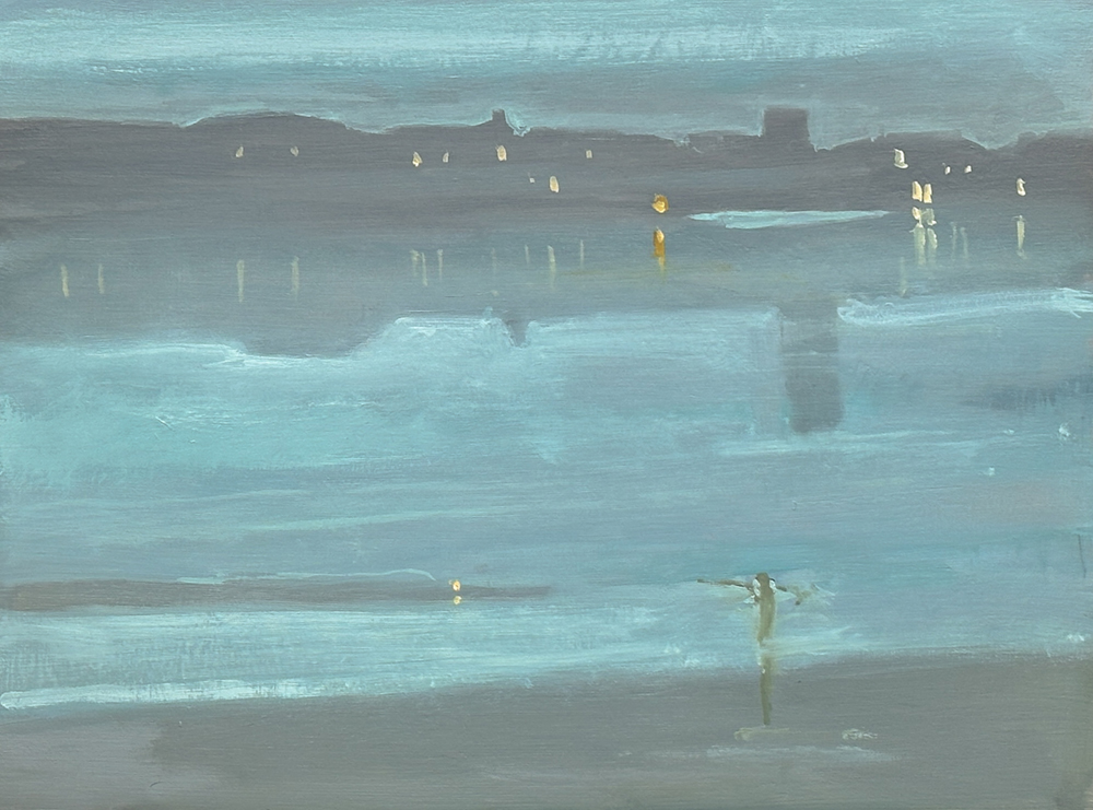
So here’s my finished version of the Whistler!
I’ve added a few final highlights, including the small light in the water and a few touches along the edge of the buildings.
Looking at it now, I still don’t feel I quite captured that sense of softness and haze to the paint surface.
If I painting it again, I might experiment with Zinc White rather than Titanium White.
Zinc is more translucent, so it could be useful for laying a very thin veil over parts of the painting and gently knocking things back. That might help create more of that misty, luminous quality without losing the underlying colour and value structure. What was interesting was that I found that I painted 90% of it with just those four original colours.
That’s also part of the value of doing a study like this.
You start to understand not only what the painting looks like, but how the paint handling contributes to the mood. And I think that subtle, veiled quality is one of the things that makes Whistler’s Nocturnes so beautiful.
I really hope you enjoyed the lesson and found it useful to see how the painting developed, including some of the experiments along the way.
Hopefully it’s given you a few ideas to try in your own work, particularly with limited palettes, translucent layers and keeping the value structure simple.


Thanks for this, I’m looking forward to trying it. Wanted to let you know there’s a tiny typo in the description of the original painting, 1671 instead of 1871.
Good catch, thanks Jane.
Thank you for sharing your art knowledge so freely with us novices…really appreciated
My pleasure Penny, hope you find it helpful.
Will
Thank you for this, Will. I have been keen to try a nocturne not complicated by city streets, buildings and lights. This one is beautiful.
Good one, Jenny. Yes, keeping the majority of the colours within a compressed tonal range, so the lights can really shine, can make all the difference in a nocturne. (Also, you might be interested in this moonlight step-by-step tutorial)
After 3 days of a nor’easter here in New England, painting a subject with this tonal range and tranquil mood seems perfect timing. I am looking forward to the new experience of painting on wood and will use zinc white to mix just to see if it make a difference as you suggest, and perhaps try scumbling with zinc white over the blues and greys at the end, to create an optical grey mist? I am using water-mixable oils, so will get an Indian Yellow (PY83 with PR101) from Duo Aqua, as this seems to be the mix used by Michael Harding’s Indian Yellow Red Shade, but will probably need to add more red oxide to get the same hue. I am looking forward to painting this, thanks so much for sharing this Will.
Hope you enjoy experimenting Philippe, yes scumbling the zinc over the top when the layer below if dried. The Indian Yellow from Holbein looks perfect.
Will
I wanted to ask you Will the following within this forum for the benefit of anyone else be planning to paint this Nocturne: If planning to use water-mixable oils, is it advisable to coat the wood panel on both sides with an acrylic medium (example Golden soft gel gloss), to prevent warping?
I saw an interesting video from the Tate, where it is thought that Whistler used to wipe the freshly painted surface with a rag wet with turpentine to create a soft haze effect and reveal the underlying surface texture (link below). Would this work if I used a rag wet with a thinner compatible for WM oils? https://www.youtube.com/watch?v=Plo19sUzl4o&t=73s
Thanks Will for opening up this very interesting novel approach to a relative beginner such as myself.
Hey Phillipe, great to hear you’re enjoying experimenting with the Nocturne!
The risk of warping depends on the thickness of the panel and the type of wood used. Thin plywood can warp depending on how much moisture you introduce to the surface. A cradled panel will be sturdier. Manufacturers such as Ampersand make panels supported by a wooden frame on the back, which helps keep them rigid and reduces the risk of warping.
If you already have a thin board, you can coat the back with a polyurethane varnish to help reduce moisture absorption, although this won’t guarantee it stays flat.
For bare hardwood plywood from a timber merchant, you can apply a couple of coats of acrylic gloss medium or Golden’s GAC 100 to help reduce support-induced discolouration, where substances from the wood migrate into the acrylic layers. Then apply three coats of acrylic gesso over the top to help prevent oil from penetrating the wood, allowing each coat to dry before applying the next.
Thanks for sharing the Tate video, too. You could certainly experiment with that wiping approach using Winsor & Newton’s Artisan thinner. I’d test it on a spare primed panel first, using a cloth barely dampened with thinner, as it can lift more paint than you might expect.
Will
That’s very helpful Will, thank you! I am using cradled birch wood unprimed panels by DaVinci (7/8″ thick). I will first do a smaller study to experiment, then may move on to a large panel if all goes well. By the way, finally found a zinc white in WM oils, by Cobra marketed as zinc white — older tubes of Cobra “zinc white” included titanium white, but Cobra apparently has changed the new formulation and only includes PW7 now, but confusingly sells it under the same name of zinc white. Older tubes are still around so one has to be careful on purchase.
Looking forward to sharing my results and seeing how others have fared.
Thank you so much Will for sharing your vast knowledge and it is very much appreciated.
My pleasure Carolyn.
Really appreciate your generosity and skill. Thank you!
Thanks Philippa.