‘And after drawing comes composition. A well-composed painting is half done’
Pierre Bonnard
Imagine a lovely drawing of a house with a path meandering up to it, trees either side in careful balance, a classic landscape scene that just ‘works’.
Where is this masterpiece? The Tate? The National?
No, stuck to your fridge door, created by a 4-year-old.
As a young child, visual harmony and composition comes naturally.
Children seem to start out with a near perfect sense of composition if you have small children or are lucky enough to have any of your old drawings you created as a child I’m sure you’ll find the same to be true.
Younger children see the edges of the paper as a whole frame to fill, and they often fill them with a great sense of balance.
When you start to grow up, you know – really old like 9 or 10, that’s where the drawing problems start. The focus shifts and is aimed away from composition to the pursuit of something far more important, where the accolades are huge and respect even greater, the quest for the ultimate prize …… realism.
A reframing of priorities
The importance that was once placed on the edges of the page, the ‘wholeness’ of the piece are disregarded in favor of singular objects, and the representation of these objects as accurately and as detailed as you can possibly make them.
The prize is no longer for composition, a 10-year-old doesn’t care, the focus is on accuracy and realism especially ‘hard things to draw’ like hands or faces. But the ultimate goal, the real award winner is this….If you can draw a crumpled can of Coke realistically you are king of the art room.
The simplest way to start
Once you have diverted from the path of composition in childhood it is hard to get it back, and you will have a natural tendency to place objects in the centre of a piece, this is due to the strong symbol systems formed in childhood.
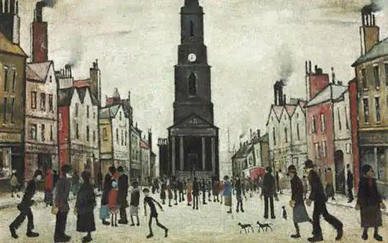
Lowry embraced this simplistic quality resulting in his paintings looking childlike.
It is not only through the handling of the paint, but the composition of his painting where everything is biased towards the center. If you want to make the jump towards a more sophisticated composition there are a few things to consider.
Choosing a format, square or rectangle
A format is just another word for shape, and this comes down to personal preference. From squares, rectangle, panoramic. The easiest shape to create a balanced composition is a rectangle, just like an A4 piece of paper.
The rectangular format: this is an absolute classic and extremely flexible format. When a rectangle is displayed with its shorter side across the top it is known as ‘portrait format’ and with its longer side across the top ‘landscape format’.
The square format: This can work extremely well or very badly. You very rarely see a square old master painting. This is because it is harder to balance a painting that has lots of elements within, for example, a collection of figures in a landscape within a square format. It can look awkward very easily. However, using a square format for a more contemporary subject, an abstract or a minimalist seascape, can be very effective.
3 is the magic number
- A composition is about variety just “don’t make any two things the same”
- The “Rule of Thirds” can be key to creating balance in landscape painting
- Make sure the shapes, spaces, and gaps between objects are all different.
com·po·si·tion/ˌkämpəˈziSHən/Noun
1. The nature of something’s ingredients or constituents; the way in which a whole or mixture is made up.
2. The action of putting things together; formation or construction.
Composition can be confusing and hard to pin down, you don’t really notice good composition in a painting it is just there, which is why it is one of my 7 principles of painting . The dictionary definition above doesn’t necessarily help us. ‘the action of putting things together‘ well, this is true but the actions of putting things together so they ‘work’ is harder to explain.
If colour mixing is about relationships, the warm to the cool, the bright to the muted then composition is about variety- busy to calm, large and small.
Don’t make any two things the same. If you’ve got a row of fence posts going into the distance – check the gaps, they should all be different.
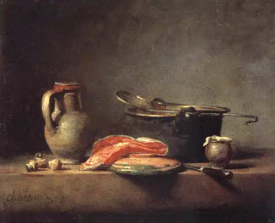
If you have a simple still life with a jug and some fruit – check the heights, they should all be different, check the width, they should all be different.
This seems very straightforward, and it is. It is just a simple way of analyzing your initial set up. Is this method true for all paintings? No, but the more you look, the more you will notice this to be true.
The rule of thirds
What is the Rule of Thirds?
The rule of thirds is very commonplace in photography. It instantly helps to add tension, balance and interest to your photograph but applies equally to the composition in painting. When creating a landscape composition this is what you do:
1. Divide your page horizontally into 3.
2. Decide whether to have your horizon on the top third or the bottom third (the bottom third is always easier to balance, it helps to make the sky look vast and imposing).
3. Split the vertical into thirds.
4. Align areas of focus at the intersection between the lines.
5. Marvel at your genius
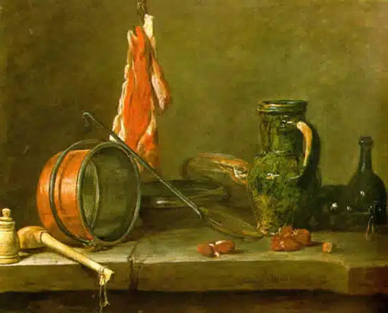
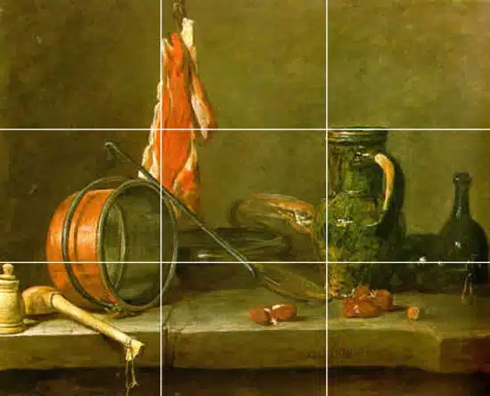
You can see in the Chardin painting above how there are numerous examples of aligning objects within the rule of thirds, the top of the jug aligns with top horizontal line and sits butted up to the vertical line, even the top of the funny little pot on the far left side sits on the bottom horizontal line, to name a few.
Pro tip: If you have a Mac, iphoto does all the work for you. It can change the size and the rule of third lines are already on the screen for you. Align, resize, repeat.
How your digital camera can help your composition
Your digital camera probably has a viewfinder function built in, often called grid. It again overlays the rule of thirds over your image, just align important compositional elements along these lines or their intersections and voila… instant painting.
A word of warning
Rule of thirds can work very well within a rectangle, however, for landscapes squares can be harder to create a balanced painting even when sticking to the ‘rules’.
A Brief History
The rule of thirds was first written down by John Thomas Smith in 1797. In his book Remarks on Rural Scenery:
“Rule of thirds”, (if I may be allowed so to call it)…, in a design of landscape, to determine the sky at about two-thirds ; or else at about one-third, so that the material objects might occupy the other two : Again, two thirds of one element, (as of water) to one third of another element (as of land); and then both together to make but one third of the picture, of which the two other thirds should go for the sky and aerial perspectives.”
If you put the principle of ‘no two spaces the same’ with the ‘rule of thirds’ you can create pleasing compositions very easily. If we analyze the quote below by Sir Joshua Reynolds we can see how both these points are touched upon.
“Two distinct, equal lights, should never appear in the same picture : One should be principal, and the rest sub-ordinate, both in dimension and degree : Unequal parts and gradations lead the attention easily from part to part, while parts of equal appearance hold it awkwardly suspended”
Sir Joshua Reynolds
This last comment is the key, nobody wants a painting ‘awkwardly suspended’. He also comments on the importance of contrast when creating a harmony to your work:
“And to give the utmost force and solidity to your work, some part of the picture should be as light, and some as dark as possible : These two extremes are then to be harmonized and reconciled to each other.”
Sir Joshua Reynolds
The golden mean
Classical paintings had a very scientific and structured approach, with lots of confusing things like root rectangles and golden means. They are often more mathematical and planned out than you would ever imagine….whooahh there, we are moving into complicated classical territory which deserves a proper explanation, which I will address in a future post.
The key point to remember with composition is about variety – just as Reynolds says ‘Unequal parts and gradations lead the attention easily from part to part’ so add variety in your pieces and start with a rectangle canvas.
You might also like:
The rule of thirds in landscape painting


This article has helped a tremendous amount. I’ve always understood the principles of composition but to read it as you have described has given me a much greater understanding. I actually got a pen and paper and made notes!
Is there a mailing list to be notified of any new articles on this site?
Your site is in my favourites and I’ve already subscribed to your YouTube Channel.
Jay
Hi Jay, Glad you’re enjoying the articles. You can sign up to the RSS feed in the top right of the page and will be adding an autoresponder in the next few weeks. I tend to put on a new post every Thursday of Friday.
Thanks again, Will
Hi Will, thanks for my first newsletter post, its so easy to read and follow ~ I love it! ~ and wow!! you put soooo much into it :) its packed full with info goodness! … I’m so glad I signed up! … mmm, the golden mean looks fascinating! Carol
Hi Carol,
Kind of your to say so, yes, the hidden rules of composition are fascinating, especially in Old Master paintings there was often a very precise system to the compositional elements of the piece.
Will
P.S Thanks for signing up to the drawing course, looking forward to helping you discover more about the principles of drawing.
I have enjoying reading the art lessons they are so easy to follow. thanks
Great to hear it Nancy,
Cheers,
Will
Thanks Will , as said before I’ve read a lot about forming compositions, but you added valuable information to what I had.
Pleased to hear it Naima.
Will
Will, what can I say that’s not already been said..about your insight….I’m a self taught artist that finds myself blocked for the first time in ten years. I’ve been painting in watercolors and have recently started painting with acrylics. I found my paintings lacking in composition….Also I tend to want to paint landscapes in portrait format. Any tips on landscapes in this format would be cherished.
Thanks for the help.
Best, Monica
Hi Monica, pleased the article helped. When working in the portrait format for landscapes I always favour a rough 2/3 sky to 1/3 land. If the horizon line starts to creep too much towards the centre of the piece it can sometimes feel a bit odd.
You might find this article of interest.
Cheers,
Will
Much thanks, that’s exactly what happened, the horizon just kept creeping higher up the canvas to the center and it does look odd. I’ll pull it back down to the 1/3 .
Again much thanks for sharing your wisdom.
Best, monica
You’re welcome Monica
wow:) what a inspirable stuff i love it:)thanks for creative ideas
Cheers Falak, pleased you enjoyed it.
Will
good job Will:)
This article re-unites me again with the power of compositions and breaks it down closer to my understanding. I will refer my fellow students to this site. The writing is indeed superb. Cliff
Very kind of you to say so Cliff, great to hear you found the article on composition helpful.
Cheers,
Will
Thanks so much for this great article Will! Do you know by chance of any good books on children’s natural talent for composition.
Hi Tom, pleased you enjoyed the article, I can’t think of any specific books on the subject of children’s natural talent for composition, if you come across any it would be interesting to know.
Cheers,
Will
Hello Will, Thank you for an interesting article. Are there any composition rules that comic book artists could apply to their work that is different to what you have outlined above?
I ask as I am currently ‘drawing’ a Lego strip for my website. I use Lego minifigs, buildings and clipart. There is no drawing as such, I use pose the figures and take photographs. So probably this question may not apply here!
The aim is to see if I can create a comic strip using Lego and produced in a comic book style. I’m not sure I have a correct understanding of what composition is. The strip is for my own enjoyment, but I’m inflicting it on an unsuspecting world via my website. Thank you.
Hi Adrian, yes, for creating narrative storyboards etc there are different approaches you can take to create movement in your compoitions. You might find this book of interest. Drawing and composition for visual storytellers.
Cheers,
Will
Hi Will, my first time here. I have been putting off going to art classes for some strange reason, though I love to draw and paint. Must be an age thing. However your site may be the answer for me. How you relay your instructions and thoughts here is keeping me motivated to actually learn the necessary processes of drawing and painting. I am impatient and lack direction and structure but find myself very interested here !!! looking forward to reading more . Thanks, Rosie.
Great to hear it Rosanna,
Take the lessons a step at a time and you’ll achieve some fab results.
This week I’m going to be doing a simple tonal drawing that you might be interested in, enjoy discovering!
Cheers,
Will
Just found your site tonight….very informative, very articulate, most all enjoyable . I will look forward to hear/seeing more about the use of the golden mean in composition or classical and current art design.
Thanks Leah, hope you’re finding it helpful in your compositions.
Cheers,
Will
thanx this stuff helped me a lot
You’re welcome Aishwarya.
Composition, even just taking a few minutes to plan it, can be so valuable to a picture or a painting. Thank you Will for all your great resources!
Cheers Kevin
This was extremely helpful. I was looking for juxtapositioning methods when I came across this and it gave me a whole new perspective. ThanX a bunch!
You’re welcome Noran.
Will
Excellent article!! Thanks so much. I have my sketch book in front of me taking notes! I’m planning my still life at the moment and this has really helped!!
Thanks Katie, glad it’s got you inspired with your sketchbook.
Cheers,
Will
Will…..I really how you teach the painting classes online…I really want to learn how to “see” when attempting to do a painting…I have taken some drawing, but if you asked to draw something…I would have difficulty….thanks for all your efforts in your videos…they are great…Joe
Thanks Joe, pleased you’ve been finding the teaching style suits you.
Cheers,
Will
Hi Will,
I am enjoying your website immensely. I am also very happy that you take the time to answer each individual who addresses you. I do have a question. I can “draw”, as I do realistic graphite portraits, but cannot paint. Do you think I should start with your drawing course since I’ve never had any formal training in this area, so I don’t know the “rules” about composition, color theory, none of it, but I can draw. Where would you suggest I begin?
Hi Angela,
Nice to hear from you and pleased you’ve been enjoying the website. If you can draw already you can go straight to the beginners painting course, you might find the beginners drawing course a bit too basic, but is does cover approaches to composition and techniques with graphite (such as a tonal ground) that are then echoed in the painting techniques. You can see a recommended progress through the courses here.
Hope this helps,
Cheers,
Will
Thank you so much for your well written article. It has helped me to construct a much more interesting painting.
Anne
Pleased you found it helpful Anne.
Cheers,
Will
Thanks for the rules. Now go off and break them…
Thank you. I would like to add my opinion. In my photography, I have found that the rule of thirds seems to apply because it forces the photographer to have 3 parts, foreground, mid ground and background. Not all images need three parts. You can have a great image with just a foreground, but if you add a great middle image, it is that much better, or a great background, when you can bring all 3 in and the embellish each other, you have a much better photo. With regards to landscapes, we have 2 eyes, making our field of view, wider than it is tall, and in many cases, we prefer images like wider than tall, however the composition takes priority, some images are simply not wide enough, or tall enough. As for painting, I have trouble drawing stick figures, and will stick with a camera. I admire anyone who can draw…
Cheers Anthony, glad you enjoyed it.
Will
Always get loads of information from your posts. Thanks Will.
My pleasure Michelle.
Will
“Never make any two intervals the same!”
Greg Albert, author of The Simple Secret of Better Painting
Cheers Greg!
Will
I loved the information, really gave me a new scope to look at.
Pleased you enjoyed it Gabrielle.
Will
Thank you Will for that very interesting lesson !!!
Pleased you found it of interest Margarita.
Will
It is so helpful for me, thanks Will