
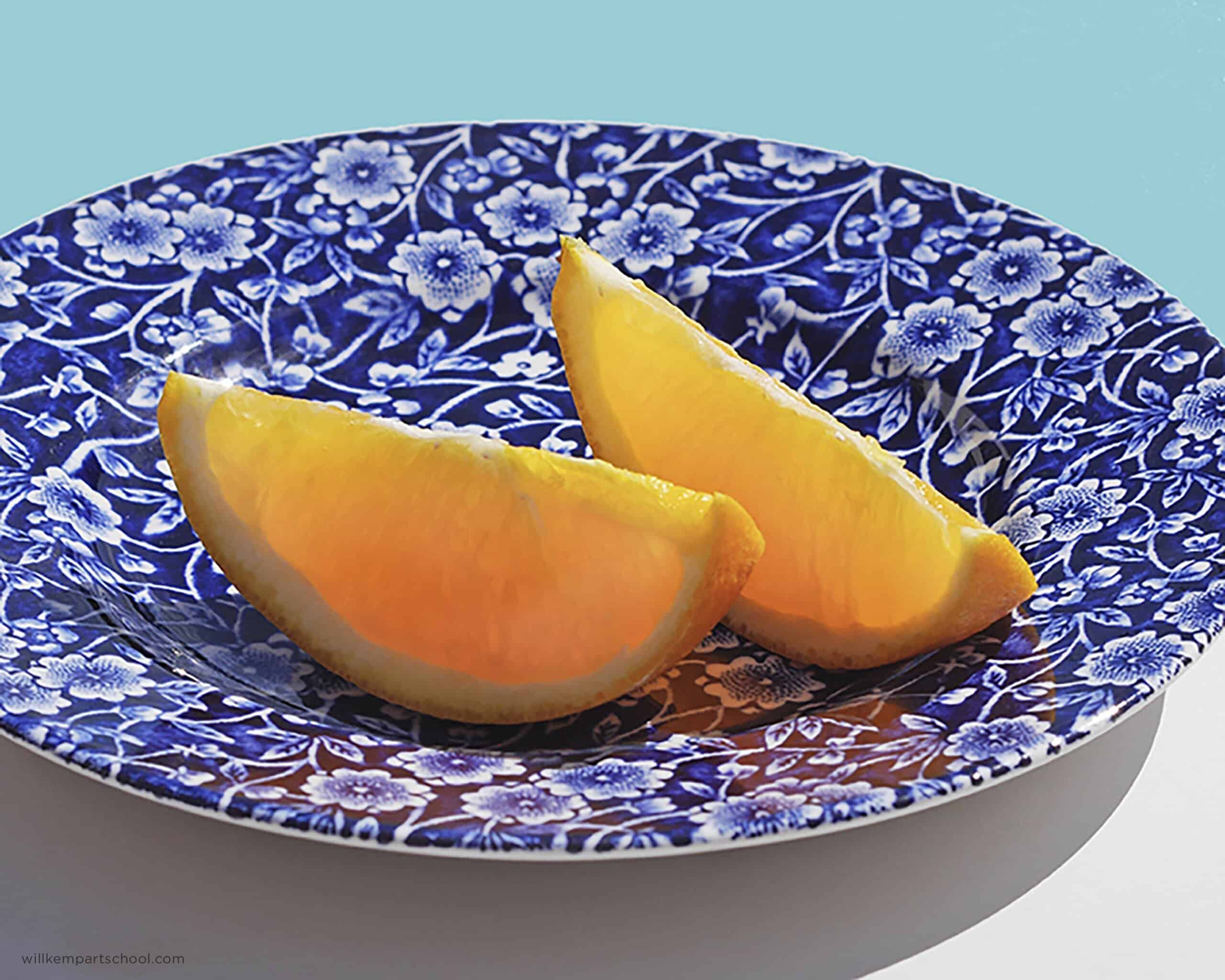
Morning class, this week I’ve been enjoying taking my breakfast outside onto the terrace which gets great mid-morning sunshine. Because the angle of the sun is lower at this time of the day, it can create a lovely backlight for translucent subjects.
I really liked how the sunlight coming from behind the orange segments gave them this wonderful backlit glow and thought it would work well as a little weekend acrylic study.
You can download a reference image below to follow along with the lesson, hope you enjoy it!
Downloading the reference photograph
The photo below can be downloaded, so you can use it as a reference image, print it out and follow along with the steps below.
You can download a larger version of the image here.
Materials you will need:
- 8 x 10-inch (20 x 25cm) canvas or board
Paints:
- Neutral Gray 7 Acrylic (or you can mix your own using Burnt Umber, Bone Black and Titanium White)
- Cadmium Yellow Light (Cadmium Yellow Medium would also work well)
- Cadmium Orange (Golden Paints)
- Permanent Alizarin Crimson (Winsor & Newton)
- Ultramarine Blue (Golden Paints)
- Burnt Umber (Golden Paints)
- Turquoise Phthalo (you can mix your own with Phathol Blue Red Shade and Phthalo Green)
- Hansa Yellow Light (Golden Paints)
Brushes:
- Rosemary & Co, Golden Synthetic, Series 302, Size 10
- Princeton, Aspen Round, Series 6500R, Size 4
Mediums/extra tools
- Acrylic Marker by Daler Rowney FW Marker filled with Sepia High flow acrylic (Golden Paints). I use this for drawing out but you could also use a pencil
- Glazing Liquid Gloss (Golden Paints)
- Airbrush Medium (Golden Paints)
- Palette Knife ( I use an RGM diamond shape size 45)
I’m using a 8 x 10 inch (20 x 25cm) cotton canvas. I toned my canvas by applying a pre-mixed Neutral Gray 7, diluted with water and a little airbrush medium. A coloured ground helps to take away the glare of the white canvas and gives me a neutral base to work on top of and if you want to learn more about the benefits of painting on a coloured ground see: How a prepared canvas can drastically improve your paintings
Step #1. Drawing out the image with an acrylic marker

You can download a high-res 8 x 10 image of the line drawing here: Orange Segment Line Drawing
I’m really looking for the main shapes of the orange segments, making sure that they’ve got a nice curve to them. Because the far edges of the plate go off the frame, try to imagine you were drawing the whole plate so the curve at the bottom matches the curve at the top. I’ve also got in the cast shadow from the plate underneath.

Top – Daler Rowney : FW Mixed Media Paint Marker – 0.8mm
Step #2. Blocking in the background with a turquoise.

To add a bit of intensity to the background I’m using the Turquoise Phthalo from Golden paints, you can always mix your own using a little of Phthalo Blue (Red Shade) and Phthalo Green. It’s a high tinting pigment so I start with some Titanium White on my palette and then just add a couple of drops of the Turquoise Phthalo (this was also a high flow I’d ordered to try with the pen)

Rosemary & Co, Golden Synthetic, Series 302, Size 10
Princeton, Aspen Round, Series 6500R, Size 4
I paint this on the background with a square flat brush, I used a Golden synthetic range 302 from Rosemary & Co, size 10.
Once I’d blocked that in at the top, the next stage was to mix a neutral grey for the cast shadow. I darkened down the Neutral 7 Gray I used for the ground with ‘black’ I mixed, using Burnt Umber and Ultramarine Blue.
For the small sunlit area of the table to the bottom right-hand side, I added some Titanium White to the Neutral Grey 7. This helps to emphasis the shape of the cast shadow and ground the plate into the scene.
Step #3. Blocking-in the plate

I swap to a synthetic round brush, this was a Princeton Aspen round, 6500R, size 4, but any round brush would be fine.
Here I’m just using Ultramarine Blue diluted with water. I start to block in the main shapes on the plate, nice and loosely leaving the floral pattern showing.

I add a little bit of the Burnt Umber & Ultramarine Blue ‘black’ to darken the Ultramarine Blue mix. I’m mainly adding this to the under shadow side of the orange segments, where the least amount of light it hitting.

Step #4. Adding glow to the orange segments

For the orange segments, I paint some Cadmium Yellow Light warmed with a touch of Cadmium Orange. If you have a Cadmium Yellow Medium, that would work well straight from the tube. This gave me a brighter base to work on top of and I really enjoy it at this stage, there’s something so fresh about it. Even with the simplicity of the flat graphic colours, it still tells the story of the scene.
Pro Tip: If you are using a student grade Cadmium Yellow it make take several layers to get the same intensity, you could add a little Titanium White to help with coverage.

From here I add a bit more diluted Cadmium Orange and start to flow that in onto the outer edges of the peel on the orange, my brushstrokes are always loose and painterly to break through some of the sharp edges.
Step #5. Adding contrast around the shapes

The next step is to work on the shadow sides of the orange segments, again using the earlier Ultramarine Blue and Burnt Umber mix. I also start to build up a slightly thicker wash of Ultramarine Blue around the plate and then mix in some Titanium White to lighten the value and start to add some of the details with the flowers.
Step #6. A pattern impression

I’m trying to give an impression of the pattern on the plate, without getting obsessed in the detail. I’m always aiming to balance the energy of the brushstrokes with the viewer still being able to interpret the subject.
Adding more white to the Ultramarine Blue and using the round brush, I’m adding thicker daubs of paint. I also put a very fine white edge on the very bottom rim of the plate so that it stands out next to the grey shadow.
Then I glaze down the centre of the orange segments using Permanent Alizarin Crimson. This is diluted using Acrylic Glazing Liquid Gloss so the thin film of paint holds together rather than running down the surface of the painting. I glaze over the whole central area of the orange, and also onto the plate that’s in shadow. And add a subtle glaze to the shadow tone under the plate.
Once this is dry, I start to layer a slightly thicker paint onto the orange segments and glaze down a couple of the bits in the background, Then I put some white details just on the very top of the pith of the orange segments.
Step #7. Adding depth to the orange segments

Once the warm glaze had been painted in, it was easier for me to judge the shift in colours within the flesh of the orange. I painted in some thicker applications of paint observing the shifts within the light and saturation. Notice wherever the light is shining through the flesh it is the most yellow, giving the impression of translucency.
I also added cooler hues to the pith of the orange that is in the shadow, this is harder to judge because you know it’s ‘white’ so take your time observing the hue.
I then glazed a subtle yellow over the top of the brightest section using Hansa Yellow Light, which is a transparent yellow.
Step #8. Finishing touches
For the finishing touches, I add some dashes of pure Titanium White to the centre of the floral pattern and refine the shapes a little.
Next time we cover how Acrylics compare to Water Mixable Oils painting a blended sky, In the video tutorial we will observe the handling properties and the pros and cons when just diluted with water.
Have a great weekend!


I can taste the sweetness of the orange! Love it! I feel the inspiration relating to the pureness of morning air, which for me is more about walking with the pooch and taking in the backdrop of snow covered Cascades … even in July. And understand your explanation of how to achieve it. I can’t wait to start!
So pleased you enjoyed it Laura, sounds an idyllic morning walk, hope your painting turns out well.
Will
Will, I am enjoying my Urban Sketching course and now I have these lovely oranges to work on! Thanks for keeping us all creative. Great lesson as usual. Thanks.
Lawrence
That’s great to hear Lawrence, so pleased you’ve been enjoying the sketching course.
Will
Hello Will. Your tutorials and way of teaching is undoubtedly amazing.
I have a question Sir. What can I use instead of raw umber paint & cadmium orange (in general)? I couldn’t found the raw umber paint the place I live in.
Thank you ❤
Hi Afia, you’re very kind to say so. You can add a little Ultramarines Blue and a touch of yellow to a Burnt Umber to cool it down. It’s hard to replicate the intensity of a cadmium orange, but a pyrolle orange is nice.
Cheers,
Will
Great Will. Thankyou for putting that up. Will definitely do it at some stage. Love all your comments that go with your lessons. I learn so much from you.
Currently doing your portrait course – now that’s a challenge – but a good one :-)
Glad you’ve been enjoying the challenge of the portrait course Shirley! pleased you’ve been enjoying it.
Will
Thank you very much for your kind lesson with a full description. Best regards
My pleasure Tata
Will
Great work, Will, very subtle , excellent (and taste) result.
Greetings from the Netherlands
Thanks so much Rens
Will
Hi Will, sorry about my earlier comment ….. my translator started to interfere!
Again …. great work, suttle with a juicy result.
Regards from Holland once more.
Lovely image. Thank you, Will.
Cheers George, hope you enjoy it
Will
one of my favorite colour combinations- blue and orange
Glad you enjoyed it Patrick
Will
Thank you for your wonderful morning acrylic orange painting and instructions. I’ll try it today. I would like to see one on watermelon. Have a safe and happy painting.
Really hope you enjoy it Maria, yes watermelon slices can look amazing in paint.
Will
Thanks again for another very
helpful session.
Was worried, as we haven’t heard from you for a while.
Keep well and a few useful
landscapes or gardens using
greens etc would be very helpful
too.
Kind regards
Jo
My pleasure Jo, really hope you enjoy it
Will
Your tutorials are the best and most detailed I have come across.
Thank you!
Thanks so much Sabine, pleased you’ve been enjoying them
Will
Hi Will, A very sunny inspiring Tutorial.
Can I ask about the use of the Golden airbrush medium.—
And do you mix Golden glazing medium, as you go little by little ,or into the paint mix
before using. Thank you for such a clear sunny Tutorial. Cheers Alex.
Hi Alex, I mix in the glazing medium into the paint as I go, on this glazing video tutorial you can get a better idea of the application.
Cheers,
Will
Will Great lesson as always thank you for sending it I ve recently been making two easel’s the first being a James Gurney sketching Easel see YouTube the second a painting and sketching easel being a little larger a desktop size 14″ x 10″ it has a water pot holder with holes for brushes and small removeable shelf for watercolour paint box with a built rack for brushes or palette knife or folding maulstick. Kind regards Steve stay well &keep safe
Great stuff Steve, James does sone excellent lessons.
Will
I was so happy to see a new tutorial from you again, I’ve followed you for years from far-off Arizona in USA. You explain things so well – keep writing, traveling, painting and teaching!! Stay safe!
You’re very kind Judy, thanks for your support, so pleased you’ve been enjoying the lessons.
Will
Hi Will!
Thank you for the ever helpful step by step and inspiration! Always a pleasure to try and follow along from Canada!
Cheers Dave, great to have you following along.
Will
Will, just a delightful way to start the day! The orange segments look delicious and refreshing.
I have moved to Signal Mountain in Tennessee and all my art things are coming in a POD! I can hardly wait to paint again. We have a courtyard, which would be perfect for morning paintings!
So glad to hear from you! I learn so much.
Stay safe!
Kay
Thanks do much Kay, hope your art supplies turn up for you soon.
Will
Love the colours in this one, thank you from Canada, Love your tutorials!
My pleasure Janet, thanks so much.
Will
Gorgeous gem like orange segments in the sunshine. I see where you use the glazing medium, where do you use the airbrush medium or do you mix those mediums together. What are their properties that make them effective? Always lovely painting.
Thanks Rhonda, the airbrush medium is mixed with my water when diluting the first ground layer. It helps to retain paint film integrity in thinner applications.
Cheers,
Will
This new tutorial was my morning sunshine today! Thank you so much, Will, for another great lesson. Can’t wait to work on it here in (unbearably hot today) New Jersey! Suzanne
Really hope you enjoy it Suzanne!
Will
I’ve been following you for years and always love how clear and concise your lessons are. I always recommend your page to my high school art students. The color in these orange slices is so vibrant and juicy!
That’s so kind of you Ro, very much appreciated.
Will
Hey, Will,
Awesome tutorial. Your steps make it seem so easy! Certainly lovely. I’m ready to try it. Thanks so much for taking the time to share your expertise in such relatable steps.
Jen
So pleased you’re feeling inspired Jennifer, glad you found the steps easy to follow
Will
I love your work…
Thanks Maryam
Will, seeing a lesson that you are presenting is a welcome relief from all the turmoil we see today.
I have not tried the lesson yet but it presents a wonderful challenge.
Thank you,
R. Roland Shugarts
That’s so nice to hear, hope you enjoy the painting
Will
Thanks for this lesson, Will! Can’t wait to start it. It is so simple and pleasing to look at. I have a bowl with the same pattern on it, purchased in 1986 somewhere….
My pleasure Kate, its a great pattern to paint, really hope you enjoy it
Will
I enjoyed the step by step process. Look forward to the next tutorial.
Cheers Patrick, pleased you enjoyed it
Will
This is such another great lesson to learn from you, Will. Thank you so much!
Cheers Sandy, hope it turns out well
Will
BLUE IS MY FAVORITE COLOR AND THE YELLOW AND ORANGE ARE SO CHEERFUL. BEAUTIFUL. THANK U FOR THE STEP BY STEP DEMO.
That’s great to hear Cheryl.
Will
Thank you yet again for sharing your efforts in such a friendly and still very helpful way. I also like the way you integrate other helpful links within the overall process. I tend to follow them and they seem to fit in nicely. Your choice of subject matter really opens our eyes in new ways. Much appreciated.
Thanks for your kind words Ken, pleased the links helps to give a more rounded overview of the process.
Will
Hi Will, you are an amazing art teacher! You make it so easy and very motivating. It’s like you sprinkle that magic into my eyes! You make me see it very clearly.
Ha, ha you’re very kind Tipp, so pleased you liked the lesson
Will
Love the bright cheerful bowl with orange slices. Great tutorial. Thanks much
Thanks Tisa
Will
Hi Will,
When I saw your photo of oranges slices and the plate background I thought right away this is not for me. Then I went through all the details of your tutorial and was delighted in how you clearly explain every step on your unique way to teach it gave me the courage to try it! Thank you very much from our summer less Canada.
Hi Marivone, that’s so nice to hear, so pleased you’re feeling inpsired to give the lesson a try, really hope you enjoy it.
Will
I’m always glad to see your lesson postings. Gives me a little nudge to get back to painting after slacking off…Thank you. You and family stay well.
Cheers Eduardo, glad you’re keeping well
Will
Thank you! What an uplifting subject!!
It has been difficult to feel inspired of late, but you have made my fingers itch to return to my studio and create!!
That’s so nice to hear Lorraine, really hope it helps to inspire your works
Will
Really great instruction, thanks!
I still need to understand glazing; do you have a lesson you can recommend?
Also, I can’t wait for your demo comparing the acrylics with the water mixable oils! I have never used acrylics and I am contemplating switching over to water mixable oils due to ease of cleanup and elimination of fumes. Thanks again!
Thanks Lesli, I have an acrylic glazing demo here and an in-depth oil portrait course that looks the oil glazing process
Cheers,
Will
Hi Will! Thank you for another wonderful lesson! This is one of my most favorite lessons As I as it is so bright and cheerful and the orange slices look so juicy. I collect blue and white chi
My pleasure Nancy, really hope you enjoy it.
Will
You made me RUN to the kitchen and cut an orange—and eat it! The whole tutorial had me smiling with pleasure from the beautiful colors and your approach was awesome. A gold ⭐️! from your fan in Iowa.
Ha, ha , that really made me laugh Dave, great that you where inspired in the kitchen!
Will
Sorry, my message got mangled somehow. Anyway, I wanted to ask you if there is a final coat you recommend putting on my finished acrylic paintings, or should I just leave them as is? I have a an entire wall now covered with the paintings done from your lessons and a floral still life I purchased yet to finish. Greetings from Colorado, USA! Stay safe and well.
Hi Nancy, yes you can apply a varnish layer to your paintings. I apply an isolation coat layer first (to separate the varnish from the painting surface) and then a varnish layer. You can see an article on isolation coat and varnishing and oil varnishing
Will
I really enjoyed doing this orange.
Will you be doing clouds…I am not very goods and could do with some help.
Hi Glenys, I haven’t got a cloud tutorial planned for the blog at the moment but good to know it would be of interest.
Will
A beautiful, simple painting. But, wait no companion video . . . come’on my friend. Put a free one up on YouTube. Pretty please?! :-) If not, I can still paint along with your instructions. I just like to see your face and hear you voice and music. It’s soooo soothing. Hope all is well with you and that you are staying safe.
From your Tennessee friend!
Glad you enjoyed it Laundrea, I didn’t film this lesson but a new video tutorial coming next time.
Cheers,
Will
You are so generous with your time posting these really helpful tutorials. I loved the geranium pot plant one which worked really well so will definitely have a try with this one.
Many thanks
Thanks so much Margaret.
Cheers,
Will
Nice work. I wonder if this could also be achieved with a very restricted palette? Just a red, a white, a yellow and a blue. If so, which colours would you choose?
Sure, you could use ultramarine blue, cadmium yellow, alizarin crimson and burnt umber.
Will
Thanks for super subject and clear explanations. Also was very interested in reading the comments and your replies to other subscribers queries as it cleared up some of the questions I had thought of…and some of the questions I hadn’t thought of. Also was interested in the art materials that you use and how they are used. Thanks for continuing to put so much effort into these online classes.
My pleasure Beryl, so pleased you found the lessons and explanations easy to follow.
Will
Thoroughly enjoyed painting this refreshing piece of art. I am going to hang around here and do some more! Theres so much to explore on your website. Thank you Will for sharing your knowledge with us. Truly very helpful. God Bless!
So pleased you enjoyed it Yolanda!
Will
As always, simple subject and fantastic instructions, I just love your lessons, take care in this strange world
Much appreciated Lennie
Will
Thank you, Will!! Lovely!! I am most impressed with this sentence that I copied from your text just above.
“I’m trying to give an impression of the pattern on the plate, without getting obsessed in the detail. I’m always aiming to balance the energy of the brushstrokes with the viewer still being able to interpret the subject.”
God bless, C-Marie
So pleased it was helpful C-Marie, hope it helps with your painting
Will
Hi Will from Cairns Australia. I love your courses as I want.to use acrylics – I am currently doing the portrait one and will.do thenglazing ome next!
I agree your videos double up as a de-stressor – they are very therapeutic!
Would it be weird to paint this double size so it is a larger painting?
Hi Lois, nice to hear from you and pleased you’ve been enjoying the courses. Yes, you could on a larger scale with the lessons. Glad you’ve been finding the paintings therapeutic.
Will
Thanks Will, I really appreciate your fabulous technical advice.
Lisa M
You’re most welcome Lisa
Will
Many thanks Will. Glad you and your followers keeping well.
And you Bernie.
Will
Thank you Will. As always it’s a pleasure to receive your lessons which I enjoy very much. Stay well and kind regards to you.
My pleasure Cheryl, thanks very much
Will
What a wonderful addition to options to pursue during the covid containment. I just finished your portrait glazing course and was very pleased with the results. Now I can’t decide what to do first – try this still life or to apply what I learned in the glazing course to my own subject! Great to have options!
So pleased you enjoyed the portrait course Dorothy, glad you’ve been finding the lessons helpful
Will
Thank you so much for the tip about the Daler Rowney pen! I have been using the Montana pen, but it dries out so easily in my climate and it’s expensive. I really like the idea of being able to fill the pen with the Golden High Flow acrylic paint in my choice of colors. Your little painting is so lovely, especially the translucent effects on the orange slices. As always, I really appreciate the your teaching and your newsy posts.
Hi Honey, yes, being able to match the high flow to your other paints is super exciting! there are other tips available aswell so you can vary the marks.
Cheers,
Will
Thanks Will, for an interesting and helpful tutorial. So many useful tips as usual.
All the best,
Peter B.
Thanks Peter, really glad you found it helpful
Will
Great painting, thanks Will. The backlight is a very good effect to get and capture. I think the patterned bowl is the hardest thing here because it’s easy (as you say) to get too concerned about getting the pattern correct rather than suggest it and have the eye do the work. I tend to fall down on this type of detail sometimes. On the other hand, getting it exactly right can also make a great painting – but a different, less “painterly” style perhaps.
Cheers, Alastair
Thanks Alastair, glad you enjoyed it, yes balancing the level of realism can really change the feel and flow of a piece. Pleased you’re keeping well.
Will
The last white drops in the middle of the blooms make it beautifully! And that warm orange is really warm to see! Thanks for sharing!
Thanks Trudy, glad you liked it
Will
Love it Will, thanks so much you are a great teacher and artist!!
Cheers Elaine
Will
Hi Will, thank you so much for the many beautiful tutorials. I just discovered the daler-rowney marker and montana marker through this tutorial. I am wonder how the ink flow with these pens and if they clog often with acrylic ink?
Chuong
Hi Chuong, nice to hear from you, I haven’t had any clogging yet with the pens, its more a case of the different surfaces that might make the flow less smooth.
Will
Dear Will,
Thanks for the tutorials. I am a multi media person with a lot of work (amateur level) in charcoal, pencils, pastels and oils. in the last few months, I have resumed my art hobby after ten years and needed to take baby steps. After watching hundreds of tutorials on YouTube, your site motivated me to give acrylics a try. I am learning a lot from your videos and really enjoying it. I have done three paintings so far (merely following your instructions) and planning to do some more before I attempt any original work.
You are a great teacher and very generous with your time and knowledge. Thank you.
Stay safe and happy!
Ruby
That’s great to hear Ruby, so pleased you’ve been finding the tutorials helpful, hope the paintings have been turning out well for you!
Will
Hi Will. I have been working with collage/mixed media for several years, and wanted to spread out. Found your wonderful school and plan to take some courses–baby stepls first, though! I finished the Cherry Still Life this morning and was so happy with the results–thanks to your tutorial. I will try the orange slices after I try the apple, but my question is; can I mixed cad yellow and cad red to make cad orange? I’m still working on getting my paint supply up to snuff, and don’t have a large assortment of colors yet. Thanks for everying!
Hi Sharon, so pleased you’ve been enjoying the lessons. Mixed together they will create an orange that will work for the tutorial, but they won’t be as vibrant as a pure cadmium orange pigment.
Will
Very nice website, thank you Will for giving all this information. Might be a question that is unrelated to this specific class, but I see there are in addition to student/artist grade, also heavy body or soft body acrylics. My understanding is that the heavy body ones are for when one wants impasto, is this correct? Using student grade until now, which are thinner, I think I prefer paint to flow well from the brush. Is it ok if I just buy fluid or soft body paints (I see Liquitex ones get good reviews), instead of the thick ones? I ask in case there are effects, aside from impasto, that I cannot do with the fluid ones, in which case I’ll get heavy paints. Wanted to check before I go out and buy some. Thanks :-)
Hi Paul, Yes, if you prefer the paint to flow you can use a soft body of fluid paint. Being able to paint impasto is the main difference with the heavy body paints.
Will
Hi Will,
I am finally circling back to try this tutorial and wanted to print the line drawing for guidance as my drawing skills are limited. Unfortunately, I keep getting an error message. I am wondering if it is just my/my laptop or if there is a limited access time.
Thanks!
Hi Nancy, thanks for the note, I’ve just updated the image so it should work now.
Will
Exceptional as always Will. You do teach us a lot! Newbie here at 57 yrs old!!! told in art class in school that I was useless……….never had anything to do with pencils, paints or brushes since! However in June of this year, I started! With folks like you, I have proven my old school wrong!!!
Diolch Will
Well so pleased you’ve been proving your art teacher wrong! glad you enjoyed the lesson.
Will
Thanks, Will. I love the blue and yellow colour combination. Maybe, I will have a go at painting this one, too, when I’m finished with your Colour-Mixing Course, which I purchased not so long ago. I am very pleased with how the Tulips and Apricots paintings have turned out. I also did the “How to Paint like Monet: Lessons on the Techniques of the Impressionists” painting following your free 4-part tutorial video, for which I’m grateful, of course. I still can’t believe I can paint. It’s like a dream :-) …. Best wishes!
So pleased you’ve been enjoying the courses Beatriz, yes I think you’d get great results with this lesson.
Will
How come this picture is so pleasing to the eye when they are complimentary colors? I thought when you put complimentary colors together one should be more subtle if the other is more vibrant, but these to vibrant colors work. At least, I think that’s what I got out of one of your videos
Hi Carrie, glad you liked the image, it depends on the scene, as a general rule, yes having the most dominate colours complement muted can help to balance an image. Here, the dominate orange is balanced by the muted blue/turquoise in the background, the grey tones in the foreground, and the darker blue.
Will
Hello Will! Thanks so much for a new project! In step 5, what are you using on the curve of the peel that has a browner tone –also – when you introduced the orange was that diluted with the cad yellow med? Many, many thanks for your projects and instruction – you are “the wind beneath my amateur wings”:)
Hi Karen,
what are you using on the curve of the peel that has a browner tone
A muted orange, mixed by adding a little Ultramarine Blue to the Cadmium Orange and lighting with Titanium White.
when you introduced the orange was that diluted with the cad yellow med?
Yes, mixed in with some of the Cadmium Yellow
Cheers,
Will
Many thanks, another great tutorial – love the blue and orange combination and very interesting to see how you tackle the pattern on the plate. (Hope you have a bit more than a couple of orange segments for breakfast?!)
Ha, ha, so pleased you enjoyed it Bonnie.
Will
I’m a newcomer to acrylics and to brush-painting generally, but found the sunny colours and juicy orange segments impossible to resist and decided to have a go! I didn’t have all the ‘right’ colours but this forced me to mix my own, so was a learning process in itself. Ironically, considering this was an exercise in loosening up, I enjoyed it so much that I had to keep fiddling well into the early hours. I found your tutorial excellent and my confidence has increased hugely. Am quite pleased with the result and inspired to try more of your tutorials. Thank you for your generosity in sharing your talent and passion.
That’s fantastic to hear Kylia, so pleased you enjoyed the painting. Yes, that plate pattern can become addictive!
Cheers,
Will
I’ve only seen this today. It’s gorgeous. Like everyone who posts here, I’m learning a ton from your courses. Your teaching is a class act, Will!
Thanks Jennifer, it gets great results this one, really hope you enjoy it.
I did this on Galeria Paper 20 x 25cm
This was very faffy for my clumsy fingers. Having said that I’m fairly happy with it, and feel I’m making slow but steady progress.
Great to hear you’re seeing progress in your painting practice Rod.