Morning Class!
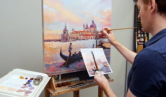
The new Venice – Light & the Landscape Impressionistic Course is now available!
I’ve developed this acrylic painting course inspired by a Venetian Sunset to help guide you through the process of moving from small-scale to large-scale acrylic paintings.
What pitfalls does an artist face when painting big?
As a student visiting the Musée de l’Orangerie in Paris, I’d just seen Monet’s monumental Water Lily paintings and I was in awe.
The sheer scale of the pieces with thick painterly brush strokes inspired me to get back to my little studio space at home.
It was time to break out with the big canvas.
I wanted to create impressionistic landscapes and seascapes that still held the qualities of light-fall and realism that I’d seen, but maybe a little bit smaller than 40ft!
And this immersive large-scale painting experience is what many beginner artists want, it feels exciting and well….arty to create something big and expressive.
Grabbing a large decorators brush, making gestural marks on your canvas – feels invigorating, almost like a breakthrough and then…. you start to hear your inner artist voice getting overwhelmed.
You haven’t got a plan, you don’t know what the next step is so you lose you nerve…
You can read more about the course here


Hello Will,
After Firenze, now Venezia, next… Roma! (Ask Vanessa, I’m sure that she will be ok to go there :) )
And what a beautiful big lanscape to do with soft lights, that’s going to be a delight
Thus, thanks to you, I have just offered myself my birthday present for Monday, but… I can wait to there to look at videos, me could not resist! lool
Grazie mille Will, è perfetto come al solito
Hey Christel, really hope you enjoy the course and have a great birthday!
Will
Thank you Will ;)
Super excited about this one…Thanks Will!
Good one Maria, really hope you enjoy it.
Will
Thank you, Will! I’ve downloaded the videos … now off the grab a brew and start painting! I have to let you know that you are simply the best teacher when it comes to your art classes. I can’t find another source of online instruction that gives as much clear, step by step information as you do. Plus you have SO MANY FREE videos! Thank you thank you thank you! This aspiring artist is so grateful for your generousity. I am sure I’m in over my head with this new class but I’m gonna just go for it. Cheers!
Ha, ha, enjoy your brew Kristin! thanks for your kind words and really hope you enjoy the challenge of the new course.
Cheers,
Will
Thanks for this course. I`m SUPER excited!! Blessings :)
Good one Tomas, really hope you enjoy it and enjoy working on a larger scale.
Cheers,
Will
Morning, Will!
I was looking for these brushes: Isabey Isacryl Acrylic Brush, Flat Shape Size 4: Series 6552 and the size 6. I can’t seem to locate them anywhere. Are these regular flats, brights or long flats? Any suggestions for an alternative?
Hi Kristin, I’ve just gone to check in the studio and there was a blob of paint on the brush handle that I read as a 5 rather than a six!
So it’s the 6562 Isabey Isacryl Bright size 4 & 6. Thanks for the keen spot, I’ll update it on the materials list.
Cheers,
Will
Thanks will!!
Oh how exciting!! I’ve never painted anything this big but cannot wait to get started. I do have a 20″ x 20″ canvas I bought a long time ago when I was feeling particularly inspired but then lost my nerve so it’s still sitting in the corner of my studio in it’s pristine condition staring at me. :)
Thank you Will – this is just what I needed – with your clear teaching methods, I am ready to take this on.
Brilliant one Helle, enjoy working with the larger scale canvas.
Cheers,
Will
Hi Will, Thank you so much for this new landscape course.
I have been waiting for this for a while, so it will be awesome to be able to get into it.
It has everything I’ve wanted to learn, about water, capturing light, and painting bigger!
I’ve just downloaded the course, but my dad has been unwell with pneumonia, so I might be a while in sending you any finished work to show you.
However slow it may be, I’m sure I’m sure I’ll enjoy every minute of it.
Thank you again!
Hi Aya,
So pleased you’ve been looking forward to the new course, really hope you enjoy it. Hope your Dad is on the mend and feeling better.
Cheers,
Will
its definitely tempting , paint for up to and beyond Paddys Day!
Hello Will,
Great course. Looking forward to some learning!. One question. You say in your materials list 6 x 8 inch canvas boards for the small studies. Can I use 5mm thick MDF board as an alternative?
Best regards,
Greg
Hi Greg, nice to hear from you, yes a 5mm MDF board would work absolutely fine, you’ll just notice a slight difference in the textural quality.
Cheers,
Will
Hello Will,
Thank you for confirming that the MDF board will be okay. I have a fair amount of colours but I don’t have some of the others you have listed. Please can you tell me if there are alternatives for the following?
Galeria Pale Umber
W&N Yellow Iron Oxide
W&N Permanent Rose
I have Golden Mars Black instead of Carbon Black. Will that be okay as an alternative? I don’t have W&N Yellow Ochre but I do have it in Golden, Cryla Heavy Body and Atelier will any of those do the job?
Finally, I don’t have 24 x 24 inch stretched canvas but I do have the same in canvas covered board. Will that be okay?
Got to try and save some money now I am fully retired!!!
Best regards,
Greg
Hi Greg,
Here are some alternative mixes:
Galeria Pale Umber
If you haven’t got a Pale Umber, you can mix a similar colour using the same pigments found in the Galeria pre-mixed tube:
Titanium White – PW6
Yellow Iron Oxide – PY42
Red Iron Oxide – PR101
Mars Black – PBk11
Yellow iron Oxide – Yellow ochre with a little cadmium yellow added
Permanent Rose – Quinacridone Red
Mars black will be good, any of the Yellow Ochres will be fine.
The 24 x 24 stretched canvas board will work well.
Cheers,
Will
Hello Will,
Thank you for the details of the alternatives. I’m very grateful.
Best regards,
Greg
My pleasure Greg.
Will
Dear Will,
It is amazing the amount of knowledge you provide in this course. It will take weeks to process everything. There are so many lovely techniques together, and tricks that as far as I remember you haven’t mentioned yet, I am totally surprised. :) And special thanks for the special price. I <3 Venice. :)
I managed to buy everything, except one: the violet iron oxide. There is nowhere, including my favourite online shop. :( As I can see, it is an earth colour, it will be hard to mix something similar. I have some nice blues and reds, like cobalt blue, ultramarine blue, quinacridone red, permanent alizarin c., and even dioxazine violet. Earth colors: burnt umber, raw umber, burnt sienna, yellows like cad medium and yellow ochre. Do you think I have any chance to mix something like violet iron oxide? Or is it easier to wait a week when the manufacturer sends it by post?
Many thanks,
Dora
Hi Dora, really pleased you’ve been enjoying the new Venice course. You could try mixing the violet iron oxide, but personally, I’d wait a week to receive by post as it will save much more time in the actual painting process as it’s one of the key mixes for the main painting.
Will
This is a great course. I especially like how I depth this course is and all of the exercises that you include. I’ve completed the first three videos and just finished spraying fixative on the canvas. I’ve done all my art study on the internet and your courses are by far the best I’ve taken. All the best. Jack
Thanks very much Jack, really pleased you’ve been enjoying the lessons on the new course, glad the drawing stage went well, on to the block-in!
Cheers,
Will
Looking forward to start on the course. With regards to the violet iron oxide, is there any reason why W&N was used instead of Golden Heavy Body ? Though I did notice one seems to be Transparent while the other is Opaque. I am rather new to painting and often wonder if it’s easy to substitute one brand with another. The Mars Violet in Matisse Structure Acrylics is another one I wonder about.
Hi Lianne, nice to hear from you, yes, you can substitute different brands of paint and intermix them. There will be slight differences in drying time/opacity/viscosity, but you’ll often find certain pigments from certain brands that you’re just really drawn to. The Golden Violet Oxide would work just as well, really hope you enjoy the course.
Cheers,
Will
I happily primed the canvas with a stucco type finish mixed with pale umber. Then, I added the guide lines. I must say that adding the drawing is giving me fits. I do not draw enough and I am struggling with the placement of the buildings, their proportions and the relative sizes. I am going to keep at it until it looks correct since there is no point in painting a picture when the composition is out of whack. Thank you for adding this course.
Hi Patti, yes, it’s worth spending the time to get the composition drawn out before commencing with the paint. As long as you work within the initial guidelines of the buildings they will’sit’ within the distance and scale of the scene. Also, working on the larger scale can take more getting used to as you’ll be scaling the drawing from a smaller reference to a larger drawing so it can take a few goes with the putty eraser!
Will
Hello Will,
With regards to the image that shows the measurements for setting out the drawing. I would like to apply that method to other landscapes I will paint in the future. Please can you describe how an image of a landscape is scaled so that the measurements can be applied to the canvas as shown in the drawing video “Venice Chapter 4”.
Best regards,
Greg
Hi Greg, you need to use a photo editing software like photoshop / photoshop elements or gimp (which is free)
1. Change the image size within the photo editing software to the larger canvas size.
2. Pull across guidelines to key sections in the piece in the larger image and measure with the ruler in the software to see what the real-life size will be.
3. Make a note of the sizes and then rescale the image back to a smaller size so you can print out the image.
Cheers,
Will
Hello Will,
Thank you very much for the information. I have Paintshop Pro but I am sure that the software will do the same job. I will try the method on one of my photographs and let you know the results.
Thanks again.
Best regards,
Greg
Hi Greg, yes, the same method should work fine in paint shop pro.
Cheers,
Will
First, let me say you are a maestro with a palette knife! I want to verify my understanding of your blue/grey/purple tones. The first color was ultramarine blue and burnt umber mixed to value #2 for parts of the sky and the gondolier. Then, you saved some of that and added white and a tad of burnt sienna for lighter sky and water tones. You saved some of that and added more blue and white. Then, you saved some of that and used blue, violet oxd., burnt sienna and white to make sky shadow tones (#8).
Do I have it correct that you used a base mix for each of those 4 tones? Also, I can see that I have mistakes with my tonal under painting. Should I attempt to fix them or move on and correct as I go with color? Thank you.
Hi Patti, all of the stages of the mixes are on the colour mixing video section, what you see is exactly what I did, I didn’t have any base tones mixed off screen that I was adding too. The easiest thing to do is rewatch the colour mixing video again one mix at a time and practice mixing that one tone. Then hold it next to your reference image to start to get a feel for the area of the painting it will work for.
On the tonal stage, if there are any big areas that you notice are wrong it’s best to change it at this stage as then you’ll then be able to judge the tonal value of the colours you apply on top more accurately.
Cheers,
Will
Hello Will from Haiti. I have been painting a few years and just purchased this course because I want to move to another level…. I have watched all the videos and feel ready to start. Very excited! Your artwork is very beautiful. Question, I have never done a tonal study. Do you always start with one when approaching a new subject? I just purchased all the neutral grey’s. My biggest issue is always not getting enough light contrast. Will this help?
Thank you
Andrew
Hi Andrew, yes, definitely the greys will really help. Yes, I usually do a tonal study for larger scale pieces as it saves so much time in the long run. Working with the greys will make a massive difference in achieving the light contrast in your images and can be very revealing to what subject will translate well to make a good painting. Really hope you enjoy the course.
Cheers,
Will
Aloha, Will! Mahalo(Thank you) for your wonderful course. I studied the photos and lessons over and over, watched how your did your paint mixes, used the grid method and transferred my drawings to a 11×14 and 16×20 canvas for the main painting. Except for the W&N pale umber which I purchased, I mixed all of my base colors, substituting for red oxide and violet oxide ( I had yellow oxide) and value mixes. You packed a lot in this art adventure and from your excellent demonstrations and teaching tips, I would recommend your fine course to any serious art student. Thanks to your patient and painstaking teaching, I now have my Italian experience with two beautiful pieces of art! Let me know when we can travel together again! God bless you!
-Liz from Blue Hawaii
Ciao Liz! what a lovely comment and so pleased to hear you’ve enjoyed your Italian adventure and have been able to adapt the colours and canvases. Glad you’re pleased with your two new paintings, Ke aloha, Will
Hello Will,
I am slowly going through the lessons, they contain huuuge amount of information. Somehow the basilica painting after the first stage (before any glazing) is not as “purple” as yours. Or is it OK having it paler? I followed the steps as you described. I have no idea what I did wrong. But I hope after the glazing it will be fine anyway.
I would like to buy an acrylic pen, it would be very handy, could you tell me the brand and any instructions where to search it?
Many thanks,
Dora
Hi Dora, pleased you’re enjoying working through the lessons, along as the colours on your painting are close to your own reference image the whole painting will come together well. The glazing will darken areas and add intensity of colour. The exact acrylic marker I use is listed in the materials list (by Montana) but many manufacturers make them, Liquitex also have a good range.
Cheers,
Will
Will, I learned so much from this video series and spent too much time reworking the same things. However, I want to do another painting using your methods but I am having a rotten time trying to figure out how to resize a photo using Gimp. Is there another way to accomplish this?
Thank you
Patti
Hi Patti, really pleased you’ve been enjoying the course, when you say resize a photo, what particular steps are you having trouble with?
For instance, if I have a 3 x 5 or 4 x 6 photograph and want to put it onto a 14 x 18 inch canvas. Proportionally, those won’t transfer without elongating the picture. True, I can crop it but, in some instances, that cuts an interesting element. Any advice is appreciated. This is always a stumbling block for me.
Hi Patti, scaling anything up that isn’t proportionate you will end up cropping, it’s just up to you to decide where that crop will be. What you can do is make a file that is 14 x 18 inch and then pull in the 6 x 4 image, scale that within the 14 x 18 until you have a composition you’re happy with.
Cheers,
Will
Hi Will, I went through the course and really enjoyed it. You explain all steps really well, and I learnt a tonne. It is fantastic too see how the painting comes together.
I have a question, I saw you use heavy body acrylics, even for stages of the painting where you don’t add texture. Many people seem to use fluid acrylics for flat applications, i tried some briefly but I find them hard to control, I don’t know. Somehow, I prefer using the heavy body ones, even though I find myself spending a lot of time thinning them down.
Can you advice on what are the pros and cons of each type of paint, and why in this case you used the heavy body ones all along. Is there some advantage in using them, if one doesn’t do impasto?
Hi Francjs, that’s fantastic to hear, so pleased you enjoyed the course. I tend to use heavy body paints as I trained in oil paints where the paint consistency is closest to heavy body acrylics paints so the paint handling and application are similar and then water down if I want something more fluid. But there are some paintings where I will block-in with fluid colours and then work with heavy body on top of that but most of the time I use the heavy body.
Hope this helps,
Cheers,
Will