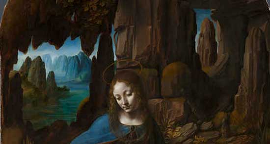
Leonardo da Vinci – The Virgin of the Rocks (detail), 1491-1508
Why do mountains look blue in the distance?
Have you ever wondered why a hill, that you know is covered in green trees, looks purple or blue when viewed from a long distance away?
Trying to create a sense of depth and distance in your landscape painting is key for creating realism in your paintings.
The simplest way to do this is with Aerial perspective…
What is aerial perspective?
Aerial perspective is the optical effect that the atmosphere has on objects viewed at a long distance.
For example, in the daytime, a mountain range will usually appear bluer and lighter as it gets further and further away from us.
The air in the atmosphere contains various impurities and these act as a filter stopping certain wavelengths of light reaching our eyes.
This gives the illusion of a change of colour and value.
Cool colours like blues and greens get through the ‘filter’ of air more easily than the warm colours so mountains usually appear bluer.
Leonardo da Vinci noticed and studied that as a landscape recedes from the viewer its colours and tones alter due to the nature of the atmosphere.
You can see this in his painting above where he has cool blue muted mountains in the background, and warm browns in the foreground.
It is sometimes referred to as atmospheric perspective.
What effect does aerial perspective have on landscape painting?
Change in colour – A green tree will quickly appear purple, then blue as it receded into the distance.
Change in tone – Everything gets paler, the atmosphere not only affects the perceived colour in front of us but the tones, how light or how dark, each area of the landscape is. The changes are most noticeable in the dark tones, (just like the dark colour tones)
You can see in this photograph how obvious, now it’s in black and white, the tonal value changes are.
It is also useful to note how the crispness of line also alters, making the very back mountain quite blurry.
Pro tip: It is often a good tip when painting to blur the furthest mountain into the sky, You can blur it more than you would initially think and the viewer will ‘create’ the mountain in their mind.
5 points to remember
As the distance between you and the mountain increases, the contrast between the mountain and its background (usually sky) decreases.
The further away a mountain is the less detailed it becomes.
The colour becomes less and less saturated (intense) as it disappears into the distance and becomes closer to the background colour. As objects are viewed at increasing distances the colour change effect is more pronounced, and (if viewed in the day) progressively from purple to blue. This will give the illusion of depth.
The elements most altered by aerial perspective are the dark tones, e.g: a dark green will change more dramatically than a light green.
warm and cool – Use the power of warm and colours to add even more depth. Add a red highlight in the foreground to bring your viewers gaze forward and to heighten the effect. Warm in the foreground cools in the background
Aerial perspective example:
Dark Green forest scene on a clear, sunny day
Foreground: light green highlights – dark green shadows
Middle ground: cooler green (towards blue)- green/purple hue to the shadows
(the lighter areas will also change but only a little cooler green, rather than a complete change in hue)
Far Distant: light purple/blue highlights – blue shadows with a purple/violet shade
Very far distance (50 miles) near white highlight – pale blue shadows
Everything gets lighter in value as the distance from the viewer increases, as the landscape hits the horizon line it is often very similar in value to the sky.
Will Kemp, Scottish landscape, 2011
The areas that are lighter in value near the front of the scene will hold onto their value for longer, the darks will turn to midtone quickly. Pure whites hold on to their value for a long distance so you can still use titanium white to indicate houses in the far distance as in the painting above.
A note on clouds
John Constable, Harwich Lighthouse, 1820
Pro tip: Clouds grow darker as they recede, instead of lighter, and they grow warmer instead of cooler. So on a clear day with clouds in the sky, the clouds become yellowish as they recede, and those way off in the distance will be pinkish.
I’m having a hard time keeping the items in the foreground soft. The outlines of the lighter objects are quite straight and hard-looking; what would you suggest to help keep the edges from looking so sharp when the colour is quite light in contrast to the background? I’m not noticing this so much with the darker items that are further into the distance. Is there some agent I should be using that softens lines without adding more colour? I’m still fairly new to all this and have a lot of your techniques bouncing around in my head, so it could be that I’ve come across it and am just not picking out the right one.
Thanks very much, your videos have all been extremely helpful!
Glad you’re getting a lot from the website, there is a lot to take in when you’re first starting but as with learning most things, the more you paint, the more all the techniques should fall into place.
For creating depth in a painting, objects in the foreground are usually kept sharp and more in focus, whilst the distant background is kept soft and blurred.
The same with colour, it’s usually less saturated as it goes into the distance.
I often use a glazing liquid to help blend and soften edges but with acrylics keeping soft edges is harder to do. Have a look at this article on mediums to see the different additives you can mix in with your paints.
Could you build a little on the information about painting clouds. The top tip is very useful. Maybe a session dedicated to this would be good?
Always enjoy the updates on your site. Really well laid out
Hi Will thanks for the good tips, now I know why the mountains look purple. A bit more about me I am a pensioner 69 years old I am in painting for about 6 month I like it and enjoy to paint lansdcape I do acrylic painting . I live in Pretoria, South Africa
You’re welcome Suzanne, so pleased that the mix of ‘how and why’ has helped you with your paintings.
Often, having an understanding of both is key so you can start to see the principles as a whole. Thanks again for your comment.
Hi Will,
If only I had your instruction when I was in school! You make so clear things that we all see in the world around us but never actually notice, until we try to replicate them on a canvas, that is!! Thank you so much for your tutorials, they’re inspiring!
Claire
Will I’ve been enjoying your site so much, since discovering it! I am so excited as I never realized the information you shared above about clouds… darker as they recede and warmer. Wow! I’ve been drawing and painting most of my life (55 years young) as a hobby and occasionally more seriously. The past couple of years, as a means of supplementing our budget I’ve been teaching children to draw. This year I have a small group of girls who will be learning to paint in acrylics along with me. Your site has been a wonderful resource! Thank you for sharing so much lovely information free for all. You are a great blessing. I do plan on purchasing a course or two as well! Again, thank you for all you do!
Lovely to hear from you, so pleased you’ve been finding the articles helpful, and looking forward to hearing how your group of new recruits get on with learning to paint with acrylics.
I’m dumbstruck at finding this information. Will, you are wonderful for putting all of this together. I play with watercolors. My mountains are beautiful — even I think so — but something kept bothering me. Oh, yeah… atmosphere… I live in Tucson where all the atmosphere is heavily endowed with dust and light. Aerial perspective.
You are teaching me how to see. What a blessing you are!
The information about the clouds is fascinating and completely counter-intuitive. Upon further reflection I can understand distant coulds being darker, but pinker?? Why would they not become more *blue* with distance, as everything else does? :)
As the light from the sun has to travel through more atmosphere/clouds the longer wavelengths of light, those (towards the red end of the spectrum) travel better through the clouds and reflect back down from clouds as red, orange, pink and purple shades.
Hadn’t thought about this until after reading this very good article, but how does one work with receding water? I noticed some of the paintings above show the water becoming lighter as it recedes, but also notice that if there were no land masses in the background, but just open sea, the color darkened against the horizon. Would one follow a similar vein as in regards to painting receding mountains? Does the eye perceive receding water like the color of the receding sky? Does it become warmer sans clouds?
Hi Laura, yes, a similar vein to painting receding mountains (pinker/purple in the far distance), dependent on whatever is in the sky for that painting which would influence the reflected colours into the sea surface.
I’ve not been painting long and I’ve taught myself what little I know by reading whatever I can find by people like you who are so willing to help. But, since I only have myself as a critic, I don’t know if I’m doing anything right. A friend brought a painting down and wants me to paint it. Of course, I know I can’t paint one just like it due to copyright and probably couldn’t even if it was allowed.. The painting is very smooth whereas my paintings have a rough looking finish to them. Should I aim for a really smooth finish like this painting. I should add that I’m home bound so I can’t get out to look at other paintings. Also, I’m never truly satisfied with a painting and always feel like I could do it better, when I’ve finished it. Is that weird or do all artists feel that way. I always see things that I could improve on, in every painting I do. I normally work in acrylics but this last painting I added oils on top, trying to get a brighter finish because it’s a sunset and the acrylics just didn’t have a ‘wow’ factor if you can understand what I mean. I did manage to get a nice reflection of the sun in the water. But, I guess my main question is how can I tell if I’m adding too much paint on the canvas or what’s making mine have a really stark appearance instead of a smooth look.
Hope you’re doing well, welcome to the world of being an artist! All painters are their own worst critics so the feelings that you could always improve is 100% normal. You can’t really ever add too much paint to the canvas, it just depends on the mood and feeling of the subject that you’re after. If you tend to paint with a rougher style, you might just more naturally suit an impressionistic approach. So just go with the style that feels right to you, rather than trying to imitate other artists’ styles.
Oh, something I should have added. I always apply a coat of Gesso on my canvas then do my sky and if it has water, I apply the blue for the water. This part of my painting always has a nice smooth finish. I seem to have learned that part very well. But, when it comes to adding my subject, that is when my picture takes on the more stark appearance that is just not smooth like the sky etc.
Smoothness of a subject is often depended on the way you handle the edges and blending of the subject matter you are trying to depict. Check your edges to see how they look.
Hi Debra, there wasn’t a tutorial that went along with these mountains images, but you can right click the photos and paint a long from that.
Cheers,
Will
Thanks. Okay! I guess I should wean myself from your awesomely made videos on this one. You’re a great teacher. I will let you know how it goes. Thanks for challenging me!
Will,
I found you on You Tube a few months ago, searching for some online courses to get me motivated to start painting. I have done several of your free tutorials and am choosing which ones I plan to purchase next week. I am no longer afraid to paint and I feel I owe it to you. When I am driving or walking, I am picking out areas in the landscape which I would be blocking-in. I feel so confident. Your constant reassurance and encouraging manner is so valuable to me since I am an artist in the inside but was afraid to come out! Thank you thank you thank you!
Hi Micki, you’re more than welcome, fantastic to hear you’ve been finding the tutorials have been giving you the confidence to create paintings and the fact that you’re spotting areas of ‘blocking in’ in the landscape is just great. Opening your eyes to ‘see’ the paintings before you begin is the real ‘secret sauce’ to developing as a painter. Good one Micki!
Cheers,
Will
Hi!
I found your website through Pinterest. All the articles and YouTube videos in the site are very informative and have helped me understand more about acrylic painting. Thank you for sharing all the details.
Thank you Will for this opportunity you are giving me. My first year of art (1948) was abruptly interrupted by the Korean war. I have not had the opportunity to continue at a college level until this date with you. I am compiling your instructions in a notebook to refer to as I progress with my (almost hands on) training. It’s hard to believe that such a teacher as you exists!
Thanks so much for all these instructions! I am teaching my 7 year old students to make landscapes and this post is very helpful! Glad I found you!
Cynthia
Lima-Peru.
Will, your tutorials are awesome. I have been struggling with a mountain painting. (acrylic) It is a snow covered peak from a photograph (Andes mtns.) and it is the sunset that lights up the very top. It has rust colored rock showing through some areas. Mixing the rust colors are driving me crazy! And the shadow areas along the snow are a challenge. Paint white snow color first or shadows first?
I am my own worst critic and I take way too much time on one painting. I have so much more that I want to paint. THANK YOU! I don’t think I can find some of the products you show here in the US. What kind of palette do you use to mix your paints?
Hi Nancy, really pleased you’ve been enjoying the tutorials. What you can do is isolate the rust coloured rock and just match that colour to start with and then base your judgements from there for the rest of the snow colours. I mix most of my paints on a ‘tear-off’ palette.
Cheers,
Will
Will, I was typing a comment and hit the wrong key.
Thank you for your answer to my question. I enjoyed your snow scene tutorial.
I waste too much paint mixing colors but I’m learning.
Hi from the Sonoran desert of Arizona
When painting a woods that is deep and dark underneath the trees, how do you show perspective without making it look like you have a hole in your canvas? And I understand that anything very dark should be a combination of colors…..not black. I am fairly new to acrylics but learn something everytime I paint. I enjoy painting outside.
Hi Paulette as long as you have a interesting pattern of darks it will help to lead the viewers eye around the painting, rather than focusing on one area.
Cheers,
Will
You are a wonderful tutor. I really enjoy your videos as they have this calming quality about them. I have long pauses in between bouts of painting because of work pressures,and I use your videos to get back in the mood. I am learning and you are an amazing help.
Thanks.
Hello,
I just finished an acrylic painting from a photograph of the Scottish castle, Eilean Donan, in the fall, …my issue is; no matter how hard I try to make my mountains realistic they end up looking like “paint by numbers”… my farthest away mountains are fine..it’s ones up close that I have such a hard time with … is it just practice or is there a particular technique I have yet to grasp/learn …any suggestions? I have looked online for guidance – (I find a lot of mountains painted in the distance with snow, etc.. but can not find tutorials with bare mountains) and always end up coming back to your site (which is an excellent site, BTW..) for help.
Thanks in advance…Adele
Hi Adele, to make mountains appear realistic it’s often a case of checking the silhouette shape of the drawing in your painting, so I’d try doing some pencil sketches of your scene of just the mountain edge with a fibre tip pen. Try just to capture the essence of the mountain shape with one line, then compare to your painting.
Hope this helps,
Another fantastic Nugget of Gold Will. Your articles are great, they contain so much important information in them to the art student for Painting/drawing.
Scumbbling I heard it called in artists terms.Working in gradients and using dead ground(the distance in between the mountain peaks coming forward to indicate the actual depth). Basically, the less faded the nearer the object. More importantly blue gradients for maximum realism.
My comfort zone and what I do best is pen and ink but I decided to go back and meet the challenge of acrylics and colors–I love working in black and white. Each time I looked for simple to-the-point instructions with explanations, I kept getting directed back to your website. You keep it simple, informative and instructive. I love your website and bookmarked it as my “go-to!” Thanks for sharing.
Hi Keith, pleased you’ve been enjoying the lessons, I don’t currently have a specific lesson on Autumn colour palettes but great to know it would be of interest.
Will


Great post,
adds a great deal of information to what knowledge I had of this subject :).
Thanks Michael,
I’m putting together a painting tutorial video about atmospheric perspective in the next couple of weeks.
Will
Very good tips.
Thanks,
Will
Excellent! You always add so much detail that I’ve never heard before. A zillion thanks.
-DianaL
Good to hear it Diana.
This amazing!! “aerial perspective” I’ve never hear it before! It helped me to do well my project. My God bless you! Good new year!!!!! cheeer
Good one Ndizihiwe, pleased you’ve discovered a new painting tip!
Cheers,
Will
Hi Will,
I’m having a hard time keeping the items in the foreground soft. The outlines of the lighter objects are quite straight and hard-looking; what would you suggest to help keep the edges from looking so sharp when the colour is quite light in contrast to the background? I’m not noticing this so much with the darker items that are further into the distance. Is there some agent I should be using that softens lines without adding more colour? I’m still fairly new to all this and have a lot of your techniques bouncing around in my head, so it could be that I’ve come across it and am just not picking out the right one.
Thanks very much, your videos have all been extremely helpful!
Hi Jacqueline,
Glad you’re getting a lot from the website, there is a lot to take in when you’re first starting but as with learning most things, the more you paint, the more all the techniques should fall into place.
For creating depth in a painting, objects in the foreground are usually kept sharp and more in focus, whilst the distant background is kept soft and blurred.
The same with colour, it’s usually less saturated as it goes into the distance.
I often use a glazing liquid to help blend and soften edges but with acrylics keeping soft edges is harder to do. Have a look at this article on mediums to see the different additives you can mix in with your paints.
Cheers,
Will
I would like to thank you for the wonderful tips you have mentioned and paintings and gesso application, the drawings tips r commendable too.
Keep up the good work!!
Thanks very much Mihir, kind of you to say so.
Cheers,
Will
Could you build a little on the information about painting clouds. The top tip is very useful. Maybe a session dedicated to this would be good?
Always enjoy the updates on your site. Really well laid out
Hi Karen, nice to hear from you, I’ll add a cloud tutorial to the list!
Cheers,
Will
God bless you Will,your tips are so useful ,great work thank you …
Very kind of you to say so Rozh, pleased they’re helping your painting progress!
Cheers,
Will
Hi Will thanks for the good tips, now I know why the mountains look purple. A bit more about me I am a pensioner 69 years old I am in painting for about 6 month I like it and enjoy to paint lansdcape I do acrylic painting . I live in Pretoria, South Africa
Hi Paul, pleased you found the article helpful and are enjoying painting acrylic landscapes.
Cheers,
Will
Will, Thank you for your generosity. Your explanations of the “how and why” of things helps me understand what I see.
You’re welcome Suzanne, so pleased that the mix of ‘how and why’ has helped you with your paintings.
Often, having an understanding of both is key so you can start to see the principles as a whole. Thanks again for your comment.
Cheers,
Will
Hi Will,
If only I had your instruction when I was in school! You make so clear things that we all see in the world around us but never actually notice, until we try to replicate them on a canvas, that is!! Thank you so much for your tutorials, they’re inspiring!
Claire
Hi Claire, thanks so much for your kind words, really pleased you’re finding the site helpful in learning how to paint.
Looking forward to hearing how your paintings turn out!
Speak soon,
Will
Will I’ve been enjoying your site so much, since discovering it! I am so excited as I never realized the information you shared above about clouds… darker as they recede and warmer. Wow! I’ve been drawing and painting most of my life (55 years young) as a hobby and occasionally more seriously. The past couple of years, as a means of supplementing our budget I’ve been teaching children to draw. This year I have a small group of girls who will be learning to paint in acrylics along with me. Your site has been a wonderful resource! Thank you for sharing so much lovely information free for all. You are a great blessing. I do plan on purchasing a course or two as well! Again, thank you for all you do!
Hi Kate,
Lovely to hear from you, so pleased you’ve been finding the articles helpful, and looking forward to hearing how your group of new recruits get on with learning to paint with acrylics.
Cheers,
Will
I’m dumbstruck at finding this information. Will, you are wonderful for putting all of this together. I play with watercolors. My mountains are beautiful — even I think so — but something kept bothering me. Oh, yeah… atmosphere… I live in Tucson where all the atmosphere is heavily endowed with dust and light. Aerial perspective.
You are teaching me how to see. What a blessing you are!
oozing appreciation!
Patti
Thanks very much Patti, very kind of you to say so. Really pleased you’re finding the articles helpful.
Cheers,
Will
The information about the clouds is fascinating and completely counter-intuitive. Upon further reflection I can understand distant coulds being darker, but pinker?? Why would they not become more *blue* with distance, as everything else does? :)
Hi Danielle,
As the light from the sun has to travel through more atmosphere/clouds the longer wavelengths of light, those (towards the red end of the spectrum) travel better through the clouds and reflect back down from clouds as red, orange, pink and purple shades.
Hope this helps,
Will
Hi Will,
Hadn’t thought about this until after reading this very good article, but how does one work with receding water? I noticed some of the paintings above show the water becoming lighter as it recedes, but also notice that if there were no land masses in the background, but just open sea, the color darkened against the horizon. Would one follow a similar vein as in regards to painting receding mountains? Does the eye perceive receding water like the color of the receding sky? Does it become warmer sans clouds?
Kind regards,
Laura
Hi Laura, yes, a similar vein to painting receding mountains (pinker/purple in the far distance), dependent on whatever is in the sky for that painting which would influence the reflected colours into the sea surface.
Cheers,
Will
I’ve not been painting long and I’ve taught myself what little I know by reading whatever I can find by people like you who are so willing to help. But, since I only have myself as a critic, I don’t know if I’m doing anything right. A friend brought a painting down and wants me to paint it. Of course, I know I can’t paint one just like it due to copyright and probably couldn’t even if it was allowed.. The painting is very smooth whereas my paintings have a rough looking finish to them. Should I aim for a really smooth finish like this painting. I should add that I’m home bound so I can’t get out to look at other paintings. Also, I’m never truly satisfied with a painting and always feel like I could do it better, when I’ve finished it. Is that weird or do all artists feel that way. I always see things that I could improve on, in every painting I do. I normally work in acrylics but this last painting I added oils on top, trying to get a brighter finish because it’s a sunset and the acrylics just didn’t have a ‘wow’ factor if you can understand what I mean. I did manage to get a nice reflection of the sun in the water. But, I guess my main question is how can I tell if I’m adding too much paint on the canvas or what’s making mine have a really stark appearance instead of a smooth look.
Hi Betty,
Hope you’re doing well, welcome to the world of being an artist! All painters are their own worst critics so the feelings that you could always improve is 100% normal. You can’t really ever add too much paint to the canvas, it just depends on the mood and feeling of the subject that you’re after. If you tend to paint with a rougher style, you might just more naturally suit an impressionistic approach. So just go with the style that feels right to you, rather than trying to imitate other artists’ styles.
Hope this helps,
Will
Oh, something I should have added. I always apply a coat of Gesso on my canvas then do my sky and if it has water, I apply the blue for the water. This part of my painting always has a nice smooth finish. I seem to have learned that part very well. But, when it comes to adding my subject, that is when my picture takes on the more stark appearance that is just not smooth like the sky etc.
Smoothness of a subject is often depended on the way you handle the edges and blending of the subject matter you are trying to depict. Check your edges to see how they look.
Cheers,
Will
Really very good information one can get.
Thx alot Will.
You’re welcome Sadaf.
Will
Hi Will. I am trying to get my hands on your aerial perspective tutorial that goes along with you mountain images here. Can you help me?
Debra
Hi Debra, there wasn’t a tutorial that went along with these mountains images, but you can right click the photos and paint a long from that.
Cheers,
Will
Thanks. Okay! I guess I should wean myself from your awesomely made videos on this one. You’re a great teacher. I will let you know how it goes. Thanks for challenging me!
Will,
I found you on You Tube a few months ago, searching for some online courses to get me motivated to start painting. I have done several of your free tutorials and am choosing which ones I plan to purchase next week. I am no longer afraid to paint and I feel I owe it to you. When I am driving or walking, I am picking out areas in the landscape which I would be blocking-in. I feel so confident. Your constant reassurance and encouraging manner is so valuable to me since I am an artist in the inside but was afraid to come out! Thank you thank you thank you!
Hi Micki, you’re more than welcome, fantastic to hear you’ve been finding the tutorials have been giving you the confidence to create paintings and the fact that you’re spotting areas of ‘blocking in’ in the landscape is just great. Opening your eyes to ‘see’ the paintings before you begin is the real ‘secret sauce’ to developing as a painter. Good one Micki!
Cheers,
Will
Hi!
I found your website through Pinterest. All the articles and YouTube videos in the site are very informative and have helped me understand more about acrylic painting. Thank you for sharing all the details.
You’re welcome Cynthia, really pleased you’ve found the articles helpful.
Cheers,
Will
Hi,
I just wanted to say your website is awesome, and your articles have been so helpful to me!
Thanks for taking the time to educate us :)
Terry
Good one Terry, really pleased you’ve been finding the lessons and articles helpful in your painting
Cheers,
Will
Thank you Will for this opportunity you are giving me. My first year of art (1948) was abruptly interrupted by the Korean war. I have not had the opportunity to continue at a college level until this date with you. I am compiling your instructions in a notebook to refer to as I progress with my (almost hands on) training. It’s hard to believe that such a teacher as you exists!
Very kind of you to say so Danny, so pleased you’ve been finding the website helpful on your journey back to painting.
Cheers,
Will
Thanks so much for all these instructions! I am teaching my 7 year old students to make landscapes and this post is very helpful! Glad I found you!
Cynthia
Lima-Peru.
Pleased you’ve been finding it helpful Cynthia.
Cheers,
Will
Will, your tutorials are awesome. I have been struggling with a mountain painting. (acrylic) It is a snow covered peak from a photograph (Andes mtns.) and it is the sunset that lights up the very top. It has rust colored rock showing through some areas. Mixing the rust colors are driving me crazy! And the shadow areas along the snow are a challenge. Paint white snow color first or shadows first?
I am my own worst critic and I take way too much time on one painting. I have so much more that I want to paint. THANK YOU! I don’t think I can find some of the products you show here in the US. What kind of palette do you use to mix your paints?
Hi Nancy, really pleased you’ve been enjoying the tutorials. What you can do is isolate the rust coloured rock and just match that colour to start with and then base your judgements from there for the rest of the snow colours. I mix most of my paints on a ‘tear-off’ palette.
Cheers,
Will
Will, I was typing a comment and hit the wrong key.
Thank you for your answer to my question. I enjoyed your snow scene tutorial.
I waste too much paint mixing colors but I’m learning.
Hi from the Sonoran desert of Arizona
Thanks Nancy, pleased you enjoyed the tutorial.
Cheers,
Will
When painting a woods that is deep and dark underneath the trees, how do you show perspective without making it look like you have a hole in your canvas? And I understand that anything very dark should be a combination of colors…..not black. I am fairly new to acrylics but learn something everytime I paint. I enjoy painting outside.
Hi Paulette as long as you have a interesting pattern of darks it will help to lead the viewers eye around the painting, rather than focusing on one area.
Cheers,
Will
Excellent tutorial-thanks Will.
Cheers Alison, pleased you enjoyed it.
Will
You are a wonderful tutor. I really enjoy your videos as they have this calming quality about them. I have long pauses in between bouts of painting because of work pressures,and I use your videos to get back in the mood. I am learning and you are an amazing help.
Thanks.
That’s very kind of you to say so Ashish, pleased you’ve been enjoying the lessons.
Will
Hello,
I just finished an acrylic painting from a photograph of the Scottish castle, Eilean Donan, in the fall, …my issue is; no matter how hard I try to make my mountains realistic they end up looking like “paint by numbers”… my farthest away mountains are fine..it’s ones up close that I have such a hard time with … is it just practice or is there a particular technique I have yet to grasp/learn …any suggestions? I have looked online for guidance – (I find a lot of mountains painted in the distance with snow, etc.. but can not find tutorials with bare mountains) and always end up coming back to your site (which is an excellent site, BTW..) for help.
Thanks in advance…Adele
Hi Adele, to make mountains appear realistic it’s often a case of checking the silhouette shape of the drawing in your painting, so I’d try doing some pencil sketches of your scene of just the mountain edge with a fibre tip pen. Try just to capture the essence of the mountain shape with one line, then compare to your painting.
Hope this helps,
Cheers,
Will
Very clear explanation, thank you Will.
My pleasure.
Another fantastic Nugget of Gold Will. Your articles are great, they contain so much important information in them to the art student for Painting/drawing.
My pleasure Andrew
Scumbbling I heard it called in artists terms.Working in gradients and using dead ground(the distance in between the mountain peaks coming forward to indicate the actual depth). Basically, the less faded the nearer the object. More importantly blue gradients for maximum realism.
My comfort zone and what I do best is pen and ink but I decided to go back and meet the challenge of acrylics and colors–I love working in black and white. Each time I looked for simple to-the-point instructions with explanations, I kept getting directed back to your website. You keep it simple, informative and instructive. I love your website and bookmarked it as my “go-to!” Thanks for sharing.
That’s great to hear Marlena, really hope you find it helpful.
Will
I’m so grateful that you’re leaving these older lessons on your website. They add a lot of depth.
Really glad you’ve been finding them helpful Laura.
Cheers,
Will
Just joined your on- line newsletter. I have enjoyed reading your page on aerial perspective.
I have just started a ‘sunny autumnal’ landscape painting of the Dolomite alps.
– can you please suggest colour palette for aerial perspective of 3 levels of receding ‘autumnal greens’ in alpine mountains?
– do you have an on line tutorials on acrylic Autumn Landscape Colour Palettes?
Thank you
Keith
Hi Keith, pleased you’ve been enjoying the lessons, I don’t currently have a specific lesson on Autumn colour palettes but great to know it would be of interest.
Will