
Morning Class,
For this step-by-step tutorial, we’re focusing entirely on staying within the yellow family of colours.
We’ll move from a bright, saturated Cadmium Yellow Light through to a darker, earthy Raw Umber, and see how much of a painting we can create just within that colour family.
The perceived limitation of the palette actually becomes a strength. It forces you to examine form, composition, light, and the interaction between objects.
But the main thing it helps with is colour mixing.
Once you have the colour scale, you can adjust the colours by moving up or down it without veering too far off course.
Painting Lemons: Working with the Yellow Colour Family
Downloading the acrylic step-by-step reference
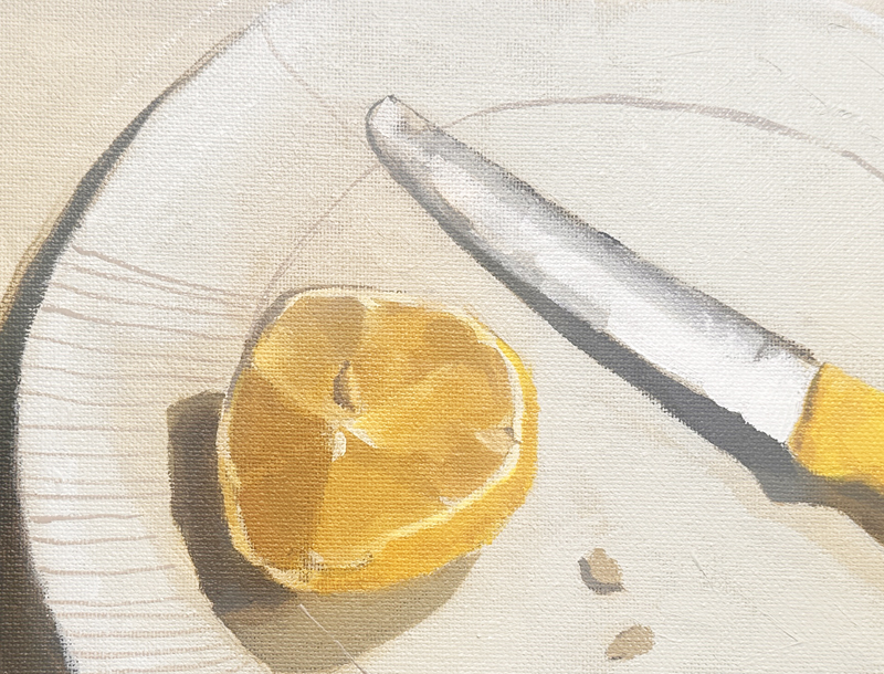
You can download the photo below as a reference image, print it out, and follow along.
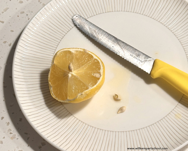
Full-size image here. The size of the reference image is 1:1 to the size I painted, 10 x 8 inches. (Opens in new tab)
Materials for the Acrylic Painting:
- 10 x 8-inch (25 x 20 cm) Canvas or Canvas Board
Paints:
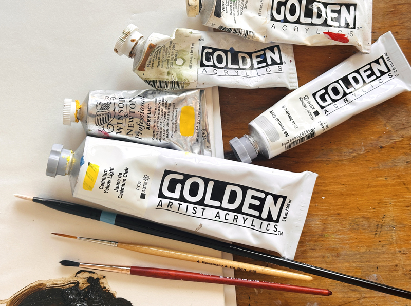
I use Artist Quality Heavy Body Acrylics, but you can follow along with any brand.
For the coloured ground:
- N8 Neutral Grey (Golden Paints)
- Cadmium Yellow Light (Golden Paints)
- Cadmium Yellow Medium (Winsor & Newton)
For the painting:
- Titanium White (Golden Paints)
- Cadmium Yellow Light (Golden Paints)
- Cadmium Yellow Medium (Winsor & Newton)
- Raw Sienna (Golden Paints)
- Raw Umber (Golden Paints)
- N8 Neutral Grey
Brushes:
- Bright, Size #4, Series 6500 (Princeton Aspen)
- Small Round Synthetic – Size #4, Series 344 (Rosemary & Co Designer Series)
- Small round rigger brush
- 1 1/2 inch decorator’s brush for painting the coloured ground
Extra tools
- An HB Pencil – (I use a Mechanical Pencil with a 0.5mm lead)
- An Eraser – (I use a Putty Eraser by Faber Castell)
- Acrylic Glazing Liquid Gloss (Golden Paints)
- Palette Knife (I use a diamond shape size 45 by RGM)
- Metal dipper or small pot for mediums
- Jam Jar for water
Preparing the Canvas Surface
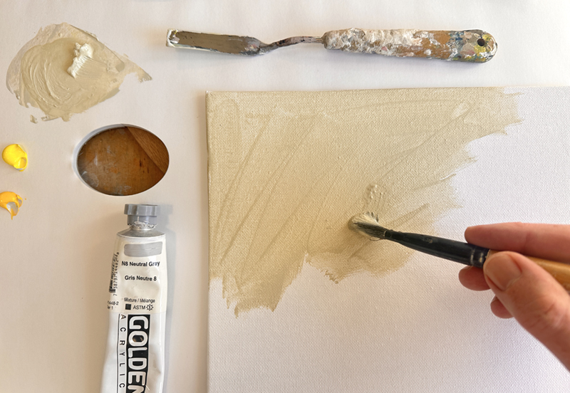
I’m using a 10 x 8-inch (25 x 20 cm) canvas board. I toned my canvas by applying a diluted grey mix that was the same tonal value as the background in the reference image.
I’ve used a Neutral Grey 8 from Golden Paints, and I’ve added some Cadmium Yellow Light and a touch of Cadmium Yellow Medium (This is from Winsor & Newton, but any brand will be fine)
I’ll start by mixing that with the palette knife, and then dip the brush tip into some water to bring the bristles together. Then paint that over in a continuous block. You can use a decorator’s brush, or any large brush, to lay down the ground colour.
A coloured ground helps to take away the glare of the white canvas and provides a harmonious base for the rest of the colours to sit upon.
You don’t always need a harmonious colour; often, a contrasting colour can work great for adding energy to the painting. If you want to learn more about the benefits of painting on a coloured ground, see: How a prepared canvas can drastically improve your paintings
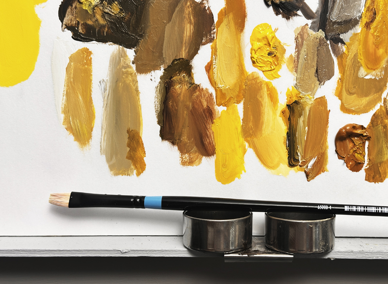
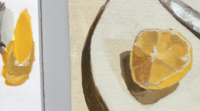
Choosing the palette – Colour Progression
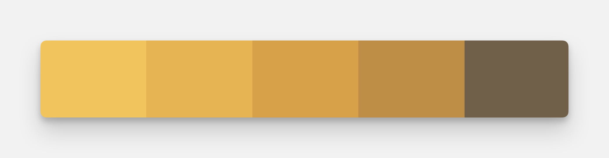
I wanted to see how much of the painting could be created by keeping within a narrow colour family. To give the widest value (light and dark) range, I wanted a bright, light colour and then a range of darker, less saturated colours that are harmonious.
Cadmium Yellow Light (You could also use Bismuth Yellow)
This is the brightest, most chromatic. For an explanation of the 3 keys to colour, Hue, Value Chroma, see this article.
Cadmium Yellow Medium
This is slightly warmer and less intense.
Raw Sienna
This is an earthy yellow-orange with medium intensity. You could also use Yellow Ochre.
Raw Umber
This is the darkest and least chromatic. Every time we add Raw Umber to one of the brighter colours, it will darken it, reduce the chroma, yet still keep within the same yellow colour family without having a large colour drift.
Drawing the Still Life
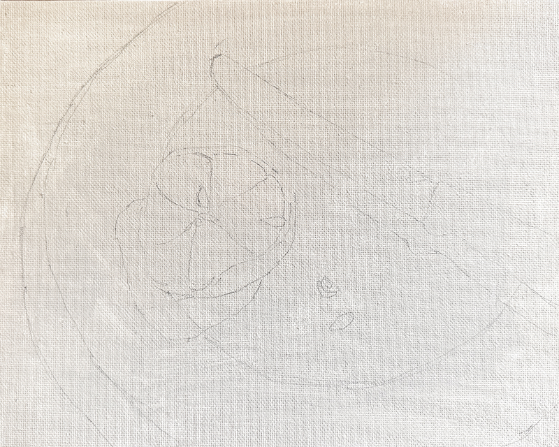
I’ve drawn out the design using an HB mechanical pencil to establish the proportions for the painting.
Things to look out for are the ellipse curve of the plate. If you’re struggling to get it to feel realistic, lay your painting on a black sheet of paper and draw the whole plate ellipse shape. You’ll be able to judge how the curve should look as an entire circle. Also, make sure to leave enough space between the knife and the lemon for your eye to travel through.
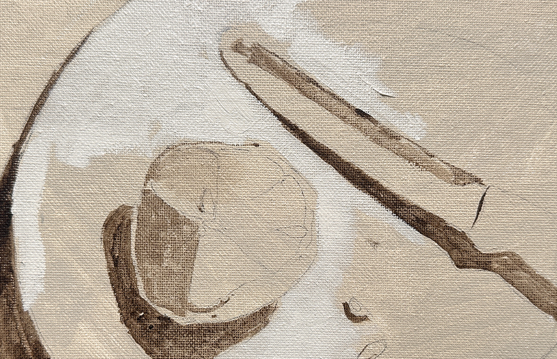
Raw Umber Block in
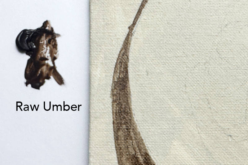
I want to establish the cast shadows. This gives the viewer a sense of direction of where the light is coming from, it also ‘grounds’ the objects so that they feel like they are sitting on the surface. It gives us a value range to work within.
I’m using Raw Umber heavy body acrylic paint, which is from Golden Paints. I dip a round brush into water and then start to draw in the shadow area.
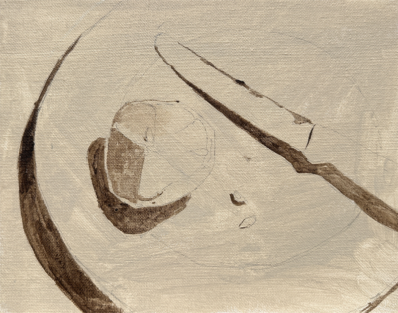
I vary the darkness of the mix by adding more or less water.
Notice the thin wash on the lemon’s surface. That’s on the shadow side. This creates the illusion of light coming from one direction. It also sets up a contrast to the reflection we’ll add on the knife blade later.
Painting the plate
Now I’ve mixed up a colour, slightly lighter than the ground colour.
This is created with Neutral Grey 8, a touch of Titanium White, and some Cadmium Yellow Light. So it’s still harmonious with that background colour, just one level lighter.
I use a square brush called a “bright.” It’s like a flat brush but with shorter, stiffer bristles. It offers more control for short strokes and more impasto, thick paint.
I block in most of the plate area. But I leave a couple of spots on the shadow side as the ground colour. These show the subtle cast shadow from the lemon blocking the light.
I’m using a Size #4 Bright brush from Princeton (Aspen Range).
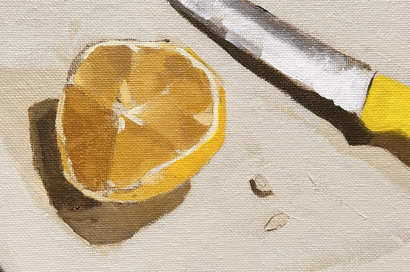
Painting the Knife Reflection
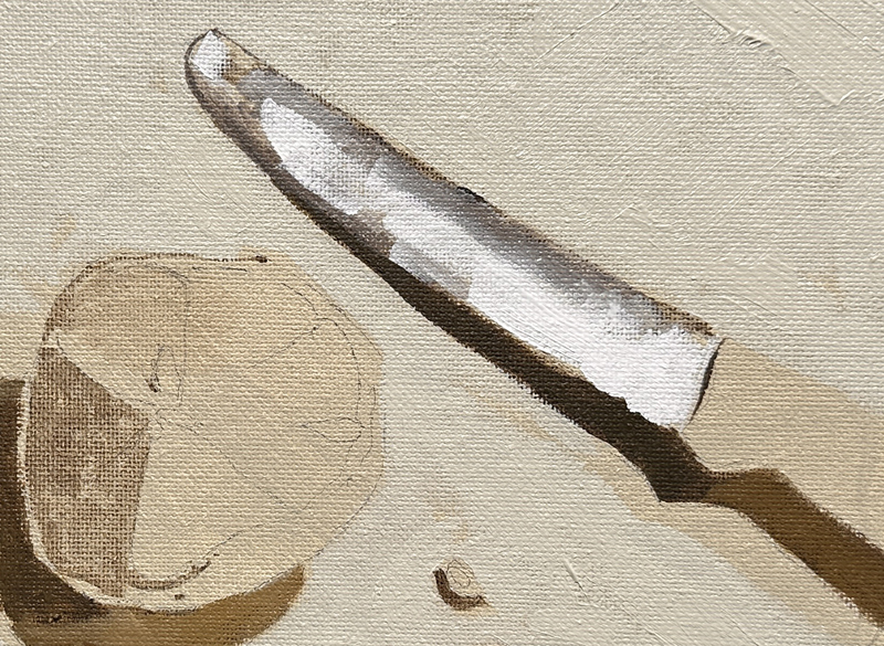
For the knife, I use the Neutral Grey 8, since all other colours are in the yellow family.
Pro tip: If you don’t have Neutral Grey, mix your own using Ivory Black, Burnt Umber, and Titanium White.
I block the grey on the knife’s top edge. Then I use Titanium White, applying it thickly to show the reflection on the knife blade.
Now I check how the painting looks overall. I have:
• My darkest dark (Raw Umber)
• My lightest light (white reflection)
Next, I judge the colour saturation. On the knife handle on the right, I paint some Cadmium Yellow Light straight from the tube. This thin application forms a bright base for any modelling on the handle.
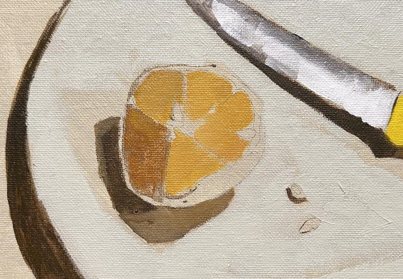
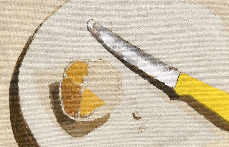
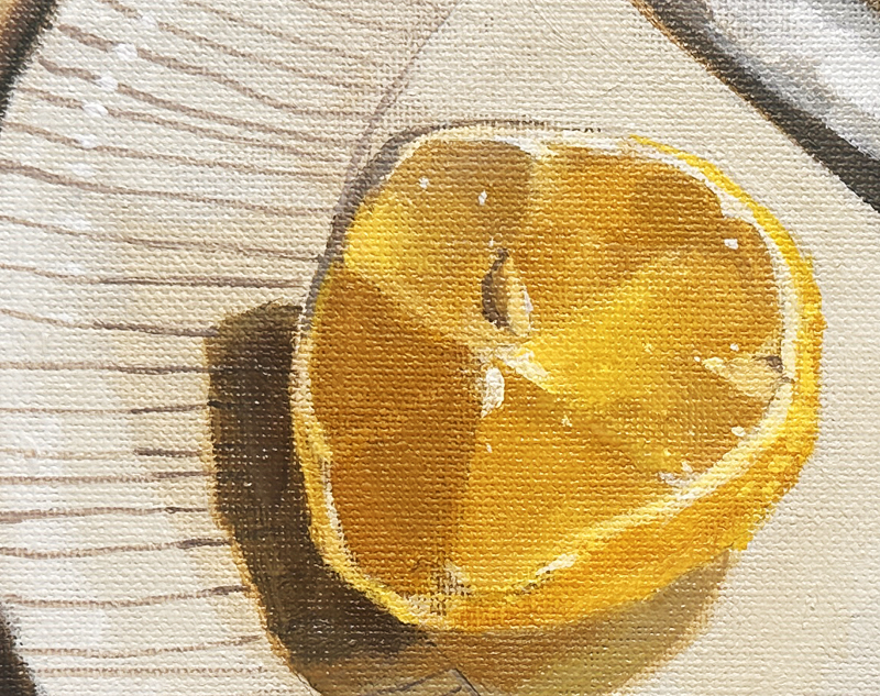
For the lemon, I start mixing colours down the value scale. I add Raw Sienna to the yellow mix for a more muted colour. I wash this onto the lemon’s segments.
Mixing the yellows for the Lemon
This creates a value map, bright yellow that gradually becomes more muted. I do this by adding more raw umber to tone it down. Then I paint the subtle changes between each lemon segment.
With a smaller round brush, I paint the lighter areas around the lemon’s edge using titanium white and Cadmium Yellow Light. This creates contrast against the lemon’s inside. I also block in some Cadmium Yellow Medium on the lemon’s side surface.
At this stage, most everything is blocked in. The background shadow stays mostly as the ground colour. On the knife handle, I go slightly darker where it enters shadow. I also warmed up that shadow area by adding Raw Sienna to the mix.
Notice the lemon’s cast shadow has two different values:
• A mid-value closer to the plate bottom
• A darker value further out
At the bottom, there’s a curved line where I’ve started the plate pattern. I use a thin “rigger” brush loaded with paint and a bit of water to achieve a smooth flow.
Adding Pattern to the Plate
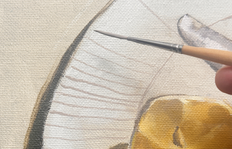
I paint a few pattern lines around the plate first. Then I can add the stripes to match those guidelines.
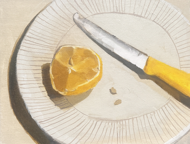
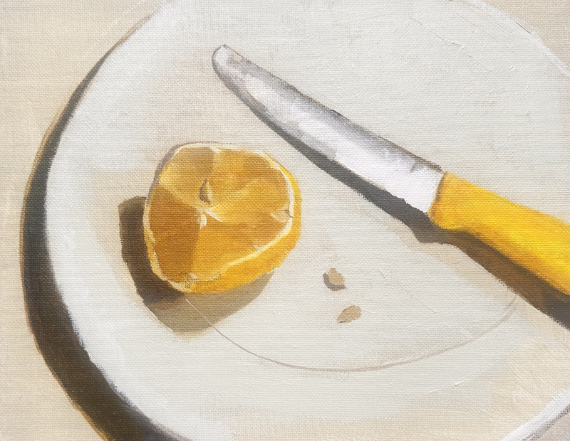
Final Highlights
The last step is adding highlights:
• White highlights on the lemon surface
• Small dashes of highlight around the plate rim
• Highlights where light hits the left side of the plate
The Finished Still Life Painting
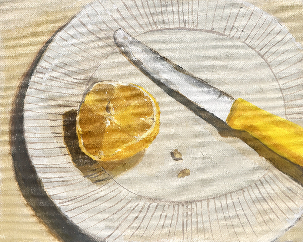
Will Kemp, Lemon Cut with a Tomato Knife, 10 x 8 inches, Acrylic on Board
Here’s our completed lemon painting, working mainly in the yellow family with just neutral grey as an extra colour.
This approach builds confidence in colour mixing. You practice moving up and down the yellow range and learn to create harmony by staying within one colour family.
I really hope you enjoy this lesson as much as I enjoyed painting it!
Cheers,
Will


Thank you so much for the detailed guide that I need so much. This was an incredible exercise (I used oil) and found it
very educational. You were very generous to give this to us!!
Thanks again,
Judee
My pleasure Judee, so pleased you could adapt it to oils easily, did you have most of the colours?
Thank you, Will, for such a detailed explanation and beautiful photography. I really enjoy your step by step by step lessons and I will be doing this soon! You’re such an excellent teacher!
Glad you enjoyed it Nancy
Fun learning about how shadows become different color combinations. Intriguing and so pretty.
Thanks Anne, hope you enjoy it.
Will, I’d like to thank you so much for this detailed tutorial ! I started it this afternoon and I hope to finish it soon, very soon !
Looking forward to seeing how it goes Margarita!
Such a valuable lesson— really helped deepen our understanding of colour. Huge thanks, Will, for sharing these treasures!
My pleasure Milena, really hope you find it helpful.
This was a great tutorial Will, thanks for putting it together. A wonderful way to spend a September afternoon, and to consolidate color mixing knowledge.
One question though – I used the same colors for the plate (neutral grey 8, titanium white, and a bit of cadmium yellow light), but on later painting the stripes on the plate with neutral grey 8, the color came out a pale lilac (unlike your painting) … Turned out well with the yellows, but I cannot figure out why this color combination would yield lilac.
Hey Philippe, the grey will appear lilac due to the contrast in colour with the yellows that surround it. I added a touch of raw umber into the mix.
Will
I got my biscuit and brew and then had a lovely go at this exercise. Thank you for taking the time and effort to put this together. I thoroughly enjoyed myself and was rewarded with a great lesson and a nice painting.
Ahh, so pleased to hear it Karen, glad you enjoyed it.
Will
This looks to be an amazing lesson on using a very limited palette. Can’t wait to get started on it. Wondering how long will it be available to view?
Hey Phyllis, it will stay on the blog, really hope you enjoy it.
Will
Hi Will, I’ve really valued the challenge of using a limited palette in this tutorial. Thank you. Just one question: am I right to assume the ‘darks’ painted in Raw Umber are NOT over-painted?
Hi Jacqui, they can be overpainted, some areas that are dark enough are left.