Student Success Stories – Masterclass
Below is a gallery of students’ work that has been inspired by the reflections painting in The Still Life Masterclass Course If you’ve completed the painting from the course yourself, drop me an email and I’ll add it to the page!
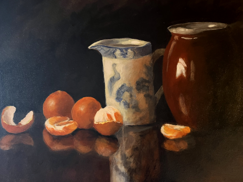
Elizabeth Hunt
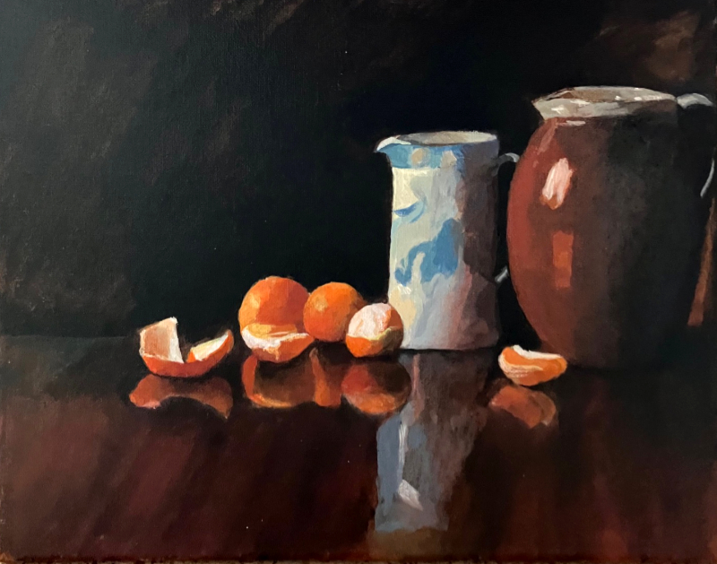
Kathleen Ferno

John Bottone

Keith Wyld

Helen Harrison

Giovanna Paolozzi

Sian

Sonja Mason

Julie Vatcher

Kathleen Bolster

Garry Nisbet

Joëlle

Helen

Barbara Boettcher

Robin Jeffery

Tibor Rijk

Sheila Newlands

Anna Whalen

David Wilkinson

Jayne Jones

Michelle Kennedy

Paul Nash

Terri Fey

Vince Doherty

Karlene – The warm colours of the oranges look brilliant. Great reflections with the handling of the differences between the reflections – being dulled down, and the actual subjects being more realistic, I can almost smell the polish on the table top!

Hans Gustafsson – I love how Hans has been bold in the colours and got real richness to the paint texture, and then smoked and muted down all of the colours reflected into the mahogany, it works so well.

Jean Kesser – Jean has observed the differences between the reflections and the main objects really well, the way the reflection in the wood is smoked and muted next to the crisper clearer colours on the orange is perfect!

Sharon Hodgdon – This is a great observation of values, how your eye is drawn to the white jug and then flows around the rest of the piece is fab, great job!

Dr. Connie Hurley – The reflections the tabletop look amazing!

Huguette – Love the contrast between the colours and that glow of mahogany

Kim Gracey – Great work with the oranges! notice that nice balance between a more detailed crisper edge to the actual oranges and a smokier, muted feel in the reflections in the table.

Alex Wilkins – Really brilliant work on the drawing, the red jug has been really well-handled and the colours on it are absolutely perfect. The lights dashes at the top of the rim are excellent.

Anne Wilkinson – The glazed ceramic pot looks epic! Love the bold brushwork on the highlights of the glazed surface, great job.

Paddy Wilkinson – Fantastic result! The bluebird on the side of the jug has been so delicately observed, the colour mixing is great and the shapes on the reflections blend in perfectly.

Dorothy Van Arkadie – The simplicity of shape helps to distinguish the warms and the cools.

Eamonn Bonner – The colours and tones on the red jug look fab and the reflections in the wood are an abstract painting in themselves!

Guy Holloway – Nicely judged balance between more detailed edges and the smokier, muted reflections in the table. The red jug looks great with that lovely sense of form within the dark shadows.

Inna Balanica – Great use of texture on the blue jug to draw the viewers eye

Jayne Williams – Fabulous ceramic sheen on the red jug and the detailing on the rim has given it a nice solidity. Also, the reflection on the wood of the blue and white jug is ace!

John Redmond – Can’t believe this is John’s first acrylic painting! Great work with the oranges, lovely colours and I think the single orange segment on its own has worked particularly well. The red jug is an absolute triumph with lovely luminous colours on the shadow side of the blue jug too, fab work!

Jon Andrews – The way Jon has built up the layers onto the oranges is excellent. Particularly like the strong blocks of colour, beautiful colours and a lovely painterly approach.

Kenneth Mays – Brilliant colour mixing, Ken has really got that balance between the orange tones and the pale blues right. The reflections on the red jug are spot on with a lovely soft transition into the darks on the jug and delicately handled white reflections, nicely painted.

Krystyna Szewczy – Really fabulous job on the painting, the drawing is looking excellent and some lovely strong clean colours in the mixes, great turning of the form and sheen on the red jug!

Monica Walsh – The oranges themselves look fab, and the window reflection on the glazed red pots looks ace! Really captured that sheen to the pot surface and warmth into the shadow really well.

Robert Adams – Bob’s observations of having softer lines that melt into the background (especially in the red jug) looks really good. It has an accomplished feel to it, the colours are matched and balanced well and the drawing is solid.

Simon Roberts – The colour mixing throughout this piece is really well handled, the way Simon has smoked and muted the reflection in the wood next to the crisper clearer colours on the orange is perfect. There’s a real energy to the brushmarks here

Virginia Nickle – Virginia has made a great job of bringing the tabletop together so that it feels like one single plane, with the reflections ‘within’ which is perfect. Also, the brighter blue on the white jug helps to define the drawing and bring up the level of contrast between complementary colours of the blue and orange really well.
You might also like:
You can learn more about the Masterclass Acrylic Course Here