PLEASE NOTE: This course is currently being updated, you might be interested in this online still life painting course that looks in depth at how to glaze with acrylics.
Or secretly feel they are the missing ingredient to your work?
If you don’t use black whilst mixing colours, you could be missing a trick.
A tale from two masters:
John Singer Sargent and Claude Monet used to go out and paint together.
One day, Sargent had left his paints behind and asked Monet to lend him his to work with. “Where’s the black?” asked Sargent.
“I don’t allow myself to use black,” replied Monet.
“It’s against the impressionist theory. In nature, all colours are made by mixing.”
Sargent refused to understand how anyone could paint without black.
Green paint is like peanut butter is for dieters, dangerously addictive.
I don’t quite know why, maybe the freshness, the feeling of a landscape, the memory of nature… whatever the reason it’s a bad one.
Step 1. If you buy a starter set of beginners paints, throw away the green that is included (usually this is Emerald green)
It is usually terrible and very unforgiving when trying to create harmonious colour in painting.
“Can’t I use it to tone down red? or use red to tone down the green? I know about complementary colours; I’ve only just bought it, I can’t throw it away!”
Time lapse preview for New painting course The Art of Acrylics with Will Kemp
“The Art of Acrylics” Painting Course
Developing your artists eye
When I was first learning to paint my results were often disheartening, the apple looked too flat, the greens looked garish and harsh and I was generally getting more and more frustrated.
I often took a large palette knife to the canvas and smeared the entire painting.
The result?
My new abstract period!!!
The problem with learning to paint is that you have an inbuilt ‘taste’ meter. You know a good painting when you see one. You don’t have to be art educated or have studied the classics, you just need to trust your own judgments.
So when you attempt your first painting and it goes wrong, you know it is wrong.
It was painted with Ivory black, raw umber (both Micheal Harding oil paints) and titanium white (Winsor and Newton) on pre-primed linen.
About the painting
Offscreen represents a conscious shift away from the formality of traditional portraiture.
It was inspired by the snap-to-capture culture in which we live, where everything from the mundane to the most important moments in life are a mobile phone photo away, I like the juxtaposition of an instant snap, taken in a moment, with the meticulous hours needed when painting a traditional portrait.
The portrait took over 50 hours to complete.
It poses the viewer the simple question – if the subject is not engaged in something worthy, does that make the painting less important?
The national exhibition runs from 14th October to 25th November at the King’s place gallery, London.
Perspective is one of the most common issues beginners have with drawing and painting.
Get it wrong and it can easily ruin a great start, get it right and it can instantly improve your work.
If you’re like most painters you are probably trying to create a sense of depth in your work.
Leading the viewer’s eye deep into the scene giving the illusion of reality.
But sometimes it just doesn’t look right.
The distant object doesn’t look so distant, your figures look out of proportion, a building looks like it is sliding off the page. And your still life just looks….odd.
But why does your colour mixing look wrong? or your pink looks salmon and not hot pink?
How to make a bright pink colour?
A quick look at the undertone of a few red paints can show you how mixing the perfect pink can easily elude you.
Cadmium won’t allow you to make a hot pink; this video will show you how.
This is not due to a lack of mixing ability, just the wrong red paint colour for the desired result.
Mixing a bright purple?
The right choice of red will influence your ability to make a bright purple, and Part 2 of this video (at the end of this post) will show you how easily purple can go muted and grey rather than bright and vibrant.
This is due to the ‘muting down‘ effect of complementary colours.
It’s all to do with the colour bias of the pigment hidden in paints…
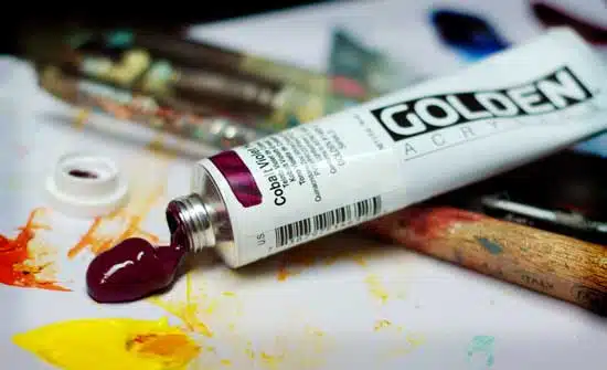
A brief overview of Artists’ vs Student quality paint
There are usually two grades of colour available, artist quality and student quality.
But what is the difference?
And, is it worth the cost?
When first starting painting lessons it is often overwhelming to try and decide which brush to buy, what canvas to paint on and the biggest choice of all. What paints to buy!
Your paints can help greatly in your progress as a painter, what usually happens is a hesitancy on investing in the ‘good quality’ paints until you yourself become a better painter.
This is a mistake.
One of the key things to understand is the labelling and differences between artist and student quality paint and how better quality paint, can make your life as a painter much easier…
Head Study – After Collins, Oil on Linen, Will Kemp
“Every time I paint a portrait I lose a friend” John Singer Sargent
How not to paint a portrait, a personal tale
Let me take you back several years to the beginning of my experiments with portraiture.
It was a bright sunny morning after a long arduous night painting and I was feeling pretty pleased with myself, I had finally cracked my self-portrait…. enter my wife Vanessa
Vanessa: “Why do you look like Tom Jones?” Me: “I don’t look like Tom Jones” Vanessa: “You do, what have you done? The portrait was looking great last night!” Me: “I don’t look like Tom Jones” Vanessa: “You do! Look how orange it is, you look like the freakin’ Tango man” Me: “Shit….. I look like Tom Jones”
This technique is best for landscapes and still life paintings. Video transcript:
When I’m doing (painting) landscapes, or still life’s, I usually always use Yellow Ochre as a coloured ground.
It has got a nice mid-tone to it, a really lovely warmth to it. It’s cheap and if you move onto Oil painting it dries quickly…
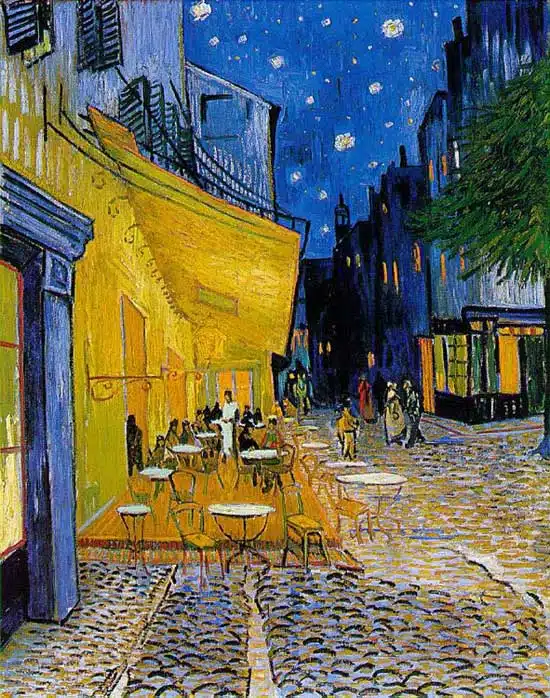
Vincent Van Gogh, Café Terrace on the Place du Forum, Arles, 1888.
Complementary colours
Two colours, placed side by side, will appear differently depending on which colours are used and what they are placed next to.
The effect of this interaction is called simultaneous contrast.
Simultaneous contrast is most intense when two complementary colours are juxtaposed directly next to each other.
For example, red placed directly next to a green, if you concentrate on the edge you will see a slight vibration.
Your eye doesn’t like resting on the edge. The two complementary colour in their purest, most saturated form don’t sit well together, however, if you want to try and focus your viewer gaze on a particular part of the painting a knowledge of the ‘attraction to the eye’ can be used to great effect…
“I am a simple man, and I use simple materials: Ivory black, Vermilion (red), Prussian blue, Yellow ochre, Flake white and no medium. That’s all I’ve ever used in my paintings.
L.S.Lowry
A great deal of things in nature are actually very muted, it is often the difference between light and dark and warm and cool colours, rather than the use of a bright colour.
If you want to paint subtle still life paintings, choose muted earth colours.
If you want very bright, vivid abstracts, you might need some more man-made pigments that have a higher colour saturation.
My suggested basic acrylic colour palette is somewhere in-between. It allows bright colour mixtures as well as subtle. The pigments are all light-fast (will not fade over time) and are a mixture of series (the price labelling system of paints) so the cost will be kept down….