A Step-by-Step Value Painting Tutorial
Article contents
- Materials
- Step #1 – Coloured Ground
- Step #2 – Drawing out
- Step #3 – Blocking in the background
- Step #4 – Colour block-in
- Step #5 – Painting the lightest plane
Morning Class, this week, I’ve enjoyed making my morning brew in my Moka Pot and thought it would work well as a weekend acrylic study.
The Moka pot was invented by Italian engineer Alfonso Bialetti in 1933 and is a fantastic shape for observing changes in surface planes.
Working with angular flat shapes is a great way to learn how light behaves on an object. Because this pot has a flat matte white surface, it is easier to see the transitions. It allows us to concentrate on the values more easily without the extra complications of colours.
You can download a reference image below to follow along with the lesson, hope you enjoy it!
Downloading the reference photograph:

The photo can be downloaded and printed out.
Materials you will need:
I’ve used a 10 x 8 inch (20 x 25cm) cotton duck canvas
Paints:
- Titanium White (Golden Paints)
- Yellow Iron Oxide (Winsor & Newton)
- Burnt Sienna (Winsor & Newton)
- Raw Umber (Golden Paints)
- Neutral Gray 7 (Golden Paints)
- Neutral Gray 5 (Golden Paints)
- Neutral Gray 3 (Golden Paints)
Brushes:
- Isabey Isacryl, Size 6 6562 Flat
- Rosemary & Co, Series 302 Golden Synthetic Flat
- Small Round for details
View this post on Instagram
Step #1: Coloured Ground

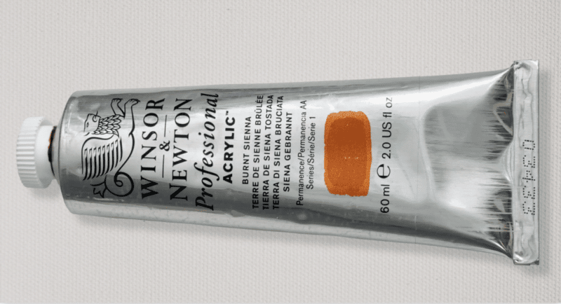
For the coloured ground, I’m using a Burnt Sienna from Winsor & Newton; I find this a fantastic colour. It’s so nice in transparency for thin glazing layers and great for working on warm and cool paintings.
This is diluted with roughly an equal mix of water and Airbrush Thinner (from Golden paints) to create a thinnish consistency, giving a nice stain. As the subject is neutral, I liked the idea of the warmth and glow from the burnt-rich orange underneath, adding more interest to the painting.

Burnt Sienna, Winsor & Newton Professional Acrylic
Step #2: Drawing out
I’ve used a neutral grey acrylic marker (with a chisel tip) from Liquitex, to draw out the Moka pot. It’s quite subtle because I want to leave some of the orange ground showing through around the silhouette, so I didn’t want the underlying drawing to be too heavy to distract.

Grey acrylic marker ontop of the Burnt Sienna ground
I’ve grouped the form shadow and the cast shadow as one solid shape (you can learn more about this technique in the still life project e-book)
Step #3: Blocking in the background

I start by painting in the background using a premixed neutral grey from Golden paints and a flat brush. I’m using an Isabey Isacryl, Size 6 Flat.
Using a dry brush, I start with a value N7 Neutral Grey at the top of the painting, I’m not really diluting the paint much with water, just using the paint that comes out of the tube. Also, I’m using the surface texture of the canvas, which creates a lovely broken effect. I don’t want to completely cover that nice warm ground colour. I want to keep that to add character to the painting.

Golden Neutral Grey Acrylic N7, N5 & N3
What’s great about these neutral paints is they come as pre-mixed different values. So it can be an effective way of panting different tonal steps, knowing there’s a distinct jump in the value you’re using.
Step #4: Colour block-in

Then, as the painting moves down, there’s more of a shadow area at the bottom, closest to the edge of the table, so I can darken that down progressively.
So next, I take Neutral N5 Grey, still in the neutral greys and mix and blend that with the first laid down Value N7 working my way down the painting. Finally, I apply value N3 and use that on the darkest areas, the central band and handle shadow.
I introduce Yellow Iron Oxide onto my Palette. This is a lovely muted yellow. It’s got a little more Chroma, (more saturated) than Yellow Ochre, but you could also use Yellow Ochre if you’ve got some.
I mix it in with a little light grey to block in the muted yellow/wood hues on the pot’s top, handle, and wooden surface on the front.
Step #5: Painting the lightest plane

I then move on to the lightest values on the front of the Moka Pot.
I’ve added Titanium White to my palette and lightened up the value 7.
The key thing to remember is that I don’t want to have pure white at this stage. I still want to allow some ‘value space’ for the final highlights. So even though it looks white on this image, it is still off-white. I can move down the values as the light changes around the pot’s surface, and see how the value (lightness or darkness) drops as it moves away from the light.

At this stage, I’ve got a really basic block-in of all the major elements, so it’s a good time to step back from your painting. Walk back across your room to see how it reads from a distance. Are there any value steps you could make closer together? Does the cast shadow need to go darker?

Once I’ve got these neutral values down and I’m happy, I can start introducing some of the reflected light and colours from the yellow on the wooden worktop into the shadow side.
I then swap to a softer, smaller flat brush (Rosemary & Co, Series 302 Golden Synthetic Flat.) This allows me to work over the surface, refining the details.

I continued refining the values.
I introduced a Raw Umber and a tiny touch of black, so I could go a little bit darker behind the handle and the central band on the pot, using a smaller round brush to paint the details.
If you look at the dark edge where the lid sits on the pot and also on the bottom of the pot, these dark areas are really helpful to give it that sense of form.
Once these were in for the finishing touches, I could go back with just pure Titanium White and put fine lines onto the edges of the panels using the flat brush, and it’s amazing how these thin white highlights really brought the coffee pot to life!
And finally, I felt that the yellow colour on the tabletop was a little too intense, so I added a bit more light grey to mute it down.
Have a great creative weekend!


Perfect !!! Bravo Will, seems perfect !!! Thanks for the presentation !!
My pleasure Margarita.
I love how the underpaint shows through and gives the painting that sparkle! Thank you for sharing your talent with us and being such a great teacher!
Thanks so much Virginia, pleased you liked it. Hope your version turns out well.
Will
Love watching you translate a good, simple and elegant photo of an object into a painting that pops! Always looking forward to your new still lifes and the process descriptions!
Great stuff Morana, so pleased you enjoyed seeing the process.
Will
Thank you Will for this insight. Love the effect of the underpainting. Food for thought.
Yes, trying different colours for your underpainting can be a great way to add interest to more neutral subjects, happy experimenting!
Will
Will thank you so much for your free tutorals since 2012. You are a real inspiration and I am always looking forward to your mail. Thank you very much. Annelise
Wow Annelise, thanks for following along since the start! as it’s world kindness day, I’m going to send you a free course!
Will
Going to give it ago
Great stuff Georgie
This is great!
I always have trouble getting straight lines in those places where its absolutely necessary for a feeling of authenticity- eg like the plane shifts on the pot (or in architectural details). (I really should get a mahl stick!) But do you use a ruler or something to steady your hand to get those crisp details? A little video would be really helpful perhaps…
Hey Judy, glad you enjoyed it, no mahl stick or ruler for this painting, just the edge of a flat brush.
Will
I have learned so much from your painting courses. Just finished the market peach and I am starting to understand how colors work together and underpaintings effect on the work. My moka pot came out so much better than I expected it gave me confidence to keep making art. I really appreciate you sharing your skill.
So pleased you’ve been enjoying the courses Renee, great to hear your Moka pot turned out well.
Will
A little late, but thank you– I tried the Moka pot. I enjoyed your instruction and learned alot, Will. You gave the image a 3D quality. I thought it would be difficult, but it worked
So pleased it worked out well for your Belinda!
Will
This was so much fun, Will. I ended up doing it in oils which I got as an early Christmas present. Thanks for the great lessons and videos.
So pleased you enjoyed it Robb, and glad the painting of the moka pot turned out well.
Will
Love it! Going to paint for my kitchen!
What if I don’t have neutrals?
Can I make them w black and white tones?
Sure, that would work aswell, you can add a touch of Burt Umber to your black to warm it slightly.
Will