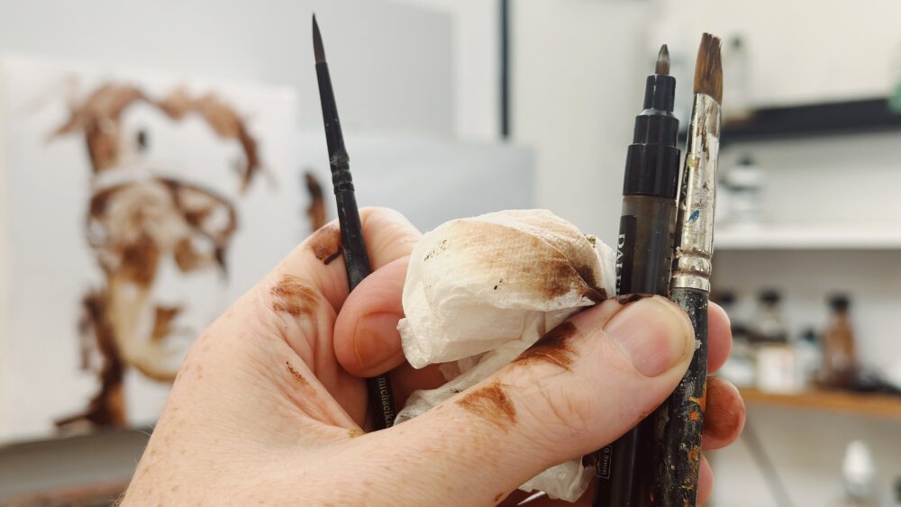
Hue, Value, Chroma – The 3 Keys to Colour Mixing

I’ve found most people overcomplicate colour mixing.
Especially warm and cool colours.
So, here’s a super handy chart from Golden Paints I thought might help.
Download the chart here: https://goldenhub.goldenpaints.com/storage/uploads/cool-to-warm-order-for-golden-heavy-body-acrylics.pdf
This chart helps with ‘HUE’
One of the 3 keys to colour mixing.
1.Hue
Hue refers to the base pigment of a colour, which is what most people think of when they hear the word “colour.”
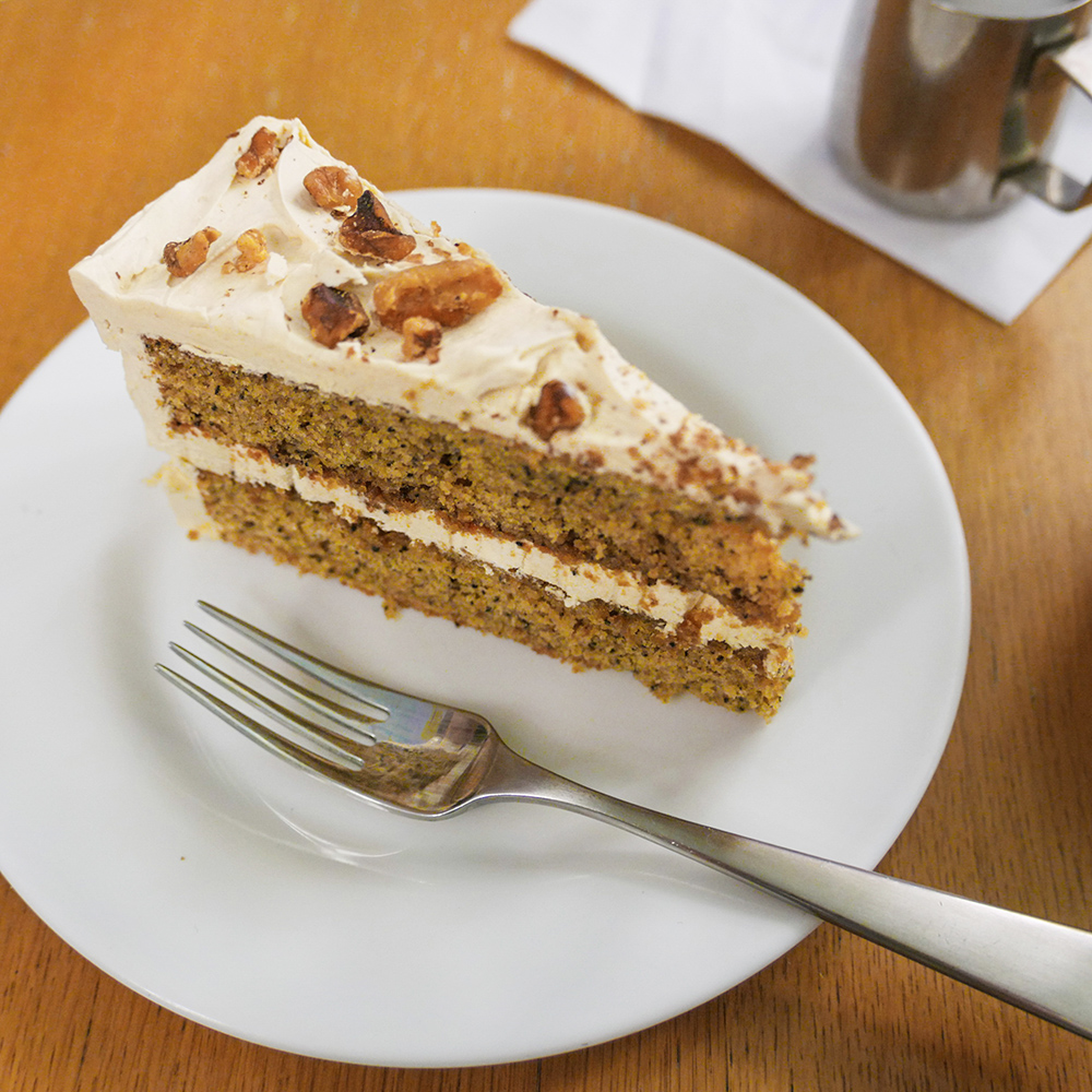
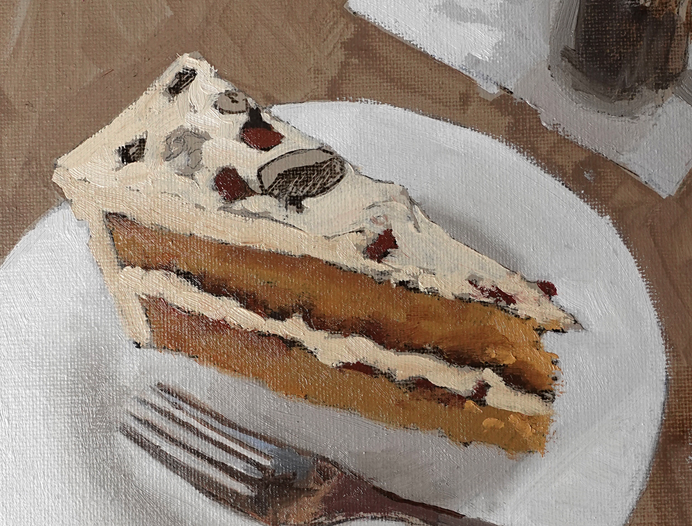
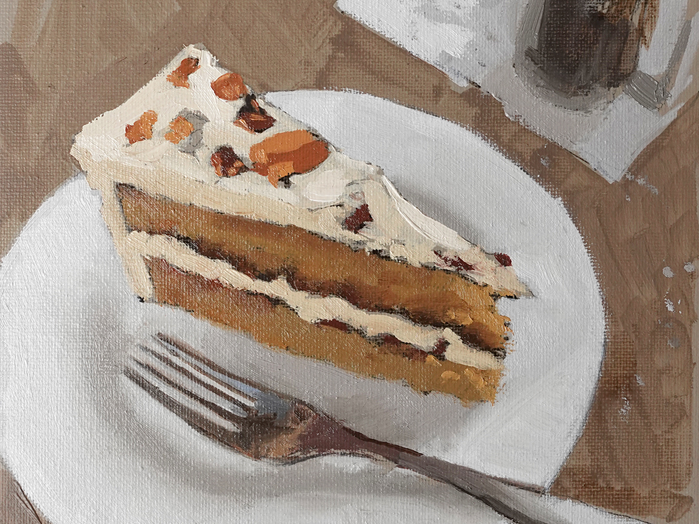
Let’s say we’re trying to mix this colour:

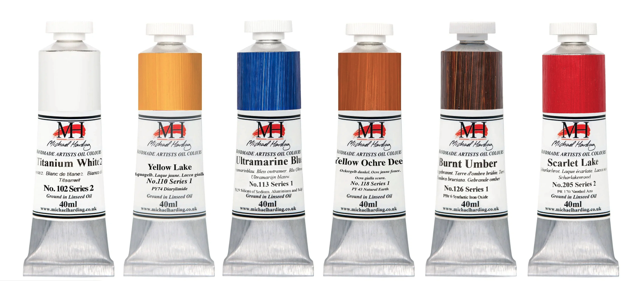
Step One: Make your first best guess from the tube colours you’ve already got. Select a tube to try. I’m going to try Cadmium Red Medium.

Step Two: Add white to reveal its undertone and colour bias.

Then, you can focus on whether you need to go warmer or cooler.

Step Three: Look at the colour chart and find the pigment you started with.
I need to go cooler.
I don’t have any Cadmium Medium Hue, so I’ve gone for Naphthol Red Medium.

Step Four: Check your new mix. It’s better, but it’s still not there. Let’s go cooler.

I don’t have any Primary Magenta, so I’ve jumped to Quinacridone Red.

Getting much closer, but I’ve noticed there are some cooler tones in the shadows.
I’ve got a Quinacridone Magenta from Winsor & Newton. Let’s try that.

Too far.
It’s gone to cool and needs to be warmed up.
Step five: Combine your colours.

By mixing the Quinocridone Magenta with the Quinocridone Red, I can create a colour that better matches the range of hues in the flowers.
The key to success?
With every mix you make, think about the warmth and coolness of the colour in relation to other colours in its family. Then, you will be much closer with your mixes.

If you don’t have as many colours, you can still learn about your different pigments by making swatch scales and adding white to your pigments.
Bonus: You can check your ability to judge HUE with this Colour Challenge and Hue Test
You have to rearrange the squares as the HUE changes.
Zero is the best score you’re after.

2. Value
VALUE is sometimes also called TONE, and it refers to the lightness or darkness of a colour.
Observing value is one of the core elements in creating depth, mood, and visual interest. It gives your drawing form and solidity and plays an integral part in your paintings.
Not recognising the importance of the value structure will unintentionally create a struggle in your art. It will make colour mixing harder, your compositions won’t work, and your paintings can look amateurish.

The great thing is you already know what you’re looking for.
When you draw, you think in value
When you draw, you’re already thinking in value. Drawing is making sense of a coloured image and turning it black and white.
The problem is, colour lures you in.
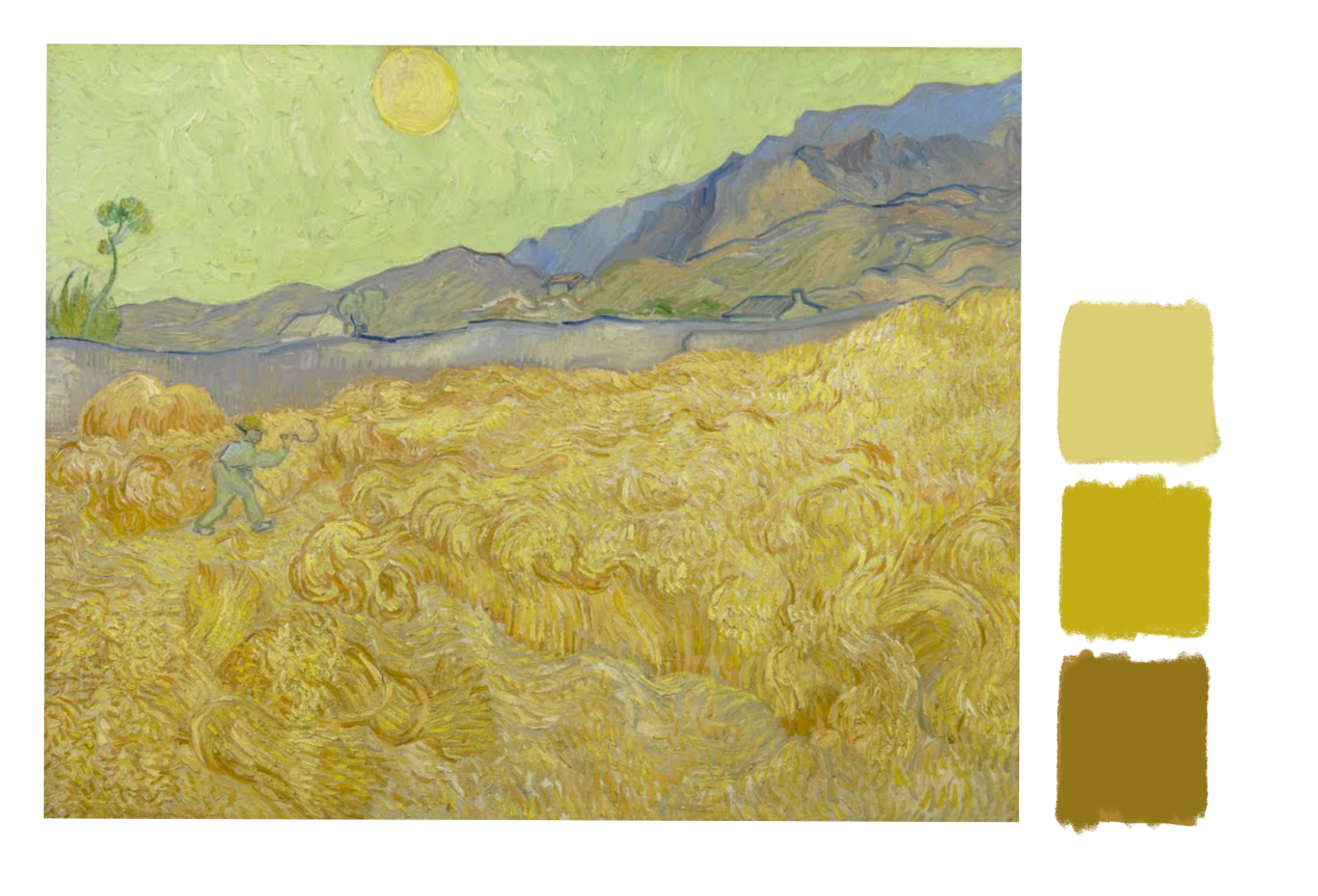
How light is this yellow? (Detail of Wheatfield by Vincent Van Gogh)
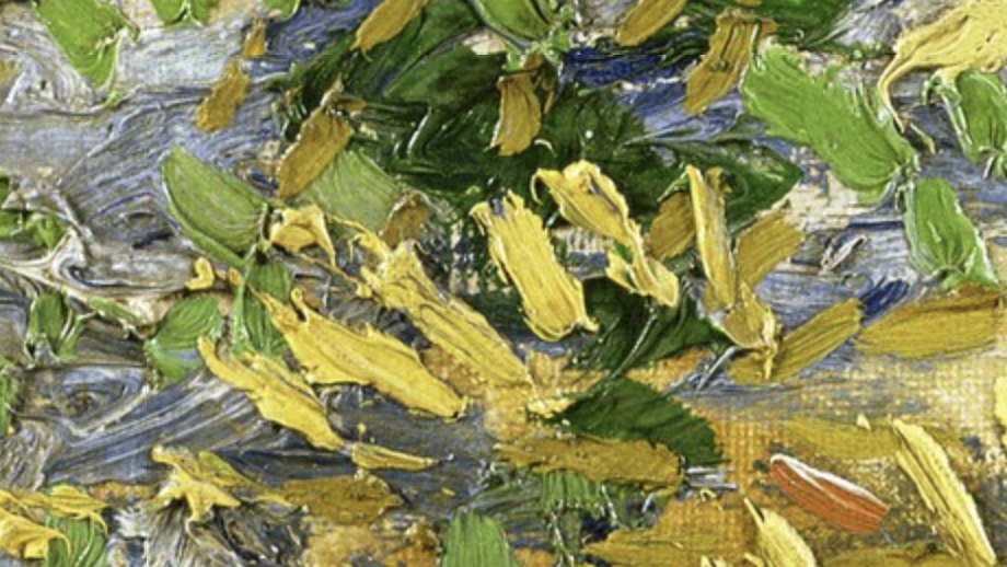
Because it’s bright, you’d think it is light.

Say whaaat? Why is it so dark?
All Colours have a Base Value
Each yellow pigment will have an inherent lightness.

In this range of yellows, Cadmium Yellow Primrose is the lightest.
Cadmium Yellow Primrose
Cadmium Yellow Light
Cadmium Yellow Medium
Cadmium Yellow Dark

In black and white, they still appear relatively close in value.
In this range of yellows, the inherent value is darker.

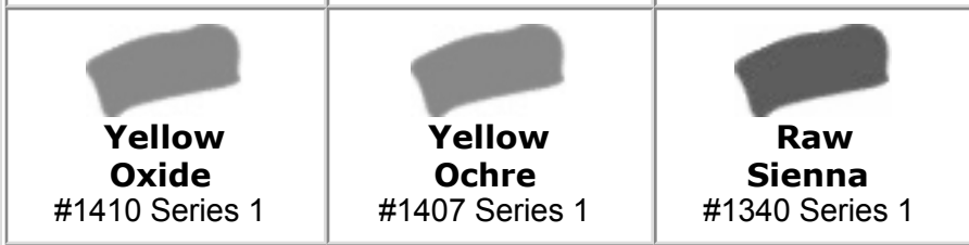
You can see the difference most clearly when you compare the Raw Sienna to the Cadmium Yellow Primrose.
 Wheatfield, Vincent Van Gogh
Here’s the whole painting. Notice how Van Gogh has created different varieties and focus throughout the piece just by utilising the different values of the yellows, from the darker Raw Sienna yellows on the right-hand side to the lighter Primrose yellows in the centre.
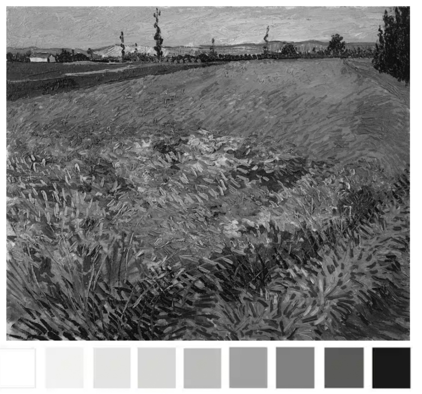
When we focus on the value, it’s easier to see how the majority of the colours are within the darker end of the value scale.
All Values are Relative
Just as with one colour appearing warmer or cooler depending on what colour it is placed next to, the same is true with value.
And that’s why it can be so hard to judge.
In this Wheatfield painting by Van Gogh, the yellows appears bright and light. However, when viewed in isolation, they are a darker value.
This doesn’t seem right. Why do the central yellows appear brighter?
They appear brighter because they are surrounded by darker colours.
This is called ‘simultaneous lightness contrast.’

The two central squares above are the same colour. And the same value.
But the square surrounded by black appears lighter, just like the yellows in the Van Gogh painting.
How can you start to develop your ‘value vision’?
Closing your eyes can help.
If you look at your subject/reference and painting so they are within the same frame. Then close your eyes.
Slowly open your eyes until you identify the first lightest shape.
Does it match what you’re painting?
Does the hazy image look the same lightness and shape?
You’re trying to see the most basic value structure of your subject into tonal masses. These simple masses with hold the structure of your painting together.
Once you get accustomed to this technique you can then practice ‘squinting down’ from when your eyes are open.
You don’t always need a wide value range
When you’re composing a painting, it doesn’t always have to be high contrast (wide value range)
Here’s a second Wheatfield painting by Van Gogh.
 Wheatfield with a Reaper, Vincent Van Gogh
You can see the figure in the wheatfield due to the difference in colour.

Notice how the figure practically disappears when I’ve turned the painting black and white.
 The values of the yellows within this painting are mostly a mid value.
 Here are 3 yellow swatches.

To mix the darkest swatch, we can look for a yellow pigment with a similar value.
I’m using Yellow Ochre.
Then add a touch of Raw Umber to darken it. (If you have Raw Sienna that will be very close straight from the tube)
Then I lighten the mix by adding some Hansa Yellow Light.
For the lightest mix I add a touch of Titanium White and a little more Hansa Yellow Light.
The key to success?
With every mix you make, think about the lightness and darkness. How would you approach it if drawing in black and white?
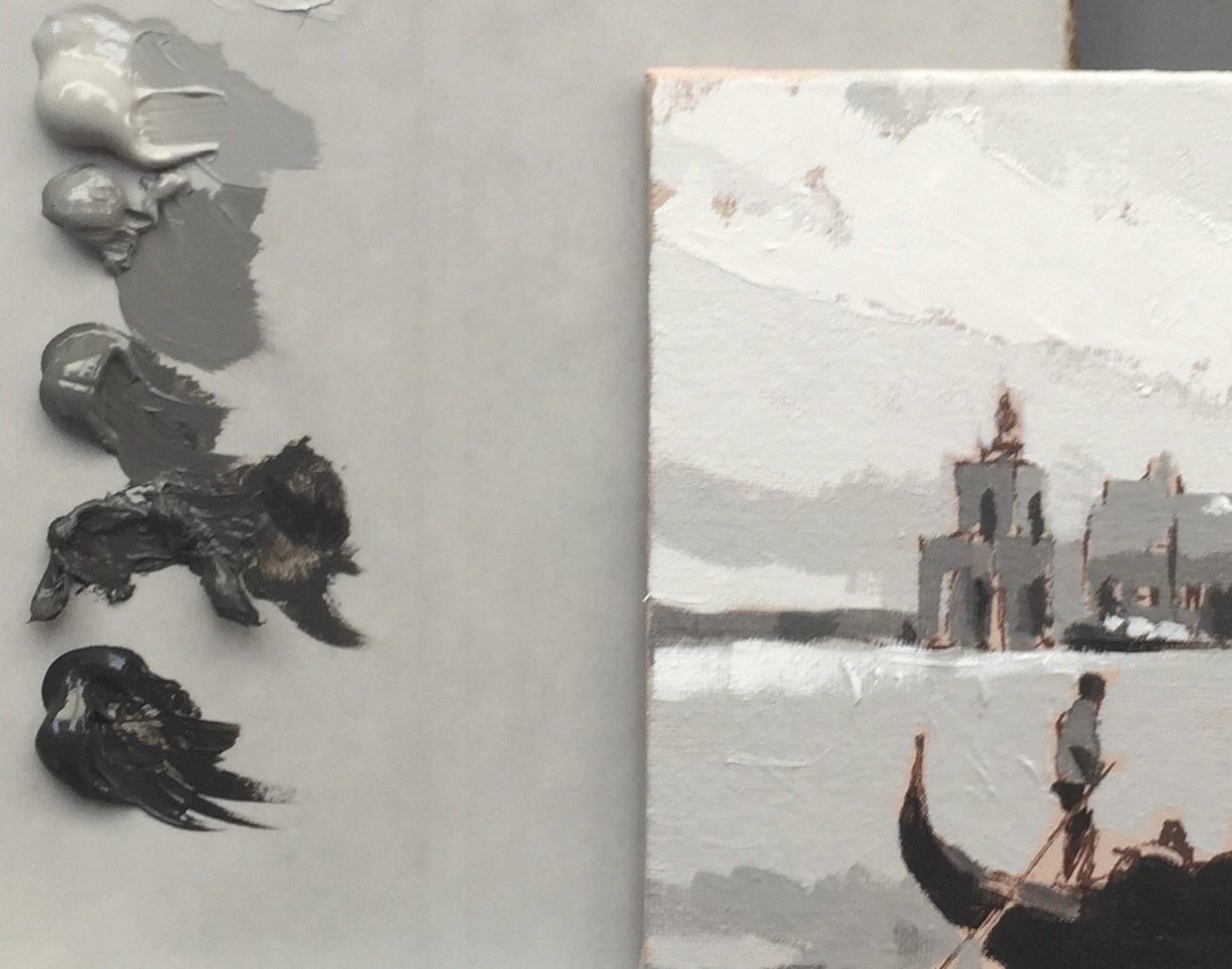
I use a grey scale value strip also called a tonal strip, to help me.
It goes from black to white, with each ‘step’ having a number for easy reference. I print it out and make hole punches through each value square.
I can use those as a viewfinder to judge tonal values in a reference image.

When that colour just about ‘disappears’ into one of the grey values on my strip, I know that would be the closest value to check my paint mix against.

Notice how numbers 4, 5 and 7 match the swatches.
When you’re aware of HUE and VALUE, there is one missing piece to the puzzle.
3. Chroma
Chroma originates from the Greek word “khrōma,” which means “colour”.
It describes the saturation, or purity of a colour, how dull or intense it is.

In the series of swatches above, Green 1 has the highest chroma. The chroma reduces as the ratio of grey increases, with 10 being a neutral grey.
3 shades of grey
When I talk about ‘neutral grey’, I’m describing a grey that doesn’t shift towards warm or cool.
 You don’t need to always add grey to lower the Chroma.
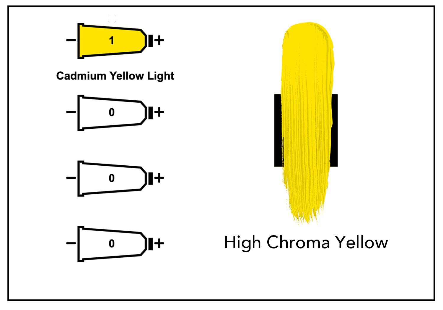
If you think of chroma as a purity of colour, Cadmium Yellow Light, straight from the tube, has a high chroma.
If you mix in any another lower chroma pigment, you will reduce the chroma.

By adding a lower chroma red (Cadmium Red Medium) to the higher Chroma Yellow (Cadmium Yellow Light) we have lowered the chroma by using colour, rather than a neutral grey.
Are you still with me? it’s a lot of Chroma’s
All pigments have a Chroma Value
Just like colours have different tonal values, they also have different chroma values.
Here’s a range of colours on a scale of light to dark.
But which one has the highest chroma?
When in grayscale, it doesn’t show us the chroma intensity, just the lightness or darkness (value)

This colour has the highest chroma in the range.
How do I know? I look for which colour had the most pure intensity, the richest more purest pigment. All the white based colours or the earth colours take away the purity.
How does this help you in your painting?
If you can judge the chroma of the scene, you can select appropriate pigments that have a matching chromatic range.
Here’s a painting by Anton Mauve.

Morning Ride along the Beach, Anton Mauve, 1876
It reads as a bright morning at the beach, with clear blue skies.
That should be vivid and high chroma?
 But when we take colour swatches from the painting, look how dull they are.
Actually, all low chroma colours.
What would happen if you boosted the saturation of the colours?
 You can see in the swatches, all of the colours now have more saturation, but the painting has a completely different feel.
You might love, super intense, vivid colours or prefer subdued, subtle mixes. There is no right or wrong answer, it’s more of a case of looking at the style of paintings that you’re trying to create and matching the chromatic qualities.
4 methods for lowering chroma
There are 4 main ways to reduce chroma (apart from adding white)
- Add a lower chromatic version of the colour
- Add a complementary colour
- Add a neutral grey
- Add a black
Each method will give you slightly different results depending on the pigments you use.

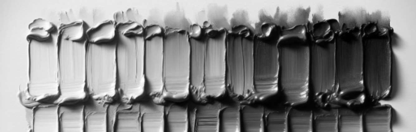
In the example above, I’ve started with high chroma Cadmium Orange on the top row, and added different ratios of colours to reduce the intensity.
I’ve added Burnt Umber as a lower chromatic version of the colour.
I’ve added Ultramarine Blue as a complementary colour
I’ve added Neutral Grey as a Grey
I’ve added Mars Black for a Black
Note how the different mixes all look very similar in the low chroma oranges, even with different pigments.
Each method has pros and cons. The main thing to be aware of is the colour bias of the particular pigment you are going to use, how it shifts, and how it affects other colours.
The key to success?
Observing and experimenting.
You won’t truly understand how a pigment behaves until you try it with paint.
Find a painting you like and experiment with choosing a colour palette.
If you only have a few colours, see how far you can push them, or try to find a subject that already fits with the colours you have.
Note how colours change under different lighting conditions and how the highest chroma isn’t always in the lights.
Start to look at objects and try to guess the highest chroma areas. When you’re aware of it you’ll start to train your eyes to notice more.
I really hope you found this helpful; if you’d like to learn more about colour mixing and how to put the theory into practice, you might enjoy the simple colour mixing course.
I demonstrate this with acrylics, but the same principles apply to oils.